In many ways, pastels provide the artist with the best of both worlds. The medium is dry and applied in a manner that is considered drawing, but the finished look is similar to a painting. Like opaque paints, pastels can be layered and applied to cover previous applications. Mixing mostly happens on the surface as layers are applied.
In this lesson, we'll create a simple still life with pastels, exploring basic pastel techniques including layering, mixing, and blending.
Pastels are often at their best when they are layered. Layering creates depth and complexity in color and encourages mixing. In most circumstances, multiple layers of color are applied. This requires a bit of patience to develop colors and value relationships fully. While marks made with the pastel are immediate, we should expect to make more than a few to develop a painting.
The surface of the paper then plays an important role in our success. Papers with a heavier tooth (texture) often perform better since they can accept multiple layers of color. There should be enough texture to accept the marks. If the tooth of the paper is too weak, we are limited in the number of layers that can be applied. The paper used in this demonstration is Canson Mi-Tientes pastel paper. Both sides of the paper have an ample amount of texture to accept marks.
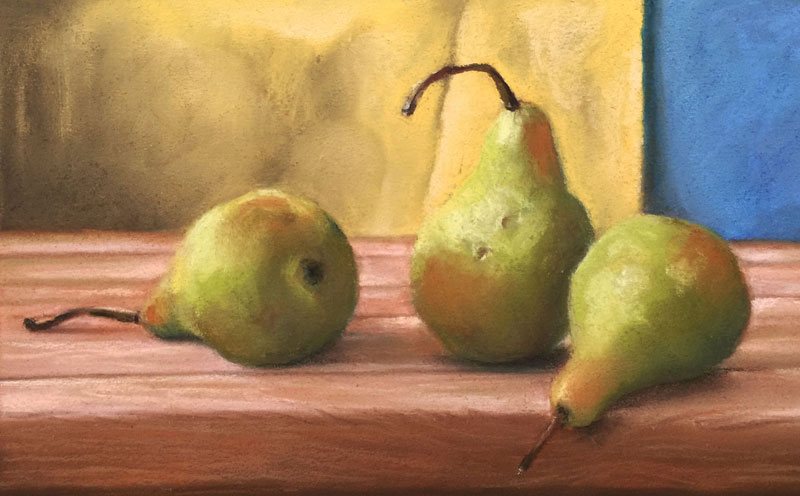
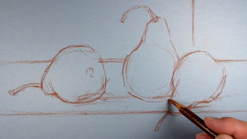
We'll start with a loose sketch of the contour lines using a pastel pencil. The shapes of each of the pears are defined as well as the edges of the elements in the background and the table.
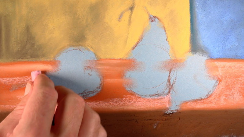
With a loose sketch in place, we can start adding some of the colors in the background. In this example, we'll exaggerate the observed colors in the background to create a primary relationship (red, yellow, and blue). This will provide a bit more contrast in the colors around the pears. Values are also quickly developed to create a bit more interest and texture.
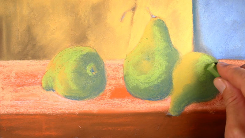
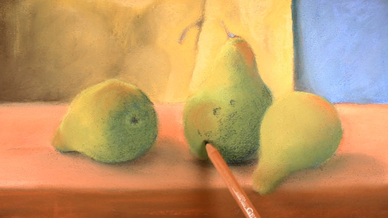
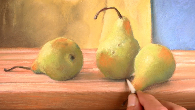
The local color of the pears is defined with a medium yellow-green before modeling the form with darker and lighter values. Cooler blues are used in areas of shadow while warmer yellow-greens are used in areas of highlight. This provides a bit of color contrast as well as contrast in value. A medium yellow-green is applied in areas of midtone to ease transitions from light to dark.
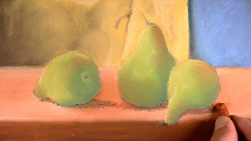
These applications are then gently blended with a finger to smooth transitions further. Cast shadows underneath and behind the pears are developed by layering a darker blue, Burnt Sienna, and Burnt Umber.
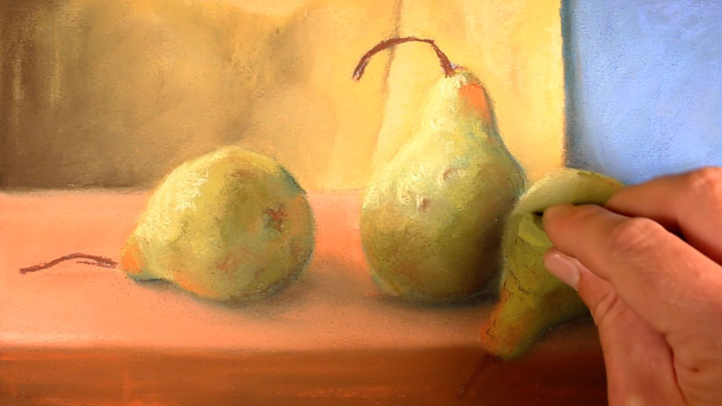
Using a black pastel pencil, shadows are strengthened on the pears and on the surface of the table. These applications are then gently blended with a blending stump, mixing with the colors already in place.
We'll continue to apply multiple layers of color on the pears. With each layer of darker and lighter versions of yellow-green, the form of the pear begins to become defined. As the color becomes more complex, less blending occurs. The stems of the pears are also defined using a dark brown pastel.
Details of the table are next addressed. The darker edges of each of the boards are defined with a dark brown pastel and a bit of black. Lighter values are addressed with lighter grays, pinks, and browns. Each application is gently blended to mute the strength of the marks without removing the detail.
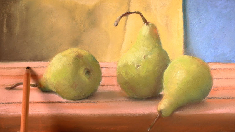

As each application is applied and gently blended, the details of the table begin to emerge. A few lines are added on the shadowed side of the table with a light brown continuing the texture of the wood.
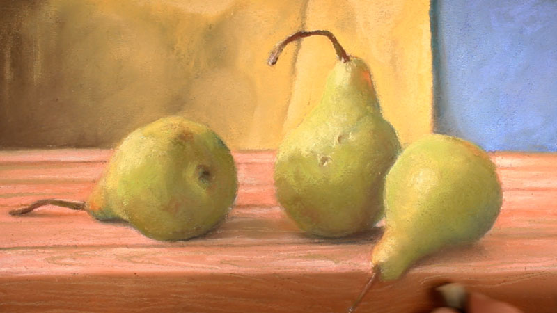
Cast shadows are strengthened with the black pastel pencil and blended with a blending stump. Bits of red are also re-established on the pears with Burnt Sienna.
A few more applications of light yellow-green are applied to strengthen the highlights and increase the contrast finishing the work.