Combining Markers and Colored Pencils
Some mediums simply work well together. One such combination is alcohol-based markers and colored pencils. However, we must consider the order in which we develop a drawing with this combination of media. The markers are typically added before the colored pencils. This means that the marker drawing becomes an underpainting, leaving the details and more intense colors to the colored pencils.
See also: Combining Markers and Colored Pencils
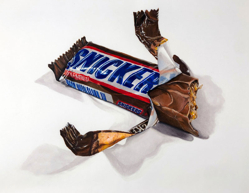
In this lesson, we’ll take a look at my process for combining markers and colored pencils to create a realistic drawing. We’ll draw a deceptively complex candy bar. Here’s a look at the completed drawing…
Materials and Surface for this Drawing
Before we dive into the drawing process, we’ll first take a quick look at the materials and the surface we’ll use. While you’re free to use any brand of markers and colored pencils, it’s important to use alcohol-based markers. These markers differ from their water-based counterparts in both performance and price.
Alcohol-based markers produce translucent marks that build in intensity with each stroke layered. Water-based makers do not behave in this manner and instead, produce fairly opaque marks with one pass. This means that alcohol-based markers give the artist more control, but this added control does come at a higher price. (The following links are affiliate links which means I make a small commission if you purchase at no additional cost to you.)
- Staedtler Lead Holder with 2H Graphite
- Alcohol-Based Prismacolor Premier Markers
- Prismacolor Premier Colored Pencils
- Canson Marker Paper
- White Gouache
Marker paper is semi-translucent. This is an advantage for illustrators wishing to transfer sketches or photos to the surface. This paper is designed to absorb the applications made by the markers, reducing any bleeding that may normally occur on standard drawing paper.
See also: All About Drawing Papers
This paper, however, is fairly smooth with a relatively weak tooth. This means that the number of layers of colored pencil applications that you can add is reduced. This will not be an issue since we are using the marker applications as fairly developed underpainting.
Sketching the Candy Bar with Graphite
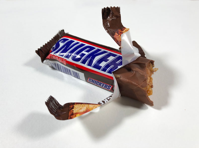
Clearly, a photo reference is used to create the drawing. In this case, I simply purchased my favorite candy bar from the store, took a delicious bite, and snapped a photo. Here’s a look at the reference image…
The Contour Line Drawing
Since we’re striving for realism in this image, we’ll first transfer the subject onto the marker paper. There are several ways to do this. In this case, I chose to use a light board. But even with a light board, some of the details are lost. For this reason, I refined the contour line transfer by observing the reference photo.
A note on tracing – I won’t go too deep here into the process of tracing and the unnecessary debate on its usage in the art creation process. The reality is that tracing (or some form of ensuring accuracy in a contour line drawing) is used often by professional artists and illustrators. It has been used throughout history as well.
See also: Is It OK to Trace in Art?
Even though the contour lines have been transferred, the drawing must still be developed through careful observation and mark making with markers and colored pencils. If your goal is to develop your observational drawing skills, then yes – you should not trace. But this is not the focus of this work. Our goal is realism.
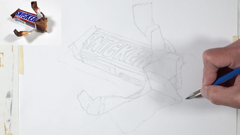
Since we want the contour line drawing to be fairly light, a 2H graphite pencil is used to trace the image and then refine the drawing freehand. Here’s a look at the contour line drawing…
Creating an Underpainting with Markers
As it is with other forms of mixed media, we’ll use the strengths of each our mediums to make up for the weaknesses of the other. In this case, the markers cover areas quickly but it is difficult to develop delicate details due to their tendency to bleed. Colored pencils, on the other hand, are slow to cover larger areas but are excellent at developing details.
Since the colored pencils can be used over marker applications, it makes sense to use the markers to develop an underpainting. We can then apply colored pencils over the top, allowing bits of the marker underpainting to influence the color.
Generally speaking, we’ll think in terms of value and shape to develop the marker underpainting. We’ll observe the shapes of different values of color and attempt to mimic or even exaggerate what we observe in our drawing.
For the most part, we’ll choose at least three colors for each section on the candy bar. One color should be a midtone with a lighter and darker version. This will provide us with a range of value for each color. Of course you’re free to take this further with a broader range of tone.
We can begin anywhere we wish. In this case, I chose to start with the brown sections of the wrapper. From there, I progressed on to the text.
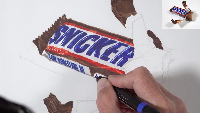
As we continue to develop the marker underpainting, we’ll address the exposed chocolate and filling. For the chocolate, similar colors are used as those applied to the wrapper. However, we need to ensure that the final color contrasts that of the wrapper. To achieve this, we’ll start with a different base – Light Tan. We’ll also push the chocolate to be more red by allowing the Sienna Brown to dominate.
As we did with the wrapper, we’ll gradually bring out the form and texture of the chocolate by layering shapes of colors of differing values.
For the delicious filling, we’ll focus on using colors that are more yellow – even though the colors in our reference are fairly muted. Browns are used to create contrast which leads to the illusion of texture. Since this areas features moist caramel, some open areas are left to give the impression of highlights.
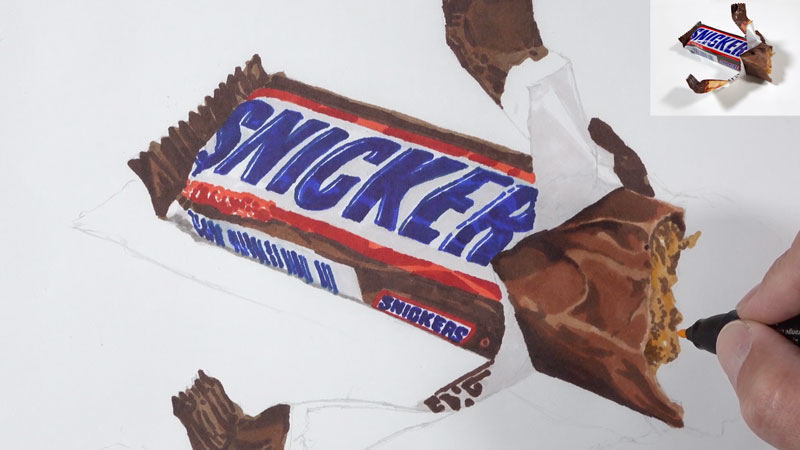
It’s only natural that we assume that “white” parts of a subject should be also be white in our drawing. However, if we look a little closer at “white” areas, we’ll often notice a bit of color. Sometimes, these light values are cooler and sometimes they are warmer. Often, we can determine whether we want them to be warmer or cooler.
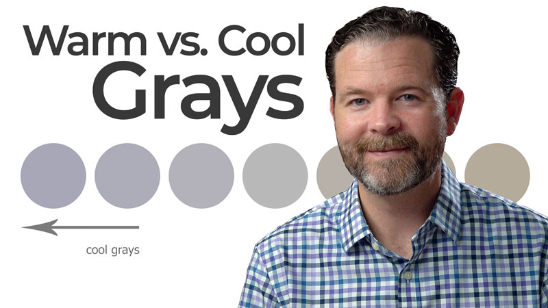
Many times, we can address these “white” areas with grays. Grays can be warmer or cooler depending on whether the black used to mix them is dominated by brown or blue. Professional colored pencil and marker brands offer a range of grays – some cooler and some warmer. Prismacolor labels their grays with percentages based on the intensity of darkness. For example, 70% Warm Grey is a darker and warmer gray compared to 20% Cool Grey.
See also: Warm vs. Cool Grays
For this drawing, I chose to work with warm grays in the “white” areas. I decided to work with warm grays due to the fact that most of the other colors are warm. We can see this warmth int the browns in the wrapper, the reds in the logo, and the blues in the text.
Now, you may say, “The blues? Aren’t they cool?” Yes, blue is a cool color. But blue can lean warmer or cooler. In this case, the blues we’re using lean warmer. Ultramarine is a warmer blue than Cerulean, for example. This means that working with warmer grays will help to unify the image.
In the “white” areas on the wrapper and for the shadowed areas, 20% Warm Grey is applied, creating subtle shifts in value and color. This may not seem as though this color makes a big difference, but when the final highlights are added, we’ll notice the contrast.
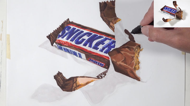
We’ll continue on developing the marker underpainting by addressing the details of the wrapper and increasing the contrast in areas. You can take the underpainting as far as you wish. The more refined and detailed your marker underpainting is, the better your final drawing is likely to be.
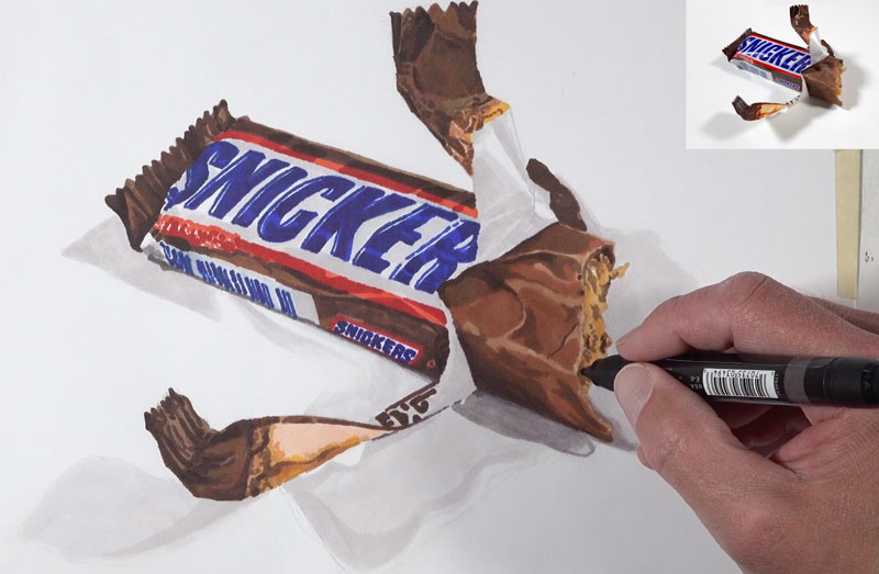
Layering Colored Pencils
With the marker underpainting complete, we’re ready to layer colored pencil applications over the top. The colored pencils will allow us to develop the details while intensifying colors and broadening the range of value. The addition of colored pencil applications will also add depth to the color which leads to more convincing realism.
We can begin with colored pencil applications anywhere we wish. In this case, I chose to start in the same place I began with the markers – on the brown parts of the label. As we did with the markers, we’ll focus on using several colors for each section. Again, we’ll choose a midtone and a lighter and darker version. In some areas, a broader range of value and color are used. Remember, more layers = more depth = more realism.
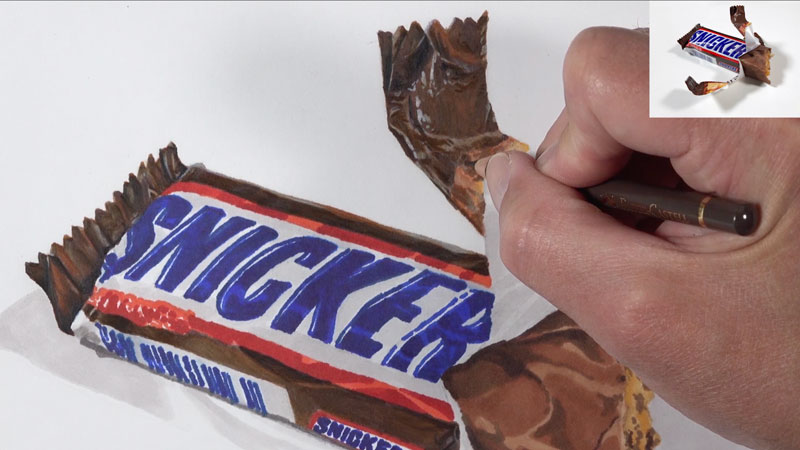
It’s important to note that “black” is not used in this drawing. Instead, a more natural black is created by mixing colors. Dark browns are first used to address the darkest areas on the wrapper. In order to make the shadows as dark as they need to be, Indigo Blue is layered over the top. The dark blue and brown mix to create a more natural looking black, which appears as a more natural looking shadow.
We’ll continue on by addressing the photos on the wrapper. For these types of details, it’s best not think about what you are drawing, but instead focus on the colors and shapes that you observe. If you stay true to what you see, then the result will be quite convincing.
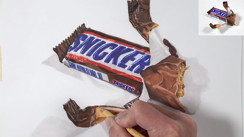
One of the factors that affects the realism of a drawing is the subtle nuances of value. In reality, we often don’t notice these subtle shifts of value and tone. But in a drawing, we can exaggerate them to a degree, making the drawing more interesting and realistic.
In this case, you’ll notice that I am exaggerating the changes in value on the candy bar wrapper by increasing the contrast between colors that are mostly very similar. This can be achieved by “beefing up” the highlights and darkening the colors around them.
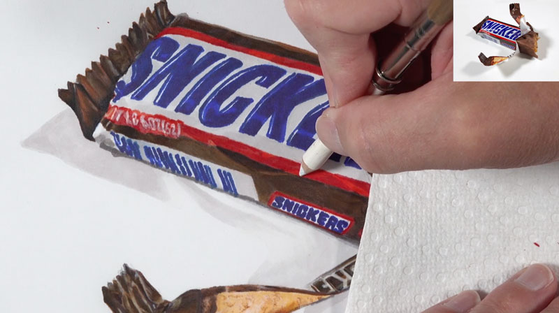
We’ll next address the blue text and red portions of the logo, again using a range of color with slightly different values. As we intensify the color in these areas, we’ll also refine the details and sharpen the edges.
Just as we did with the marker applications, we’ll address the “white” areas with a warm gray. Most of these “white” areas are addressed with 20% Warm Grey and then burnished with a colorless blender to smooth the texture.
One such “white” area can be found where the wrapper is torn. Here we see some of the text showing through. The blues and reds here should be slightly different than what is observed on the main portion of the label. Instead of layering a combination of colors, as we did with red and blue areas, we’ll only use one light layer of the color. Gray and white is layered over the top, along with a bit of the colorless blender to smooth the application.
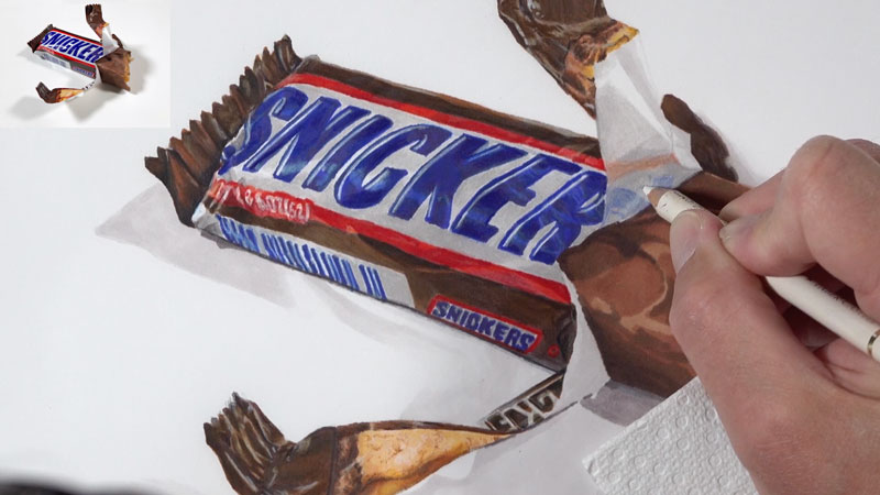
Working our way from the left to right, we’ll next address the chocolate and the filling. Again, we’ll use a collection of colors that compliment and add complexity to the colors found in the marker underpainting. Lighter values are used for the raised portions. Reddish browns are used for the midtones and darker browns are used for the recessed areas and shadows.
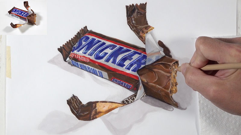
This same process is used for the filling. We’ll begin with the lighter values since it’s easier to make an area darker. Again our colors are slightly more intense than the colors we observe. The observed colors are rather muted. By exaggerating the colors slightly, our drawing is more interesting.
Darker areas within the filling are carefully added with touches of dark brown.
Finishing with Strong Highlights
Strong highlights are difficult to achieve with colored pencils alone. When working on white paper, we could preserve the strongest highlights by leaving these areas open. But this is also very difficult to do – especially when using more than one medium. These highlights are essential in creating a realistic drawing, so they must be included. These highlights are the result of light reflecting off the reflective wrapper and moist areas in the filling.
Thankfully, we can use gouache directly over the colored pencil applications to develop very strong highlights. Gouache is opaque watercolor. But unlike traditional watercolor, gouache can be applied over wax-based colored pencils.
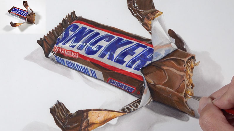
Using minimal amounts of water, white gouache is applied with a small round brush to accentuate the strongest highlights. The result is the illusion of a reflective candy bar wrapper and moist, candy filling.
Realistic Drawing with Colored Pencils and Markers – Conclusion
Now our drawing is complete. Here’s another look at the completed drawing…

As you can see, this process does require patience. You are essentially drawing the subject several times with different media. But with each layer, you become more familiar with the subject. The time you invest in the drawing does pay off in the end so work slowly and take your time. Breaks are essential.
If so, join over 36,000 others that receive our newsletter with new drawing and painting lessons. Plus, check out three of our course videos and ebooks for free.
How to Draw a Flamingo with Watercolor and Colored Pencils
Flamingos are also masters of balance. They can stand on one leg for several hours! During that time, another leg is tucked close to the body. It is supposed that such a pose helps to conserve heat, as flamingos spend much time feeding in cold water. A more recent hypothesis is that standing on one leg may require less effort, allowing the birds to support the bodyweight without any muscle activity.
The coloration of flamingos’ feathers varies from pink or orange to wonderful reds. It comes from the carotenoid pigments that are found in the birds’ food. A wild flamingo’s ration includes shrimp, algae, and plankton. Captive flamingos are fed a diet that helps to preserve their coloration.
However, not all flamingos can boast of such bright plumage. Some birds are grayish or white. The typical coloration of young birds is also less saturated.
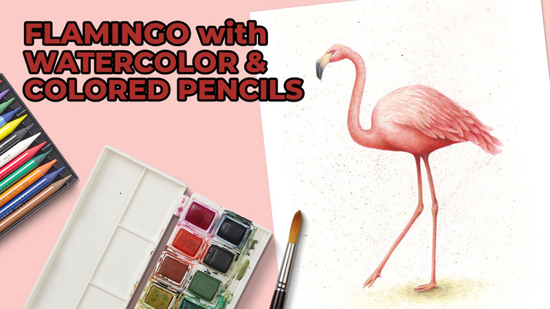
In this drawing tutorial, I’ll show you an easy way to draw a flamingo with wonderful pink feathers. We’ll start with a graphite pencil outline. Then we’ll add some watercolor. At the finishing stage of the process, we’ll work on textures and finer details using colored pencils.
Art Supplies for this Drawing
Before we dive into the process, let’s take a look at the materials we’ll use.
Paper and Pencil
We’ll need a sheet of watercolor paper. (Mixed media paper is also an option.) My paper is a standard A4 size. The paper is quite heavy, 280 gsm, and has a subtle texture. Keep in mind that papers with a very rough, textured surface make it more difficult to create details.
See also: All About Drawing Papers and Surfaces
In most cases, drawing an object from scratch is a back-and-forth process of estimations and adjustments. During this stage, we’re making our sketch more and more precise – and also removing the unnecessary lines. Excessive erasing can damage the delicate surface of watercolor paper.
That’s why I’m going to create an initial graphite pencil outline on a sheet of ordinary printer paper. Then I’ll transfer the main contours of our flamingo to the watercolor sheet using carbon paper.
However, starting with the printer paper is completely optional. Feel free to jump straight to your final surface. Just be sure that you’re erasing as little as possible. Also, limit the number of graphite marks.
We’ll need a graphite pencil (H or HB type) and a soft eraser.
Watercolor and Brushes
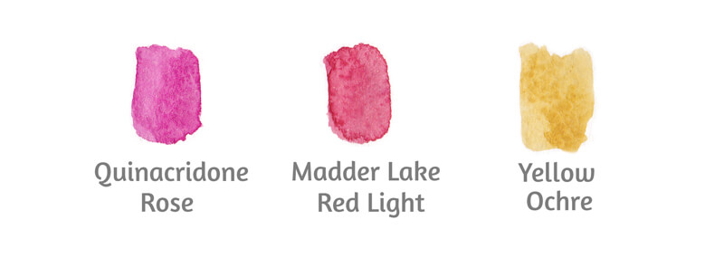
My watercolor paints are White Nights by Nevskaya Palitra. I’ve chosen a deep Madder Lake Red Light and a red-violet Quinacridone Rose.
Feel free to work with watercolor of any brand. The colors are up to you too. Just pick a couple of reds – a warmer and a cooler one.
I’ll be using two round squirrel brushes (sized 2 and 5) to apply paint.
See also: All About Artist Paint Brushes – Hair Types, Shapes, Marks, and Parts
The larger brush allows us to work with relatively broad strokes. It can wet a considerable area of the paper’s surface with a single touch.
The smaller brush can be used to control and guide the watercolor. Some areas, such as the neck, legs, and the edges of the flamingo’s body, require accuracy and precision.
A generic bristle brush will help us to create expressive watercolor splashes.
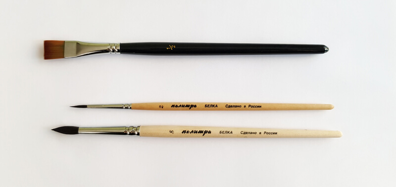
We’ll also need a container for water. Keep a paper towel or a soft clean cloth at hand. It will help to collect the excessive moisture from your brushes.
Colored Pencils
My colored pencils are Faber-Castell Polychromos. You’ll find the swatches in the image below.
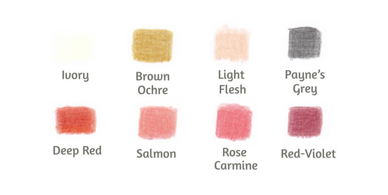
The number of pencils can be limited. The variety of reds in this range is based on difference in value and color temperature.
I recommend choosing at least three reds that present a simplified value scale – light, medium, and dark. In addition to this, pick at least one warmer or cooler variation that is supplemental to your reddish midtone.
Keep a pencil sharpener at hand. A sharp pencil point is required to create crisp details.
Drawing a Flamingo with a Graphite Pencil
I start with a graphite pencil on a sheet of thin printer paper. We’ll create a simplified framework of the flamingo’s body.
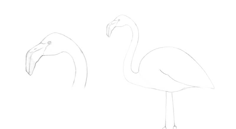
First, I draw the round shape of the bird’s head. Then I add the shape of the small eye. It is located on the upper part of the head, closer to the beak.
The bill is large and curved down. I add its rough shape.
I mark the direction of the neck with a long line that resembles the letter “S”. This part of the flamingo’s body is very flexible. When a flamingo is in the mood to preen its feathers, its head and neck easily go backward. While feeding, the bird’s neck is bent downwards with the same grace and simplicity.
The body of a flamingo has a massive coating of feathers. They can be divided into groups, depending on their sizes and textures. In a simplified manner, the typical body contour looks like a teardrop that is lying on its side. The head is quite small in comparison with the body.
I also mark the edge of the folded wing.
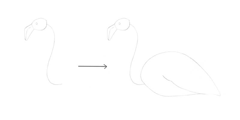
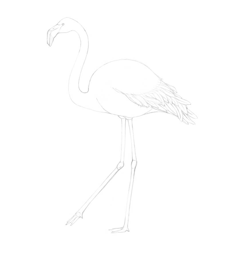
I add the framework of the legs. The joints are marked with small circles.
There are three forward-pointing toes. Some flamingo species have a small hind toe and others don’t. As we’re depicting a collective image, it’s up to you to decide on the number of toes.
By the way, the flamingo’s backward bending “knee” is really the bird’s ankle. The actual knee is very close to the body and is not visible through the plumage.
The legs are very long. Considering the pose, they take up more than half of the overall height of the figure. A vertical line in the image below helps to evaluate this proportion.
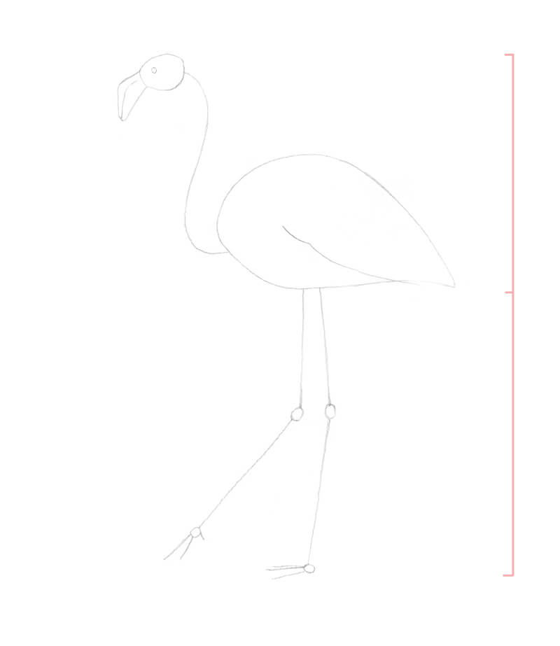
I refine the head. The lower part of the bill is larger than the upper one. I darken the tip of the beak with light graphite marks.
There is a nostril at the upper part of the beak. I add it too. Then I mark the borders between the beak and the head’s plumage.
I outline the contours of the neck and erase the subsidiary core line.
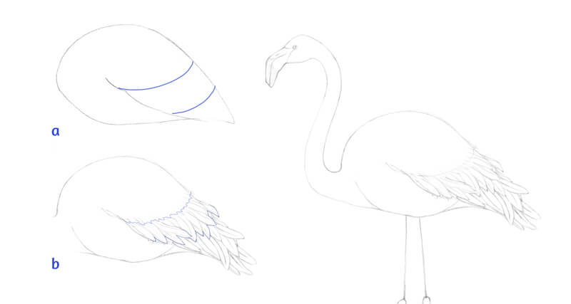
The wings of a flamingo are large. Even in a folded state, they look fairly voluminous. The wings’ feathers keep the bird warm. They also allow it to swim and fly.
I mark the prominent contour of the wing in the lower part of the body.
We’ll draw the feathers of the wing and tail. To simplify the task, I divide the wing area into three sections. (Pay attention to the blue lines in the image below, illustration a.)
The feathers above the top line are soft, delicate, and fluffy. I leave this area untouched – refining this texture doesn’t make much sense now. Feathers of this area overlap the underlying plumage.
The feathers between the blue lines have a more pronounced, discernible structure. I give them some variation in shape and direction.
The feathers in the lower section are the longest ones. They are located beneath the elements of the previous group.
I outline the contours of the legs and feet. The front toes are webbed.
Now we can erase any unnecessary lines and the preliminary drawing is complete!
Transferring the Drawing
Unless you’ve drawn your flamingo directly on the watercolor paper, it’s time to transfer the preparatory sketch to the final drawing surface.
I usually trace the contours while holding the papers up to the window. However, in this case, the watercolor paper is too thick. It doesn’t let the light come through easily, so I have to use carbon paper to transfer the drawing.
Normally, I avoid carbon paper because it can create marks that are difficult to erase. And yet, sometimes this option is the most convenient one.
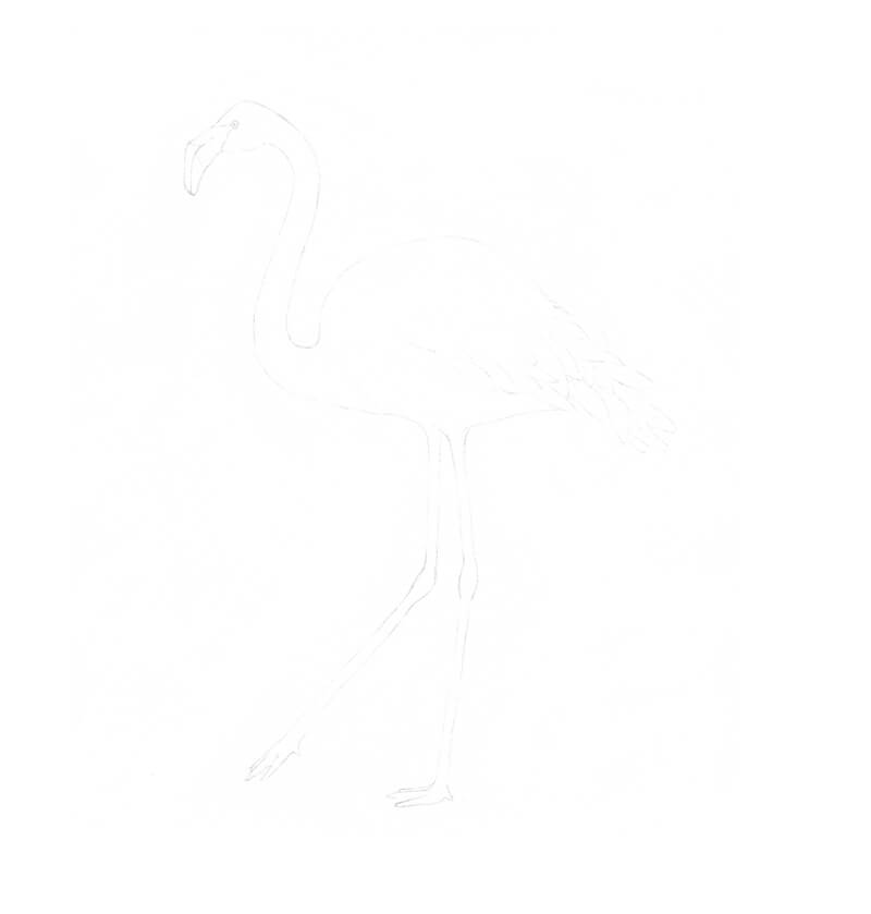
If you use carbon paper, keep a light touch with your tracing tool. (It may be a pencil or a pen with an empty refill.) Working in such a manner, you’ll get very light, barely visible lines.
Also, try to limit the quantity of the traced marks. Your preliminary sketch may stay with you during the entire creative process. Refer to it if you need help regarding the details.
Here is what my traced image looks like (it is very light)…
Applying the Watercolor
We’ll use colored pencils to enhance colors and refine details. We’ll use the watercolor as an underpainting. So, let’s continue next to watercolor.
Creating a Color Base
Let’s add some beautiful painterly washes!
With round brush #5, I moisten the area with clean water before applying the paint. Note that watercolor is heavily diluted. You can use a palette or a spare piece of paper to try the intensity of your colors before making marks on the final surface.
The type of paper affect the result. My paper has some percentage of cotton in its structure. It’s no wonder that the applications of watercolor will look significantly faded after drying.
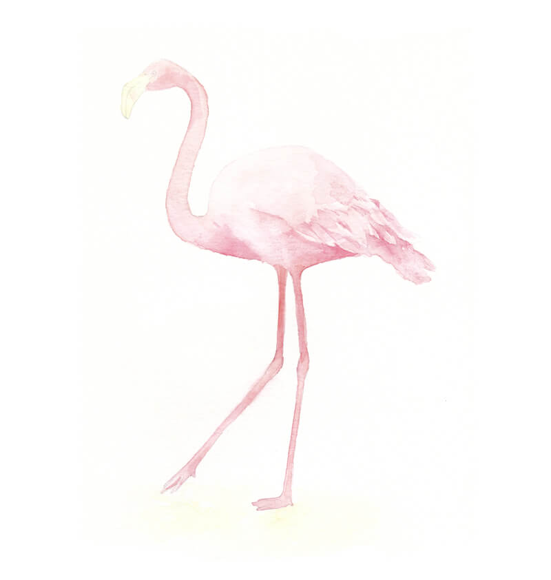
I add Madder Lake Red Light mostly to the upper part of the bird’s body, including the head and neck.
Quinacridone Rose is applied to the legs and the lower areas of the wing. These areas would normally get less light from the environment. This wonderful red-violet color accents the subtle transition to shadowed areas.
I use a smaller brush #2 to paint the head, neck, and legs of the flamingo.
I apply an additional layer of watercolor to the darkest parts, such as the upper legs, the area under the wing, and the gaps between the feathers.
Pigments tend to consolidate into harsh edges near the contours of the figure. I use the smaller brush to push the pigments away from the edge while wet, without any pigment loaded in the brush.
I also add some diluted Yellow Ochre to the beak. Flamingos can be found at a beach, so I’ve decided to create a hint at sand under the bird’s feet.
First, I moisten the area with a clean brush. Then I apply the watercolor.
Creating Splashes
Now we’ll add some watercolor splashes to make the artwork more vivid and expressive.
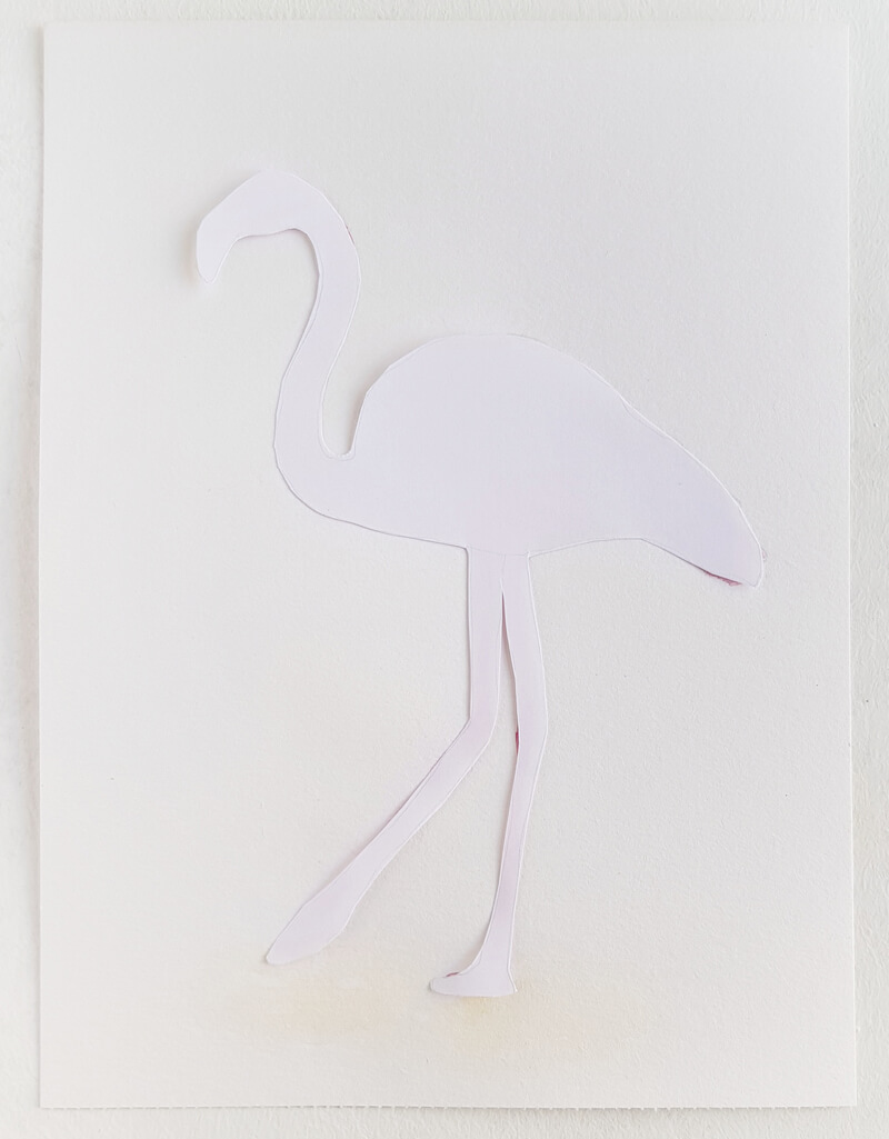
But first, we have to make a protective stencil. It should repeat the shape of our bird. The stencil will cover the flamingo, allowing the splatter to go all over the negative space.
Here’s the easiest way to make a stencil…
Put a sheet of thin paper on top of your painting. Such paper has some level of transparency – especially if you place it against a light source. You’ll be able to see the silhouette of your artwork through the upper blank layer.
I outline the rough contour with a pencil and cut it out. Then I put the stencil on top of the bird.
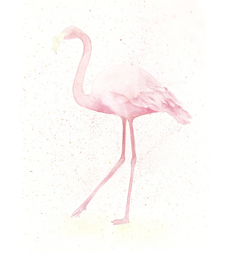
I dip my bristle brush into the paint. I’ll be using all three colors one by one.
The wetter your brush, the bigger stains you can get. It may be a good idea to try this method beforehand – create some splatters on a spare piece of printer paper.
Press on the top edge of the bristles with a finger and push them aside. Feel how the bristles are trying to spring back. As soon as they are released, the paint will fall onto the surface beneath the brush.
Create as many stains as you wish. Let the artwork dry completely before proceeding to colored pencils.
Drawing a Flamingo with Colored Pencils
With Light Flesh, I cover the whole figure of our flamingo, including the legs and the lighter areas of the beak. My pencil moves in small circles. Directional lines are also an option.
See also: Colored Pencil Techniques: A Practical Guide
The pressure on the pencil is light.
The application of this tint doesn’t change much in our artwork. It rather creates a base for further colored pencil applications. There is just a minor shift in the color temperature – the colors have become warmer.
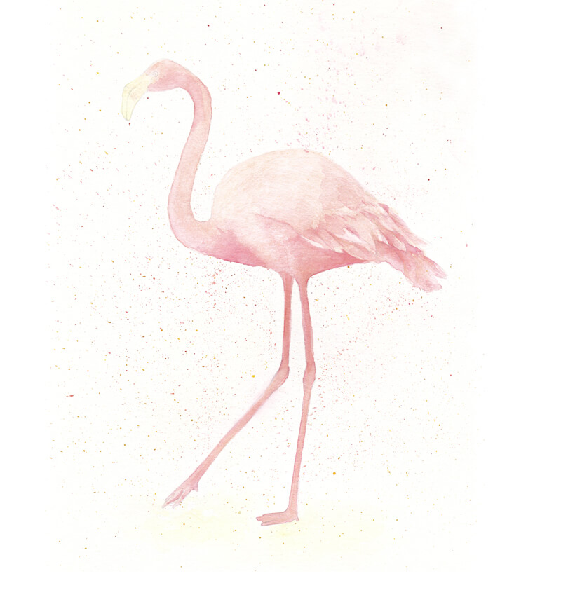
I add Rose Carmine to the darker areas, applying it as a solid layer. Such areas include the lower parts of the head and body. I deepen the shadows between the wing feathers. The pressure is slightly increased.
Also, I mark out the legs by making their right sides a bit darker. Soft shadows help to differentiate the toes visually. I work on the neck, following a similar approach.
The upper part of the body is lighter, so I use this color to reveal some basic details of texture. I apply long lines that conform to the contours of the bird’s body. They imitate long, fluffy feathers.
When I’m working on such details, I always make sure that the tip of the pencil is sharp.
I add groups of short directional hatches to the lighter parts of the neck. They create the illusion of texture.
There is a soft pink spot on the flamingo’s beak, so I add it. I also darken the area near the eye.
In the image below, you’ll find a couple of samples of texture.
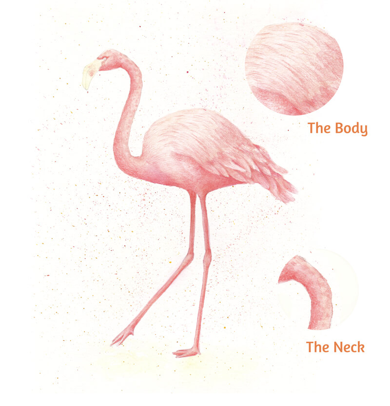
With Deep Red, I make the colors even warmer. I strengthen the core shadows, including the lower part of the bird’s body, the side of the neck, and the legs.
I leave some gaps in the covering. They let the underlying applications of watercolor show through, creating a pleasant variation in color temperature.
I add long, thin lines to the lighter parts of the bird’s body. They repeat its contours and strengthen the illusion of texture.
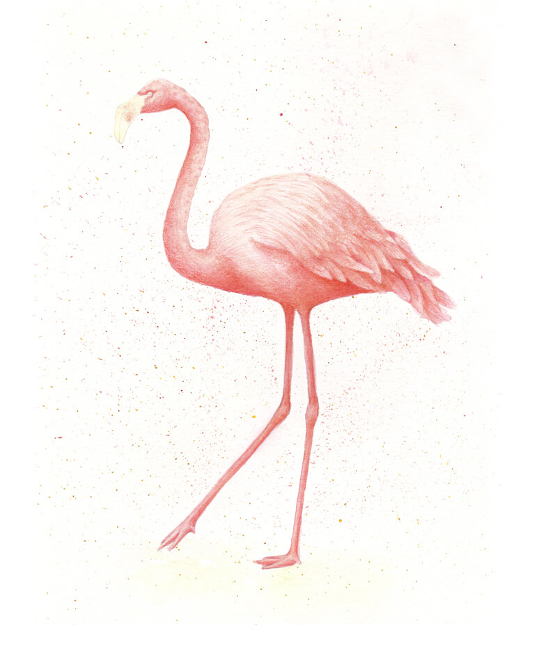
I apply Ivory on top of the lighter areas, including the beak, the lower parts of the legs, and feet. The pressure on the pencil is increased and the lines repeat the contours of the bird’s body.
As I move the pencil tip, I move the pigments found on the paper’s surface. The covering becomes smoother and more unified.
I work on the midtones in the same manner, using Salmon. I also polish the darker areas to unite the applications visually.
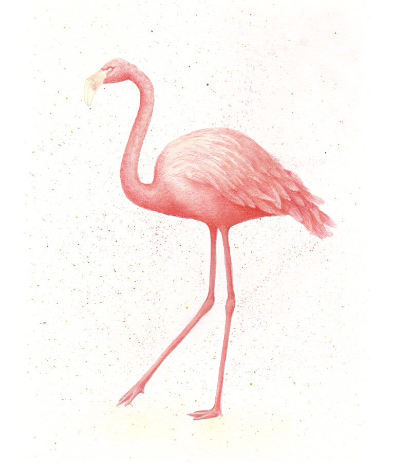
With Brown Ochre, I create nice subtle nuances in the plumage. I add dots and short strokes to the legs and feet, creating the illusion of texture there.
This color is also applied to the area near the bird’s feet. The pencil moves in small circles at very light pressure. The edges of the resulting shape are very soft and blended.
With Red-Violet, I accent the darkest parts of the drawing, increasing the contrast.
I also draw the pupil. The pencil point is very sharp!
I use Payne’s Grey to shade the tip of the beak. I also darken the area of cast shadow on the sand that is beneath the flamingo’s feet.
We can include this gray into the darkest parts of the drawing, but keep the pressure as light as possible.
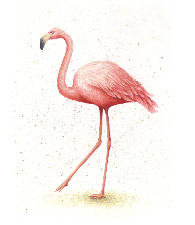
Drawing a Flamingo with Watercolor and Colored Pencils – Conclusion
Congratulations – we’ve created a beautiful artwork! Thank you for being with me on this creative journey. I hope that you’ve enjoyed the process of working with watercolor and colored pencils.
I wish you much inspiration for your future projects!
If so, join over 36,000 others that receive our newsletter with new drawing and painting lessons. Plus, check out three of our course videos and ebooks for free.
3 Tips to Improve Your Figure Drawing
Limited work time is not the only challenge to drawing the figure. It is a slippery subject, able to dramatically change its orientation. Since the figure does change its shape, it provides the artist with a unique experience each drawing session.
The audience amplifies the challenge, as we are more critical of the drawn figure more so than any other subject. People are quick to point out displeasing human proportion (both in art and in life). Therefore, one must work extra hard at accurately capturing the figure in a drawing or painting. Beyond hard work, one needs proven methods for doing so.
See also: Gesture Drawing – Drawing the Human Figure Quickly
Proven Methods for Figure Drawing
Keep in mind, there are numerous methods to creating a drawing, not all of which are the focus of this lesson. The approaches described here are meant to be integrated into your process, not replace it. These ideas are time tested.
- Build a drawing on the elements of art and in the order as the elements of art.
- Use negative shapes to your advantage.
- Look at vertical and horizontal alignments of body parts.
Building a Figure Drawing with the Elements of Art
The elements of art are line, shape, form, value, color, space, and texture. These elements are almost always listed in this same, logical order. This particular order is organized from simple to complex with line being the most simple. We will see how the first three elements act as a road map to start a figure drawing.
Drawing the Figure with Line
Note – The following drawing was created from life in a classroom environment. The photograph of the drawing manikin is for the reader’s benefit but was not used when making the drawing. For this reason, there may be small discrepancies between drawing and the photograph that was taken after the completion of the drawing.
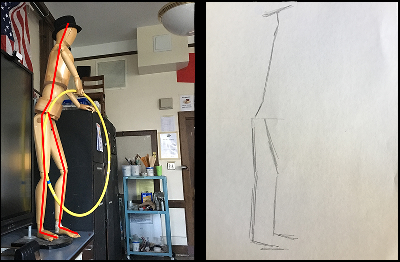
In the image above, we can see how the first element of art – line, captures the subtle tilt of the figure. Starting a figure drawing from life with only one or two lines is enough to capture the overall gesture of the figure. One should refine this line until it leans and tilts like the subject.
In order to find this angle, you may consider holding your pencil up at the subject. Compare the angle of your pencil with the observed angle of the major parts of the subject’s body.
Drawing the Figure with Shape
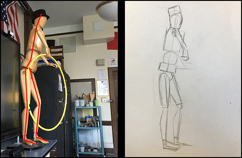
The second element of art is shape. The second step in a figure drawing is to draw shapes on top of the line from the previous step. The line will keep you from losing the gesture while focusing on the basic shapes. Use these shapes to judge general proportions. This is the time to modify proportion, while there are neither details nor shading.
Notice that these shapes are quite simple. They are pieced together to make more complex shapes. Try to simplify your subject down to the most basic shapes possible.
See also: Drawing Basics – Construction
Drawing the Figure with Form
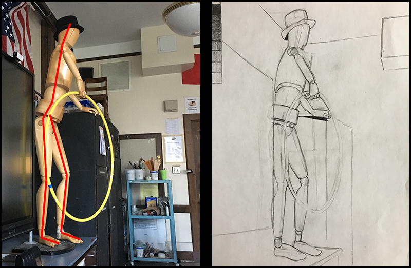
Form is the third element of art we’ll consider. Only after capturing gesture and proportion using line and shape should the artist refine his/her drawing into a collection of specific forms and subtle contours. At this point, the artist can carefully capture form without fear of having to make major proportional changes.
With a drawing, we are dealing with the illusion of form. This means that we create this illusion by developing the values. Value is another element of art and refers to the darkness or lightness of a color. The positioning and relationships of values inform the viewer of the form (and texture) of the subject as well as the light within the scene. This is the process we commonly refer to as “shading”
See also: Basic Shading Techniques
Using the elements of art to construct a drawing organizes the process. While this is not a step by step formula, it is clearly a process we can use to organize our observation.
However, there is more to consider with figure drawing.
Consider Negative Shapes
The shapes mentioned in the previous section of this article are not the only shapes in this drawing. There are other often overlooked shapes – negative shapes.
Negative shapes are shapes created by the areas around the subject and its environment. Negative shapes are the empty shapes between things. Look at the images below. Some of the important negative shapes in the scene are highlighted in yellow.
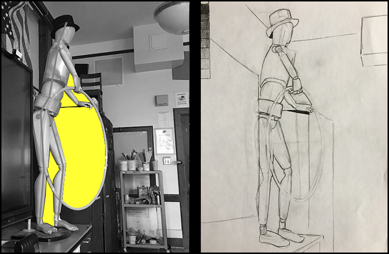
Negative shapes help the artist to capture the relationship of different parts of the figure. Look at the small quadrilateral shape between the hand, body and hoop. If that negatives shape is drawn similarly, then the relationship of those three individual parts is accurate. Negative shapes help us to capture the oneness of complex composition.
By considering both positive and negative shapes, we have a better chance of accuracy in our drawing.
See also: Positive and Negative Space
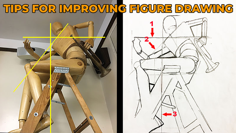
Negative shapes are not our only option when it comes to capturing the relationship of individual elements in a composition. While negative shapes capture the relationship of adjacent parts, alignment lines capture the relationship of disconnected parts.
Using Alignment Lines in Figure Drawing
In the image below, lines have been superimposed over a complex pose. These lines are vertical, horizontal, and diagonal.
Most of us are better at imagining vertical and horizontal lines compared to diagonals. Think about it – using only the imagination, most or all people can more easily draw a vertical line than a line that slopes at 31 degrees to the right.
Now let’s look at our manikin reference and compare it to a line drawing of the same subject.
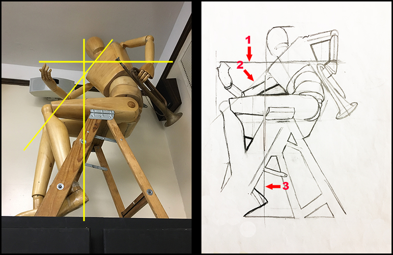
Look at the line marked “1”. It reveals the tip of the hand on our left is horizontally in alignment with the wrist of the hand on our right. This is important information. Now look at line “3”. It shows that the head and the heel are vertically aligned with one another.
So, the head has a special relationship to the heel. The fingertips on one hand have a special relationship with the wrist of the other hand. These special relationships act as checkpoints when creating a drawing.
Of course the artist is not restricted from using imaginary lines that are not vertically or horizontally oriented. The artist can, using his/her imagination, stretch out the figure’s actual contours. Look again at the image above. See how the shoulder line (marked “2”) is drawn all the way to the manikin’s knee. This line will help the artist check the knee’s placement for accuracy.
Let’s Wrap It Up
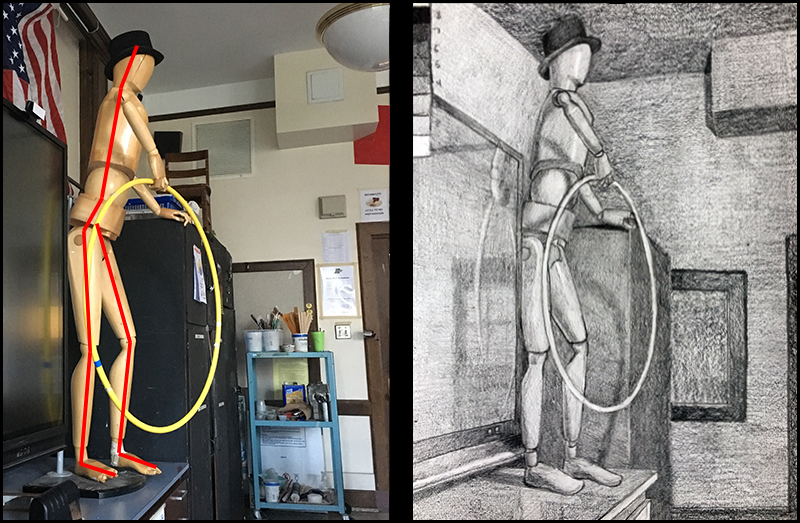
Although the focus of this lesson is drawing the figure from life, these same techniques will improve the efficiency of drawing any subject – even from a photograph. Using the elements of art, negative shapes, and alignment lines to draw the figure are not exclusive steps but should all be considered simultaneously.
Incorporate these techniques into your own process to improve the accuracy and speed of your drawing.
If so, join over 36,000 others that receive our newsletter with new drawing and painting lessons. Plus, check out three of our course videos and ebooks for free.
Easy Line and Wash Lesson For Beginners
What is Line and Wash?
Line and wash is an art-making process that typically refers to the combination of a fluid painting medium and a linear drawing medium. In many cases, this means the combination of watercolor and pen and ink, although it could refer to any linear drawing medium and fluid painting medium.
In this lesson, we’ll look at the process of combining watercolor with pen and ink. This combination of media has been popular for many years but has recently become even more popular thanks to a new interest in a form of plein air painting dubbed “urban sketching”.
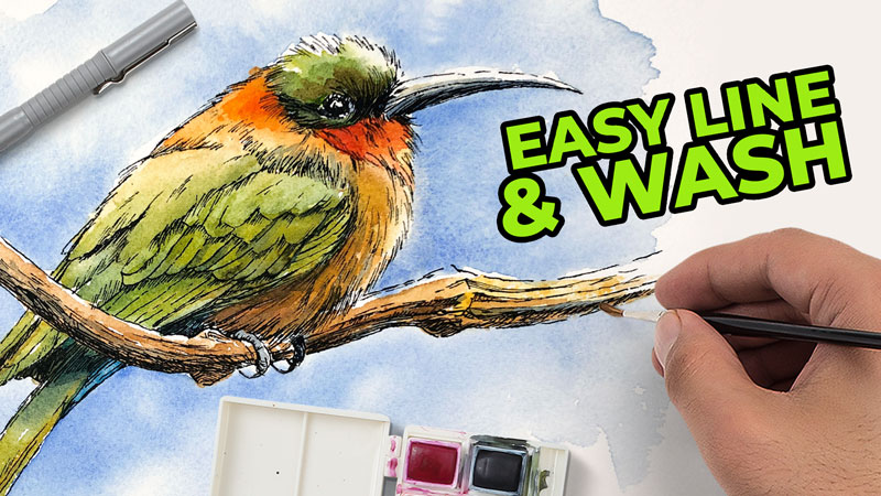
This lesson is designed to be simple so that even a “brand new” beginner to line and wash can be successful. Here’s a look at the image we’ll create…
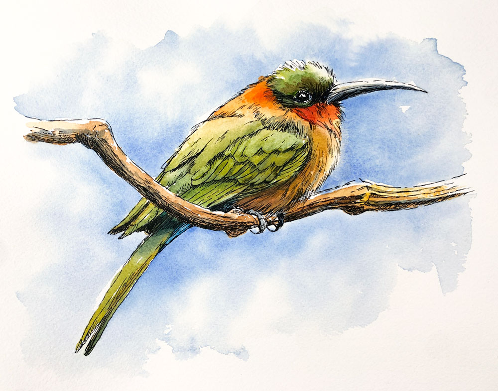
In many cases, art mediums are combined to take advantage of the strengths of one of the mediums and/or to make up for the weaknesses of the complimenting medium.
Pen and ink is a rigid medium that is suited for hard edges and intricate details. However, it is difficult to create smooth transitions of value and color with pen and ink.
Watercolor, on the other hand, is looser and fluid. It is suited for expressive shapes of color and value and softer edges. However, some may find it difficult to define intricate details and strong contours with the medium.
But, when we combine the mediums of pen and ink and watercolor, we benefit from the strengths of each. The strengths of each medium make up for the “weaknesses” of the other.
Materials and Surface
We’ll use fairly basic materials for this lesson which can all be purchased at your local art store or online. You are free to substitute as necessary. (The following links are affiliate links which means I make a small commission if you purchase at no additional cost to you.)
Drawing the Bird with Pencil and Ink
We’ll work from a photo reference for this work, which comes from Pixabay.com. The bird we’ll be painting is the European Bee Catcher. Here’s a look at the reference image…

There are different approaches you can take to create a line and wash image with watercolor and pen and ink. Some artists prefer to develop the ink drawing first and then apply watercolor, while others prefer the opposite approach. It doesn’t matter which approach you decide to take as both will produce similar results.
For this work, we’ll begin with the ink and then layer washes over the ink drawing. But before we begin with the ink applications, we need to start with a light graphite drawing.
In this case, the drawing is developed with a light and loose application of 2H graphite. Some of the important details, such as the overlapping feathers, talons, and eye are all included in the initial sketch. The remaining details are developed during the inking process.

Once the loose graphite sketch of the bird is in place on paper, we can begin with pen and ink applications. For this image, we’ll begin with the eye of bird and work outward. Be sure to leave open areas within the eye to create the impression of highlights.
Working outward from the eye, we’ll gradually develop the texture and some of the darker tones with directional stroking and hatching. Notice that the outer contour of the bird is described with looser strokes instead of a defined contour line.

We’ll continue to work outward from the head and the eye, gradually moving down the picture plane. The upper wings and the bulk of the body are developed next.

As is the case with most art media, it’s important to work slowly and take your time with your pen and ink applications. Ink is not forgiving, so it’s best to be deliberate with your applications. Consider each stroke, taking care to not get too dark with your marks. We can always make an area darker, if needed, by adding more ink to the surface. However, it is difficult to make areas lighter if we go too dark, too quickly.

Applying Watercolor Washes to the Bird
Once the pen and ink drawing is complete, we can erase away any remaining graphite marks in preparation for the watercolor washes. Once the pencil marks have been removed, we can begin applying watercolor.
We can begin with our washes anywhere we wish. In this case, I’ve decided to begin with the head. A mixture of Sap Green and Cadmium Yellow is applied to the head and just underneath the eye. This color can be made darker with a bit of Ultramarine.
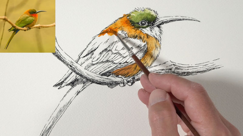
A mixture of Cadmium Orange and Cadmium Yellow is used for the sections underneath the head. Some bleeding of the colors is acceptable. A bit of Burnt Umber is used to darken the value of this color.

Next, we’ll return to the top and address the bright red and orange section under the head. Here, our Cadmium Orange mixture is applied first. While this area is still wet, a touch of intense red (Cadmium Red) is applied to the corner of the shape and allowed to bleed.
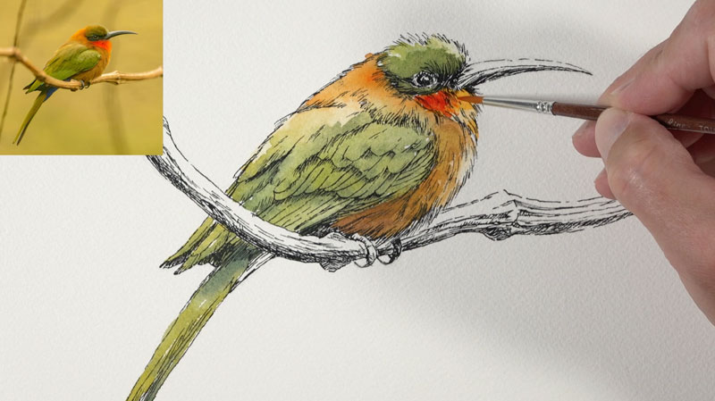
As the painting continues, we can return to areas and intensify the colors where necessary. You may find that you prefer a “light and airy” appearance. If this is the case, then intensifying colors with additional layers of watercolor isn’t necessary.
Touches of blue on the underside of the body are added with a bit of Cerulean mixed with Ultramarine. These small areas are easily overlooked, but help to create more contrast and interest.
Next, we’ll address the beak. A minimal amount of color is used here since the top of the beak is left open in order to communicate a highlight. On the underside of the beak, a mixture of Payne’s Grey and Ultramarine is applied. While this area is still wet, a touch of Yellow Ochre is applied to create a more natural appearance. This same cool gray is used on the talons as well.

Now it’s time to turn our attention to the branch that the bird is resting upon. We’ll use our orange mixture with a bit of Burnt Umber here, leaving open areas on the top of the branch to indicate highlights.
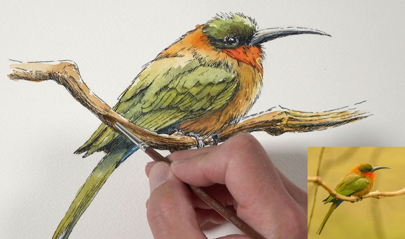
Once our initial application of watercolor has dried on the branch, we can darken the shadows with a light mixture of Payne’s Grey and Ultramarine.
Lastly, we’ll add a touch of color around the bird. In this case, we’ll create the impression of the sky with a fluid and light field of blue. To develop a softer look, we’ll first apply a liberal amount of clean water to the open areas.
While this area is still wet, we’ll add strong touches of color, in this case Ultramarine. The water that we applied pulls the color, resulting in soft transitions in the intensity of color. This gives the viewer the impression of airy clouds among a blue sky.

Once the watercolor is dry, our image is complete. Here’s another look at the completed drawing/painting…

Easy Line and Wash Lesson for Beginners – Conclusion
As you can see, pen and ink works exceptionally well with watercolor. Each one of the mediums compliments the other. This lesson is considered an introduction to this form of mixed media. Keep in mind that this combination of media can be used to create highly developed images as well as works that are wonderfully simple. There’s plenty of room for stylistic choices and an endless number of possibilities.
If so, join over 36,000 others that receive our newsletter with new drawing and painting lessons. Plus, check out three of our course videos and ebooks for free.
Plein Air Painting Adventure – Ocean Inlet
Plein Air Painting with Pastels
In this lesson, we’ll get out of the studio and go outdoors for a bit of plein air painting with pastels. Plein air painting refers to the act of drawing or painting outside, within the natural environment of the subject. This form of creating art has always been around, but became popular with the French Impressionists. These artists worked to capture the subtle nuances and effects of natural light. As a result, nature became their studio.
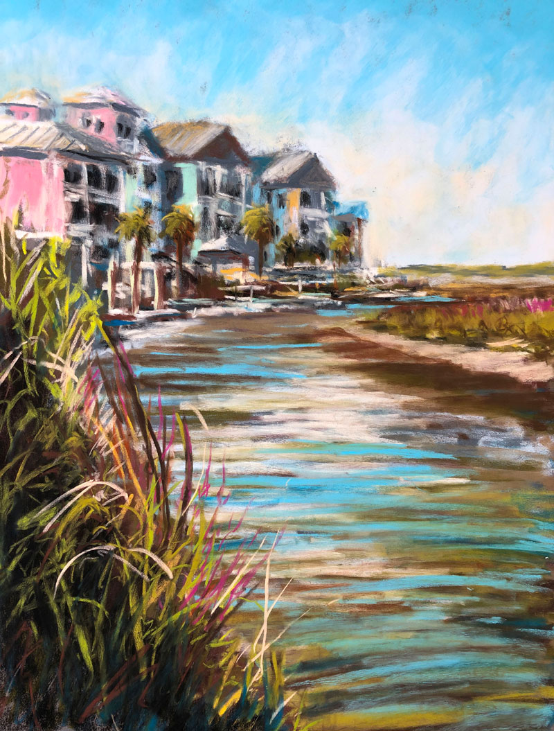
For our demo, we’ll work quickly and loosely as the French Impressionists did, but instead of traditional oil paints, we’ll develop our image with soft and hard pastels. We’ll also exaggerate some of the natural colors to add more “pop” and interest to our image. Here’s a look at the finished pastel painting…
Art Materials for this Lesson
Traditional soft pastels and hard pastels (NuPastels) are used to complete the painting. The soft pastels are by Rembrandt.
The work is completed on a medium gray piece of PastelMat paper. This paper features a fine, but coarse texture which locks the pastel in place on the surface. This reduces dust and actually enhances the intensity of the color.
See also: PastelMat Paper Review
Instead of lugging all of my pastels out to the location, I brought a smaller selection of pastels. This not only limited the color palette but also sped up the process since I didn’t have to spend much time choosing the next color.
NuPastels are slightly less dusty compared to traditional soft pastels. This material can be considered a hard pastel, although the material is not that dissimilar from soft pastels. I typically use both hard and soft pastels interchangeably.
(The following links are affiliate links which means that I make a small commission if you purchase without an additional cost to you)…
Setting Up
Our location is a beautiful small island off the coast of the eastern United States. Ocean Isle Beach is found on the southern tip of North Carolina and is separated from the mainland by a marshland that features a maze of waterways and grasses. After exploring a bit, I found a nice little place to set up, overlooking the marsh with a view of a row of colorful houses. On the bank of the wetland, I set up my easel, chair, and pastels and began to work.
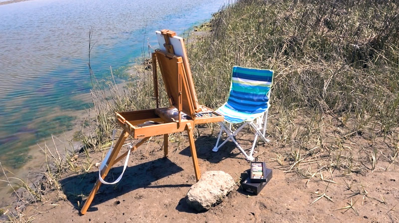
Blocking In The Shapes
When working outdoors, speed is especially important. In the natural environment, everything is constantly changing. The light changes every minute. The wind blows and moves grasses and trees. And in this case, the water was also moving as the tide began moving back in.
Because there is so much change, we must be prepared to work quickly. This means we must make quick decisions and not become overly obsessed with details.
Just as we would with an opaque painting medium, I began blocking in the larger shapes of the composition. This included the shapes for the houses, the water, and the banks on either side of the water. A dark gray pastel was used for these initial marks. You’ll notice that this gray is a bit cooler than the gray of the paper. This created a bit of necessary contrast against the warm gray of the paper.
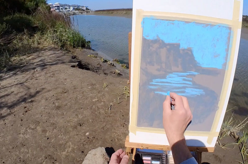
This process is loose and quick. We’re not striving for perfection, instead we’re simply thinking about getting visual information down on the surface as quickly as possible. We’ll refine the drawing as we continue.
Once the basic shapes of the houses, grasses, and water were in place, a light blue was applied to define the sky and reflections in the water.
Developing Colors and Contrast
Once the overall shape of the composition was established, I could begin adding colors over the blocked out shapes. As each layer was added, the contrast was developed and the colors became more complex.
Although black is eventually used in this painting, I avoided using it or white early in the process. Instead, dark brown, grays, and blues were substituted in order to establish the shapes of shadows. Lighter values were added using creams, light grays, blues, and pinks.
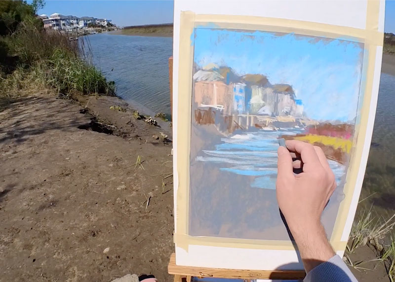
Even at this stage, the process of choosing colors and mark making is quick and loose. Pastels are very forgiving as a medium and we can afford to be experimental with color choice.
As the work progressed, I could begin developing some of the complexities, mostly through gradations and contrast. The painting never fully becomes “detailed or complex”, although details and complexities are implied. For example, a gradation from light blue to darker blue is developed in the sky through layering.
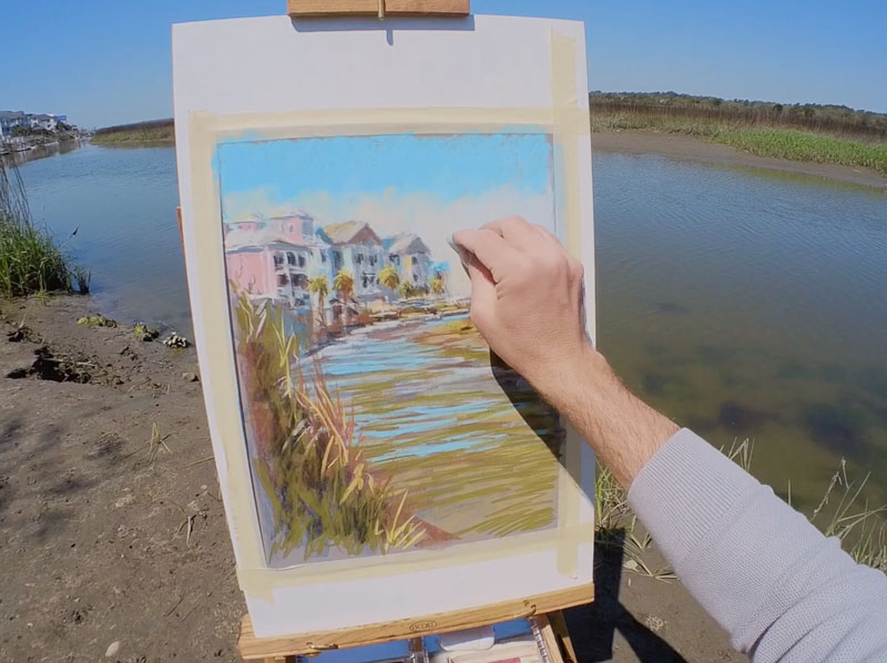
The light is clearly strong and direct which produced intense shadows and highlights. This required me to push some of the values much darker and use black in areas. However, I continued to layer colors over the black applications to mute them, making them feel a bit more natural.
Gradually, the details began to emerge as I continued to layer colors. Directional strokes of various colors and values became palm trees, small docks, grasses, windows, and roofs.
I continued to bounce around within the picture plane. As I saw colors, I quickly added them. To ensure harmony, I made sure that each color that was added was also included somewhere else within the picture plane.
I kept returning to the houses, then back to the water, then on to the grasses, then back to the houses again. This approach encouraged me to develop the entire image at once while also creating a sense of unity.
While the water reflected a brilliant blue from the sky, many other colors were present as well. Greens, browns, and dark blues were all visible at different moments during my “session”. Just as the light changed, the colors and shapes of colors in the water were constantly changing as well. I tried to capture the movement and character of the water through contrast and directional stroking.
Pastel strokes are more horizontal near the horizon line, becoming slightly curved down near the bottom of the picture plane. The contrast and size of the strokes increase lower on the picture plane as well. This helped to create the illusion of space while hinting at the movement of water.
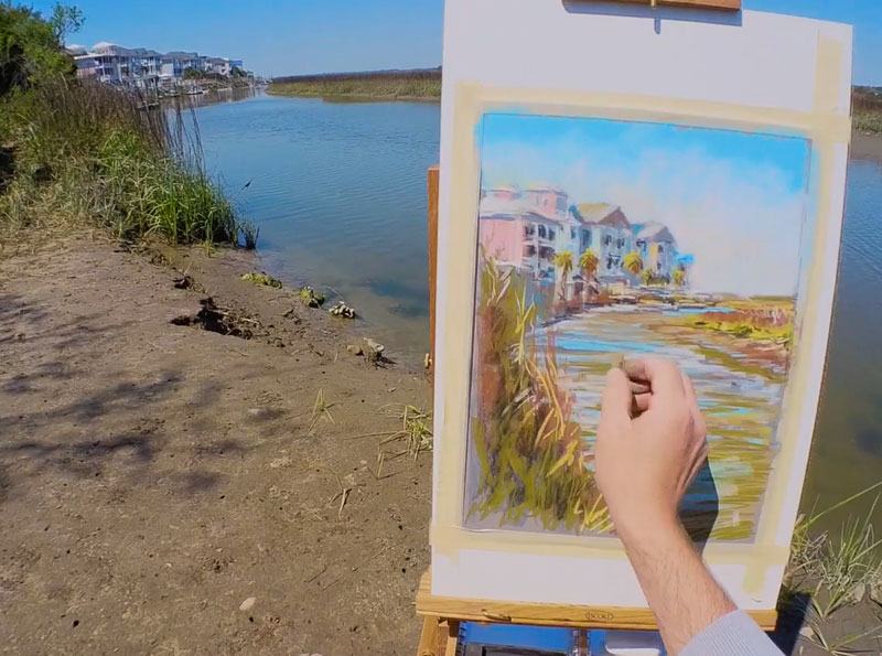
Creating “Details”
The details in this image are developed through value contrast and directional strokes. When most of us think of details, we think that they must be developed through careful applications of the medium, usually with a tedious, time consuming process. And while details can certainly be developed in this manner, they can also be implied with looser, less defined marks.
We don’t have to spell everything out to our viewers. Their brains will make sense of the visual information we provide and “fill in the blanks”. This essentially means that our viewers will fill in the details, as long as we imply them with contrast and directional stroking.
From my vantage point, I saw lots of details on the houses. In fact, the details were so numerous that they were slightly overwhelming. Each house had a dock and most had fences, poles, and other things that overlapped. While I certainly could have developed all of those details, it was best to imply them though simplification. To do this, I simply layered darker and lighter colors to create contrast with defined directional strokes.
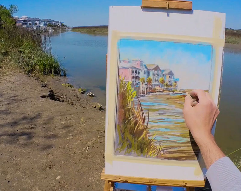
This approach communicated the details without actually including them.
Finishing Up
In the lower left foreground, I wanted to capture the movement and sharpness of the grasses. Instead of using just a variety of greens, I also incorporated browns, cream, reds, and even a few pinks.
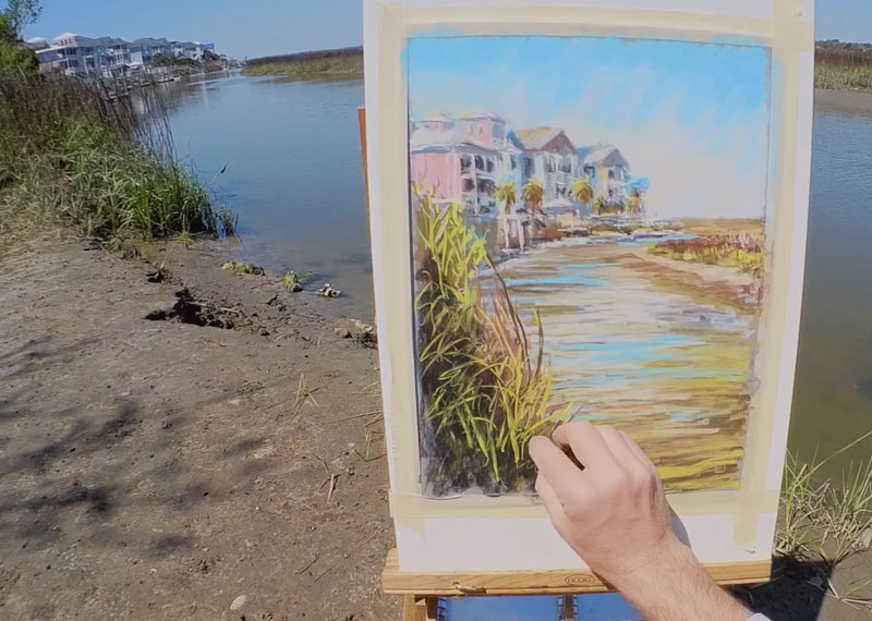
Marks made here were strong and deliberate as a I tried to capture the character of the grasses instead of a literal reproduction.
To finish the painting, I added a bit of darker blue to some of the shadows to make them feel a bit more natural and colorful. These cooler shadows were most evident in the shadows of grasses in the foreground, but a few blue marks were also added to parts of the water.
Then, as a final touch, light blue was again added to the water for additional contrast and to communicate the brilliant blue sky reflected from above.
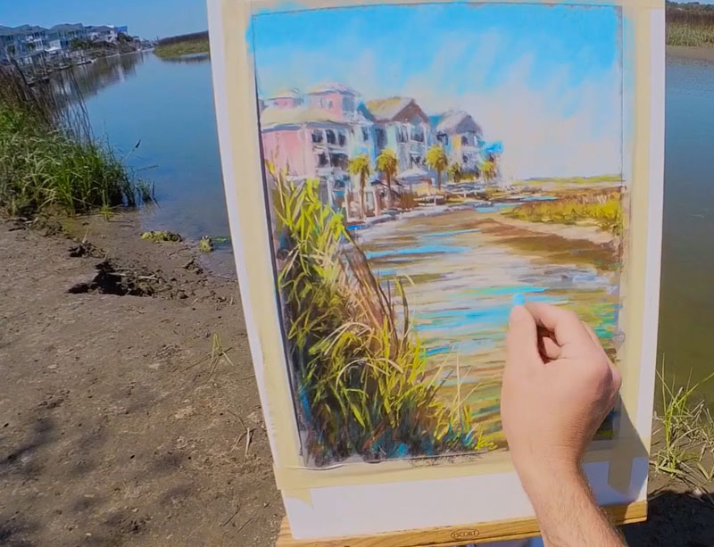
Plein Air Pastel Painting – Ocean Inlet – Conclusion
Creating art outdoors, in nature’s studio, presents its own set of challenges. The light is always changing, the bugs are always biting, and everything moves. But, this environment also allows for creativity that may not be tapped into in the studio, where everything is controlled. You may discover that when you take your supplies outside, your style changes and you may learn new things about yourself as an artist.
So grab what you can, head outside and start creating. You may discover that a very different artist emerges outside of the studio.
If so, join over 36,000 others that receive our newsletter with new drawing and painting lessons. Plus, check out three of our course videos and ebooks for free.
Drawing Gears with Pencil
Gettin’ Sketchy – How to Draw Gears with Pencil – Season 3 Episode 8
This episode aired live on YouTube on March 10, 2021.
In each episode of Gettin’ Sketchy, we create a quick sketch of a subject using a variety of drawing mediums within 45 minutes. Each episode is broadcast live on YouTube. While the goal is to produce a sketch, we also include drawing instruction and “lively” discussion.
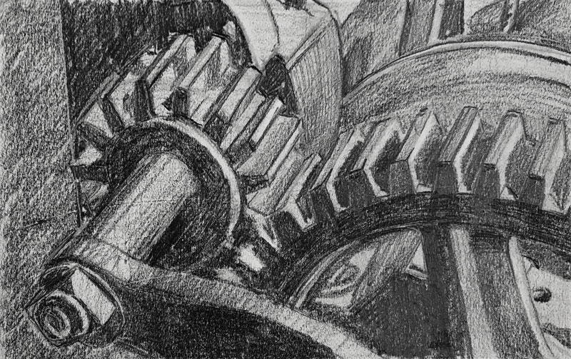
In this episode, Ashley attempts to draw a challenging arrangement of gears with graphite pencil. As you may expect, this subject presents its own set of challenges.
Here’s a look at the completed image…
Breaking Down the Complexities
This subject is not lacking in complexity. It’s easy to get overwhelmed when approaching a subject such as these gears. On top of the perceived complexity, there’s the requirement of accuracy. In order for gears to function properly, they must be precise. And if we are to draw them, we must also be precise with our drawing.
On the surface, this may seem like a daunting task. But, if we think in terms of shapes and larger forms, this subject is much easier to capture in a drawing.
When most of us are new to drawing, we think that we should focus on the contour lines. Contour lines are simply “outlines”. And while contour lines are important, it’s not always the best place to start a drawing. When we start a drawing with contour lines, there’s more room for inconsistencies and errors. Plus, beginning a drawing in this manner is inefficient and slow.
If we focus instead on the overall form or shape of the subject and then break down the details, the process of drawing is much easier.
So, in this case, instead of drawing the teeth of each gear from the start, we should concentrate on capturing the overall circular shape of each gear and ignore the details of the teeth until the major shape is in place. Once the overall shape is in place, the teeth of the gears can be “carved” out.
This is exactly how Ashley approaches this drawing and is one of the major reasons the drawing was successful.
This process is usually referred to as “construction” and is covered more deeply in the following lessons. Some of these lessons require membership…
- Drawing Basics – Construction
- 25 Days to Better Drawings: Drawing with Shapes (Membership Required)
- 25 Days to Better Drawings – Drawing with Forms (Membership Required)
- Drawing Bootcamp (Membership Required)
Here’s Some Perspective
Another complexity that should be considered with this subject is perspective. There are several different forms of perspective and each is designed to aid in creating the illusion of space within a drawing or painting. There are three forms of linear perspective and another form of perspective referred to as “atmospheric perspective”.
Linear perspective uses lines, horizon lines and vanishing points to create the illusion of depth while atmospheric perspective utilizes changes in color temperature and value to communicate depth. It’s not unusual to find both linear perspective and atmospheric perspective used within the same image. With our gears, only linear perspective is used.
While linear perspective is a rigid method of drawing with precise lines, we don’t always have to be so rigid with our drawings. We just need to keep in mind the rules of linear perspective and make sure that our drawing makes sense with these rules in mind.
In this drawing, Ashley considers linear perspective without drawing receding lines that extend all the way to the vanishing points. As the teeth of each of the gears are carved out of the larger form, the direction of the these lines are created with a vanishing point in mind, rather than drawing the vanishing points and using a ruler to draw lines to these vanishing points. The result is a convincing image that makes sense within the pictorial space. In this case, it could be argued that two-point perspective is utilized in the drawing.
Linear perspective is a fundamental of drawing. The basics of perspective are covered in the following lessons. Some of these lessons require membership…
- One Point Perspective
- Two Point Perspective
- Three Point Perspective
- 25 Days to Better Drawings – One Point Perspective (Membership Required)
- 25 Days to Better Drawings – Two Point Perspective (Membership Required)
- 25 Days to Better Drawings – Three Point Perspective (Membership Required)
Shading the Drawing
Ashley spent the bulk of the allotted time mapping out the form of the gears and then carefully drawing the contour lines with linear perspective in mind. It was only in the last few minutes that the shading was added and the drawing came to life.
Since this drawing required attention to accuracy, this is not surprising. But what may come as a surprise is how fast the shading was added and how convincing the drawing became after the values were developed. This is a testament to how important value is in art. Value is the darkness or lightness of a color and is one of the seven elements of art. Value helps to communicate the light within the scene, surface textures, and the illusion of form.
Shading can be done quickly with good results or the artist can work slowly and gradually develop the values for superior results. Obviously, if a more realistic appearance is desired, then the development of the values requires a slower approach.
See Also: The Basics of Shading with a Pencil
Ultimately, what’s most important is that a full range of value or tone is developed in the drawing. We see the world in a full spectrum of values which includes the darkest darks and the lightest lights. Therefore, it’s important to include this in our drawings and paintings. As you can see, a looser and quicker development of values can be effective – especially with a quick sketch like this.
Photo Reference
The photo reference for this drawing comes from Pixabay.com. The original image was cropped, the color was removed and the contrast was enhanced.
Here’s a look at the photo reference…

Timed Drawing of Gears – Conclusion
Each drawing that we create should be considered as a learning experience. Even if we spend a short time on a sketch, we still use the same “artistic muscles” that we use on a finished, more polished drawing. This is one reason why sketching is so important to your artistic development. Not all of us have the time to create elaborate drawings that are fully refined and polished, but we all can find 45 minutes to develop our observation and mark making skills through sketching.
If so, join over 36,000 others that receive our newsletter with new drawing and painting lessons. Plus, check out three of our course videos and ebooks for free.
How to Draw Animal Scales
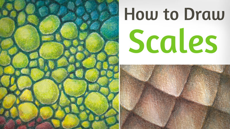
Some animals, such as fish and reptiles, can’t be imagined without scales. These small rigid plates provide protection and coloration. In certain cases, they also aid in locomotion.
These creatures boast beautiful scaly mosaics on their bodies. Butterflies and moths have membranous wings that are covered with delicate scales. Pangolin, also known as the scaly anteater, is a mammal with large scales protecting its body. Even birds have scales on their toes!
As we can see, this type of covering is widespread in the natural world. If animals appear in your art quite often, it may be useful to learn more about this texture.
Some artists find it difficult to draw scales, and for good reason. Simply observing all those small elements can be overwhelming!
From a scientific standpoint, scales present an impressive variety in shape and structure. There are specific types of scales that belong to animals of a particular class.
This tutorial is a summary of valuable information on the topic of drawing scales. We’ll focus on the practical aspects that you can apply to your art. It doesn’t matter what art medium you choose to use.
In the first part of the lesson, we’ll observe the most common types of scales. We’ll also learn a few methods to analyze this texture. I’ll show you a couple of ways to draw scales in rows. Achieving a realistic result may be easier than it seems!
The second part of the tutorial is purely practical. We’ll create two samples of texture using colored pencils. The scales we’ll draw are those of a lizard and a snake.
Reptilian scales are the focus of this lesson, but you’ll also find some advice that is useful for other types of scales. It applies to drawing fish scales and, in general, any scales that you can imagine.
The Shapes and Structure of Animal Scales
We’ll first take a look at the basic shapes and structures that we can observe with animal scales. Understanding what we’re seeing will help us when it’s time to draw.
See also: Drawing Construction – Drawing with Shapes
Mind Tricks
What animal appears in your mind when you think of scales? Most likely, your first association will be a fish. Usually, we imagine the pattern of fish scales as a set of close-fitting semicircles.
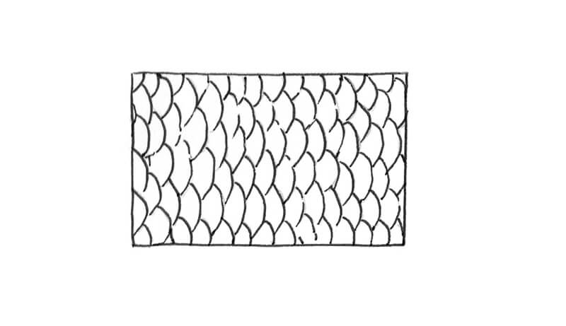
This simplified model is true for the scales of cycloid type. Such scales resemble small disks that overlap each other.
See also: How to Draw a Fish with Pen and Ink and Add Color Digitally
This abstract example invites a couple of interesting conclusions…
- The human mind has a great ability to simplify complex forms and patterns. Artists develop this skill to a high level, as it helps to create credible illusions on paper or canvas. We easily recognize real objects in stylized drawings. Adding details from memory or imagination also comes naturally.
- Our mind has storage of visual images and ready-made associations. We often choose the first option that shows up and content ourselves with it. This method definitely helps us to save energy!
However, the most obvious option usually isn’t the only (or the correct) one. Further research and brainstorming may bring some surprising results!
The process of exploration broadens our horizons. It provides additional options and data, which often leads to a more credible result. Sometimes we don’t learn new things but rather refresh our existing knowledge.
In this case, research suggests that fish scales exist in a variety of forms.
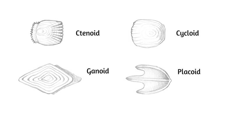
Ctenoid scales are similar to cycloid ones in shape, but their outer edges are toothed. (Cycloid scales have smooth outer edges.) Trout, herring, and carp scales belong to the cycloid type. Perch, bass, and sunfish present the ctenoid shape.
Ganoid scales are diamond-shaped. They can be found on gars and sturgeons.
Placoid scales are plate-like and have a small outgrowth. This type of scale belongs to sharks.
Reptilian scales present a similar variability. We’ll talk about them in greater detail in the next section.
Variety of Scales in Nature
Scales can be divided into several categories, depending on their visual appearance. My classification is derived from observation and is not rigorously scientific. This system is a practical attempt to categorize the abundance of natural textures.
By the way, observing a variety of references and then creating your classification may be a great exercise.
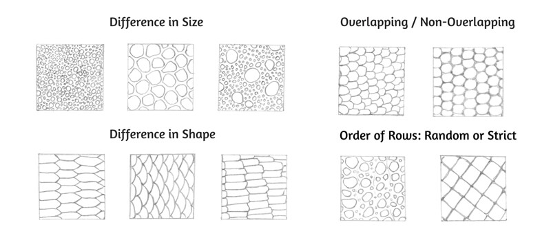
The scales’ size (and its consistency) is among the most important variables. The location of these elements also affects their size. Most often, bigger scales are found on the head, feet, and tail. Smaller ones cover the areas around the joints for flexibility.
Before you start drawing a sample of a texture, it may be useful to recognize what part of the animal’s body you are attempting to depict. Are those big, diverse scales from the chameleon’s neck or extra broad scales from the snake’s belly? It’s up to you to decide on the subject.
The shape characteristics vary, too. Here are some extremes:
- Round – angular
- Even – irregular
- Long – short
The arrangement of scales can be orderly/symmetrical or irregular.
General skin relief is another important variable. Rows of scales can overlap each other, creating prominences that create highlights and shadows.
In the image below, you’ll find a visual presentation of this classification.
Relief and Height
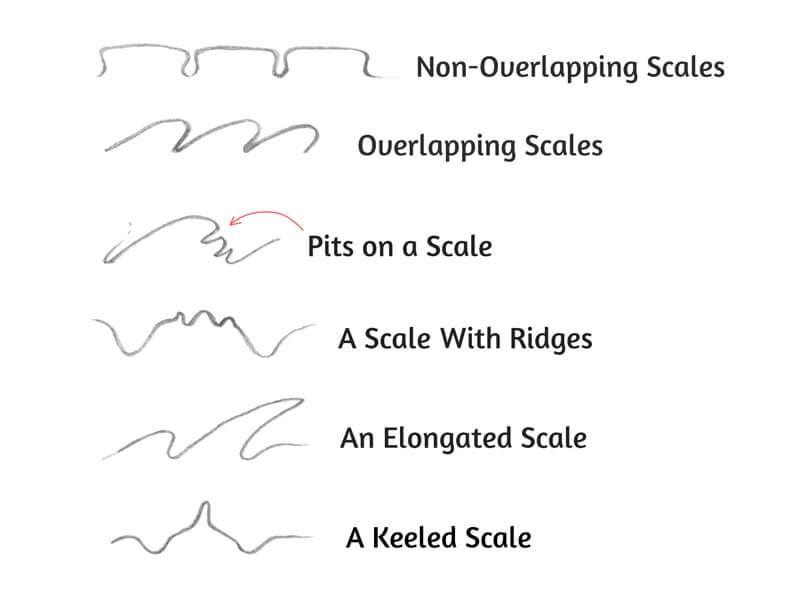
An individual scale also has a height. Some examples are relatively flat. In this case, the scale’s surface is smooth, making the element resemble a disk or a plate.
Scales may be granular. These elements appear bumpy.
Another variation is keeled scales. They have a center ridge.
All these types can be found in reptilians. Sometimes, scales have pits and other fine structures too.
In the image below, you’ll find schematic drawings of scales in a cut view. They present different kinds of relief depending on the height and form.
The Rhythm of Scales
Careful analysis is key to drawing scales and here’s a conceptual example of such an assessment.
The first step is to observe the size and shape of the elements, as we’ve done in the previous chapter.
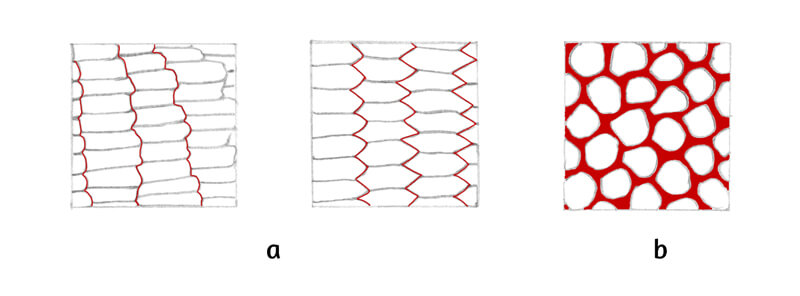
Now, digress from the scales and look at the negative space that serves as a background. Is there any component that appears to dominate? What has attracted your attention – the elements or the area surrounding them?
Observe the gaps between the scales. Do they form an intricate pattern? Try to notice the unique rhythm of this texture.
The image below illustrates this concept. The red lines follow the borders between the close-fitting scales (a), showing the pattern’s variability and movement. The horizontal borders have a monotonous character.
The example b demonstrates the negative space between the elements.
How to Draw Scales on a Form
After you’ve found the rhythm of the texture, imitating it with lines on paper becomes easier. Using subsidiary lines is one of the ways to create a framework. Such lines are especially helpful when you’re adding scales to a three-dimensional form like a cylinder or a sphere.
To practice drawing rows of scales, I recommend the following exercises…
The First Exercise
This method works great for non-overlapping scales.
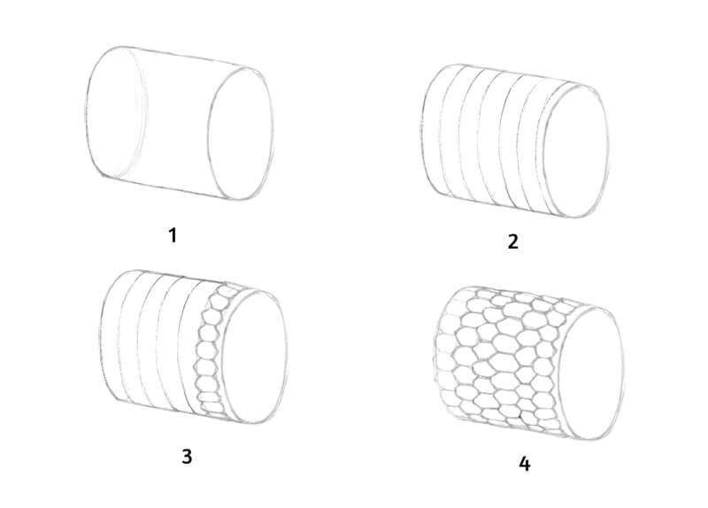
- Start with a form. Mine resembles a cylinder. It doesn’t have to be perfect. This form serves just as a basis. I imagine that it is a fragment of an animal’s body that I should cover with scales.
- Add the lines that approximately follow the contours of the form.
- Then it’s time to add the first row of the scales. In this case, scales have a shape of an irregular hexagon. The elements won’t overlap each other. Note that the elements conform to the contours of the cylinder. In its central area, the scales are fully visible, but they become reduced at the sides of the form.
- Add the next rows, one by one. Each new scale is placed between the prominent angular edges of the existing elements. You can vary the width of each row, making your texture more organized or irregular.
The Second Exercise
The following method may help you to arrange wide overlapping elements (like scales of the cycloid type.) In this case, we’ll need two sets of subsidiary lines.
- Start with your initial form.
- Add two sets of diagonal lines. The guides follow the form. There is a moderate twist near the sides of the cylinder. The intersections create diamond-shaped boxes.
- Fill the resulting shapes with semicircles – the scales. I start with the row that is closest to the viewer.
Note that the character of scales affects the outer contours of the form! In the image, they are marked with red color. The contours become slightly irregular.
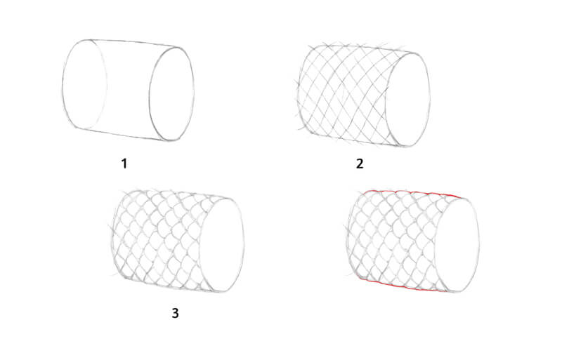
The Values – How the Main Form Affects Single Scales
Scale texture is a combination of small elements, where each element is affected by the light source. If a covering has elongated ridges, bumps, and other prominent components, this principle becomes especially important.
In such a case, each element will have areas of light, shadow, and midtone – just as normal objects. Also, overlapping scales cast shadows on their neighbors. If we draw a texture in detail, we should give the prominent elements the relevant illusion of volume with the help of values.
The texture conforms to the main form of the object and repeats its contours.
In other words, scales are found on the skin of an animal, and skin wraps around the body. The body is the main form. It is affected by the light, its direction and character. There will be areas of highlight, light, midtone, core shadow, and reflected light.
When you’re drawing scales on an animal, it’s necessary to consider the values and their location on the main form. They determine the average tone of the texture in any given area. In the image below, you’ll find an illustration of this concept.
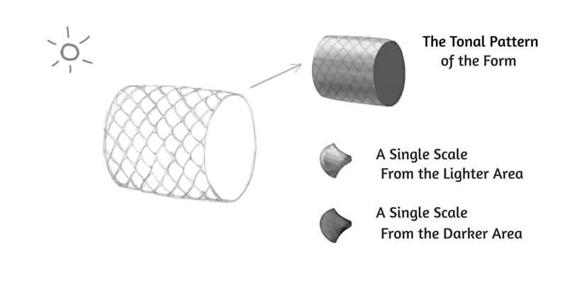
Here we have a cylinder with scales on its surface. The light comes from the upper-left corner of the scene. It is soft, so we won’t see any harsh, chopped shadows between the scales – even if the texture is observed close-up.
The light affects both the main cylindrical form and the individual scales. In general, the upper-left areas of the elements will be lighter, as they have more chances to catch the light.
The values of the main form affect the texture. An enlarged scale from the cylinder’s brightly lit area will look quite different from a scale on a shadowed part of the form.
So in a nutshell, always pay attention to the main form and its values. Don’t get carried away with all those fascinating details of texture found on the scales!
A Note on Coloring Scales
As we know, scales provide coloration. In certain cases, the pattern can be quite complex.
Sometimes the change of color happens as if within the scales. The borders are crisp and readable, so the pattern resembles a page from a coloring book. (See illustration a in the image below.)
The transition between the colors can be blurred. In this case, the colors go beyond the borders of the scales. (Illustration b.)
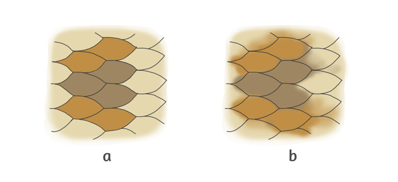
How to Draw Lizard and Snake Scales
Now let’s put the concepts we’ve covered to practice and draw a couple of animal scales.
We’ll need a graphite pencil to create an outline. I recommend an H or HB. Alternatively, you can use a gray pencil from your set of colored pencils.
Keep an eraser at hand to remove any unnecessary lines and excessive graphite.
A ruler will help you to create straight, even borders for your texture swatches.
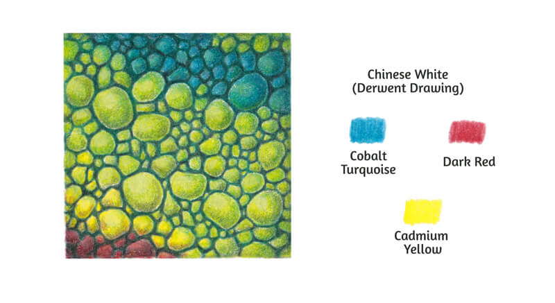
Below you’ll find my list of colored pencils. The vast majority of them are from the Faber-Castell Polychromos set. The only exception is Chinese White – it belongs to the Derwent Drawing range.
See also: Comparing Colored Pencils
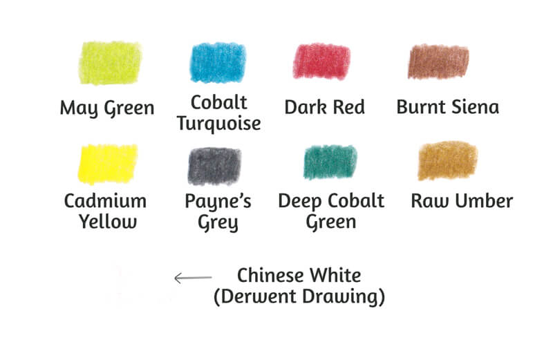
A pencil sharpener is another must-have tool for our project. A sharp pencil is required to create such detailed work.
I’ll be drawing on 200 gsm paper of A5 size. This format is enough for both drawings, as the size of each texture sample is 6.5 × 6.5 cm (2.6 × 2.6 inches.) The paper has a subtle texture.
Drawing Lizard Scales
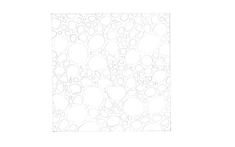
With a graphite pencil and a ruler, I create a square to indicate the borders of the swatch. Then I fill its inner space with rounded shapes – the scales.
It’s possible to divide the scales into three groups, depending on their size. I prefer drawing the larger elements first. The scales of medium and smaller sizes will be arranged within the remaining space.
In my sketch, larger elements have smoother, more rounded contours. The smaller scales are slightly angular.
With colored pencils, achieving sharpness on fine details may become a challenge. That’s why I avoid adding tiny, dot-like elements. Even the smallest scales are large enough and are accessible for a sharp pencil tip.
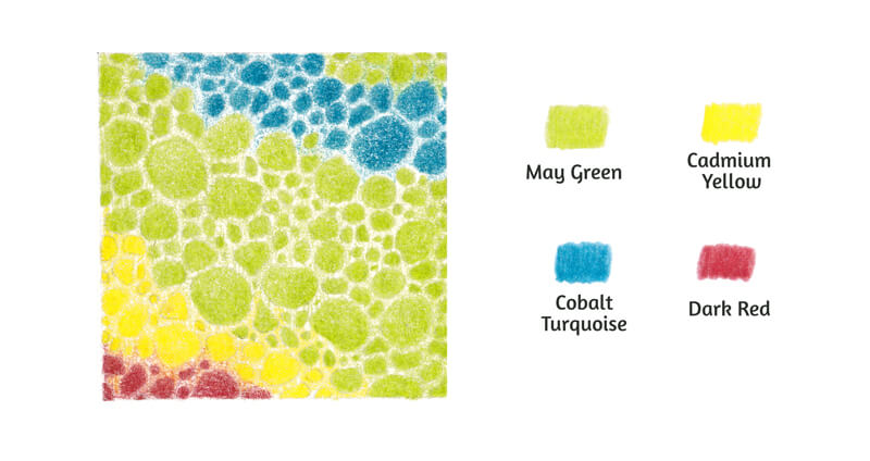
It’s time to create a colored base for our texture swatch. Before we proceed to colored pencils, it might be a good idea to lift excessive graphite with an eraser. (A kneaded eraser is the best option.)
I use May Green at light pressure to cover the central area of the square. The pencil moves in small circles. I add another layer to the scales, applying increased pressure. A small area in the upper right corner also gets this vibrant green color.
Then I vary the coloring of the lizard skin, adding other hues. The neighboring areas become covered with Cadmium Yellow, Dark Red, and Cobalt Turquoise accordingly.
The layers may overlap to create interesting nuances.
Let’s assume that light is coming somewhere from the upper-left side. It is soft and diffused.
The larger scales are quite prominent. Their tonal pattern conforms to the direction of light. The scales’ upper-left areas will be brighter, and their lower-right sides will be slightly shadowed. I make sure that the darker areas of the larger elements get a solid covering.
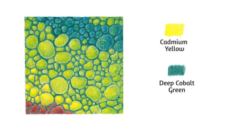
I add Cadmium Yellow to the lighter areas of the larger scales. This is relevant for the green, red, and blue elements. The inclusion of this warm hue will accent a shift in color temperature.
I add Deep Cobalt Green at light pressure to the shadowed parts of the prominent scales. Then I cover the whole area between the elements. The pencil tip is sharp.
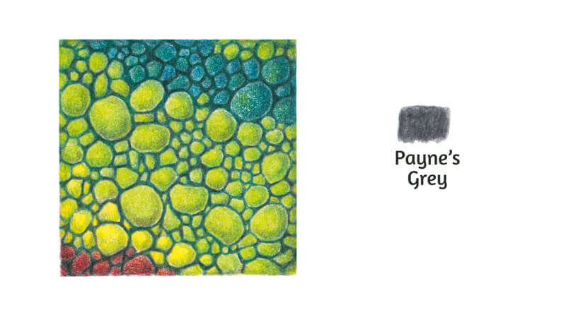
I increase the contrast with Payne’s Grey, adding it to the darker areas of the swatch. I cover the space between the scales. The perimeter of the swatch also becomes slightly darker.
It’s possible to apply this shade to the scales’ core shadows. In this case, the pressure should be very light. Such shades can darken and desaturate bright colors in no time.
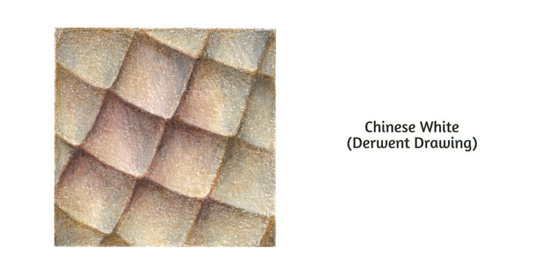
I burnish the scales with Chinese White, removing the graininess of pencil strokes on the slightly textured paper. I focus mostly on the lightest parts of the elements, as the white pencil also lightens the underlying colors.
I add some Cobalt Turquoise to the periphery of the swatch to give it a more unified look.
I also create an exchange of subtle color nuances, using Dark Red, Cadmium Yellow, and Cobalt Turquoise. This technique is similar to adding reflections to shiny objects of contrasting bright colors.
For example, I add some Dark Red to the yellow scales that are close to the red ones. Cobalt Turquoise is applied to the green elements, and Cadmium Yellow – to green and red ones. This simple trick also helps to unite the swatch visually.
Drawing Snake Scales
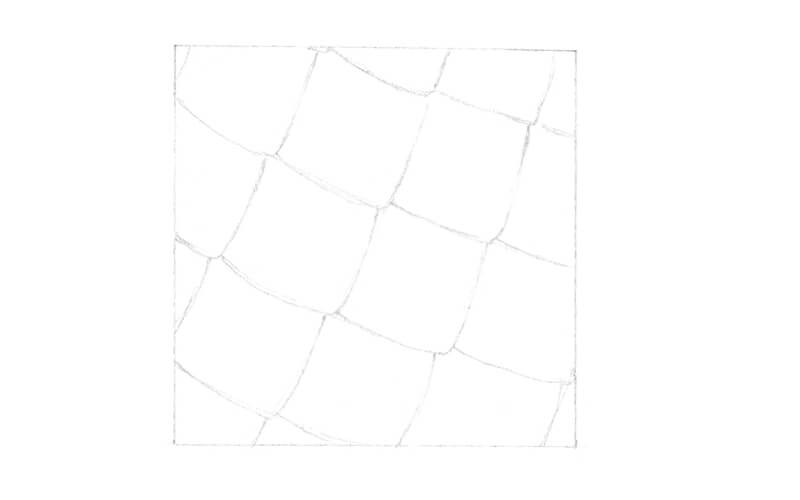
I start with a graphite pencil underdrawing. The scales are quite large and are approximately the same size.
Some crossing subsidiary lines may help you to recreate the rhythm of this texture. Draw two sets of parallel lines that are going in both directions. Then, place the scales into the resulting rhombic shapes.
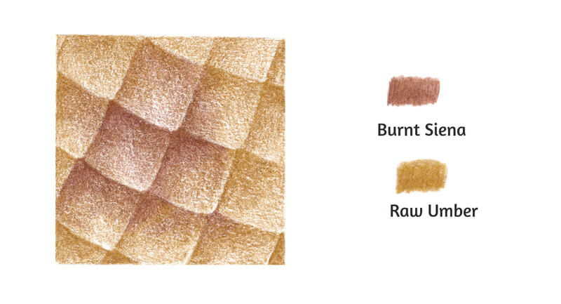
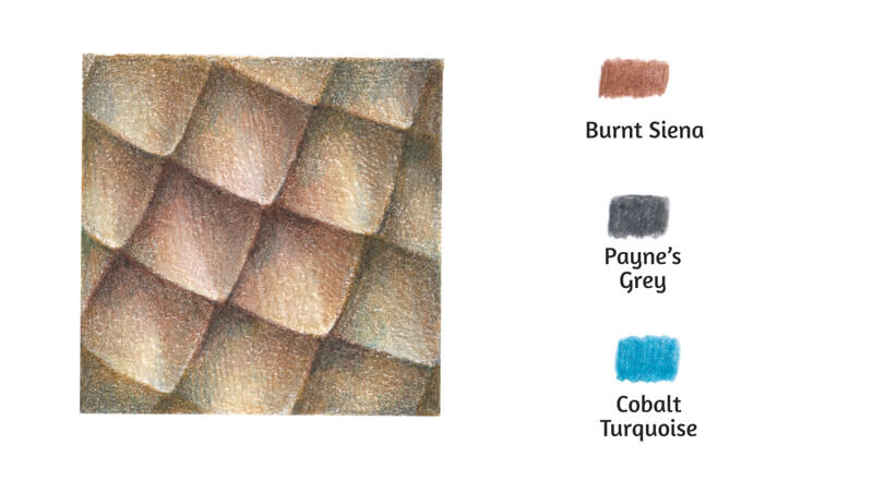
I cover the central scales with Burnt Siena. The lines are soft. The majority of them have a vertical back-and-forth direction. The strokes conform to the contours of each scale.
The color pattern is slightly blurred. It goes beyond the borders of the individual scales.
I add Raw Umber to the remaining space of the swatch.
Let’s agree that soft light is coming from the upper-left corner, just as it was in the previous example. The left sides of the scales, closer to the lower tip, will be slightly brighter. I apply an additional layer of pigment to the shadows between the scales.
The lower prominent ends of the scales remain lighter. This contrast strengthens the recognizable rhythm of the texture.
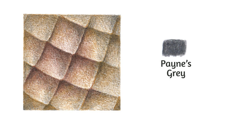
With Payne’s Grey, I increase the contrast. The shadows between the scales become darker.
The outer part of the swatch gets a subtle dark gray covering, too. This trick imitates a vignette photo effect.
I carefully touch the right sides of the scales, accenting the transition of values. The pressure is very light.
The strokes look grainy. I burnish the colored pencil layers with Chinese White.
Now the covering is smooth and polished, but the colors look slightly faded. We’ll restore the vividness and contrast in the next step.
I apply Burnt Siena as a thin layer to liven up the richness of browns.
With Payne’s Grey, I deepen the shadows and accent the details.
As a finishing touch, I apply Cobalt Turquoise near the inner borders of the swatch. I also add it to the shadowed areas between the scales. In small amounts, this hue often makes the drawing more realistic.
The swatch is complete!
A Couple of Words on Drawing Scales as a Texture in a Finished Artwork
In our practical part of this lesson, we were depicting scales as a flat, abstract, close-up fragment of texture.
Such exercises allow us to focus on the external structure. We explore the connection between the relief and values – and also notice color nuances. We don’t have to think about the main form’s values and their visual impact on the texture.
But what if the task changes? Let’s imagine that now the goal is to depict a three-dimensional object instead of its fragment. In this case, we can’t – and shouldn’t – draw all the details of texture.
When we’re portraying a scaly subject in full view, we aim to convey its perceived qualities in a stylized manner. Simplifying a texture means that we abandon the unnecessary visual information. We should keep only the larger, more significant elements and give just a hint at the less important details.
Rhythm helps a texture stay recognizable in any form. If we look at scales from a distance, we’ll notice how the gaps between the elements form a pattern.
In some cases, this pattern may seem irregular, but it still exists and can be imitated. In other examples, scales are arranged in a strict, symmetrical order.
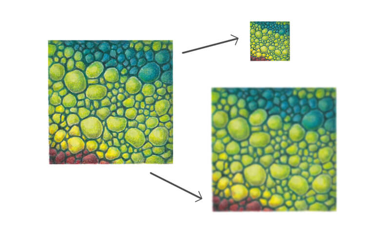
To determine the key features, squint your eyes and look at your photo reference or subject of texture (make sure that your eyes are relaxed and don’t strain them). This trick helps to evaluate any subject.
In the image below, you’ll find an illustration of this concept.
The upper image demonstrates a smaller, distant version of our lizard scales’ texture swatch. The lower image is blurred in a digital program to convey an effect of a squinted look.
The larger elements become more prominent visually. Also, we can notice a hint at an irregular rhythm.
Drawing Animal Scales – Conclusion
Congratulations – we’ve completed our journey into the world of scales! I hope that this lesson was interesting and informative. Hopefully you see that drawing scales isn’t as complex or difficult as it may seem. It simply requires a bit of analysis and informed mark-making.
I wish you much inspiration for your future creative projects!
If so, join over 36,000 others that receive our newsletter with new drawing and painting lessons. Plus, check out three of our course videos and ebooks for free.
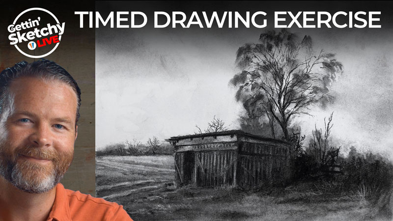
Drawing a Landscape with Charcoal – Timed Drawing Exercise
Gettin’ Sketchy – How to Draw a Landscape with Charcoal – Season 3 Episode 7
This episode aired live on YouTube on March 3, 2021.
Gettin’ Sketchy is a live broadcast on YouTube where we attempt to create a drawing in 45 minutes. Because of the time constraint, the drawings are closer to “sketches”. Some mediums result in images that feel more finished or refined, while others are considerably looser.
Charcoal, the medium used in this episode, is a looser medium but is capable of producing a surprisingly “finished” look in a short period of time. This is partly due to the rich darks that charcoal produces, but also because of the forgiving nature of the medium.
Here’s a look at the completed image…
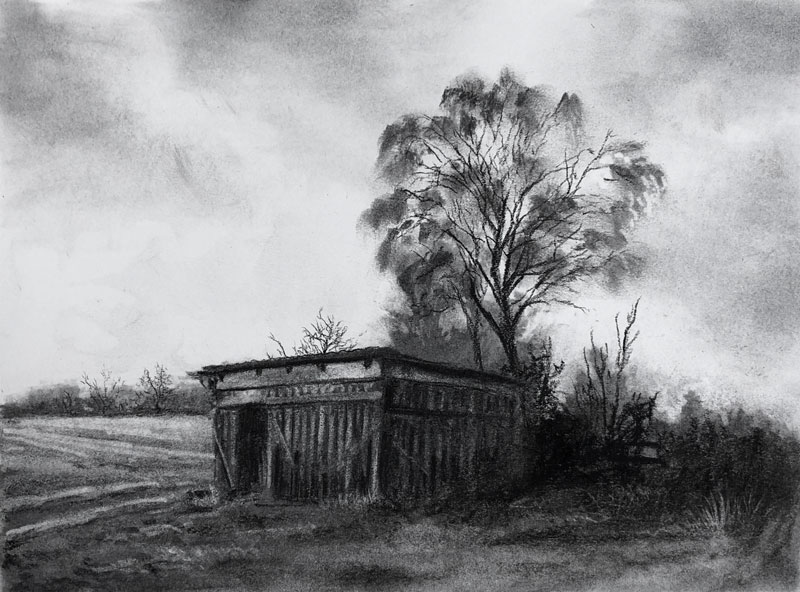
Thinking Like a Painter
Charcoal is clearly a drawing medium, but we can think like a painter when we use it. Opaque painting mediums like acrylics and oils allow the artist to cover applications and make changes easily. In other words, these painting mediums are rather forgiving. Charcoal is similar in this aspect.
Vine charcoal is easily erased and also easily covered with additional applications of charcoal. With oils, it’s easy to create transitions in values. The same is true for charcoal, due to its powdery nature. We can effortlessly manipulate the vine charcoal on the surface, moving it around with a blending stump, erasing, and refining with additional applications.
And just like with an oil painting, we start looser and then refine the drawing as we develop it. The details gradually emerge as we work the material. This means that the drawing develops in stages with each stage being slightly more refined than the last. We can stop at any point (or at any stage) and the drawing may still feel “finished”, just with less details.
Working with Values
Value is one of the seven elements of art. Most artists will argue that value is the most important of the seven. I definitely agree with this and consider value to be more important than line, color, or form. Value is defined as the darkness or lightness of a color.
The reason why value is so important is because it is the way we see and understand the world around us. Value also influences other elements such as form, texture, space, and color.
It is the darks and lights that we see, the values, that inform us of the light within the scene. And light tells us about the forms and textures. Lighter values translate as highlights while darker values translate as shadows. The relationships between the highlights, shadows, and middle values communicate the light to our viewers and in turn – the forms and textures.
This is why value is so important to our success. When we create a drawing, we need to capture the values found on our subject and within the scene we are depicting in a drawing.
Why Charcoal is Great for Manipulating Values
As I’ve mentioned charcoal is a great medium for developing values. We’ve discussed how easy it is to manipulate it. Erasing to make lighter values is easily accomplished with an eraser and moving the charcoal around on the surface is effortless. But what makes charcoal so special is the richness of the darks.
We see the world as a full range of value. This means we see the darkest darks and the lightest lights with a range of middle values in between. In order to capture this full range, we need to use a medium that is capable of producing these tones. Charcoal excels at this due to its rich blacks.
While graphite is the most popular choice for sketching, it simply cannot produce tones as dark as charcoal can. In fact, graphite is actually gray and will never be truly “black”. This gives charcoal an advantage over graphite for producing convincing drawings. However, graphite is much cleaner and easier to “tame”. As we all know, charcoal is very powdery and can make a mess.
Here are a few lessons and lesson series that provide more information on charcoal and its usage. Some of these lessons require membership…
- How to Draw a Raven with Charcoal
- The Secrets to Drawing – Charcoal (Membership Required)
- Charcoal Drawing Techniques
- How to Draw an Ostrich with Charcoal – Lesson Series (Membership Required)
- Landscape Drawing with Charcoal – Lesson Series (Membership Required)
Photo Reference
The photo reference used for this drawing exercise is from Pixabay.com. The original image was altered by cropping and the contrast was enhanced.
Here’s a look at the photo reference…
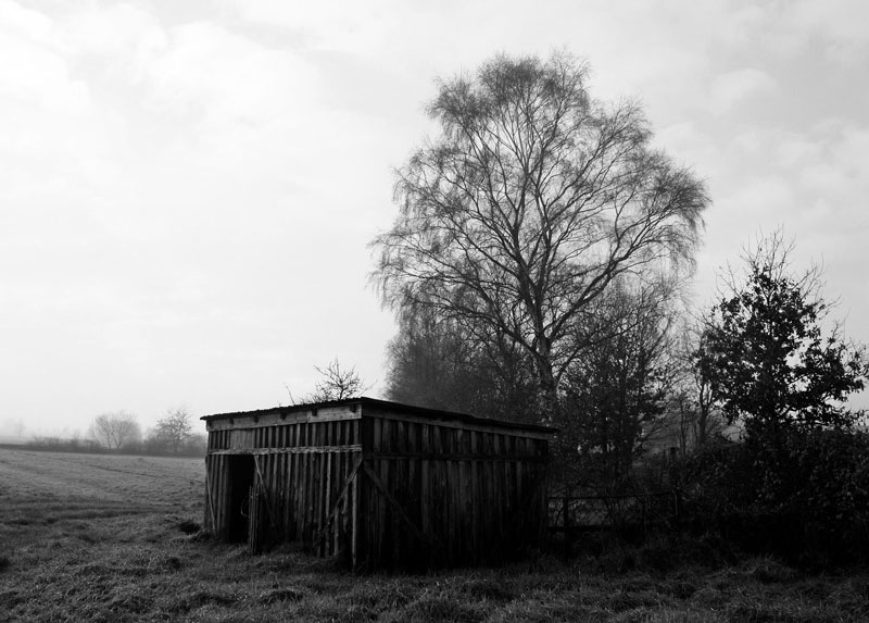
Timed Drawing of a Landscape with Charcoal – Conclusion
As we see, charcoal is a wonderful medium for sketching. It is messy and loose, but these are the very characteristics that make it so good. It’s easily manipulated and creating a full range of value is a breeze. Charcoal is a forgiving medium and is a nice “bridge” to opaque painting mediums like acrylics and oils.
Charcoal doesn’t get as much usage as more popular sketching mediums like graphite, but this is due mostly to fear (of a new medium) and the messy reputation that charcoal carries with it. People also mistakenly believe that it is difficult to control. But hopefully, you see that this isn’t the case and charcoal is actually very easy to control. It just requires a different approach than using a pencil.
If so, join over 36,000 others that receive our newsletter with new drawing and painting lessons. Plus, check out three of our course videos and ebooks for free.

