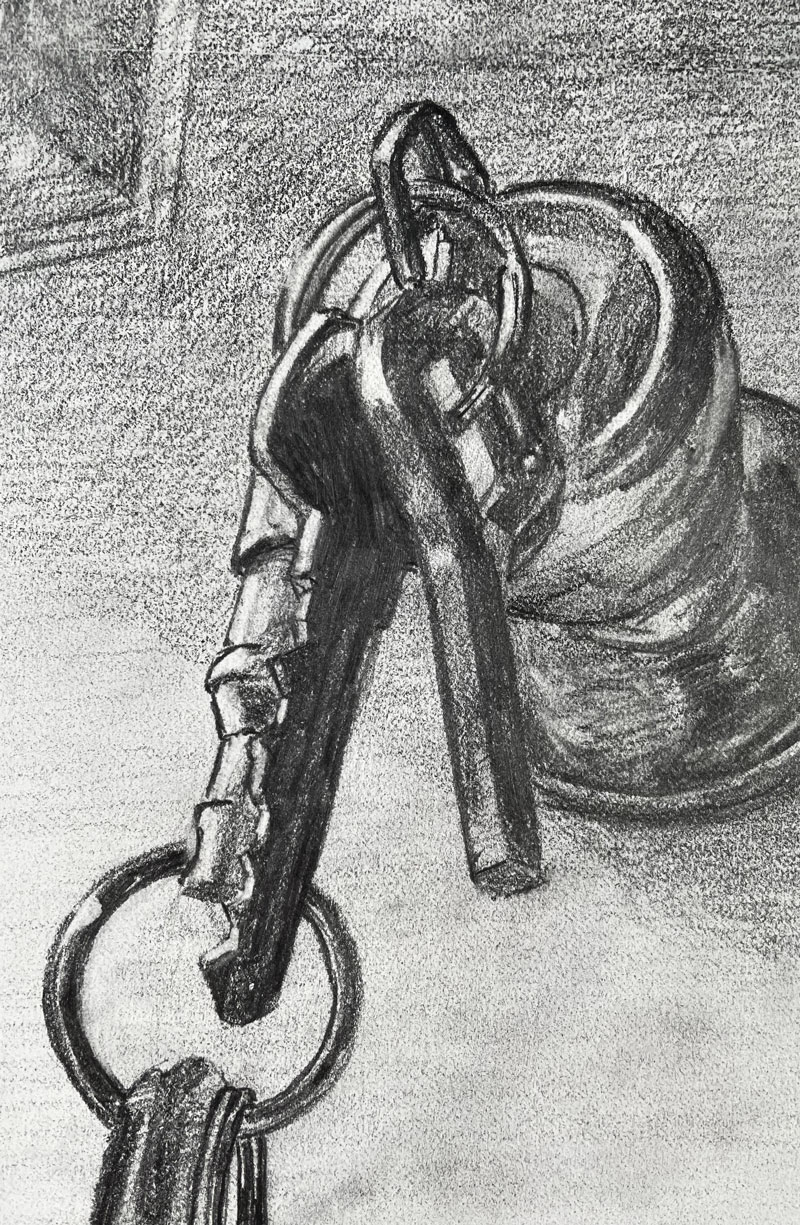
Gettin’ Sketchy – Drawing Everyday Objects – Door Knob and Keys – Season 4 Episode 6
This episode aired live on YouTube on July 7, 2021.
In this drawing lesson, Ashley creates a drawing of a couple of objects that are part of our everyday lives – a door knob and a set of keys. Everyday objects like this are great for sketching. Sometimes all we have to do is look around us to find sources of inspiration. And while these objects may not seem like exciting objects, they are still filled with challenges that will help us improve our drawing skills.
Here’s a look at the completed drawing…
It’s Easier Than You Think
It’s easy for beginners to look at certain potential drawing subjects and get overwhelmed. It’s only natural to assume that highly reflective subjects like metal or glass will present difficult challenges. Objects that are precise or detail-oriented can also deter some budding artists. Most of these folks will simply look for other subjects to explore rather than tackle this challenge.
But this is a mistake. Challenges force us to grow. When we challenge ourselves with “difficult” subjects we often surprise ourselves with the results. But when we avoid subjects that present challenges, we stagnate and our artistic growth is stunted.
The simple subjects of this drawing – the door knob and keys – could be considered “difficult” due to the precision of the keys and the reflective surface of the door knob. However in this demonstration, Ashley shows us that even difficult subjects can be simplified and communicated in a drawing in a short period of time.
The Secret to Drawing Reflective Surfaces
Value is one of the seven elements of art. Most artists agree that value is also the most important element of art. The values and the positioning of the values inform the viewer of the light within the scene, the form of the subjects, and the surface textures of the subjects.
Surfaces that are not reflective typically feature gradual changes in values from dark to light. But reflective surfaces, like shiny metal or glass, are different. Instead of gradations of value, reflective surfaces often feature extreme changes in value. Often, we see a dark value positioned right next to a light value. It’s the strong contrast in value and the extreme change in value that leads to the illusion of a reflective surface in our drawings.
All we need to do is pay close attention to the shapes of these contrasting values and try to replicate them in our drawing. If we get the shapes and values close to what is observed, the result is the illusion of reflection.
Materials Used For This Drawing Exercise
In this lesson, Ashley uses simple drawing tools to complete the sketch. A common HB pencil is used for the initial contour line drawing and some basic shading. Once the contour sketch is in place, Ashley pushes the range of value with a General’s Layout pencil. This pencil is similar to a 4B pencil so the marks are quite a bit darker.
See also: Artists Graphite Pencils Explained
The drawing is completed on basic white drawing paper that you’ll find in any sketchbook. There is a texture to the paper, but the tooth is relatively weak.
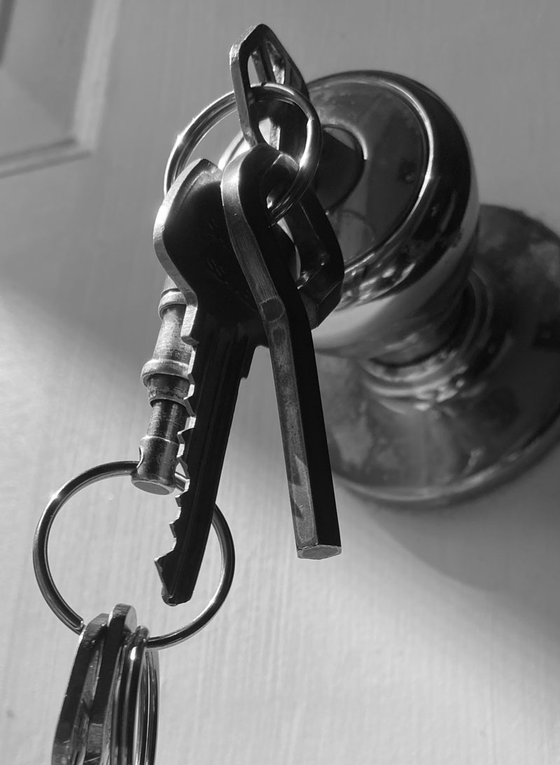
Photo Reference
Ashley took the photo that is used for reference. The color was removed, making the values and value relationships easier to discern.
Here’s a look at the photo reference…
Looking for other ideas to sketch? Check out 101 Drawing Ideas for Your Sketchbook

Drawing a Door Knob and Keys Exercise – Conclusion
Drawing is a skill that anyone can learn and develop. But like any other skill, drawing requires practice. The more that you practice, the more improvement you will see in your drawing skills. Don’t dismiss the everyday objects around us a potential subjects. Even objects that seem “boring” can be made exciting with a strong composition.
Challenge yourself and don’t be afraid to draw subjects that may seem difficult on the surface. Often, these “difficult subjects” lead to a greater sense of accomplishment and more growth.
If so, join over 36,000 others that receive our newsletter with new drawing and painting lessons. Plus, check out three of our course videos and ebooks for free.
Impressionist Cherries with Oil Pastels – Timed Drawing Exercise
Gettin’ Sketchy – Drawing Cherries with Oil Pastels – Season 4 Episode 5
This episode aired live on YouTube on June 30, 2021.
The goal of Gettin’ Sketchy is to create a drawing of a chosen subject with a specific medium within a determined time period. This time period is usually 45 minutes. This amount of time is not enough to create a fully developed drawing, but this isn’t the focus. Instead, our focus is on the challenge involved and the exercise of sketching. Looser and quick sketches still force us to exercise the same “artistic muscles” that we use when we develop a fully rendered drawing. This means that quick sketches help to improve our drawing skills just as much a fully developed drawings.
Gettin’ Sketchy is broadcast live which elevates the challenge. Beyond creating a quick sketch for you live, we obviously include some art instruction as well.
In this episode, the goal is to use oil pastels to produce a drawing of cherries. Due to the time constraint and the looser nature of the medium, an image that resembles an Impressionist painting emerges.
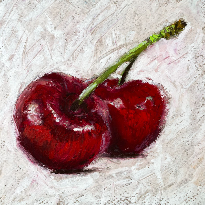
Here’s a look at the completed image…
Drawing with Oil Pastel
Oil pastel is an art-making medium that falls somewhere between soft pastels and wax-based crayons. Oil pastels feature an oil-based binder that never fully dries. This means that oil pastels remain workable after the drawing has been completed.
Unlike traditional soft pastels, oil pastels do not produce a dust. This means that oil pastels are slightly less messy, but also more difficult to blend. Oil pastels can still create a mess. As the medium is applied, small pieces of the medium usually fall off. These small pieces can be brushed away using a drafting brush or similar tool.
While a light pencil sketch can used as a starting point with oil pastels, most applications are made directly with the medium. If a graphite drawing is too dark, the oil pastels may mix with the pencil producing an undesired grayish color. Also, lighter colors of oil pastel may not cover pencil underdrawings, resulting in the pencil drawing remaining visible through the oil pastel applications.
Drawing on Toned Surfaces with Oil Pastels
Oil pastels can be applied to almost any surface, however textured surfaces are usually preferred. This is due in part to the importance of layering applications. Once the texture of the paper has been filled with the medium, subsequent applications of oil pastels are difficult to apply and may lift from the surface.
See also: All About Drawing Papers
Many artists prefer to work on toned paper when using oil pastels. A toned surface provides a “starting value”. This allows for more accurate evaluations of value relationships compared to white paper. As an added benefit, some small specks of the paper may show through the oil pastel. This means that the color of the paper influences the finished look of the drawing.
The paper used for this drawing is Canson Mi-Teintes pastel paper. This paper features two distinct textured surfaces – one with a heavy tooth and one with a slightly less heavy tooth.
See also: 6 Reasons to Draw on Toned Paper
Here are a few lessons and lesson series that provide more information on oil pastels and its usage. Some of these lessons require membership…
- Oil Pastel Landscape – Expressive Brushstrokes
- Impressionist Oil Pastel Landscape
- Woodland Landscape with Oil Pastels – Lesson Series (Membership Required)
- Mountain Stream with Oil Pastels – Pastel Landscape Mastery Course (Membership Required)
- Mountainside Landscape with Oil Pastels – Lesson Series (Membership Required)
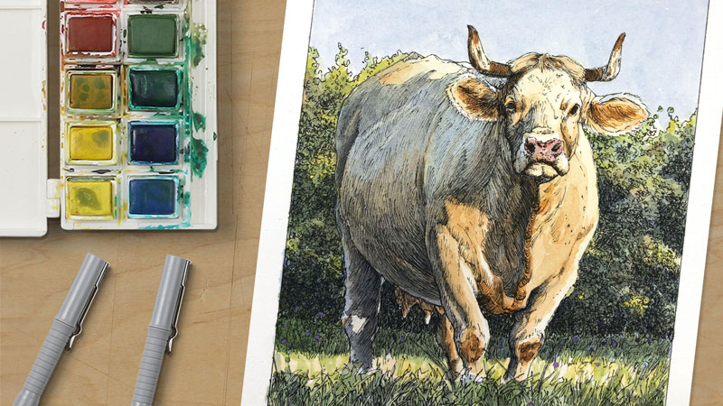
- Cow with Oil Pastels – Animals with Pastels Course (Membership Required)
Photo Reference
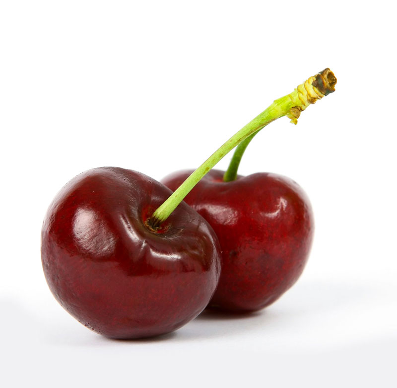
A reference photo was used in this drawing exercise. This image was slightly enhanced in Photoshop. The original image comes from Pixabay.com
Here’s a look at the photo reference…
Oil Pastel Brands
As is the case with any art making medium, there is great variety in quality and price with oil pastels. I generally prefer to use two different brands – Cray Pas by Sakura and Sennelier. Cray-Pas oil pastels are harder with less concentrated amounts of pigment. This makes this oil pastel perfect for initial marks and layers.
Sennelier oil pastels are much softer and are best suited for finishing touches such as strong highlights and “pops” of color. Sennelier oil pastels cover like thick oil paint and are loaded with pigment.
Cray-Pas oil pastels are inexpensive while Sennelier oil pastels are quite pricey. Both brands are easily used together.
Here are few links to purchase the materials used in this lesson…(The following links are affiliate links which means I make a small commission of you purchase at no additional cost to you.)
Drawing Cherries with Oil Pastels – Conclusion
The finished drawing has an Impressionistic look due to the looser nature of the medium. In fact, this is one of the reasons I love working with oil pastels. It forces me to be looser and focus on shapes of color and value instead of details. Working with shapes of color and value is fundamental to painting. With oil pastels, we have a medium that is applied as a drawing but is closely related to painting. This medium is great for practicing the concepts of painting without pulling out the brushes.
If so, join over 36,000 others that receive our newsletter with new drawing and painting lessons. Plus, check out three of our course videos and ebooks for free.
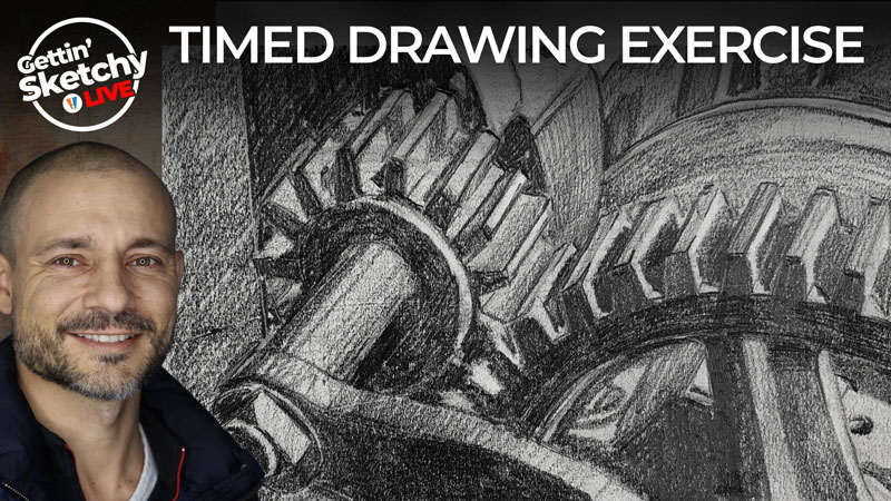
Drawing Nuts and Bolts – Timed Sketching Exercise
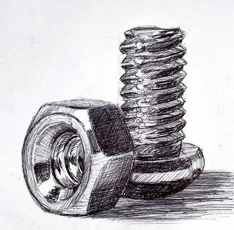
Gettin’ Sketchy – Drawing Nuts and Bolts with a Ball Point Pen – Season 4 Episode 4
This episode aired live on YouTube on June 23, 2021.
Sometimes the best subjects for sketching are simply lying around us. Subjects such as tools or hardware provide us with drawing challenges that force us to look closely and problem solve. Nuts and bolts certainly fall into this category. These small fasteners feature complex details enveloped in basic shapes and forms.
In this sketching exercise, Ashley creates a drawing of a simple nut and bolt on white drawing paper with a basic ball point pen. This quick sketch is a great example of how inexpensive tools like a ball point pen can be used to create a developed sketch.
Here’s a look at the completed drawing…
Constructing the Sketch
We have a natural tendency to look for the lines when we begin a drawing. While we can clearly develop a drawing in this manner, there is a better, quicker, and more accurate way to approach drawing. When we start with the lines, we often run into proportional issues and produce less accurate drawings.
Instead of starting with the lines, we should consider looking for a different element of art – the shapes. We can build a drawing by stacking and combining shapes before shifting focus to the lines. This leads to greater accuracy in our drawings and also increases our speed.
This approach to drawing is often called construction and can be applied to any subject.
See also: Drawing Basics – Construction
Construction works by breaking complex objects down into basic shapes like circles, ellipses, rectangles, triangles, etc. These basic shapes are lightly drawn first, creating a framework for future marks.
As the drawing develops and the spacial relationships of the subjects are solidified within the picture plane, the details and the contour lines can be added confidently.
He begins with the ellipse found on the nut and then builds a structure outward from there. Another clear example of how construction is utilized is how he uses a rectangle to define the overall shape of the bolt before “carving” out the threads.
With this approach, Ashley is able to concentrate on the larger shapes and then gradually develop the details and smaller shapes within the larger ones. This allows him to work quickly without sacrificing accuracy.
Shading with a Ball Point Pen
Ashley first constructs the drawing with a graphite pencil. He begins with a pencil so that any mistakes can be correctly easily before committing with ink.
Once he is confident in the structure he’s created with the pencil sketch, he begins layering the ball point pen applications.
The ball point pen is quite unique when used as an art making tool. Unlike traditional drawing pens, a ball point pen can be used to create different values and intensities based on the amount of pressure placed on the pen.
Traditional pens used for drawing require the artist to work the concentration of marks in combination with the white of the paper to produce different values. While ball point pens can be used in this same manner, they also allow the artist to vary the pressure to produce grays like we can with a pencil.
See also: Basic Pen and Ink Techniques
This means that a ball point pen falls somewhere in between a graphite pencil and a traditional drawing pen. This allows the artist work the drawing as a traditional pen and ink drawing and/or as graphite drawing. While this sounds quite exciting, one obvious drawback is the lack of permanence of the medium.
When exposed to light over time, ball point ink will fade. Many artists that have embraced the ball point pen as a serious art making medium look for archival or acid-free inks but there is still no guarantee that these inks will last.
Materials for this Exercise
You likely already have the materials used in this drawing exercise. Basic white drawing paper, like you may find in a typical sketchbook, is used along with a HB graphite pencil and an inexpensive ball point pen.
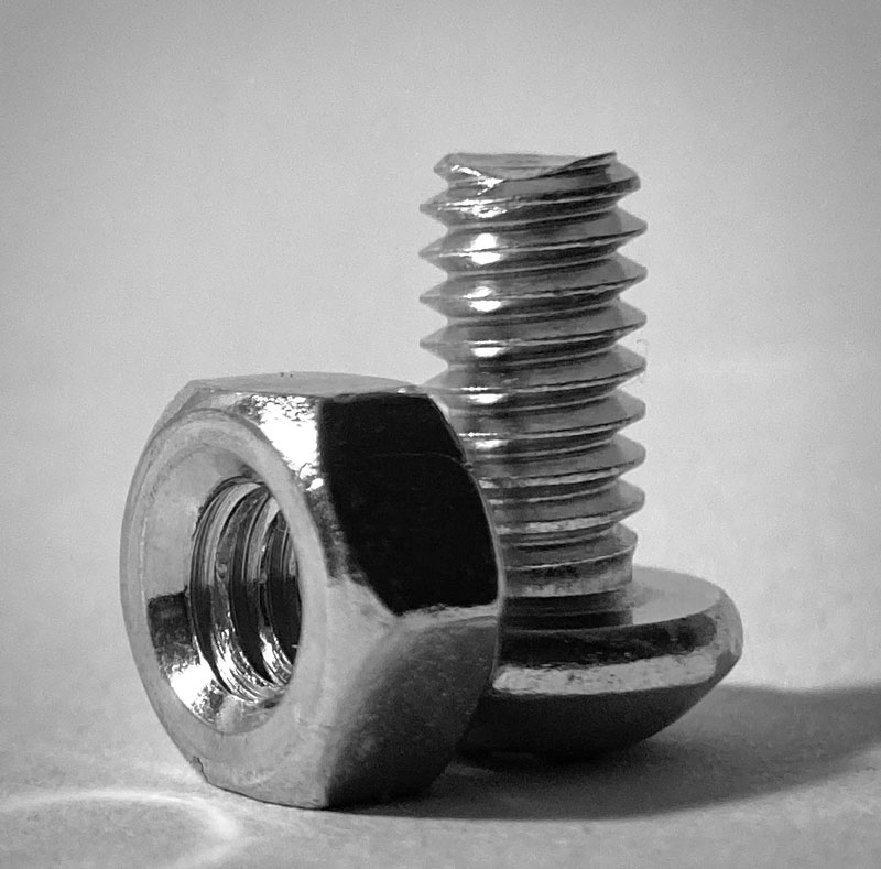
Photo Reference
A reference image was used for this lesson. The reference image was photographed by Ashley after carefully positioning the objects into a pleasing composition.
Here’s a look at the photo reference…
Nuts and Bolts – Timed Drawing Exercise – Conclusion
The most basic subjects often make some of the best subjects when it comes to sketching practice. And while a couple of fasteners like a nut and bolt may seem like an odd subject, there are plenty of challenges there. Subjects like these are also great for larger, finished artworks as well.
Ultimately, when you practice – you improve. The subject that you choose to sketch is largely unimportant. Every subject presents challenges and forces you to problem solve, take chances, and exploit the medium. The more that you draw, and face these challenges, the faster you will improve.
If so, join over 36,000 others that receive our newsletter with new drawing and painting lessons. Plus, check out three of our course videos and ebooks for free.
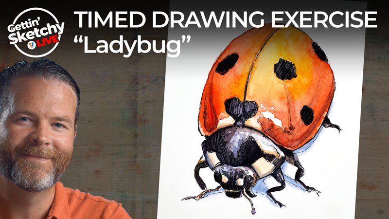
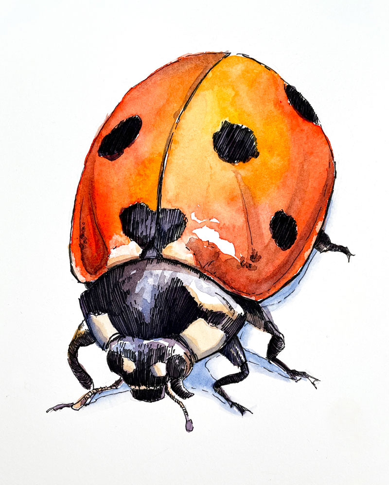
Line and Wash Drawing of a Ladybug – Timed Drawing Exercise
Gettin’ Sketchy – Ladybug with Watercolor and Pen and Ink – Season 4 Episode 3
This episode aired live on YouTube on June 16, 2021.
In this timed drawing exercise, we spend 45 minutes creating a line and wash work of a ladybug. This one is a real challenge to complete in the allotted time due to the mediums used. Thankfully, the ladybug is fairly simple and easy to draw with basic shapes.
Here’s a look at the completed drawing…
Line and Wash – Combining Pen and Ink with Watercolor
Certain combinations of art media work exceptionally well together. Pen and ink and watercolor is one such combination. This combination of media is often referred to as “line and wash”.
Combined mediums that work well with one another usually compliment each other. Often, one medium makes up for the weaknesses for the other.
Obviously, another factor to consider is the chemical and physical makeup of the two mediums combined. If the mediums do not “play well” together, then they will not work.
Pen and ink and watercolor “play well” together both physically and chemically. But they also make up for the weaknesses of the other, making this combination of media a popular choice for many artists – especially those interested in plein air activities like “urban sketching”.
Pen and ink is a rigid and often precise drawing medium. Typically, line is the vehicle for developing the drawing. Line is used to communicate the contours, or outlines, but also the values, textures, and form.
Through the methods of hatching and cross hatching, line can be used to create a gradation of value with pen and ink. However, this process is challenging and a true gradation of tone cannot be achieved using just line.
Watercolor, on the other hand, if fluid and loose. While it can be controlled, it’s at its best when it’s allowed to flow.
In a line and wash work, pen and ink and watercolor work together to create a complete piece. The pen and ink produces a rigid and precise drawing, while the watercolor brings color and smooth gradations of color and value.
The Order to Apply Pen and Ink with Watercolor
Pen and ink and watercolor can be applied in any order. Some artists prefer to apply the pen and ink first and follow with watercolor washes. Others prefer to apply the watercolor first and then refine the art with pen and ink.
The order in which the mediums are applied is less important than the balance between the two mediums. For example, a pen and ink drawing that is fully developed is likely to appear dark after watercolor washes are applied. To avoid this, the pen and ink drawing should be slightly underdeveloped so that the watercolor applications can be allowed to influence some of the values.
Materials for this Exercise
One appealing characteristic of line and wash is the cleanliness and compact nature of the medium. Drawing pens are inexpensive. Watercolor travels well and cleans up easily. Watercolor paper is also easy to find and is available in small travel “sketchbooks”. For this sketch, Staedtler drawing pens and Winsor and Newton watercolors are used on Canson Heritage 140 lb. hot press watercolor paper.
Cold press watercolor paper is completely acceptable for line and wash images. However, hot press papers provide a smooth surface which favors the pen and ink applications.
(The following links are affiliate links which means I make small commission if you purchase at no additional cost to you.)
- Staedtler Drawing Pens
- Winsor and Newton Travel Watercolor Set
- Canson Heritage 140 lb. Hot Press Watercolor Paper
Photo Reference
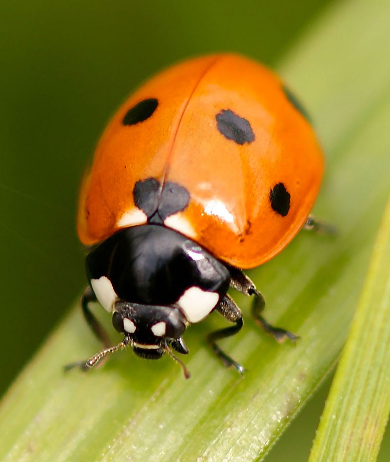
The reference image for this drawing exercise comes from Pixabay.com. The original image was edited. The image was cropped and the color was enhanced in Photoshop in order to bring out more reds.
Here’s a look at the photo reference…
Ladybug with Watercolor and Pen and Ink Exercise – Conclusion
Line and wash is an excellent combination of media for both finished works and quick sketches. Pen and ink and watercolor work well with one another due to the fact that they compliment each other so well. The pen and ink provides the details, edges, and some of the value and texture while the watercolor provides the color and gradations of value and tone.
Keep in mind that the lesson presented here is an exercise. And just like with physical exercise that makes you stronger, any drawing exercise – even one that lasts only 45 minutes – will make you stronger as an artist. Practice is important and is a key part of developing your artistic skills.
If so, join over 36,000 others that receive our newsletter with new drawing and painting lessons. Plus, check out three of our course videos and ebooks for free.
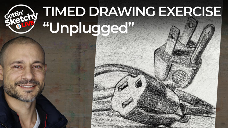
Timed Drawing Exercise – Unplugged
Gettin’ Sketchy – Unplugged – Season 4 Episode 2
This episode aired live on YouTube on June 9, 2021.
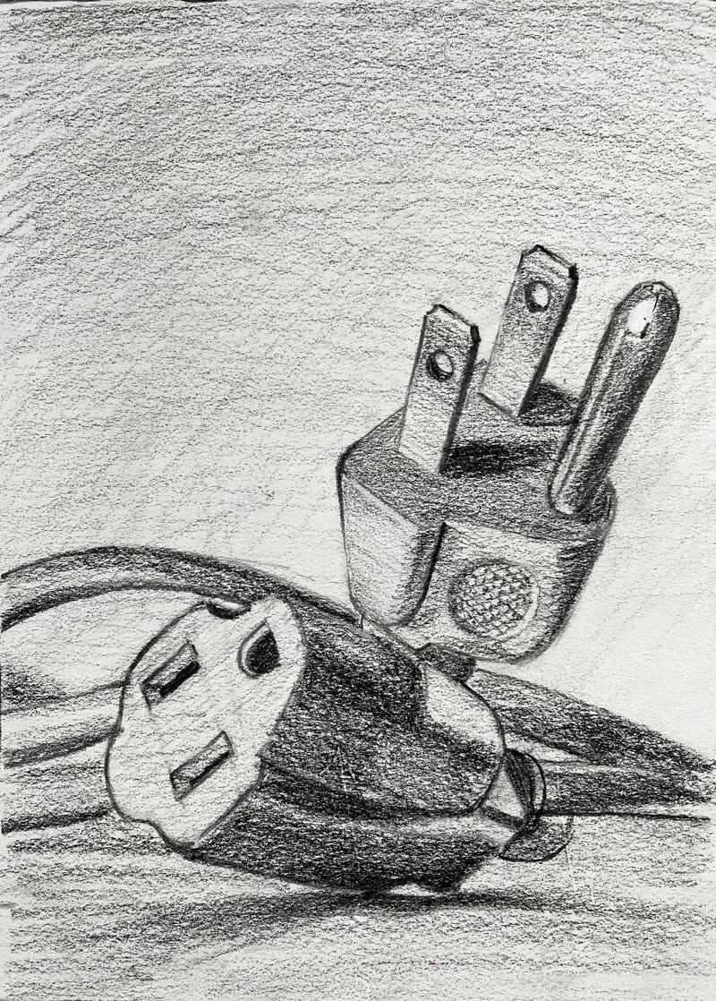
In this episode of Gettin’ Sketchy, Ashley creates a drawing of an electrical cord and plug. This may seem like an unlikely subject for drawing but it forces us to focus on composition and precise execution. Complex details are absent, but interesting relationships of simple shapes and forms are there – making this an interesting and challenging subject for sketching.
Here’s a look at the completed drawing…
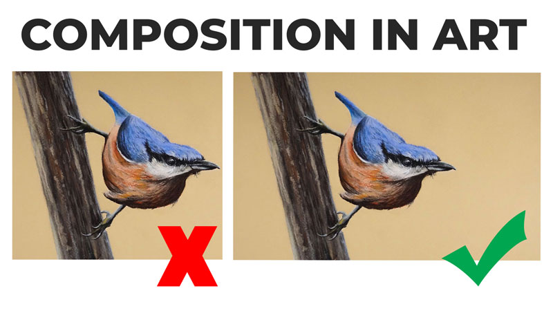
Considering Composition
Composition in art refers to the way the elements within the picture plane are arranged. Composition affects how our viewers interact with our art and influences our success or failure. Unfortunately, the importance of composition is often overlooked by beginners.
Creating a strong composition may seem like “guesswork” to the inexperienced artist. Fortunately, composition can be learned and the more that you practice it – the more it will improve.
See also: Composition in Art
In this work, the composition is the “star of the show”. The subject may be a mundane object, but the composition is interesting. There is a nice balance between the positive and negative space, a variety of shapes and forms, and a feeling unity created by repetition. There’s also a nice sense of space developed through overlapping and placement. The meandering cord also pulls the viewer’s eye through the sketch.
This successful composition is no accident. Ashley carefully considered the composition before making any marks. He took several different photos of the subject, experimenting with slightly different arrangements. This is important to note. Successful compositions often emerge through experimentation. This is one reason why thumbnail sketching is so important.
See also: Improve Your Drawing Skills in 6 Days
Materials Used For Unplugged Drawing Exercise
The materials used in this drawing are simple and easily accessible to most. Ashley uses two graphite pencils and standard white drawing paper. A harder, HB pencil is used for the initial sketch. A General’s Layout pencil is used to shade the drawing once the initial contours are established. This pencil is a darker pencil, somewhat equivalent to a 4B pencil.
See also: Artists Graphite Pencils Explained
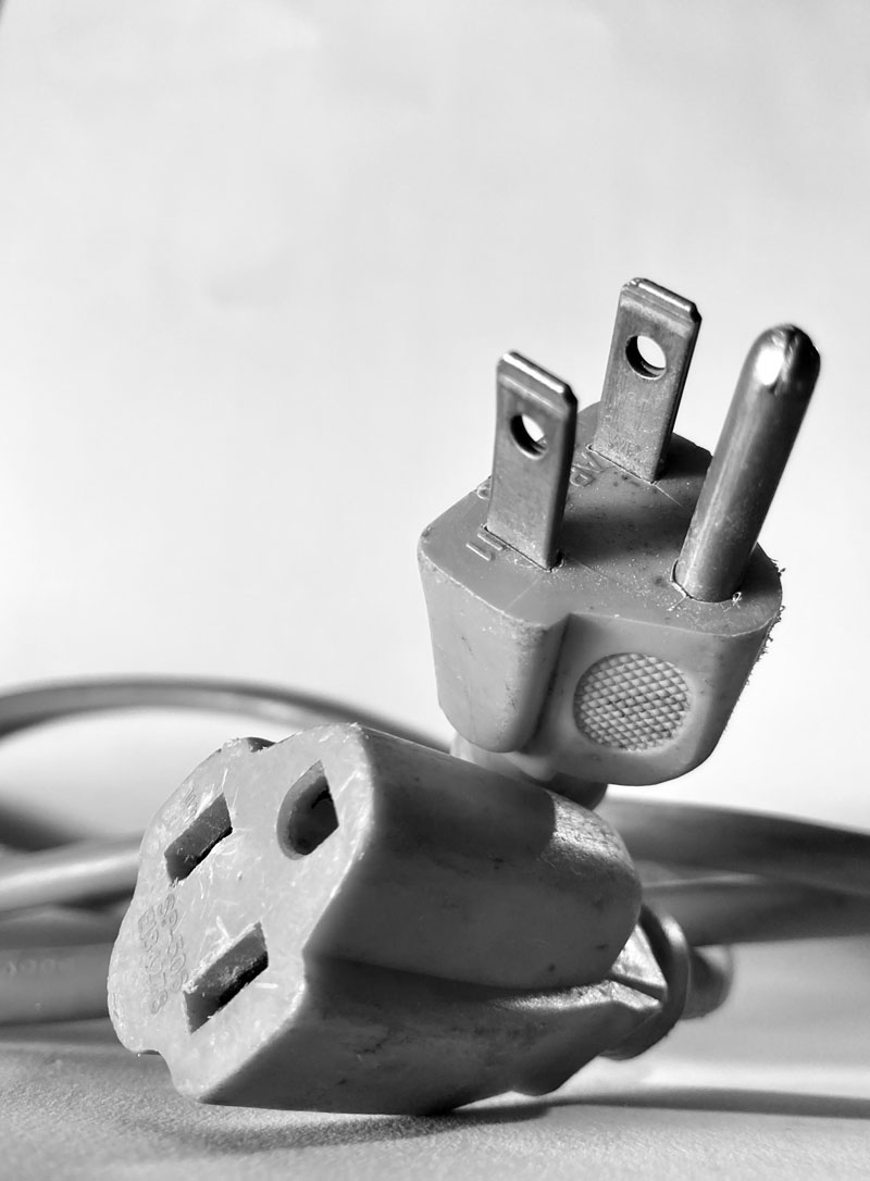
Photo Reference
The reference image for this drawing exercise was developed by Ashley. As we have already established, the success of the sketch starts with the composition of the photo.
Here’s a look at the photo reference…
Drawing Exercise Unplugged – Conclusion
We often assume that the subject is the most important element in our artworks. While the subject is clearly important, it doesn’t carry as much weight as we may assume. Even everyday, “boring” subjects can be interesting for sketching or more refined drawings and paintings. Composition is clearly important in any artworks that we create. But its importance and its presence is more noticeable when the subject is subtle.
If so, join over 36,000 others that receive our newsletter with new drawing and painting lessons. Plus, check out three of our course videos and ebooks for free.
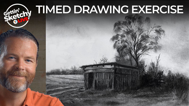
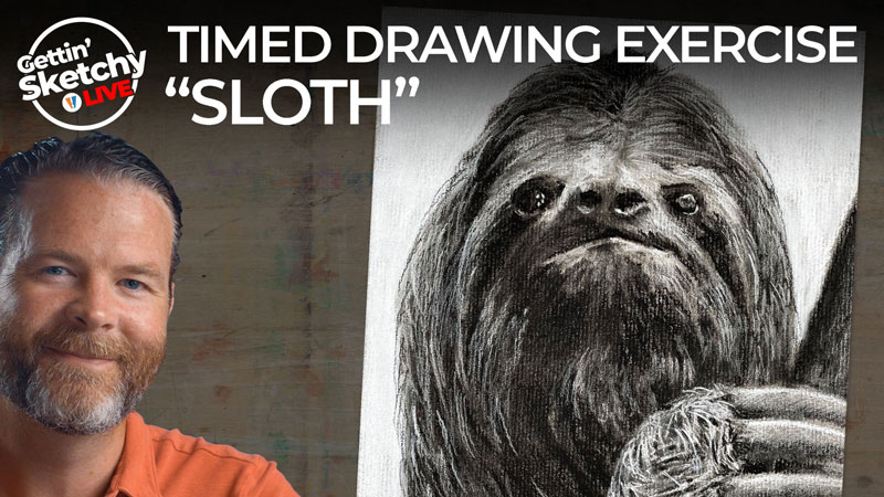
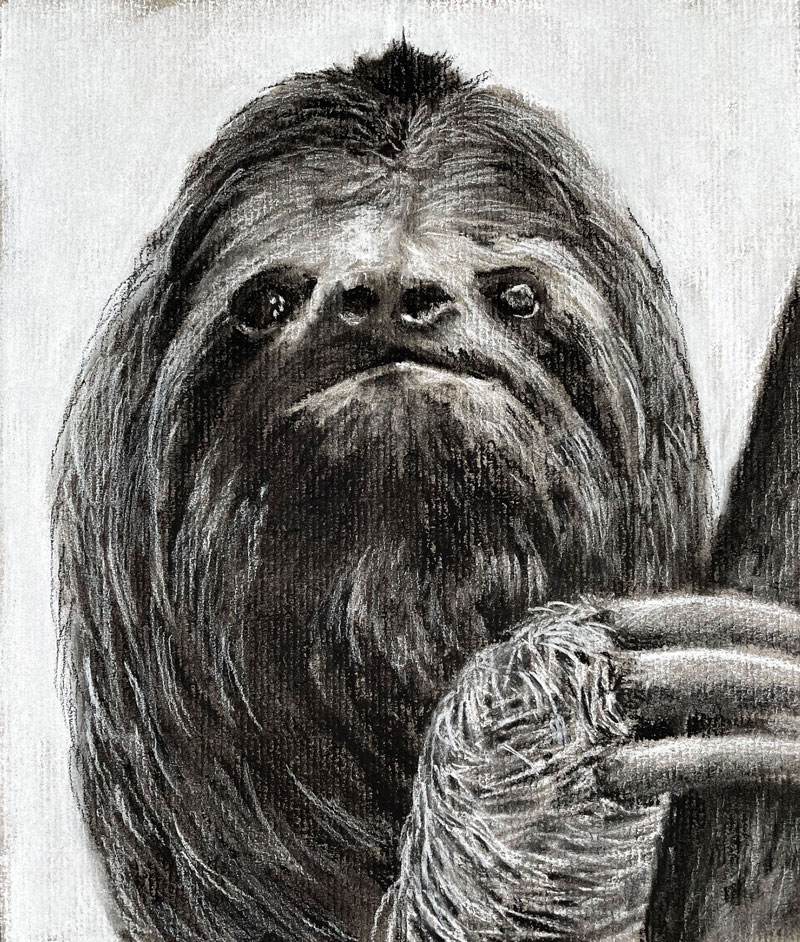
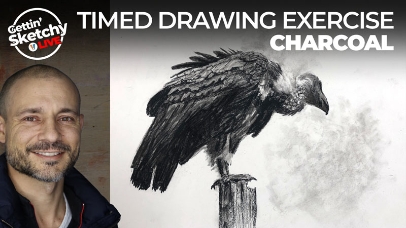
How to Draw a Sloth with Charcoal – Timed Drawing Exercise
Gettin’ Sketchy – How to Draw a Sloth with Charcoal – Season 4 Episode 1
This episode aired live on YouTube on June 2, 2021.
Gettin’ Sketchy is broadcast live on YouTube. In each episode, we try to create a drawing within a timed period – usually 45 minutes. While 45 minutes isn’t really enough time to create a “finished” drawing, it’s enough time to create a looser sketch. Depending on the medium used, some drawings appear more finished than others. Gettin’ Sketchy is about having fun, practicing drawing skills, and providing tidbits of drawing instruction.
While the focus of Gettin’ Sketchy is about speed, it’s only fitting that we draw a very slow animal. In this lesson, we’ll draw a sloth with charcoal.
Here’s a look at the completed image…
Drawing with Charcoal
Charcoal comes in several different forms, each with their own strengths and weaknesses. In this lesson, vine charcoal, compressed charcoal, and white charcoal are used on gray toned paper. Since the vine charcoal is loose and easily erased, it is used first to create somewhat of an underpainting.
Compressed versions of charcoal follow after the vine charcoal to define and refine the details of the sloth. Compressed charcoal is more difficult to erase than vine charcoal, but it is much darker and less powdery.
With charcoal especially, a kneaded eraser is a valuable tool. In this case, the eraser is used to remove charcoal material to create grays and to keep the drawing tidy throughout the process.
See also: All About Drawing Papers
The toned surface allows us to push values as the drawing develops. Since the paper is gray, we can begin with medium grays and gradually extend the value range by adding both lights and darks. This is an advantage that we don’t have when we work on white paper but it also means that we must use a medium that can produce light values as well as dark ones. In this case, the white charcoal serves to develop the lighter tones.
See also: 6 Reasons to Draw on Toned Paper
Here are a few lessons and lesson series that provide more information on charcoal and its usage. Some of these lessons require membership…
- How to Draw a Raven with Charcoal
- The Secrets to Drawing – Charcoal (Membership Required)
- Charcoal Drawing Techniques
- How to Draw an Ostrich with Charcoal – Lesson Series (Membership Required)
- Landscape Drawing with Charcoal – Lesson Series (Membership Required)
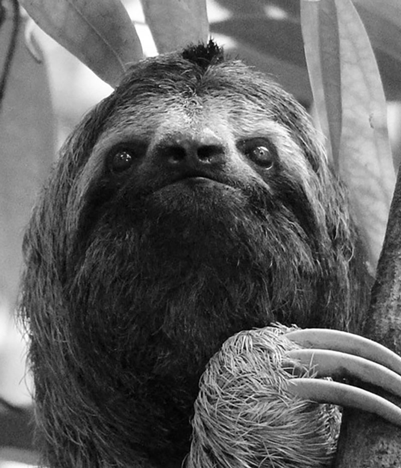
Photo Reference
A reference photo was used to develop the drawing of a sloth. The original image featured the entire body of the sloth. Since I wanted to focus on only the head and claws, the original image was cropped. The original image comes from Pixabay.com
Here’s a look at the photo reference…
How the Drawing Develops
The approach I take to create a drawing changes slightly or dramatically depending on the medium chosen and the subject. However, in most cases, I like to define the overall shapes of the subject and gradually refine the contours before moving on to the finer details.
This often means that I will start from the outer contours (or outlines) of the subject and work my way in. This approach to drawing is often called “construction”.
See also: Drawing Basics – Construction
This is not the approach I took with this subject. Instead, I began with the eyes and nose and worked outward. I choose to work in this manner because I noted a clear relationship between the locations of these features and I knew that this area would become the focal point of the drawing.
This is a unique example of taking a different approach to laying out a drawing, but still getting similar results. In this case, I noticed that the eyes of the sloth are on a similar “line” as the nose, with the mouth just below it. This was an easy and natural place to begin making marks and more importantly, making comparisons.
We know that drawing is about observation. And close observation requires making comparisons. As we work through a drawing, we make comparisons to portions of the drawing we have already established. But we must begin somewhere and have some visual information place in order to make these comparisons. In this way, the starting point for this drawing begins within the outer contours and the comparisons expand outward from there.
Drawing a Sloth with Charcoal – Conclusion
When we draw any subject, we improve. Often the most challenging subjects present the most opportunities for growth and development. But no matter how difficult the subject may be or the challenges presented by the medium, the most important factor for improvement is action. Practice is key to improving your drawing skills. The more that you draw and the more that you challenge yourself with the subjects that you chose, the faster your drawing skills will develop. Even sketching for just 45 minutes forces you to work the same observational “muscles” that you use to create longer, more finished drawings. Even if your life is very busy and you wish to improve your drawing skills, then time to practice for just 45 minutes should be easy to find.
If so, join over 36,000 others that receive our newsletter with new drawing and painting lessons. Plus, check out three of our course videos and ebooks for free.
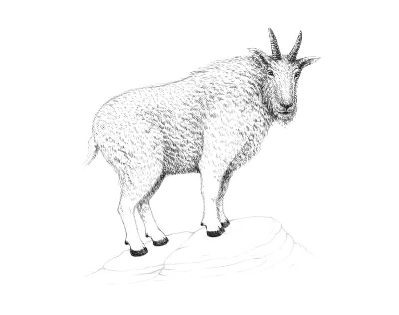
How to Draw a Goat with Pen and Ink
On top of this, these charming creatures make good companions for people and other animals.
Today’s drawing lesson is dedicated to goats. More precisely, we’ll be drawing a mountain goat. It is also known as the Rocky Mountain goat.
Technically, mountain goats are not in the same genus as true goats. They belong to the Bovidae family, just as their mentioned relatives. Most likely, mountain goats share a common ancestor with true goats and sheep.
Within the Bovidae family, mountain goats are associated with antelopes, gazelles, and cattle.
Anatomically, the appearance of true goats and mountain goats is quite similar. Both demonstrate woolly coats, cloven hooves, and the signature curved horns.
The more significant distinction between these two groups is habitat. Mountain goats live in alpine and subalpine environments. They mainly reside among the mountain peaks of North America.
The high elevation protects theses animals from predators. Mountain goats are capable climbers. They are adapted to the insecure footholds of cliffs that are covered with ice and snow.
I hope that this introduction was interesting enough to make you excited and inspired to draw a goat. Let’s begin our drawing session! We’ll learn some other facts along the way.
Art Supplies For Drawing a Goat with Pen and Ink
We’ll start with a graphite pencil underdrawing, so keep an ordinary HB pencil and an eraser at hand.
I’ll be drawing on an A4 sheet of paper with a smooth surface.
For the inking part, I’ll be using two ink liners. Their sizes are 0.05 and 0.1. A combination of a dip pens and liquid black ink is also an option.
Drawing a Goat with a Graphite Pencil
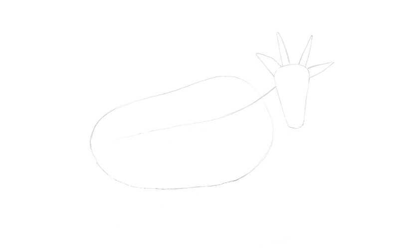
I’ve chosen a pose with a slight inclination. This pose will make our artwork more dynamic and eye-catching. The goat will be standing on a rock and looking at the viewer.
Our first task is to create a stylized framework of the animal’s body. I start with simplified shapes that mark the position of the goat’s elongated head, horns, and ears. Mountain goats have thinner, lighter skulls than true goats. Also, their horns grow shorter, slenderer, and pointier than those of true goats.
It’s interesting to know that, unlike true goats, mountain goats do not butt heads. Instead, they stab each other with their horns – ouch.
At this stage of the process, the marks can be rough and sketchy.
I add a long core line that indicates the direction of the animal’s body.
The body is marked with a long elongated shape. Mountain goats have two types of fur, so their woolly coats are thick and shaggy. This feature is quite beneficial, as these animals live in a cold environment. Our shape also includes some space for the fur.
I mark the eyes, nose, and mouth, using subsidiary lines. There is a significant distance between the eyes’ level and the nose. Keep in mind that one side of the head will be less visible due to foreshortening.
See also: Drawing Basics – Construction
I create a simplified shape of the neck by joining the head and the body with two lines. Then I mark the short tail.
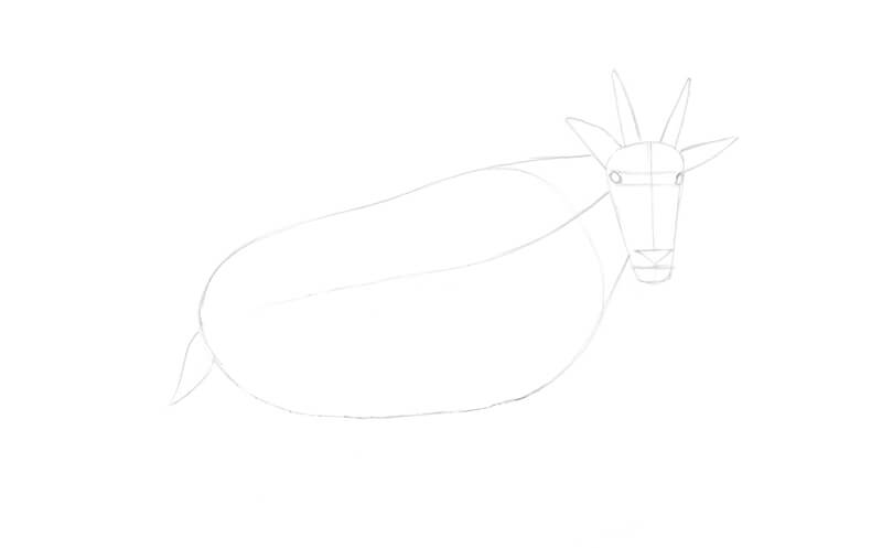
Let’s add a framework for the limbs. I mark the joints with circles.
For the forelimbs, the joints include the shoulder, elbow, and knee. (From top to bottom.) The joints of the back legs are the hip, stifle, and hock.
The shapes at the lower ends of the legs mark the hooves.
I add two inclined lines under the goat’s feet. They outline the direction of the underlying surface, so the pose becomes steadier.

I draw the contours of the limbs.
The areas near the joints are thicker, more prominent. Some parts, like hock or elbow, show an angular curve.

I refine the head and add the pupils and the ear openings. I also widen the area of the muzzle, but it’s still quite slender.
By the way, horizontal pupils enable panoramic vision, allowing the animals to notice danger as soon as possible. Such a shape supports an enhanced image quality of the objects that are directly ahead of the animal. Horizontal pupils also allow for more light to enter the eyes.
See also: How to Draw Animal Eyes with Pen and Ink
We no longer need the subsidiary lines, so I erase them.
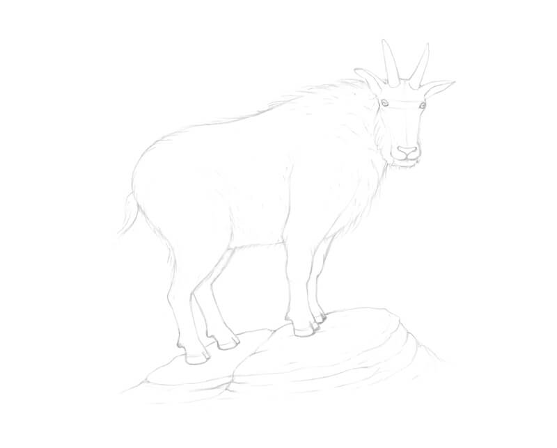
After refinement, the contours have become smoother and more polished. I add the strands of long fur that are framing the lower sides of the head. They are more visible at the side that is closer to the viewer.

I refine the contours of the body and legs. The long, shaggy fur affects the appearance of the silhouette, so I remove the initial continuous line and replace it with a set of marks that imitate hairs.
I change the hooves, too. There are two toes on the front side of each hoof. They can spread out to improve balance.
I also add the dewclaws. They can be found on the back of the goat’s feet and help to prevent slipping.

As a finishing touch, I add the contours of rocks under the feet of our animal.
The underdrawing is complete!
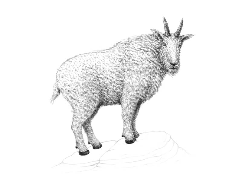
Drawing a Goat with Ink Liners
Mountain goats have beautiful fur coats of white or cream color. No doubt that this light coloration provides excellent camouflage among the snow!
As we’re going to use black ink to complete the drawing, working gradually should be our core principle. It’s always possible to add more lines, but removing the excessive marks can be extremely difficult.
See also: How to Fix Mistakes in a Pen and Ink Drawing
There are folds of fur in the neck area and also near the upper parts of the legs. With 0.05 ink liner, I mark the darker, deeper areas in the goat’s coat.
I work with groups of short lines. There may be some variation in direction, curvature, and length. In general, the marks follow the contours of the goat’s body.
The upper part of the body gets more light from the natural environment. In that area, much of the paper may be left untouched.
Also, I start creating the main contour of the animal’s body. Long lines imitate the flow of hairs.
In the image below, you’ll find samples of the fur texture and the enlarged contour.

With 0.1 liner, I draw the eyes. Then I darken the nose, mouth, and ear openings.
I draw the contours of the horns with an interrupted line and mark the texture of the yearly growth rings. Fur overlaps the foundations of the horns, so avoid any harsh outlines there.
With short marks, I start creating the texture of the head’s coat. In some areas, the lines resemble dots. (The image below, point a.)
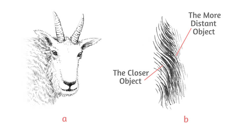
Now let me explain the concept behind the other illustration (point b) in the image above.
Although the fur’s local color is light, it may look much darker in the shadowed areas.
Besides that, sometimes we deal with two objects that have a light local color. Let’s imagine that the first object is closer to the viewer and the second one is more distant. (Like, in our case, the closer and the farther leg of our mountain goat.) We should increase the contrast to make a distinction between the objects.
Here’s a tip that helps to set the planes visually. It also allows conveying the feel of the fur texture.
The lines used for the closer object should imitate the texture – in our example, the hairs. When working on the farther objects, place ink marks in the gaps between the hair-like marks of the closer object’s contour. The lines that cover the farther object should be more unified.
We’ll use this technique when working on the goat’s legs. The folds in its coat require a similar approach.
I continue adding groups of short hatches with 0.1 liner. I work on the body. The deeper areas of folds in the coat (neck and belly) get an accent.
I create soft shadows that separate:
- the head and neck
- the belly and the upper legs
I darken the legs that are farther from the viewer. I make sure that the hairy contour of the legs closer to the viewer remain readable. We don’t have to be perfectly precise with our marks or draw every single hair or strand. The goal is to create the illusion of fluffy fur wrapping up the limbs.
I also accent the hooves, covering them with layers of cross-hatching. Horizontally-oriented lines are slightly curved. They repeat the contours of the hooves.

With a 0.05 liner, I add more lines to the head. The muzzle becomes slightly darker. This shift conveys the transition between the planes – it is assumed that this area receives less sunlight.
The sides of the nose become covered with short hatches while the marks follow the direction of the fur. The central part of the nose is worthy of the most delicate lines. They are very short, resembling dots.
I make the beard slightly longer.
I darken some areas of the fur on the head. This change is minor. The subtle contrast creates a hint at irregularity that is typical for natural textures.
I add layers of contour hatching to the horns, giving them more volume. One side of each horn is slightly lighter.
With a 0.05 ink liner, I work on the legs in a similar manner. New marks support the existing ones and contribute to the overall look of the texture.
Be patient, as drawing fur often requires a lot of time and effort.
I add some long lines to the lowest area of the belly to accent the form and emphasize its direction. These marks also strengthen the core shadow.
There are deep folds of the fur in the bottom part of the goat’s body. We remember that although the coat is light in value, it may look significantly darker in a shadowed area. I make sure that even the lighter, more prominent parts of the folds, are not too bright. They shouldn’t distract the viewer’s attention.
The hatches that I add to the lower parts of the legs are plain and unified. The fur is shorter there, and the contours reflect this change. You may need to add some contour hatching to the areas near the hooves to give the limbs more volume.
It’s time to complete the fur on the goat’s back and rump. These sections are lighter, so I’m going to leave much of the paper’s surface untouched.
With a 0.05 liner, I add more short lines to the mentioned areas. In the image below, you’ll find a close-up sample of this texture.
I add some short lines along the contour of the goat’s back. They create the illusion of light coming through the hairs.
The components of the head (eyes, nose, and horns) and the hooves are my reference points in terms of value and contrast. They should be dark enough to emphasize the lightness of the fur.
At the end of this stage, we should get a nice, soft gradient from the lighter top of the animal’s body to its darker bottom. Squint your eyes softly and look at your artwork. Do you like the resulting value transition? This simple trick will help you to determine whether you need to add more ink marks.

With a 0.05 liner, I add long, mostly parallel, lines to the stones. The marks repeat the direction of the planes. The darker areas of the relief get an additional layer of hatches.
I use fewer lines in the bottom part of the drawing. This trick creates the impression of a transition of value.

With a 0.05 liner, I work on the details of the rock texture. The goal is to give some interest and credibility to the environment, leaving the goat as a focal point. Be careful not to overdo this element. A few cracks and hollows will be enough.
I darken the area right under the animal, strengthening the cast shadow.
I evaluate the artwork once again. It is complete!

How to Draw a Goat with Pen and Ink – Conclusion
Congratulations! We’ve created a beautiful drawing of an interesting mountain goat. I hope that you’ve enjoyed our creative journey – and also learned a couple of useful things!
I wish you much inspiration for your future art projects and pen and ink drawings. Have fun and enjoy your work!
If so, join over 36,000 others that receive our newsletter with new drawing and painting lessons. Plus, check out three of our course videos and ebooks for free.
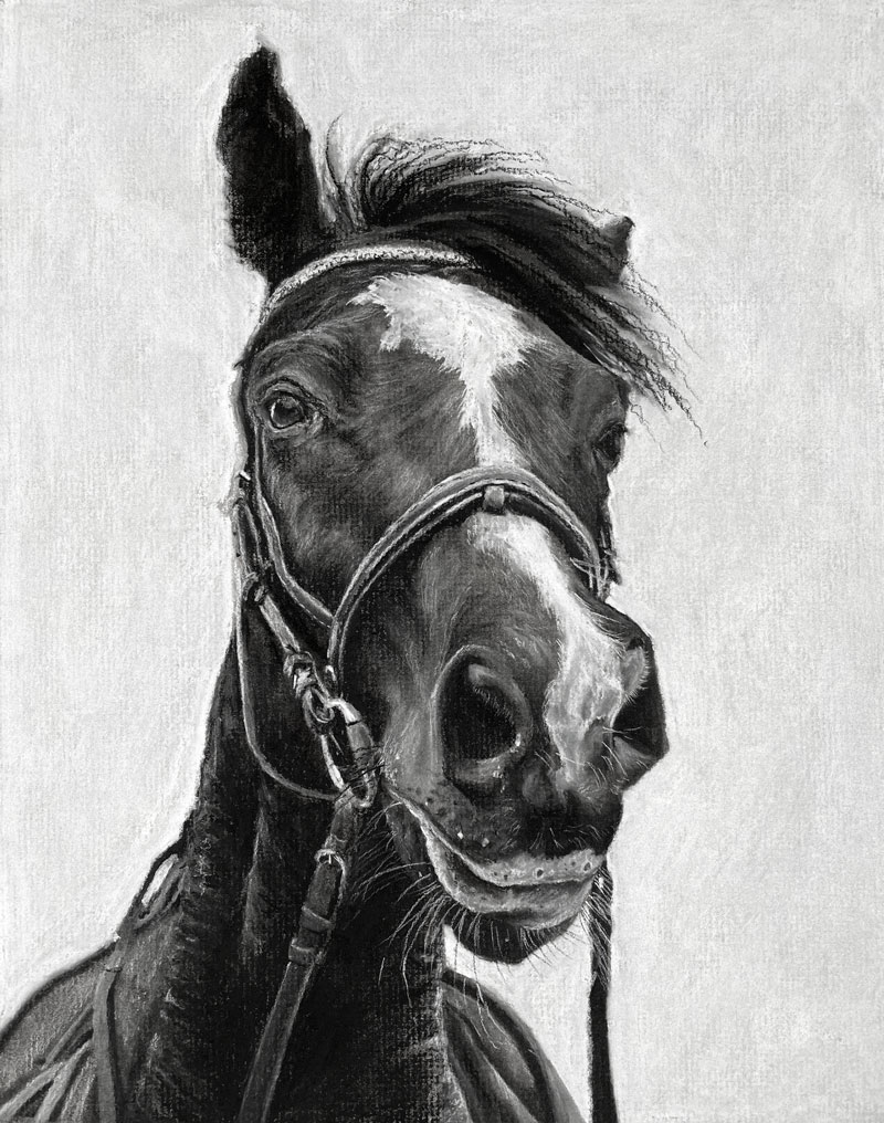
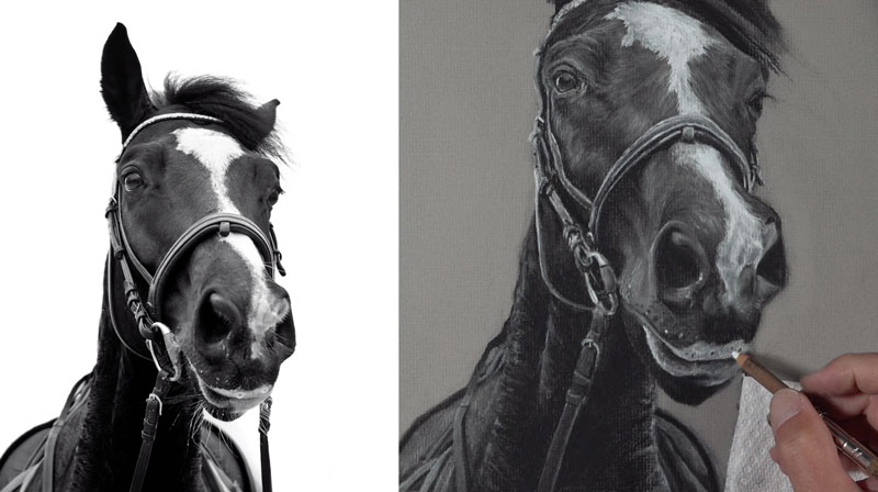
How to Draw a Horse with Charcoal
Drawing a Horse with Charcoal
Horses are wonderful creatures. They combine an element of gracefulness with strength and beauty. In this drawing lesson, we’ll take a look at the process of drawing a horse with charcoal on toned, gray paper.
Here’s a look at the completed drawing…
Materials and Surface for Drawing a Horse
Charcoal is an inexpensive, traditional drawing media. Yes, it can be dusty and a little messy, but this is a small price to pay for the forgiveness and versatility of the medium. Plus, if the correct paper is used, then the messiness is greatly reduced.
In this lesson, we’ll use charcoal in various forms to complete the drawing. Vine charcoal is used in the early stages while compressed charcoal is used in the later stages.
Vine charcoal is soft and brittle. It’s easily spread, erased, and manipulated on the surface. This makes this form of charcoal best suited for the initial marks.
Compressed charcoal is darker and harder than vine charcoal. Unlike vine charcoal, compressed charcoal is more difficult to erase. For this drawing, we use compressed charcoal in pencil form.
See also: Charcoal Drawing Techniques
White charcoal is also used to address the lighter values and to produce a variety of grays. This material isn’t truly charcoal and the make up of this material is considered a “trade secret”. However, it does behave in a similar manner as compressed charcoal, so its use is best reserved for the later stages of the drawing.
As I mentioned before, the surface is important for a few reasons. The texture of the tooth of paper plays a role in how the medium behaves. Smoother surfaces will not hold charcoal, making the process messy and dusty. Papers with a heavier tooth will help to hold the material in place, reducing the dust. For this drawing, gray Canson Ingres paper is used. It has a similar tooth as traditional charcoal paper. Both papers feature a laid pattern.
See also: All About Drawing Papers
(The following links are affiliate links which means I make a small commission if you purchase at no additional cost to you.)
- Vine Charcoal
- Charcoal Pencils
- White Charcoal
- White Charcoal Pencils
- Canson Ingres Paper (Gray)
- Blending Stumps
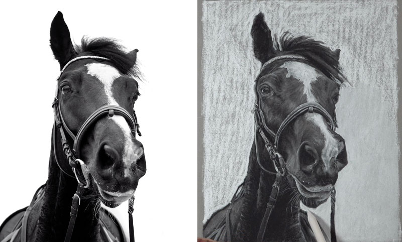
Drawing with Values
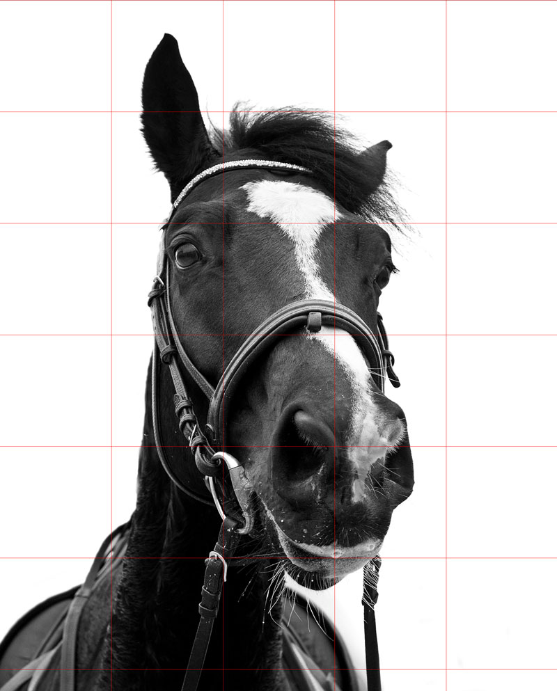
To ensure accuracy in our drawing, the grid technique is used. For this approach, a grid is created over the reference image. A corresponding grid is created on the drawing surface. We are then able to observe the visual information in each square and transfer the information to the drawing surface.
Here’s a look at the reference image with a grid placed over it…
A white charcoal pencil is used to create the grid on the drawing paper. Graphite is avoided since it is a different medium and some of the grid lines may be visible when charcoal is layered. A very light touch is used with the white charcoal pencil so that the lines are just barely visible. This will ensure that the grid lines are easily removed when they are no longer needed.
We can begin anywhere on the drawing surface, but since I am right-handed, I decided to start in the upper left corner and work downward and to the right. This helps to keep my hand out of the way as I work.
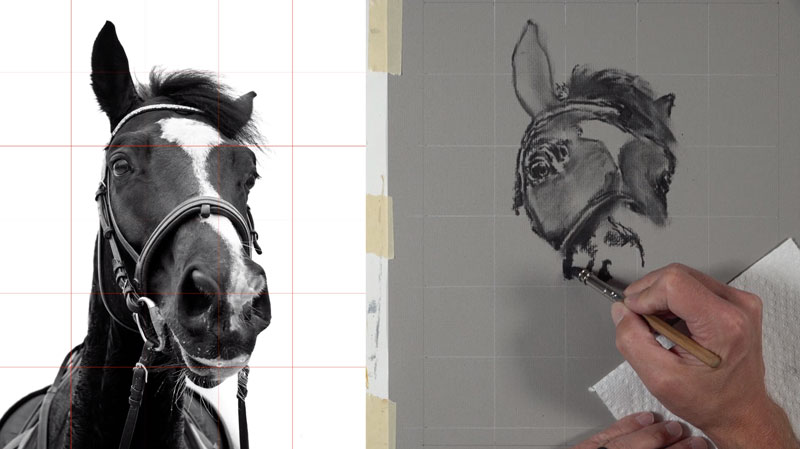
Due to the nature of charcoal, more than the contour lines are addressed in this early stage. As you can see, some information about the values are added. Since vine charcoal is so easy to erase, we can smudge and move the material around on the surface.
We can continue with this loose application of the charcoal, working our way down the body and the picture plane. At this point, I’m not concerned with the details – just the values, the contours, and shapes.
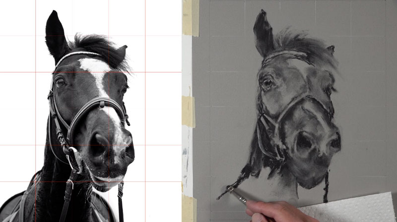
Once we have the basic shapes and some of the preliminary values in place, we can clean up the background with a kneaded eraser. As you’ll note, this eraser is used for more than just clean up. It is also used to manipulate some of the shapes of values as the preliminary drawing is developed.
All of the remaining grid lines in the background are erased. Since we have the basic shape of the horse defined, we no longer need them.
Drawing the Details of the Horse
Now we’re ready to begin developing the details of the horse with applications of compressed charcoal. We can think of the drawing that we have in place at this point as an “underpainting”. We’ll continue to manipulate the shapes and values as the drawing continues.
Since the eye of the horse is a natural focal point, I decide to begin here. By alternating between white and black charcoal, we can slowly broaden the range of value as we address the texture and subtle details.
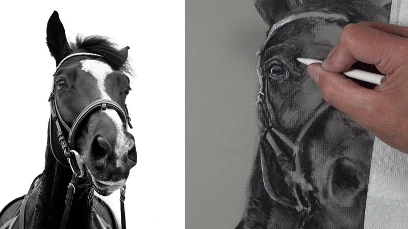
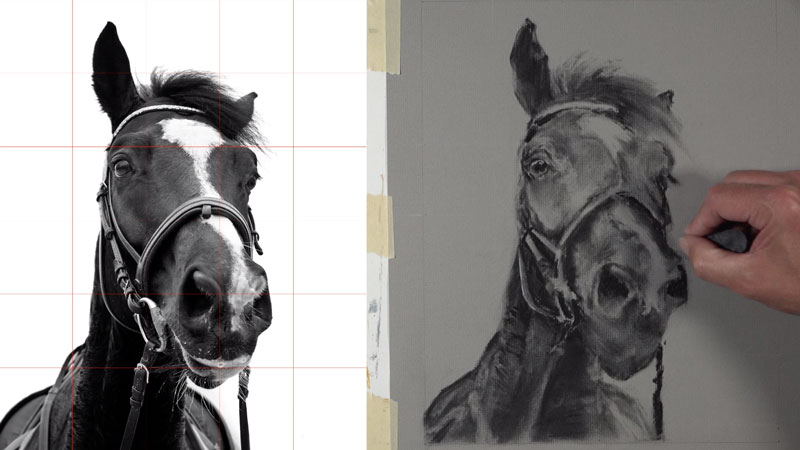
As we continue to work our way outward from the eye, we should consider the directional strokes that we make with both the pencils and the blending tools. The hair of the horse flows along the form of the head. This creates subtle indications of direction. Our marks and blends should reflect this. Ensuring that our marks flow in unison with the hair helps to create the illusion of texture and form in the drawing.
For the large shape of light value in the center of the head, a stick of white charcoal is applied. This white charcoal is slightly more intense that the white charcoal pencil and covers a larger area.
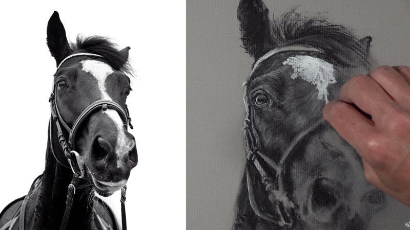
It’s easy to assume that every single detail must be included in order to develop a representational drawing. Thankfully this isn’t the case. As long as we capture the general shape and relative value of the subject or objects, then our drawing will be successful. We can see an example of this with the harness and saddle.
In this area, the details are suggested rather than replicated exactly. This ensures that attention is not pulled from the head of the horse. The harness is a supporting element and not the “star of the show”.
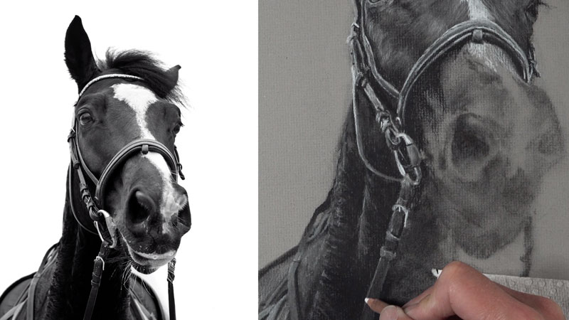
We’ll slowly work our way over to the snout of the horse, gradually building out a range of value. The snout of the horse protrudes out. This creates a bit of distortion called foreshortening. Since a grid was used to create the preliminary drawing, this should already be worked out.
However, in order to create an even greater illusion of space, we should slightly broaden the range of value and create more contrast here. Objects that are closer to the viewer usually feature stronger contrast in value and higher levels of contrast.
The details should also be slightly more developed here as well.
Addressing the Background
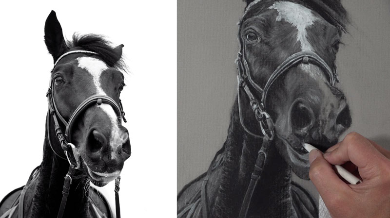
Once we have refined the drawing of the horse, we can consider the background. In this drawing, the background is acceptable left as the raw, gray paper. However, I decided to add a bit more contrast to make the horse stand out by covering the background with white charcoal.
The application of white charcoal alone is acceptable in the background and creates the necessary contrast. However, by blending with a blending stump, we can make the background recede even further. This increases the illusion of space in the drawing.
Once the background is in place, we’re ready to put the finishing touches on the drawing. Some of the hairs and whiskers are added with a sharp charcoal pencil, overlapping the background.
How to Draw a Horse with Charcoal – Conclusion
Now our drawing of a horse is complete. Here’s another look at the completed drawing…
Charcoal is a wonderful medium for drawing. The rich blacks and forgiveness of the vine charcoal allow us to develop convincing drawings in a short period of time compared to other drawing mediums. The nature of charcoal as a medium also helps us to bridge the gap from drawing to painting. Layering is important with charcoal as it is with opaque painting mediums. Sure, it’s a little messy. But with the right paper and patient applications, charcoal is an excellent drawing medium.
If so, join over 36,000 others that receive our newsletter with new drawing and painting lessons. Plus, check out three of our course videos and ebooks for free.