Combining Markers and Colored Pencils
Some mediums simply work well together. One such combination is alcohol-based markers and colored pencils. However, we must consider the order in which we develop a drawing with this combination of media. The markers are typically added before the colored pencils. This means that the marker drawing becomes an underpainting, leaving the details and more intense colors to the colored pencils.
See also: Combining Markers and Colored Pencils
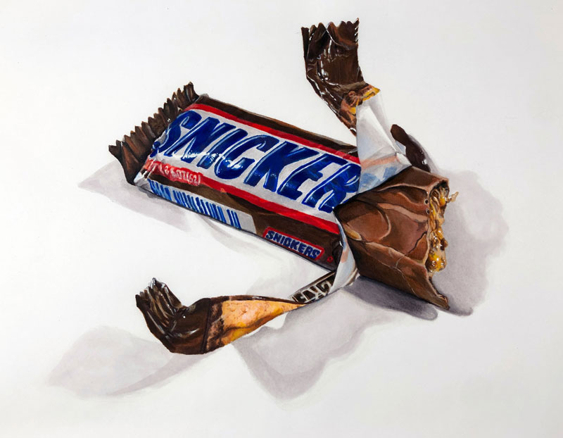
In this lesson, we’ll take a look at my process for combining markers and colored pencils to create a realistic drawing. We’ll draw a deceptively complex candy bar. Here’s a look at the completed drawing…
Materials and Surface for this Drawing
Before we dive into the drawing process, we’ll first take a quick look at the materials and the surface we’ll use. While you’re free to use any brand of markers and colored pencils, it’s important to use alcohol-based markers. These markers differ from their water-based counterparts in both performance and price.
Alcohol-based markers produce translucent marks that build in intensity with each stroke layered. Water-based makers do not behave in this manner and instead, produce fairly opaque marks with one pass. This means that alcohol-based markers give the artist more control, but this added control does come at a higher price. (The following links are affiliate links which means I make a small commission if you purchase at no additional cost to you.)
- Staedtler Lead Holder with 2H Graphite
- Alcohol-Based Prismacolor Premier Markers
- Prismacolor Premier Colored Pencils
- Canson Marker Paper
- White Gouache
Marker paper is semi-translucent. This is an advantage for illustrators wishing to transfer sketches or photos to the surface. This paper is designed to absorb the applications made by the markers, reducing any bleeding that may normally occur on standard drawing paper.
See also: All About Drawing Papers
This paper, however, is fairly smooth with a relatively weak tooth. This means that the number of layers of colored pencil applications that you can add is reduced. This will not be an issue since we are using the marker applications as fairly developed underpainting.
Sketching the Candy Bar with Graphite
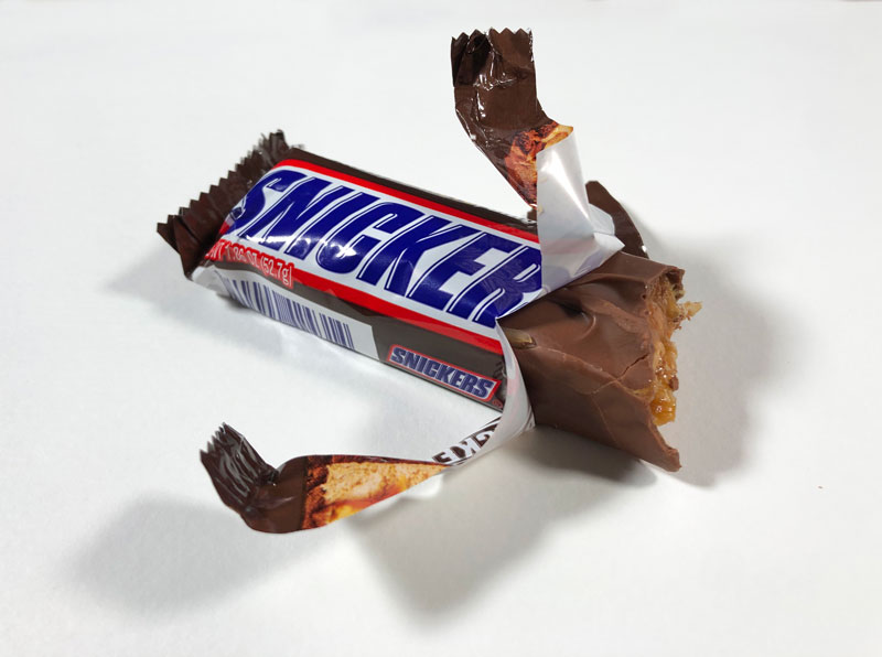
Clearly, a photo reference is used to create the drawing. In this case, I simply purchased my favorite candy bar from the store, took a delicious bite, and snapped a photo. Here’s a look at the reference image…
The Contour Line Drawing
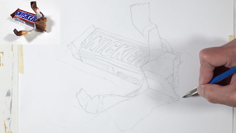
Since we’re striving for realism in this image, we’ll first transfer the subject onto the marker paper. There are several ways to do this. In this case, I chose to use a light board. But even with a light board, some of the details are lost. For this reason, I refined the contour line transfer by observing the reference photo.
A note on tracing – I won’t go too deep here into the process of tracing and the unnecessary debate on its usage in the art creation process. The reality is that tracing (or some form of ensuring accuracy in a contour line drawing) is used often by professional artists and illustrators. It has been used throughout history as well.
See also: Is It OK to Trace in Art?
Even though the contour lines have been transferred, the drawing must still be developed through careful observation and mark making with markers and colored pencils. If your goal is to develop your observational drawing skills, then yes – you should not trace. But this is not the focus of this work. Our goal is realism.
Since we want the contour line drawing to be fairly light, a 2H graphite pencil is used to trace the image and then refine the drawing freehand. Here’s a look at the contour line drawing…
Creating an Underpainting with Markers
As it is with other forms of mixed media, we’ll use the strengths of each our mediums to make up for the weaknesses of the other. In this case, the markers cover areas quickly but it is difficult to develop delicate details due to their tendency to bleed. Colored pencils, on the other hand, are slow to cover larger areas but are excellent at developing details.
Since the colored pencils can be used over marker applications, it makes sense to use the markers to develop an underpainting. We can then apply colored pencils over the top, allowing bits of the marker underpainting to influence the color.
Generally speaking, we’ll think in terms of value and shape to develop the marker underpainting. We’ll observe the shapes of different values of color and attempt to mimic or even exaggerate what we observe in our drawing.
For the most part, we’ll choose at least three colors for each section on the candy bar. One color should be a midtone with a lighter and darker version. This will provide us with a range of value for each color. Of course you’re free to take this further with a broader range of tone.
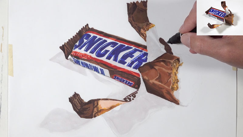
We can begin anywhere we wish. In this case, I chose to start with the brown sections of the wrapper. From there, I progressed on to the text.
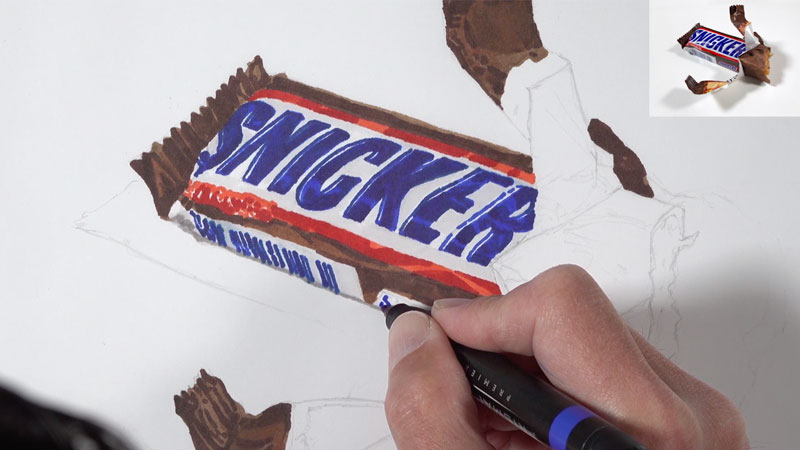
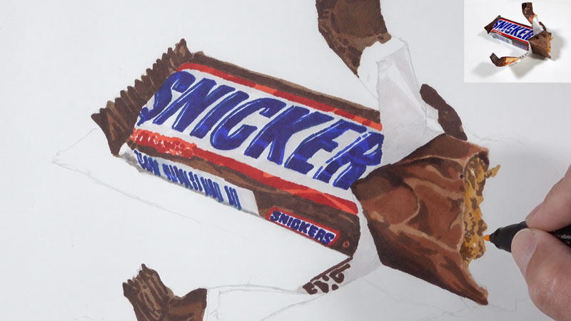
As we continue to develop the marker underpainting, we’ll address the exposed chocolate and filling. For the chocolate, similar colors are used as those applied to the wrapper. However, we need to ensure that the final color contrasts that of the wrapper. To achieve this, we’ll start with a different base – Light Tan. We’ll also push the chocolate to be more red by allowing the Sienna Brown to dominate.
As we did with the wrapper, we’ll gradually bring out the form and texture of the chocolate by layering shapes of colors of differing values.
For the delicious filling, we’ll focus on using colors that are more yellow – even though the colors in our reference are fairly muted. Browns are used to create contrast which leads to the illusion of texture. Since this areas features moist caramel, some open areas are left to give the impression of highlights.
It’s only natural that we assume that “white” parts of a subject should be also be white in our drawing. However, if we look a little closer at “white” areas, we’ll often notice a bit of color. Sometimes, these light values are cooler and sometimes they are warmer. Often, we can determine whether we want them to be warmer or cooler.
Many times, we can address these “white” areas with grays. Grays can be warmer or cooler depending on whether the black used to mix them is dominated by brown or blue. Professional colored pencil and marker brands offer a range of grays – some cooler and some warmer. Prismacolor labels their grays with percentages based on the intensity of darkness. For example, 70% Warm Grey is a darker and warmer gray compared to 20% Cool Grey.
See also: Warm vs. Cool Grays
For this drawing, I chose to work with warm grays in the “white” areas. I decided to work with warm grays due to the fact that most of the other colors are warm. We can see this warmth int the browns in the wrapper, the reds in the logo, and the blues in the text.
Now, you may say, “The blues? Aren’t they cool?” Yes, blue is a cool color. But blue can lean warmer or cooler. In this case, the blues we’re using lean warmer. Ultramarine is a warmer blue than Cerulean, for example. This means that working with warmer grays will help to unify the image.
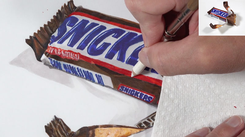
In the “white” areas on the wrapper and for the shadowed areas, 20% Warm Grey is applied, creating subtle shifts in value and color. This may not seem as though this color makes a big difference, but when the final highlights are added, we’ll notice the contrast.
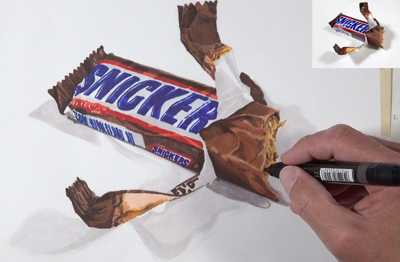
We’ll continue on developing the marker underpainting by addressing the details of the wrapper and increasing the contrast in areas. You can take the underpainting as far as you wish. The more refined and detailed your marker underpainting is, the better your final drawing is likely to be.
Layering Colored Pencils
With the marker underpainting complete, we’re ready to layer colored pencil applications over the top. The colored pencils will allow us to develop the details while intensifying colors and broadening the range of value. The addition of colored pencil applications will also add depth to the color which leads to more convincing realism.
We can begin with colored pencil applications anywhere we wish. In this case, I chose to start in the same place I began with the markers – on the brown parts of the label. As we did with the markers, we’ll focus on using several colors for each section. Again, we’ll choose a midtone and a lighter and darker version. In some areas, a broader range of value and color are used. Remember, more layers = more depth = more realism.
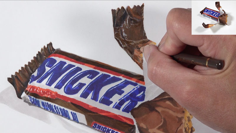
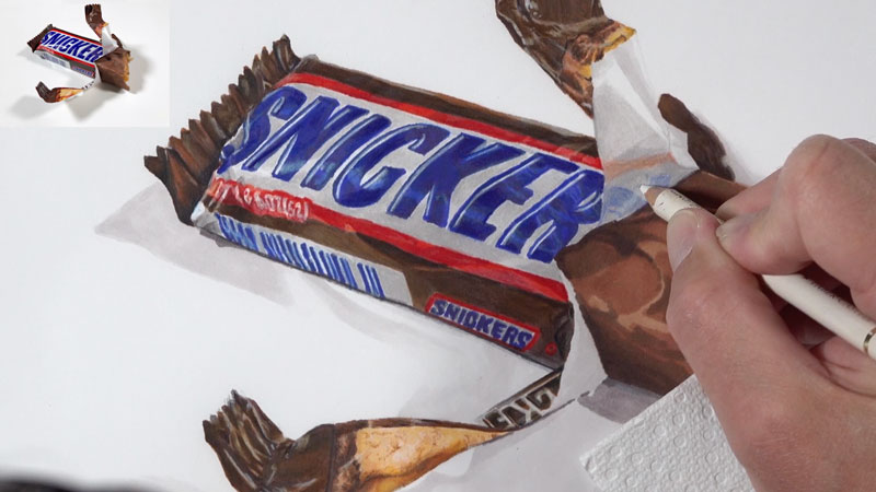
It’s important to note that “black” is not used in this drawing. Instead, a more natural black is created by mixing colors. Dark browns are first used to address the darkest areas on the wrapper. In order to make the shadows as dark as they need to be, Indigo Blue is layered over the top. The dark blue and brown mix to create a more natural looking black, which appears as a more natural looking shadow.
We’ll continue on by addressing the photos on the wrapper. For these types of details, it’s best not think about what you are drawing, but instead focus on the colors and shapes that you observe. If you stay true to what you see, then the result will be quite convincing.
One of the factors that affects the realism of a drawing is the subtle nuances of value. In reality, we often don’t notice these subtle shifts of value and tone. But in a drawing, we can exaggerate them to a degree, making the drawing more interesting and realistic.
In this case, you’ll notice that I am exaggerating the changes in value on the candy bar wrapper by increasing the contrast between colors that are mostly very similar. This can be achieved by “beefing up” the highlights and darkening the colors around them.
We’ll next address the blue text and red portions of the logo, again using a range of color with slightly different values. As we intensify the color in these areas, we’ll also refine the details and sharpen the edges.
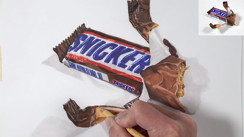
Just as we did with the marker applications, we’ll address the “white” areas with a warm gray. Most of these “white” areas are addressed with 20% Warm Grey and then burnished with a colorless blender to smooth the texture.

One such “white” area can be found where the wrapper is torn. Here we see some of the text showing through. The blues and reds here should be slightly different than what is observed on the main portion of the label. Instead of layering a combination of colors, as we did with red and blue areas, we’ll only use one light layer of the color. Gray and white is layered over the top, along with a bit of the colorless blender to smooth the application.
Working our way from the left to right, we’ll next address the chocolate and the filling. Again, we’ll use a collection of colors that compliment and add complexity to the colors found in the marker underpainting. Lighter values are used for the raised portions. Reddish browns are used for the midtones and darker browns are used for the recessed areas and shadows.
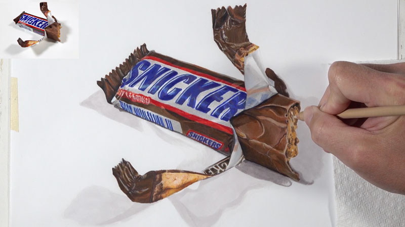
This same process is used for the filling. We’ll begin with the lighter values since it’s easier to make an area darker. Again our colors are slightly more intense than the colors we observe. The observed colors are rather muted. By exaggerating the colors slightly, our drawing is more interesting.
Darker areas within the filling are carefully added with touches of dark brown.
Finishing with Strong Highlights
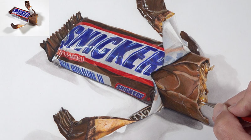
Strong highlights are difficult to achieve with colored pencils alone. When working on white paper, we could preserve the strongest highlights by leaving these areas open. But this is also very difficult to do – especially when using more than one medium. These highlights are essential in creating a realistic drawing, so they must be included. These highlights are the result of light reflecting off the reflective wrapper and moist areas in the filling.
Thankfully, we can use gouache directly over the colored pencil applications to develop very strong highlights. Gouache is opaque watercolor. But unlike traditional watercolor, gouache can be applied over wax-based colored pencils.
Using minimal amounts of water, white gouache is applied with a small round brush to accentuate the strongest highlights. The result is the illusion of a reflective candy bar wrapper and moist, candy filling.
Realistic Drawing with Colored Pencils and Markers – Conclusion
Now our drawing is complete. Here’s another look at the completed drawing…
As you can see, this process does require patience. You are essentially drawing the subject several times with different media. But with each layer, you become more familiar with the subject. The time you invest in the drawing does pay off in the end so work slowly and take your time. Breaks are essential.
If so, join over 36,000 others that receive our newsletter with new drawing and painting lessons. Plus, check out three of our course videos and ebooks for free.