Painting a Desert Landscape with Pastels
In this pastel lesson, we’ll take a look at developing a desert scene with pastels on PastelMat paper. We’ll work in a specific order, addressing the background first, followed by the middle ground, and lastly – the foreground. Although we’ll mostly focus on local color (observed color), we’ll also pull out a color scheme of secondary colors to create additional contrast, while ensuring harmony.
Art Materials for this Lesson
Both traditional stick pastels and pastel pencils are used to complete the desert scene. Mostly pastels are used, but the pencils come in handy for details. Rembrandt pastels and Carbothello pastel pencils are used in this case, but any brand can be substituted.
This work is painted on PastelMat paper (light gray surface). This paper features a tooth similar to ultra fine grit sandpaper. As a result of the texture, colors can be easily layered while keeping the dust to a minimum. Keep in mind that the surface in which you choose to work is just as important as the medium. The surface has a huge impact on how the medium behaves and the final result.
(The following links are affiliate links which means that I make a small commission if you purchase without an additional cost to you)…
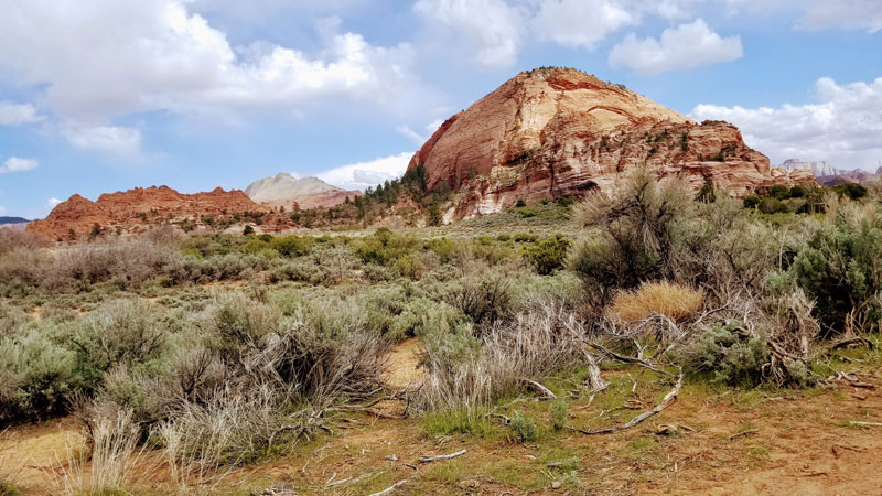
The Photo Reference
The photo reference used in this painting comes from Pixabay.com. As you’ll notice, we use the photo reference for the layout, textures, and value relationships. However, during the execution of the painting, changes are made and the reference is loosely followed. Our painting should not be a direct copy of the image, but rather an interpretation of the subject.
Here’s a look at the photo reference used in this painting…
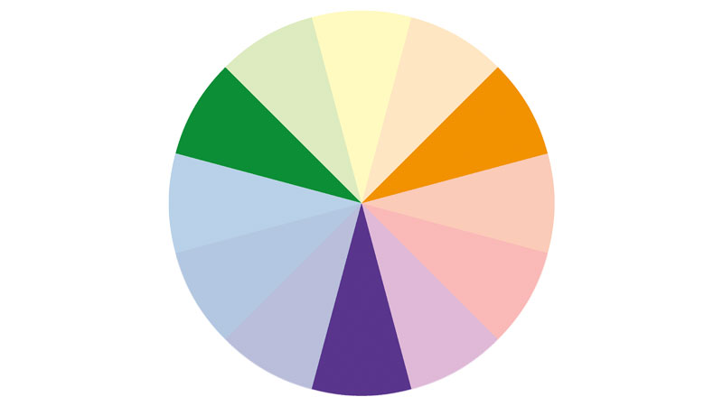
Pulling Out a Color Scheme
A color scheme is typically a limited palette of colors that have a defined relationship in terms of their locations on the color wheel. As you may imagine, there are lots of possibilities when incorporating a color scheme in a painting. The artist may choose to completely manufacture colors, but keep the values accurate. Or, the artist may choose to intensify certain colors so that they create a subtle, but noticeable color scheme.
In the case of our subject, we can clearly see that orange is already a dominant color. We also notice that green is present. And if we look closer, we can see hints of purple as well.
This means that a secondary color scheme of purple, orange, and green makes sense for this image. This will keep the image looking natural while increasing contrast and interest.
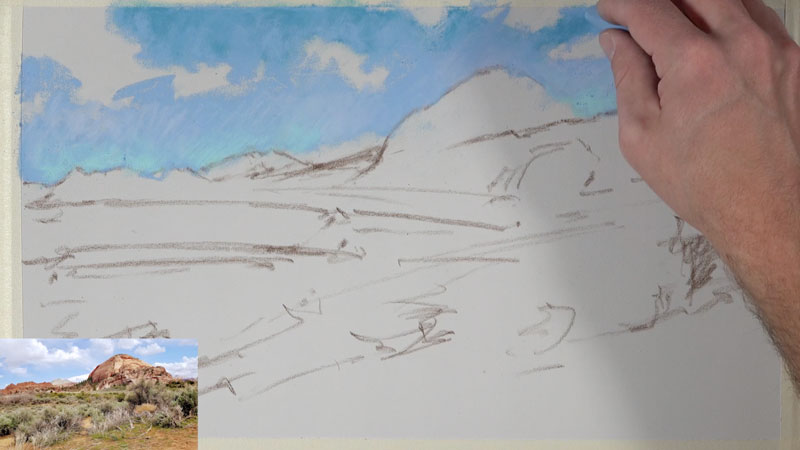
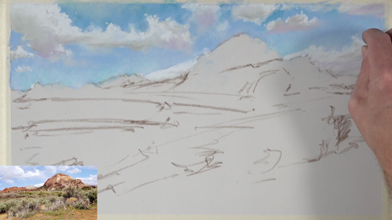
Start with the Background
We’ll begin by first quickly sketching the composition using loose lines. At this stage, we want to map out the subject on the paper and have an idea how we plan on moving the viewer’s eye through the work. A dark brown pastel pencil is used to apply these marks. This is drawn quickly without regard to any details.
Once our loose sketch is in place, we can turn our attention to the background. Pastels are similar to the opaque painting mediums of oils and acrylics. Even though pastels are a drawing medium (since they are applied dry), the thought process of the artist is more closely related to that of painting. Pastel applications can completely cover previous applications. This means, that like with opaque painting mediums, we can work from the background to the middle ground and finish up with the foreground. Working in this manner, and in this order, ensures that we don’t have to work around objects in the foreground to develop the middle ground and background like we have to do with other drawing mediums like colored pencils or graphite.
In this case, our background consists of the sky. We’ll begin with a medium light blue, leaving open areas for the shapes of the clouds. A slightly darker blue is applied to the top of the sky, while a couple of lighter blues are applied adjacent to the horizon.
Once we have our initial applications of blue applied to the sky, we’re now ready to add the clouds. A very light blue is applied to define the shapes of the clouds. Although it may be tempting to use white for this, a light value of a color is a better choice.
Once the shapes of the clouds are in place, it’s time to develop the illusion of form by layering darker and lighter values. A few light grays are layered and blended in the core shadows. A bit of color is also mixed in. In this case, purple is added since it fits with our color scheme.
A light yellow is used to add highlights which is followed by a touch of white. Edge quality is important. Pay attention to the softer and harder edges of the clouds. In the areas where the edge is soft, use your finger or a blending stump to smudge.

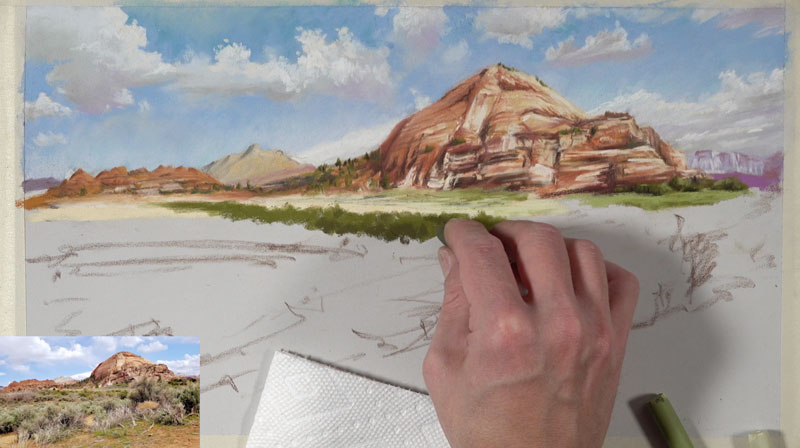
Mountains and the Middle Ground
Once the sky is complete, we can move on to the middle ground. In our scene, the middle ground is made up of the distant mountains, the flat desert floor, and strips of multi-colored vegetation.
We’ll begin with the distant mountains, layering the color right over the sky. At first, just basic shapes of color are applied. A light yellow ochre and an earthy orange are used.
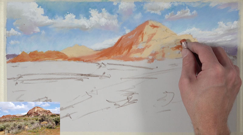
With an underlayment of basic colors in place, we can layer colors of similar hue, but contrasting values, to gradually develop the details and texture.
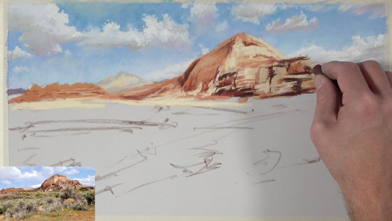
You’ll also notice that the shapes of a couple of purple mountains are added as well. These areas are enhanced with contrasting values of light and dark purple using the pastel pencils.
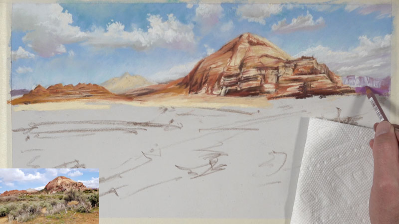
A few hints of trees are added on the distant mountains using a few greens (both dark and light) as we begin to transition to the lower portion of the picture plane.
We’ll begin layering strips of color as we work down into the heart of the middle ground. These strips of color are influential in the eye flow of the viewer. Since we want to encourage the viewer to move through the work, we’ll layer these marks in a slight diagonal. This will help to pull the viewer’s eye from the right side of the picture plane back to the distant mountains on the left side of the scene.
We’ll use the same greens that we used to indicate the trees on the mountains but add more variety by broadening the range of value. This means that lighter and darker greens are used here in addition to the greens used for the trees.
As we continue to work in the middle ground, we’ll patiently layer colors and values to develop the vegetation of the desert floor. Dark reds (to contrast greens) are used mostly in the shadowed areas while bright yellow-greens are layered over darker greens to create the highlights. Black is mixed in areas to make the values darker but not without some blending, while bits of the orange desert sand is allowed to peek through in areas.
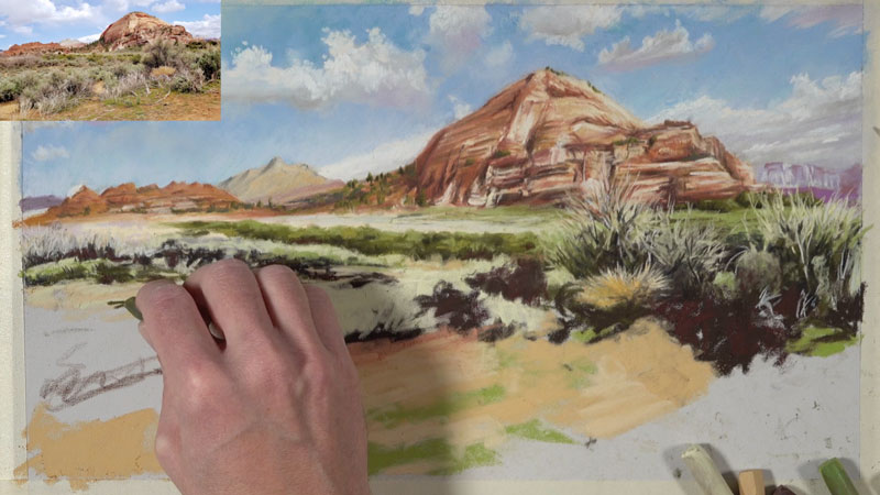
Working into the Foreground
As we work into the foreground of the desert scene, we’ll continue increasing the contrast in values. We’ll also incorporate a broader range of color. Objects that are closer to the viewer are typically stronger in value contrast.
As we layer the colors and values for the vegetation in the foreground, we’ll create a diagonal that leads the viewer up from the lower left of the picture plane to the right. From there, the viewer’s eye is lead to the distant mountains on the left side of the picture plane thanks to the diagonal we developed earlier in the upper middle ground.
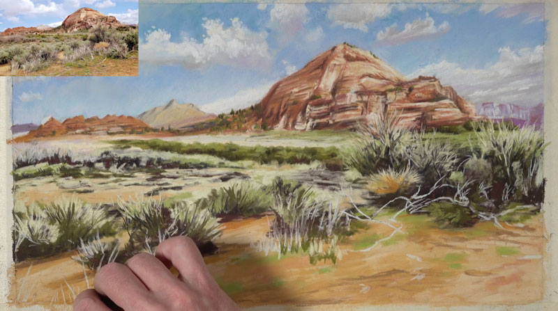
Using light yellows and grays, we’ll pull up grass blades and withering branches over the darker tones. We’ll also add more variety to the oranges and browns of the desert floor. Here again, we’re following the reference loosely. Feel free to add or leave out as much information as you wish. Also, don’t be afraid to be bold with your use of color.
Pulling Out a Secondary Color Scheme
At this point, we have an ample amount of orange and green in our scene. This leaves us the opportunity to pull out more purples. Some of the dry vegetation is a lighter gray, but we can add a touch of purple that matches the value. By matching the value, we could add any color we wish. These light purple additions bring the work together and creates harmony while pushing contrast.
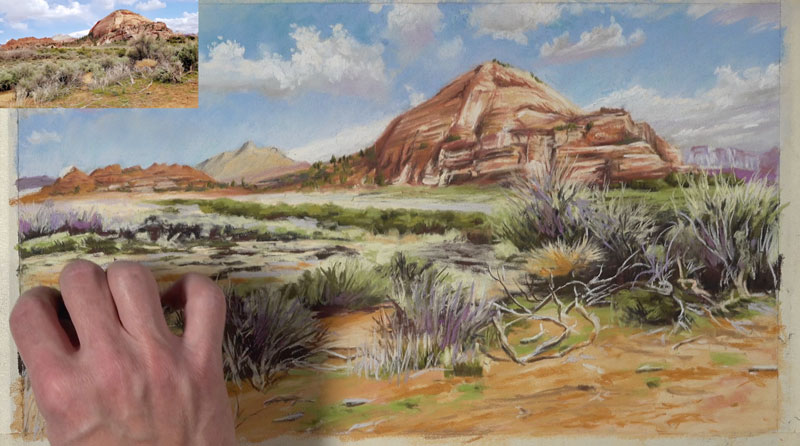
As we add bits of purple, we can continue to strengthen the contrast by layering darker browns and reds in shadowed areas. Highlights are also added to some of the branches to communicate a sense of form.
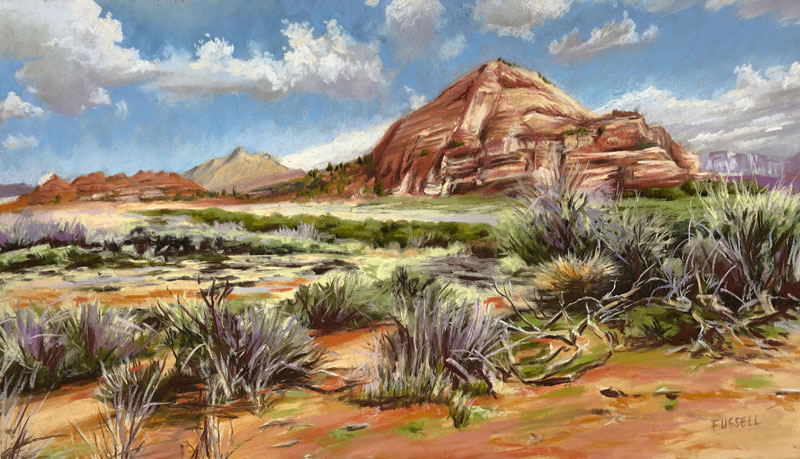
Desert Landscape Painting – Conclusion
The complete the image, we’ll add a few last indications of grass blades and brush to the foreground. Then we’ll return to where we started with the sky. Here, a few deliberate marks are added with our original light blue, making the painting slightly brighter.
Our completed pastel painting of a desert scene features a subtle color scheme of secondary colors while communicating the subject in an artful way.
If so, join over 36,000 others that receive our newsletter with new drawing and painting lessons. Plus, check out three of our course videos and ebooks for free.