
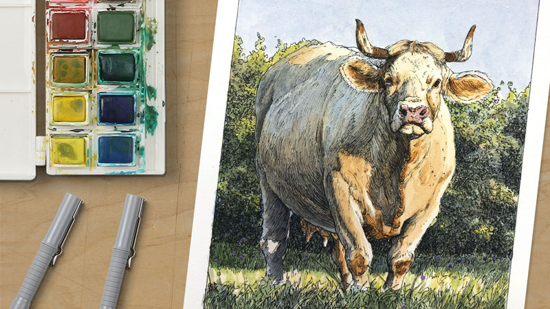
Which Colored Pencils are the Best?
There are so many different brands and types of colored pencils out there. How do you decide which brands or which types of colored pencils are best for you as an artist? In this lesson, we will attempt to answer that question.
Let’s be honest, the quality of the materials that you use to create art matters and we all want to use the best. But what exactly is the best? How do we determine what art materials we should use as artists?
Some of us are trapped in an endless search for the best, constantly buying the next best colored pencil or any other art material for that matter. You know who you are.
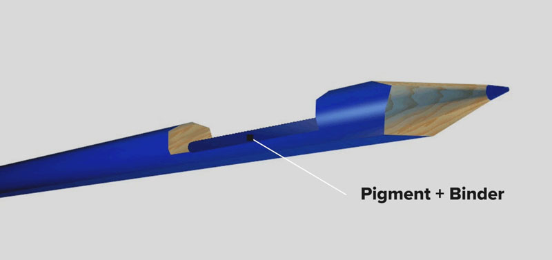
With so many types and brands of colored pencils out there, it’s easy to get lost and wrapped up in all of this stuff. There’s colored pencils, colored graphite pencils, watercolor pencils and more. In this case, we’re only going to focus on true colored pencils – those with a wax-based or oil-based binder. We’re also only going to focus on professional colored pencils.
See also: Comparing Colored Pencils
So Many Colored Pencils
I’ve created so many colored pencil drawings with so many brands of colored pencils – I’ve learned quite a bit. I’d like to share with you what I’ve learned so that you can make an informed decision on what colored pencils are best for you.
Before we get into this, I want to make it clear that all brands and all types of colored pencils have their pros and cons. You need to weigh these in order to decide which brand or which type of colored pencil is best for you.
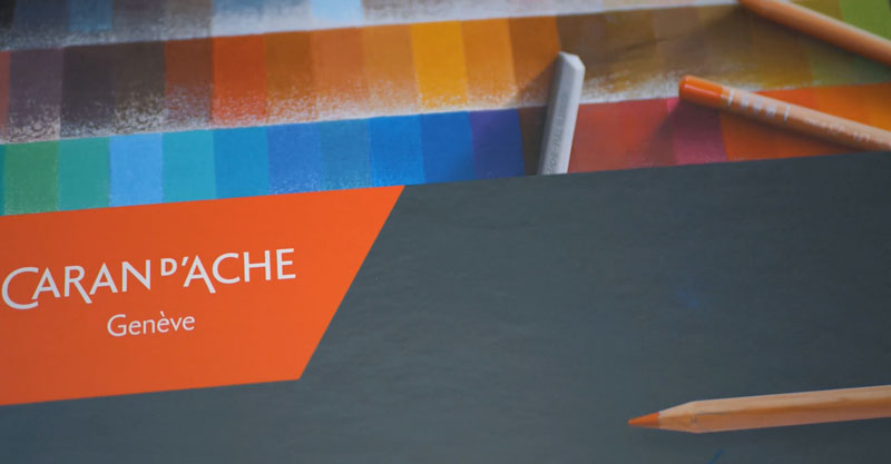
Instead of examining every single brand of colored pencil out there, I’m going to simplify things and focus on three of the most popular brands available. These brands are Prismacolor Premier colored pencils, Faber-Castell Polychromos colored pencils and Caran d’Ache Luminance pencils.
Prismacolor Premier Colored Pencils
Prismacolor Premier colored pencils are soft core, wax-based colored pencils that are now widely available nearly everywhere. They’re rich and buttery, layer easily, and the pigmentation is quite nice and consistent.
Perhaps the biggest drawback to these pencils is how brittle they are. Because the core is so soft sometimes they break when sharpened.
For this reason, some people hate them. But for me, they’re my favorite. I deal with the brittle cores because the way they work on the surface matters more to me. These pencils are available in 150 colors, so there’s quite a bit of variety as well.
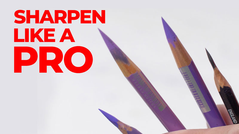
See also: How to Sharpen Any Pencil
Faber-Castell Polychromos Colored Pencils
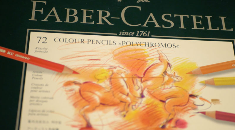
Now let’s look briefly at Polychromos pencils by Faber-Castell. These oil-based pencils feature cores that are harder than Premier pencils. They’re a bit more expensive, but the pigmentation is strong and consistent.
Since these pencils are a bit harder, layering is a must. But layering leads to depth in color. Those who like to layer applications with a lighter touch may prefer these pencils for this very reason.
As an added bonus, the tip of these pencils tend to stay sharper for a longer period of time. I absolutely love these pencils, and they’re available in 120 colors.
The biggest drawback to these pencils is that they may accentuate the tooth or texture of the paper.
So those that require a solid application will need to be patient to achieve this look. Plus, less colors are available compared to the Premier pencils, and these pencils are quite expensive as well. They may not be available everywhere in the world.
Caran d’Ache Luminance Pencils
Now, let’s talk about Luminance pencils by Caran d’Ache. Of the three, these pencils are the brightest. The pigmentation of these wax-based pencils is very strong.
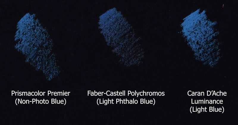
These pencils work great on darker surfaces. Luminance pencils are harder than Premier pencils, but softer than Polychromos pencils. But colors unfortunately are limited, with only 100 available in this line.

But Which Pencils Are the Best?
So, which pencils are right for you? Should you go with the softest, the brightest, or the ones that layer easily.
I could spend hours and hours weighing the pros and cons of all the different brands and types of colored pencils out there. But here’s the truth…
Any brand of colored pencil will perform in the hands of a trained and practiced artist.
It’s not the colored pencil that makes the art. It’s the artist.
I suggest finding a brand that feels best to you and the way you like to work, and then practice your technique. It may very well not be one of the brands that we discussed. Buy a starter set or just a few pencils to try so you don’t break the bank. When you find a brand that jives with you, then buy a larger set of colors.
Stop the endless searching for the “best colored pencil”. Instead, focus on your drawing skills. Yes, quality matters, but your skills matter more. Once you find a brand that you like and you practice, your confidence will build. And that confidence will show in what you create.
The Best Colored Pencils – Conclusion
So what are the best colored pencils? Well, that really depends on you. What might be best for me may not be best for you. It all depends on how you like to work and what materials give you the confidence to create at the highest level.
If so, join over 36,000 others that receive our newsletter with new drawing and painting lessons. Plus, check out three of our course videos and ebooks for free.
Powdered Graphite – Secret Weapon for Graphite Drawing
Smooth Applications of Graphite Without Pencil Strokes
Many times with graphite drawings, we want to create smooth transitions of value or simply areas of smooth applications where you don’t see the pencil lines.
Most of us simply adjust the amount of pressure we place on the pencil and then use a blending tool such as a blending stump to soften the applications. And while this technique works okay, it’s often inconsistent and it’s also time consuming. Well, there is a better way – a secret weapon, if you will, to get these same effects.
See also: 6 Reasons to Draw on Toned Paper
The Secret Weapon – Powdered Graphite
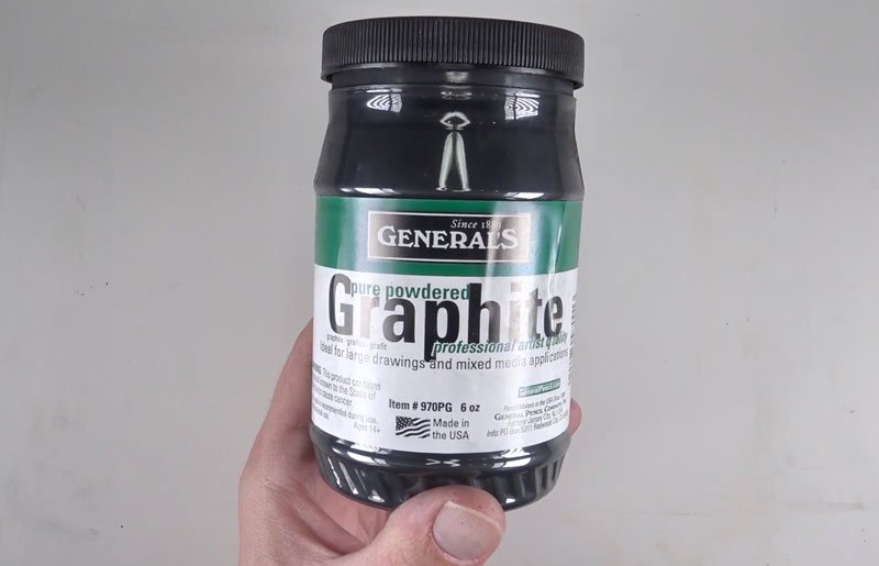
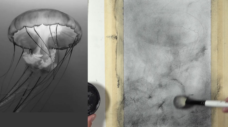
This interesting form of graphite is called powdered graphite. As the name implies, it’s simply pulverized graphite. Pictured below is powdered graphite manufactured by General’s.
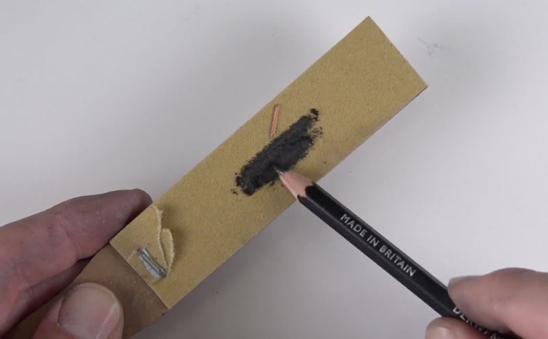
Making Your Own Powdered Graphite
Powdered graphite may be difficult to find a local art store but we can make our own. Just use a sandpaper pad and rub some soft graphite over the surface. Then using a brush, we can lift up the powdered graphite that we’ve created and apply it to the surface.
Applying Powdered Graphite
You’ll notice that your initial applications of powdered graphite are quite soft and light, but we can revisit the powdered graphite and put an additional layer, gradually darkening the value.
If you choose to use the manufactured powdered graphite, it’s best to put it in a smaller container. I like to use the lid from the container that contains the powdered graphite and use the brush to apply it to the surface. As we rub the brush over the surface, less of the graphite remains in the brush, making a lighter mark. We can keep revisiting the powdered graphite and adding additional applications to make the value slightly darker.
Powdered Graphite Usage
All of the remaining excess powder that remains on the surface can be blown away gently or brushed away with a drafting brush. Powdered graphite can also be applied with a cotton swab or a tissue paper.
Just like with any drawing medium, the surface of the paper plays a role in the application and look of the powdered graphite. The texture of the paper will affect the appearance of the powdered graphite.
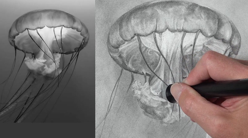
One method of using powdered graphite is somewhat like painting. In this particular case, I’ve sketched out the contour lines of the subject.
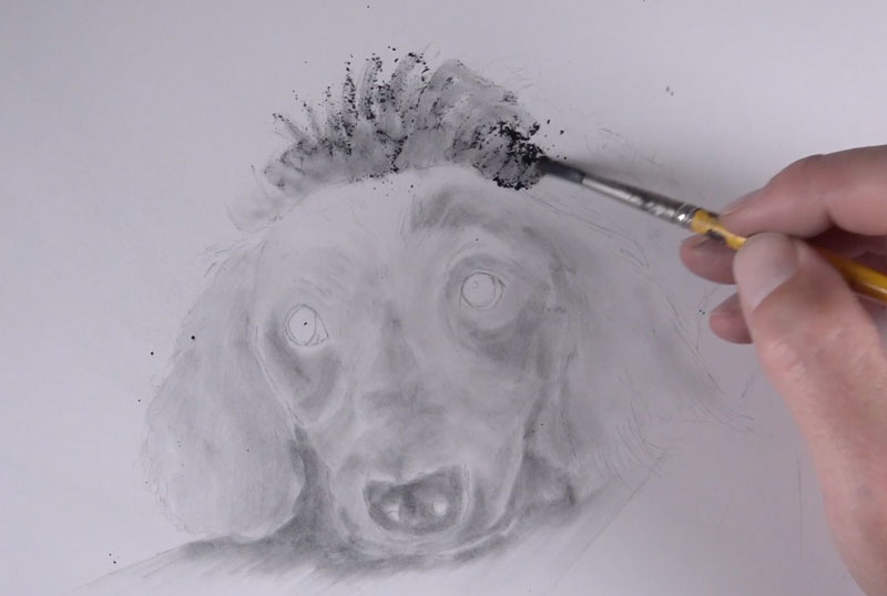
In this particular drawing, I’m adding the powdered graphite much like I would in a painting. I’m just adding bits of value, and if I need a darker value – I apply more layers of the powdered graphite to the surface. Then over the top of my “underpainting” with powdered graphite, I can apply pencil marks with a traditional pencil.
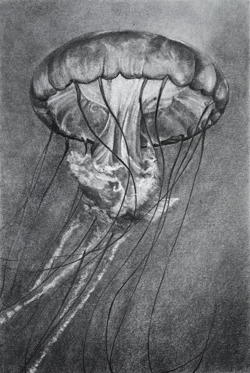
Here’s a look at the finished drawing…
Another way you might choose to use powdered graphite is to create a base value on the surface of a drawing. In this drawing, I again draw the subject using just the contour lines. I apply powdered graphite with a mop brush, but this time I’m applying it over the entire surface. This basically tones the paper, giving me a nice starting value that’s a little bit darker than white. This layer of graphite allows me to erase out some of the highlights and add some of the darker values.
Instead of just adding darker values, I can also remove some of the graphite to create lighter values or tints. This leads to a broader range of value in the final drawing and additional contrast. Essentially we can push and pull the values, adding lighter values by erasing and adding darker values by adding additional graphite. This helps us create a full range of value in the drawing, which leads to a greater illusion of realism.
Here’s a look at the finished drawing…
Once our contour line drawing is in place and our picture plane has been taped off, we can apply powdered graphite. This time, I’m going to apply a heavy application to create a darker value to begin with.
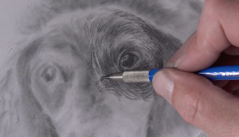
Using the mop brush, I can evenly spread it around on the surface. If I need to blend it additionally, I use a blending stump or a chamois.
I reinforce my lines using a pencil and begin using the eraser and the pencil to create a full range of value. This time, we’re starting with a value that’s closer to the middle of the value scale. Again, this will lead to a greater illusion of realism thanks to a broader range of value. You can appreciate how important the eraser is as a mark making tool when we use powdered graphite in this manner.
I love using an electric eraser as well, and this surface – Stonehenge paper – is very tough and won’t tear when we use an electric eraser.
When the drawing is complete, we can carefully remove the tape away, revealing a nice sharp border. Here’s a look at this finished drawing with powdered graphite…
Powdered Graphite – The Secret Weapon – Conclusion
Powdered graphite allows the artist to create smooth transitions of value without visible pencil strokes. It also saves time in many cases. Perhaps the most important benefit is how powdered graphite encourages the use of a full range of value which ultimately leads to more convincing drawings. Whether purchased or made, powdered graphite is a tool that we can use to improve our drawings.
If so, join over 36,000 others that receive our newsletter with new drawing and painting lessons. Plus, check out three of our course videos and ebooks for free.

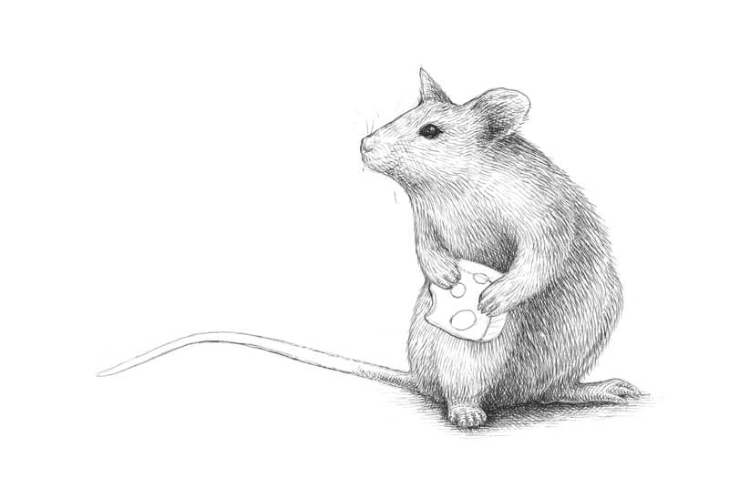
How to Draw a Mouse with Pen and Ink
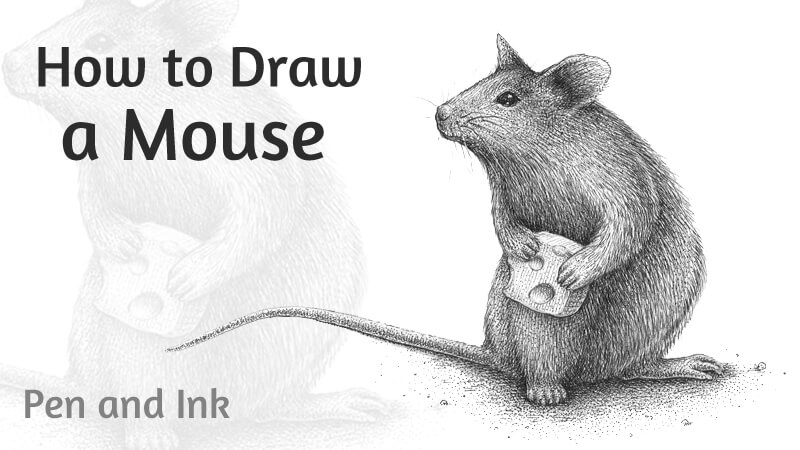
In this drawing tutorial, we’ll create an ink drawing of an adorable mouse. Also, we’ll discuss the distinctive features of these animals and, hopefully, learn a couple of fun facts about them.
For this drawing, I’ll be using just one ink liner of 0.1 width number. The paper is standard A4. Please feel free to use any inking tool that you prefer – a nib pen instead of a liner will be a great option.
Also, we’ll need a graphite pencil and an eraser to create the underdrawing.
How to Draw a Mouse with a Graphite Pencil
What do we know about this animal? A mouse is a small rodent with 30 different species. A typical mouse has a pointed snout, relatively large ears and eyes, and a long tail.
Mice are social animals. They have facial expressions that are used to communicate with other mice and express their mood.
Whiskers found on the snout allow sensing smooth and rough edges, breezes and temperature changes.
Mice have soft feet with nails on each of their toes. Nails enable the mouse to climb well as it can wrap its feet around things. A mouse has five toes on its back feet and four toes on its forelimbs. A greater number of toes on back feet gives the animal more stability while standing on them.
Mice also range in color. There are examples of coat colorings from white to light brown, dark brown, grey or black.
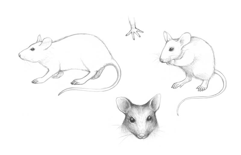
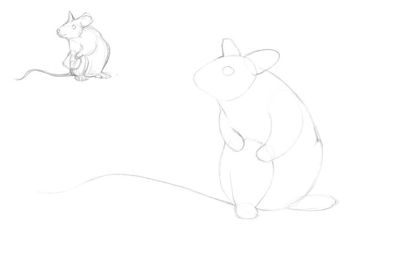
I start with a miniature sketch. It may be rough and stylized. The goal is to define the animal’s pose and develop the general concept. You’ll find my small sketch in the corner of the image below.
I decided to create a drawing with a hint at a story. What if we put a small bit of cheese in the “hands” of our mouse? Chances are that our drawing will resemble an illustration from a fairy tale. Let’s go for it.
Interestingly, real mice don’t like cheese — it’s a myth. They even actively shy away from certain types of cheese that have strong or specific odors.
I draw the mouse in simple shapes, starting with the rough contours of its head and body. Then I add stylized shapes of ears, eyes, and all four limbs. Don’t forget about the tail! A long line marks its direction. I think this tail position adds interest to the composition — there is plenty of room in front of the animal’s snout (enough space for its “look”).
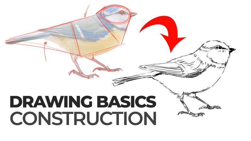
See also: Drawing Basics – Construction
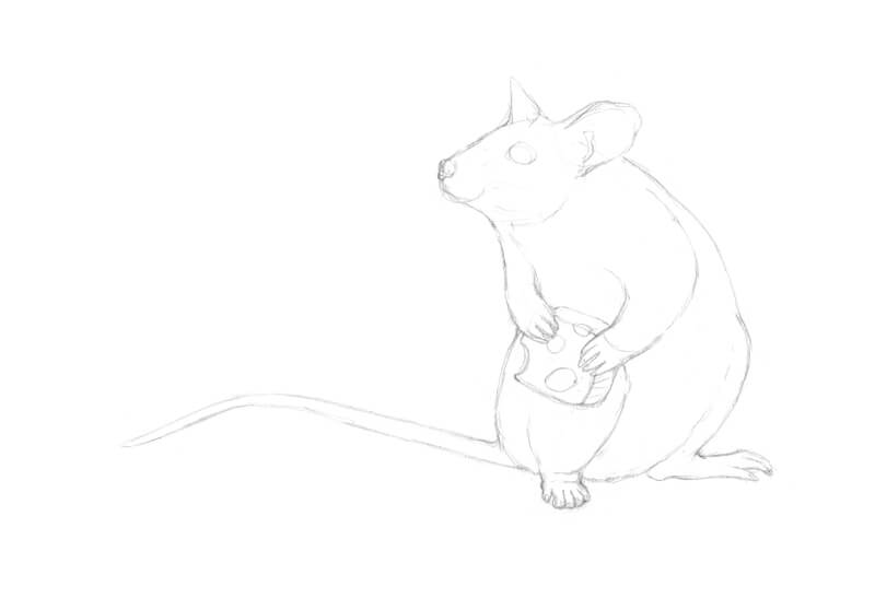
We’ll draw the cheese in the next step. For now, I leave some space for it.
I refine the contours of the head. Then I add the nose, whiskers and the details of the ear’s opening.
The tail gets some thickness, transforming from a single line into a shape. Also, I refine the limbs and add the toes. (There are four toes on front limbs and five on back ones.)
The upper parts of the limbs will be covered with short fur. We’ll deal with this texture in the next part.
As a final touch, I draw a small cube of cheese and add some random holes to it. However, the pattern of holes and hollows should look harmonious.
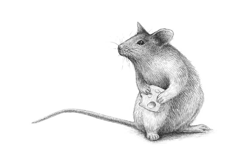
How to Draw a Mouse with Ink
The eyes are very important — the character’s look defines the overall mood of the artwork. That’s why starting with the eyes seems to be a sensible idea. I darken the visible eye with short, dense, rounded hatches, leaving a small highlight in its upper part.
As I mentioned, the mouse is covered with fur. That’s why we can’t use a solid line to create the contours as it will look unnatural.
I mark the contours of the animal’s body with short ink lines. Their direction and character imitate the flow of hairs. The tail is nearly hairless, so I draw it with a broken line supported with short hatches.
Also, I apply this hair-like hatching to the darker areas of the drawing, such as fur under the front legs, the ear opening, and the belly area.
I create a base for a deep cast shadow under the mouse.
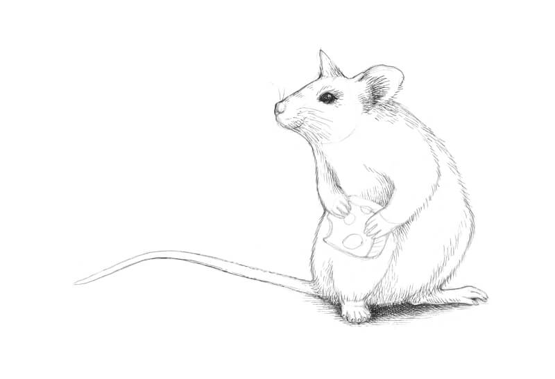
With relatively long ink hatches, I create an illusion of fur in the lower part of the mouse body. This area needs particular attention. According to my vision, it gets less light compared to the snout and the upper part of the body. The more layers of hatching we apply, the darker the area will be.
Also, I apply ink hatching to the limbs. The direction of rounded lines conforms to the contours of the form.
See also: Pen and Ink Drawing Techniques
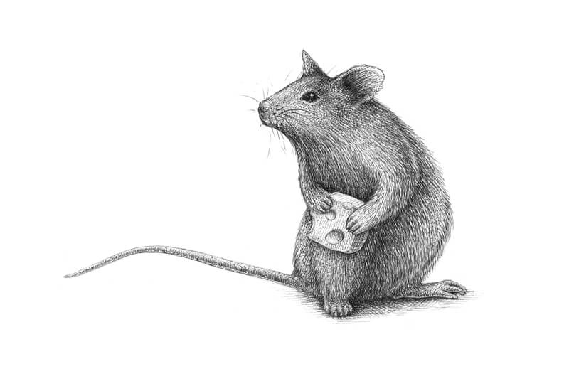
I outline the contours of the cheese cube and mark the holes.
I work on the upper part of the animal’s body, using hair-like hatching that is already familiar to us. The direction of lines may vary which will make the drawing more natural.
I evaluate the drawing as a whole system at each step, applying ink hatching to the areas that don’t seem dark enough.
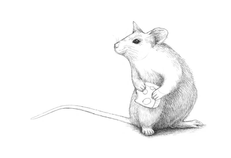
I start adding short rounded hatches to the tail. The lines repeat the contours of this body part, giving it more volume. I apply the same type of hatching to the ears and right under the snout to give the mouse more volume.
I continue working on the tail. If short hatches seem too heavy for these thinner areas, it’s possible to use dots instead. I leave a subtle line of reflected light near the bottom contour of the tail.
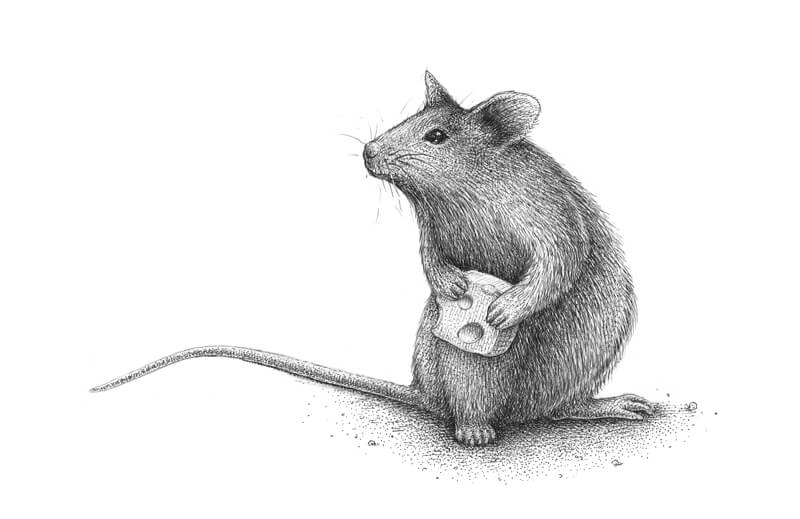
I add long parallel lines to the cheese, keeping light pressure on the pen. The direction of these lines accent the position of each particular plane of the cube. I decided to create a crust pattern on the side of the chesse.
There are subtle shadows inside the holes. I mark them with rounded ink lines.
I apply some dots to the head of our mouse. A few stippled marks create the illusion of soft fur. When it comes to making a smooth value transition and deepening the shadows, this technique is a great help.
In a similar manner, I add dots to the remaining body parts, aiming at the gaps between the lines. If this process seems too time-consuming, stippling can be replaced with hatching that imitates flowing fur, or cross-hatching.
I deliberately create an intense shadow around the cheese. Strong contrast will attract the viewer’s attention to this area.
I apply dots and short hatches to the “hands” and “feet” of our mouse.
Also, I add some small dots to the cheese to create visual unity.
I strengthen the bottom contour line of the tail to make the mouse look more stable. However, I leave the contour of its tip almost unchanged because we don’t want to distract attention from the facial expression of the mouse. The main story happens there, closer to its “face” and “hands” that hold the cheese.
As a final touch, I extend the cast shadow, using both stippling and hatching. I also add some rounded shapes that imitate large particles of sand or soil (or bread crumbs as another option).
Drawing a Mouse with Pen and Ink – Conclusion
Congratulations! We’ve done a great job. Now we have a wonderful ink drawing of an adorable mouse holding a bit of cheese.
I hope you enjoyed every step of the process, and wish you much luck with your future creative projects!
If so, join over 36,000 others that receive our newsletter with new drawing and painting lessons. Plus, check out three of our course videos and ebooks for free.
Matte Drawing Pencils – No More Graphite Shine
The Problem with Graphite Pencils
I love using my graphite drawing pencils to create drawings and I bet you do too, but there are two major problems when it comes to graphite drawings.
The first is graphite is actually a dark gray and not black. No matter how hard we push it, we’ll never be able to create true black with a graphite pencil.
Have you ever created a graphite drawing and noticed it was super shiny when you were finished and it was incredibly frustrating when you looked at the drawing from a certain angle and all you saw was the reflection of the light? Well, this is something called graphite shine.
The second obvious issue with graphite is that graphite drawings sometimes have this shine associated with them. Graphite is inherently a shiny medium, so graphite drawings are a bit shiny. Thankfully, there are a couple of products on the market that will help to eliminate that graphite shine and also make our blacks a little bit blacker.
See also: Black Wing Pencil Review
Matte Drawing Pencils That Reduce Shine
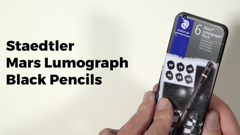
The pencils we’ll discuss and use here are Mars Lumograph black pencils by Staedtler. Staedtler, of course, is one of the most reputable brands out there for drawing products. I love their products and I’ve used them on many occasion. In fact, I love Staedtler products. I found these pencils and started using them during our last season of Getting Sketchy (Season 7).
See also: Gettin’ Sketchy – Season 7 Review
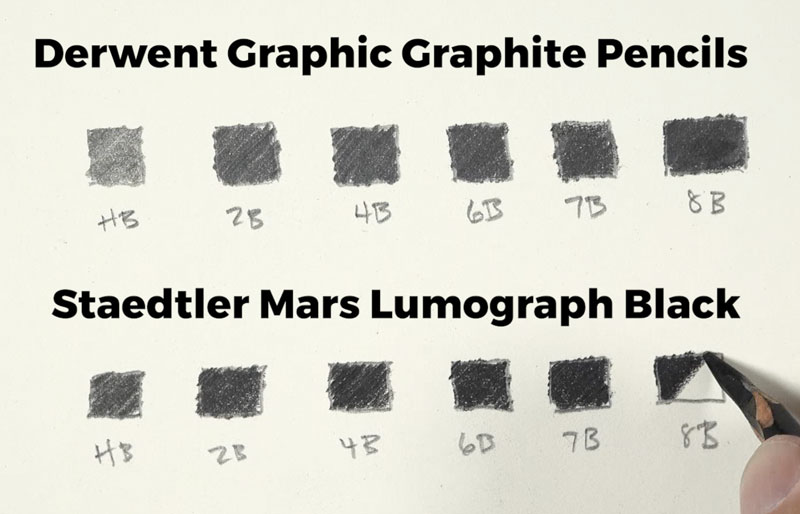
First we’ll do a little bit of a comparison between these pencils and traditional graphite pencils. I’m going to be comparing them to my favorite wooden graphite pencils by Derwent. Here’s a look at my Staedtler black pencils. Inside of my case, I’ve got six pencils. There is an HB pencil, 2B, a 4B pencil, a 6B pencil, a 7B pencil and an 8B pencil. As you can tell, these are mostly the darker values.
Making Marks with Matte Pencils
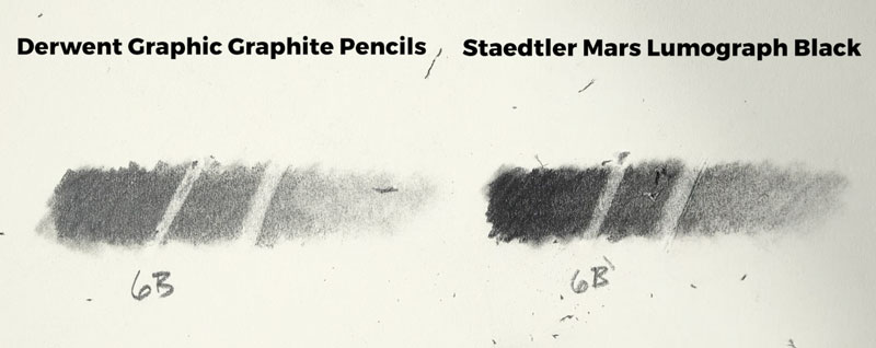
You’ll notice below that the black pencils are noticeably blacker, as they should be. You’ll also notice that they are less shiny as well. If we take the paper and bend it, we can still see there’s a little bit of shine – especially with the lighter pencils. But the darker pencils shine considerably less. This is due to a higher concentration of carbon content in the black pencils. They’re actually not called graphite pencils at all. The carbon content is making these pencils a lot darker and a lot blacker but also reducing the shine.
Blending and Erasing Matte Pencils
Both pencils are easily blended using a blending stump. The graphite pencils are only slightly easier to blend.
See also: Do You Really Need Blending Stumps?
Let’s take a look at how these two different types of pencils erase using a kneaded eraser. You can see that the graphite is a bit easier to lift than the black pencils, but the black pencil is still erasable just to a lesser degree, especially with the kneaded eraser.
Matte Pencil Feel
These pencils are nice and smooth as they make marks but they feel a little bit different than graphite. They feel closer to using a colored pencil. I do feel like this is due to the carbon content. If you’ve ever used a colored pencil on drawing paper, you know how that definitely feels a little bit more waxy. These pencils have that type of feel when you’re moving them across the drawing paper.
Creating a Drawing with Matte Black Pencils
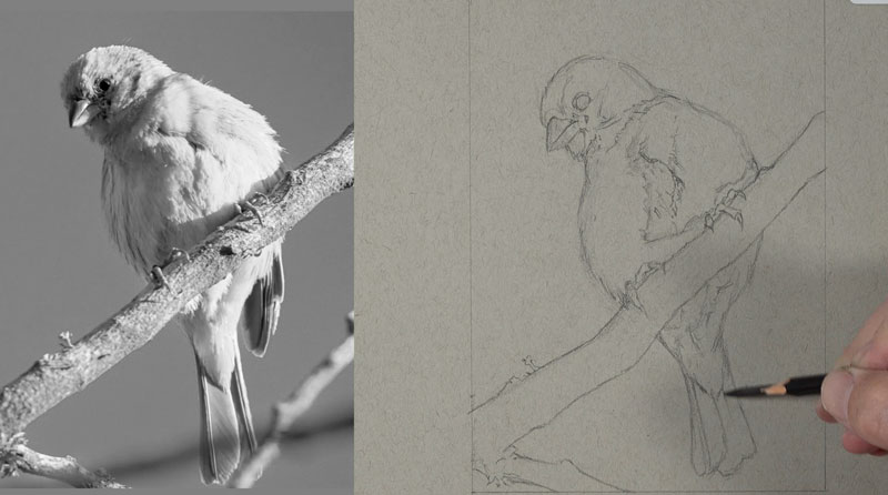
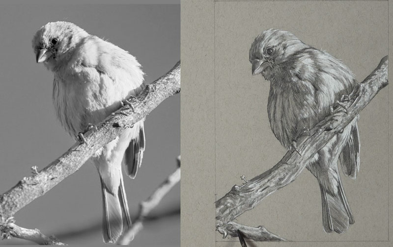
Now that we’ve had a quick look at how these pencils behave and how they compare with traditional graphite pencils, let’s go ahead and create a drawing from start to finish using these pencils along with some white charcoal on gray drawing paper.
See also: 6 Reasons to Draw on Toned Paper
For this drawing, I worked on Strathmore gray toned drawing paper. Graphite and white charcoal is a combination of drawing media that I really enjoy. This combo allows me to push the value range outward from a neutral gray. Essentially I can start with a neutral value – the gray, and add both darks and lights to build out a full range of value. Of course, one of my complaints with using traditional graphite pencils is the graphite shine and the fact that traditional graphite pencils will never get totally black.
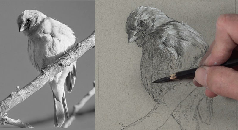
Creating the Sketch of the Bird
I start the sketch like I would any other ordinary sketch – basically focusing on the shapes that I see that make up the bird. These include shapes of both dark and light value but also the shapes of the different parts of the bird – the eye, the beak, the branch, the talons, and so on. I use only the black pencil, so there’s no graphite pencil used at all in the development of this drawing – just the black matte pencils.
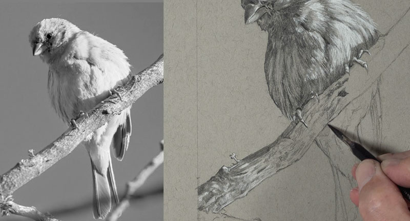
Shading and Developing the Values
Once I’ve got some of the basic contours in place, I’m ready to start applying the material with more vigor. We’ll next begin developing the value. I start at the top of the picture plane and work my way down. I take each section of the subject one at a time while being careful to keep the palm of my hand of out of the way.
A blending stump or a blending tool works great with this medium. It blends predictably, and you can still erase and lift up the medium.
Just like I would with any drawing, I’m considering the texture. The key to creating the illusion of texture in a drawing lies in your relationships of values and the directional strokes that you make. As we work down to the branch, the process remains the same. We can gradually build up the range of value through careful applications of the matte drawing pencils and white charcoal.
While I want this drawing to be representational, I’m not tied too much to the reference. I’m picking up information from the reference regarding the texture – the patterns that I see – that can translate into the texture of the branch. Then I’m just translating those patterns that I see into the drawing. Every little single mark that I see in the photo reference is not necessarily included in the drawing, but rather the suggestions that I’m getting from the photo reference.
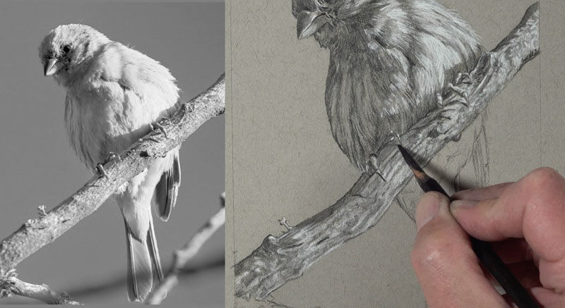
One of the things that I’ve noticed about these pencils is that they do seem to accentuate the tooth or texture of the paper slightly more than traditional graphite pencils. Of course, this can be alleviated by using a blending stump. Depending on the desired look of your drawing, this could be a positive or a negative.
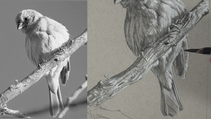
As we continue to work down to the lower part of the drawing, you’ll note that the matte drawing pencils do mix with the white charcoal to a certain degree. When they do mix, a cooler gray develops. We can see how cool this gray is when we compare it to the warm gray tone of the drawing paper.
Matte Drawing Pencils – No More Graphite Shine – Conclusion
Now our drawing of a bird with black matte drawing pencils and white charcoal is complete. Here’s a look at the completed drawing…
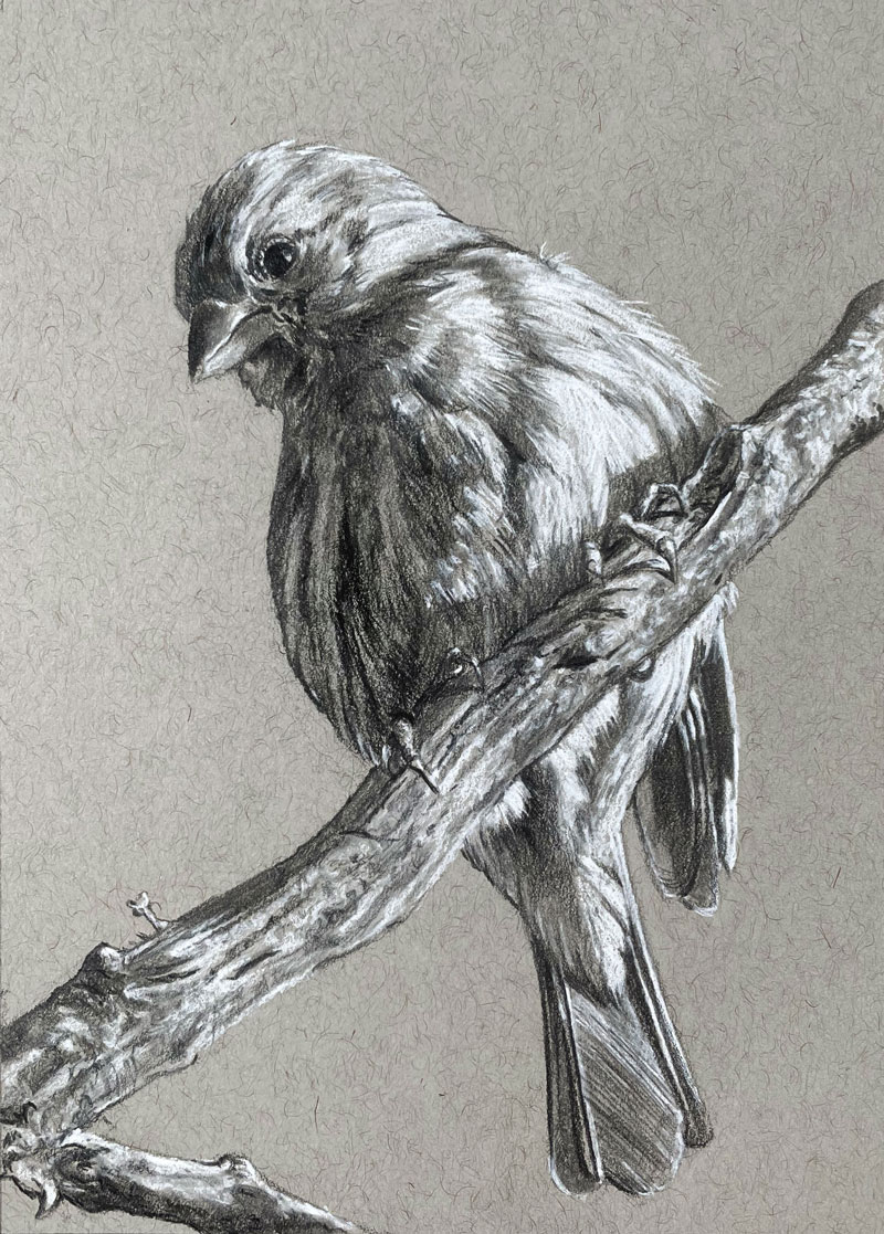
Although these matte pencils don’t totally eliminate graphite shine, they do reduce it greatly. If you can get past the waxy feel of the pencil, then these pencils may belong in your drawing box – for those times you need serious blacks without the shine.
If so, join over 36,000 others that receive our newsletter with new drawing and painting lessons. Plus, check out three of our course videos and ebooks for free.
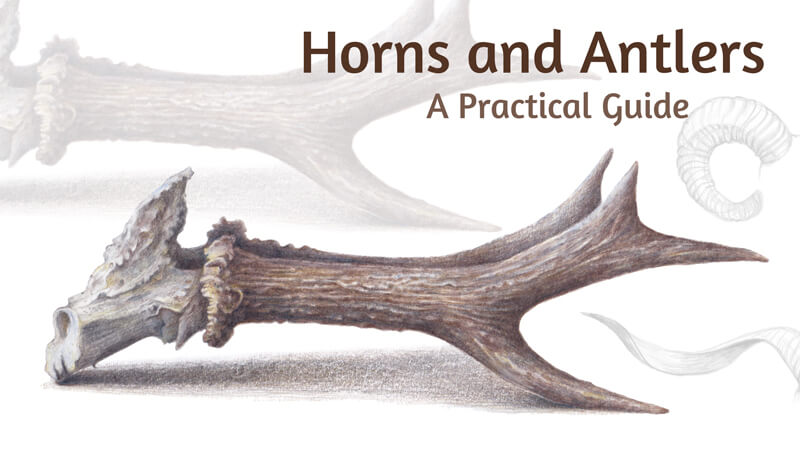
How to Draw Horns and Antlers
In this drawing lesson, I’ll show you the principles of drawing realistic horns and antlers. My goal is to show you that even the most whimsical form can be broken down into simple, easy to draw components. We’ll explore a method of transforming a complex task into a sequence of steps, where each action can be easily replicated.
The concluding section of our tutorial is a fully practical texture study. We’ll draw antlers with colored pencils using a reference photo.
Are They Horns or Antlers?
In colloquial speech, the words “horn” and “antler” are often used interchangeably. Sometimes they refer to any kind of head extension, even those of certain lizards, birds, and insects. However, there is a distinct difference between horns and antlers.
The Difference Between Horns and Antlers
Antlers can be found exclusively on members of the Cervidae family. It includes species of deer and moose. Antlers are paired and branched and are made entirely from bone.
In most cases, antlers present for only a few months before annual shedding. Such structures usually occur in males. (Reindeer is an exception – females have antlers, too.)
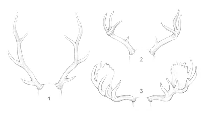
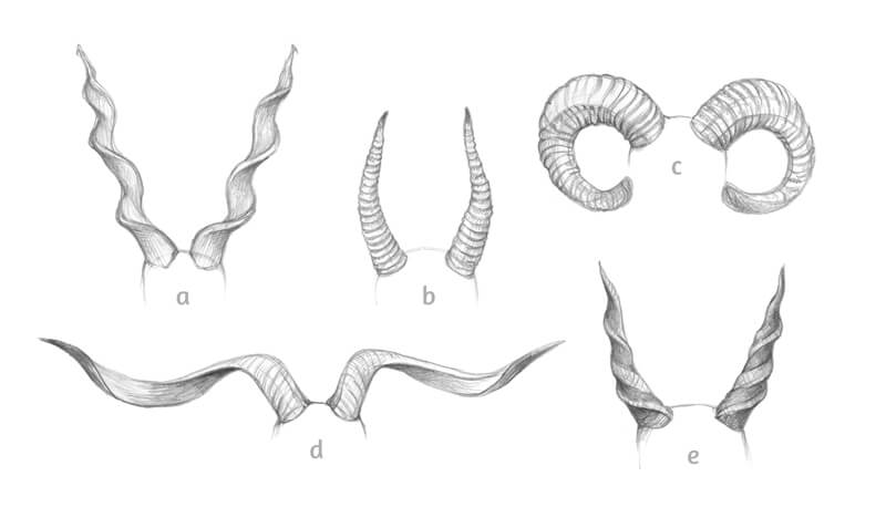
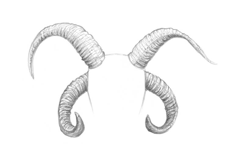
In the image below, you’ll find three examples of antlers. (1 – red deer; 2 – white-tailed deer; 3 – moose antlers.)
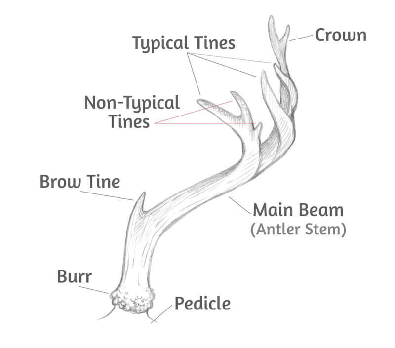
As antlers have such a complex branched structure, it’s good to know the basic terminology since this will help us draw the sturctures. Here are several characteristics that are worth remembering…
- Main beam refers to an antler’s stem.
- Secondary outgrowths are called tines.
- Burr is the lowest part of the antler – it has an interesting prominent texture.
Horns on the other hand, are found on members of the Bovidae family. It includes cows, sheep, goats and also antelopes, gazelles, and even water buffalo. Horns can appear on both males and females depending on the species.
Horns are unbranched. They typically grow in symmetrical pairs. Usually, horns have a curved or spiral shape with ridges.
Another difference is that, unlike antlers, horns are a permanent feature. In many species, they grow continuously throughout an animal’s life.
The size and shape of horns vary from species to species. Below you’ll find several examples of horns. (Marking: a – Markhor; b – Saiga; c – Mouflon; d – Valais Blackneck Goat; e – Giant Eland.)
Pronghorn antelopes are the exception among horned species. They have branched, upright horns with a sheath that is shed each year.
Usually, animals have only one set of horns. However, some sheep breeds possess multiple sets of such structures. (For example, the Navajo-Churro sheep – see the image below.)
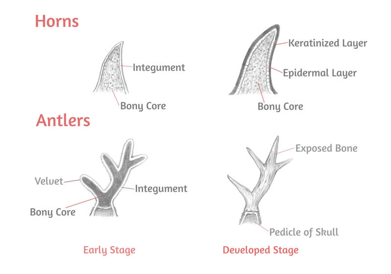
The Inner Structure and Growth Cycle
As was mentioned earlier, horns have a bony core. It is fused to the skull with connective tissue.
The core is covered with an epidermal layer. Keratin (found in the epidermis) thickens, forming the protective surface of the horn.
Antlers grow out of pedicles – two bony structures on top of the animal’s head. Pedicles support the antlers as they grow.
The antlers are made of bone. They are coated in a so-called velvet – a skin layer that supplies oxygen, blood, and nutrients to developing antlers. When the structures have grown to their full size, the velvet falls away.
In antlers, there is no covering of keratin as it is in true horns.
Below, you’ll find a comparison of the antlers and horns in early and developed stages.
Functions of Horns and Antlers
Both antlers and horns serve quite similar purposes. Their primary function is to establish social hierarchy, dominance, and territory.
Antlers are often used in fights against other males during the mating season. They also serve as a means to impress and attract females – antlers are a prime indicator of health and genetic quality. They also provide some protection against predators.
Beyond that, there are some special functions. For example, a moose with big antlers has better hearing than one without them.
Reindeer use their antlers to clear away snow to eat plants that are hiding underneath. It is interesting to know that reindeer females keep their antlers during the winter months. They are shed only in the spring – after the calves’ birth. Most likely, the antlers are retained because of their important role in the nutrition process.
Males of the Bovidae family also use their horns in fights during the breeding season. In species where females also sport horns, they’re usually smaller and serve rather as a defensive tool.
How to Draw Antlers and Horns
Now that we know quite about antlers and horns, let’s look at a simplified way to draw them.
A Structured Approach
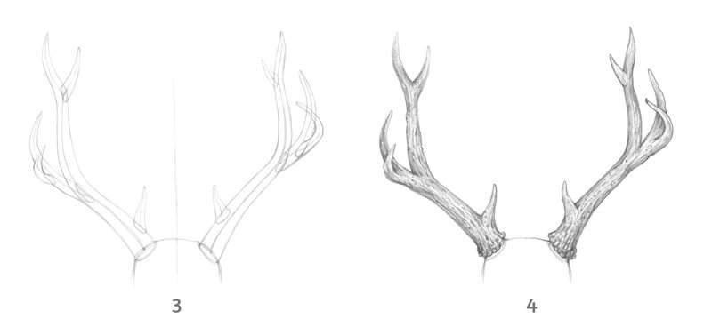
Now I’ll show you a sequence of steps that you can apply to any drawing process. We’ll use it to draw deer antlers.
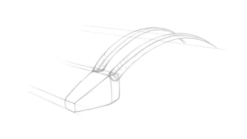
Our initial task is to simplify the subject as much as possible. Try to imagine the antlers’ inner structure, as if they’re made of glass or another transparent material.
The form of real antlers’ main beams can be stylized to an elongated conus. The tines are smaller cones that are attached to the main form.
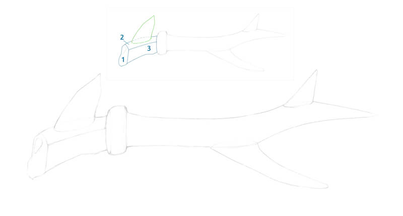
First, I mark the basis of each antler with an ellipse. It helps to create a space that this element takes up on the head’s surface.
Then I mark the direction of each stem with long core lines. They reflect mild twists that are inherent to antlers. (In the image below, point 1.)
I often use a subsidiary line that intersects the top center of the skull. It allows me to check the symmetry of the antlers. However, such natural structures usually look slightly unequal in comparison, so symmetry is relative.
Then I add the outer contours of the main beams. (Point 2.) If you’re using a reference, evaluate how thick or thin the stems are – compare their width with the animal’s head or other body parts.
See also: 7 Drawing Techniques For Accuracy
Now it’s time to add the secondary outgrowths – the tines.
I mark the foundations of the tines with ellipses, too. There may be smaller elements that grow out of tines – they are added last. (See point 3 in the image below.)
The framework is complete and now we can refine the contours. It may mean widening or narrowing certain parts, and also making the lines smoother or more curved. For example, I’ve broadened the lower part of the antlers where the burr is located.
We can shade the darker areas – this will give the drawing some volume. Also, it’s time to add textural details. (Point 4.)
Note that texture affects the look of the antlers’ main contours, making them somewhat irregular.
How to Analyze the Shape of Horns
Any process of drawing horns or antlers can be broken down into the same steps that we’ve followed in the previous paragraph.
- Mark the starting and ending points. Outline the direction of each horn.
- Add the outer contours of forms, starting with larger ones.
- Add the appropriate details. Refine the drawing, if necessary.
- Complete it with shading and texture.
Sometimes the horn-like structures present such a complex appearance that we may feel overwhelmed. This part of the tutorial includes a collection of tips that will help you to analyze such forms.
Please note that I’ll be using the word “horns” in the majority of cases, but these methods can be applied to antlers, too.
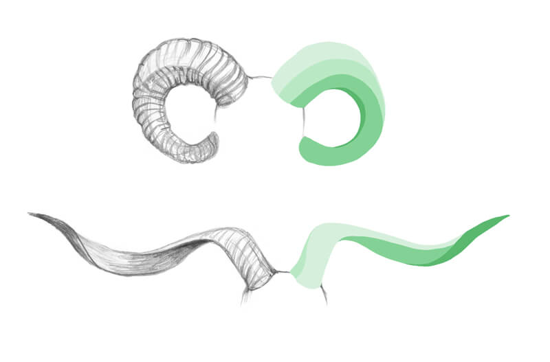
See the Form as a Set of Shapes
Try to imagine the horns as a combination of flat shapes or planes. You can do it just in your mind – or, draw a simple scheme on a piece of paper. The goal is to create a visual distinction between the parts or sides of a horn.
Notice where different planes change direction. A specific part of the horn may go forward or backward or it can turn aside. Observe these bends and transform them into stylized shapes.
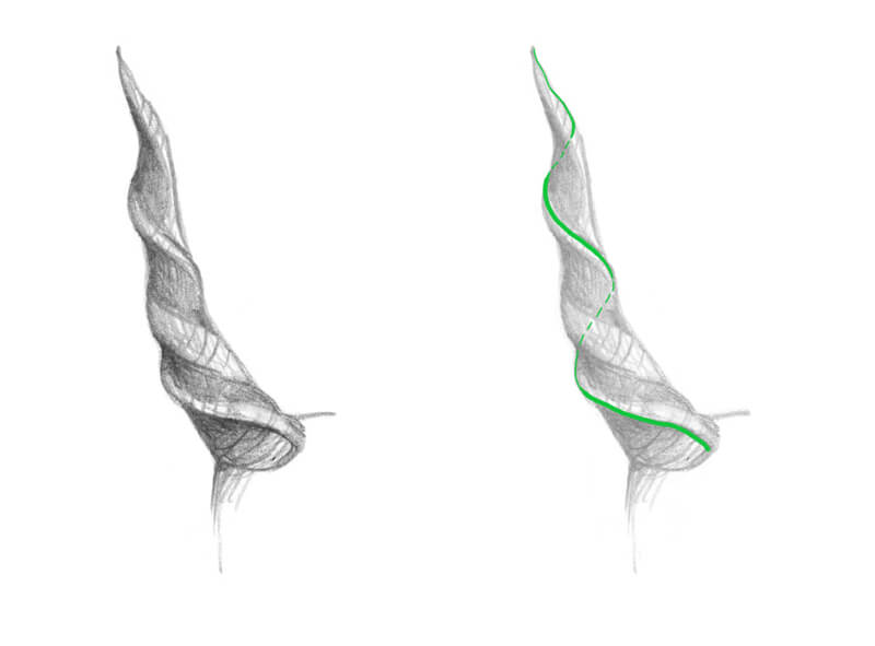
Imagine That the Form of the Antler Is Transparent
In the case of curved or spiral horns, it may be useful to envision the inner structure. Pretend that the object is made of glass. Look for repeating patterns or imaginary lines of relief.
Below you’ll find an illustration of this concept. The green line follows the curve. It envelops the whole form – from its top to bottom. This line becomes interrupted at the horn’s back side.
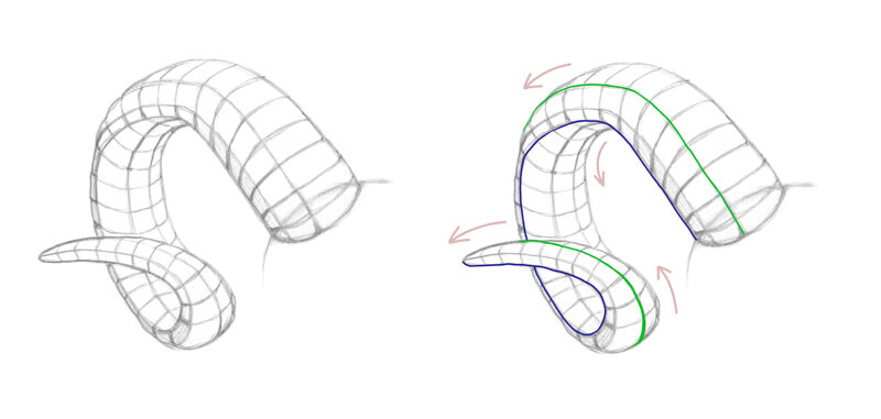
“Chopping” the Form
If you draw ribbed horns, try to simplify the form so that it looks chopped. As a result, curved areas will become flat, straightened. This trick makes the planes (or facets) clearly readable.
Observe each plane’s direction in space and its visibility to a viewer.
Also, pay attention to the areas near the horn’s edges. Chances are that you’ll be able to trace an imaginary line that follows the contours of the form. In the image below, such lines are marked with blue and green colors.
Drawing Horns and Antlers in Perspective
It’s necessary to remember that horns, just as any other object, conform to the principles of perspective. However, we don’t have to create a strict technical design that includes a horizon line, vanishing points, and guides.
See also: Linear Perspective
The best way to grasp this concept is to observe live animals with horns. (Alternatively, use reference photos.) You’ll notice how these head extensions look in different perspectives causing foreshortening.
Adding Color to the Drawing with Colored Pencils
It’s time to sharpen our pencils – we’re ready to start drawing with colored pencils! Let’s reinforce our newly discovered drawing knowledge.
It’s important to set a goal for your drawing practice. What’s your desired outcome – a detailed scientific illustration, a quick loose sketch, or a study of a texture’s fragment? The purpose determines the amount of effort and time that should be invested.
My goal is to observe the subject and learn something new about its structure and texture. Such valuable takeaways can be used in a more complex and elaborate artwork. I aim to complete this drawing within several hours, so probably it won’t be perfectly detailed. My result won’t be an accurate copy of the reference.
The Art Supplies for This Drawing Exercise
For this project, I’ll be using Faber-Castell Polychromos colored pencils. You’ll find the swatches in the image below.
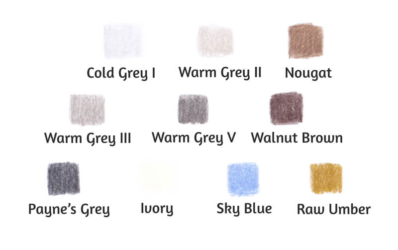
Please note that it is possible to complete this drawing with fewer pencils. An absolute minimum includes three greys (light, medium, and dark) and one brown. Of course, an extremely restricted palette won’t allow creating subtle color nuances, but you’ll still be able to draw and learn by doing.
See also: How to Draw a Seashell with a Limited Palette with Colored Pencils
I’ll be drawing on an A4 sheet of thick drawing paper with a subtle texture.
Also, keep a graphite pencil, a soft eraser, and a pencil sharpener at hand.
See also: 9 Must Have Colored Pencil Supplies
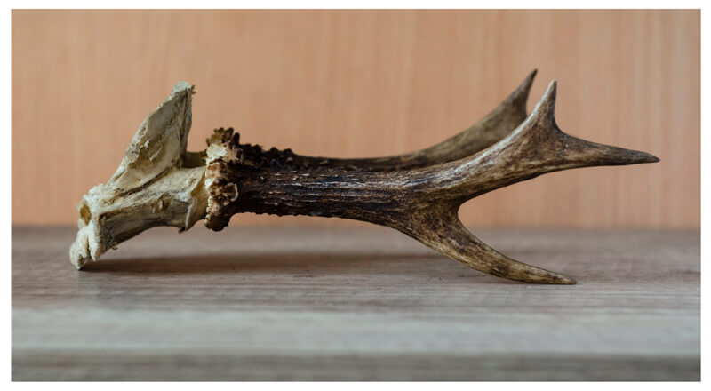
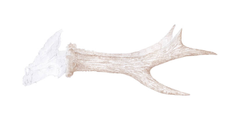
The Reference Photos Used for This Drawing
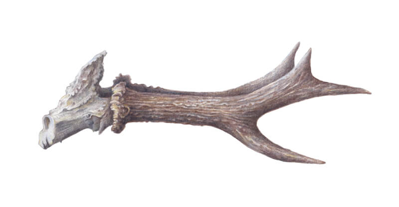
Our subject matter is Roe deer antlers. Feel free to use this image to follow along!
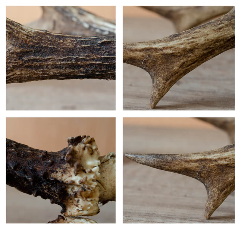
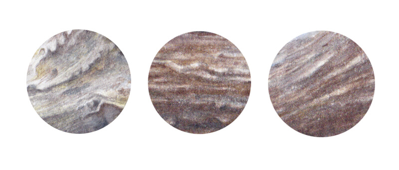
And here are some fragments of texture in close-up. Note that each area of an antler has specific textural qualities.
The burr is coarse and has prominent relief. The antler stem demonstrates a rough surface with long shallow furrows. The top part of the main beam and the upper tines have a smoother, more unified texture.
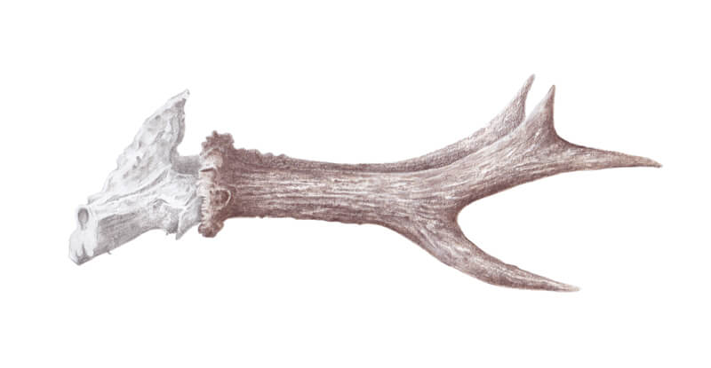
Create an Sketch of the Antlers
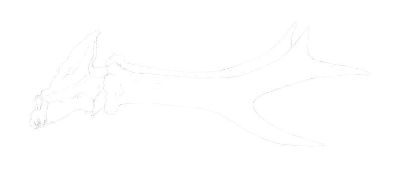
Let’s sketch the antlers. At this stage, the drawing will be rough and approximate. It is like a “box” for our object.
I present the skull as a set of shapes. Shape 1 is the side that is turned away from the viewer. Shape 2 presents the upper plane and shape 3 is the lower part of the bony area. The top projection is marked with green.
I also add the rough borders of the closer antler and its tines.
In this case, I don’t use many subsidiary lines, such as a core line and various ellipses that mark tines’ bases. These Roe deer antlers have a simple structure.
Keep the graphite marks as light as possible, and please note that I’ve intensified the lines in my sketch for your convenience. Heavy marks may be difficult to erase.
Now I refine the contours of the subject, removing unnecessary lines. Take your time to observe the reference and notice important details. Transfer them to your drawing.
At this step, I add the second antler.
Besides the contour line, I don’t include the details of the antlers’ texture. However, if that helps you to study the subject, please mark some furrows and bumps.
When the underdrawing is complete, soften the graphite marks with an eraser.
A Quick Note on Working with Texture
Before we proceed to colored pencils, let’s make a quick digression.
Some materials present a greater challenge for the artist. The surface of horns or antlers may be considered as such an example. This texture has so many details!
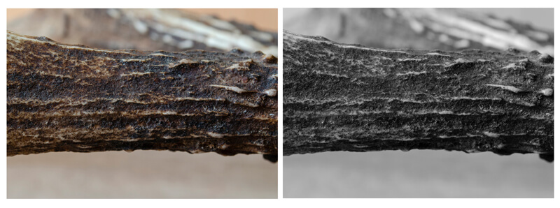
Here is one of the tricks that may help you to grasp the essence of this material. Take a photo of your subject matter and switch it to a black and white version. When you remove the colors, the relief of the surface becomes much more visible. The values will be clearly readable too.
Also, it may be a good idea to start with a study of texture. Focus on one fragment at a time, and you’ll find that complexity is just an illusion.
And the last piece of advice – make sure that you spend enough time observing the texture. It might bring you unexpected insights!
Drawing the Antlers With Colored Pencils
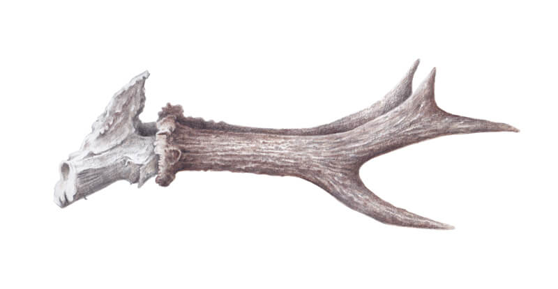
Let’s start with a color base.
I cover the bony part, using Cold Grey I. Some areas of the skull seem to have a cool undertone. A subtle contrast in color temperature will make the drawing livelier.
See also: Warm vs. Cool Grays
With Warm Grey II, I cover the lighter areas of the antlers.
I add Nougat to the darker parts of the antlers. The antler that is farther from the viewer gets a more unified covering because it should stay in the background. Too many details of texture will push it forward visually.
The applications of Warm Grey II and Nougat may overlap each other.
I make sure that I spend enough time observing my model. When I notice a specific detail, I transfer it to my drawing. However, we don’t have to make a hand-drawn copy of the subject matter. It is more important to convey the perceived feel of the texture.
I keep light pressure on the pencils. My fingers create a back-and-forth movement that is also known as directional lines.
See also: Colored Pencil Techniques: A Practical Guide
With Warm Grey III, I work on the midtones found on the skull.
Then I use Warm Grey V to accent the shadowed areas. The applications of these two greys may overlap – this will create a soft value transition.
I carefully observe my reference, still searching for valuable details. Those nuances will make our drawing more credible.
I add Walnut Brown to the antlers. The covering is slightly irregular. It has gaps that conform to the overall look of the texture. I create furrows with longer lines. The marks repeat the direction of the hollows.
I accent the burr and the main beam with an additional layer of pigment.
In my reference photo, the farther antler demonstrates lower value, so I darken it additionally.
I increase the contrast, using Payne’s Grey. This pencil has a nice cool undertone that is great for creating shadows.
While working on the antlers, make sure that you keep light pressure. Also, avoid covering the prominent details of the texture.
I use Walnut Brown to strengthen the bone’s core shadows. The pressure is very light. The inclusion of this shade will unite the artwork in terms of color.
Note that we usually see fewer details in the highlighted and the shadowed areas. Let the covering be slightly unified there.
Also, decide what area should get an emphasis. Something similar happens when we take a photo. We focus on a particular area, while other parts of the image become a bit blurry. They’re out of focus, and the details are not as crisp there.
I’m going to accent the middle part of the main beam that is closer to the viewer. This area will require a more detailed elaboration.
With Ivory, I cover the upper areas of the skull. I use the pencil’s tip to move the pigment found on the paper, so the covering becomes more polished. This tint creates a slight change in the color temperature. It conveys the gentle touch of light.
I apply this color to the antlers, accenting the lighter areas.
The tines have a smoother texture, and Ivory can be used to express this feature. I keep an increased pressure to polish those areas.
I add Raw Umber to the burr and bony part. It creates interesting color nuances that make the drawing more vivid.
At this stage, I pay less attention to the model. Instead, I start treating my drawing as an independent art object. I prioritize its visual credibility over the conformity to the reference.
I apply Walnut Brown and Payne’s Grey interchangeably to increase the contrast and deepen the shadows. I cover the antlers, leaving the most prominent details untouched. The darker areas of the skull get an additional layer of shading, too.
When we work on a textured object, it may be tempting to dive into creating all kinds of details. At the same time, it’s necessary to evaluate the main form – does it look three-dimensional? Are the core shadows dark enough to create a sense of volume?
I mute down all the areas that still seem plain and unexpressive. The texture in the darker areas becomes slightly smoother. I get rid of excessive roughness, including the specks of paper that may be showing through the applications.
It’s possible to use Nougat to create additional color nuances and details of texture.
I use Sky Blue at a light pressure to create a nice cool accent at the upper tines. Also, we can add this color to the side of the skull that is turned away from the viewer.
I recommend taking a break before you call this artwork finished. Come back with fresh eyes and chances are that you’ll find something that requires a final touch.
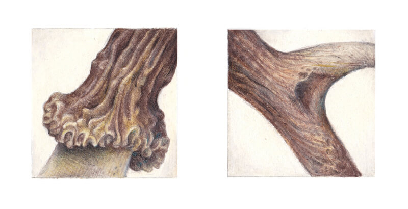
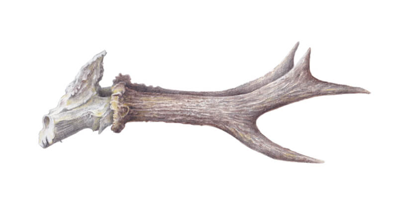
Here are close-up samples of hand-drawn textures. They include the bony part area, the antler stem, and tines.
I create a cast shadow, using Payne’s Grey and Walnut Brown. I work with long lines, holding a pencil at an angle, so its body produces the marks.
I layer the applications on top of each other. The cast shadow should be dark enough to emphasize the antlers. Let its edges be blurry.
The darkest areas of the cast shadow are near the points where the object is touching the supporting surface.
Drawing Antlers and Horns – Conclusion
Congratulations – we’re at the end of this lesson! Time flies when you’re focused and having fun. We’ve created a wonderful texture study and, hopefully, gained some insights and new knowledge.
Thank you for being with me on this journey. I wish you much inspiration for your future projects!
If so, join over 36,000 others that receive our newsletter with new drawing and painting lessons. Plus, check out three of our course videos and ebooks for free.
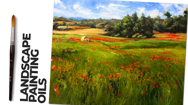
Painting Orange Slices with Acrylics
Orange Slices with Acrylics
In this acrylic painting lesson, we’ll use acrylic paints on panel to create a looser painting of orange slices that emphasizes brushwork and composition.
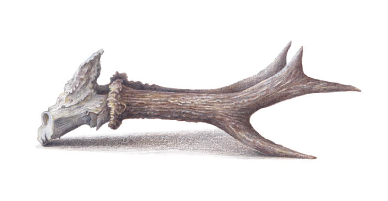
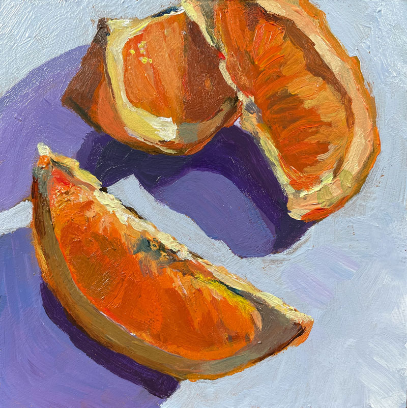
Here’s a look at the completed painting…
Brushstrokes and Composition
The beauty and complexities of the brushstrokes of artists of Impressionism and those influenced by Impressionism should be an inspiration to all artists. These marks transform mundane objects and subjects into true art and not just replications of what is observed. Bold applications of thick paint sometimes appear haphazardly applied, but with a bit of distance, we see the genius. In this lesson, we’ll allow our brushstrokes to be loose and bold – somewhat like the Impressionists.
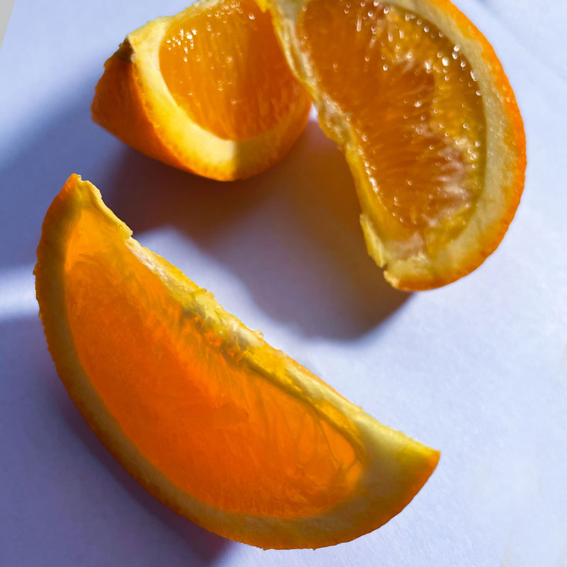
In preparation for this painting, I took several photos of my subject and experimented with several arrangements before deciding on the composition below. I like the way the shapes of the shadows and the shapes of the orange slices create an interesting composition. Here’s a look at the photo reference…
Materials and Surface
This painting is created using Liquitex heavy body acrylics. You can use any brand of acrylics that you wish, if you want to follow along with your own painting. I suggest using heavy body paints instead of thinner craft acrylics.
(Links to suggested materials are affiliate links which means I make a small commission if you purchase at no additional cost to you.)
If you’re looking for a great set of basic colors, you may consider this set…
Liquitex Heavy Body Acrylics – 12 Tube Set
The panel that this painting is created upon is small, measuring only 4″ by 4″. The surface is pre-primed with gesso and features a smooth surface. Because of the smooth surface, the brushstrokes are accentuated.
Pre-primed panels can be found at your local art store, but you can also order them online…
3 – Pack Primed Panels for Painting
Nylon brushes were used to apply the acrylic paint and a bit of slow drying fluid medium was used to slow the drying time of fast-drying acrylics.
Mediums for acrylic painting can be found at your local art store, but you can also order them online…
Slow Dry Fluid Medium for Acrylic Paints
Prior to painting, I prepare the panel with a base color or ground using a mixture of Yellow Oxide, Titanium White and Burnt Umber. This ground provides a warm, medium value instead of a stark white surface. This allows us to make better decisions regarding the values and colors that we add.
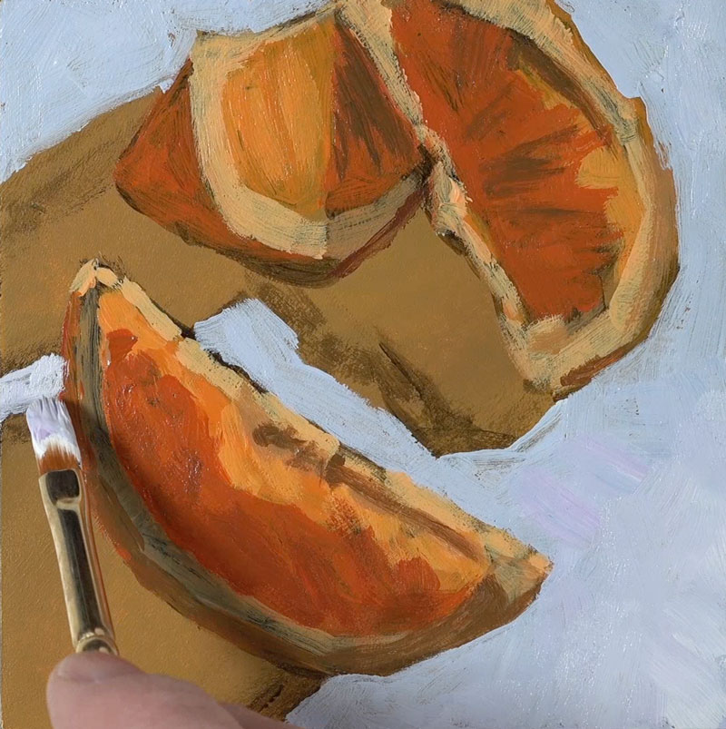
Sketching the Oranges
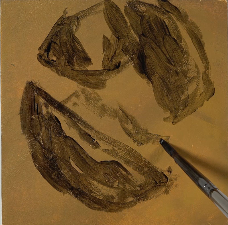
We’ll begin by simply sketching out the shape of the oranges, getting the composition in place on our panel. I apply a mixture of Burnt Umber and Payne’s gray. This mixture makes a nice dark value that’s not quite black, but is dark enough to create contrast.
As I’m adding the shape of the orange, I’m also allowing some of the shadowed areas to be filled in with this darker value. I’m only concerned with the relationships of the spaces around the edges and the spaces in between the oranges. I’m using the space around the oranges in order to figure out where the oranges are actually placed on the composition.
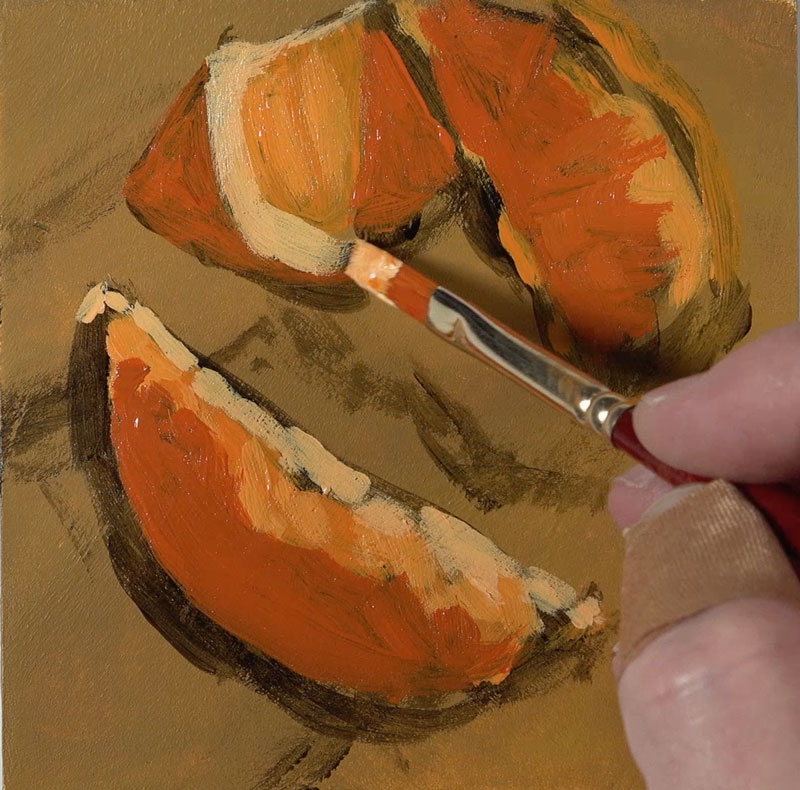
Blocking in Colors
Once our loose sketch is in place, we can start mixing up our initial color for blocking. I’m using a bit of Cadmium Yellow and Cadmium Red. This creates a bright orange that is applied to the areas of middle value. I’ve switched over to a larger flat brush to do so. In fact, I’ll stick with this larger brush for as long as I possibly can. This adds to the looser feel of the painting and it will force me to focus on the shapes of color and value that I see instead of the details.
Once we have many of the middle values blocked in, we can start to push the value range and contrast. This means that we’ll gradually add both lighter and darker values, based on what is observed from the reference.
Our light source is originating from the upper right hand corner. We can see that the lighter values exist along the top edges of the oranges. We’re creating an illusion when we create a drawing or painting. And when we’re painting, this illusion is created by the relationships of shapes of value and color. That’s why we’re focusing on these relationships of lighter and darker value.
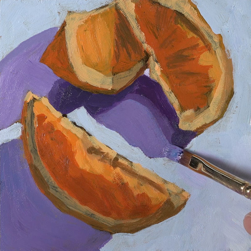
Painting Cast Shadows
Next the cast shadows underneath the oranges are addressed. Keeping the light source in mind, we’ll notice that these shadows make defined shapes that extend from the bottom of the orange slices opposite from where the light source originates.
Purples are chosen for the cast shadows. This exaggerated color harmonizes with the blue background, but contrasts the yellows found on the orange slices.
Adding “Details”
Now that we have some of our background colors in place, we can go back to the oranges. We can do so armed with a bit more information on the value relationships and color relationships. I’ve switched over to a smaller brush and I’m addressing some of the details on the orange that’s closest to the viewer.
At this point, I’m fighting the desire to make this painting feel a little bit more realistic. Instead, I want this painting to feel looser and fresher with brushstrokes that are a bit more expressive. When we switch to a smaller brush, it’s a little bit harder to do so.
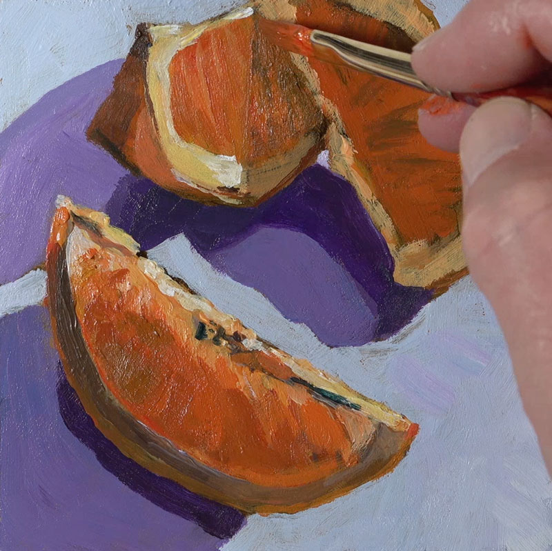
The process of developing the details in the painting is essentially the same as the blocking process that we used when the painting began. The only exception is that we are now paying attention to smaller shapes of value and color instead of larger ones. If we stay focused on color and value and the shapes of those colors and values then the “details” will slowly emerge.
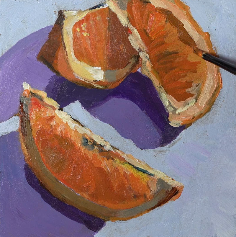
Painting Oranges with Acrylics – Conclusion
To finish the painting, we’ll simply continue to find and add various values and intensities of the colors we observe, taking care that we don’t overwork the painting and lose the freshness of the bolder and larger brushstrokes.
Here’s another look at the completed acrylic painting of orange slices…
Due the size of this painting, the time required to complete was rather short. Working on a smaller surface allows you experiment and learn quickly without committing to a larger painting. And for those of you that tend to overwork your paintings, working smaller forces you to be more efficient with your brushwork.
If so, join over 36,000 others that receive our newsletter with new drawing and painting lessons. Plus, check out three of our course videos and ebooks for free.
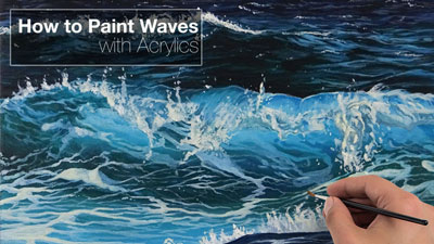
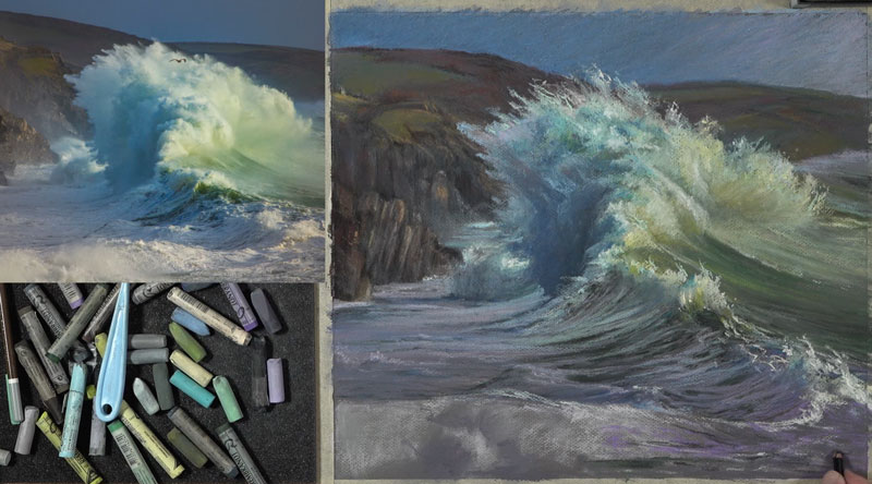
Drawing Waves with Pastels
Waves with Pastels
In this pastel lesson, we’ll take a look at drawing waves with soft pastels on Canson Mi-Teintes pastel paper. We’ll try to capture the power and beauty of the ocean through bold mark-making and strong colors.
Here’s a look at the completed drawing…

Considerations for Composition
A photo reference from Pixabay.com was used to complete the drawing. Only slight alterations to the color and contrast were made in Photoshop. Here’s a look at the photo reference…
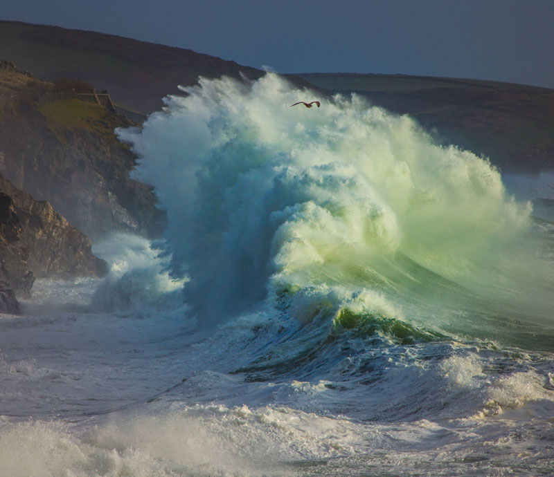
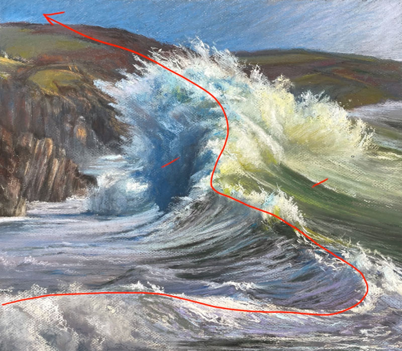
The photo reference already has a strong composition and there’s a reason why this composition is strong. We’ll notice here that there is a strong line that divides the cooler side of the wave from the warmer side of the wave. This line is incredibly important in the success of this composition. This edge basically forces the viewer’s eye to move right along it.
We want to make sure that this is not lost in the final image, and we want to accentuate it so that our composition is as dynamic as it possibly can be.
See also: Composition in Art
Sketching the Waves
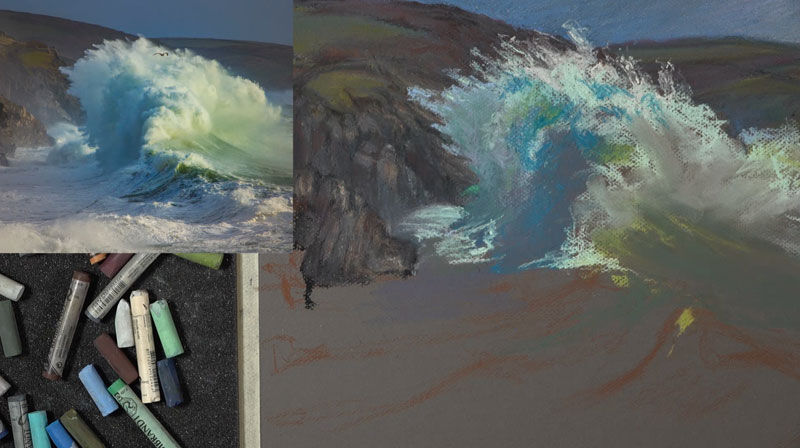
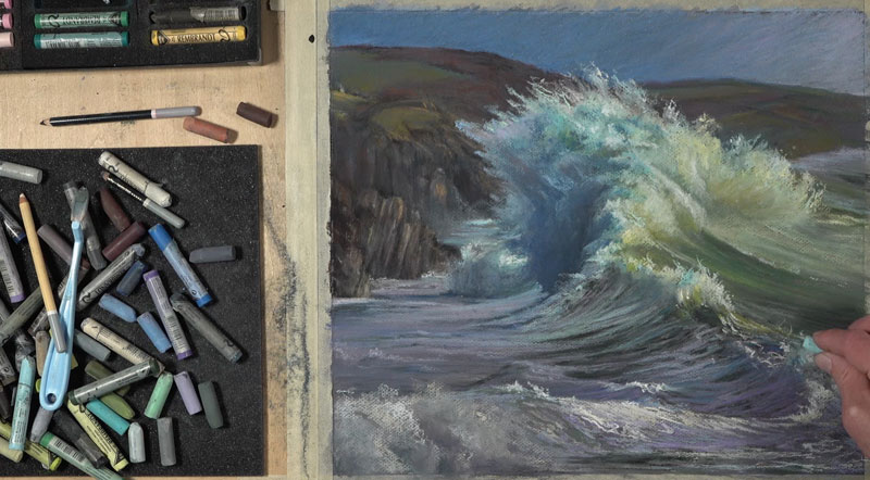
We’ll get started with a pastel pencil on the heavily textured side of the paper. There are two sides to this paper and both sides are suitable for pastel applications.
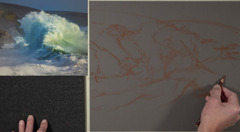
I’m using a reddish brown pencil and I’m holding the pencil fairly low on the shaft. Initially, I use it more like a paint brush rather than a pencil. I’m making loose sketchy marks here, just trying to find the composition. I’m trying to find the flow of the wave and the distant hillside as well.
Drawing the Sky and Background
For the sky, I start with a light blue and apply a bit of gray and some other blues over the top. I want to create a gradation here from a darker blue on the left side over to a lighter – almost red-purple on the right side of the sky. I’m also trying to keep the strokes that I’m making fairly consistent. As you can see below, most of them are going at a diagonal.
Since pastels can have an opaque quality about them, we can work from the background to the foreground. You can see I’ve overlapped the horizon line with additional pastel applications. And that will make the connection between the horizon line and the background sky a bit more seamless.
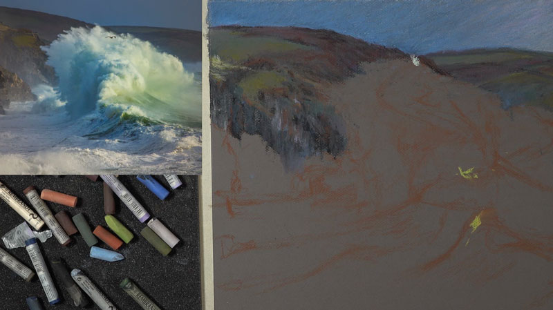
I layer lots of different colors here. There are reds, red-purples and orangey browns. There’s also some yellow-greens and blue-greens. Layering these colors requires patience. This is especially true when you’re working with a heavily textured surface, like we are here. You can see in the early stages when I move onto a new section, the material is fairly sparse and it’s not reading well. But as we continue to add more layers and build up depth in that color, the colors start to make a little bit more sense and the values do as well.
Drawing the Wave From the Top
Once we have a good portion of the background complete, we can address some of the main focus of this image – the wave. I start with a lighter blue on the shadowed side of the wave. In the middle, a warmer highlight is added. From here, I begin gradually building up the shadow and the color contrast in the wave.
On the shadowed side, we see a lot of cool colors. But on the highlighted side – the right side of the wave – we see warm colors. The colors on the right side of the wave lean more towards a yellow-green. The colors on the shadowed side of the wave lean more to blue or blue-purple.
While there is some blending of the pastels, I’m trying to focus on creating deliberate, strong marks with the medium. You’ll see evidence of this type of mark-making mostly around the areas where we see sea spray. I try to get some energy in my mark making and communicate the power of this particular wave through the marks that I make.
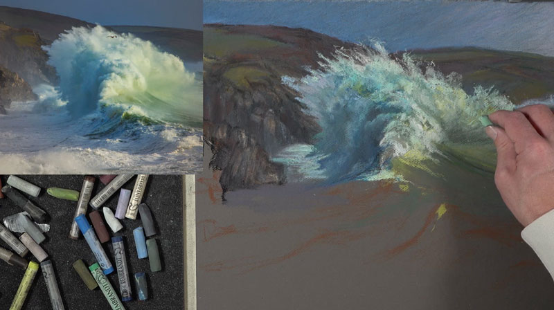
I bring in some lighter yellow-greens and blue-greens here and there as I continue to push that relationship between the darker side or the cooler side of the wave and the warmer and lighter side of the wave. This contrast in value and color temperature is important for capturing the light within the scene.
The direction of the stroke that you make is important and plays a role in communicating the subject. On the right side of the wave, we can see these directional strokes flow in a slightly curved direction. But on the lower part, where we have the water, those directional strokes are flowing down the wave. The opposite of this is happening on the other side of the wave. Again, the directional strokes are flowing down the face of the backside of the wave.
Drawing the Wave in Middle Ground and Foreground
As we work down towards the foreground, we need to keep in mind that the cliffs continue. So as we work down the picture plane into the middle ground and foreground, we’ll continue to make adjustments to the background as well.
As we work towards the viewer, we’ll notice that the contrast in value increases. For this reason, we’ll begin adding bits of black to force some of the values darker. Black, on its own, is very strong and can make a drawing look flat or unnatural. For this reason, we can layer some color over our black applications to make it appear more natural.
To help tone down the black applications, a black pastel pencil is used. This pencil is not quite as soft as a stick pastel so the intensity is slightly lessened.
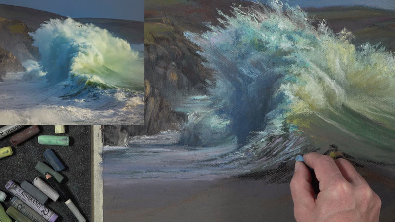
To heighten the contrast even further, we’ll make strong, unblended applications of lighter values along the crest of the wave. We even see some subtle highlights on the shadowed side of the wave.
Behind the wave, on the left side of the picture plane, we see a large section of water that is mostly in shadow. There is color here and I choose to use purples. Subtle highlights within this shadowed area are addressed with horizontal marks of lighter purples and red-purples.
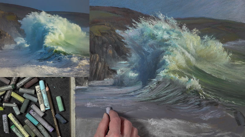
Drawing the Foreground Waves
As we work to the foreground, the dynamic of the wave changes. In the foreground, we see what appears to be mist on the left side of the picture plane. Our mark making here changes as result. Some of the marks are blended out and more neutral grays are applied.
While the left side of the picture plane is slightly blended, the right side remains fairly strong in contrast. We’ll exaggerate this, making the marks strong, bold and colorful.
As we do this, we’ll make sure to accentuate the crest of the wave as it curves with strong highlights.
Finishing Touches to the Waves
To complete the drawing, a few more highlights are added to the crest of the wave in the foreground. After stepping back and analyzing the drawing, additional adjustments are made to the wave in the center of the picture plane and the distant background. These final marks are designed to increase the illusion of space and add a sense of movement and energy.
After these final touches are applied, the drawing of waves with pastels is complete. Here’s another look at the completed drawing…
Once the drawing is complete, the tape around the border can be carefully and slowly removed by pulling at a 90 degree angle.
If so, join over 36,000 others that receive our newsletter with new drawing and painting lessons. Plus, check out three of our course videos and ebooks for free.
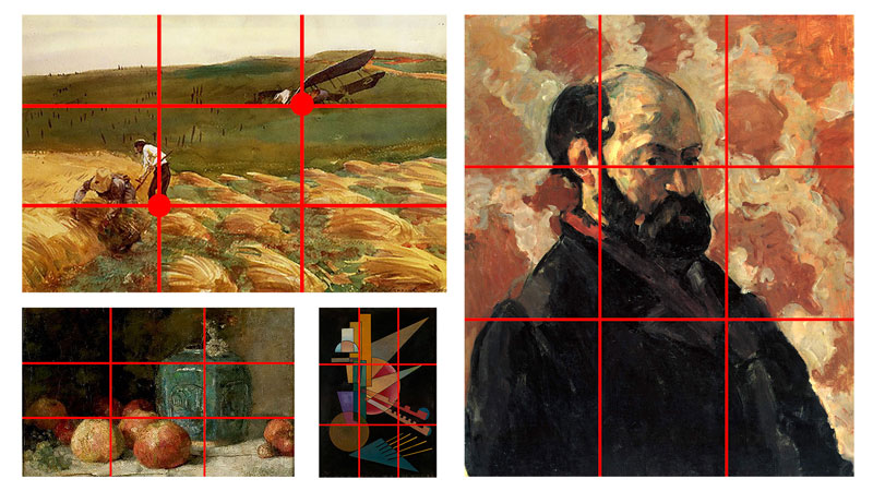
Critiquing Van Gogh’s Café Terrace at Night
Critiquing Van Gogh
Vincent Van Gogh is one of the most well-known artists in all of art history. Categorized as a Post Impressionist, Van Gogh’s influence on the art world is undeniable. Even though he did not experience fame and fortune in his lifetime, his legacy as one of the greatest artists of all time lives on.
In this critique, we look at one of his most famous works, “Café Terrace at Night”. We examine the characteristics of this painting that make it a masterpiece and the choices that Van Gogh made. We do this so that we can apply the same concepts to our own artworks and develop an appreciation for the discipline of art-making and composition.
Facts About this Painting
Title: Café Terrace at Night
Medium: Oil on Canvas
Date: 1888
Dimensions: 80.7 cm × 65.3 cm (31.8 in × 25.7 in)
Location: Kröller-Müller Museum, Otterlo
The Importance of Critique
It’s easy to assume that an art critique only benefits the artist that created the art. But this is far from the truth. Critique helps us all since we learn from analyzing any artwork. We can take what we learn and apply these concepts to our own artworks.
If so, join over 36,000 others that receive our newsletter with new drawing and painting lessons. Plus, check out three of our course videos and ebooks for free.