Drawing with Colored Pencils on Toned Paper
In this lesson, we’re going to take a look at creating a drawing of a koi fish using colored pencils on toned drawing paper. You’ll see how easy it is to ensure accuracy in your drawing, using a transfer process. And we’ll also take a look at how abstract shapes of color and value often lead to the illusion of realism in a drawing.
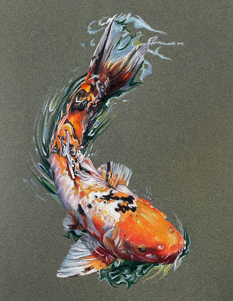
Here’s a look at the completed drawing…
Materials and Surface
In this lesson, we’re using Prismacolor Premier colored pencils on Canson Mi-Teintes pastel paper. Canson Mi-Teintes paper features two distinct sides. One side of the paper is heavily textured, while the other side is less textured. We’ll be working on the less textured side of the paper. (The following links are affiliate links which means I make a small commission if you purchase at no additional cost to you.)
Transferring the Image
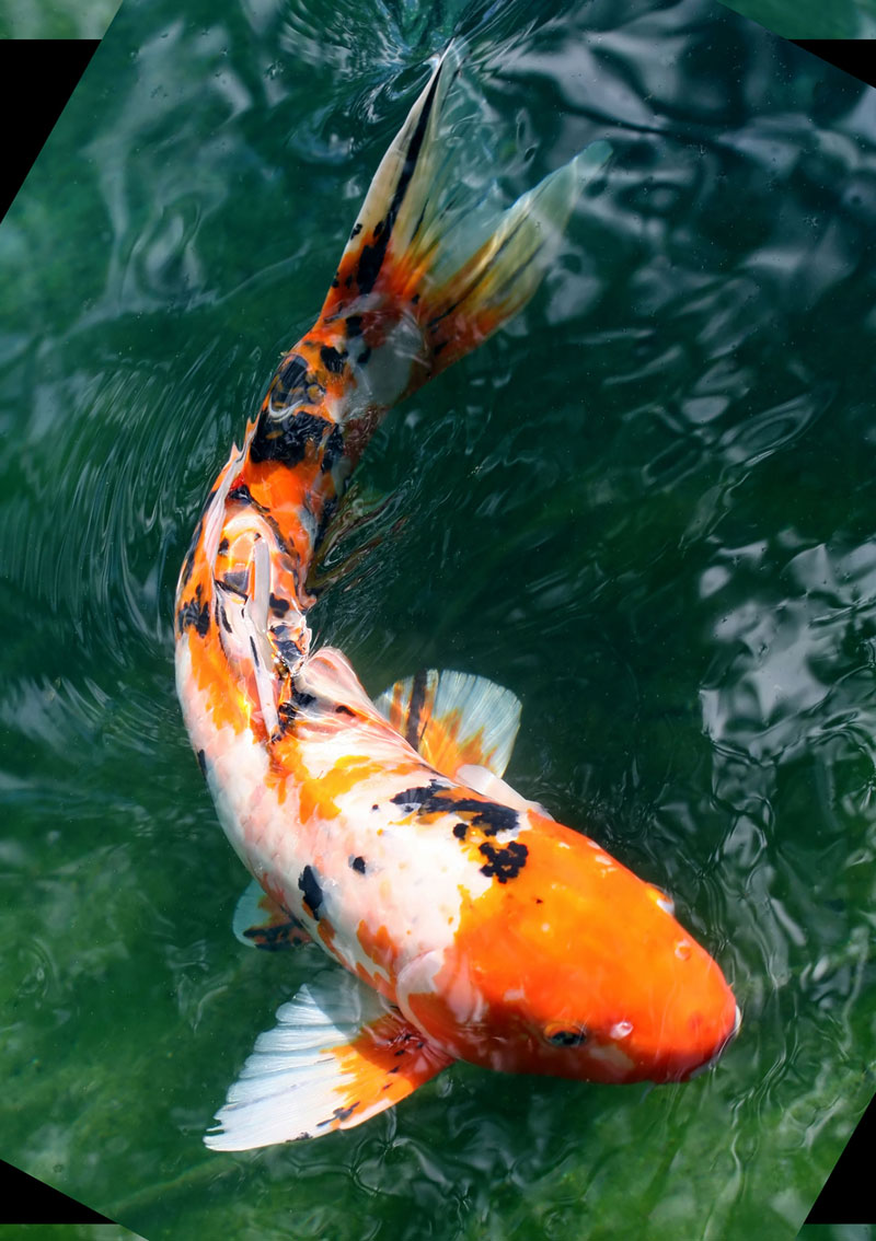
A photo reference is used to create the drawing. Here’s a look at the reference image…
We’re going to start out by using a transfer process to ensure that we get the contour lines of our fish in place on our drawing surface. We’ll use a bit of PanPastel and apply it to the back of the photo reference. I’ve printed out the photo reference on just regular typing paper and I’m using the white PanPastel and applying it fairly liberally to the back of the photo reference.
I’ll take my drawing paper, which I’ve already prepared and tape it down in place so it doesn’t move. Then we’re going to carefully place our photo reference over the top and tape it down very gently with a few pieces of masking tape. Now, we’ll need to use a sharp tool in order to place pressure on all the contour lines to basically transfer the PanPastel material onto the drawing surface.
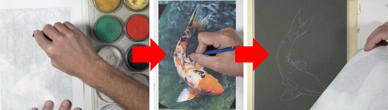
Using a lead holder with sharpened lead, I trace over all of the contour lines I wish to transfer. I’m careful not to place too much pressure on the pencil though because I don’t want to create grooves in the finished surface. When we remove the photo reference, we can see that we have a contour line drawing in place of our koi fish.
See also: Is It OK to Trace in Art?
Formulaic Colored Pencil Applications
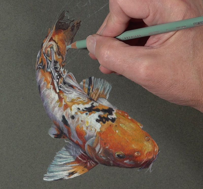
Now we’re ready to begin with colored pencil applications. I’ll start with the eye, building up a natural black. I’m not going to use the color black at all. Instead, I’m using a combination of indigo blue and dark umber. This creates a more natural looking black that gives me full control over the color temperature. If I want my black to appear a little cooler, I’ll add a little bit more of the indigo blue. If I want it to be warmer, I’ll just add more of the dark umber.
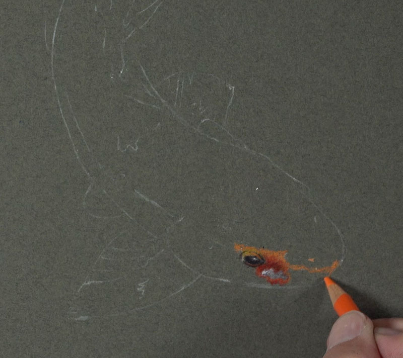
From this eye, I’m going to start working outward, layering different varieties or different versions of oranges, yellow-oranges, and red-oranges – a bit of white and gray as well.
As I work, I’m trying to come up with a formula for how I’m going to layer my colored pencil applications. You can see I’ve got a broad range of value in this small little section. For the most part, I start with just a standard orange colored pencil. Over the top, I’m adding a little bit more of an earthier red-orange. This color is terra cotta and it does make the value darker, but not quite dark enough. I switch over to a 70% warm gray. This makes the value darker, but a little bit too cool. So add a little bit of dark umber over the top.
This is typically how I like to work with a colored pencil drawing. I’ll start in a small area and come up with a formula of how I’m going to layer my pencils to build up the color and value.
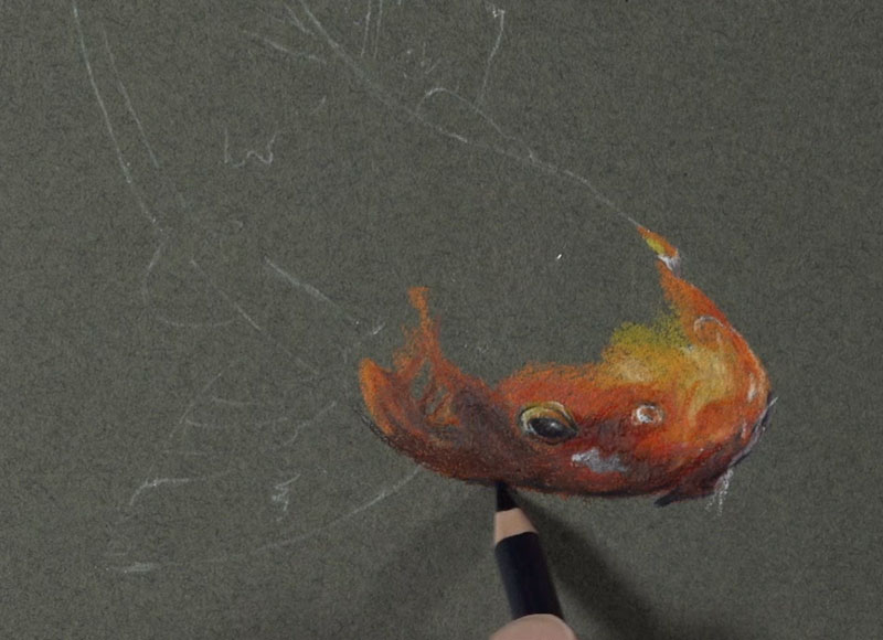
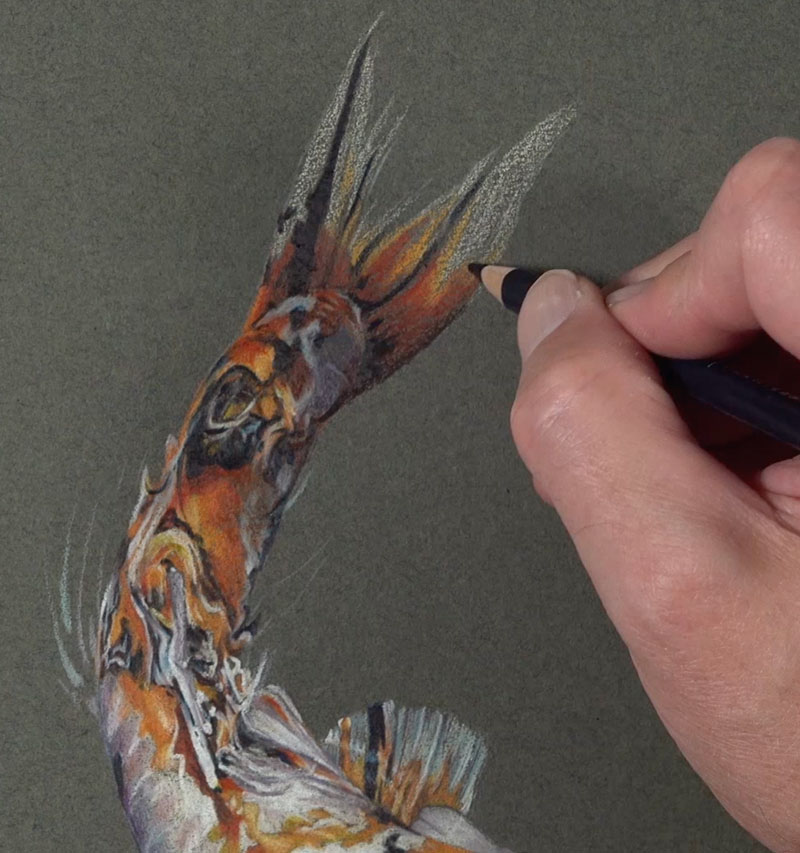
The values on the head of the fish are much lighter. I’ll layer some lighter yellow-oranges, including yellowed orange and a bit of cream. Now, there are some reds here too and I don’t want to lose those. So in this case, I’ll layer a bit of poppy red over the top in some of the areas.
Remember, we want to create variety in the color. Orange is mixed by combining yellows and reds, so it makes sense to use yellows and reds in orange areas. Now that I have my formula in place, I’ll simply work my way out from this location.
As we work each area, we’ll adjust the formulation that we use appropriately.
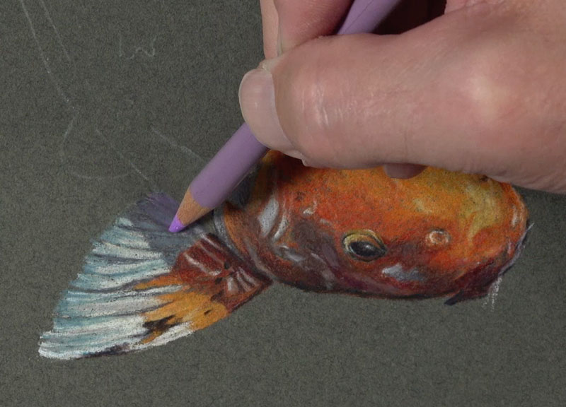
Working Up the Body of the Koi Fish
This process is slow and tedious. Make sure to take your time and patiently layer your colored pencil applications. Colored pencils are at their best when they’re layered. This layering adds to the complexity of the color, making your drawing look more natural.
I’m applying the colored pencils in a way that the application appears solid – so that none of the color of the paper is showing through. This is another mistake people often make with colored pencils. They draw very, very light. Instead, you should try to build up to a heavy application. This doesn’t mean that you start with a heavy application, it just means that you will slowly and gradually build up a heavy application.
Incorporating a Color Scheme
You can see here in the shadowed area of the first fin that we are addressing that I’ve decided to add a little bit of purple to the mix. This color is appropriately dark purple and you might be wondering why purple?
And that’s a great question.
Purple is used because I’m trying to exploit a specific color scheme. A color scheme is a defined arrangement of colors usually based on their positioning on the color wheel.
The color scheme I’m trying to exploit here is called a secondary color scheme. This scheme is made up of the colors of purple, orange and green. These colors are equidistant from each other on the color wheel, making them a color triad. I’m going to put hints of purple here and there because the paper we’re working on is green and the bulk of the fish is orange. If we add bits of purple here and there, that will keep us in line with the secondary color scheme. The secondary color scheme will create additional pop and color contrast which will make our drawing look a bit more interesting.
See also: Warm vs. Cool Grays
Shapes of Color and Value
I’m carefully paying special attention to the relationships of the shapes of color and value that I see and I’m trying to mimic those as closely as possible.
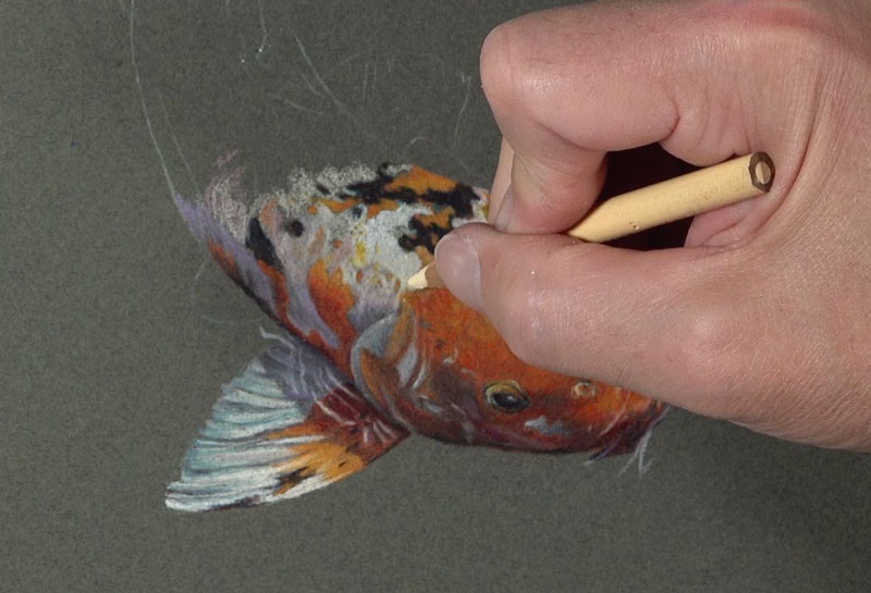
Instead of thinking of drawing a fish, I am thinking of only shapes, colors and values. The fish will emerge from the paper as long as I get these right.
We see that we have a collection of dark shapes right next to light shapes and these are all distorted because of the water. What we actually see is a collection of shapes of values and colors. If we can replicate these shapes of color and value on our drawing surface, then we’ll create a convincing illusion that will look realistic. And that’s how abstraction leads to realism.
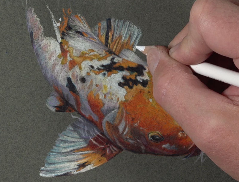
Even as we work up to the tail end of the fish, we’re sticking with the same colors – just the values will change from section to section. This means we’ll have to have some darker sections and some lighter sections as well. We want to make sure that we continue to create that variety in the oranges by adding bits of red and yellow-orange. I’m bringing in some jade green up here at the end of the fish as well.

I’m going to add hints of the water around the edges of the fish so that we can see a bit of movement and to make the drawing a bit more interesting. You could fill out the rest of the picture plane if you wish, or just add a little bit more of this information.
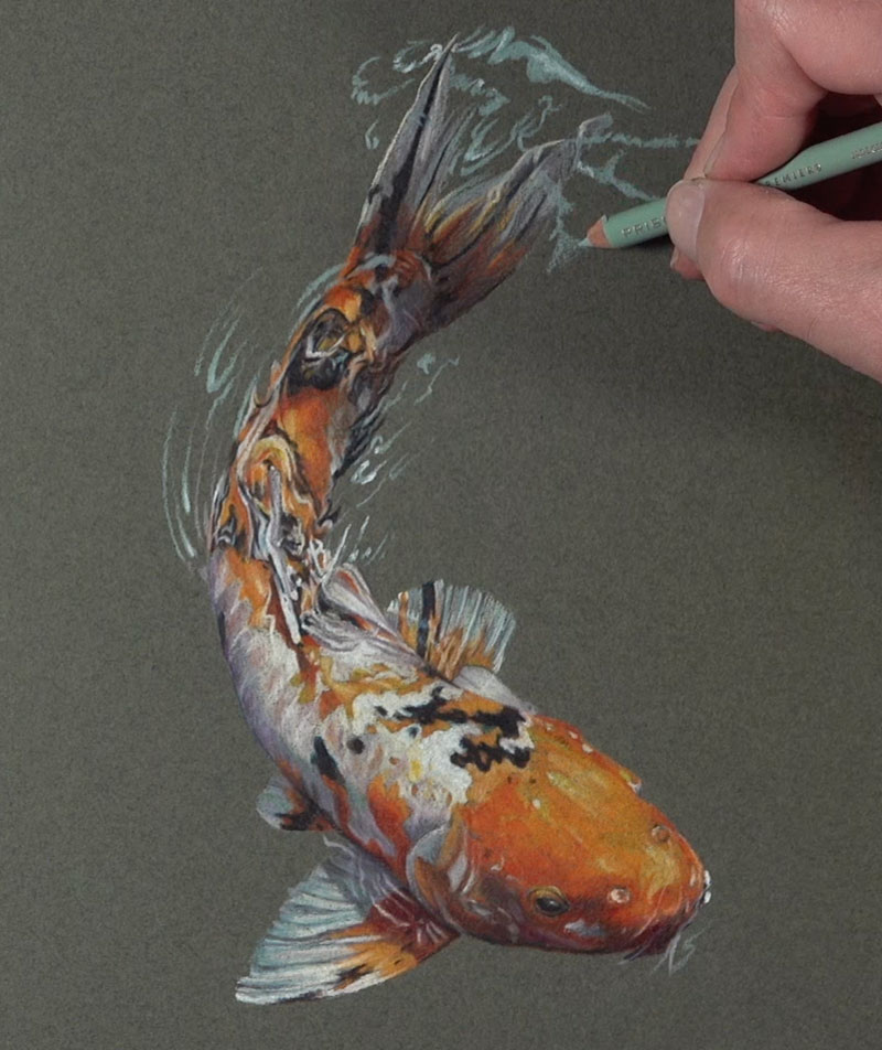
I’m allowing more of the paper color to show through because the color is a dark green and makes sense for this particular subject. I’m using a bit of slate gray to add a little bit more variety in the ripples. We’ll simply pull out a few strokes that mimic what we see in the reference.
We’ll do the same on the left side of the picture plane with the slate gray. Now we have some lighter values and some middle values for our water ripples. We need to add some darker values and we’ll start with a bit of dark green. This green is cooler so it makes sense to add it in some of the water areas, but we need to make the values darker. To do this, we’ll add a bit of indigo blue.
Finishing Touches to the Drawing
Let’s add another green – a yellow-green. Lime peel is used to add more variety to our water areas and it still makes sense with our secondary color scheme. Then we’ll just continue working out the areas that we want to include in our drawing. It’s completely up to you how much you want to add or how much you want to leave out.
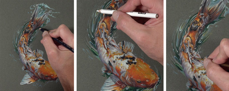
Lastly, we need to add some strong highlights on top so the water actually looks wet. Obviously, we’ll start with a white colored pencil and put heavy pressure so that it covers up the colored pencil applications underneath.
The white colored pencil does a fairly good job of creating these highlights, but there might be a couple of areas that you want to make a bit stronger. To address these areas, we can turn to a material called gouache. Gouache is opaque watercolor and we can apply it directly over the top of a colored pencil drawing. A very fine-tipped brush is used to apply pure white gouache to a couple of selected areas to make the highlights quite a bit stronger. After these highlights are added, our colored pencil drawing of a koi fish on toned green paper is now complete.
Here’s another look at the completed drawing…
Koi Fish Drawing with Colored Pencils – Conclusion
Drawing with colored pencils requires patience, but it’s worth it. Work slowly and concentrate on the shapes of color and value that you see. Match what you see as best as you can and a realistic image will appear. Layer your colored pencil applications to develop depth in the color and enjoy every step of the process.
If so, join over 36,000 others that receive our newsletter with new drawing and painting lessons. Plus, check out three of our course videos and ebooks for free.