The Problem with Stippling
Stippling is the process of applying countless small dots to the drawing surface in order to create the illusion of shadow. Stippling gives you great control over the gradation or changes from dark values to light values. Stippling can be used with any drawing medium, but most of the time – we see it used with pen and ink. This is because it’s sometimes difficult to create gradations of value or shadow when we use pen and ink.
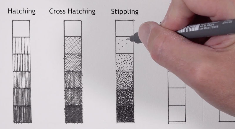
But there is a fatal flaw with stippling, and that is – it takes forever.
But what if there is a way that we could speed up the process, or if there was some way to create the illusion of stippling without making all of those small dots? And what if that solution was the drawing paper?
A Textured Paper to Create The Stipple Look
Let’s start by taking a closer look at the paper which is stipple texture paper by the Bee Paper Company. If we look at the label, we can see it’s acid free and it’s excellent for all dry media – so it says. It also says “ideal for designing tattoos”, which I’m not sure about that one.
Buy Bee Stipple Paper on Amazon (This is an affiliate link which means we make a small commission if you purchase at no additional cost to you.)
We’ll go ahead and start here with graphite. In each one of these squares, we’ll take a quick look at different media. I’m using a 3B pencil here, so this is a fairly soft pencil. And you can see that it is somewhat difficult to get quite as dark as you might expect with a soft pencil like this. But again, that’s because little white specs of the paper are showing through.
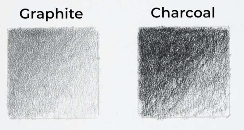
Let’s move on to charcoal. We’ll use a compressed charcoal pencil here, and you can see clearly that the charcoal is much darker. It’s also matte, which is helpful. But again, it’s still a little bit difficult to get some of those really dark values because of the texture of the paper. As we’ll see in the demonstration that follows, that might be a good thing.
Let’s look at how colored pencils behave on this surface. We’ll do some overlapping and see if we can get some optical color mixing to happen here. By layering a bit of red over blue, we can start to see hints of purple showing through. You’ll also notice I’m fighting the white of the paper again because of the coarseness of the texture of the paper. This doesn’t mean colored pencils aren’t a good medium to work on this surface, but you might have to push values really dark or work hard to make those values dark.
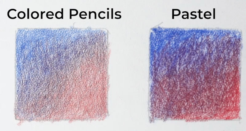
Now, lastly, we’ll take a look at pastel pencils. And as you can see, the pastel pencils do fill in a lot more of the tooth, but they create somewhat of an irregular pattern. I feel like there’s not a whole lot of control here with the pastels. There’s lots of other paper options out there for pastel pencils, but the charcoal and the graphite intrigues me. So let’s try a third medium.
Let’s try a carbon pencil. A carbon pencil will fall somewhere between a charcoal pencil and a graphite pencil. We’ll be able to create those dark darks without all that graphite shine and without the mess that we typically see with charcoal pencils.
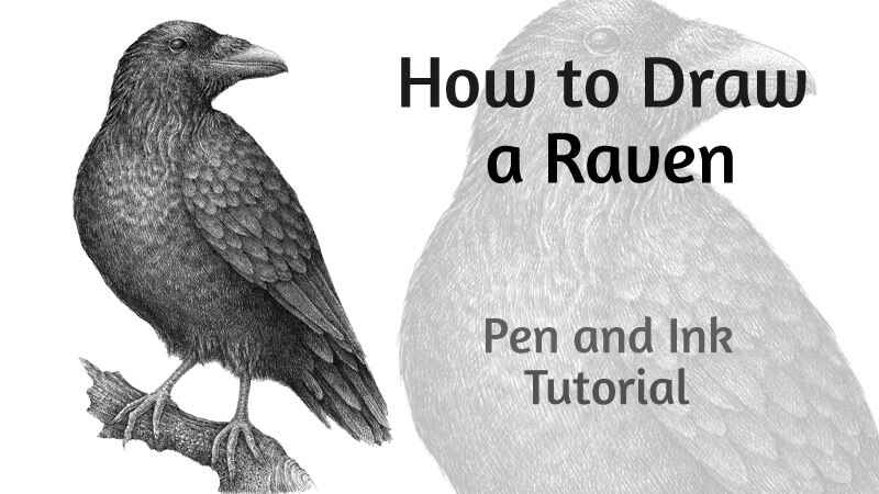
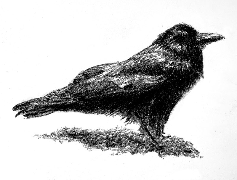
Drawing a Crow with Carbon Pencil on Stipple Paper
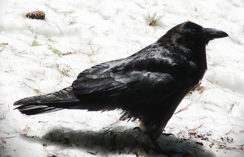
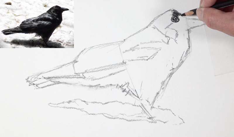
For this drawing, I am working from a photo reference from Pixabay.com. Here’s a look at the reference photo…
We’ll start here with the carbon pencil on the stipple paper. We must be careful with the carbon pencil because the blacks are very black and this pencil is not necessarily the most forgiving pencil in the world. We’re going to keep our marks loose and light. Even though these marks look a little bit dark, it’s just because of the contrast of the paper.
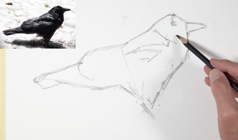
You’ll see as we put more pressure on the pencil, the darks get much darker. Even though I’m using sketchier lines here, these are going to melt into the drawing as we progress. Initially, I’m trying to find the bird using mostly straight lines and I am thinking about the shapes that I see.
You can see I’ve drawn a small shape for the beak and a small shape for the eye. Those two things are very important to the overall form of the bird. At this point, I’m drawing in some lines where I see contrast in value. This particular subject, of course, features lots of dark values on the bottom half.
Now that I’ve got the overall sketch of the shape of the bird in place, I’m ready to start putting a little bit more pressure on the pencil and develop some of these darker values. Clearly you can see that this paper is very coarse and the texture is showing through, and that’s what we want. The paper here is very important in the finished look. But as a result of this course texture, it’s a little bit more difficult to create precise details. Instead, you have to rely on the relationships of values in order to communicate your subject to your viewer.
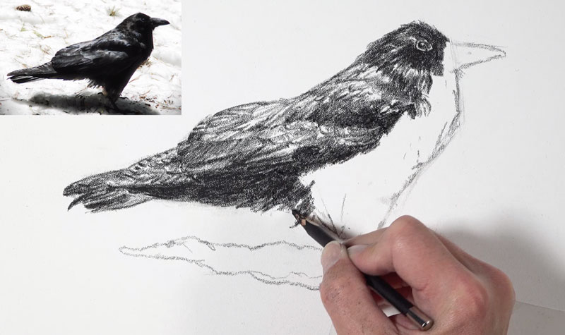
I’m adding some of the smaller feathers that happen here on the larger wing, which is tucked behind the bird. I can’t get some of those really defined lines that I normally can get with other drawing media on other surfaces – namely smoother surfaces. Now this may initially seem like a drawback to using this paper, but I view it somewhat as an advantage and here’s why – A lot of times we get wrapped up in all the details that we see when we’re creating a drawing and those details can be overwhelming.
This paper forces you to think about the form of what you’re drawing. So instead of thinking about all the details, you’re thinking about where the dark and light values are. This speeds up the process, and it also makes you feel a little less stressed about including all the details. The result is details are implied, and of course our viewer understands them anyway without spelling everything out. So, essentially, this paper helps you loosen up.
Finishing the Drawing on Stipple Paper
This paper allows some of that white to show through, even in the darkest areas. This is an advantage because we don’t really necessarily see solid black in reality. This paper helps our blacks feel more natural by allowing little specs of the white to show through. For this same reason, there’s more emphasis on the directional strokes that we make.
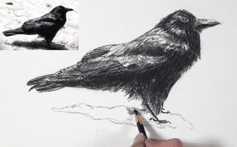
Strokes are pulled so that they follow the form of the bird or how the feathers grow. These directional strokes are still very much visible. And here, even in these areas where I’m trying to make the black as black as it possibly can be, there’s still some of those specs of the paper showing through.

This paper saves you time because you don’t have to worry about all the details, as we mentioned before. Again, you can quickly add just a bit of value to the surface and we get that wonderful stippled look that the paper produces. This obviously leads to a grainy appearance, but if we remember analog photography back before we had digital photography, the prints created also have a grainy appearance.
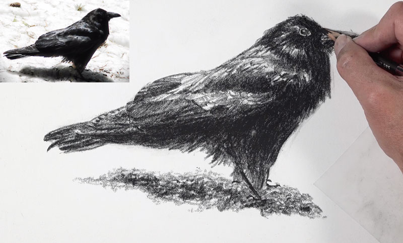
You can see, as the finishing touches are added, we’ve created the illusion of the form of the bird and captured the subject in an interesting way using this unique paper. And now our drawing is complete.
Drawing on Stipple Paper – Conclusion
This paper isn’t for everyone and it’s not for every medium or subject. But for certain circumstances, this paper is a fantastic time-saver. It creates a unique appearance and it’s worth a look for those wishing to explore alternative surfaces.
If so, join over 36,000 others that receive our newsletter with new drawing and painting lessons. Plus, check out three of our course videos and ebooks for free.