Drawing a Snowy Landscape with Figures
As many of you know, I absolutely hate the winter. I hate the cold. I hate the short days. I hate the gray days. I hate winter. But about the only thing that I can tolerate with winter is probably the snow. And fortunately, around here, we don’t get much snow. But when it does snow, it’s quite the event. And recently it snowed quite a bit here and that meant it was time for a fun snow day on our sledding hill. I wanted to capture that in a drawing and I’m going to share with you that process in this lesson.
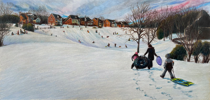
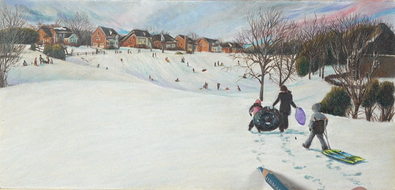
Here’s a look at the completed drawing…
Materials and Surface
For this particular drawing, I use Prismacolor Premier colored pencils, which are wax-based pencils. You can use any brand that you wish and get similar results. I also used just a bit of PanPastel. This is not required, as I use the PanPastel material to basically create an underpainting or a base in which to apply colored pencils over the top.
This drawing is created on Stonehenge paper, which is a wonderful surface for colored pencils. It’s 100% cotton and very soft, but it does require the artist to apply multiple, layered applications with colored pencils. If you want to build up lots of depth in color, layering is very important and this paper encourages it and helps you do it.
Photo Reference and Composition
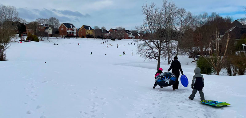
A photo reference is used to create the drawing. Here’s a look at the reference image…
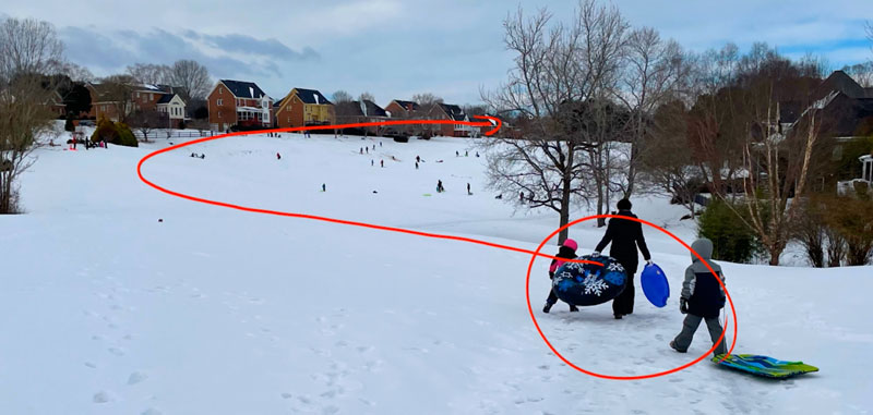
When we’re dealing with composition, we’re talking about the way the elements are laid out within the picture plane. Composition influences the way a viewer interacts with your piece.
When I look at this image, my eye comes into the picture plane at the focal point and then moves its way to the back of the sledding hill and these distant houses. Part of that is because of the layout of the land and the way that we have these little hills that overlap each other. I wanted to accentuate that in the final drawing, or at least capture that in the final drawing, of course.
See also: Composition in Art
Sketching the Landscape
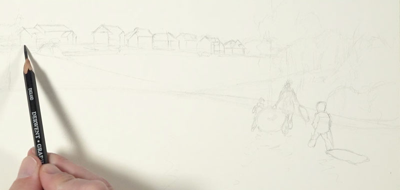
We’ll begin here on Stonehenge paper using a light graphite pencil. In this case, I’m using a 2H graphite pencil. This is light enough so that it doesn’t overpower the image, but I can still put a little bit of pressure on the pencil to make the marks dark enough so that I can see them.
Initially, I’m just finding where the horizon line is and drawing some basic shapes for some of the distant trees before drawing some shapes or each one of the individual houses.
Adding Color
With our loose pencil sketch in place, we’ll begin with PanPastel applications. A variety of blues and muted colors are added, before adding a bit of material for the snowy hill. These PanPastel applications provide a base for colored pencils.
With a bit of PanPastel on the surface, we can begin with colored pencils. I decide to start along the distant horizon line on the left side of the picture plane developing each house and the trees and bushes in between.
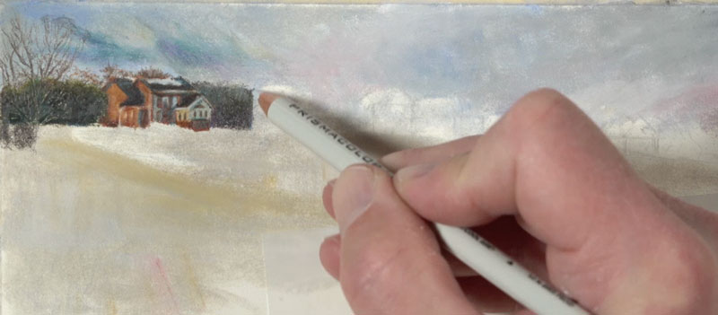
I found myself sharpening the pencil quite often. After just a few marks, the pencil becomes fairly dull. A variety of colors were used – but mainly Terracotta for the bricks of the house. An Espresso pencil, a dark warm gray, was used for the roofs and darker areas.
See also: How to Sharpen Any Pencil
I wanted to create a warmer light in the scene. I used a Yellow Ochre pencil for the sides or the planes of the houses that faced the light source, which is originating from the left side of the picture plane. For the shadowed side of the houses and for the shadows throughout the image, I chose to use a blue – somewhat of a cerulean blue.
This contrast between warm and cool helped to make the light feel warmer and the shadows, cooler.
When we work with colored pencils, we need to keep in mind that it does require a level of patience. One of the easiest areas that you can improve in your drawings, or I should say one of the areas where you can see improvement the quickest is to just increase your patience a little bit. For some of us that’s going to be a little bit harder to do, but of course, if you just focus on slowing down and not trying to be in a hurry to finish your art, I think that you’ll see improvement happen naturally.
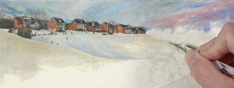
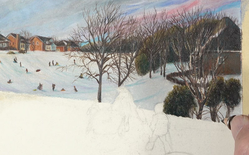
As we move to the right side of the picture plane, I preserve some of the areas where we see trees that are in the middle ground. I’m using the indention tool to preserve these areas. The lines that are preserved are not evident until you start making marks with colored pencils over the top of those areas that you indented.
Small Figures within the Landscape
This landscape is covered with figures. And since these figures are located in the distant middle ground and the foreground, there’s quite a difference in the size that these figures should be rendered.
We have to be mindful of proportion. We want to make sure that – proportionally speaking, the shapes that we draw here make sense with the distant figures and, of course, the figures that we’re going to add in the foreground.
After developing the shapes of the figures with the dark Espresso pencil, bits of bright color are added over the top. These bits of color add life and make the figures make sense.
I gradually and patiently work my way to the houses, trees, and bushes in the foreground. Here we see a higher level of contrast in value due to the fact that these areas are closer to the viewer.
Drawing the Figures in the Foreground
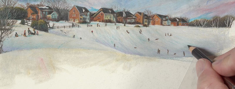
From here, I continue to work down the picture plane to the larger figures. We’ve finally made it to the focal point. Since these figures are in the extreme foreground, we’ll notice the highest level of contrast in value. But even here, the color black is avoided. Instead, a layered combination of a dark brown and blue are used to develop the darkest tones.
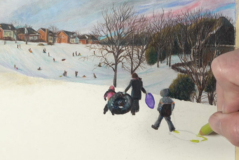
After the figures are in place, it’s back to PanPastel applications, filling in the remaining spaces of snow.
After burnishing some of those applications with a bit of the 10% Cool Gray, I went back to the figures and made some final adjustments here, making the contrast a little bit stronger and adding a few bits of shadow here and there to the backside of some of the clothing.
I decided to make the lower portion of the left side of the picture plane a little bit cooler. I did this with a bit of lighter blue on the snowy hill closest to the viewer.

Finishing Touches to the Winter Landscape Drawing
Then, of course, when the drawing is complete, it’s time to tear away the tape. This can be a nerve-wracking experience. You’ve spent all this time with the drawing and you don’t want the tape to tear, but if you pull it away at a 90 degree angle, usually you can pull that tape off without any tearing.
Here’s another look at the completed drawing…
Winter Landscape Drawing with Colored Pencils – Conclusion
Colored pencils provide us with exceptional precision. But there is a tradeoff. This tradeoff comes in the form of time and patience. Work slowly, build up colors gradually and watch your drawing come to life.
If so, join over 36,000 others that receive our newsletter with new drawing and painting lessons. Plus, check out three of our course videos and ebooks for free.
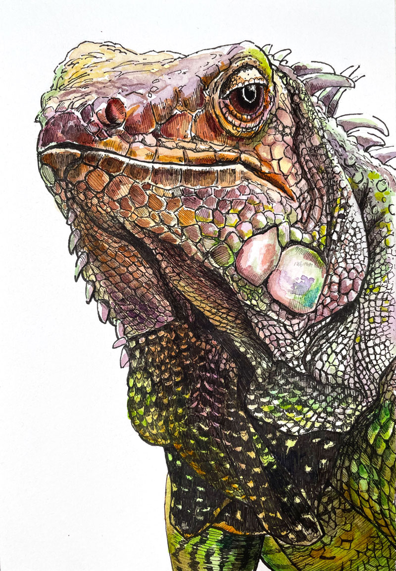
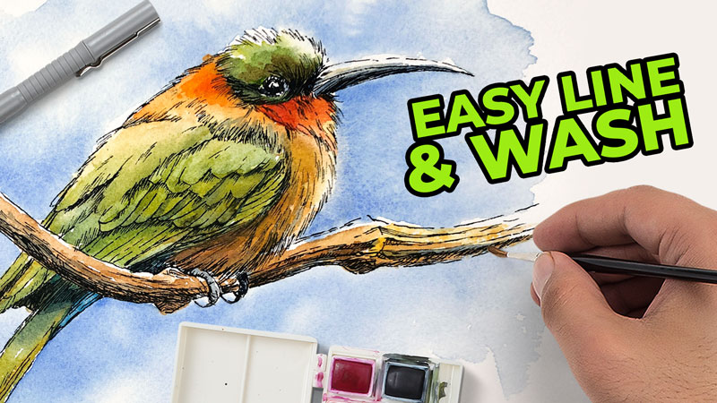
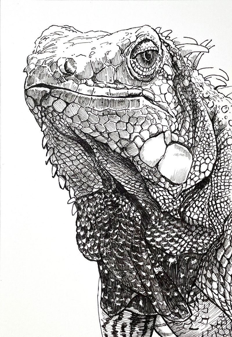
Painting an Iguana with Watercolor
Painting an Iguana with Watercolor
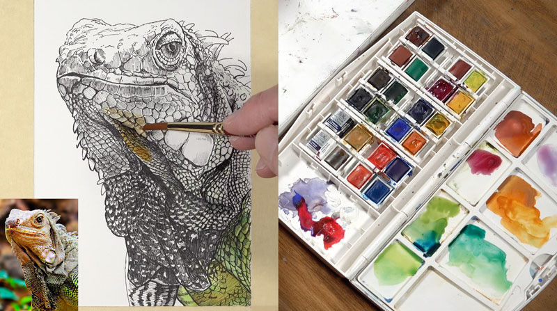
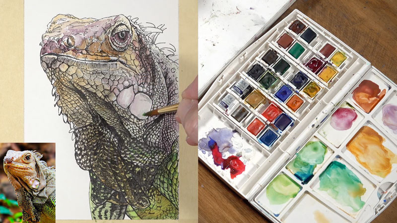
This lesson is a continuation of a past lesson on drawing an iguana with pen and ink. In this lesson, we’ll complete the art by adding watercolor washes over the pen and ink drawing, a process commonly called “line and wash“.
Here’s a look at the completed art with both pen and ink and watercolor washes…
Materials for Painting an Iguana with Watercolor
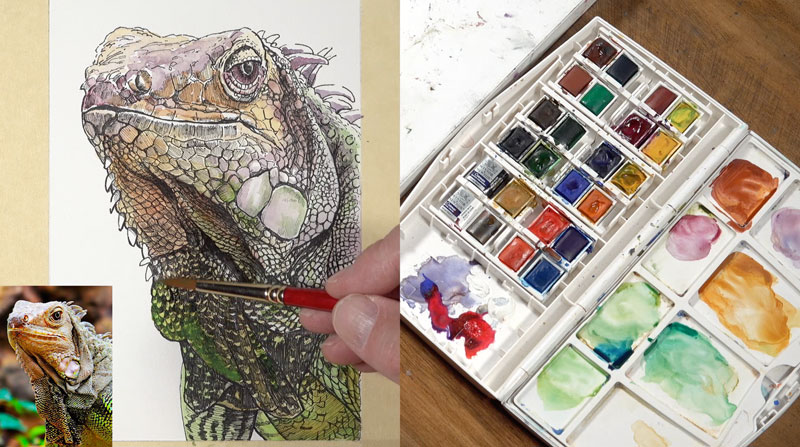
I’ll be working with Cotman watercolors by Winsor & Newton to complete the painting, but feel free to use any brand that you wish if you’re following along.
Grumbacher Golden Edge brushes are used to apply the watercolor. I’ll be using two brush sizes – a #4 round, and a #00 round.
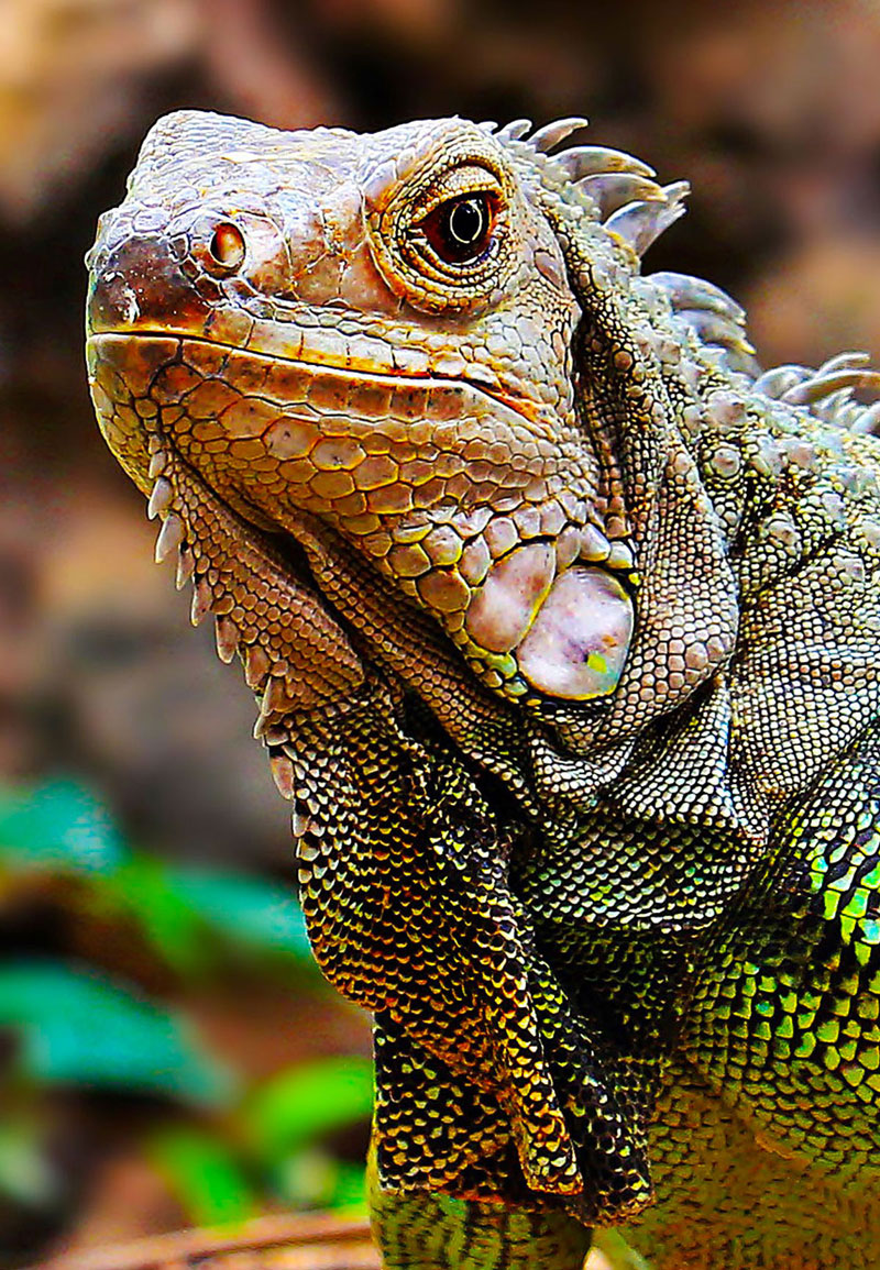
A photo reference is used for this work. This reference comes form Pixabay.com and has been edited for composition and color. Here’s a look at the photo reference…
Considering a Color Scheme
Before we dive into the watercolor application process, I want to speak for a minute about colors and the colors that are included in this painting. In this work, my intention is to exploit a secondary color scheme. Secondary colors are made by mixing two primary colors together. The secondary colors are orange, purple and green. These colors are equidistant from each other on the color wheel and form a color triad.
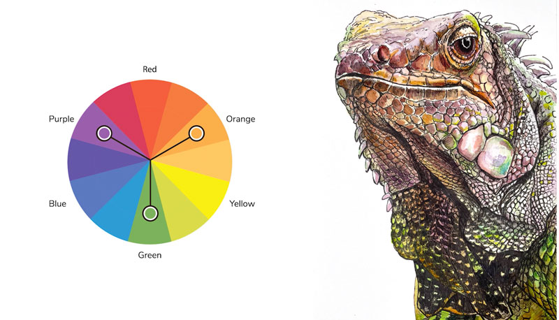
This means that we’re going to get some “pop” and contrast from these colors. Since we’re limiting our palette, meaning that we’re only using a few colors, we’re going to ensure harmony and unity in the piece.
Watercolor Washes to the Iguana
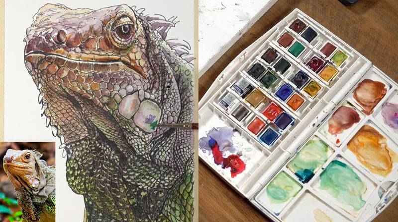
We’ll begin here by just mixing up a few colors on our palette. Since we’re going to be sticking mostly with a secondary scheme, I’m going to go ahead and isolate a few purples, oranges and greens. I’ll start with Indian Red and a bit of Purple Lake. There’s a mixture of Cadmium Orange and Yellow Ochre off to the right and a mixture of Sap Green and Hooker’s Green. I’ll also pull in a little bit of Intense Blue here with the green, so that we have a range of cooler green to warmer green.
Then, pulling from our palette, we’ll begin with initial washes.
We’ll start with light, glaze-like applications. Gradually, we’ll get a little bit more intense with our applications. This is how I like to approach watercolor painting, through a layered approach.
While the surface is still wet, I’ll add additional colors, allowing those colors to bleed together. We do see a little bit of a transition or gradation of colors throughout the body, and we’ll try to replicate that in the watercolor painting.
On the right side of the body, we have some fairly light values. In fact, we’re seeing strong contrast here between the dark values and light values. Some light values appear almost white in some areas, but we’re going to add a bit of color, so a very light glaze of a cooler green is added. Later, I’ll add a bit of orange and purple here too.
We’ll have these transitions of color happen throughout the painting, where the colors basically transition from purples and oranges to greens and back again.
Getting Darker with Watercolor
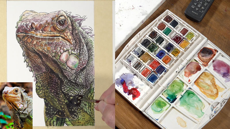
When you create a pen and ink drawing with watercolor, you can somewhat rely on the pen and ink to develop the values and the watercolor to add the color. Since we have our values in place, I’m concentrating mainly on adding the colors, but the colors that are added do affect the value slightly. Some of the colors are going to make some of the areas a little bit darker in value naturally.
Even though the pen and ink and the subsequent washes of watercolor gradually broaden the range of value, we’ll still need to push this range further, increasing contrast. As we continue to layer watercolor washes, the value slowly begins to darken, creating this range and contrast.
We want to build up some interest and complexity on the color by layering colors on top of each other and allowing them to optically mix on the surface.
Just like with any drawing or painting medium, there is some patience involved. Work slowly and take your time. For me personally, I like to gradually layer the colors to build up the depth in the color. If I put down a color that seems a little bit too intense, I’ll reach in with a paper towel and lift it up quickly so that I’m assured that I’m putting down the correct intensity of the color.
Don’t be afraid to deviate from the reference and create your own piece of art. We shouldn’t just replicate what we see. Instead, we should put our own little artistic touches on what we see.
Considering the Light Source
The light source is originating from above and slightly to the right of the iguana. This means that the shadowed areas are going to exist mainly on the lower portion and the left side of the body. So as we continue to broaden the values we can make colors more intense on the left side, which means the values are also going to be slightly darker as well.
You’re going to find that you’re going to need to make value adjustments. Value, one of the seven elements of art, is relative. This means that we understand value based on the values around a specific value. As we get darker with our image, we might find that we need to go back and increase contrast in other areas or adjust values.
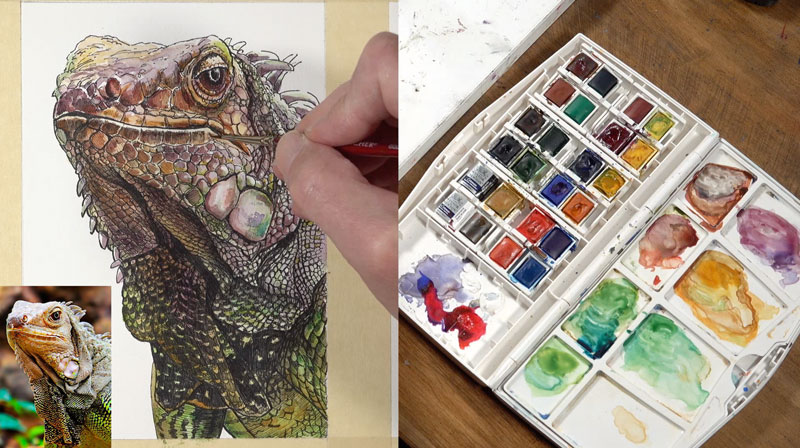
That’s why it’s important to work around the picture plane as you go, allowing the image to develop in totality. Even though I’ve gone back to the top of the picture plane, and I’m working my way down, I’ll still find myself bouncing around.
Finishing Touches to the Painting
After I’m happy with the transitions of color, the relationships of value, and the intensity of color, I let the painting dry. Many times with a line and wash image, you’ll find it necessary to return to the work with pen and ink. This painting is no exception, and I decide to revisit a few areas with the ink to complete the art.
Painting an Iguana with Watercolor – Conclusion
Combining watercolor with pen and ink is one of my favorite combinations of media. The ink provides control, texture, and detail while the watercolor adds color and life. The two mediums compliment each other which is what is desired when mixing art mediums.
If so, join over 36,000 others that receive our newsletter with new drawing and painting lessons. Plus, check out three of our course videos and ebooks for free.

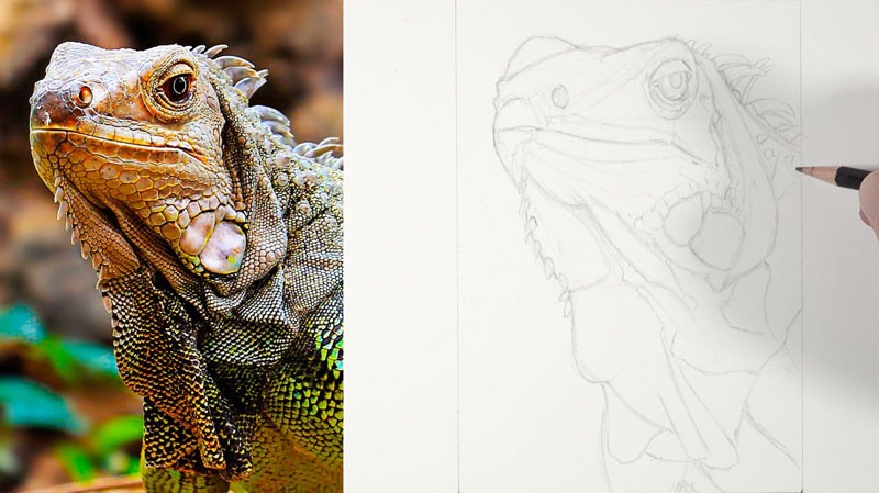
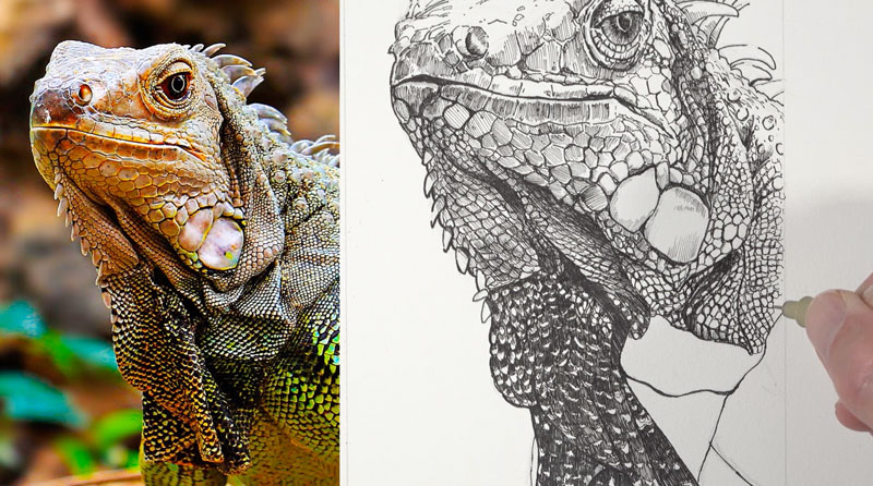
How to Draw an Iguana with Pen and Ink
Drawing an Iguana with Pen and Ink
In this lesson, we’ll create a pen and ink drawing of an iguana on hot press watercolor paper. Now, why are we creating this drawing on watercolor paper? Well, it’s because we’re going to eventually add watercolor applications over the top – but in this lesson, we’re going to complete the pen and ink drawing.
Here’s a look at the completed pen and ink drawing…
Materials for Drawing an Iguana with Pen and Ink
We’ll work on Canson Heritage hot press watercolor paper which is a smoother watercolor paper. It’s different from cold press watercolor paper. This paper is suitable for pen and ink applications since it is so smooth.
See also: All About Drawing Papers
I’ll sketch the drawing with a 4H graphite pencil. From there, we’ll move on to the pen and ink applications. Two different pens, by different manufacturers are used – a Staedtler 0.1 pen (a fairly thin pen) and a 003 Micron pen, which is a super thin pen.
A photo reference is used for this drawing. This reference comes form Pixabay.com and has been edited for composition and color. Here’s a look at the photo reference…
Sketching the Iguana with Pencil
We’ll begin here using a 4H graphite pencil. I’m using this lighter pencil so that the graphite lines that I apply are easily erased and not noticeable in the final pen and ink drawing. I’m using a fairly light touch here to loosely sketch out the outer contours and the basic shapes of the iguana.
I’m using sketchier lines at first but as I become a bit more confident with the lines that I have in place, I’ll gradually apply more pressure to the pencil. When using a harder pencil like this 4H pencil it’s important not to press too hard because you can put grooves or indentations in the surface of the paper, which may be visible in the final image.
I’m just basically drawing lines here where I see contrast in value. When we see these folds overlap on top of other sections, a shadow is produced and this creates some contrast. I’m simplifying that contrast into easily understood lines.
Pen and Ink Applications
Once we have our graphite drawing in place, we’re ready to start with the pen and ink applications. I’m going to start with the larger of the two pens – a 0.1 pen by Staedtler. This pen is going to make a slightly larger mark than what we see with the Micron pen that will follow. At this point, I’m basically more concerned with the contour lines or the outlines in the areas where I see some dark shadow or some of the larger shapes that we see on the iguana.
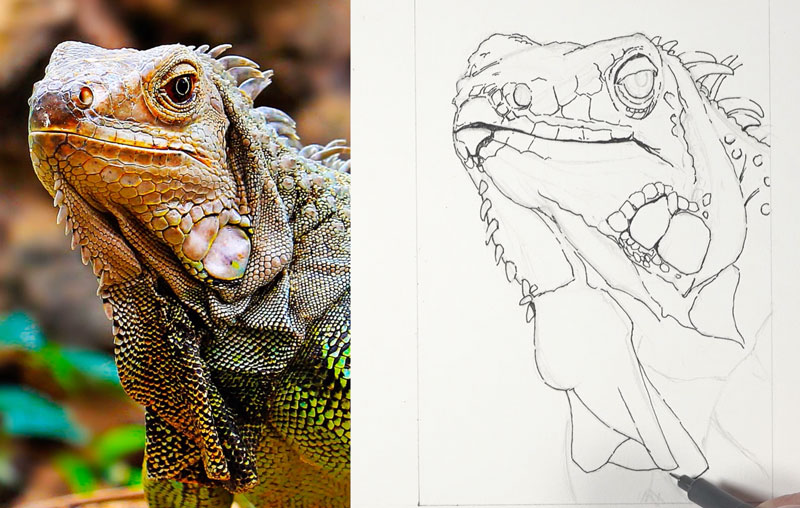
I am considering and thinking about the line quality, which I like to refer to as the thickness or thinness of a line. I’m starting with some of the larger lines here initially. Throughout the process, you’ll see that I also add smaller lines and go back and beef up some of the lines here and there, ensuring variety. Variety is one of the eight principles of art and it’s important to include in our work.
Developing Texture, Shadow, and Form with Pen and Ink
With much of the contour lines established, we’ll move on to the smaller Micron pen. This is a 003 pen with super tiny tip. This is a relatively small drawing anyway, and I’m going to be using this pen mostly for developing the shadow in this drawing. I begin with the eye, adding lines coming out from the center of the eye to create darker value.
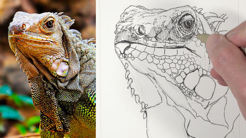
One of the things we need to watch out for in a pen and ink drawing is that we don’t go too dark, too quickly. It’s very easy to do, so it’s always a good idea to go a little lighter than you think you might need. You can always add additional applications of ink to make the value a darker, if needed.
The hatching marks that I make are going to change direction slightly. ‘m just trying to follow the plane that’s created in three dimensional space. This will not only help to develop the shading, obviously, but also help to communicate the form of the lizard as well.
I also want to point out that my lines are not perfect. I’m not really overthinking the lines as I’m adding them. I’m not putting too much pressure on the pen as well and my lines are a little sketchier than you might expect. The drawing will still look sharp and controlled in the end, but you can allow yourself a little bit of freedom with your mark making and not get too overly obsessed with making the perfect mark.
What’s important to note here is that this pattern is made up of irregular shapes and sizes. I’m just basically using my photo reference as a guide as to determine where the shapes are larger or smaller. I’m not getting obsessed with matching everything exactly. Instead, I’m just focusing on the patterns that I see, and I’m trying to replicate that pattern as best as I can.
As we work down the body of the iguana, the pattern changes and values become darker in areas. When you’re creating a pen and ink drawing, you’re interpreting what you see in reality into lines. We’re all going to interpret what we see a little bit differently. As a result, the marks and patterns that we make on the drawing surface may be different from one artist to the next. And this is perfectly acceptable. Don’t think that you have to interpret things exactly the way another artist might interpret them in order to be successful. We all have our own artistic vision and we interpret things differently.
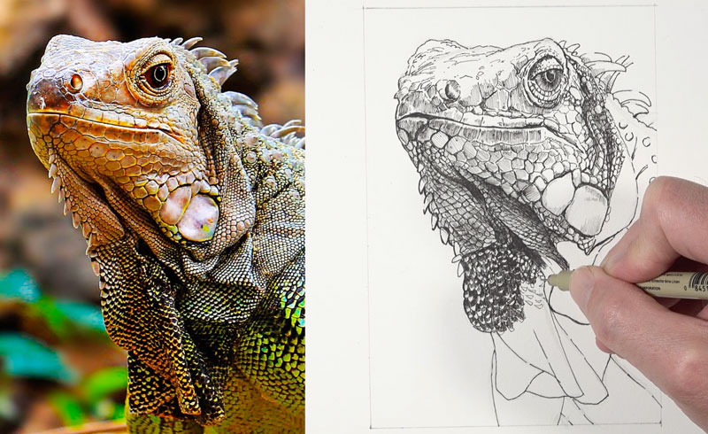
Finishing Touches to the Drawing
We’ll move on down to the leg and the body of the iguana, which is pretty much what we’ve got left here. You can see that the hatching marks I’ve used here curve slightly to communicate the form of the leg because it curves as well. You can see the methodology I used to create a lot of the patterning on the body of the iguana. I basically just drew guidelines and then filled in those guidelines with the repeating shapes.
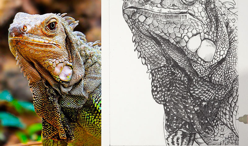
After the ink is dry, a kneaded eraser is used to erase away any remaining graphite lines, revealing only a pen and ink drawing…
Drawing an Iguana with Pen and Ink – Conclusion
After we’ve covered the graphite drawing with pen and ink and we’re happy with the relationships of value, our drawing is complete. In this case, our pen and ink drawing of an iguana could stand on its own as a completed piece of art. However, I later add watercolor to this drawing to add color and interest. We’ll cover this process in the next lesson.
If so, join over 36,000 others that receive our newsletter with new drawing and painting lessons. Plus, check out three of our course videos and ebooks for free.
How to Store and Protect Your Art
Properly Storing Your Drawings
You’ve got all of these artworks laying around and you’re looking for somewhere to store them. In this post, we’ll take a look at all of your storage options so you can keep all of those artworks that you worked so hard to create nice, safe, and secure.
Storing your art is incredibly important. You want to protect it from the elements and all the other things that could work against it to mar and destroy.
What Can Damage My Art?
There are lots of things that could damage your artwork. Moving things around, of course, could damage artworks. It could cause you to have to go back and make fixes later after you’ve finished your art. There’s also environmental elements such as UV light, moisture, dust, and other contaminants. So it’s important to protect your artwork from these things so that it doesn’t get damaged.
I have artworks laying around the studio at any point in time, mainly because I have lots of projects going on at one time. But typically, these artworks just hang out in my studio – sometimes in the floor, sometimes against walls, generally all over the place. But then when I’m ready to store my artwork, I need to find a place to store it properly, and there are several options.
Considerations for Storing Your Art
The way you store your art greatly depends on the medium that you used and the surface on which the art was created. You wouldn’t store an oil painting created on canvas in the same way that you would store a pen and ink drawing on paper, for example.
The first thing is to make sure that the art you’re storing is clean. So break out that eraser and clean up your art before storing it.
Some folks also like to fix their art with a spray fix, or any other type of fixative. You can use a final fixative if you’re completely finished with your art, or a workable fixative if you may want to come back and work on it later. While some people like to use a fixative, I personally don’t use one. This is a personal choice. I find that fixative can make the values a little bit darker, so it does alter the art slightly.
Storage Option 1: Framing
The first storage option is probably the best and that is framing your art. This is the best option for protection and preserving your art. I have a lot of my artwork framed, and obviously stored on the walls.
Framing is great, but it can get expensive and you’ll run out of storage space fairly quickly too. So let’s look at a more practical option – portfolios.
Art Storage Option 2: Portfolios
Portfolios are manufactured in a variety of sizes. Most manufactured portfolios are also made of archival materials, so you can rest assured that your art won’t be destroyed by the way you’re storing it. Manufactured portfolios are fairly inexpensive, but you can always make your own too.
Two large pieces of cardboard and some tape come in handy for creating a portfolio. But these materials obviously aren’t archival and are best suited for temporary portfolios or temporary storage.
Portfolios are really best for drawings that aren’t dusty or prone to smudging. Colored pencil drawings, pen and ink drawings, watercolor paintings, and graphite drawings, are all great candidates for storing away in a portfolio. But other mediums like pastels and charcoal are best stored elsewhere, which brings me to another option – drawers or flat files.
Art Storage Option 3: Flat Files or Drawers
I have a couple of flat files in the studio which is where I store the artworks made with medium that is prone to smudging. Each drawer is devoted to a different medium. I have charcoal drawings in one drawer, oil pastel drawings in another, and soft pastels and still another.
I typically like to lay down a layer of the artworks face up. On top of each layer, a sheet of acid free paper is laid on top before another layer of art is carefully laid down. I typically like to use acid free banner paper, but you could also use papers that work as cover sheets, like glassine. Glassine is perhaps the best option since it minimizes any smudging at all.
If you decide to store your artwork in drawers, just make sure that you’re using paper that’s acid free as a cover sheet. This will minimize the likelihood of your artwork getting marred by the cover sheets, which is something that you definitely don’t want to happen.
Let’s Wrap It Up
Hopefully, you’ve enjoyed this quick look at some options for storing your art. I use all of these options myself. I frame my art. I store it in drawers. I store art in portfolios and even in makeshift ones (for temporary storage).
If so, join over 36,000 others that receive our newsletter with new drawing and painting lessons. Plus, check out three of our course videos and ebooks for free.
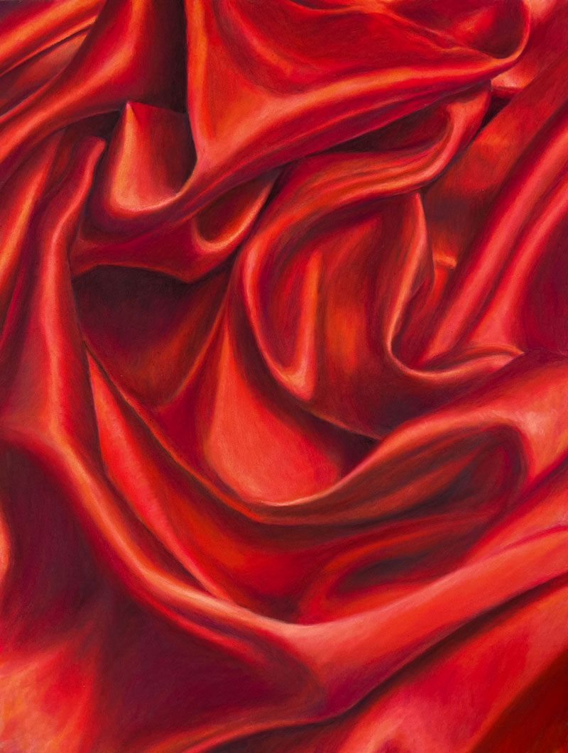
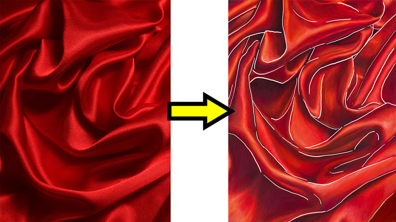
How to Draw Fabric Folds
Drawing Fabric with Pastel Pencils
In this lesson, we’re going to take a look at drawing a classical subject matter – folds of fabric or cloth. Pastel pencils are used for this demonstration, but you can use any drawing or painting media that you wish because the concepts that we cover can be applied to any drawing or painting media.
Here’s a look at the completed drawing…
Materials and Surface
This drawing is created on Pastelmat paper, which has a very fine, but heavy tooth. A dark gray surface is chosen for this particular demonstration.
The drawing is completed with CarbOthello pastel pencils. These pencils are a little bit harder than some of the pastel pencils out there, but they keep a nice sharp tip and give you lots of control. We’re only going to be using a few colors.
See also: Pastel Drawing Lessons
Here are the general colors that are used. Note that these are not the specific names of the colors, but a general description…
- A couple of Red-Oranges
- Peach
- Cream
- Dark Cool Gray
- Black
- Golden Yellow-Orange
- Dark Red-Purple
Keys to Success When Drawing Fabric Folds
Drawing folded fabric is a classical subject that may seem very difficult at first impression. We’re going to take a structured approach that makes the process easier.
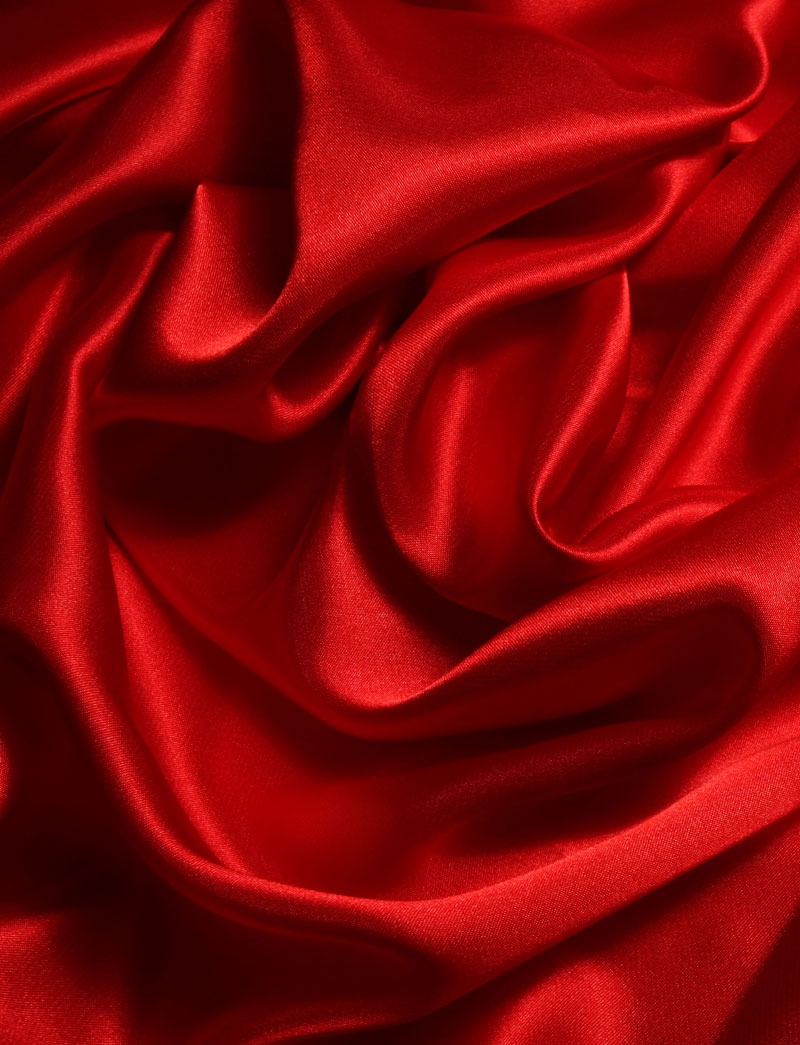
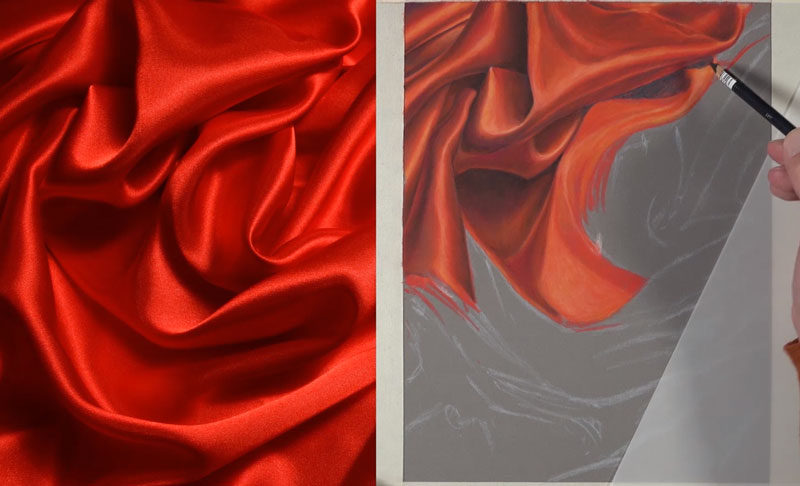
A photo reference is used to create the drawing. Here’s a look at the reference image…
The first step is to find the contour lines. These contour lines aren’t very obvious, but we can look for them by looking at areas of contrast in value. These are areas where we see a dark value nestled right next to a lighter value. We’re going to start by making these initial marks on our drawing paper.
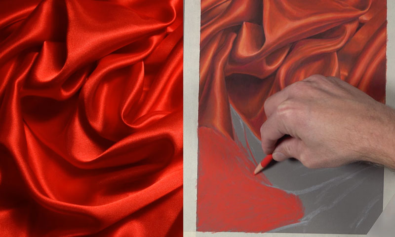
After the contour lines are roughly in place, we’ll begin analyzing the relationships of the values. The lighter values are going to be found where the fold comes towards the viewer. Any area that protrudes is generally going to be lighter in value. The opposite of this is true. Any area that recedes is clearly going to be darker in value.
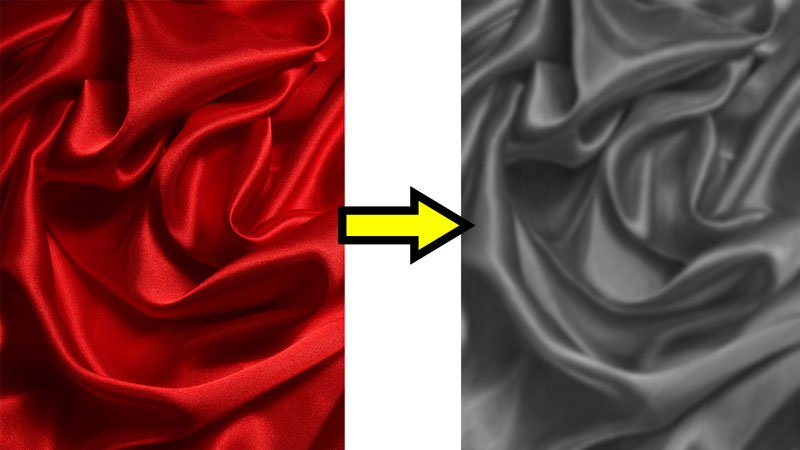
The relationships of light and dark values and the transition areas that happen between will eventually lead to the illusion of folds. If you have trouble seeing these values, you might try squinting your eyes. When you squint your eyes, you remove all those edges of strong contrast and instead only see the shapes of value.
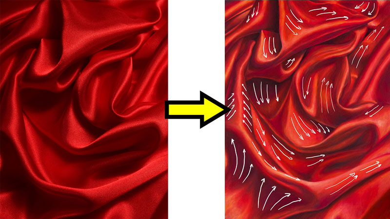
As we develop the values, we’ll also consider the directional stroke-making or the direction that we pull the pencil when we’re making marks. Directional strokes help to create the illusion of form and texture as well.
Drawing Fabric Folds Step by Step
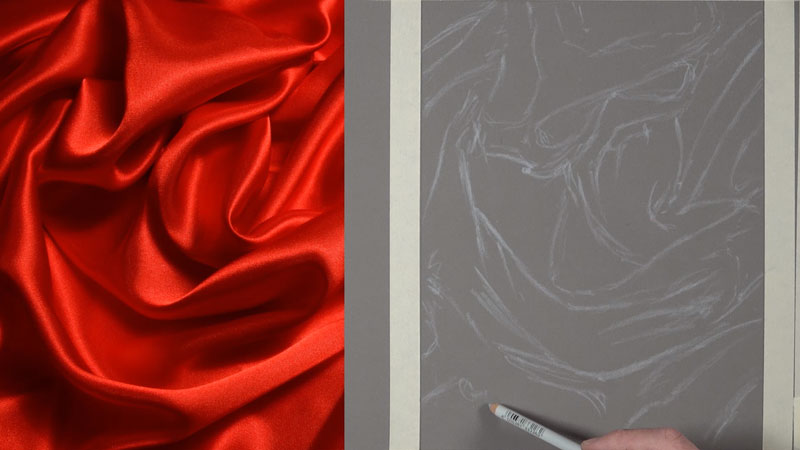
We’ll begin by sketching the contour lines on gray Pastelmat paper using a light cool gray pastel pencil. I’m using this pencil simply because it provides enough contrast against the darker gray background so that I can see the marks. I know that when I apply pastel applications over the top, these marks will dissolve and disappear. At this point, I’m just concentrating on the contrast and value. You can see that these lines are loose and sketchy.
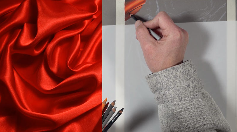
Now we’re ready to start applying the actual colors and develop the value. I’ll start here by trying to figure out a formula or a process that I can go through by layering my pencils that’s repeatable. I’ve started with one of the red-oranges that we’re using. This is the red-orange that’s a little bit more red. Over the top, a peach pastel pencil is used to define some of the areas of highlight.
A cream pencil is used to add a little bit of warmth to these highlighted areas. A dark cool gray is then used for the shadowed areas.
Black is also layered with a very light touch. Black on its own is much too dark, so red-orange is applied over the top to create a darker value that doesn’t look unnatural.
To create a warmer highlight, a golden yellow-orange is layered over the highlighted areas.
And to add a bit of color, a touch of dark red-purple is applied to the middle shadows.
Formulaic Pastel Applications
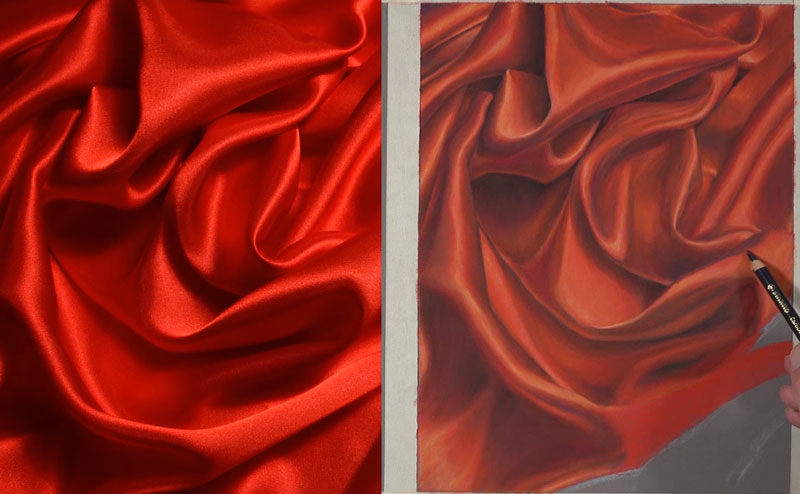
At this point, I have my process down. I know what order of colors that I want to add to create the desired effect. Now it’s simply a process of repetition, taking each section at a time.
All we need to do is continue working our way across the picture plane. And in this case, I’m working my way down and to the right, trying to keep the palm of my hand out of the way. I’m doing this because I’m right-handed. If you’re left-handed, you might consider working from the upper right hand corner, progressively working your way down the picture plane and slowly to the lower left hand corner.
I should point out that you should be patient in this process. Of course, you should be patient with any drawing or painting that you create.
Often, inexperienced artists believe that works of art are easily created by people who have developed their drawing and painting skills. And this isn’t necessarily true. Nothing comes easy, no matter how skilled you are as an artist. It does require your full attention. And there are challenges inherent in every subject, no matter what your skill level.
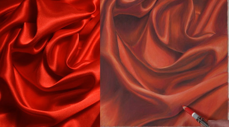
After we’ve patiently worked our way down the picture plane, carefully layering our progression of colors, our drawing of folded fabric is now complete.
Here’s another look at the completed drawing…
Drawing Fabric Folds – Conclusion
Drawing folded fabric like this is really not that dissimilar from drawing anything else that you might draw from observation obviously. It’s clearly about understanding the relationships of values because value, the darkness or lightness of a color, is how we understand the form of objects. It’s how we understand the light within the scene, the texture. Value is so incredibly important.
If so, join over 36,000 others that receive our newsletter with new drawing and painting lessons. Plus, check out three of our course videos and ebooks for free.
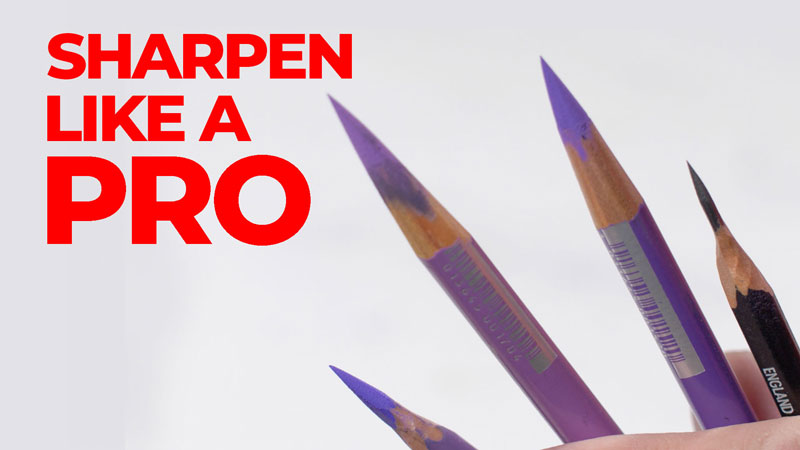
How to Sharpen Any Pencil
Sharpening Pencils
Does a nicely sharpened pencil give you an artistic advantage? You bet it does. In this lesson, we’re going to take a look at how you can sharpen your pencil like a pro.
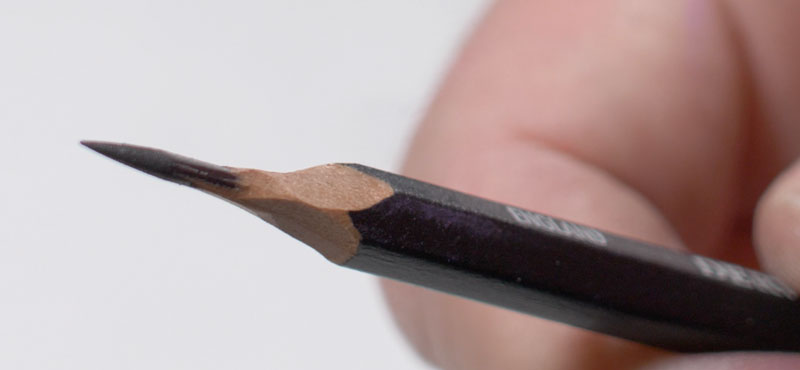
We’re all familiar with all of the pencil sharpeners out there. There are electric pencil sharpeners, handheld pencil sharpeners, and of course, those that are stuck to the wall. All these options work great, but how do artists get those really long tips that allow them such precision and a variety of different mark making options? Well, let’s take a look at a few options.
See Also: All About Drawing Papers
Exposing More Medium at the Tip
Ordinary pencil sharpeners do a fine job sharpening a pencil, but the tip that’s produced is better for writing. It’s adequate for drawing, but we can do better. The secret to getting those long tips on an artist’s pencil is simply to expose more of the medium at the tip of the pencil.
Sharpening a Pencil with a Knife
One way to expose more of the medium at the tip of the pencil is to use a knife. This approach does have a few risks. You clearly can cut yourself. So if you are a younger artist, perhaps it’s a good idea to get some adult help with this.
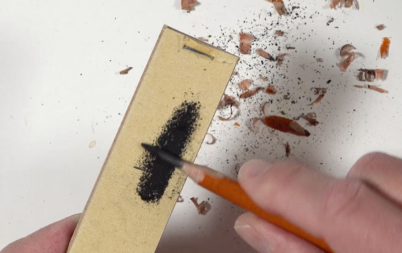
Holding the pencil firmly, simply use a sharp knife and patiently cut the wood away from the pencil, pushing the knife away from your body. Once you’ve exposed enough of the medium, use a sandpaper pad to finish the job.
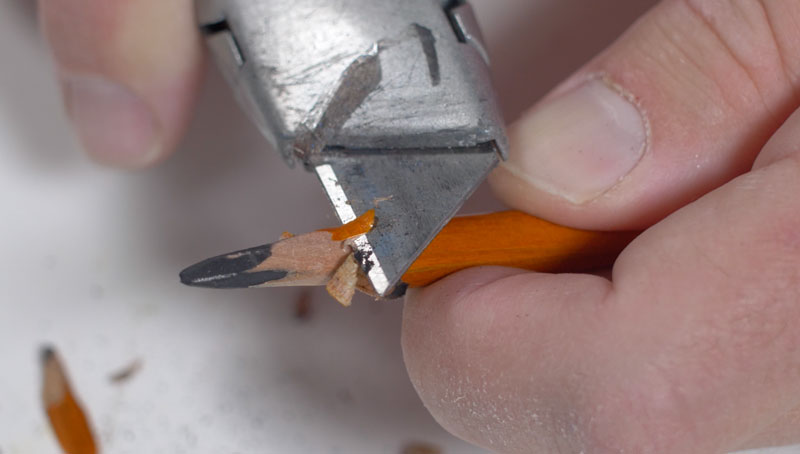
While rotating the shaft, slide the pencil tip back and forth over the sandpaper, producing a super sharp tip. This technique does require a bit of patience and clearly some attention to what you’re doing but it does work for nearly every drawing medium. Graphite pencils, charcoal pencils, pastel pencils, and colored pencils can all be sharpened this way.
There are a couple of drawbacks to this approach of sharpening your pencil. The first drawback is obvious – you could cut yourself. The second drawback is that some pencils have extremely soft cores. With a rigid wood casing, breaking the core with a knife is super easy. And if you sharpen and break the core often, then your pencil will be gone in no time.
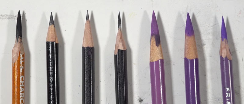
Sharpening a Pencil with a Specialized Sharpener
Thankfully, there are some alternatives to sharpening your pencil with a knife that still produces a nice long tip. Some manufacturers make pencil sharpeners specifically for artists. These sharpeners still produce the long tips that we’re after, but with less danger to our bodies and our pencils.
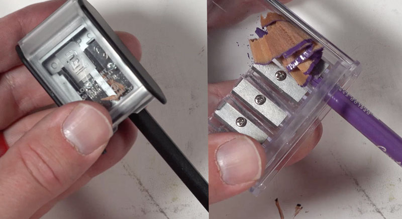
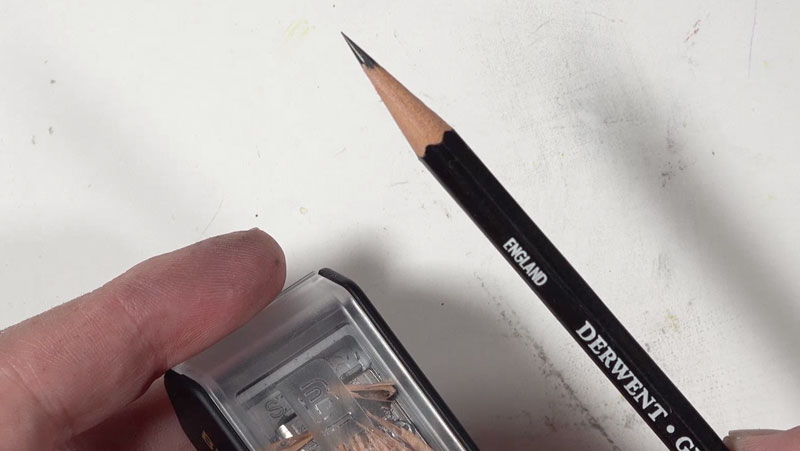
This first option features several different sized openings and a container to catch the shavings. What makes this sharpener different from a regular handheld pencil sharpener is that the core of the pencil is allowed to extend out beyond the tip of the blade. This produces a long tip.
This sharpener also has a small bit of sandpaper inside of the catch that you can use to make the tip even sharper, but I found that using the sandpaper pad works a lot better. Due to all of the different sized openings, you can sharpen all kinds of pencils with this one sharpener.
(This sharpener worked great for a while but quickly fell apart. I would recommend the Blackwing, which follows.)
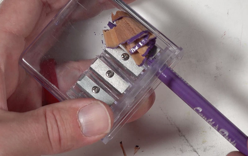
Another option is the long tip pencil sharpener by Blackwing. This sharpener features two openings and you might think that each opening is for a different type of pencil, but that’s not the case.
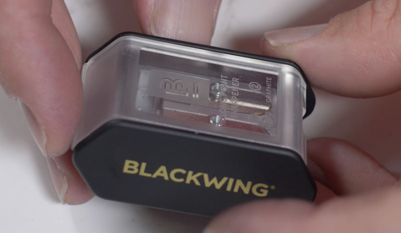
Sharpening is actually a two step process. The first opening is for sharpening back of the wood. The second opening is for sharpening the graphite. Once you go through the process of inserting the pencil in the first opening and then the second opening, the result is a super sharp, long tip – perfect for drawing.
Buy the Blackwing Pencil Sharpener (This link is an affiliate link which means I make a small commission if you purchase at no additional cost to you.)
This sharpener is specifically designed for graphite, but I don’t see why it wouldn’t work for other mediums like colored pencils.
Pencil Sharpening for Artists – Conclusion
So there you have it – a quick look at some options for sharpening your pencil like a professional artist. Now obviously, the advantage of sharpening your pencil with a longer tip is that you have more options for creating more variety in your mark making, but also that extra precision you get with a super sharp pencil.
If so, join over 36,000 others that receive our newsletter with new drawing and painting lessons. Plus, check out three of our course videos and ebooks for free.
How to Draw a Koi Fish with Colored Pencils
Drawing with Colored Pencils on Toned Paper
In this lesson, we’re going to take a look at creating a drawing of a koi fish using colored pencils on toned drawing paper. You’ll see how easy it is to ensure accuracy in your drawing, using a transfer process. And we’ll also take a look at how abstract shapes of color and value often lead to the illusion of realism in a drawing.
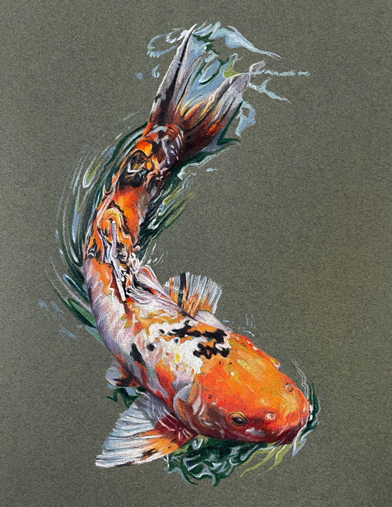
Here’s a look at the completed drawing…
Materials and Surface
In this lesson, we’re using Prismacolor Premier colored pencils on Canson Mi-Teintes pastel paper. Canson Mi-Teintes paper features two distinct sides. One side of the paper is heavily textured, while the other side is less textured. We’ll be working on the less textured side of the paper. (The following links are affiliate links which means I make a small commission if you purchase at no additional cost to you.)
Transferring the Image
A photo reference is used to create the drawing. Here’s a look at the reference image…
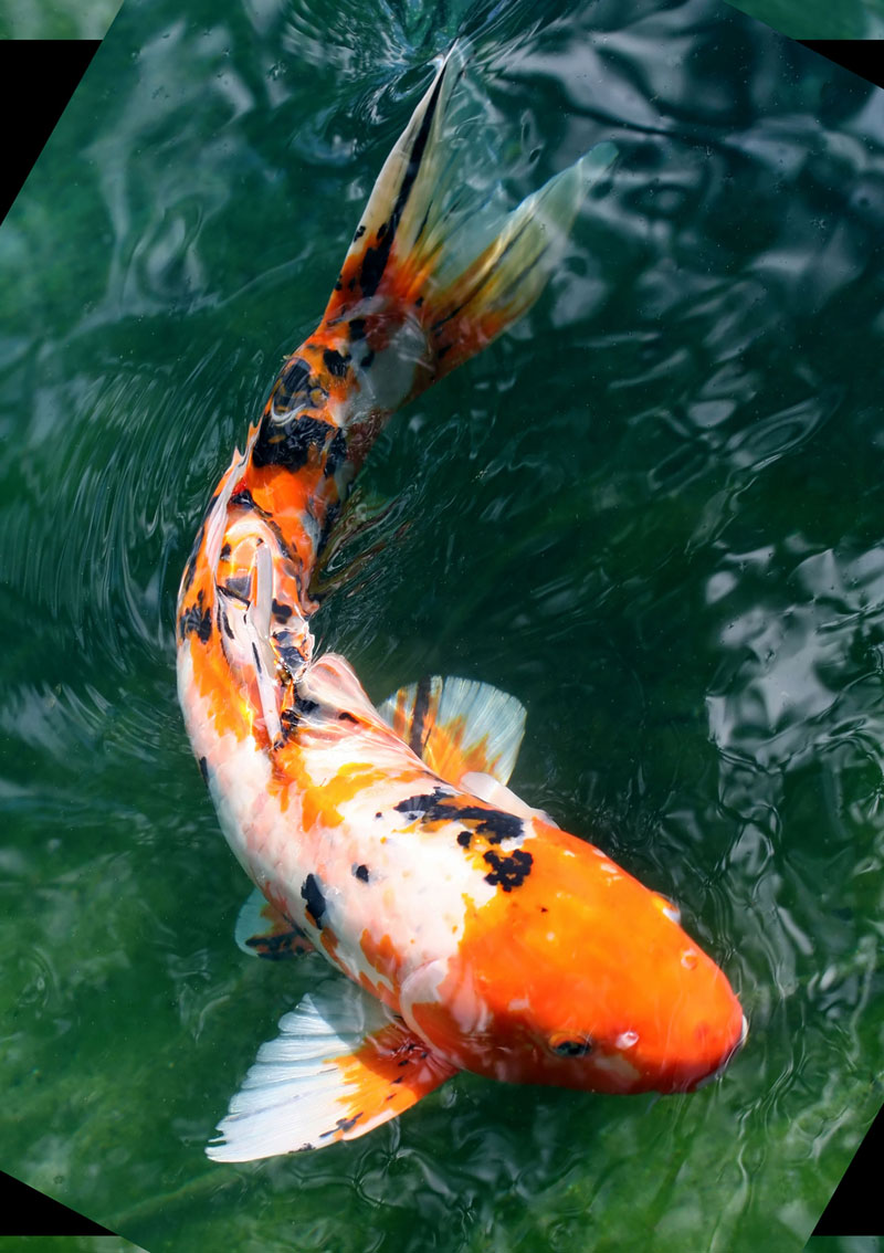
We’re going to start out by using a transfer process to ensure that we get the contour lines of our fish in place on our drawing surface. We’ll use a bit of PanPastel and apply it to the back of the photo reference. I’ve printed out the photo reference on just regular typing paper and I’m using the white PanPastel and applying it fairly liberally to the back of the photo reference.
I’ll take my drawing paper, which I’ve already prepared and tape it down in place so it doesn’t move. Then we’re going to carefully place our photo reference over the top and tape it down very gently with a few pieces of masking tape. Now, we’ll need to use a sharp tool in order to place pressure on all the contour lines to basically transfer the PanPastel material onto the drawing surface.
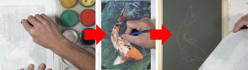
Using a lead holder with sharpened lead, I trace over all of the contour lines I wish to transfer. I’m careful not to place too much pressure on the pencil though because I don’t want to create grooves in the finished surface. When we remove the photo reference, we can see that we have a contour line drawing in place of our koi fish.
See also: Is It OK to Trace in Art?
Formulaic Colored Pencil Applications
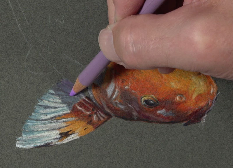
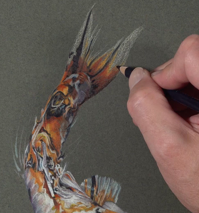
Now we’re ready to begin with colored pencil applications. I’ll start with the eye, building up a natural black. I’m not going to use the color black at all. Instead, I’m using a combination of indigo blue and dark umber. This creates a more natural looking black that gives me full control over the color temperature. If I want my black to appear a little cooler, I’ll add a little bit more of the indigo blue. If I want it to be warmer, I’ll just add more of the dark umber.
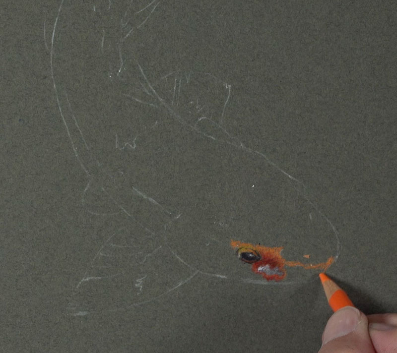
From this eye, I’m going to start working outward, layering different varieties or different versions of oranges, yellow-oranges, and red-oranges – a bit of white and gray as well.
As I work, I’m trying to come up with a formula for how I’m going to layer my colored pencil applications. You can see I’ve got a broad range of value in this small little section. For the most part, I start with just a standard orange colored pencil. Over the top, I’m adding a little bit more of an earthier red-orange. This color is terra cotta and it does make the value darker, but not quite dark enough. I switch over to a 70% warm gray. This makes the value darker, but a little bit too cool. So add a little bit of dark umber over the top.
This is typically how I like to work with a colored pencil drawing. I’ll start in a small area and come up with a formula of how I’m going to layer my pencils to build up the color and value.
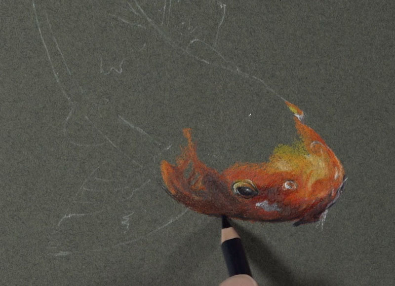
The values on the head of the fish are much lighter. I’ll layer some lighter yellow-oranges, including yellowed orange and a bit of cream. Now, there are some reds here too and I don’t want to lose those. So in this case, I’ll layer a bit of poppy red over the top in some of the areas.
Remember, we want to create variety in the color. Orange is mixed by combining yellows and reds, so it makes sense to use yellows and reds in orange areas. Now that I have my formula in place, I’ll simply work my way out from this location.
As we work each area, we’ll adjust the formulation that we use appropriately.
Working Up the Body of the Koi Fish
This process is slow and tedious. Make sure to take your time and patiently layer your colored pencil applications. Colored pencils are at their best when they’re layered. This layering adds to the complexity of the color, making your drawing look more natural.
I’m applying the colored pencils in a way that the application appears solid – so that none of the color of the paper is showing through. This is another mistake people often make with colored pencils. They draw very, very light. Instead, you should try to build up to a heavy application. This doesn’t mean that you start with a heavy application, it just means that you will slowly and gradually build up a heavy application.
Incorporating a Color Scheme
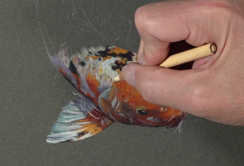
You can see here in the shadowed area of the first fin that we are addressing that I’ve decided to add a little bit of purple to the mix. This color is appropriately dark purple and you might be wondering why purple?
And that’s a great question.
Purple is used because I’m trying to exploit a specific color scheme. A color scheme is a defined arrangement of colors usually based on their positioning on the color wheel.
The color scheme I’m trying to exploit here is called a secondary color scheme. This scheme is made up of the colors of purple, orange and green. These colors are equidistant from each other on the color wheel, making them a color triad. I’m going to put hints of purple here and there because the paper we’re working on is green and the bulk of the fish is orange. If we add bits of purple here and there, that will keep us in line with the secondary color scheme. The secondary color scheme will create additional pop and color contrast which will make our drawing look a bit more interesting.
See also: Warm vs. Cool Grays
Shapes of Color and Value
I’m carefully paying special attention to the relationships of the shapes of color and value that I see and I’m trying to mimic those as closely as possible.
Instead of thinking of drawing a fish, I am thinking of only shapes, colors and values. The fish will emerge from the paper as long as I get these right.
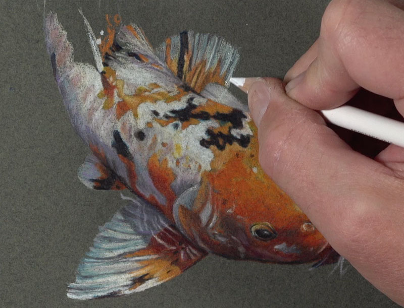
We see that we have a collection of dark shapes right next to light shapes and these are all distorted because of the water. What we actually see is a collection of shapes of values and colors. If we can replicate these shapes of color and value on our drawing surface, then we’ll create a convincing illusion that will look realistic. And that’s how abstraction leads to realism.
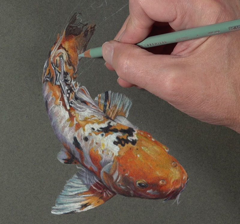
Even as we work up to the tail end of the fish, we’re sticking with the same colors – just the values will change from section to section. This means we’ll have to have some darker sections and some lighter sections as well. We want to make sure that we continue to create that variety in the oranges by adding bits of red and yellow-orange. I’m bringing in some jade green up here at the end of the fish as well.
I’m going to add hints of the water around the edges of the fish so that we can see a bit of movement and to make the drawing a bit more interesting. You could fill out the rest of the picture plane if you wish, or just add a little bit more of this information.
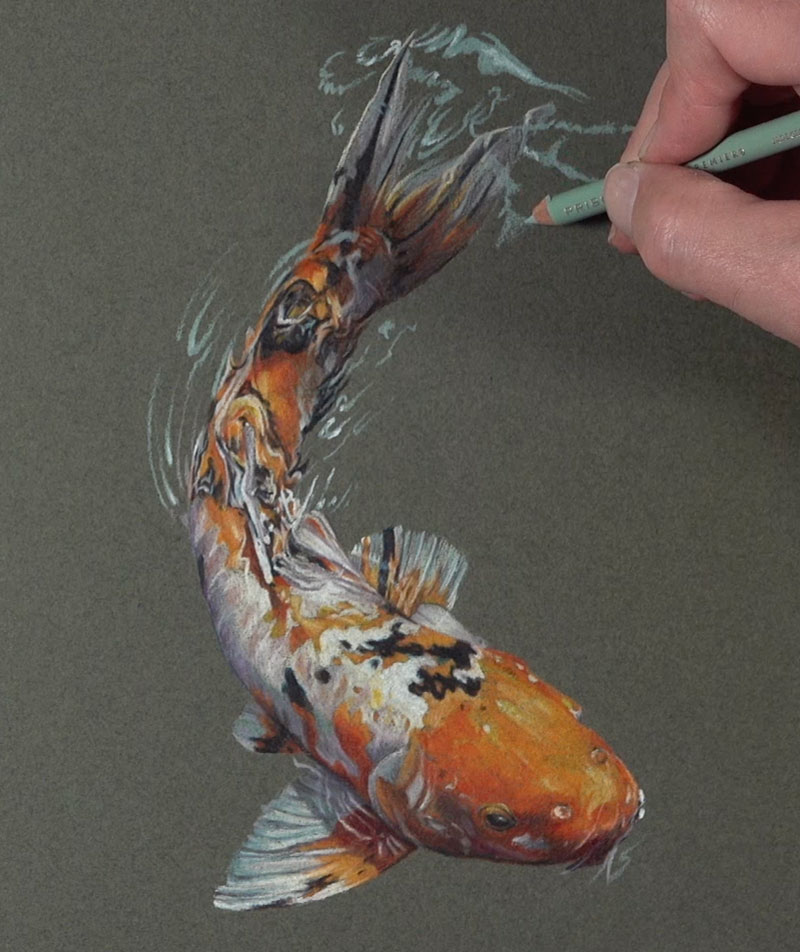
I’m allowing more of the paper color to show through because the color is a dark green and makes sense for this particular subject. I’m using a bit of slate gray to add a little bit more variety in the ripples. We’ll simply pull out a few strokes that mimic what we see in the reference.
We’ll do the same on the left side of the picture plane with the slate gray. Now we have some lighter values and some middle values for our water ripples. We need to add some darker values and we’ll start with a bit of dark green. This green is cooler so it makes sense to add it in some of the water areas, but we need to make the values darker. To do this, we’ll add a bit of indigo blue.
Finishing Touches to the Drawing
Let’s add another green – a yellow-green. Lime peel is used to add more variety to our water areas and it still makes sense with our secondary color scheme. Then we’ll just continue working out the areas that we want to include in our drawing. It’s completely up to you how much you want to add or how much you want to leave out.
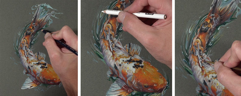
Lastly, we need to add some strong highlights on top so the water actually looks wet. Obviously, we’ll start with a white colored pencil and put heavy pressure so that it covers up the colored pencil applications underneath.
The white colored pencil does a fairly good job of creating these highlights, but there might be a couple of areas that you want to make a bit stronger. To address these areas, we can turn to a material called gouache. Gouache is opaque watercolor and we can apply it directly over the top of a colored pencil drawing. A very fine-tipped brush is used to apply pure white gouache to a couple of selected areas to make the highlights quite a bit stronger. After these highlights are added, our colored pencil drawing of a koi fish on toned green paper is now complete.
Here’s another look at the completed drawing…
Koi Fish Drawing with Colored Pencils – Conclusion
Drawing with colored pencils requires patience, but it’s worth it. Work slowly and concentrate on the shapes of color and value that you see. Match what you see as best as you can and a realistic image will appear. Layer your colored pencil applications to develop depth in the color and enjoy every step of the process.
If so, join over 36,000 others that receive our newsletter with new drawing and painting lessons. Plus, check out three of our course videos and ebooks for free.
Stippling Without Dots
The Problem with Stippling
Stippling is the process of applying countless small dots to the drawing surface in order to create the illusion of shadow. Stippling gives you great control over the gradation or changes from dark values to light values. Stippling can be used with any drawing medium, but most of the time – we see it used with pen and ink. This is because it’s sometimes difficult to create gradations of value or shadow when we use pen and ink.
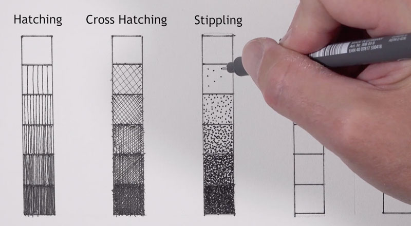
But there is a fatal flaw with stippling, and that is – it takes forever.
But what if there is a way that we could speed up the process, or if there was some way to create the illusion of stippling without making all of those small dots? And what if that solution was the drawing paper?
A Textured Paper to Create The Stipple Look
Let’s start by taking a closer look at the paper which is stipple texture paper by the Bee Paper Company. If we look at the label, we can see it’s acid free and it’s excellent for all dry media – so it says. It also says “ideal for designing tattoos”, which I’m not sure about that one.
Buy Bee Stipple Paper on Amazon (This is an affiliate link which means we make a small commission if you purchase at no additional cost to you.)
We’ll go ahead and start here with graphite. In each one of these squares, we’ll take a quick look at different media. I’m using a 3B pencil here, so this is a fairly soft pencil. And you can see that it is somewhat difficult to get quite as dark as you might expect with a soft pencil like this. But again, that’s because little white specs of the paper are showing through.
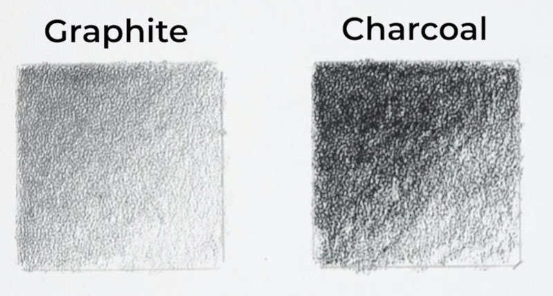
Let’s move on to charcoal. We’ll use a compressed charcoal pencil here, and you can see clearly that the charcoal is much darker. It’s also matte, which is helpful. But again, it’s still a little bit difficult to get some of those really dark values because of the texture of the paper. As we’ll see in the demonstration that follows, that might be a good thing.
Let’s look at how colored pencils behave on this surface. We’ll do some overlapping and see if we can get some optical color mixing to happen here. By layering a bit of red over blue, we can start to see hints of purple showing through. You’ll also notice I’m fighting the white of the paper again because of the coarseness of the texture of the paper. This doesn’t mean colored pencils aren’t a good medium to work on this surface, but you might have to push values really dark or work hard to make those values dark.
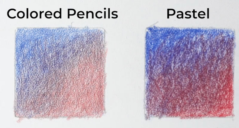
Now, lastly, we’ll take a look at pastel pencils. And as you can see, the pastel pencils do fill in a lot more of the tooth, but they create somewhat of an irregular pattern. I feel like there’s not a whole lot of control here with the pastels. There’s lots of other paper options out there for pastel pencils, but the charcoal and the graphite intrigues me. So let’s try a third medium.
Let’s try a carbon pencil. A carbon pencil will fall somewhere between a charcoal pencil and a graphite pencil. We’ll be able to create those dark darks without all that graphite shine and without the mess that we typically see with charcoal pencils.
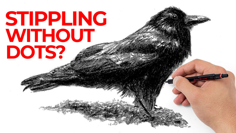
Drawing a Crow with Carbon Pencil on Stipple Paper
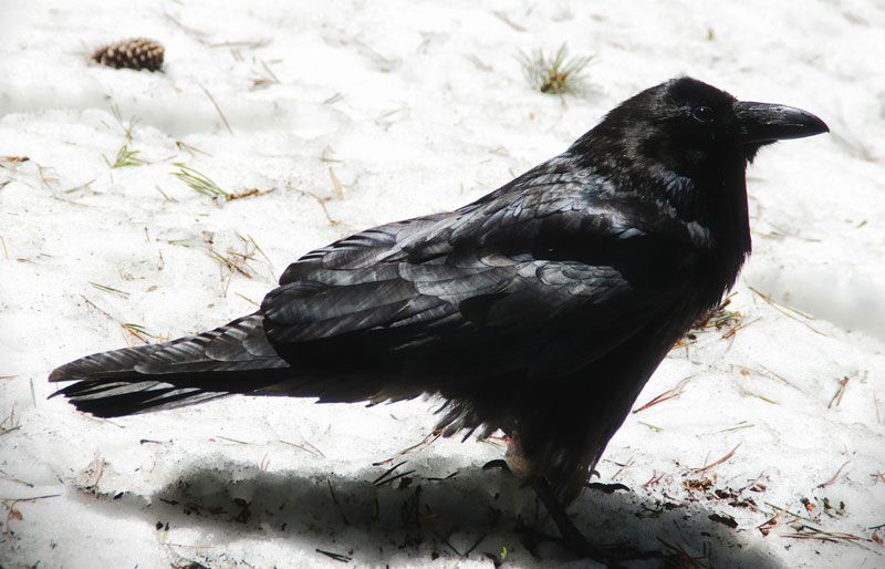
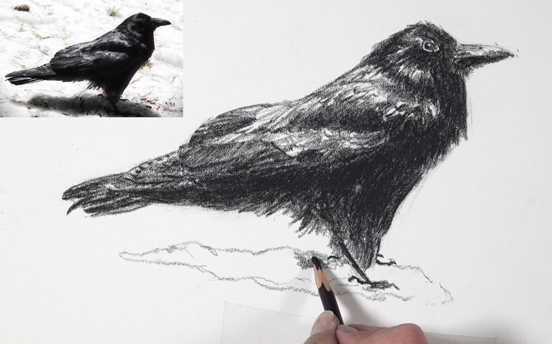
For this drawing, I am working from a photo reference from Pixabay.com. Here’s a look at the reference photo…
We’ll start here with the carbon pencil on the stipple paper. We must be careful with the carbon pencil because the blacks are very black and this pencil is not necessarily the most forgiving pencil in the world. We’re going to keep our marks loose and light. Even though these marks look a little bit dark, it’s just because of the contrast of the paper.
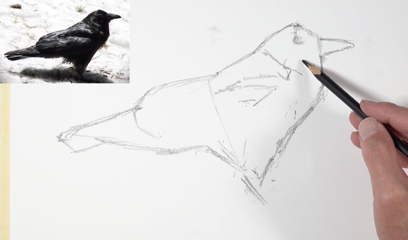
You’ll see as we put more pressure on the pencil, the darks get much darker. Even though I’m using sketchier lines here, these are going to melt into the drawing as we progress. Initially, I’m trying to find the bird using mostly straight lines and I am thinking about the shapes that I see.
You can see I’ve drawn a small shape for the beak and a small shape for the eye. Those two things are very important to the overall form of the bird. At this point, I’m drawing in some lines where I see contrast in value. This particular subject, of course, features lots of dark values on the bottom half.
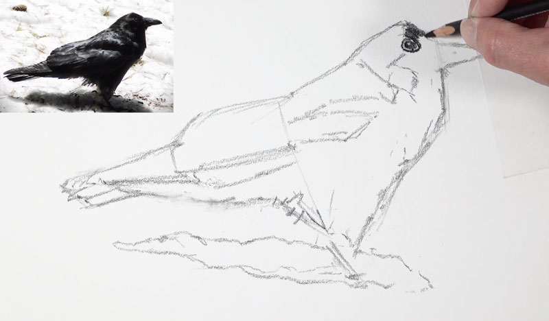
Now that I’ve got the overall sketch of the shape of the bird in place, I’m ready to start putting a little bit more pressure on the pencil and develop some of these darker values. Clearly you can see that this paper is very coarse and the texture is showing through, and that’s what we want. The paper here is very important in the finished look. But as a result of this course texture, it’s a little bit more difficult to create precise details. Instead, you have to rely on the relationships of values in order to communicate your subject to your viewer.
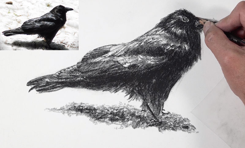
I’m adding some of the smaller feathers that happen here on the larger wing, which is tucked behind the bird. I can’t get some of those really defined lines that I normally can get with other drawing media on other surfaces – namely smoother surfaces. Now this may initially seem like a drawback to using this paper, but I view it somewhat as an advantage and here’s why – A lot of times we get wrapped up in all the details that we see when we’re creating a drawing and those details can be overwhelming.
This paper forces you to think about the form of what you’re drawing. So instead of thinking about all the details, you’re thinking about where the dark and light values are. This speeds up the process, and it also makes you feel a little less stressed about including all the details. The result is details are implied, and of course our viewer understands them anyway without spelling everything out. So, essentially, this paper helps you loosen up.
Finishing the Drawing on Stipple Paper
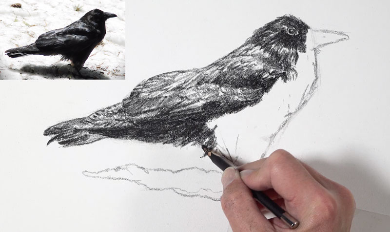
This paper allows some of that white to show through, even in the darkest areas. This is an advantage because we don’t really necessarily see solid black in reality. This paper helps our blacks feel more natural by allowing little specs of the white to show through. For this same reason, there’s more emphasis on the directional strokes that we make.
Strokes are pulled so that they follow the form of the bird or how the feathers grow. These directional strokes are still very much visible. And here, even in these areas where I’m trying to make the black as black as it possibly can be, there’s still some of those specs of the paper showing through.
This paper saves you time because you don’t have to worry about all the details, as we mentioned before. Again, you can quickly add just a bit of value to the surface and we get that wonderful stippled look that the paper produces. This obviously leads to a grainy appearance, but if we remember analog photography back before we had digital photography, the prints created also have a grainy appearance.
You can see, as the finishing touches are added, we’ve created the illusion of the form of the bird and captured the subject in an interesting way using this unique paper. And now our drawing is complete.
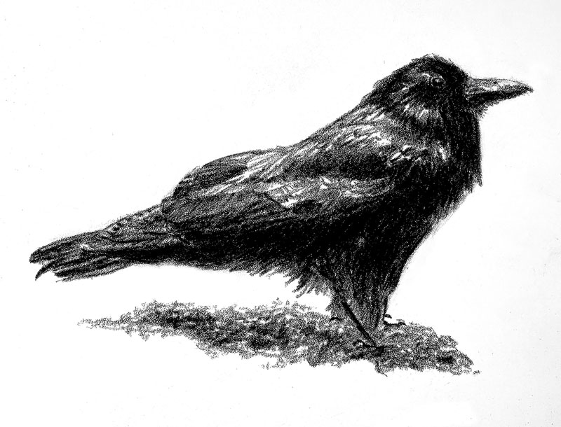
Drawing on Stipple Paper – Conclusion
This paper isn’t for everyone and it’s not for every medium or subject. But for certain circumstances, this paper is a fantastic time-saver. It creates a unique appearance and it’s worth a look for those wishing to explore alternative surfaces.
If so, join over 36,000 others that receive our newsletter with new drawing and painting lessons. Plus, check out three of our course videos and ebooks for free.