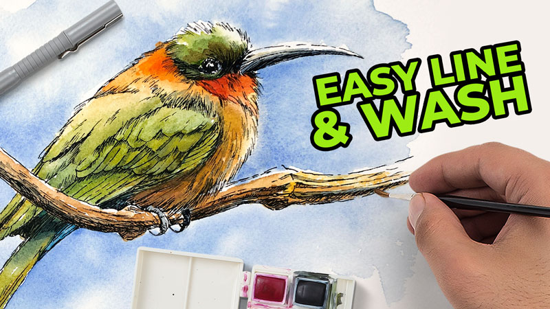
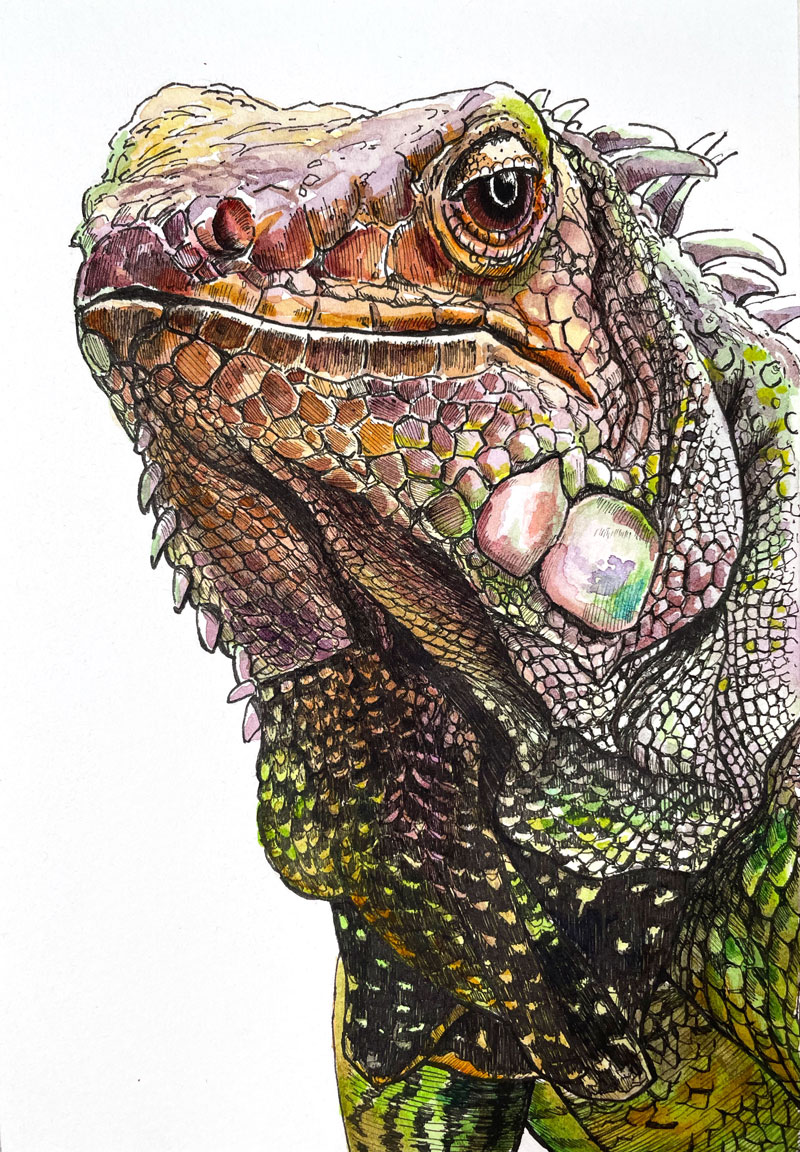
Painting an Iguana with Watercolor
This lesson is a continuation of a past lesson on drawing an iguana with pen and ink. In this lesson, we’ll complete the art by adding watercolor washes over the pen and ink drawing, a process commonly called “line and wash“.
Here’s a look at the completed art with both pen and ink and watercolor washes…
Materials for Painting an Iguana with Watercolor
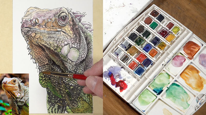
I’ll be working with Cotman watercolors by Winsor & Newton to complete the painting, but feel free to use any brand that you wish if you’re following along.
Grumbacher Golden Edge brushes are used to apply the watercolor. I’ll be using two brush sizes – a #4 round, and a #00 round.
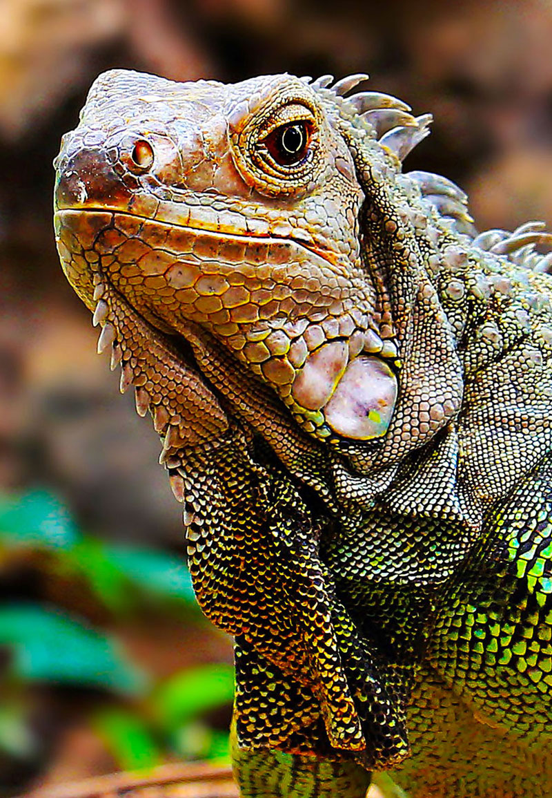
A photo reference is used for this work. This reference comes form Pixabay.com and has been edited for composition and color. Here’s a look at the photo reference…
Considering a Color Scheme
Before we dive into the watercolor application process, I want to speak for a minute about colors and the colors that are included in this painting. In this work, my intention is to exploit a secondary color scheme. Secondary colors are made by mixing two primary colors together. The secondary colors are orange, purple and green. These colors are equidistant from each other on the color wheel and form a color triad.
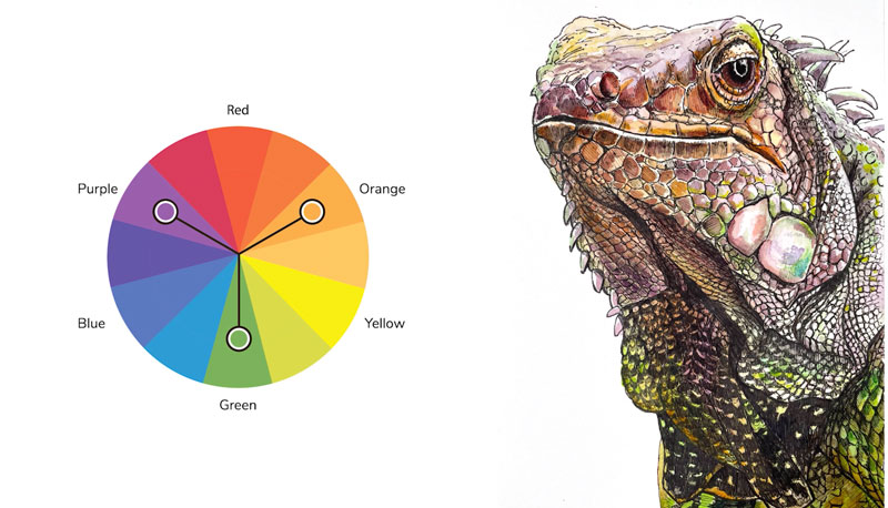
This means that we’re going to get some “pop” and contrast from these colors. Since we’re limiting our palette, meaning that we’re only using a few colors, we’re going to ensure harmony and unity in the piece.
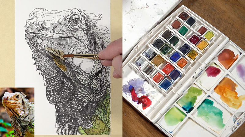
Watercolor Washes to the Iguana
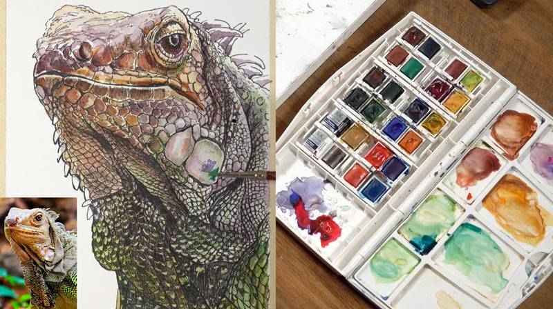
We’ll begin here by just mixing up a few colors on our palette. Since we’re going to be sticking mostly with a secondary scheme, I’m going to go ahead and isolate a few purples, oranges and greens. I’ll start with Indian Red and a bit of Purple Lake. There’s a mixture of Cadmium Orange and Yellow Ochre off to the right and a mixture of Sap Green and Hooker’s Green. I’ll also pull in a little bit of Intense Blue here with the green, so that we have a range of cooler green to warmer green.
Then, pulling from our palette, we’ll begin with initial washes.
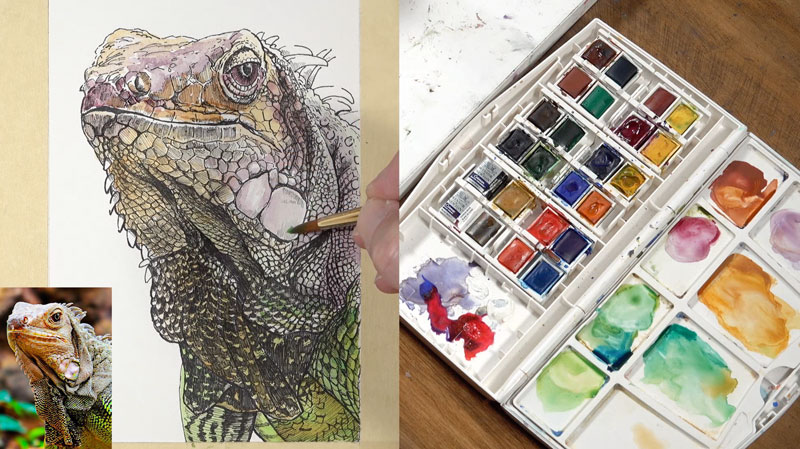
We’ll start with light, glaze-like applications. Gradually, we’ll get a little bit more intense with our applications. This is how I like to approach watercolor painting, through a layered approach.
While the surface is still wet, I’ll add additional colors, allowing those colors to bleed together. We do see a little bit of a transition or gradation of colors throughout the body, and we’ll try to replicate that in the watercolor painting.
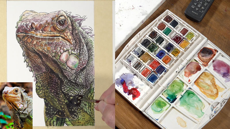
On the right side of the body, we have some fairly light values. In fact, we’re seeing strong contrast here between the dark values and light values. Some light values appear almost white in some areas, but we’re going to add a bit of color, so a very light glaze of a cooler green is added. Later, I’ll add a bit of orange and purple here too.
We’ll have these transitions of color happen throughout the painting, where the colors basically transition from purples and oranges to greens and back again.
Getting Darker with Watercolor
When you create a pen and ink drawing with watercolor, you can somewhat rely on the pen and ink to develop the values and the watercolor to add the color. Since we have our values in place, I’m concentrating mainly on adding the colors, but the colors that are added do affect the value slightly. Some of the colors are going to make some of the areas a little bit darker in value naturally.
Even though the pen and ink and the subsequent washes of watercolor gradually broaden the range of value, we’ll still need to push this range further, increasing contrast. As we continue to layer watercolor washes, the value slowly begins to darken, creating this range and contrast.
We want to build up some interest and complexity on the color by layering colors on top of each other and allowing them to optically mix on the surface.
Just like with any drawing or painting medium, there is some patience involved. Work slowly and take your time. For me personally, I like to gradually layer the colors to build up the depth in the color. If I put down a color that seems a little bit too intense, I’ll reach in with a paper towel and lift it up quickly so that I’m assured that I’m putting down the correct intensity of the color.
Don’t be afraid to deviate from the reference and create your own piece of art. We shouldn’t just replicate what we see. Instead, we should put our own little artistic touches on what we see.
Considering the Light Source
The light source is originating from above and slightly to the right of the iguana. This means that the shadowed areas are going to exist mainly on the lower portion and the left side of the body. So as we continue to broaden the values we can make colors more intense on the left side, which means the values are also going to be slightly darker as well.
You’re going to find that you’re going to need to make value adjustments. Value, one of the seven elements of art, is relative. This means that we understand value based on the values around a specific value. As we get darker with our image, we might find that we need to go back and increase contrast in other areas or adjust values.
That’s why it’s important to work around the picture plane as you go, allowing the image to develop in totality. Even though I’ve gone back to the top of the picture plane, and I’m working my way down, I’ll still find myself bouncing around.

Finishing Touches to the Painting
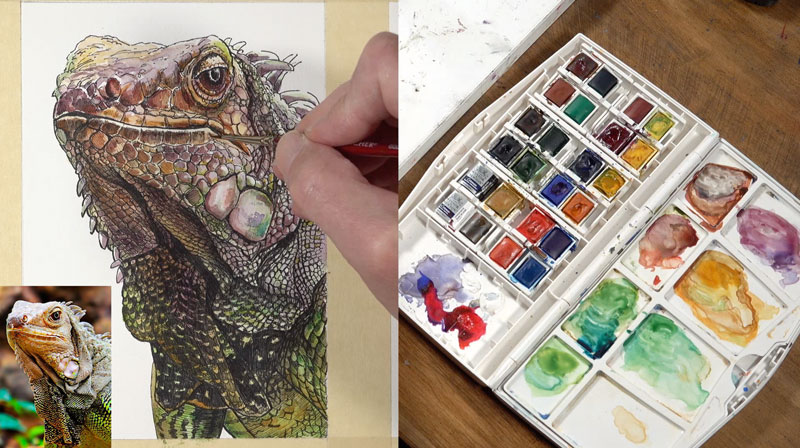
After I’m happy with the transitions of color, the relationships of value, and the intensity of color, I let the painting dry. Many times with a line and wash image, you’ll find it necessary to return to the work with pen and ink. This painting is no exception, and I decide to revisit a few areas with the ink to complete the art.
Painting an Iguana with Watercolor – Conclusion
Combining watercolor with pen and ink is one of my favorite combinations of media. The ink provides control, texture, and detail while the watercolor adds color and life. The two mediums compliment each other which is what is desired when mixing art mediums.
If so, join over 36,000 others that receive our newsletter with new drawing and painting lessons. Plus, check out three of our course videos and ebooks for free.