Orange Slices with Acrylics
In this acrylic painting lesson, we’ll use acrylic paints on panel to create a looser painting of orange slices that emphasizes brushwork and composition.
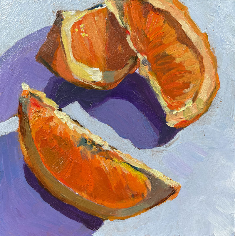
Here’s a look at the completed painting…
Brushstrokes and Composition
The beauty and complexities of the brushstrokes of artists of Impressionism and those influenced by Impressionism should be an inspiration to all artists. These marks transform mundane objects and subjects into true art and not just replications of what is observed. Bold applications of thick paint sometimes appear haphazardly applied, but with a bit of distance, we see the genius. In this lesson, we’ll allow our brushstrokes to be loose and bold – somewhat like the Impressionists.
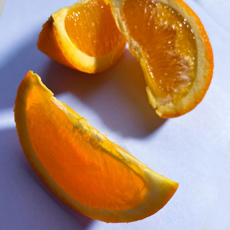
In preparation for this painting, I took several photos of my subject and experimented with several arrangements before deciding on the composition below. I like the way the shapes of the shadows and the shapes of the orange slices create an interesting composition. Here’s a look at the photo reference…
Materials and Surface
This painting is created using Liquitex heavy body acrylics. You can use any brand of acrylics that you wish, if you want to follow along with your own painting. I suggest using heavy body paints instead of thinner craft acrylics.
(Links to suggested materials are affiliate links which means I make a small commission if you purchase at no additional cost to you.)
If you’re looking for a great set of basic colors, you may consider this set…
Liquitex Heavy Body Acrylics – 12 Tube Set
The panel that this painting is created upon is small, measuring only 4″ by 4″. The surface is pre-primed with gesso and features a smooth surface. Because of the smooth surface, the brushstrokes are accentuated.
Pre-primed panels can be found at your local art store, but you can also order them online…
3 – Pack Primed Panels for Painting
Nylon brushes were used to apply the acrylic paint and a bit of slow drying fluid medium was used to slow the drying time of fast-drying acrylics.
Mediums for acrylic painting can be found at your local art store, but you can also order them online…
Slow Dry Fluid Medium for Acrylic Paints
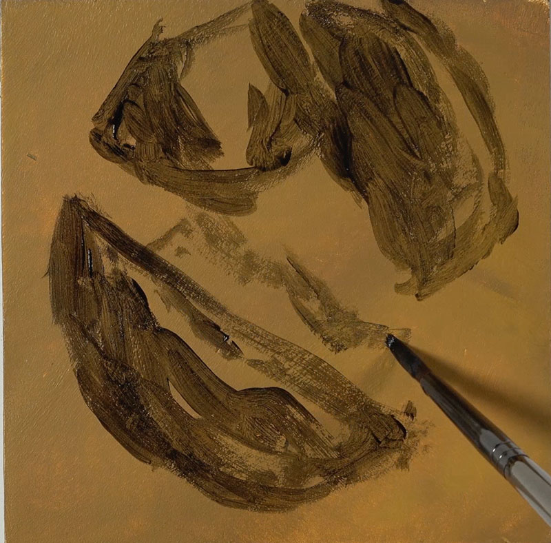
Prior to painting, I prepare the panel with a base color or ground using a mixture of Yellow Oxide, Titanium White and Burnt Umber. This ground provides a warm, medium value instead of a stark white surface. This allows us to make better decisions regarding the values and colors that we add.
Sketching the Oranges
We’ll begin by simply sketching out the shape of the oranges, getting the composition in place on our panel. I apply a mixture of Burnt Umber and Payne’s gray. This mixture makes a nice dark value that’s not quite black, but is dark enough to create contrast.
As I’m adding the shape of the orange, I’m also allowing some of the shadowed areas to be filled in with this darker value. I’m only concerned with the relationships of the spaces around the edges and the spaces in between the oranges. I’m using the space around the oranges in order to figure out where the oranges are actually placed on the composition.
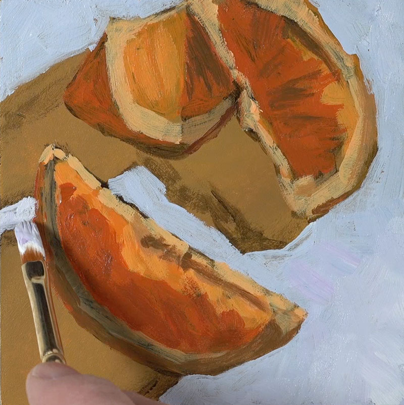
Blocking in Colors
Once our loose sketch is in place, we can start mixing up our initial color for blocking. I’m using a bit of Cadmium Yellow and Cadmium Red. This creates a bright orange that is applied to the areas of middle value. I’ve switched over to a larger flat brush to do so. In fact, I’ll stick with this larger brush for as long as I possibly can. This adds to the looser feel of the painting and it will force me to focus on the shapes of color and value that I see instead of the details.
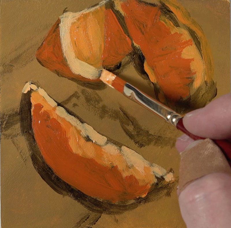
Once we have many of the middle values blocked in, we can start to push the value range and contrast. This means that we’ll gradually add both lighter and darker values, based on what is observed from the reference.
Our light source is originating from the upper right hand corner. We can see that the lighter values exist along the top edges of the oranges. We’re creating an illusion when we create a drawing or painting. And when we’re painting, this illusion is created by the relationships of shapes of value and color. That’s why we’re focusing on these relationships of lighter and darker value.
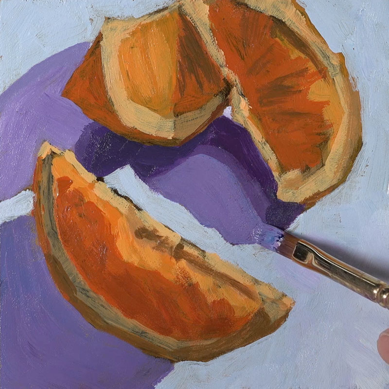
Painting Cast Shadows
Next the cast shadows underneath the oranges are addressed. Keeping the light source in mind, we’ll notice that these shadows make defined shapes that extend from the bottom of the orange slices opposite from where the light source originates.
Purples are chosen for the cast shadows. This exaggerated color harmonizes with the blue background, but contrasts the yellows found on the orange slices.
Adding “Details”
Now that we have some of our background colors in place, we can go back to the oranges. We can do so armed with a bit more information on the value relationships and color relationships. I’ve switched over to a smaller brush and I’m addressing some of the details on the orange that’s closest to the viewer.
At this point, I’m fighting the desire to make this painting feel a little bit more realistic. Instead, I want this painting to feel looser and fresher with brushstrokes that are a bit more expressive. When we switch to a smaller brush, it’s a little bit harder to do so.
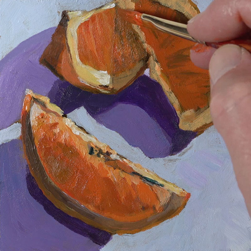
The process of developing the details in the painting is essentially the same as the blocking process that we used when the painting began. The only exception is that we are now paying attention to smaller shapes of value and color instead of larger ones. If we stay focused on color and value and the shapes of those colors and values then the “details” will slowly emerge.
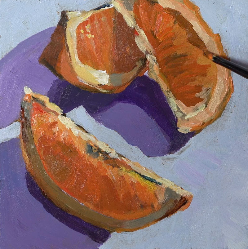

Painting Oranges with Acrylics – Conclusion
To finish the painting, we’ll simply continue to find and add various values and intensities of the colors we observe, taking care that we don’t overwork the painting and lose the freshness of the bolder and larger brushstrokes.
Here’s another look at the completed acrylic painting of orange slices…
Due the size of this painting, the time required to complete was rather short. Working on a smaller surface allows you experiment and learn quickly without committing to a larger painting. And for those of you that tend to overwork your paintings, working smaller forces you to be more efficient with your brushwork.
If so, join over 36,000 others that receive our newsletter with new drawing and painting lessons. Plus, check out three of our course videos and ebooks for free.