Gettin’ Sketchy: Season 6
Episodes
About Gettin’ Sketchy – Season 5…
Gettin’ Sketchy Live is an original live broadcast. The goal is produce a sketch within 45 minutes while providing art instruction and entertainment. In this season, Ashley focuses on drawing images that reflect the motif, “down on the farm” while Matt focuses on drawing facial features.
Episode 1: Eye Drawing
Learn how to draw an eye quickly in this live drawing exercise. Staedtler Black graphite/carbon pencils are used on gray Artagain drawing paper.
Episode 2: Rooster Drawing
Learn how to draw a colorful rooster with Prismacolor ArtStix and colored pencils on black paper in this timed drawing exercise. This drawing is created on black Canson Mi-Teintes pastel paper.
Episode 3: Nose Drawing
Learn how to draw a nose with black pencils and white charcoal on toned gray paper in this timed live drawing exercise.
Episode 4: Tractor Drawing
Use ball point pens to draw a tractor in this timed drawing lesson and exercise.
Episode 5: Mouth Drawing
Use black pencils and white charcoal on gray drawing paper to draw a mouth in this timed drawing lesson and exercise.
Episode 6: Sheep Drawing
Use graphite pencils on white drawing paper to draw a sheep in this timed drawing exercise and lesson.
Episode 7: Ear Drawing
Use black drawing pencils and white charcoal to draw an ear in this timed drawing exercise and lesson.
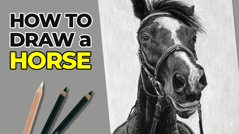
Episode 8: Horse Drawing
Draw a horse on black paper with white charcoal in this timed exercise and drawing lesson.
Episode 9: Ladder Drawing
Draw a ladder with graphite pencils on white drawing paper. Sketch out the contour lines before developing the shading. This drawing exercise is limited to just 45 minutes.
Episode 10: Avocado Drawing
Sketch avocados with pastels in this live drawing lesson and timed exercise. Learn how to sketch quickly with pastels as the timer winds down.
Episode 11: Season 6 Review and Critique
We critique our own drawings from Season 6 of Gettin’ Sketchy Live. This season, Matt worked with black pencils and white charcoal on gray paper to draw facial features. Ashley chose to work with a farm theme and created a variety of drawings with various drawing media.
Resources for this Lesson…
Distributing any content downloaded from this site is strictly prohibited and against the terms and conditions of use.
References
Here’s what you’ll need…
(Disclosure: Links to art materials are affiliate links which means we make a small commission if you purchase at no additional cost to you.)
Episode 1: Eye Drawing
Episode 2: Rooster Drawing
- Prismacolor NuPastels (ArtStix are discontinued)
- Carbothello Pencils
- Black Drawing Paper
Episode 3: Nose Drawing
Episode 4: Tractor Drawing
- Ball Point Pen
- White Drawing Paper
Episode 5: Mouth Drawing
Episode 6: Sheep Drawing
Episode 7: Ear Drawing
Episode 8: Horse Drawing
Episode 9: Portrait Drawing
Episode 10: Avocado Drawing
3 Step Approach to Drawing Anything
Step by Step Approach to Drawing Anything
In this drawing lesson, I’m going to share with you a simple three step approach to drawing and sketching that improves your accuracy and probably will improve your speed as well.
When most of us first start drawing, we usually start with drawing the outlines, and these are often referred to as contour lines. The problem with this approach is that it is a little bit harder to be accurate with your drawing. You might find a place to start on your drawing, and then when you come back and connect the contour line, sometimes it doesn’t always match up or you have distortion. In this way of drawing we’re starting with the outside part of the subject and working our way to the inside. So we’re working from the outside to the inside. But what if we switched that, reversed it, and instead worked from the inside out?
In this three step process, that’s exactly what we’re going to do. We’ll take a look at two different subjects – one that’s simple and another one that’s complex. We’ll see how this three-step process can be applied. Let’s take a quick look at this three-step process before we go into the examples.
The Simple Process of Drawing
The first step is to break our subject down into simplified shapes. Now this works for simple subjects and also complex subjects, and we’ll see this in just a minute.
See also: Drawing 101 – Simplify for Success
After we’ve broken down our subject into basic shapes, the second step is to draw the contour lines or the outlines. These are the lines that we normally begin with when we create a drawing, but in this case we’re going to start with the simplified shapes then move on to the contour lines.
The third step in the process is to develop the value. Value is the darkness or lightness of a color. It’s one of the seven elements of art, and it’s perhaps one of the most important elements of art. When we develop the value a lot of times people refer to this as shading. We are creating the illusion of form, we’re creating the illusion of a light source, and we’re making our object or subject appear more three-dimensional. So let’s take a look at our first example.
See also: 6 Reasons to Draw on Toned Paper
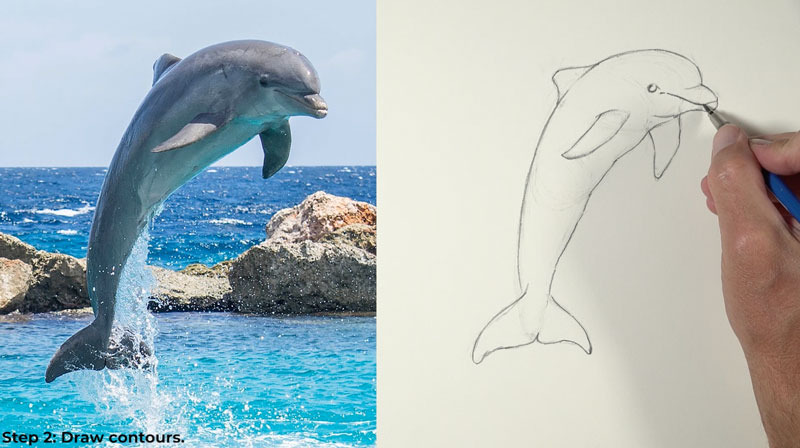
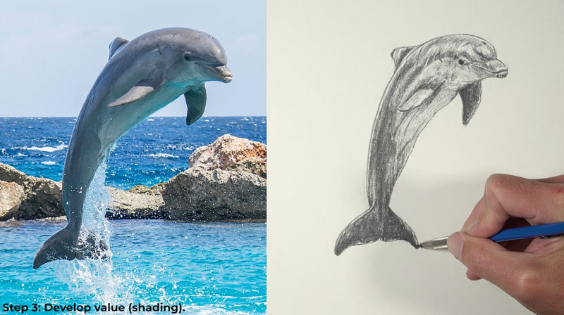
Example 1 – Drawing a Dolphin
For our first subject, we’ll draw this wonderful dolphin.

Step 1 – Draw the Basic Shapes
Our first step of the process is to break the subject down into basic shapes. We don’t have to worry about drawing a series of controlled shapes. We just want a generalized idea of the shape. I’m drawing loosely and quickly before moving on to the next shape that I see.
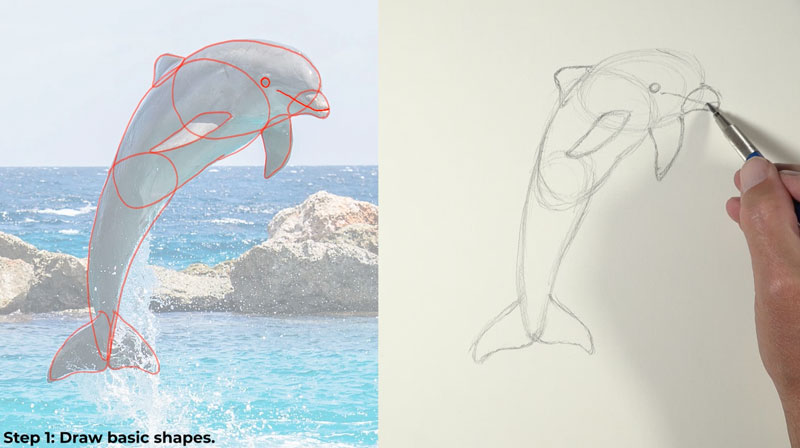
It’s important to note that you may see different shapes in this subject or any other subject that you decide to draw, and that’s completely fine. You just want to find shapes that are simple and easy for you to draw. And for some subjects, it’s going to be very easy to see these shapes. But for others, it might take a few minutes of thinking.
Step 2 – Draw the Contours
Now with a bit more pressure and a lot more refinement, we’ll go ahead and draw the contour lines or the outlines. But since we have a faint version of our dolphin in place, we can draw these contour lines with a bit more conviction, meaning we can be a bit more confident with the marks that we make here and we can concentrate on the quality of the line that we make.
Step 3 – Shade the Drawing
Now it’s time to develop the value. Value, of course, is the darkness or lightness of a color and a lot of times we refer to this as shading. In this case, we’re just adding darker values and we’re leaving lighter areas using the white of the paper to create the tints. And of course, we’re adding graphite in areas to create the shades. Our goal is to create a full range of value. This leads to the illusion of form and texture in our drawing. This is the step that is the most time-consuming part of the process.
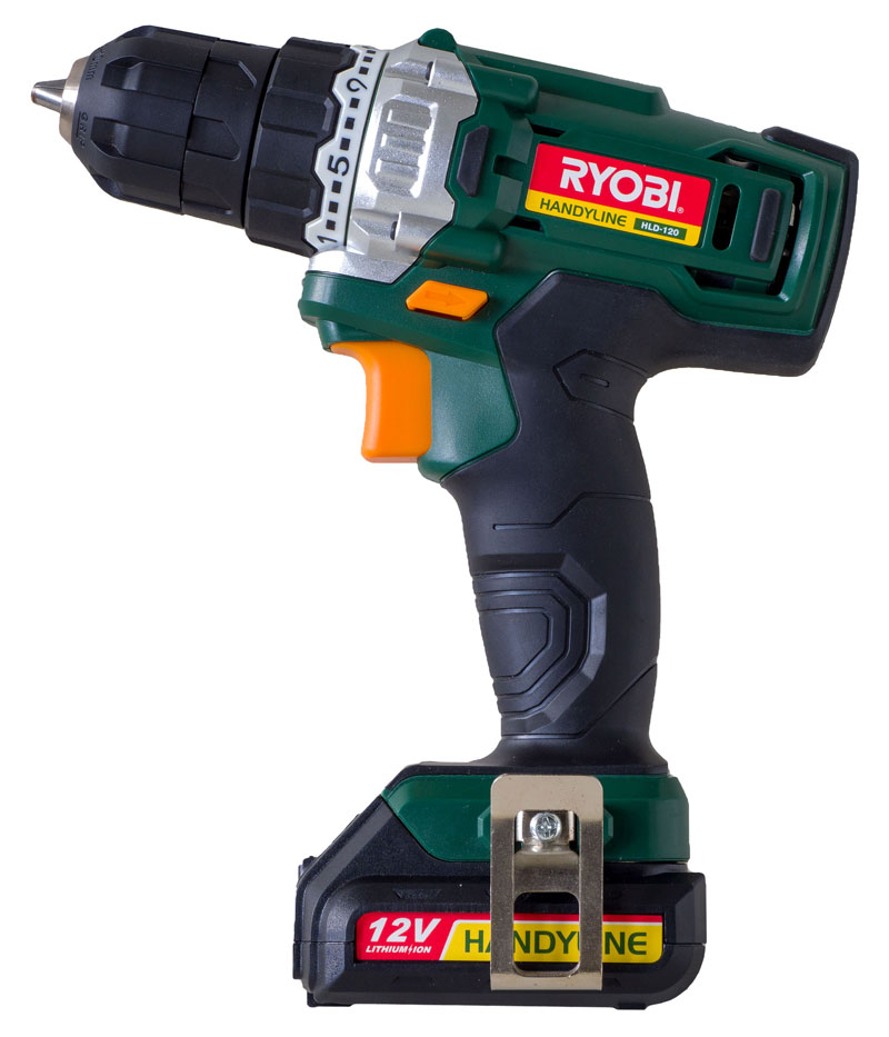
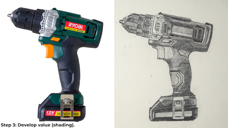
Example 2 – Drawing a Drill
Now we’ve seen how we can apply this simple three-step process to a simple subject. Let’s take a look at applying this process to a more complex subject. This time we’ll draw this very complex drill.
Step 1 – Draw the Basic Shapes
At first glance, this drill might seem overwhelming and overly complex, but we can break this down into simplified shapes. We’ll draw the simplified shapes first, and then worry about the contour lines.
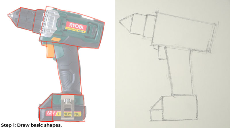
Just like with our first example, I mentioned that you may see different shapes, and that’s completely okay. We’re all going to see things differently. What’s most important is that you just find shapes that you feel are easy for you to draw.
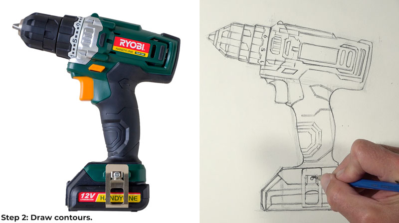
Step 2 – Draw the Contours
Now we can start with the contour lines. This is a complex subject as we’ve already mentioned, but now we have a better idea of where these contour lines need to go. Drawing these contour lines is much easier now that we have a map in place – the map we created with basic shapes. My goal is to be as accurate as possible with these contour lines, but as is the case with any drawing or painting, I’m allowing myself to be a little bit more free with my drawing. If my drawing’s a little bit different from the subject, that’s completely okay with me.
Step 3 – Shade the Drawing
After our contour lines are in place, it’s time to develop the value. Again, this is the most time intensive part of the process. It’s a slow process, but it’s also not that difficult. All we have to do is match the values that we see or match them to the best of our ability in order to create the illusion of form and light on our subject.
3 Step Approach to Drawing Anything – Conclusion
This three step approach is great for creating quick drawings and sketches. It ensures accuracy like we have seen, and it will also improve your speed as well. Now that you know and understand this approach, we’ll find use for it in your own drawings and paintings.
If so, join over 36,000 others that receive our newsletter with new drawing and painting lessons. Plus, check out three of our course videos and ebooks for free.

Gettin’ Sketchy – Season 5
Gettin’ Sketchy: Season 5
Episodes
About Gettin’ Sketchy – Season 5…
Gettin’ Sketchy Live is an original live broadcast. The goal is produce a sketch within 45 minutes while providing art instruction and entertainment. In this season, Ashley focuses on drawing “paths” or “walkways” while Matt focuses on drawing food.
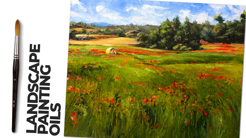
Episode 1: Landscape Drawing
Learn how to draw a landscape with high contrast and a dominate tree in this timed drawing exercise and lesson. Use graphite pencils on white drawing paper to complete the drawing within 45 minutes.
Episode 2: Muffin Drawing
Learn how to draw a chocolate muffin (cupcake) with markers and colored pencils in this timed drawing exercise and lesson. Use these materials on white marker paper to complete the drawing within 45 minutes.
Episode 3: Path Drawing
Learn how to draw a stone covered path in this timed drawing exercise and lesson. Pastel pencils are used on black paper to complete the drawing within 45 minutes.
Episode 4: Candy Corn Drawing
Learn how to draw candy corn with pastels on PastelMat paper in this timed drawing exercise and lesson. The goal is to complete the drawing within 45 minutes.
Episode 5: Staircase Drawing
Learn how to draw a staircase with graphite pencil on white drawing paper in this timed drawing exercise and lesson. This live drawing exercise is timed to just 45 minutes.
Episode 6: Apple Drawing
Learn how to draw an apple with Luminance colored pencils on black Artagain drawing paper in this timed drawing exercise and lesson. Create a dramatic shadow by letting your drawing paper do the hard work. This live drawing exercise is timed to just 45 minutes.
Episode 7: Sneaker Drawing
Learn how to draw a pair of classic Converse “Chuck Taylor” sneakers with graphite pencil on white drawing paper in this timed drawing lesson and exercise. This drawing exercise is limited to just 45 minutes.
Episode 8: Pear Drawing
Draw or paint a colorful pear with pastels and pastel pencils on PastelMat paper in this timed drawing exercise and lesson. This drawing exercise is limited to just 45 minutes.
Episode 9: Ladder Drawing
Draw a ladder with graphite pencils on white drawing paper. Sketch out the contour lines before developing the shading. This drawing exercise is limited to just 45 minutes.
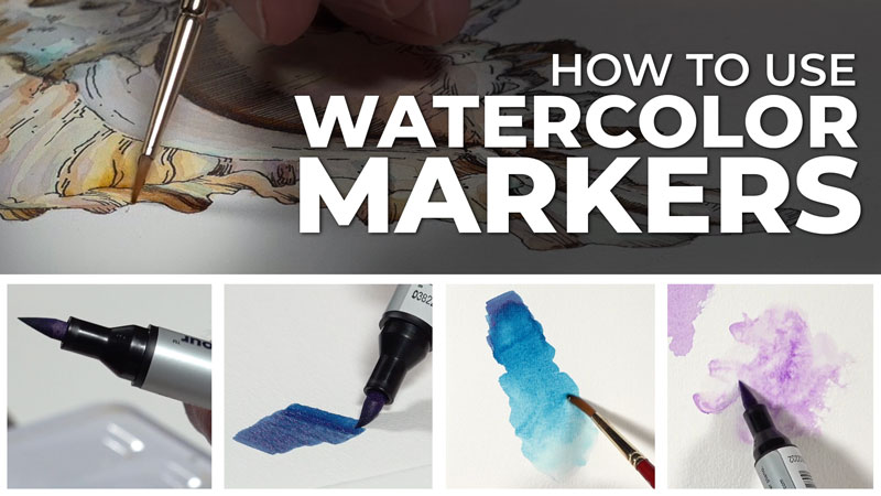
Episode 10: Sushi Drawing
Use pen and ink and watercolor markers to draw sushi in this timed drawing exercise. This drawing exercise is limited to just 45 minutes.
Episode 11: Season 5 Review and Critique
Join us as we look back live at the drawings created in Season 5 of Gettin’ Sketchy. In this season finale, we quickly critique each of the ten drawings that include works created with graphite pencils, colored pencils and markers, pastels, pen and ink and watercolor.
Resources for this Lesson…
Distributing any content downloaded from this site is strictly prohibited and against the terms and conditions of use.
References
Here’s what you’ll need…
(Disclosure: Links to art materials are affiliate links which means we make a small commission if you purchase at no additional cost to you.)
Episode 1: Landscape Drawing
Episode 2: Muffin Drawing
Episode 3: Path Drawing
Episode 4: Candy Corn Drawing
Episode 5: Staircase Drawing
Episode 6: Apple Drawing
Episode 7: Sneaker Drawing
Episode 8: Pear Drawing
Episode 9: Ladder Drawing
Episode 10: Sushi Drawing
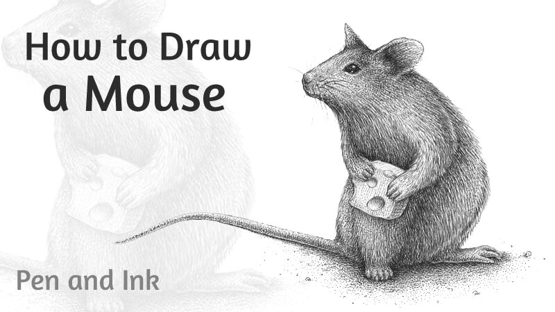
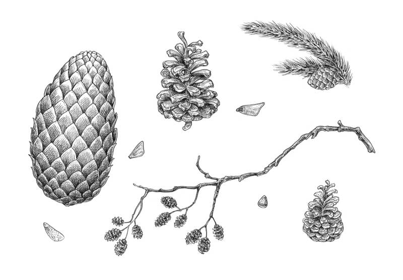
How to Create an Ink Collection of Cones
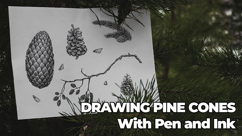
Nature has so many curiosities, and cones are one of them. We see various cones on a walk in a forest or park and in holiday wreaths and floral decorations. In this pen and ink drawing lesson, we take a look at drawing several pine cones with ink.
In other words, pine cones become a habitual part of our life. Chances are that we don’t even pay much attention to these small jewels of nature. But does it mean that cones are just something simple or ordinary?
In the recent past, we worked on an interesting project called “Ink Herbarium”. Today we’ll explore a similar idea, but at a different angle. The subject of our inked collection will be pine cones of different sizes and shapes.
Cones are a wonderful candidate for a project. Why? They can be found even in winter, when all the beautiful leaves, flowers and other numerous wonders of the natural world are temporarily not available.
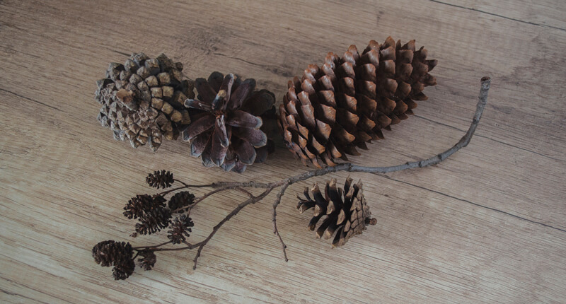
I consider this drawing as a set of sketches that we create to study nature. That’s why I’m going to use cones from my collection. Some of the exemplars were brought from another country!
I recommend that you gather some physical pine cones before starting the project. We’ll talk about the reasons for that in the next chapter.
To introduce some challenge to this project, I’ll be using one ink liner (number 0.2) to draw the whole artwork. This tool doesn’t allow much variation of the line width, in contrast to nib pens.
However, we can achieve a slight variation by changing the level of pressure on the liner. The lighter the pressure is and the faster we draw, the thinner our lines will be.
Also, using a tool that creates lines of medium width by default will add a sketchier, more spontaneous feel to the artwork.
So, please use any kind of inking tool you have or prefer. Maybe you’ll even choose graphite or colored pencils for this idea!
How to Understand the Structure of a Cone
A Wonderful Responsiveness to Humidity
It’s useful to know that scales of seed-bearing cones move in response to changes in relative humidity. The scales gape open when it is dry. But when it’s damp, they close up.
To a certain extent, you can use this mechanism to adjust the appearance of your cones so they fit your vision. One of the methods to ‘close’ a cone is to put it into a container that is filled with water.
Two Basic Shapes of Cones
We usually use the term “pine cone” to describe any cone we come across, but that’s not technically correct. Evergreens come in many types: for example, fir, pine, hemlock, cedar or spruce. They are called conifers and bear cones.
Basically, cones are found in two common shapes – we’ll talk about them in a moment. It’s necessary to mention, this classification is just something that I invented to simplify the explanations and the further process of drawing.
Of course, the world of cones is much more complex than just two categories of shapes.
For example, each evergreen has two distinct cone types – female and male. They usually differ in size and appearance, too! If you are interested in this topic, please take your time to explore it. Additional knowledge will only enhance your project, making it more credible.
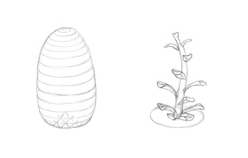
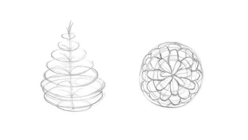
The first type of shape is an egg-like cone (like fir tree cones). It looks rather solid and massive. The top tips of scales can move away from the general shape of the core, creating an uneven silhouette, but the main egg-like mass is still visually dominating. Such cones usually have a predictable, symmetrically organized rhythm of scales.
Another type is more complex – it features extended scales arranged around a core. In this case, scales go aside from the core quite noticeably. Scales have a rhythm too, but it isn’t as strict and obvious as with the first model. Pine tree cones are an example of this second type.
Chances are that you’ll come across a cone that has features of both types, too. Nature is versatile!
In the image below, you’ll find a scheme that represents the first step that you can undertake to analyze and draw a cone of any of those types. However, your drawing doesn’t have to resemble any scheme – please feel free to develop your own approach.
Analyzing Your Cone
The best way to analyze a cone is to get a real one and observe it at different angles.
How does it look in from a side view or from above? Can you see the rows of scales on top of each other? As a general principle, look for the guidelines (like separate scales that attract your attention more than others) and rhythm in the pattern. This will help to develop your observational skills.
Also, it’s useful to study the separate scales – especially those bending aside of the “stem” quite noticeably. How do they look if we change the angle of view? Is there anything special about the shape of their tip?
Compare the scales at the center of the cone and at its periphery. How do the location and the shape of the cone itself affect the appearance of the individual scales?
Pay attention to the density and height of the scales’ rows. How do they change from top to the bottom? If we observe a cone from above, we’ll see how the scales fill in the shape of the cone. It’s possible to draw a scheme with imaginary lines that mark each row of scales.
Just keep in mind that cones may be slightly – or significantly – asymmetrical. Especially the cones of the “pine type”. Sometimes an exaggerated inclination or distortion of the cone’s core adds natural charm and expressiveness to the artwork.
A cone may seem to be a simple object, but when it comes to drawing, its complexity uncovers itself. Take the time you need. It will pay off.
Qualitative photos used as a reference can be helpful. But, they may lack important nuances that allow us to understand the structure and volume of the object. By the way, any step-by-step instructions on how to draw a generic cone may lead to a similar point of confusion – the goal is to study, not to repeat a scheme that somebody has made.
That’s why having real nature at hand is quite useful, if not crucial. You can deviate from that object’s shape which is completely normal.
Working on the Composition
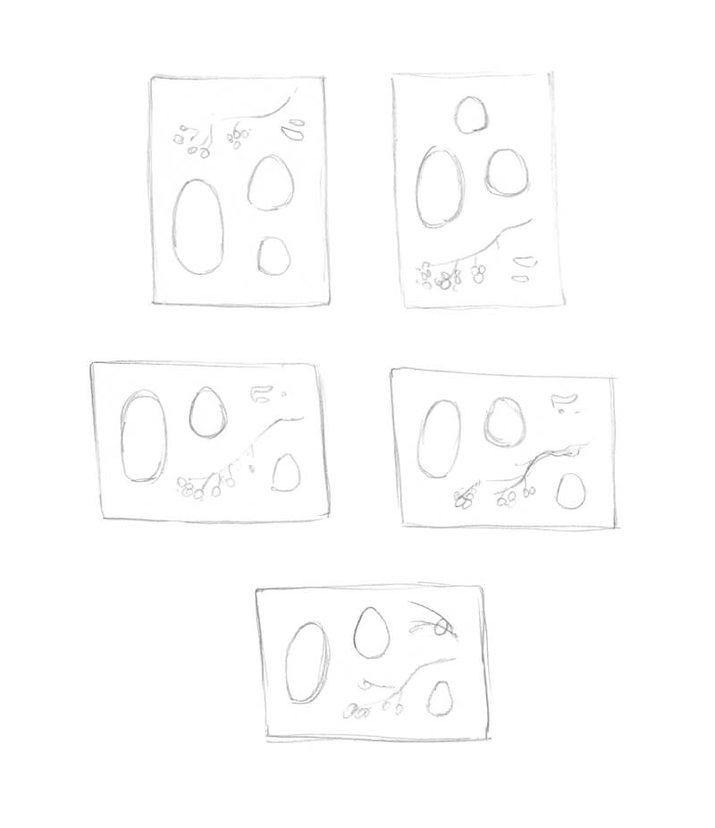
I’m going to draw several kinds of cones of different shapes and sizes, emphasizing the priority of cones with additional elements – like fir twigs and small cone seeds. A combination of smaller and larger elements will make the composition more balanced.
I plan to gather my sketches inside one sheet of paper, so this collection will look like an art poster. That’s why a harmonious composition is absolutely desired here.
See also: Composition in Art
I create several miniature sketches, playing with various possibilities.
The depicted elements may be stylized. The only thing that is important is your understanding of what is going on the final surface. For example, the meaning behind that relatively large shape on the left side of my sketches may seem dubious, but I know – it is a symbol for a big fir cone.
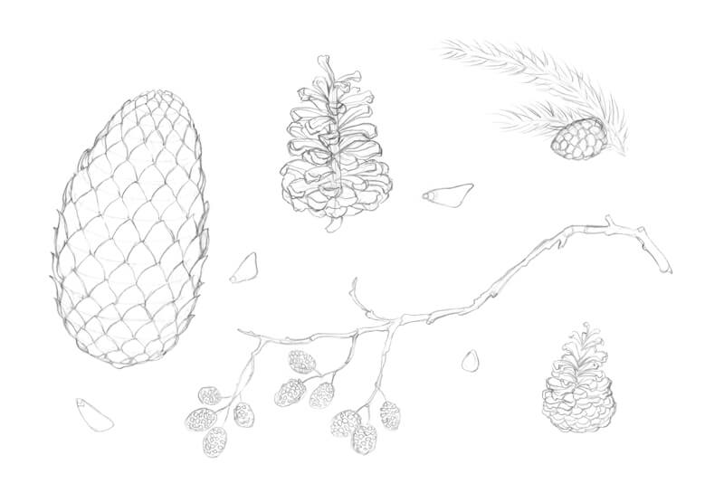
Creating the Graphite Pencil Underdrawing
In my experience, having a preparatory drawing that serves as a structure for ink lines is invaluably helpful. It allows being more confident and, at the same time, relaxed while inking.
So I sketch our objects, adding as many details as I feel necessary to start applying ink. It’s important to reflect your observations in the underdrawing and be deliberate.
For example, I don’t just repeat the pattern of scales on the biggest cone. The top scales are smaller, featuring a minor change in the rhythm.
Also, a couple of cones in my drawing may seem very similar – the only difference is their size. In reality, the discrepancy between their shapes and their tips suggest that these cones belong to different trees. However, we already know that conifers are relatives.
Drawing the Cones with Ink
I outline the main contours of the cones and their scales, paying particular attention to the silhouette of each object.
As I work with only one ink liner, it’s necessary to vary the pressure on the tool. When I draw with a lighter pressure and at a higher speed, the lines become just a bit thinner. That’s exactly what we need!
The cones of an alder tree are the smallest in our drawing. They present so many compact scale-like shapes! I avoid making their contours too complex as this may overload the drawing right away.
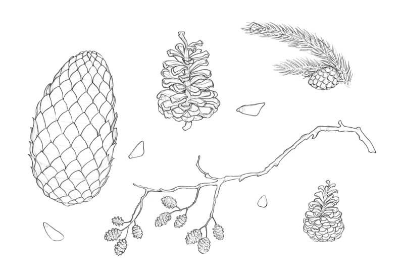
To allocate the shadows, we need to determine where the light source is. In the case with relatively small objects, a common model is an illuminance from above. As we have several sketches gathered together, the model of light and shadow should be the same or similar for all your sketches.
With groups of hatches, I accent the darker areas of the cones, focusing on the individual scales. Keep in mind the general shape of the cone. The bottom rows of scales usually present darker values, owing to the cone’s core shadow or numerous drop shadows from the upper elements.
See also: How to Shade a Drawing
Also, practice shows that darkening the area near the pine cone’s core helps to move forward the tips of the front scales visually.
Hatching can be a powerful tool – if the characteristics and direction of lines conform to the shape of the object, you’ll easily create an illusion of volume. That’s why I use contour hatching to make the cones more three-dimensional.
To learn more about the common hatching techniques used in ink drawings, check out this course: The Pen and Ink Experience
Also, the direction of hatches accents various planes (sides) of an object – for example, the upper plane of the pine cone scale, its width, and the side plane. Sometimes it’s helpful to see everything you draw in a simplified manner.
The alder tree cones require a different approach. To darken the gaps between the rows of scales, I use a spontaneous scribble line.
Feel free to erase the graphite lines as you go. At the time, I prefer to keep them – grey marks create interesting tonal nuances here.
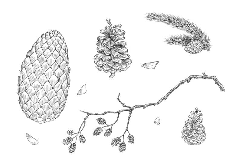
I increase the contrast in my drawing. The fir cone, which has a solid, massive shape, needs a more pronounced core shadow, so I apply a couple of hatching layers to the sides and the bottom part. The pressure on the liner is minimal because the lines should be as thin and unobtrusive as possible.
Also, I darken the areas between the scales to separate the rows visually.
I pay special attention to the contours – they should blend into the sides of the cones smoothly.
There is an advantage in working on several sketches at once. For example, such an approach increases the chances to notice new nuances as you go, because you see your drawing with fresh eyes each time. Also, you can digress from one object and have a beneficial moment of rest while working on another part of the artwork.
I add dots here and there, especially to the tips of the scales, to reveal a beautiful organic texture. Also, dots help me to soften the transition between darker and lighter values on the scales. Some areas seem too light, even highlighted, so I mute them with the deliberate use of dots.
As a final touch, I make sure that the fir tree needles, which are relatively dark in real life, have enough ink marks. The individual needles remain lighter than their neighbors. They stand out because of the contrast.
Drawing Pine Cones with Pen and Ink – Conclusion
Congratulations – we’ve completed this special project! I hope that you found cones truly fascinating and made another step in developing your artistic skills. The great news is that now you can apply this knowledge to the new projects.
Thanks for being with me on this journey. I wish you much inspiration and luck!
If so, join over 36,000 others that receive our newsletter with new drawing and painting lessons. Plus, check out three of our course videos and ebooks for free.
Acrylic Painting Lesson – Limes
Painting Limes with Acrylics
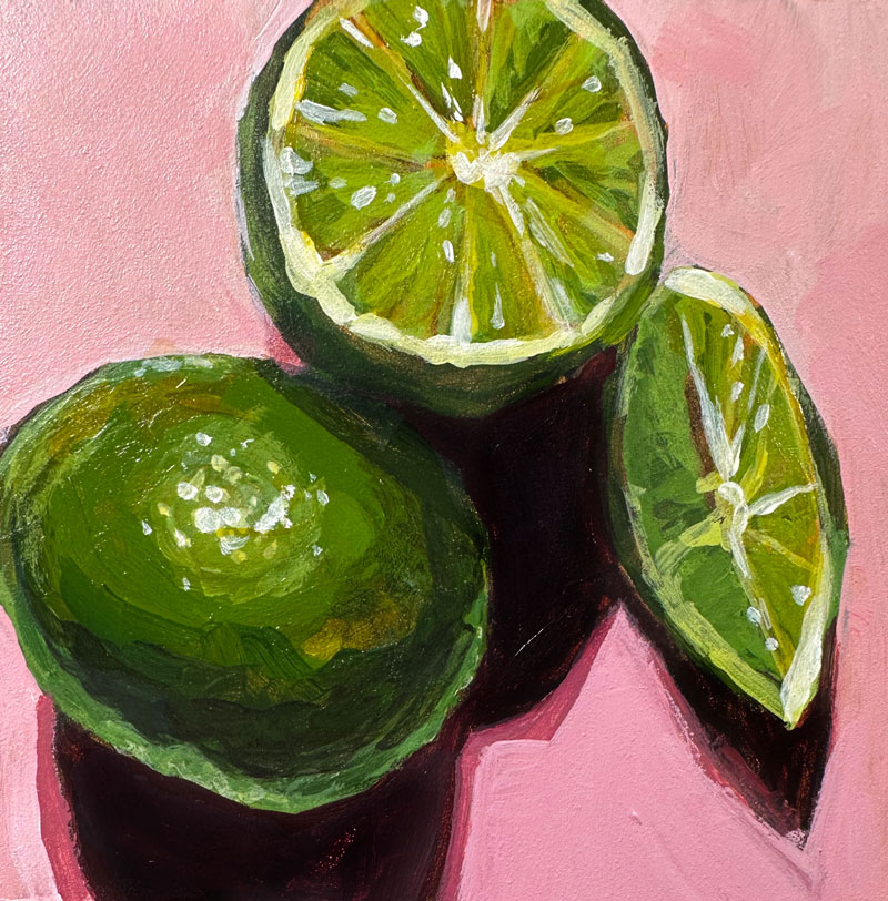
This extended painting lesson features a still life arrangement of limes. This painting is completed with acrylic paints on gessoed panel. The approach is looser with an emphasis on brushstrokes and bold marks. This real-time lesson is designed so that the student can paint alongside the instruction and create an acrylic painting of their own.
Here’s a look at the completed painting…
Materials Used in This Acrylic Painting
This lesson uses premium art materials, but you are welcome to use any brand of acrylic paints that you wish. In this case, heavy body acrylics by Liquitex are applied to gessoed panel which measures just 4″ by 4″.
Here are the materials used in this lesson (the following links are affiliate links which means that I make a small commission if you purchase at no additional cost to you.)…
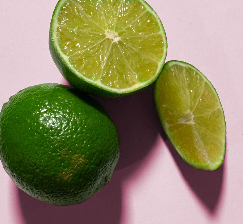
Lime Photo Reference
While the photo reference is displayed throughout the video, you are welcome to use the provided reference below to develop your own painting. Here’s a look at the photo reference…

If so, join over 36,000 others that receive our newsletter with new drawing and painting lessons. Plus, check out three of our course videos and ebooks for free.
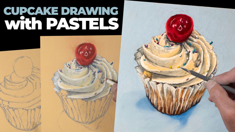
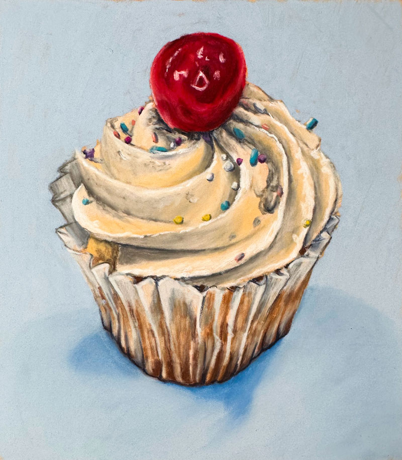
Cupcake Drawing with Pastel Pencils
Cupcake Drawing with Pastels and Pastel Pencils
In this extended lesson on drawing with pastels we’ll draw a colorful cupcake. Soft pastels and pastel pencils are applied to PastelMat paper to complete the drawing. This lesson is presented in real-time. The intention for this type of video format is for the student to draw along and create their own drawing.
Here’s a look at the completed drawing…
Materials Used in This Pastel Drawing
You are welcome to use any brand of pastels and pastel pencils as well as any surface that you wish. Keep in mind that your results will vary depending on what surface and materials you use. PastelMat paper is a unique surface and while it is a bit pricey, a substitute is not currently available. Also keep in mind that different brands of pastels will behave differently.
Here are the materials used in this lesson (the following links are affiliate links which means that I make a small commission if you purchase at no additional cost to you.)…
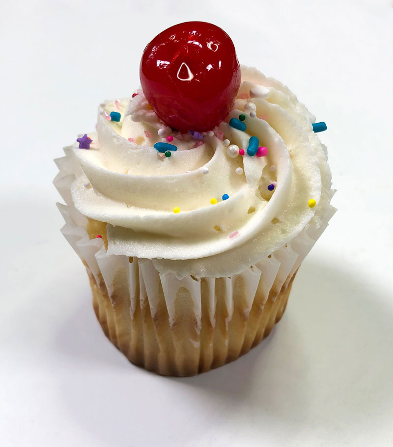
Cupcake Photo Reference
A photo reference is used to complete this drawing. Here’s a look at the photo reference…
If so, join over 36,000 others that receive our newsletter with new drawing and painting lessons. Plus, check out three of our course videos and ebooks for free.
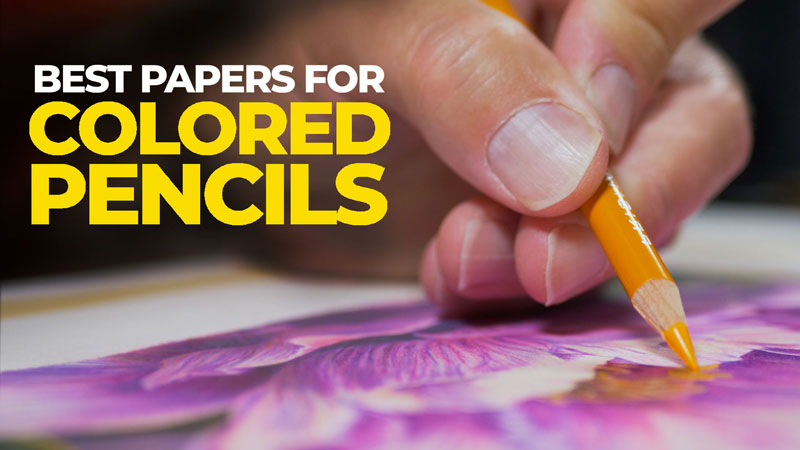
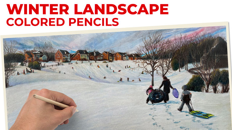
Best Papers for Colored Pencils
Surfaces for Drawing with Colored Pencils
I’ve had quite a bit of experience drawing with colored pencils and I love colored pencils. Colored pencils are one of my favorite drawing mediums to work with and I’ve found some pretty exciting surfaces over the years. They all have their advantages and disadvantages.
In this post, I’m going to share with you each one of those surfaces, the advantages and disadvantages of each one of those surfaces, and the unique characteristics of each one. (Some of the links that follow are affiliate links which means that I make a small commission if you purchase at no additional cost to you.)
See also: Comparing Colored Pencils
Bristol Paper
The first paper I’m going to share with you is Bristol paper, specifically the vellum surface. Bristol paper comes in other surfaces other than vellum which are smoother surfaces. Bristol Paper, even with the vellum surface is relatively smooth, but the vellum surface does have a little bit of tooth or texture associated with it. It is capable of accepting multiple applications of colored pencils, but it’s still limited because of the overall smoothness of the paper.
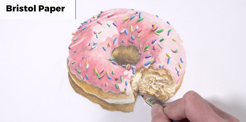
This paper is a little bit heavy. It’s very similar to card stock, but its rigidity makes it a great surface for working with colored pencils.
Notable Characteristics of Bristol Paper:
- Easy to find.
- Inexpensive.
- Easy to develop details.
- Limited layering.
- Only available in white.
Canson Mi-Teintes Pastel Paper
The second surface that I love to use with colored pencils is Canson Mi-Teintes Pastel Paper. Even though this paper is called pastel paper, it is a wonderful surface for colored pencils.
This paper features two distinct sides. One side is heavier in texture compared to the other side, but both sides have ample texture or tooth for multiple layered applications of colored pencil. This paper is easy to find and it comes in a variety of different colors. So if you want to allow that color to show through or if you just want some of that color to be your background, this is a major advantage.
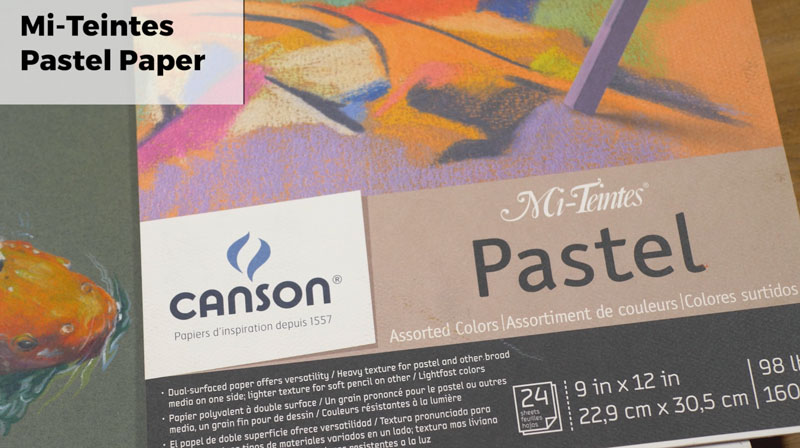
As I mentioned, this paper comes in two distinct sides, or it has two distinct sides associated with it. One side has a very heavy tooth, which will require multiple layered applications of colored pencils to fill in the tooth. The other side has a less pronounced tooth, but it’s still enough texture to accept multiple layered applications of colored pencils.
Notable Characteristics of Canson Mi-Teintes Pastel Paper:
- 2 distinct sides.
- Easy to find.
- Variety of colors.
- Heavy to medium tooth.
- Encourages layering.
- Tooth may be too heavy for some.
See also: How to Sharpen Any Pencil
PastelMat Paper
The third paper that’s absolutely fantastic for colored pencil drawing is PastelMat Paper by Clairefontaine. This paper has a heavy tooth, almost like fine grit sandpaper. This paper definitely encourages layering.
It is a great surface for use with other media like soft pastels. Again, this paper is called PastelMat Paper, but even though it’s called PastelMat Paper, it’s still great for colored pencils. If you want to use soft pastels in conjunction with the colored pencils, then this is a great surface for that. This paper comes in a variety of colors, so you have that middle value to start with and that’s going to encourage a full range of value in your drawings.
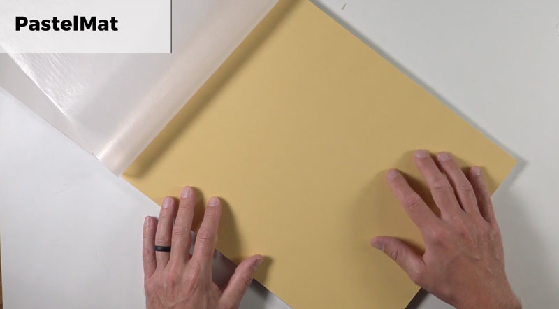
This paper is heavy and high quality. But because of this, it’s going to be expensive. In fact, compared to the other papers, this is probably the most expensive paper on the list and it is hard to get in some locations. For where I am in the world, I do have to order it online, and it does take quite a while to get to me.
Notable Characteristics of PastelMat Paper:
- Heavy tooth.
- Encourages layering.
- Great for combining with pastels.
- Variety of colors.
- Heavy, high quality paper.
- Expensive.
- May be difficult to find.
Stonehenge Paper
Stonehenge Paper is a soft paper, but it does feature a fairly heavy tooth. You can easily create multiple layered applications on the surface, which again is so important to building up that depth and color that you want in your colored pencil drawings.
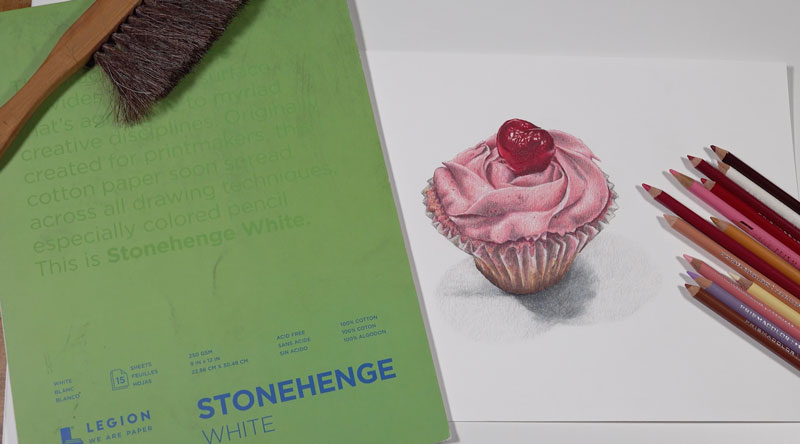
This paper is 100% cotton, so it’s really soft. But, there’s plenty of tooth for layering. It’s available as large sheets and smaller pads. So if you want to create larger colored pencil drawings, you’ve got that option. It’s probably my favorite surface for colored pencil drawing.
Stonehenge paper is great for using other drawing mediums such as graphite. If you’re interested in creating graphite drawings and colored pencil drawings, Stonehenge Paper might be a great choice for both.
Notable Characteristics of Stonehenge Paper:
- Soft paper with a medium tooth.
- 100% cotton.
- Available as large sheets and smaller pads.
- Great for other drawing mediums.
- Expensive.
- May be difficult to find.
- Limited colors.
Dura-Lar Polyester Film
One of the major disadvantages to using colored pencils is that they can be extremely difficult to erase. However, this next paper on the list takes care of that problem for us. Dura-lar is a polester film.
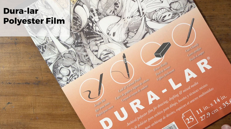
This paper is unique on this list because it has a very, very smooth surface. The tooth of this paper is very weak and that means that it’s going to be difficult to create multiple layered applications. There is a limit to how many layers you can apply to the surface, so you really have to think about your color choices when you’re using this paper.
The major advantage is that this paper is very easy to remove colored pencils. You can erase from the surface, and you can even use tools like the slice tool to remove the colored pencil from the surface. It’s almost like there has never been colored pencils applied to the surface at all. It’s really fantastic for that.
This paper is also semi-translucent, meaning that tracing and transferring images is pretty easy. One of the disadvantages of this paper is the smooth tooth or texture. It can only handle a few layers on the surface, but that disadvantage may be outweighed by the advantage of erasing, which is a completely unique aspect of this paper
Notable Characteristics of Dura-lar Polyester Film:
- Smooth surface with a weak tooth.
- Limited layering.
- Easy to erase and remove colored pencils.
- Translucency makes it easy to trace or transfer images.
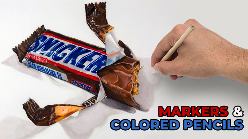
Marker Paper
The last paper on this list is somewhat of a bonus paper because you do have to use it with another medium to get the most out of it. And the paper I’m referring to is Marker paper. Again, this is a paper that doesn’t have anything with colored pencils in the name, but it’s actually a pretty good surface for colored pencils if – and that’s a big if – you are using it alongside alcohol-based markers.
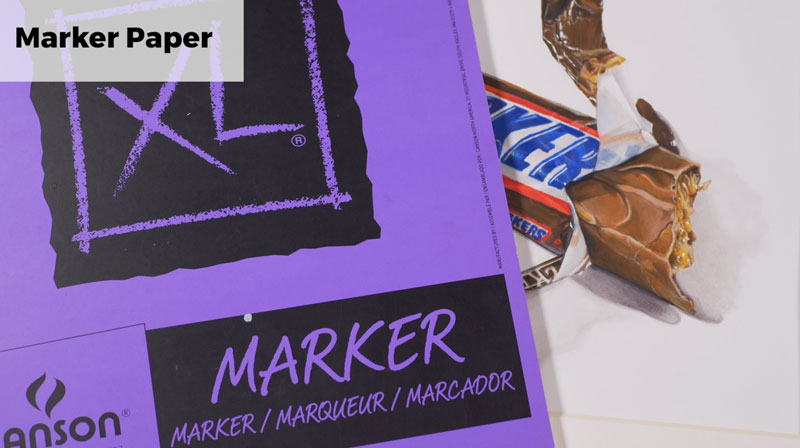
You can apply the alcohol-based markers as a base, which will cover large areas of the surface quickly. This saves time because colored pencil drawing is a time-intensive activity. But when we combine colored pencils with markers, we save quite a bit of time.
The disadvantage is that this paper is super smooth, so layers are limited. But when you’re using colored pencils in conjunction with markers, this isn’t really a big deal. Marker paper is a surface that you might consider that you might not have considered before but it’s dependent on using it with markers in order to get the most out of it.
Notable Characteristics of Marker paper:
- Great for use with alcohol-based markers.
- Saves time.
- Smooth surface has a weak tooth.
The Best Papers for Colored Pencils – Conclusion
Colored pencils are at their best when they are used on a surface or paper that allows you to use them to their full potential. Each paper has its own advantages and disadvantages. No paper is perfect, but each can be used to develop wonderful, professional colored pencil drawings.
If so, join over 36,000 others that receive our newsletter with new drawing and painting lessons. Plus, check out three of our course videos and ebooks for free.
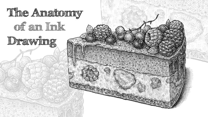
Line Hierarchy in Ink Drawing
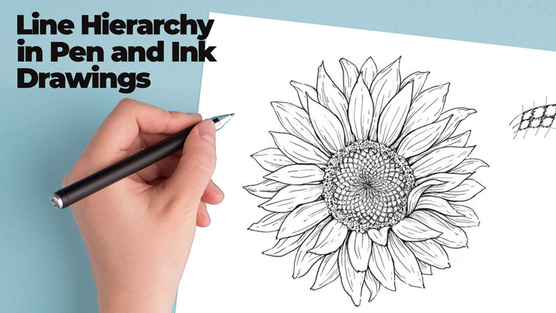
Why is this topic worth our attention? An ink drawing is basically a collection of straight and/or curved lines. A line operates as a building block – a small, yet important element. Used together, lines can communicate a subject so that we understand it as a three-dimensional object.
But line does more than this. Lines help to define edges and planes. They can be used to convey texture and indicate form. A line can also suggest where the light source is. When hatching and cross hatching is used, lines play an important role in developing value.
See also: The Elements of Art – “Line”
Practical Applications of Line
Let’s practice using line with a few drawing exercises.
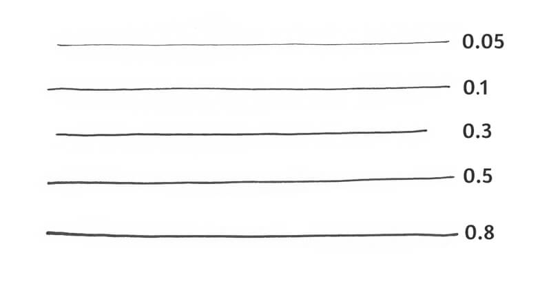
For this first project, I’ll be using three ink liners. Their numbers are 0.05, 0.1, and 0.3. We’ll also need an HB graphite pencil and an eraser for sketching.
I consider this project an exercise. We won’t be creating full-fledged artworks. That’s why I’m going to use some thin paper of A4 size with similar characteristics to that of printer paper.
The goal of my demonstrations is to show you examples of the analysis process. They are also an invitation! Choose an object that you like and draw it, keeping in mind the line hierarchy principle that we’ll discuss momentarily.
Line Quality
Line quality, also known as line weight, is a visual characteristic. It refers to the thickness or thinness of a line within a drawing. By varying the line quality, you can accent certain parts or elements of the image. You can also create depth and the illusion of volume by changing the width of your lines.
See also: Line Weight (Quality) and Cross Contour Lines
In other words, the interplay of line weights allows organizing different components of your drawing into a cohesive hierarchy. Various elements (edges, forms, textures, and so on) are presented according to some level of priority or importance. This helps the viewer to read the image.
Let’s consider four levels:
- Edges and primary shapes – Here we tackle the main contours (the ones that create silhouettes) and the larger forms in our drawing. These lines are usually the thickest.
- Focal points and elements or areas of high importance. These areas usually represent some significant features of the main object or point to the key visual idea. They tell a story, so we should do our best to attract the viewer’s attention to these areas.
- Secondary objects and shapes. Here we deal with the lines that help to define the form and relief. At this stage, we’re deconstructing the complex parts into smaller, simpler ones.
In some cases, this “level” can be merged with the previous one, so we have only three levels in our line hierarchy. For example, this may be the case for sketches of a single object.
- Lines that suggest texture, plus all the accent lines. At this level, we’re rather decorating the drawing than working on its volume or depth.
You can think of these levels as layers or stages of drawing. The second step happens only after the first one is complete. Alternatively, you can jump from one level to another and back. Just keep in mind the general scheme of hierarchy.
The Hierarchy of Ink Liners
Ink liners (pens) are a good fit for our project. They produce lines of a predictable consistent width.
Each liner has a number on its body. The larger the number, the wider the line. You can achieve some variation by pressing heavier or lighter, but the difference won’t be very significant.
Some tools, such as nibs and brush pens, allow for greater line weight variation. They can be used to create bold, expressive contour lines that generally fall into the first level in our classification.
For example, here are a few brush pen strokes.
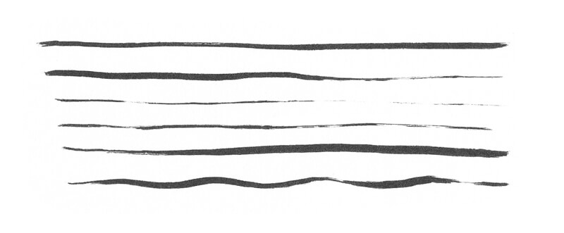
However, a line that was drawn with an ink liner still can be broadened. You can achieve the desired effect by adding new marks near the existing line and merging them.
In the image below, both sets of lines were created with the same tool.
The choice of liners is a matter of personal preference. Also, drawings of a larger size may require much wider contour lines.
Here is the scheme that I use most often for my drawings:
- I use my 0.3 pen for drawing the main contours.
- I use 2 and/or 0.1 are for focal points and secondary elements.
- I use 0.05 for details and texture.
Note that line weight is relative – it’s a matter of comparison and rhythm. But there is logic behind the sequence of line widths.
We’re making one line subtly thicker or thinner than its neighbor, depending on the level. The 0.3 line is slightly bolder than the 0.1 line. In turn, the 0.1 line is slightly thicker than the 0.05 line.
The difference between 0.3 and 0.05 lines becomes quite noticeable. However, as long as there are 0.1 lines as a middle link, our artwork stays balanced.
When it comes to drawing lines, no matter what tool is used, some beginners feel overwhelmed. It may seem scary to let your hand draw freely and spontaneously. If this is you, take some sheets of cheap paper and draw as many flowing lines as you need to become more confident.
See also: 10 Exercises for Confident Lines and Accurate Hatching
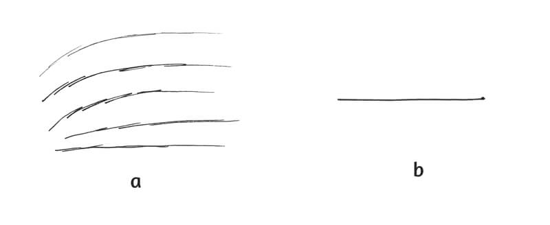
Avoid making shaky, uncertain lines that consist of numerous back and forth movements. (See the example a in the image below.) This style of mark-making is not a mistake, since there are situations when it makes sense to use looser marks.
Also keep in mind that if you leave the tip of your pen on the paper for too long, it may create an unpleasant blob at the end of the line. (See the example b in the image below.)
Tips for Your Contour Line Drawing
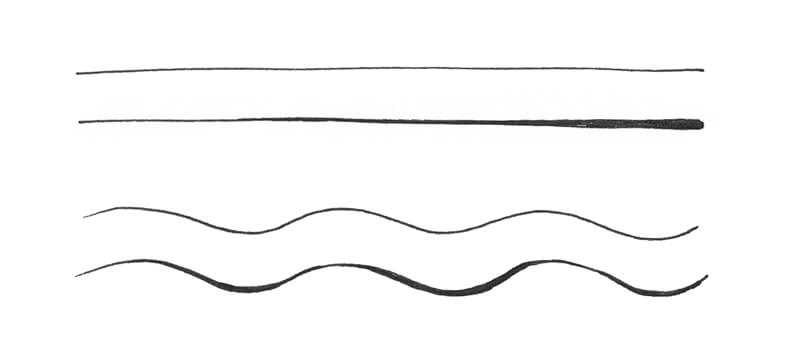
When you’re drawing a light-colored object, using a thinner liner to create an outline. Make the contour thinner to accent the area where the light hits the object.
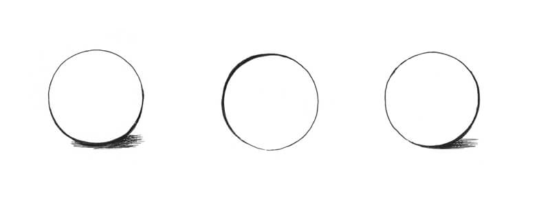
Compare the stylized spheres in the image below. There is no hatching to give them more volume, but they don’t look completely flat because of the varied contour line. The line is thinner in the lighter area. It becomes wider in the area of shadow.
Each contour line gives us valuable information about the position of the light source.
Let’s observe the interaction between the contour line and texture. Compare the models in the image below.
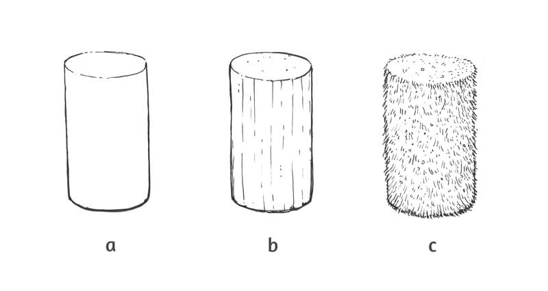
The cylinder a is drawn with 0.1 liner. The contour is broadened in the lower part of the figure to make it look as if it is in shadow. The line in the upper part is thinner because this area is lighter in value. This cylinder doesn’t have any additional details of texture or relief- just a contour.
The main contour line accents the texture as well. It’s uniform and direct, which suggests that the surface is relatively smooth with little relief.
Cylinder c doesn’t have a uniform contour line. Its edges are presented as a set of short hair-like lines that were drawn with 0.3 liner. The strokes are placed closer together in the bottom part of the figure to make it feel as if the light is less intense.
The inner area of the cylinder is filled with short 0.1 lines that imitate the texture of fur or grass.
As you can see, not every case requires that you use three or more tools of different widths to keep the line hierarchy. We’ve applied lines of two weights, and the main contours are a bit thicker than the secondary elements. This subtle difference creates an impression of orderliness and believability.
Styles of Contour Lines
Choose the style of a contour line wisely. A line can convey mood and movement and also suggest the features of the object. Let’s examine a few examples…
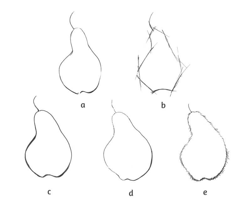
Sample a presents a flowing, spontaneous, relaxed line. This sketch has an artistic feel.
Sample b looks rough and sketchy, as if someone was making technical measurements to construct the silhouette.
Example c looks polished. We don’t see any gaps in the line. Other “happy accidents” are missing as well. The bottom area of the contour is widened.
In the case with sample d, the difference in line quality is rather subtle. In the upper part, the line breaks into smaller pieces to indicate the area of light.
Example e is truly extravagant. Its contour is presented as a set of short lines, which creates the illusion of an odd hairy texture. In the lower part of the figure, we see an increased density of ink strokes. This conforms to the principle of hierarchy that we already know.
The Practical Application of the Line Hierarchy Principle
Now, let’s put what we’ve learned in practice…
Drawing a Flower
We’ll have an organic object as a subject matter for our first artwork.
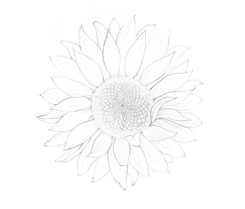
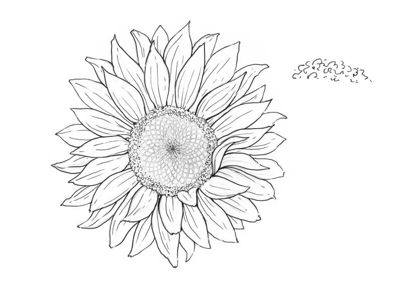
This form of flora resembles a sunflower. It has two rows of petals and a round core with seeds.
I sketch the object with a graphite pencil. As you can see, some lines are heavier than others already at this stage.
The pattern in the central part of the sunflower may be difficult to draw. Below is a simplified scheme. It may help you to understand the general principle.
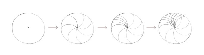
- Mark the center of the flower’s core.
- Draw several curved lines that go from the central point to the periphery of the circle.
- Draw more lines inside one or all segments.
- Add another set of curved lines that follow the opposite direction. The overlapping lines will create intersections. Place the sunflower’s seeds into these diamond-shaped “windows”.
Now let’s start inking.
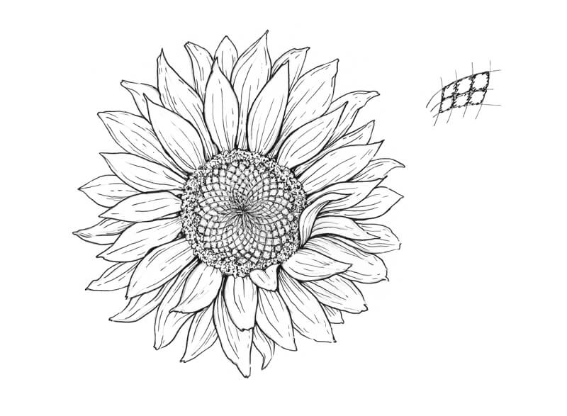
With a 0.3 liner, I outline some contours of the petals focusing on the elements that are closer to the viewer. They should attract attention, so it’s important to make them stand out. If needed, we can broaden the contour in some areas, such as near the flower’s center.
The petals’ tips are partially left untouched. The same is true for the petals from the back row. I’m going to give them a thinner outline. This trick will create a beautiful variation of line quality.
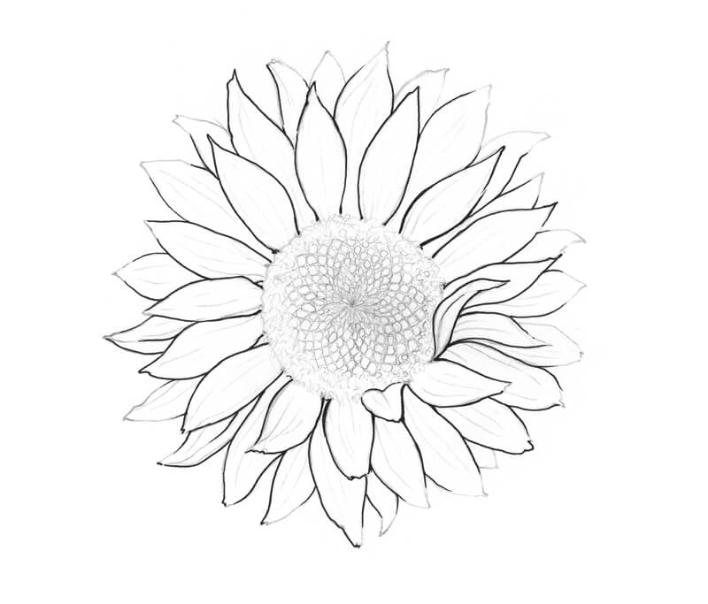
I add thinner lines, using a 0.1 pen. I complete the contour of the petals, so now we have a solid silhouette. I add some delicate lines that repeat the direction of each element. These lines reveal the relief of soft wrinkles, giving hints of the petals’ texture.
I mark the edge of the flower’s core. The peripheral part of the core demonstrates a peculiar fluffy texture – I mark it with some spontaneous scribbly lines. You’ll find a sample in the image below.
The seeds in the central area are very small, almost indiscernible. I add some short lines to the core’s center to make this area stand out. It will be the focal point.
With a 0.05 liner, I darken the area that surrounds the seeds in the flower’s core. I divide the rows with thin lines. Then I increase the contrast with additional scribbly lines. The seeds remain untouched.
I also add some fine textural lines to the core’s periphery and the petals.
Now, this sketch looks crisp and fresh. We could add some ink hatching to elaborate on the volume and texture of the petals. The core shadows could be intensified. However, bearing in mind that the petals of a sunflower are light, I prefer to leave this line art exercise just as it is. Less is more!
Drawing an Ax
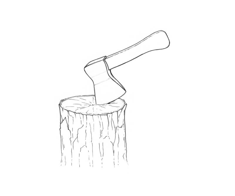
We’ve now dealt with an organic object. The flower featured soft, curved, delicate lines. Now we’re going to draw a man-made object.
With a graphite pencil, I’ve created a sketch of an ax. To make it a bit more interesting, I’ve added a piece of wood. These two contrasting subjects will allow us to play with different textures.
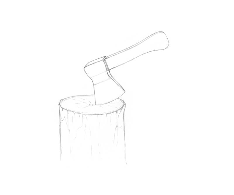
With a 0.3 liner, I outline the thickest contours. An ax is an artificial object. Its contours require a steady, confident hand with precision.
If drawing accurate lines is intimidating for you, try adjusting your breathing patterns. Some people find it helpful to hold their breath for a moment while drawing. Others say that drawing on the exhale allows producing perfect marks.
The tree is another story – here the contour line can accent various bumps, hollows, and other details of relief. Your marks can be organic.
I leave the upper part of the ax’s contour untouched. The handle is made of wood, and I’d like to accent its lightness. Therefore, I’ll work on its upper contour with a thinner liner.
I’ve accented the trunk’s cut (the upper flat plane) with a broad line, making it stand out.
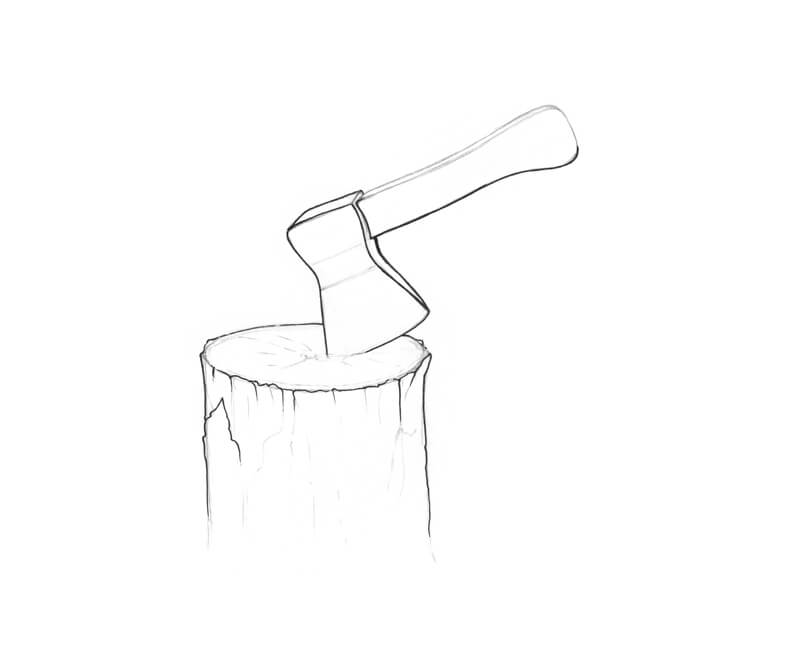
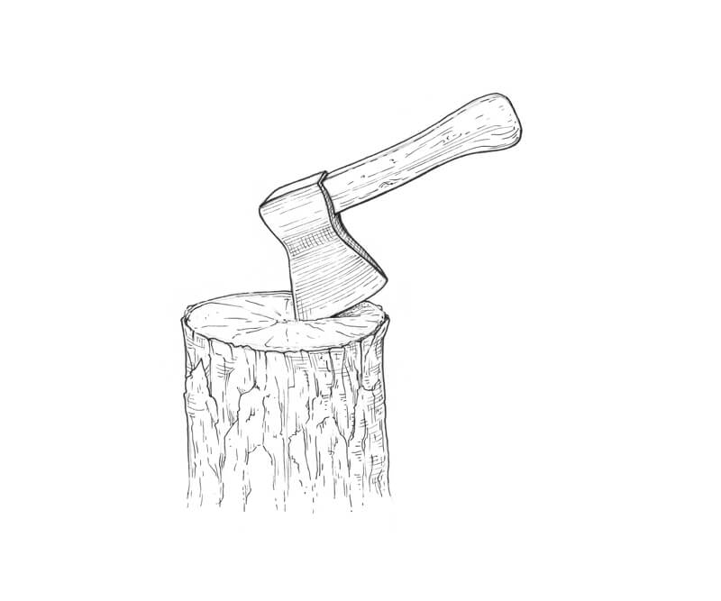
With a 0.1 liner, I complete the outlines, forming the silhouettes. The bottom part of the trunk becomes somewhat blurred or blended. This effect is achieved by leaving some gaps in the lines.
I add more ink marks that create the illusion of texture and relief. Vary the pressure on the tool to create subtle line weight variation. This trick may help even if you use only a couple of liners.
With a 0.05 liner, I add some parallel lines to the ax, accenting the smoothness of metal. The lines conform to the planes.
Although we carefully evaluate the use of every line in this project, I decided to include some elements of cross-hatching to give the ax and the trunk more volume.
I add a pattern of wood grain texture to the handle.
With several lines, I create a cast shadow under the ax. The trunk’s top surface gets fewer ink marks to communicate light hitting this area.
Conclusion
We’ve completed the project! Thank you for being with me on this journey.
I hope that you’ve enjoyed exploring the topic of line hierarchy and learned some useful tips. I wish you much joy and inspiration for your future artworks!
If so, join over 36,000 others that receive our newsletter with new drawing and painting lessons. Plus, check out three of our course videos and ebooks for free.