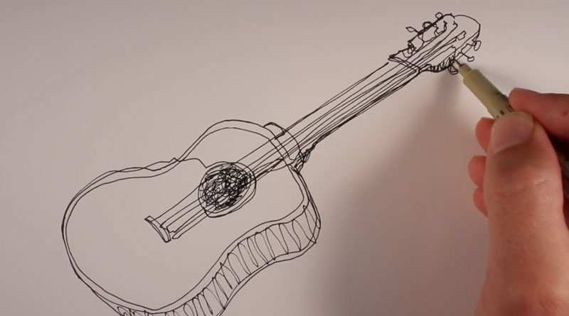
Easy Subjects to Draw
In this drawing lesson, I’m going to share with you what I consider to be the five easiest subjects to draw. These subjects are great for beginning artists especially because they’ll give you confidence. Confidence is very important in your drawing development. You want to have that confidence so you don’t throw down that pencil and quit drawing. You need to practice and keep going. Even though these subjects are easy and you might be an accomplished artist, they’re still subjects that you might want to explore because many of these subjects will improve your drawing overall.
See also: Overcoming Artistic Frustration
Easy Subject to Draw #1 – Basic Forms
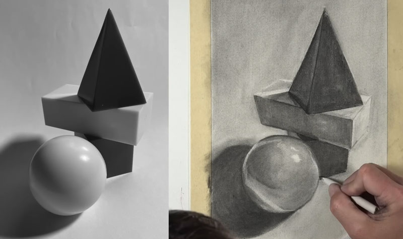
Basic forms like a cylinder, a cube, a pyramid, and so on are great for understanding the way light behaves on a surface. It helps us get a good understanding of how value leads to the illusion of form in a drawing or painting. Basic forms are relatively simple and easy to draw, which makes them number one on our list, but that doesn’t mean that they don’t have merit.
By practicing drawing basic forms, you’ll have a better understanding of how light behaves and how light (or rather the use of value) can create the illusion of form on a three-dimensional subject. We can use basic forms and piece them together to create more complex forms leading to more complex drawings. That’s why learning how to draw basic forms is usually the best place to start when you’re just beginning learning how to draw.
Easy Subject to Draw #2 – Linear Perspective
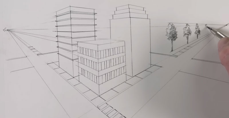
Linear perspective is a method using lines and a vanishing point or vanishing points to create the illusion of space on a two-dimensional surface. There are several different forms of linear perspective. There’s one-point perspective, two-point perspective, and three-point perspective. What makes linear perspective easy is that it’s a structured approach to drawing. It’s great for drawing from your imagination. You can create scenes relatively easily and create the illusion of space in those scenes using one of the forms of linear perspective. It is a structured approach, which means that there are a series of rules that you have to follow. If you follow these rules, you’ll end up with a drawing that looks three-dimensional.
For folks who might struggle with one-point or two-point perspective, it’s probably due to the fact that you learned one point or two point perspective incorrectly. However, all forms of linear perspective are relatively easy to learn and implement in your own drawings.
Lessons on perspective:
Easy Subject to Draw #3 – Animated Characters
Animated characters are designed to be easy to draw because they’re drawn many, many times in order to create an animation. Oftentimes there are many animators that work with the same characters. Many different people will need to be able to draw the subject over and over again accurately. Most animated characters are made up of basic and easy to draw shapes, but even with more complex animations, it is still just a simplification of the original subject.
This simplification is also seen in comic book drawings. Comic books are made to be drawn quickly. Several different artists might work on the same comic book, which means that the characters need to be easy to draw and able to be rendered relatively quickly. Comic book characters and animated characters, while they’re fun to draw, they’re also relatively easy.
Easy Subject to Draw #4 – Block Letters
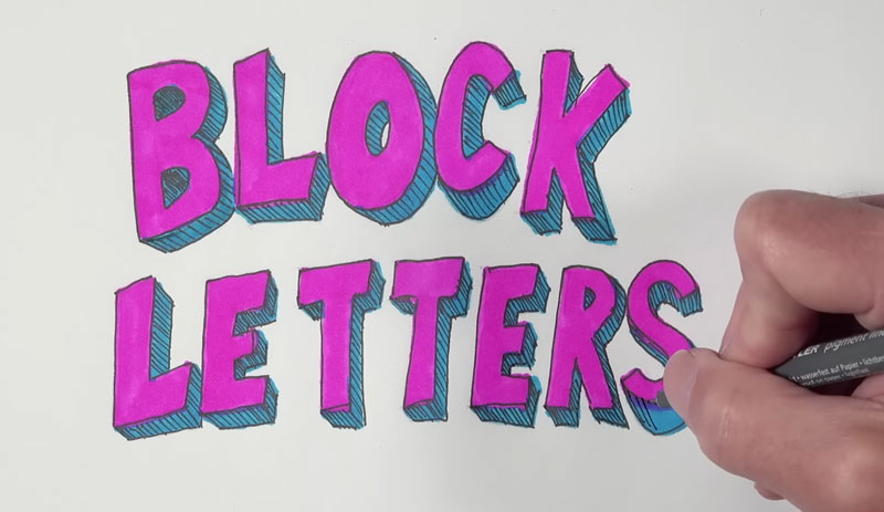
Lettering is an art form on its own, but creating block letters is fairly easy. All you have to do is draw out the letters and then make them look three-dimensional in a consistent manner. While drawing block letters is fairly easy, you can get very creative and make them fairly complex as well. Just make sure that the form that you add to each one of the letters is consistent across each letter and also add a little bit of shading or value to create the illusion of form. Block lettering is fairly easy, it’s fun to do, and anyone can be successful with it.
Easy Subject to Draw #5 – Fruits and Vegetables
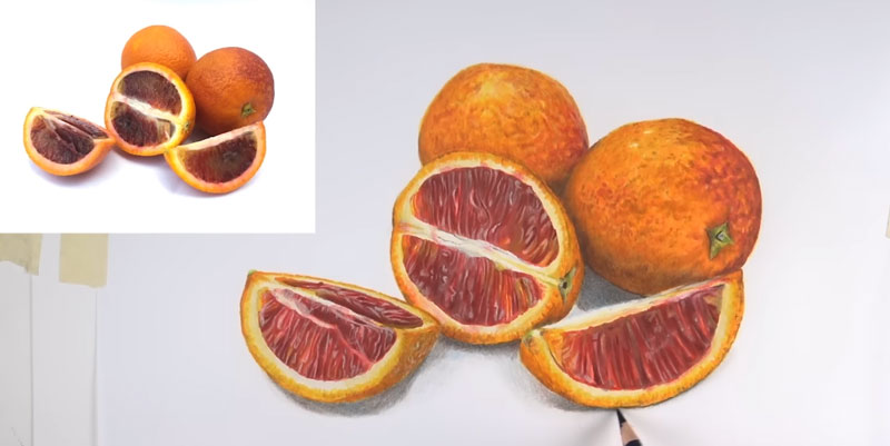
Fruits and vegetables are a wonderful subject for creating drawings and paintings. They’re made up of relatively simple forms, which makes them very easy to draw. On top of this, fruits and vegetables are organic subjects, which means that we have a little bit of liberty in creating our drawings and paintings. If there are small deviations from the reference or the subject that we’re looking at, it’s not going to be noticeable in the final drawing. If you’re looking for still life subjects to start with, then fruits and vegetables are an excellent subject. Just find some oranges, some strawberries, some bananas, set them down, take a photo if you wish, and practice your drawing that way. It won’t take you long to get the basic forms on your drawing paper.
Then just focus and pay close attention to the deviations in value and all the details that exist on these subjects. Keep in mind if you deviate a little bit from what you see, it’s not going to be noticeable in your final drawing.
Easy Subjects to Draw – Conclusion
That’s my list of what I consider to be the five easiest subjects to draw. This list of subjects are great for beginners but also can be a challenge for more accomplished artists.
If so, join over 36,000 others that receive our newsletter with new drawing and painting lessons. Plus, check out three of our course videos and ebooks for free.
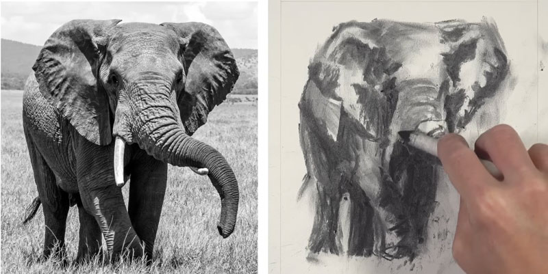
How to Draw an Elephant with Charcoal
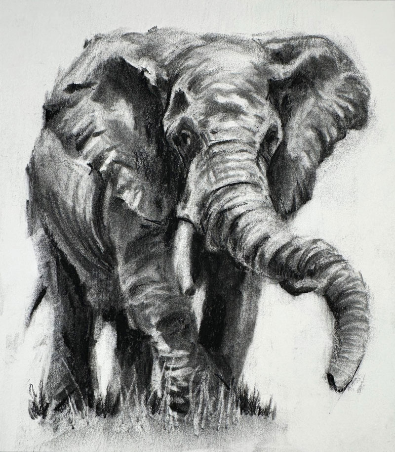
Elephant Drawing with Charcoal
In this charcoal drawing lesson, we’ll draw an elephant with charcoal in about an hour. Here’s a look at the finished drawing…
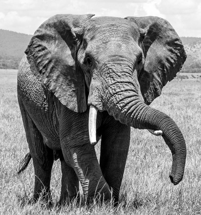
We’ll use a photo reference to complete the drawing. Here’s a look at the photo reference…
Benefits of Drawing with Charcoal
Maybe you’ve used charcoal before or maybe you’ve seen charcoal drawings and been intimidated. If you’ve used charcoal before and thought it was just a super messy medium that’s hard to control, I get that. But I really like charcoal because it is the most forgiving drawing medium out there and it forces you to think more like a painter. If you’re looking for a medium to transition from traditional drawing to painting, especially with an opaque painting medium like oils or acrylics, charcoal is a wonderful gateway medium to do so.
For this drawing, we’ll use vine or willow charcoal applied to Strathmore 400 series white sulfate drawing paper. We’ll also use compressed charcoal in the form of a charcoal pencil to make the values as dark as they need to be. We’ll use a blending stump to manipulate the charcoal on the surface, as well as a couple of erasers. We’ll use a kneaded eraser and we’ll also use a vinyl eraser for precision erasing.
Sketching the Contours of the Elephant
We’ll begin here with a small, skinny stick of vine charcoal. I’m going to start at the top of the picture plane, locating the top edge of the elephant. I’m going to make little small marks and indications where the edges of the ears are located and where they begin in relationship to the edges of the picture plane. I’m using the edges of the picture plane, which is proportional to the photo reference, to analyze the negative space between the edges of the picture plane and the edges of the elephant to find these initial marks.
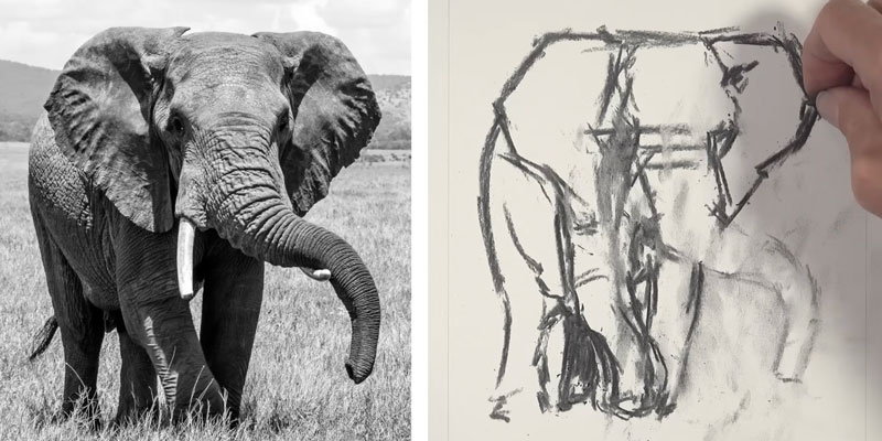
We’ll begin working our way down from our initial marks, continuing to define the edges of the ears and also the beginnings of the head of the elephant. I’m holding my stick more like a pastel instead of like a pencil. This allows me to move my arm a little bit more freely and make looser marks. In fact, this drawing is going to be fairly loose and it’s going to go through multiple stages. We don’t need to worry about getting everything perfectly right because the vine charcoal is easily smeared and smudges very easily.
We’ll go ahead and get an indication of where the broken tusk is located and also the edge of the leg of the elephant. We started at the top of the picture plane making comparisons with the edges of the picture plane to find the ears and the head and the trunk, and then as we work our way down, we can use the shapes of the ears, the trunk, and the head to find the rest of the edges of the elephant, including the back edge of the body of the elephant and one of the rear legs.
I can’t express to you how important it is to remain loose and not try to be too controlled with these initial applications. Follow your instinct and make a mark where it feels right. You can always change these marks later in the process as you’ll see that I do very frequently.
At this point, you can see some of the smudging that’s occurring from the edges of my fingers by running over the top of the vine charcoal. Again, vine charcoal is so soft and easily manipulated that it is going to smudge a bit, which is completely fine. We can clean up the drawing later.
Shading the Drawing of an Elephant
Now we’ll smudge the marks that we made initially. These lines are too hard and the edges are too rough and defined. When we do this, we’re also creating some areas of middle value, so we’re starting to push that value range already in this early part of the process.
With a larger piece of vine charcoal, I’m going to start looking at some of the broader shapes of darker value. Value is the darkness or lightness of color. It’s the most important of the elements of art. Value tells us about the form of subjects. It also can tell us about the texture, the intensity of the light source and the location of the light source. Value is incredibly important. At this stage of the drawing, instead of looking for edges, I’m looking for shapes.
We’re starting to define the areas of shadow, and at the same time we’re also defining some of the areas of highlight. It’s okay to get really dark at this stage. We’re going to go back and make some lighter marks using an eraser.
If you’re having trouble seeing the areas of dark value or the shapes of dark value, it might be helpful to squint at the subject that you are analyzing, in this case our elephant. If you squint your eyes a little bit, it’s a little bit easier to see the shapes of darker value.
Since we’re concentrating on the shapes of value that we see, we need to make sure that we don’t get overwhelmed by the details. It’s easy to look at a subject like this and see all the wrinkles, all the details and get overwhelmed, especially if you’re used to drawing with graphite or pen and ink or some other medium that requires precision. With charcoal though, it’s more of a process that’s akin to painting, where we’re looking for shapes of value in order to create the illusion of form.
Now, we need darker values, we need middle values, but we also need those stronger highlights. With a kneaded eraser, we can begin erasing out highlights.
Most of these lighter values exist on the upper portion of the elephant because the light source is coming from above, but we are still going to see some hints of lighter value at the bottom of the body as well where light is hitting some of the legs.
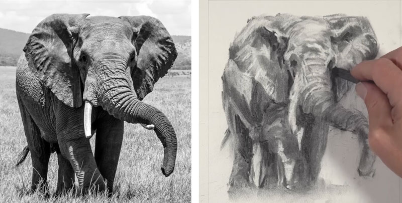
For a lot of people who are new to working with charcoal, going through these different stages may seem frustrating and it may seem like your drawing is not developing in the way that you want it to be, especially if you’re a detail-oriented person. But you have to trust the process and you have to go through these stages in order to create a drawing that’s loose and somewhat expressive. Allow the process to happen and don’t allow yourself to get obsessed with the details. Again, just concentrate on the relationships of values and the shapes that you see and allow the drawing to slowly emerge from the paper.
As you might imagine, cleaning up your drawing as you go through the process is important as well. You don’t want your finished drawing to look messy or disheveled, so cleaning up stray areas of charcoal on the surface is important as well.
It’s time for a little bit more precision. For precision erasing, I use a Tombow MONO eraser. This is a vinyl eraser that has a precise tip for an eraser. This will allow me to begin the process of erasing out some of the smaller shapes of value, which will translate into details.
The drawback to using this eraser is that it does leave some eraser shavings on the surface, and since our surface is so delicate at this point, when you wipe away some of the eraser shavings, it is going to move some of the charcoal around. But thankfully we can go back and make changes as we have throughout the process to fix these little areas of smeared charcoal.
Then it’s back to our larger stick of vine charcoal. Again, reestablishing some of those darker tones. At this point, we’re starting to get a broader range of value, and slowly the form of the elephant is starting to take shape.
Developing Details on the Elephant
Like with any drawing or painting that you might create, it’s important to be patient and allow the process to play out. Try not to allow yourself to be frustrated. Again, this is a sketch that I completed within an hour, so this is not a completed drawing by any means. This is a sketch, so keep that in your mind while you’re working and don’t put too much pressure on yourself to feel like you need to have a nice drawing at all of the stages of the process.
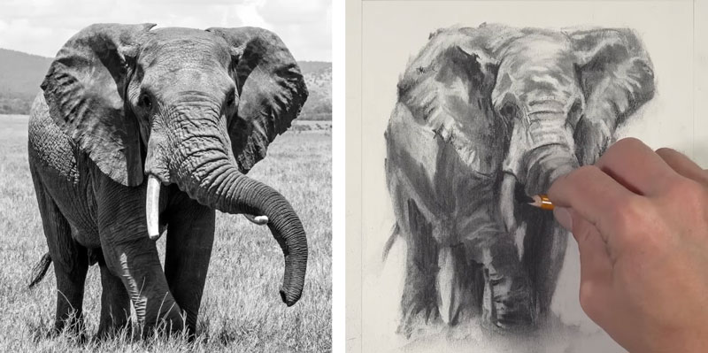
At this point in the drawing, I have enough of a base application of vine charcoal. It’s time to switch to compressed charcoal. Compressed charcoal is considerably darker than vine charcoal. It’s also more difficult to erase. I am applying this compressed charcoal using a charcoal pencil. This is going to allow us to define some of the details. But we also have to do so with the understanding that erasing these marks is going to be considerably more difficult. That’s why I like to reserve compressed charcoal applications for the end of the drawing process.
We basically have created somewhat of an underpainting with our vine charcoal applications and now we’re refining the drawing with the compressed charcoal. You’ll notice how much considerably darker the compressed charcoal is compared to the vine charcoal. This is going to allow us to create rich areas of dark value where the shadows are at their strongest.
Creating a drawing like this may feel like you’re creating lots of different drawings because you go through so many stages when you’re developing the image, which is perfectly acceptable. Each time you go over an area you’ll see new details and new bits of information that you can add to the drawing to make it more representational.
We’ll continue adding our areas of darkest value using the compressed charcoal pencil. As we apply this compressed charcoal, we can see that the contrast in the image is starting to get stronger. This makes the illusion of the light source even stronger as well, and it increases the intensity of the light within the scene.
At this point in the drawing, our drawing of an elephant is actually starting to look more like an elephant. The details are starting to emerge from the surface and we have created a more broad, full-range value, and the form is also translating pretty nicely as well.
Completing the Drawing of an Elephant
We can continue to work back and forth between the compressed charcoal applications and also the eraser to continue to clean up the drawing and also add additional details.
We’ll use the compressed charcoal at the bottom to add some of the grass blades and smooth those applications with the blending stump. We’ll also use the precise eraser to pull out some lighter marks. You can see that grass blades in the extreme foreground are overlapping the bottom portion of the elephant, so we can use this eraser to pull out some of these lighter grass blades. Again, we’re not going to get too wrapped up in the details here. We want to just give the impression of some grass at the bottom.
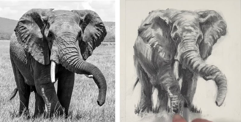
Then we’ll continue to refine some of the areas a bit further with the compressed charcoal pencil. We’ll add a few smaller indications of some wrinkles and also darken up some of the areas around the eyes. Then we’ll pull out a few more highlights using the precise eraser.
You can bring your drawing to as much detail as you wish, continuing to look for the areas of dark and light value, but at this point, I’ve decided that my drawing is finished since I’ve spent an hour on it already.
Charcoal Drawing of an Elephant – Conclusion
Now our drawing is complete. I hope that if you followed along, you see how forgiving charcoal can be and what a wonderful medium it is for drawing. If you’re patient, allow for some “messiness”, and concentrate on shapes of value instead of details, you’ll find success with this traditional drawing medium.
If so, join over 36,000 others that receive our newsletter with new drawing and painting lessons. Plus, check out three of our course videos and ebooks for free.
Drawing Exercises to Improve Drawing Skill
Improve Your Drawing Skills with Exercises
In this drawing lesson, I’ll share eight drawing exercises guaranteed to improve your skills. Drawing is a skill that anyone can learn and develop. It requires some knowledge and a lot of practice. Unfortunately, some of us don’t really understand how to practice drawing. But hopefully, these drawing exercises will get you on the right track.
Drawing Exercise #1 – Continuous Line Drawing
With a continuous line drawing, you start by making a mark anywhere on your surface but you don’t lift your pencil at all. You continue to make a continuous line, moving your pen or pencil from one section to the next within the drawing. This exercise helps to improve hand eye coordination and also your observational skills. You get accustomed to moving your eyes over the subject that you’re observing and also making marks that reflect what you see. You can use any medium that you wish for this exercise. It doesn’t take very long, and it’s an excellent exercise for your sketchbook.
See also: Continuous Line Drawing
Drawing Exercise #2 – Cross Contour Line Drawing
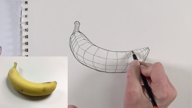
Contour lines are outlines. They typically define the edges or the edges of details within a subject. Cross contour lines however, flow over the form of the subject. Cross contour lines are sometimes visible on the subjects themselves, but mostly these lines are implied lines. You can imagine cross contour lines if you were to take your finger and move it over the form of the subject. These lines can be both horizontal or vertical.
Understanding cross contour lines and applying them to a drawing is very important. We can use cross contour lines to define form and value. You can practice drawing and understanding cross contour lines with any subject that you wish. With this drawing of a banana above, we’ve drawn the contour lines. Then we drew cross contour lines over the length of the banana, followed by cross contour lines over the width of the banana. You can see that this helps us better understand the form of the banana in three-dimensional space.
Drawing Exercise #3 – Upside Down Drawing
With this drawing exercise, you are to draw the subject upside down. Simply turn your reference upside down and draw what you see. This forces your mind to pay special attention to the shapes and relationships that you see, enhancing your observational skills. It takes the part out of your mind that makes you want to draw what you think you see instead of what you are actually seeing.
Drawing Exercise #4 – Value Study
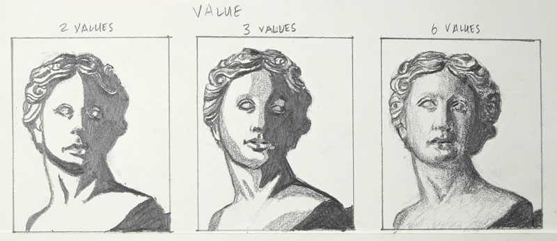
For this drawing exercise, begin by creating a value scale and then three small swatches. Value is the darkness or lightness of a color. A value scale represents (in this case) six different values, from the darkest dark to the lightest light.
For your first drawing, you’ll draw a subject using only two values. This means that if your values exist on the lower portion of the value scale, we assign the darkest value. If your values fall anywhere on the upper part of the value scale, or a lighter value, then we assign white as the value. You end up with a two-tone drawing of black and white shapes.
For the second drawing, you’ll draw the same subject, but this time we’ll assign three values. So we’ll still have white as a value and black as a value, but this time we’ll incorporate our middle value on the value scale to represent the middle values that we observe. This forces us to decide which value needs to go darker or lighter and which value needs to be assigned a middle value. In this case, we end up with a drawing with three values – black, white, and a middle gray.
For your third drawing, you’ll use all six values on the value scale. This means that we’ll assign the values based on the values that we actually see. So for this third drawing, we can have gradations or slow changes of value from dark to light. This is a complete drawing. But if you do this in order, you’ll notice that you pay special attention and closer attention to the values that you observe and you better replicate them in your drawings. Value is the most important element of art, so this drawing exercise is especially important if you want to get better at drawing.
Drawing Exercise #5 – The Square of Patience
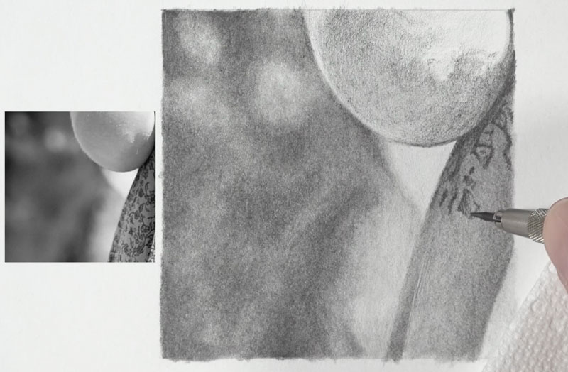
For this drawing exercise, take any photo that you wish and take a small square out of that photo. Then create a three inch by three inch square on your drawing paper and spend at least two hours drawing that one three inch by three inch square. What you end up with is a small portion of a larger drawing. This exercise makes you realize how important it is to be patient and work slowly in your drawings.
Drawing Exercise #6 – Timed Drawings
For this exercise, we’ll create three drawings of the same subject, each with different timed amounts. For the first, you’ll just spend one minute on the drawing. For the second drawing, spend five minutes. And then for your third drawing, spend 30 minutes.
This drawing exercise helps us out in a couple of ways. One, it improves our drawing speed. It helps us understand what elements we need to include and what elements we can leave out in order to communicate a subject to the viewer. It also helps us with our observational skills. If we do this in order, starting with the one-minute, then the five-minute drawing, and then finally the 30-minute drawing, we notice things in our 30-minute drawing that we might not have noticed initially with our first drawing. In other words, it helps us to see as an artist. We notice details and changes in values that we might not have noticed originally.
Timed Drawing Exercise – Gettin’Sketchy – Season 9
Drawing Exercise #7 – Gesture Drawing
Gesture drawing typically refers to drawing the human figure quickly. Sometimes we can create a gesture drawing with just one mark. Here again, timing your drawings is especially important. Start with a one-minute or five-minute or even 10-minute drawing, using just a few lines to describe your figurative subject. The point of gesture drawing is not to create a finished drawing. Instead, it’s to create a line or a series of lines that represent the pose or position that the figure is in. You can use a gesture drawing as a base for a more complete drawing, or as a simple exercise.
Gesture drawings can be created with any medium that you wish. Gesture drawings aren’t meant to be long drawings. Instead, they’re meant to be quick sketches. Gesture drawing will undoubtedly improve your figure drawing skills, but it will also improve your skills in drawing in general. You’ll get better at observing the shapes that you need to replicate in drawing and you’ll also get faster at drawing.
See also: Gesture Drawing
Drawing Exercise #8 – Black Drawing Paper
We’re all accustomed to making dark marks on a white surface. This is traditionally the way all of us start drawing. But drawing with a white media or colored media on black paper forces us to pay attention to the highlights and all of the values that we see, not just the dark values. At first, drawing on black paper with a white medium takes some getting used to. But once you get accustomed to it, it improves your drawing overall. You get better at observing and understanding the values that you see. Value is the most important element of art. You get the value right, you’re going to get your drawing right.
See also: Drawing on Black Paper
If so, join over 36,000 others that receive our newsletter with new drawing and painting lessons. Plus, check out three of our course videos and ebooks for free.
Best Erasers For Drawing
Erasers Are Not Just For Mistakes
Erasers can be used for much more than fixing mistakes. In fact, erasers can be used as a mark making tool. In this drawing lesson, we’re going to cover the basics of four different types of erasers that you’re most likely to use in your drawings.
The Rubber Eraser
There are four main types of erasers, and we’ll take a look at each one of these individually. We’ll start with one of the most common forms of eraser, the rubber eraser. This is referred to as a rubber eraser since it was originally created using rubbers, but these days, cheaper products are typically used.
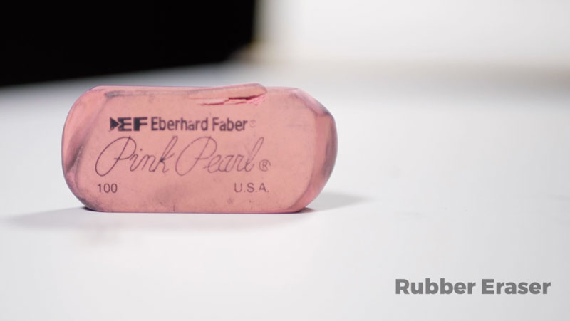
When a rubber eraser is used, it basically smears the graphite on the surface when a light touch is applied. With a heavier touch, more of the graphite is removed. This eraser lifts off the graphite as it crumbles or falls apart, leaving eraser shavings. These can be easily wiped away using a drafting brush.
The Gum Eraser
The next eraser is called a gum eraser. Of all of the erasers, this eraser is the most gentle to your drawing paper. When it’s applied, it crumbles. It literally falls apart as it removes the graphite from the surface. The paper is hardly damaged at all and the tooth of the paper is preserved. This eraser does a fairly good job of removing the graphite. You will see eraser shavings, which need to be wiped away with a drafting brush.
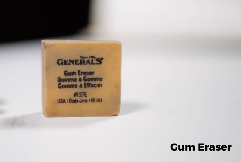
Typically, I don’t use a gum eraser for altering artworks. Instead, I use it most often to clean up edges around finished artwork or to clean mats before I mat and frame a piece of artwork. These erasers are great for cleaning the surface if there are small marks before starting on the finished artwork.
Vinyl or Plastic Erasers
The next eraser is called a vinyl or plastic eraser. This eraser is the toughest of the bunch and is capable of lifting graphite completely from the surface. One drawback is that it can damage your paper if you’re not careful. This eraser doesn’t require too much effort to remove the graphite from the surface. While this eraser does leave some shavings, for the most part, they’re larger pieces that stick together, making them a little bit easier to remove. Because vinyl or plastic erasers are so tough, they can be used in an eraser holder. This allows the artists to erase with more precision.
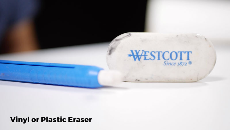
I often use vinyl or plastic erasers to remove some of the material from the surface to create highlights.
Vinyl or plastic erasers are strong enough to erase colored pencils in some situations and are also used in electric erasers. This eraser is super strong and allows for precision.
Kneaded Eraser
The fourth type of eraser is a kneaded eraser. Kneaded erasers are perhaps the most versatile eraser of the bunch. They’re definitely the softest and require the most effort to remove the graphite from the surface. One of the advantages of using a kneaded eraser is that you can mold it into any shape that you wish, creating a variety of different marks.
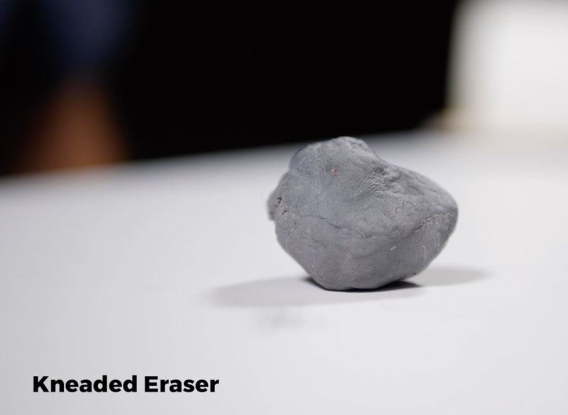
A kneaded eraser lifts the graphite without leaving any residue at all. It also preserves the tooth or texture of the paper. You can use a kneaded eraser to just dab the surface, gently lifting up the graphite from surface, preserving the texture underneath.
For nearly every drawing that I create, I have a kneaded eraser on hand. It’s definitely my favorite eraser. It gently lifts up the material and it can also be used to clean up the edges of finished artworks.
This eraser is also great for erasing any pencil marks that might remain over, perhaps a pen and ink drawing. This eraser will remove the graphite marks, but preserve the ink drawing.
Most of the other erasers we’ve covered will smear some of the material, but a kneaded eraser can be used with a dabbing motion to lift up the material, creating a lighter appearance.
Best Erasers for Drawing – Conclusion
So there you have it, four of the most common erasers used by artists to create drawings. My favorites are the vinyl eraser and the kneaded eraser. Each eraser has its place in creating drawings, and every artist will have their favorite.
If so, join over 36,000 others that receive our newsletter with new drawing and painting lessons. Plus, check out three of our course videos and ebooks for free.

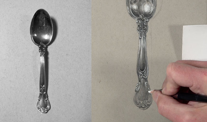
Drawing a Metal Spoon
Drawing Reflective Metal Surfaces
In this drawing lesson, I’m going to show you how easy it can be to draw a seemingly complex subject in a realistic manner. The secret to drawing reflective surfaces, like metal, is to pay close attention to the contrast in values. Often, we see dark values right next to light values. If you get this contrast right and the shapes of different values, then your drawing will look representational.
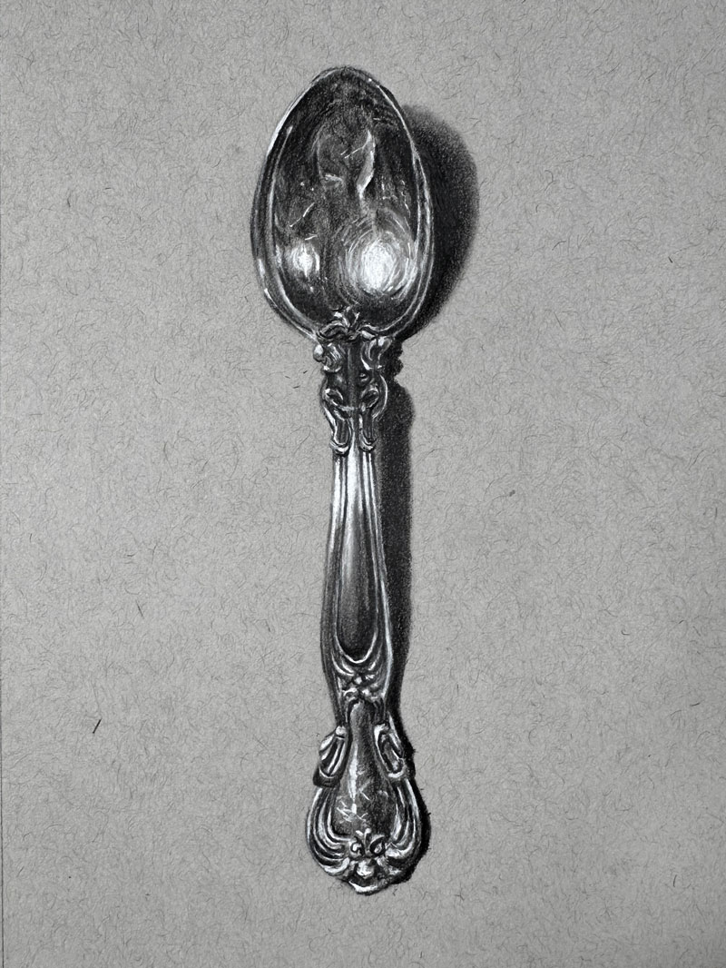
Here’s a look at the completed drawing…
Materials and Surface
For this drawing, I’ll be working on Strathmore toned gray sketch paper. This is a wonderful work surface to work on, especially when you’re using white and dark media together. This provides a nice medium toned surface to work from, so that’ll allow us to push our values lighter and darker throughout the process. Initially, I’m going to be sketching things out with just a simple H graphite pencil, but then we’ll switch over to Staedtler Mars Lumograph black pencils. We’ll start with the HB pencil initially, before switching over to the 4B, and then finally the 6B. And I’ll also be using a white charcoal pencil for the light values, and for blending, I’ll be using an assortment of blending tortillons.
The Photo Reference
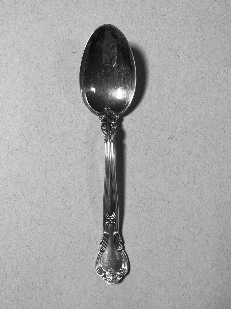
I’m going to be working from a photo reference that I took of a spoon that I actually own. Here’s a look at the photo reference…
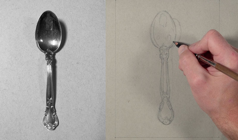
Drawing the Contours of the Spoon
First, I mark the top of the spoon, and then I mark the bottom of the top part of the spoon. Then finally, we find where the lower handle ends. I mark the width with just a couple of loose marks of the top of the spoon, and also the bottom of the spoon.
Once I have these measurements in place, I can confidently start at the top of the spoon with the H graphite pencil, sketching out the difficult shape. This is somewhat of an egg shape, but you can see it flattens out quite a bit at the bottom. So I’m using looser strokes here, making multiple marks on the surface so I can find the correct mark. Next, I simplify the edges of the outer contour of the spoon as I work down.
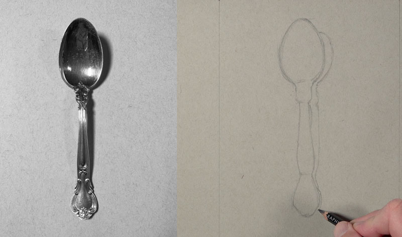
I’ll go ahead and draw a few contour lines for the shadow and the cast shadow that exists behind the spoon. Our light source is originating from the left side, this is going to create an area of cast shadow on the right side. With a sharpened H pencil, and a little bit of a slower approach, I can begin to refine the sketch.
See also: How to Sharpen Any Pencil Like a Pro
Now this is a very complex subject, even though it is just a simple spoon, there is quite a lot of changes in value. Instead of trying to figure out the patterns that I see I’m focusing on areas where I see contrast in value. So in other words, where I see a dark right next to a light, I’m sketching a quick loose line there. We don’t have to draw all those little tiny intricate lines that we see. Just plan out the areas of contrast.
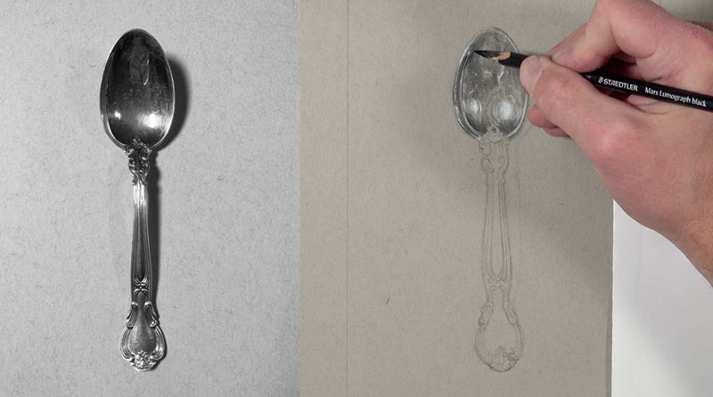
Developing the Values on the Spoon – Shading
I’m going to start with the HB black pencil with a very light application. One of the things that you need to keep in mind if you do decide to tackle this drawing is that you have to have some patience, so this is going to take a little bit of mental energy.
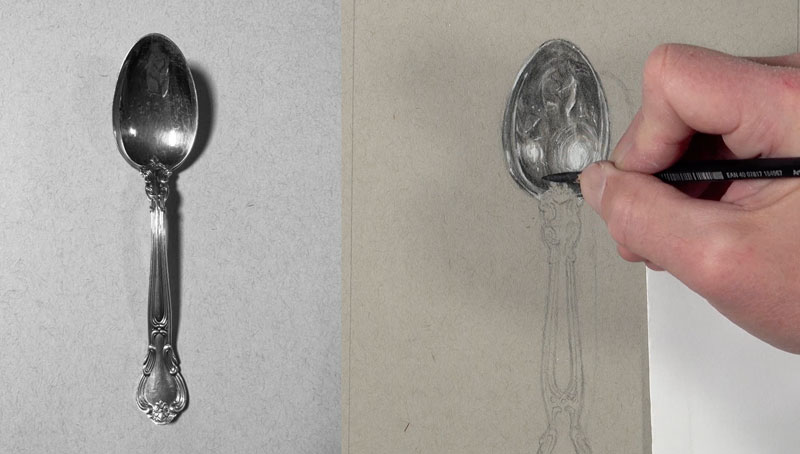
What I like to do is work very slowly for about 10 or 15 minutes, and then take a three to five minute break while looking at my drawing. This allows me to take the drawing in pieces, which makes it a little bit more easy to complete the drawing. This gives my mind a little bit of a rest. As I’m adding this very light application of material on the surface, I’m thinking about the darker values but I’m also leaving open the areas of highlight because the white charcoal will not cover over the top of a graphite pencil or this black pencil. We have to be mindful of where these highlights are located so that we can add the white charcoal in those locations.
You can see I’m starting to plan out some of the slightly darker areas with another application of the HB graphite, before switching over to the blending tortillon. I’m going to start blending some of the material into the tooth or texture of the paper, creating more of a smoother appearance. But even though I’m using a blending stump here, I am thinking about the blending stump being a mark-making tool. I’m continuing to go back and forth between my photo reference and the drawing surface, continually making comparisons between what I see and the marks that are developing on my paper.
Before we go any darker, we’ll go ahead and switch over to the white charcoal pencil. I’m going to use this pencil to put down those strong highlights that exist at the top of the spoon and I’ll also start to put in some of the subtle highlights as well.
I can switch over to the 4B black pencil and start making some of the values a bit darker. In this part of the process, I’m going to start creating some of those subtle changes in value in some of the dark locations. I’m going to bump up the contrast just a little bit so that there’s a little bit more detail visible in my reflection.
This next section underneath the top part of the spoon is quite a bit darker, so I’m starting here again with the HB graphite pencil. But I’m applying a bit more of the material here initially. In this section, we don’t have to really worry about the details, we just allow the details to come out of the drawing. I’m just concentrating on darks and lights that I see and I’m placing those darks and lights in a similar location on my drawing. I’m not getting wrapped up in all of those intricate details. If you do, you’ll either end up with a drawing that appears really stiff and maybe even a little bit cartoony looking. So allow yourself some freedom, but also just pay attention to the darks and lights, the shapes that you see, and place them in your drawing in a similar location.
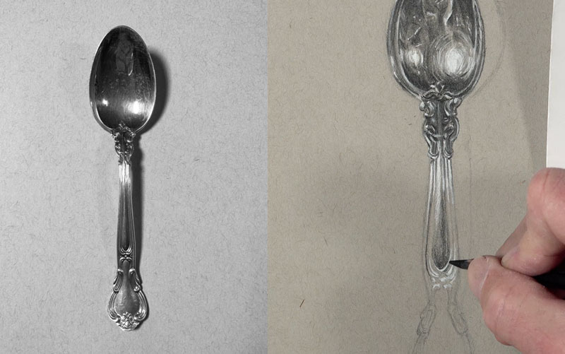
Working our way to the lower part of the handle of the spoon, we’re going to start with the HB pencil. We’ll work our way all the way to the bottom. There is quite a bit of detail, but instead of focusing on the detail, we’re going to focus on the relationships between darks and the lights and the shapes that we see. So it might be beneficial to put out of your mind that you’re drawing a spoon or even that you’re drawing this detailed relief section on the spoon. Instead, just concentrate on the shapes that you see. This is absolutely fundamental to drawing and painting.
Now our spoon looks like it’s floating, so let’s add a shadow to make this a lot more realistic. For this, I’m going to go ahead and start with the 6B pencil. You’ll notice on the cast shadow underneath the top part of the spoon there is a little bit of a transition. I’m going to release a bit of pressure as I go outward from that area. The rest of the shadow is pretty solid. It is slightly lighter in the middle portion where a bit of light gets underneath the spoon.
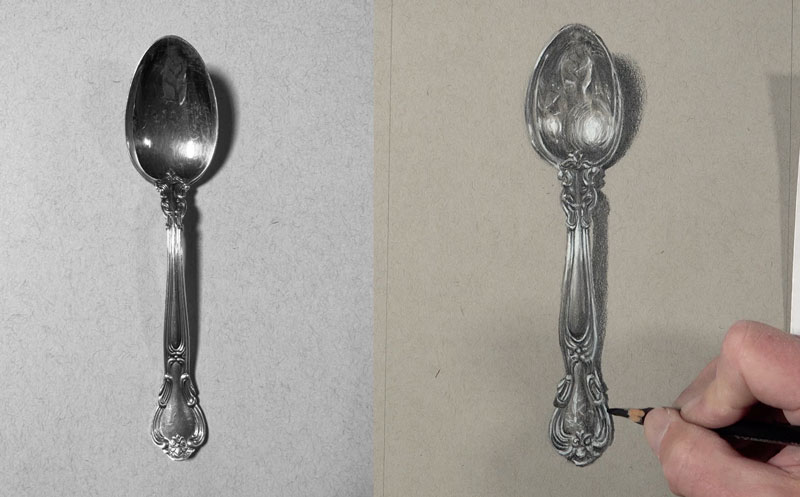
Drawing a Metal Spoon – Conclusion
Now our drawing of a spoon is complete. And even though we didn’t focus on details, we can clearly see them defined in the final drawing. Here’s another look at the completed drawing…
If so, join over 36,000 others that receive our newsletter with new drawing and painting lessons. Plus, check out three of our course videos and ebooks for free.
Gettin’ Sketchy – Season 11
Gettin’ Sketchy: Season 11
Episodes
About Gettin’ Sketchy – Season 11…
Gettin’ Sketchy Live is an original live broadcast. The goal is produce a sketch within 45 minutes while providing art instruction and entertainment. In this season, Matt and Ashley choose their own subjects and materials. Each episode is a new adventure with different subjects and drawing media.
Episode 1: Binoculars
In this live drawing lesson, Ashley will have 45 minutes to create a drawing of binoculars with graphite pencils on white drawing paper. Join in live and watch as the drawing develops. Season 11 of Gettin’ Sketchy gets underway with our first drawing of the year.
Episode 2: Ring Pop
In this live drawing lesson, Matt will have 45 minutes to create a drawing of candy (a ring pop) with alcohol-based markers and colored pencils on gray sketch paper. Join in live and watch as the drawing develops.
Episode 3: Still Life – Veggies
In this live drawing lesson, Ashley will have 45 minutes to create a still life drawing with pastels on toned paper. Join in live and watch as the drawing develops.
Episode 4: Lighthouse
In this live drawing lesson, Matt will have 45 minutes to create a landscape drawing with charcoal on Heritage hot press watercolor paper. Join in live and watch as the drawing develops.
Episode 5: Tape Dispenser
In this live drawing lesson, Ashley will have 45 minutes to create a still life drawing of transparent tape with grayscale Copic markers on white drawing paper. Join in live and watch as the drawing develops.
Episode 6: Bird
In this live drawing lesson, Matt will have 45 minutes to create a pastel drawing of a bird on PastelMat Paper. Pastels and pastel pencils are applied to develop the drawing. Join in live and watch as the drawing develops.
Episode 7: Hand
In this live drawing lesson, Ashley will have 45 minutes to create a drawing of a hand holding a coin with graphite pencils on white drawing paper. Learn the basics of drawing hands while using your hands to draw one. Join in live and watch as the drawing develops.
Episode 8: Glasses
In this live drawing lesson, Matt will have 45 minutes to create a drawing of eyeglasses with charcoal on white drawing paper. Use vine charcoal to cover the paper, then use an eraser to pull out highlights, while rendering the darker values with compressed charcoal. Join in live and watch as the drawing develops.
Episode 9: Frog
In this live drawing lesson, Ashley will have 45 minutes to create a drawing of a frog on black Colorline paper with colored pencils. Learn how to use colored pencils on a black surface as the drawing develops. Join in live and watch as the drawing develops.
Episode 10: Shark
In this live drawing lesson, Matt will have 45 minutes to create a drawing of a shark with white charcoal pencils on black Artagain paper. Learn how to apply white charcoal to create highlights and midtones while using an eraser to develop shadows. Join in live and watch as the drawing develops.
Episode 11: Season 11 Review and Critique
In this live drawing critique, we look back on the drawings we created during Season 11 and quickly critique each piece. We choose our favorite drawings and encourage you to choose your favorites as well. Join the chat and join in the discussion as we look back on what we created.
Resources for this Lesson…
Distributing any content downloaded from this site is strictly prohibited and against the terms and conditions of use.
References
Here’s what you’ll need…
(Disclosure: Links to art materials are affiliate links which means we make a small commission if you purchase at no additional cost to you.)
Episode 1: Binoculars
- Graphite Pencils
- White Drawing Paper
Episode 2: Ring Pop
Episode 3: Still Life – Veggies
Episode 4: Lighthouse
- White Drawing Paper
- Charcoal
Episode 5: Tape Dispenser
- Alcohol-Based Markers
- White Drawing Paper
Episode 6: Bird
Episode 7: Hand
- Graphite Pencils
- White Drawing Paper
Episode 8: Glasses
- White Drawing Paper
- Charcoal
Episode 9: Frog
- Prismacolor Colored Pencils
- Black Colorline Paper
Episode 10: Shark
- White Charcoal Pencils
- Blending Stumps
- Black Drawing Paper


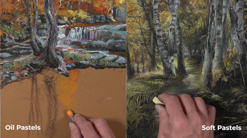
Oil Pastels vs. Soft Pastels – A Comparison
What’s the Difference Between Oil Pastels and Soft Pastels?
Oil pastels and soft pastels are extremely different from one another. Even though both mediums are referred to as “pastels”, they are different mediums entirely. In this lesson, we’ll see just how different they are.
The Binder
To understand the differences between oil pastels and soft pastels, we need to start by taking a look at the compositional makeup of each material. That starts by taking a look at what’s called binder. Binder is the material that holds the pigment together. All colored art materials include pigment and binder. Pigment is what adds the color, and binder is what holds the color together.
Soft pastels feature a gum or methyl cellulose binder.
But oil pastels feature an oil and wax binder.
Because these two binders are extremely different from one another, the materials are going to behave differently on the surface. This means that we need to approach using them differently as well. Because of its binder, soft pastels are applied dry. They’re noticeably powdery and easily blended or smudged with a finger.
This differs from oil pastels, which are applied in more of a wet manner. Oil pastels never dry completely thanks to their binder. They’re a little bit more difficult to blend with a finger compared to soft pastels.
Surfaces for Pastels
Soft pastels are typically applied to textured papers. The textured surface, of course, allows for layered applications allowing you as the artist to fill in the tooth of the paper to build up complexity in the color. Oil pastels are most often applied to textured papers just like soft pastels, but oil pastels, because of their binder, can be applied to virtually any surface, including glass.
Oil Pastel and Soft Pastel Behavior
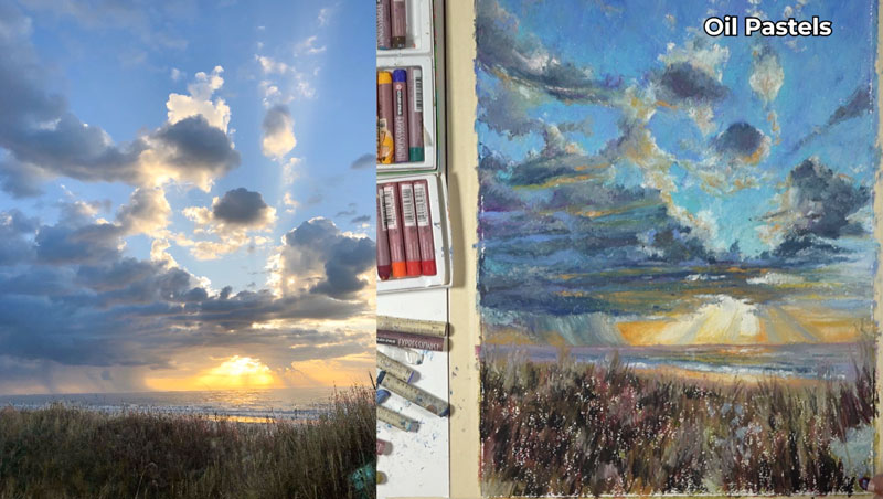
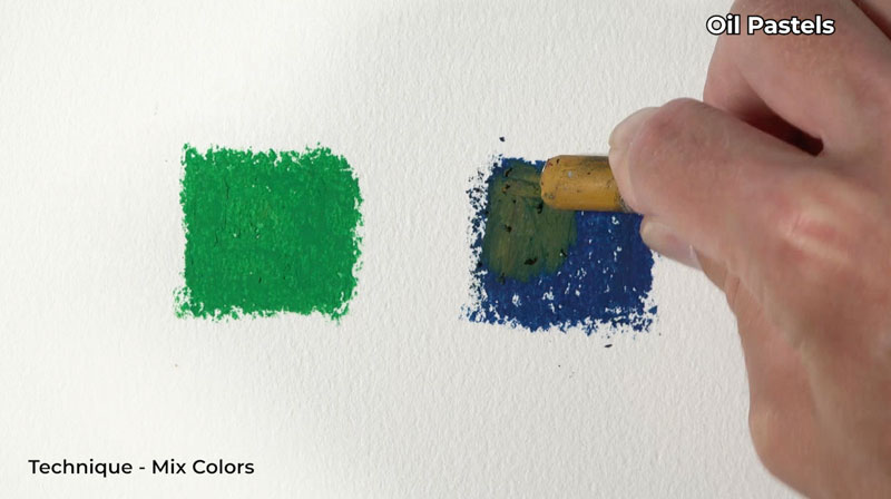
Typically, oil pastels are more intense in color compared to traditional soft pastels. Because of their similarities to crayons and colored pencils, oil pastels behave more like a crayon when they’re applied. You can see here that layering produces some mixing.
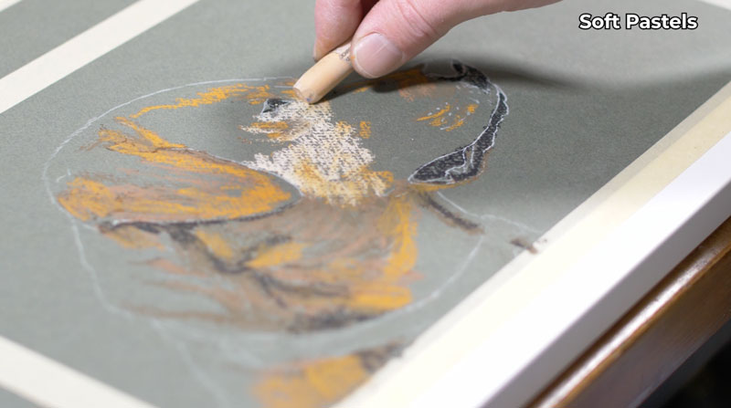
Soft pastels, however, are more like chalk. They’re powdery and loose, and easily blended with a finger or blending tool.
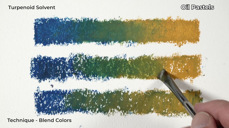
Oil pastels can also be blended, but typically we don’t use a finger to blend them. Oil pastels can be blended using a colorless blender, but you can also use painting mediums to blend the material as well. Mediums such as terpenoid or other oil painting mediums will also work for blending oil pastels.
Techniques for Oil Pastels and Soft Pastels
Many of the same techniques used for soft pastels can be applied to oil pastels. For example, scumbling and feathering are two techniques used for both mediums.
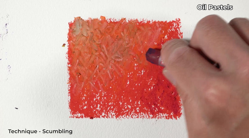
Oil pastels, however, can be scratched and removed from the surface. You can use this characteristic to create textures in the surface or remove oil pastel from the surface completely. Oil pastels can be applied in a thick manner imitating impasto oil painting techniques. Soft pastels, however, because of their dusty powdery nature remain fairly flat on the surface.
Because oil pastels are so sticky, you may notice some of the material sticking to other colors of pastels. Of course, when you apply this to the surface, you’ll see some contamination. So with oil pastels, it’s important to pay attention to the tip of your stick and make sure it’s clean before applying it to the surface. Soft pastels, however, don’t share this characteristic. You don’t really have to worry too much about contamination when you’re using soft pastels.
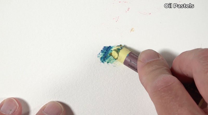
Soft pastels effortlessly cover over other applications, much like an opaque painting medium. As you can see here, I’m adding blue dots over the top of a darker blue and it’s easily visible with a very light touch.
Oil Pastels vs. Soft Pastels – Conclusion
Both soft pastels and oil pastels are obviously capable of producing amazing results, which can look like a painting. But it’s important to note that even though both of these materials are called pastels, they’re typically not used in combination with one another. This of course goes back to the fact that their binders are so extremely different, making them completely different mediums.
If so, join over 36,000 others that receive our newsletter with new drawing and painting lessons. Plus, check out three of our course videos and ebooks for free.
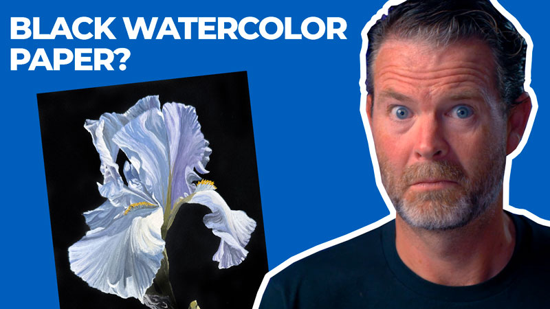
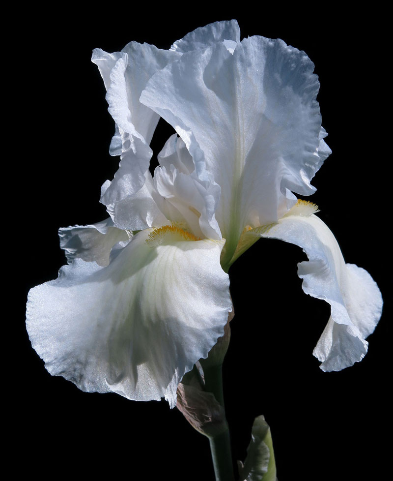
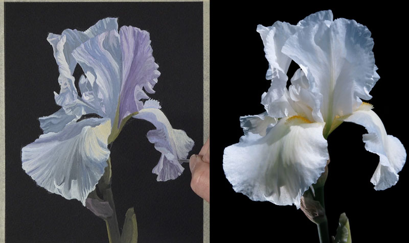
Black Watercolor Paper – Painting a Flower
Black Watercolor Paper
In this watercolor lesson, we’re going to take a look at painting on black watercolor paper. I’ll be honest, when I first heard about black watercolor paper, I was intrigued, but I was also confused because it goes against everything that I know about watercolor painting. With traditional watercolor painting, the transparent or translucent watercolor is applied to a light surface, usually white watercolor paper. The white of the paper affects the values, specifically the light values that we see in the painting. Dark values are easy to achieve with multiple layered applications. Now what happens if we work on black watercolor paper? How do we create a full range of value? I can understand that there are probably folks out here that went out there and bought black watercolor paper and tried to apply traditional watercolors to the surface and got frustrated because the result is obviously a dark painting.
How can we use black watercolor paper in order to create a watercolor painting? In this lesson we’ll cover this and we’ll create a painting from start to finish on black watercolor paper.
For this lesson, I’ll use Stonehenge Black cold pressed watercolor paper, along with Winsor and Newton Designer’s gouache. We’ll sketch the subject using an HB graphite pencil.
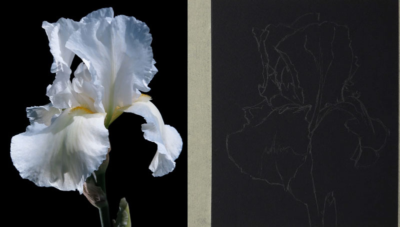
The photo reference that is used is pictured below…
Sketching the Flower
I’ll start here with a light sketch using an HB graphite pencil. I’ll take my time and pay attention to the shapes that I see. It might be helpful to mark out areas where you see areas of contrast or areas where a dark value comes in contact with a light value. You may even create a drawing that’s more simple than the one that I’ve created here.
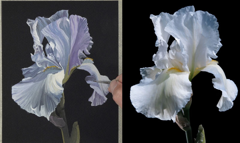
Painting the Underpainting
Once we’re happy with our pencil sketch, we can move on to applying the gouache to the surface. On my palette, I’m going to apply primary colors, yellow, blue, and red, a bit of white, and a bit of black. I’m going to start here by mixing a light purple and apply this color to the bulk of the petal shapes.
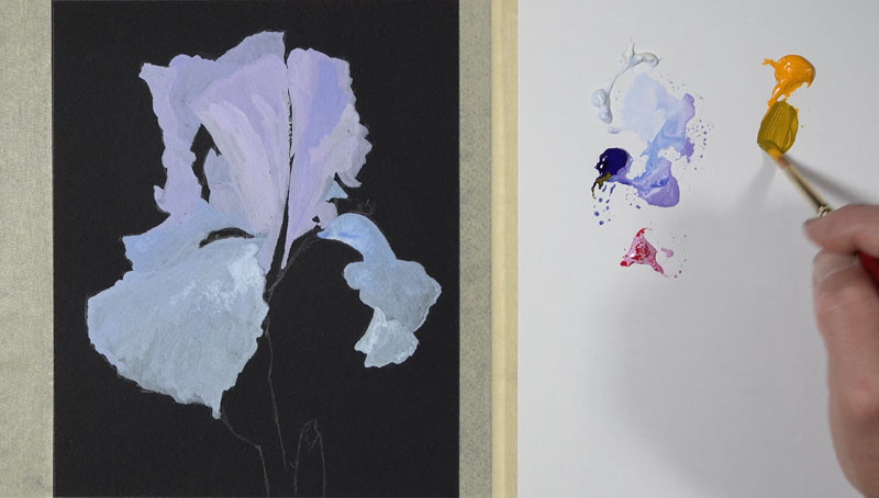
Now that we have our shapes for the petals established, let’s go ahead and mix up a green and apply this color to the stem. A bit of yellow and a bit of our blue is mixed together. To make it a little bit lighter, we’ll add just a touch of white. Here again, we just want to fill in the shape of color initially and later in the process we’ll adjust the values.
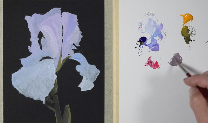
Adjusting the Values on the Petals of the Flower
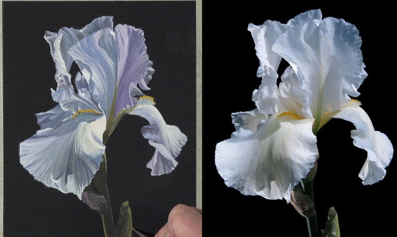
Now that we have our basic shapes established, we can start pushing the value range. We’re going to start adding some of the shadows and the highlights, broadening the contrast within the painting. We’re going to do this gradually just as we did with the shapes of the petals where we were paying attention to the overall shape. We’re going to do the same thing now with different values. We’re just going to pay attention to the shapes of dark and light values that we see and paint these within the overall larger shapes, progressively working our way down to the smaller shapes.
Adding Warm Highlights
The light in the scene is important, and in this particular case, we have a dominant light source originating from the right side. This means that our highlights are going to exist primarily on the right side of each one of the petals and our shadows are going to exist primarily on the opposite side of that. As we continue to push these value relationships, gradually our flower will begin to take on the illusion of having form. I bring in a little bit more of that yellow for the highlighted sections of the flower. This is going to contrast nicely with the purple shadows since yellow and purple are opposite from each other on the color wheel. These are called complementary colors.
Now, one trick with gouache is after you apply some of the color, you can load your brush up with just a bit of water and pull the color around. Doing this will reactivate some of the colors underneath and allow you to blend and make smooth transitions of color and value.
Increasing Contrast Between the Highlights and Shadows
We’ll continue to push the contrast between the light and dark areas on each flower, paying attention to the shape. We’ll gradually push the shadows darker while making the highlights lighter.
Pushing the Values on the Stem of the Flower
Just as we did on the petals of the flower, we’ll now push the contrast and value range on the stem of the flower. We use a lighter yellow-green for the highlights and cooler, blue-green for the shadows.

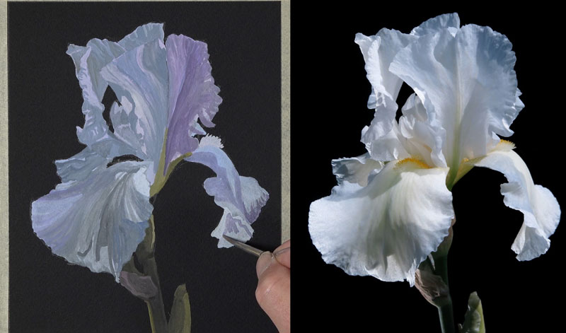
Finishing Touches to the Painting
Lastly, we make a few more adjustments to the painting, including adding the highlights to the top of the stem with a light purple. Once you are pleased with the value relationships and shapes, a kneaded eraser can be used to erase any remaining graphite marks.
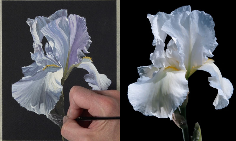
Painting on Black Watercolor Paper – Conclusion
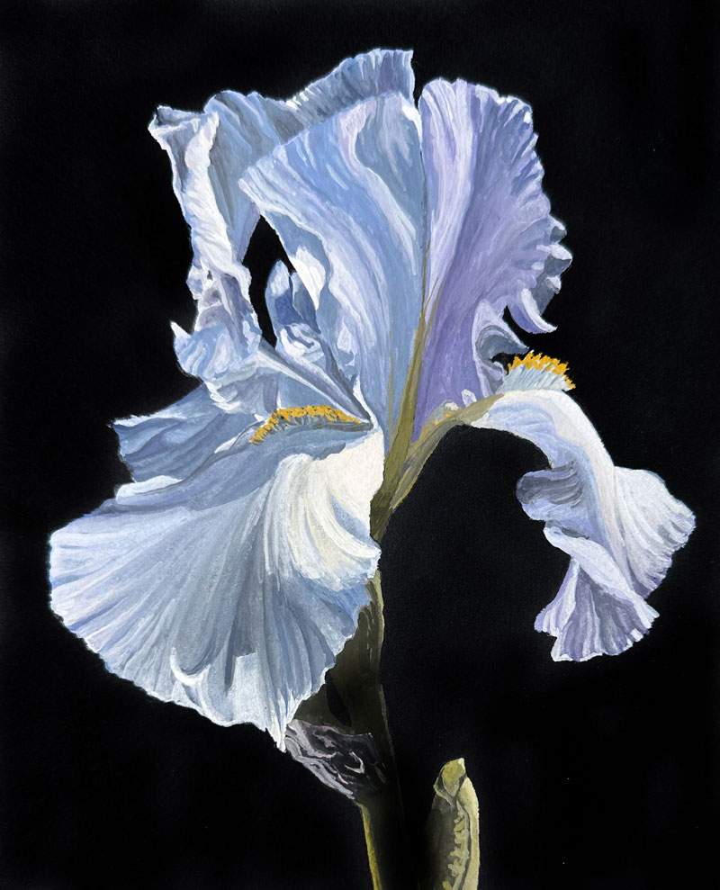
Now our gouache painting of a flower on black watercolor paper is complete. Here’s a look at the finished painting…
Black watercolor paper is a fantastic surface if you use the proper application techniques and media. For watercolor painting, I would suggest sticking with gouache over traditional watercolors. This surface is also suitable for other forms of art media, including colored pencils and pastels.
If so, join over 36,000 others that receive our newsletter with new drawing and painting lessons. Plus, check out three of our course videos and ebooks for free.