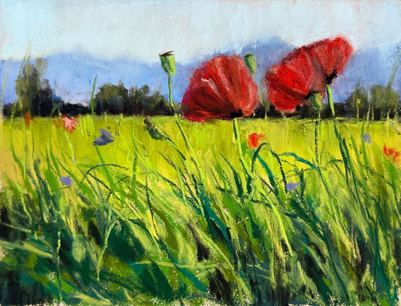
Drawing a Field of Flowers with Pastels
In this pastel drawing lesson, we’ll draw an image of a field of red poppies with pastels. Here’s a look at the finished drawing…
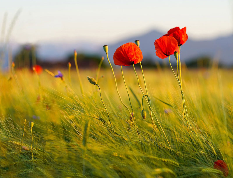
A photo reference is used to complete the drawing. Here’s a look at the photo reference…
Pastel Materials
Rembrandt soft pastels are used for this drawing. These soft pastels are pigment-rich, offering vibrant colors that blend and mix easily. They are easy to find at most art stores and are consistent in their pigmentation.
This drawing is completed on “buttercup” toned PastelMat paper. This paper features a deceptively heavy tooth that accepts multiple, layered applications while keeping pastel dust at a minimum. While this paper is pricey, it is a fantastic surface to work on.
Looking for Shapes
Pastel drawings are often referred to as “paintings”. This is because a pastel drawing often resembles a painting. Even though the medium is applied dry, the techniques for developing a pastel image is similar to that of painting. Instead of focusing on details and edges, we should instead focus on shapes of color and value. With pastels, we can develop shapes of color and value and gradually develop the illusion of details through subtleties of tone.
For this image, the basic shapes of the flowers are developed with bold color. These shapes are gradually refined by layering different values and versions of the color through multiple applications. This not only develops the illusion of form, but also develops complexity in color which makes the drawing appear more realistic.
If so, join over 36,000 others that receive our newsletter with new drawing and painting lessons. Plus, check out three of our course videos and ebooks for free.
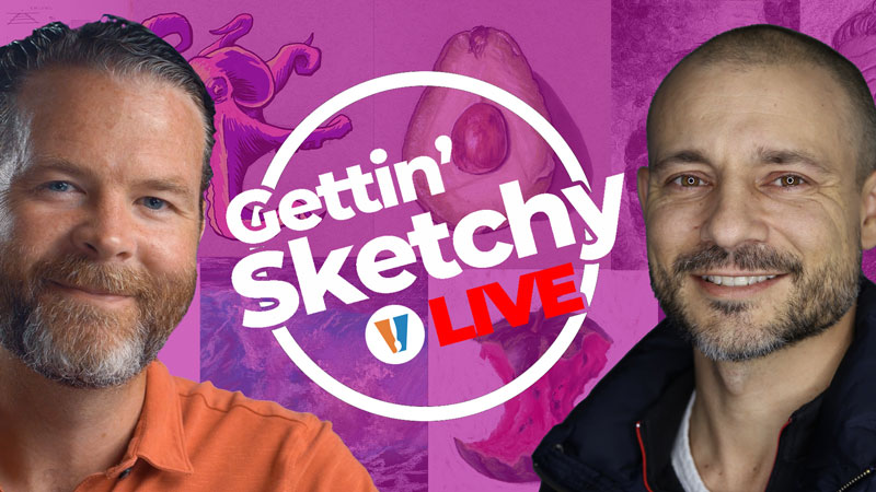
Gettin’ Sketchy – Season 12
Gettin’ Sketchy: Season 12
Episodes
About Gettin’ Sketchy – Season 12…
Gettin’ Sketchy Live is an original live broadcast. The goal is produce a sketch within 45 minutes while providing art instruction and entertainment. In this season, Matt and Ashley choose their own subjects and materials. Each episode is a new adventure with different subjects and drawing media.
Episode 1: Architecture
In this live drawing lesson, we look at drawing architecture with charcoal on white paper. Ashley will have 45 minutes to create a drawing from start to finish. Vine and compressed charcoal are applied to white drawing paper and manipulated with blending stumps and erasers.
Episode 2: Lighthouse
In this live drawing lesson, Matt will have 45 minutes to draw a landscape that features a lighthouse in the sand dunes at the beach with pastels and pastel pencils on PastelMat paper. Watch, learn, and draw alongside as pastels are layered to build up color, resulting in a painterly, colorful drawing.
Episode 3: Legozilla
In this live drawing lesson, Ashley will have 45 minutes to draw a Lego man toy with oil pastels on black paper. Sakura oil pastels are applied to black Colorline paper to complete the drawing. Watch, learn and draw alongside as this interesting subject is captured with oil pastels.
Episode 4: Bear
In this live drawing lesson, Matt will have 45 minutes to create a drawing of a bear with pen and ink. Watch and learn live as this drawing develops. Use technical drawing pens on white pen and ink paper to complete the drawing. Use hatching and cross hatching to add texture and value to the drawing.
Episode 5: Toothbrush
In this live drawing lesson, Ashley will have 45 minutes to create a drawing of a still life subject (toothbrush and tooth paste) with graphite pencils. Watch and learn live as this drawing develops. Use graphite pencils and graphite powder along with erasers to complete the drawing on white drawing paper.
Episode 6: Cardinal
In this live drawing lesson, Matt will have 45 minutes to create a drawing of a bird, a red Cardinal, with colored pencils and PanPastels. Watch and learn live as this drawing develops. Use colored pencils to complete the drawing on toned Canson Mi-Teintes pastel paper.
Episode 7: Cat
In this live drawing lesson, Ashley will have 45 minutes to create a drawing of a cat with pastels on black pastel paper. Watch and learn live as this drawing develops. Use pastels on black Canson Mi-Teintes pastel paper to complete the drawing.
Episode 8: Dog
In this live drawing lesson, Matt will have 45 minutes to create a drawing of a dog with graphite pencils on white drawing paper. Watch and learn live as this drawing develops.
Episode 9: Hawk
In this live drawing lesson, Ashley will have 45 minutes to create a drawing of a hawk in flight on tan Mi-Teintes pastel paper paper with Sepia conté . Learn how to draw a hawk in flight. Watch and learn live as this drawing develops.
Episode 10: Urban Sketching
In this live drawing lesson, Matt will have 45 minutes to create a drawing/painting of an urban landscape with pen and ink with watercolor. In this lesson, we’ll apply the watercolor washes first followed by the pen and ink. This approach will result in a looser, more expressive image. We’ll work on cold pressed watercolor paper to complete the image. Watch and learn live as this drawing develops.
Episode 11: Season 12 Review and Critique
In this live drawing critique, we look back on the drawings we created during Season 12 of Gettin’ Sketchy and quickly critique each piece. We choose our favorite drawings and encourage you to choose your favorites as well. Join the chat and join in the discussion as we look back on what we created.
Resources for this Lesson…
Distributing any content downloaded from this site is strictly prohibited and against the terms and conditions of use.
References
Here’s what you’ll need…
(Disclosure: Links to art materials are affiliate links which means we make a small commission if you purchase at no additional cost to you.)
Episode 1: Architecture
- White Drawing Paper
- Charcoal
Episode 2: Lighthouse
Episode 3: Legozilla
- Oil Pastels
- Canson Mi-Teintes Pastel Paper
Episode 4: Bear
Episode 5: Toothbrush
- Graphite Pencils
- White Drawing Paper
Episode 6: Cardinal
Episode 7: Cat
Episode 8: Dog
- White Drawing Paper
- Graphite Pencils
Episode 9: Hawk
Episode 10: Urban Sketching


Oil Pastel Drawing – Sunflowers
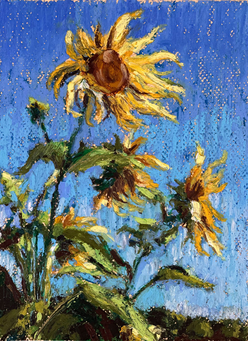
Drawing Sunflowers with Oil Pastels
In this pastel drawing lesson, we’ll draw an image of sunflowers with oil pastels. Here’s a look at the finished drawing…
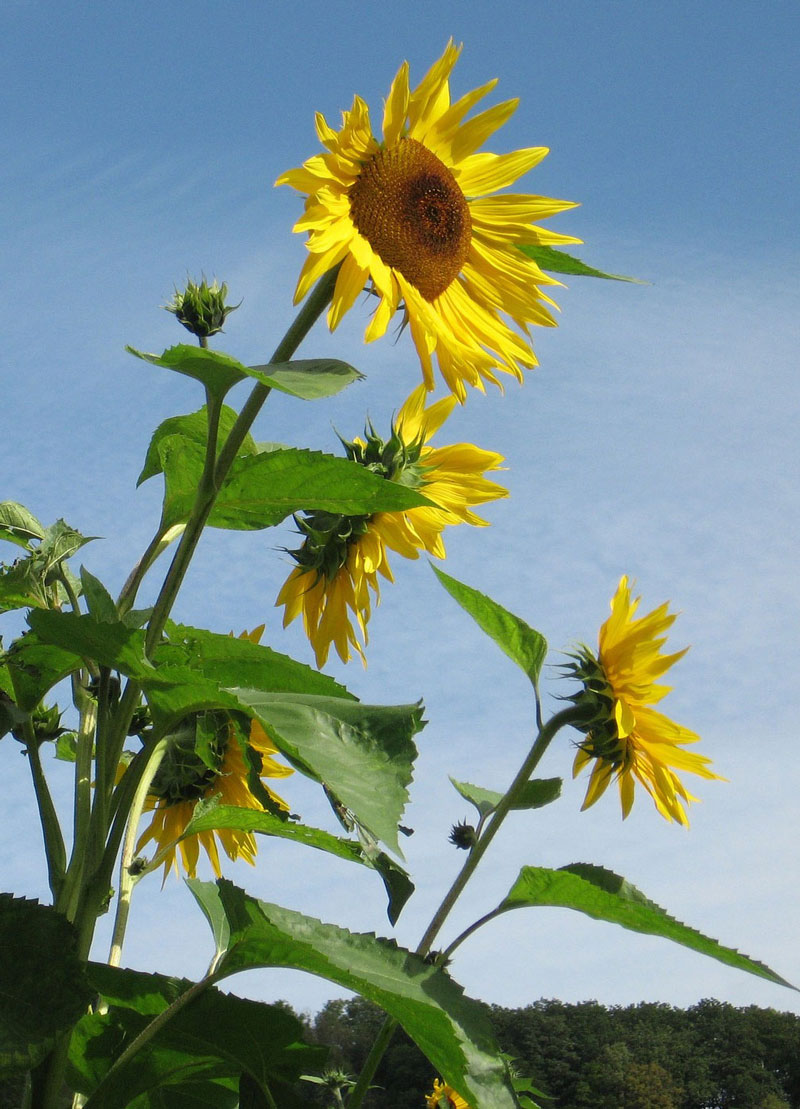
A photo reference is used to complete the drawing. Here’s a look at the photo reference…
Oil Pastel Materials
Oil pastels are a unique drawing or painting medium. While oil pastels are called “pastels”, they are quite different from soft pastels. Oil pastels never dry and remain workable. While layering is important when applying oil pastels, they are not completely opaque. Some mixing will occur with colors and values already present on the surface. This differs from traditional soft pastels. Oil pastels, while applied dry, tend to resemble a painting created with thick impasto applications.
For these reasons, we must consider the mixing that will occur as subsequent applications are applied. Oil pastels are closely related to colored pencils in their behavior. Just like with colored pencils, we build up color and “mix” colors through layering.
In this lesson, two different brands of oil pastels are used. Sakura Cray Pas oil pastels are harder and less intense with pigmentation. These pastels are used earlier in the process and act as base colors that don’t use up too much of the tooth the paper. Sennelier oil pastels are softer and more rich with pigmentation. These oil pastels are layered over the base applications to create a more painterly look.
It is important to work on a textured surface when using pastels. A heavy tooth allows for more layers, which leads to more depth and interest in color. Canson Mi-Teintes pastel paper provides and excellent surface for layering oil pastels and is the paper used in this tutorial.
Stay Loose with Oil Pastels
Many beginning artists are easily distracted by details. We tend to focus on the detail first, rather than looking for shapes of color and value. Oil pastels are a bulky medium, making details difficult to create without some layers of material on the surface. Details emerge from the drawing as various colors and values are developed.
Instead of focusing on details, we should pay attention to the simple shapes of color and value that are observed. When these shapes are drawn with the correct values and colors, the details tend to be found, rather than spelled out. For this reason, oil pastel drawings go through stages. Some stages may be discouraging to artists new to oil pastels. It is essential to work through these stages and allow the drawing to develop as it should. This development may require many layers of the material before reaching the depth in color and variety needed for a successful drawing.
If so, join over 36,000 others that receive our newsletter with new drawing and painting lessons. Plus, check out three of our course videos and ebooks for free.
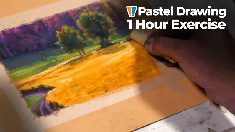
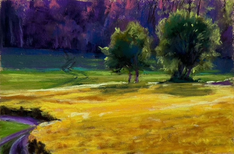
Colorful Landscape Drawing with Pastels
Creative Color in Landscape Drawing
In this pastel drawing lesson, we’ll draw a colorful landscape with pastels. We’ll limit the amount of time spent on this drawing to just one hour. Here’s a look at the finished drawing…
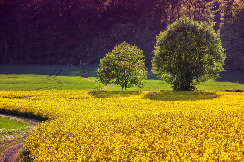
We’ll use a photo reference to complete the drawing. Here’s a look at the photo reference…
Pastel Materials for This Drawing
Soft pastels are used to complete the drawing. You can use any brand of pastels that you wish to complete the lesson. In this lesson, Rembrandt pastels are layered on PastelMat paper. Rembrandt pastels are high quality soft pastels with a broad variety of colors available. PastelMat paper features a heavy tooth that allows for many layers of pastel applications. Any textured paper with work for this drawing, however working on a toned surface will help to ensure a full range of value.
Making Colors Pop
This drawing features an exaggeration of observed colors. By slightly exaggerating observed colors, we can make our drawings and paintings more interesting and use color theory to create contrast, while preserving harmony.
In this drawing, a secondary color scheme is used to enhance the image. Secondary colors are orange, purple, and green. By limiting the piece to these colors, we create harmony. But due to these colors’ positions on the color wheel, we create contrast. It is the contrast that leads to the “pop” that we want in the finished drawing.
Simplifying Details
It is a misconception that all details must be included in an artwork. Details can be suggested. In this work, details are purposely simplified, placing more attention on the relationships of colors and values. It can be difficult to look past the details that you observe in a subject and instead focus on the shapes. One way to do this is to squint your eyes and observe your subject. By squinting, we remove the details and are left with only the values, colors, and shapes.
By focusing on the shapes that we see, we can create the illusion of form and light, without becoming overwhelmed with the details. This leads to an artwork that is more painterly and expressive. The colors become the “star” instead of the subject itself.
If so, join over 36,000 others that receive our newsletter with new drawing and painting lessons. Plus, check out three of our course videos and ebooks for free.
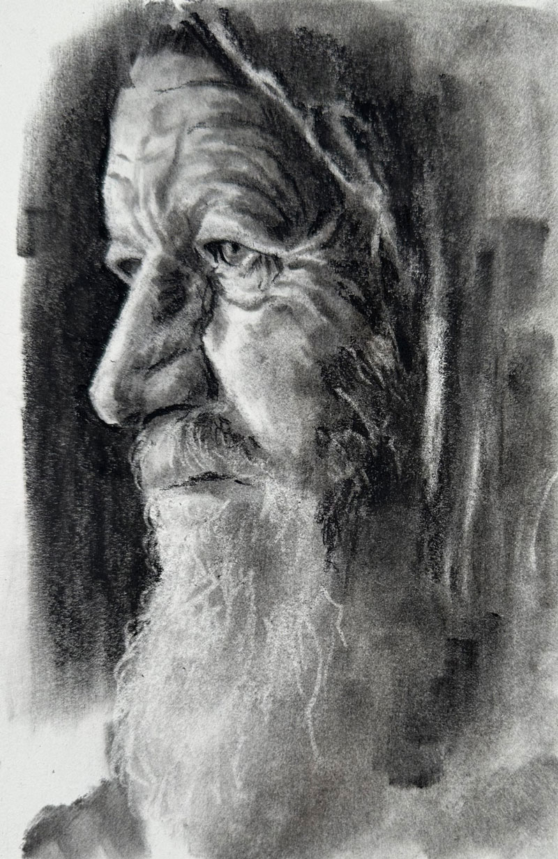
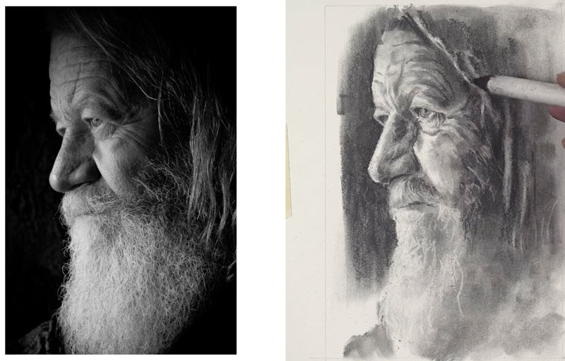
Portrait Drawing with Charcoal – Old Man
Portrait Drawing with Charcoal
In this charcoal drawing lesson, we’ll draw a portrait of an old man with charcoal in about an hour. Here’s a look at the finished drawing…
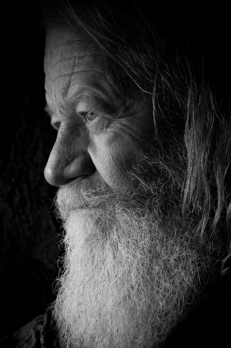
We’ll use a photo reference to complete the drawing. Here’s a look at the photo reference…
Charcoal Materials for Portrait Drawing
We’ll use a variety of forms of charcoal to complete the portrait drawing. We’ll use vine charcoal for our initial applications and compressed charcoal for the finishing applications. We’ll use a blending stump to smooth applications. Erasers are used to define the highlights. We’ll use both a kneaded eraser and a vinyl eraser for more precise erasing. The drawing is completed on white drawing paper.
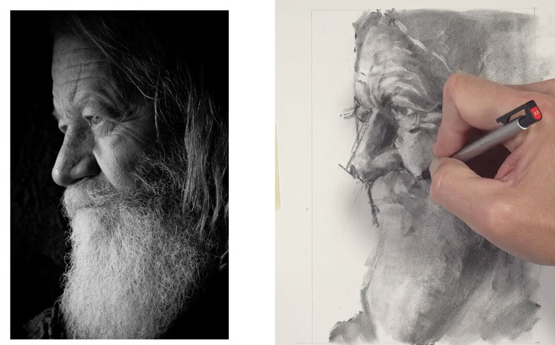
Sketching the Contours of the Face and Head
I’ll start with vine charcoal, using a very skinny stick. We’ll start by drawing a line for the forehead. Using that line, I’m going to try to figure out where the brow line is located. I’m also going to draw a diagonal line for the edge of the eye before moving on to drawing a few lines for the hairline. Using these lines, I can figure out the location and shape of the nose. I’m putting down a bit of information that I can see and then using that information on my drawing paper to make comparisons to determine where I need to make the next mark.
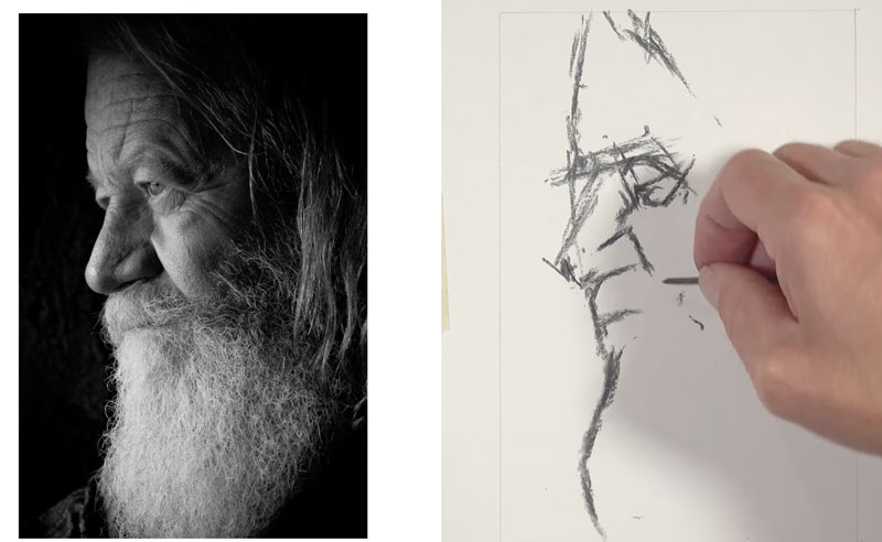
Next, I’ll block out a location for the eye. The chin is not visible here because we have a big white furry beard, but I’ll go ahead and draw a contour line for where the edge of the beard is located. You might notice that I’m not using any drawing formulas, like the Loomis Method, for example. I found that the Loomis Method does make all the heads appear very similar. The Loomis Method is great for drawing heads and faces from imagination, but since we’re working from observation, I’m going to stick with pure observational drawing.
Adding Shadows to the Face with Charcoal
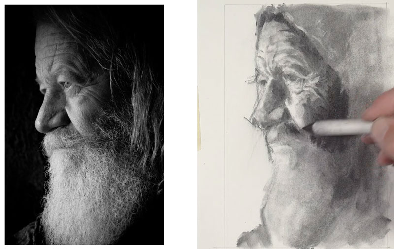
Next, I’ll switch over to a much larger piece of vine charcoal. Using this larger piece of charcoal, I’ll start filling in some of the darker values. Most of the shadowed side of the face is on the right side, so we can go ahead and be liberal with these applications.
Using a blending stump somewhat like a paint brush, I’ll start moving the charcoal around, thinking about the planes of the face. You want to think about all the tools that you use as a mark-making tool and this includes the blending stump. We’ll go ahead and go into the white of the beard knowing that at the later stages of the drawing, we will erase out some of the lighter values.
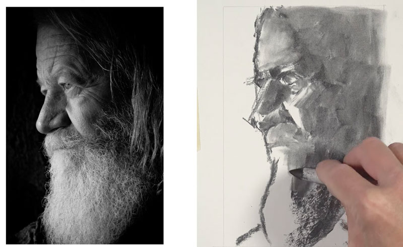
We’re starting to have a better understanding of the form of the head simply because we have some values in place. Value is the darkness or lightness of a color. You can think of a value range as a scale of different grays going from dark to light.
Using a kneaded eraser, I’ll start lifting up some of the soft vine charcoal. At this point, I’m concentrating on the lighter values and the highlights.
Drawing Wrinkles in the Face
We’ll erase out some indications of some wrinkles and details using both the kneaded eraser and the vinyl eraser. We are essentially creating highlights. The contrast between the highlights and shadows leads to the illusion of the wrinkles. We see wrinkles by seeing both the lights and the darks.
We’ll start pushing the values by adding more vine charcoal. We’ll continue to work back and forth with the charcoal and the eraser to begin pulling out the details.
One thing to keep in mind when you’re working with charcoal is that we start with a looser indication of the subject and then gradually refine the drawing as we go through the process. This is completely different than using a medium like pen and ink or colored pencils where we start with precision and end with precision in most cases.
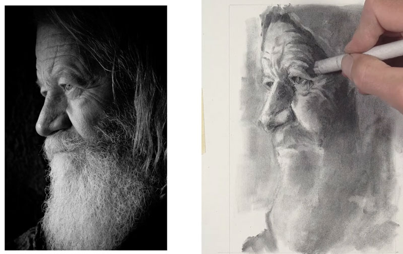
While compressed charcoal is less forgiving, it can still be blended much like the vine charcoal. We’ll continue adding compressed charcoal, blending it, and then erasing to create highlights. Slowly, our details emerge.
Drawing the Hair
Next, I’ll use the vinyl eraser to erase out some strands of hair. We’ll do so on the mustache and the beard as well as we continue to work down. It’s important to note here that I’m not trying to replicate every single strand of hair that I see. I’m just giving an impression of some of the stray hairs over the top of the medium to dark values. This will give the impression of a furry beard, as we see in the reference, without having to spell everything out for the viewer.
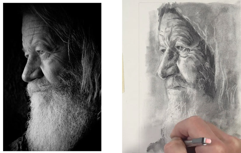
Completing the Portrait Drawing with Charcoal
At this point, we’re ready to increase the contrast along the edge of the face. Using the compressed charcoal pencil, we’ll go ahead and refine the edge.
I’m thinking about the contrast of value that happens around the edge of the face. This will allow me to refine the edge of the nose and the other facial features as they bump up against that dark tone. We’ll use the side of the charcoal pencil to cover a broader area. We’ll also do the same in the darkest areas of the hair on the right side of the picture plane.
Then, we’ll erase out a few stray hairs over the top of the darker tones. We’ll add a few more details to the eye with compressed charcoal to complete the drawing.
Now our charcoal portrait drawing is complete. Here’s a look at the completed drawing…
Charcoal Portrait Drawing of an Old Man – Conclusion
Charcoal is one of the most forgiving mediums for drawing, despite its reputation for being messy. It’s important to focus on shapes of value and try to replicate these shapes in your drawing. Details emerge from the drawings as it develops. Stay loose and patient and slowly your portrait drawing will develop into a refined image.
If so, join over 36,000 others that receive our newsletter with new drawing and painting lessons. Plus, check out three of our course videos and ebooks for free.

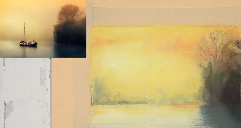
Pastel Drawing – Boat on the Water
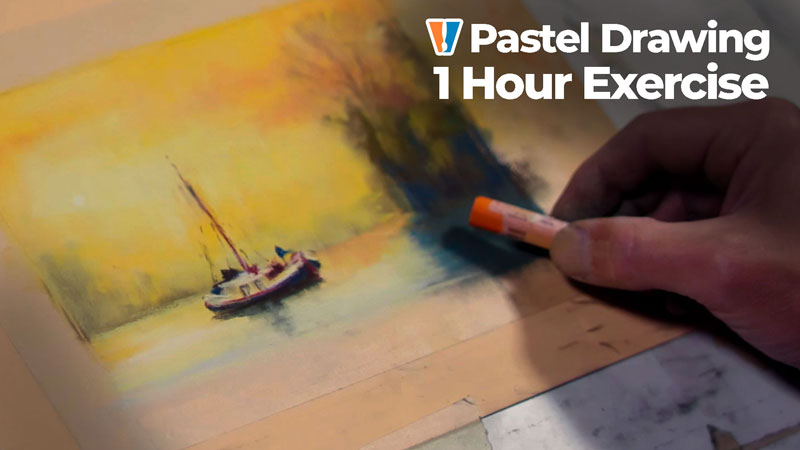
Drawing a Boat on the Water with Pastels
In this pastel drawing lesson, we’ll draw a boat on the water. This is a timed sketch and we’ll spend only about an hour. Here’s a look at the finished drawing…
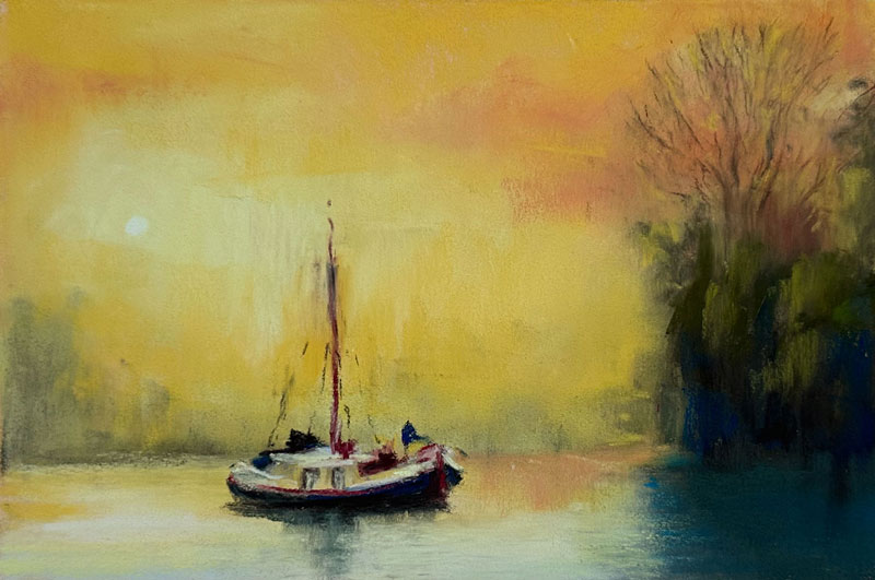
We’ll use a photo reference to complete the drawing. Here’s a look at the photo reference…
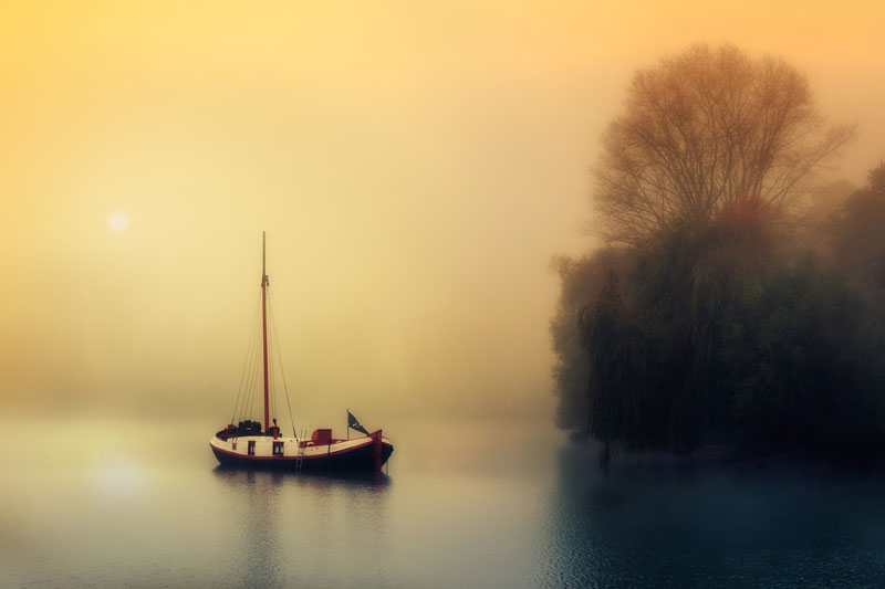
Drawing Materials
In this lesson, we’ll use soft pastels by Rembrandt on PastelMat paper. Rembrandt pastels are a high quality soft pastel that layer and blend easily. PastelMat paper features a heavy tooth that allows for many layers of pastel applications. For this drawing, we’ll use the “Buttercup” color of the paper.
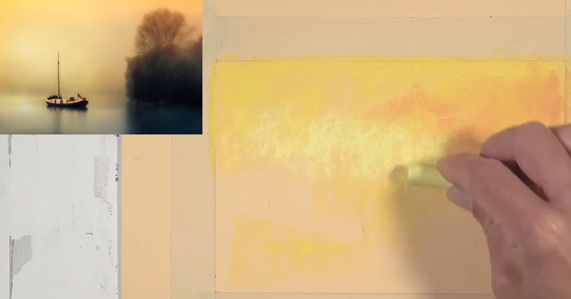
Painting the Sky
We want to create somewhat of an atmospheric feeling to the drawing, so we’re going to be spending quite a bit of time on the sky. Then we’ll move to the trees on the right, and then finally, we’ll address the boat on the water.
We’ll start with an application of yellow that is very close to a primary yellow. Then we’ll add a bit of a lighter orange. Over the top, we’ll go back to our primary yellow and work that material so that we create a gradation. We’ll also bring a bit of that yellow down into the water. We’re going to create lots of layers in the sky. Some mixing will occur with each color that we add.
Then, we’ll switch to a cooler yellow that is closer to a lemon yellow, and add this color close to where the sun is located within the picture plane. We’re also going to bring this color straight across and allow it to mix with the orange and primary yellow that we’ve already applied.
Drawing The Trees
Now that we’ve got some base applications for our sky, we’re going to go ahead and indicate the distant tree line and the trees on the right side of the picture plane.
We’ll do so with a raw umber which has a pretty dark value. It’s close to brown, but it’s more neutral than a typical brown. We’re concentrating only on shapes. After these intitial shapes are defined, we’ll go back over the top of our umber applications with the primary yellow. This will mix with the colors underneath and create more of a smoky atmospheric effect. We can use our finger to do some blending and some smudging. Just make sure that your finger is nice and clean. I like to keep a wet paper towel on hand to keep my fingers nice and clean for those situations where I need to do some blending with my finger.
Then it’s back to the lemon yellow. We’re going to bring that right over the top of the edge of the shape of trees that we’ve created on the right side of the picture plane. It’s important not to hurry this process. Even though this drawing is only an exercise for about an hour, we still want to take our time and be deliberate with our applications.
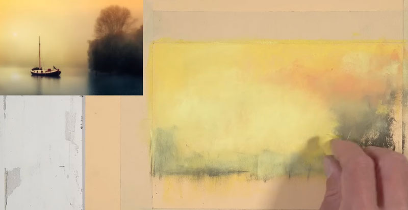
Now we’re going to go back to our umber, and we’re going to reestablish the tree line here, and since the tree line is closer to the viewer, we’re going to see more contrast in this area, but we still want to keep that smoky look. We want to create an impression of the trees instead of defining everything with details.
I switched over to a color that’s close to terracotta. This will create a little bit more variety. We can see that there are some trees with some leaves that are changing color, so the terra cotta will help communicate this. Then it’s back to the raw umber before switching back to a yellow to soften the edges of the trees. As we apply these colors, we can blend and smudge with our finger in between applications.
I’ll remind you that we don’t really need to think about details. We only want to think about the colors that we see, the values that we see, and the shapes of those colors and values.
With a darker yellow-green, we’ll establish some of the highlights. These are very faint highlights that exist primarily on the left side of the trees.
We’re going to add just a touch of a darker blue-green. We’re going to use this color quite a bit here in the lower part of the picture plane. We’re just establishing some of those cooler shadows that exist on the bottom portion of the trees. We’ll go ahead and use this color to establish the initial shape for the shadow that’s cast on the water, and then we’ll apply more of it in the trees themselves, mainly in the shadowed locations. Green is made by mixing blue and yellow, so in the shadowed areas, we’re going to add a little bit of blue, adding more interest to the color. Then over the top, we can add a bit more of the umber, darkening it while still being able to clearly see some of those blues.
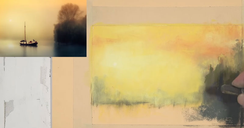
Drawing the Water
We’ll go ahead and put some colors down in the water. We’re going to start here with a very, very light yellow. This is the same color that we used in the center of the sky. Since the sky is reflected in the water, we’ll use the same colors that we see in the sky with an exception of a couple of blues.
Even though our colors are very similar to what we see in the sky and the water, we can differentiate the sky from the water with our horizontal stroke-making. A few more highlights are added to the trees on the right using an even lighter green. Then it’s back to our dark blue-green, defining the cast shadow on the water. I’ll bring in just a bit of blue here to further differentiate the sky from the water.
We’ll refine the edge where the highlighted part of the water meets the shadowed part. We’re getting some good variety and color in the water, but there are some oranges that should be reflected in our water. A bit of orange is added, followed by a cooler blue. This blue is more like a phthalo blue. It leans a little bit more towards green. Then we’ll make some of the cast shadows and shadows underneath the trees a bit stronger with our very dark brown.
Hopefully, you can see why patience is important when working with pastels. Oftentimes, you need to add multiple layers to build up the color that you need.
We’ll continue to refine the edges of the trees just a bit and add a few open areas where some of the light is getting through.
We do see some branches that are extending up. To add the branches, I’m going to start with a brown. I use the edge of the pastel to create these lines. If you’re not comfortable with this, you can always use a pastel pencil.
I can also roll the edge to create some very light marks. Then, we’re going to give this a very light smudge to keep the atmospheric look that we’re after. For a bit of variety, I’ll switch over to a darker brown and apply this mostly to the area of the trunk. We’ll add a bit more yellow in between some of the branches and also some touches of orange as well. We’ll make our sky a little bit more interesting by pulling a bit more of the orange over to the center of the picture plane and also applying it in the reflection in the water.
Drawing the Boat on the Water
Our scene is starting to come together and it’s time to add the boat which is the main focal point. We’ll start with a very dark umber to frame out the contours of the boat. If you feel more comfortable using a pastel pencil for this, you’re more than welcome to do so. This boat features dark blues and dark reds. After I’ve framed out the basic shape, I’ll go back into the shadowed areas and add a bit of blue. Then we’ll darken the blue with our umber. We’ll use our very, very light yellow to start establishing some of the white shapes of the boat. (The reason I’m not using a pastel pencil here for this is because I want to preserve this looser impressionistic feeling in this particular drawing.)
A bit of gray is added for the cast shadow on the surface of the water before switching over to a bit of red to start adding some of the red elements on the boat. This includes the stripe that goes along the side. We can clean up that line with a bit more of the very light yellow. We can add shadows with the dark umber and then continue to adjust these colors and values as much as we wish. We’ll continue to refine the overall shape of the boat before taking that dark red or terracotta color to create the mast.
Using our dark brown, we’ll add a few more details like the windows on the side of the boat. Then it’s back to our darker red, refining the stripe along the side. A few more highlights are added with a very light yellow. Then it’s time to make the cast shadow in the water. We’ll use a warm gray for this initially.
A bit more warmth is added with a bit of yellow and a few more details are developed with the terracotta. We need to make the cast shadow underneath the boat stronger.
Boat Drawing with Pastels – Conclusion
At this point, I’ve spent about one hour on the drawing and I determine that it is complete. It’s time to remove the tape. Be careful and pull the tape away at a right angle to prevent tearing. Here’a look at the completed drawing…
If so, join over 36,000 others that receive our newsletter with new drawing and painting lessons. Plus, check out three of our course videos and ebooks for free.
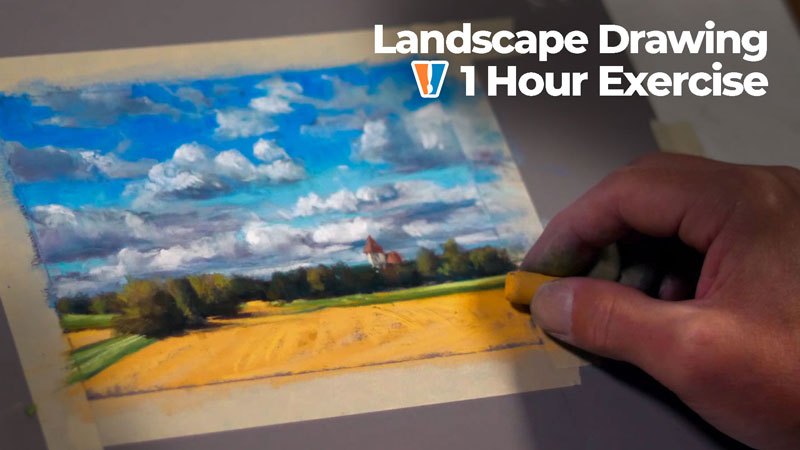
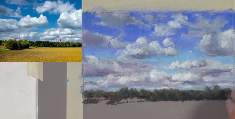
Landscape Drawing with Clouds – Pastels
Drawing a Landscape with Clouds
In this pastel drawing lesson, we’ll draw a landscape with clouds using pastels. This is a timed sketch and we’ll spend only about an hour. Here’s a look at the finished drawing…
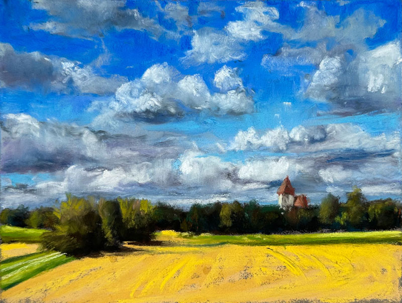
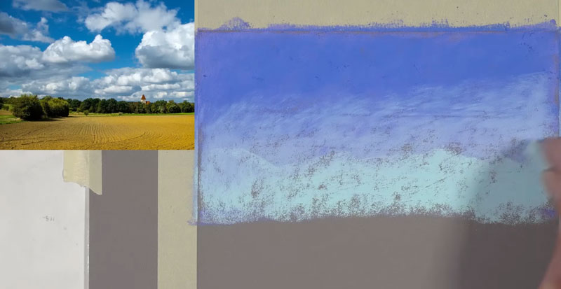
We’ll use a photo reference to complete the drawing. Here’s a look at the photo reference…
Pastel Materials
For this drawing, we’ll use Rembrandt soft pastels on Pastelmat paper. We’ll work on a darker gray surface for contrast. This type of paper is a wonderful surface for working with pastels. It has a good amount of tooth, so you can layer to your heart’s content. It blends very easily as well.
Start with the Sky
We’ll start with a medium to darker blue. We’re going to create a gradation from the top edge of the picture plane down, past the horizon line. We’re going to create a base application using several different versions of blue and then we’ll layer the clouds over the top. After our first blue, we’re going to go with a different blue. This blue is a bit more true to a primary blue. The first blue is a little bit more of a blue-purple. The layering of these colors is going to put a bit more pastel into the tooth of the paper, but it’s also going to create more depth in the color as well.
We’re going to take a lighter blue and work our way from the bottom up. Then an even lighter blue underneath is added to create a gradation or a slow change in color and value from the top edge of the picture. Then we’ll bring in another blue to ease that transition. After these blues are added, we can blend the applications with a finger.
Drawing Clouds
Now we’re ready to start putting in some of the shapes of the clouds. I’m going to use a warmer gray initially just to “block in” the shapes of the clouds. Your clouds don’t have to be exactly the same as the reference. In fact, if you look at the blues I used in my sky, they’re quite different from the blues in the reference. I’m using not the tip of the pastel, but the side of the pastel to block in the shapes.
We’re going to add a little bit of a darker value to create shadows. This is a darker gray, but it leans a towards purple. We’re going to be incorporating some purples in our clouds. In this case, the light source is coming from the left and above the clouds. As a result, the shapes of shadow are going to exist mainly on the underside of the clouds and on the right side of the clouds as well. We’re not worried about details right now. We’re only concerned about getting some colors and values in place.
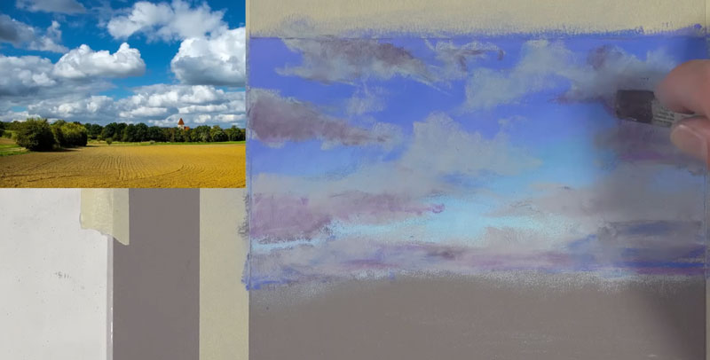
We’ll continue layering colors, including a red-purple in areas. Our goal is create the illusion of form by creating contrast in values. At the same time, we’re adding depth and interest to the color by layering.
As we go over the top of some of the pastel applications, you’ll see that some mixing occurs. We’re starting to get some of that material to look a little bit softer and more blended. It might be helpful to look at the negative shapes in between the clouds to help you get the shapes in the right place, but allow yourself some freedom here. It doesn’t have to be at an exact copy or replica of the photo.
Then, it’s back to that darker gray that leans a towards purple. Layering is so important to create depth in color. Be patient during this process and allow your layers to do the work for you. We can refine the shapes as we go with these different versions of different colors and slowly, our clouds will start to take shape. You just have to be patient here.
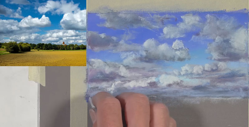
We’re going to start putting in some of the highlights and now our clouds are going to start to gradually look more three-dimensional. Our light source is originating from the upper left. We’re going to see these highlights primarily on the top parts of the clouds and more dominantly so on the left side of the clouds.
As we start to add these bits of lighter value, some additional blending occurs and our drawing is actually starting to look more like a painting. Keep in mind that you can vary the intensity of the value by adjusting the amount of pressure that you place on the pastel. If you put more pressure on the pastel, the color is going to be stronger and more intense. You can put less pressure to create more of a slow change into the darker values around these highlights.
Drawing the Trees on the Horizon
Now let’s move on to the middle ground. I’m going to start with a very dark brown, establishing the shapes of the trees that overlap the horizon line. We need a bit of variety on the top edge where the tree shapes are different. Then we’re going to go back with a dark green initially to add a bit of color. We’ll leave open some of the areas where we see the brown. We’re just establishing contrast and variety in the color.
A bit of dark gray, followed by a touch of blue is added for the shadows. I avoid using black, since it is so strong and may possibly make the drawing look flat. We make the color green by combining yellow and blue. Yellow is the lighter of the two colors, but it’s also the warmer of the two. So if we use blue for the shadowed areas, it makes more sense for something that’s green like a tree.
For the highlights, we use a lighter yellow-green, considering the light source. Since the light source is coming from the left side, the left portions of these trees are going to be highlighted. I’m also using a little bit of burnt ochre here and there to add a little bit more variety to the color. If you look closely at the tree line, you can see some of those oranges popping through.
With a bit of distance from the piece, you can see how this illusion is starting to make sense. We can see the clouds and we can see them overlapped by the line of trees. Now, in between some of the areas of the trees and also on the lower part of the edge of the trees, I’m using a much darker green here. This is a cooler green, but it is much darker than the greens that we’ve used so far.
I decided to just use the pastel sticks for the building, but pastel pencils are also an option. I’m going to start with the roof using a little bit of burnt ochre. Initially, we’ll use the dark brown to create a shadowed shape, followed by a very, very light yellow-green for the edge of the building. That front edge is picking up most of the light, so it’s slightly lighter in value. We will use a darker brown to create the shadow, and then we’ll go back over the top of it with that very light yellow green.
Drawing the Field in the Foreground
Now we’ll move on to the foreground. We’re going to allow the foreground to overlap the middle ground. I’m going to start with yellow ochre, defining the shape of the yellow parts of the field. Once the overall shape is defined, we’ll add a bit more of a bolder color. This is still somewhat of a yellow ochre, it’s just more saturated. Then stepping up the saturation scale even further, we’re going to go with a yellow that’s more like a primary yellow.
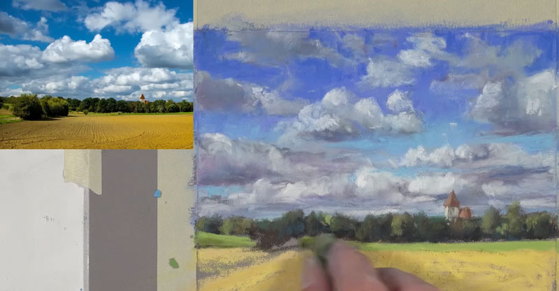
I’m using my directional strokes here to indicate the texture in the field. You could go in with a darker brown to make it more visible, but in this case, I’m going to insinuate the texture. We’ll add some light yellow-green in the background for some of that grass that’s off in the distance.
Then, we’ll go a bit darker. There is quite a bit of variety in the value and color in these green sections, so a slightly darker yellow-green and then an even lighter yellow-green to make some of the highlights stronger. With just three colors, we have quite a bit of variety in that green grassy section. Using a yellow-green, we’ll go ahead and define that small strip of grass on the left side of the picture plane. We’ll use a lighter version and a darker version to add variety.
Now, we’re going to go ahead and define the shapes of the trees in the foreground. We’re just concerned about the shape initially. We’ll go ahead and pull out some indication of the cast shadow on the field. Again, we’ll use a bit of dark blue on the shadowed sides of these trees. We know that these trees are green so we’re using blue in the shadowed section. Then we use that dark gray again to create some darker shadows before going back over the top of it all with a bit of yellow green.
A touch of burnt ochre is added as well. If you squint, you can see these bits of orange. Then with a bit more pressure, we will bump up the intensity of the highlights with the yellow-green.
Completing the Drawing of a Landscape with Clouds
We’ll continue to add more texture in the field and the foreground. I’m going to let some of the texture of the paper still show through here in the foreground just to get more variety in the value. Then we’ll use just a touch of cream to add the road around the grassy area in the foreground. Then, it’s time to peel back our tape because at this point I’ve spent around an hour on this pastel sketch.
Landscape Drawing with Pastels – Conclusion
While pastels are applied dry, making them a drawing medium, the process and the end result is more like painting. For this reason, we must think and work as a painter. Instead of lines, we should think in terms of shapes of color and value. Since layering is integral to our success, we must be patient as well and let the drawing develop into a finished painting.
If so, join over 36,000 others that receive our newsletter with new drawing and painting lessons. Plus, check out three of our course videos and ebooks for free.
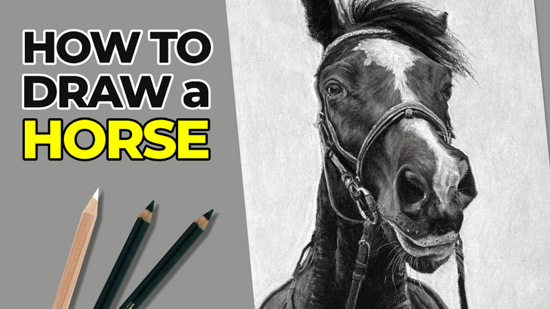
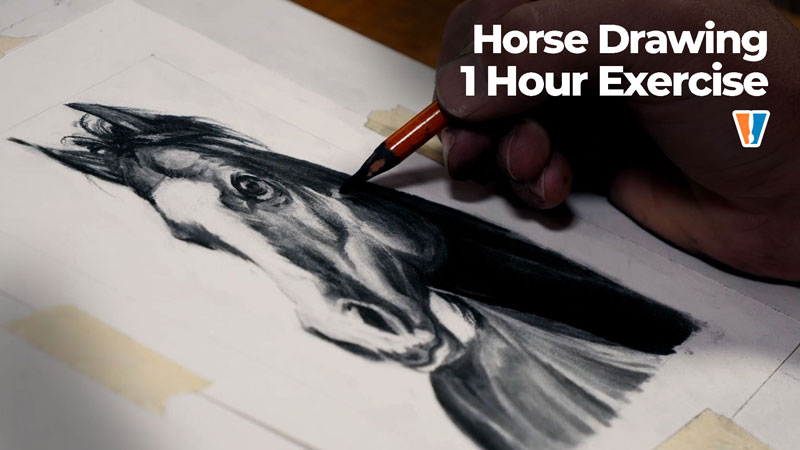
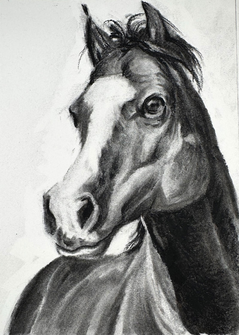
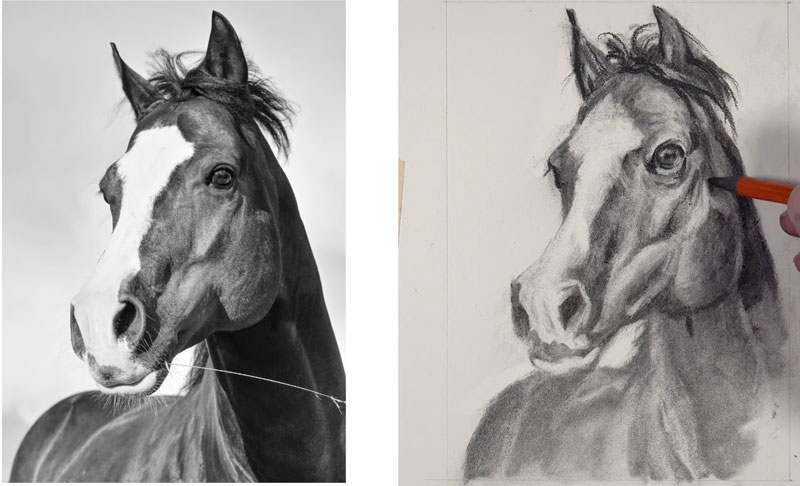
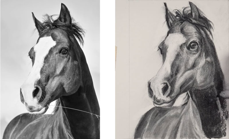
How to Sketch a Horse with Charcoal
Horse Drawing with Charcoal
In this charcoal drawing lesson, we’ll draw a horse with charcoal in about an hour. Here’s a look at the finished drawing…
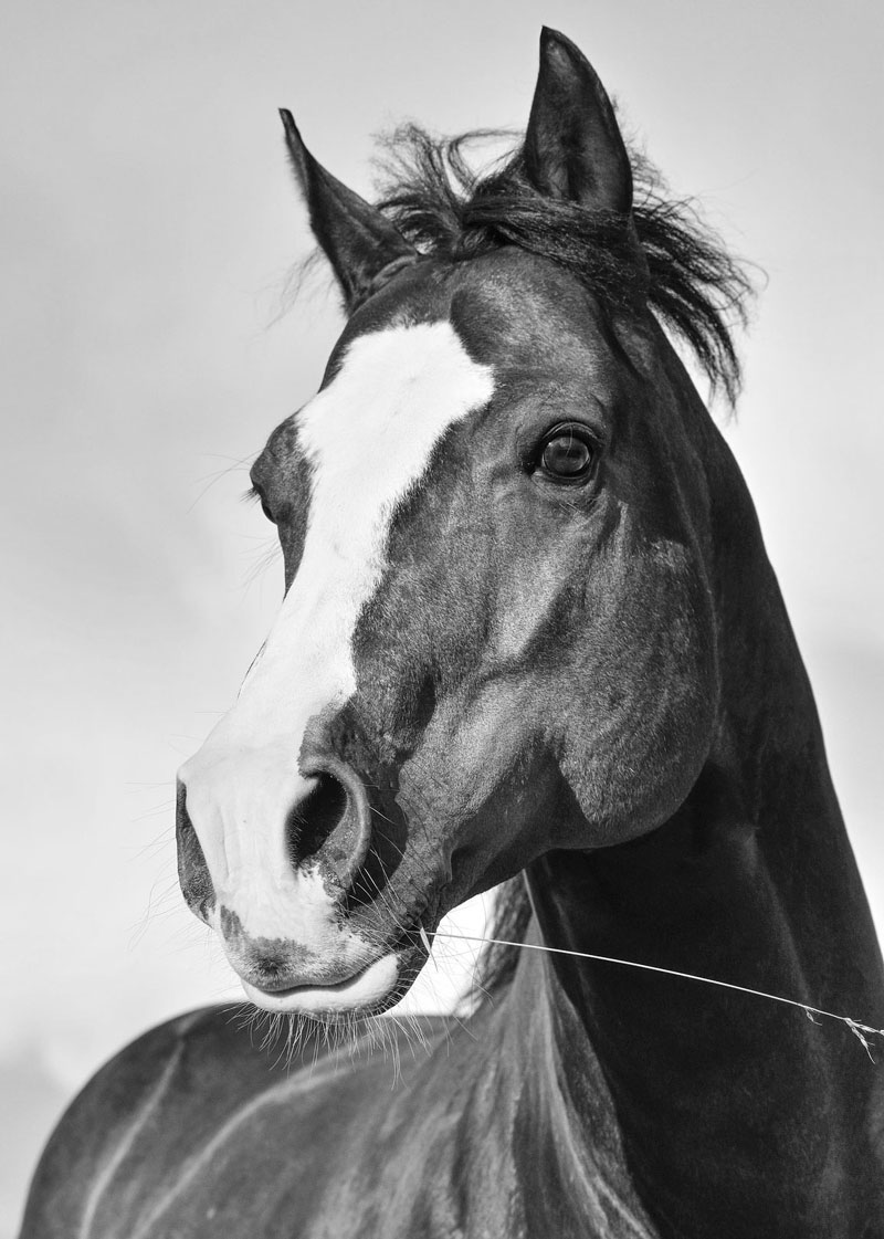
We’ll use a photo reference to complete the drawing. Here’s a look at the photo reference…
Charcoal Materials
For this drawing, we’ll be working with vine or willow charcoal which is very soft and brittle but easily blended and removed from the surface. We’ll also be using compressed charcoal in the form of a charcoal pencil. We’ll also be using a blending stump. You can use a blending stump or a blending tortillon. We’ll be working with a couple of erasers, a kneaded eraser and also a vinyl eraser for more precision erasing.
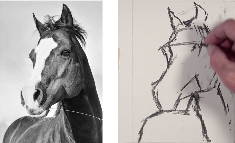
Sketching the Contours of the Horse
We’ll begin making marks with a small stick on vine charcoal. I’m just looking at the contour lines and trying to find shapes as well. I’m making comparisons between the negative space around the horse and the negative space on my drawing paper to find the shapes. I’ll draw a line across the brow line that’ll help me understand where the tops of the eyes are located. Once I have these initial marks in place, I can use them to make comparisons as I add the remainder of the marks for the rest of the head of the horse, the neck and the lower portion of the body.
Shading the Horse
Now that we have a rough contour line drawing in place, we’re going to shift our gears a little bit and begin thinking about value. Value is the darkness or lightness of a color. We need to have a full range of value in this piece, meaning we need to have the darkest darks and the lightest lights and the full range of grays in between. Sticking with the vine charcoal, I’m going to start planning out some of the areas where I see shapes of darker value. I’m also going to go ahead and give this drawing a quick little smudge here. This will pull some of the soft vine charcoal into some of the open spaces and provide us with a nice gray base in which to manipulate the values.
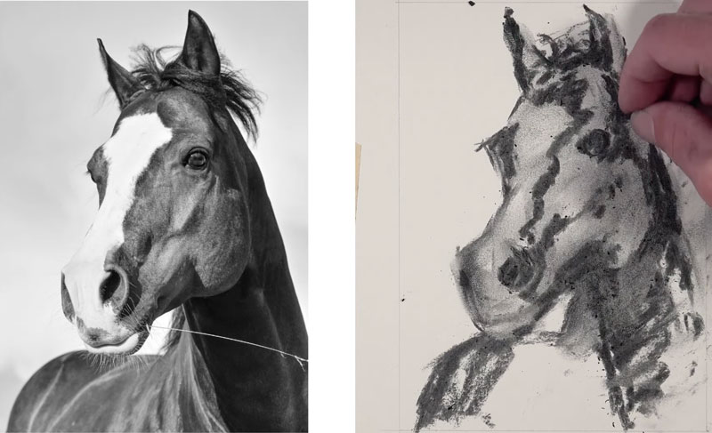
Don’t worry that your drawing is getting messed up at this point. I know it’s really easy to do, especially if you’re accustomed to drawing with pen and ink or graphite. But charcoal is a different medium entirely. We can move the charcoal around on the surface and erase relatively easily.
With the blending stump, I’m going to go ahead and pull out a few lines for some of the hair at the top. We’ll find this later in the process. And we’re going to go ahead and go down into the face or the head of the horse and start pulling some of those dark to medium values around.
I’m continually going back and forth with my eyes between the photo reference and the drawing surface, continually making comparisons between the shapes that I see and the shapes that I am including in the drawing.
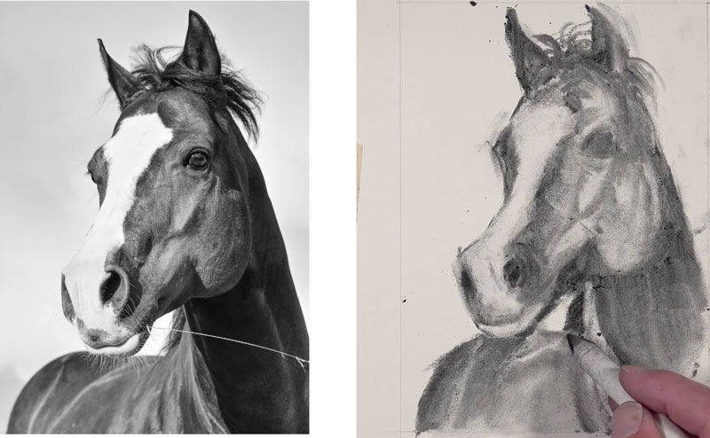
I’ve switched over to a more precise eraser. This is a vinyl eraser, so it’s a tougher eraser than the kneaded eraser. It does leave some shavings on the surface, but you can blow these away or brush them away with a drafting brush.
Now we’ve got a faint version of our horse in place with some of the values. We’re going to go ahead and continue the process of darkening the values. I’m using a charcoal pencil here, but you’ll see I quickly switch back to the vine charcoal since I’m not quite ready to commit to some of the areas of darker value.
I like to think of working with charcoal somewhat like working with a ball of clay. If you’re trying to make something out of clay, you start with a ball of clay and you have to continue to move it around until you get your sculpture in place. Well, the same thing’s true with charcoal. We start with a very loose interpretation of the subject, and then we gradually refine the drawing using our tools, so the charcoal of course, the blending stump, and also the erasers.
There is a slight reflected highlight on the right side of the jaw, so I’ve used the kneaded eraser to remove that.
Now I’ve switched over to the compressed charcoal pencil. We’re going to get a little bit more defined with some of our details and get quite a bit darker with our darkest values. This will expand the contrast within the scene and create a more full, more natural range of value.
Keep in mind that the compressed charcoal pencil is more difficult to erase compared to the vine charcoal so the marks that you make at this stage are going to be more permanent. You can still blend and smooth transitions of value using the blending stump with compressed charcoal, but erasing is definitely more difficult.
We’ll go ahead and start from the top and work our way to the bottom after we’ve addressed the eye. After adding some of those darker values with the compressed charcoal, I’m using a blending tool to smooth those transitions. We’ll also add some lines for the wispy hair at the top.
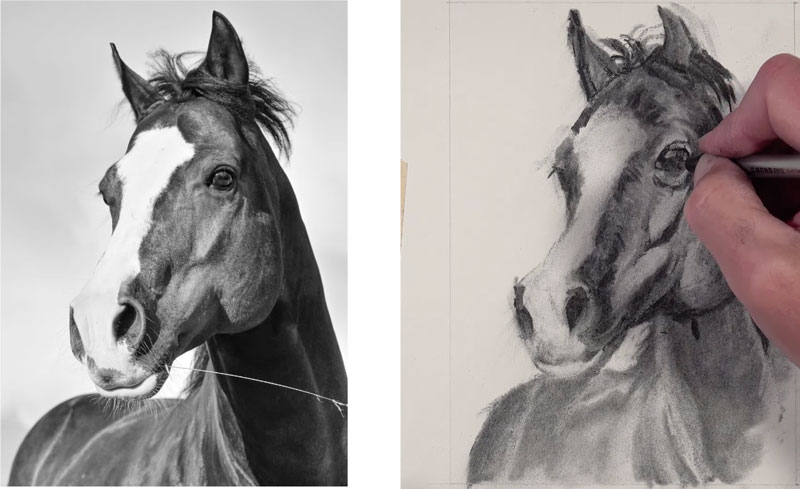
Developing Details on the Horse
Our details are beginning to emerge. We’ll continue switching back and forth between the different forms of charcoal, along with the erasers, to refine the details.
Continue working back and forth with your eyes to find small details and refine them in your drawing. At this point, things slow down a bit. Take your time and make changed to your drawing as necessary.
Completing the Drawing of a Horse
Determining when you’re finished with the drawing is up to you. The beauty of charcoal is that there are several stages that you can call the drawing “complete”. Decide when you have added enough details and refinement to call your drawing complete. At this point, I have spent around one hour on the drawing, and while I could continue, I decide that my sketch is complete.
Charcoal Drawing of a Horse – Conclusion
Charcoal has a reputation of being messy and difficult to control. However, charcoal is quite forgiving and allows the artist to make changes throughout the drawing process. Pay attention to the shapes of value instead of lines. Take your time and allow the drawing to go through the necessary stages to completion. Don’t get frustrated and just keep making adjustments until you are happy with the results.
If so, join over 36,000 others that receive our newsletter with new drawing and painting lessons. Plus, check out three of our course videos and ebooks for free.