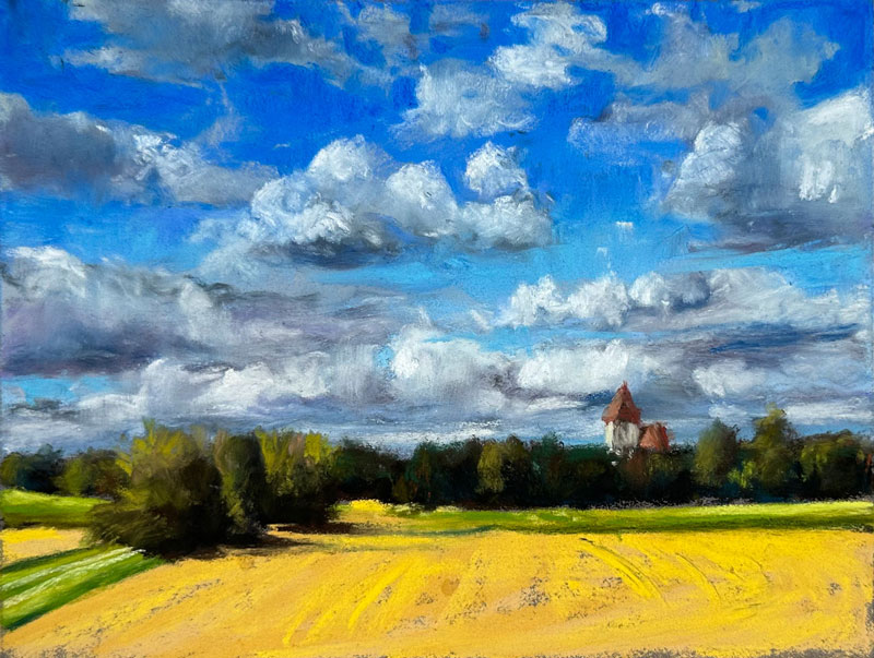
Drawing a Landscape with Clouds
In this pastel drawing lesson, we’ll draw a landscape with clouds using pastels. This is a timed sketch and we’ll spend only about an hour. Here’s a look at the finished drawing…
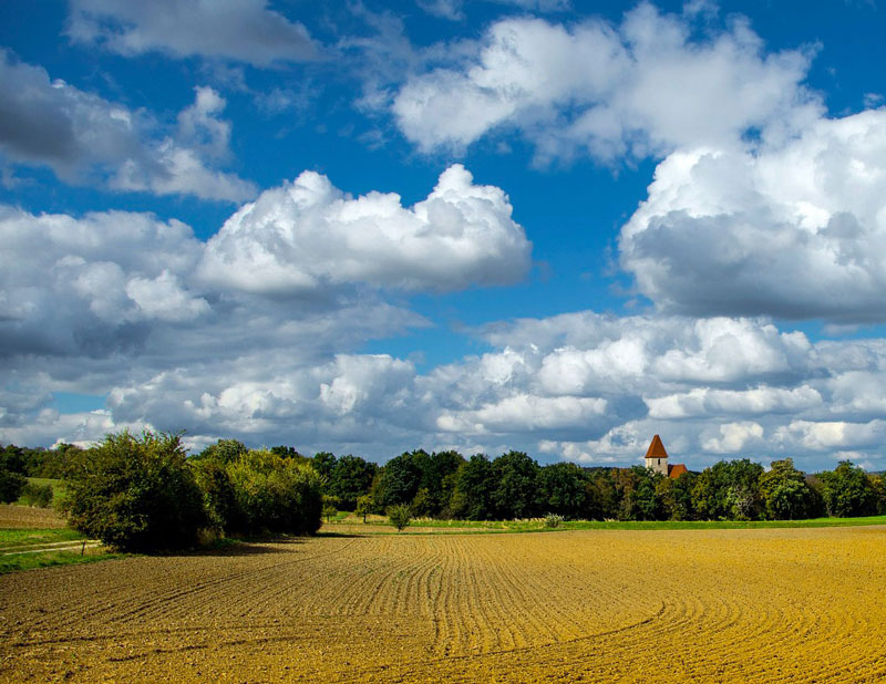
We’ll use a photo reference to complete the drawing. Here’s a look at the photo reference…
Pastel Materials
For this drawing, we’ll use Rembrandt soft pastels on Pastelmat paper. We’ll work on a darker gray surface for contrast. This type of paper is a wonderful surface for working with pastels. It has a good amount of tooth, so you can layer to your heart’s content. It blends very easily as well.
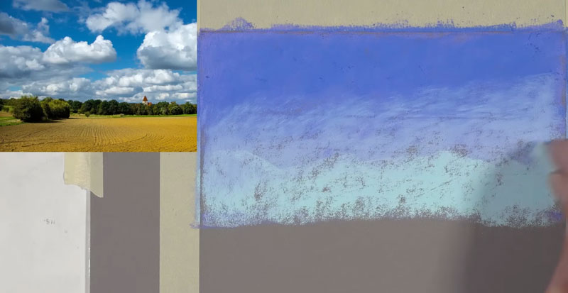
Start with the Sky
We’ll start with a medium to darker blue. We’re going to create a gradation from the top edge of the picture plane down, past the horizon line. We’re going to create a base application using several different versions of blue and then we’ll layer the clouds over the top. After our first blue, we’re going to go with a different blue. This blue is a bit more true to a primary blue. The first blue is a little bit more of a blue-purple. The layering of these colors is going to put a bit more pastel into the tooth of the paper, but it’s also going to create more depth in the color as well.
We’re going to take a lighter blue and work our way from the bottom up. Then an even lighter blue underneath is added to create a gradation or a slow change in color and value from the top edge of the picture. Then we’ll bring in another blue to ease that transition. After these blues are added, we can blend the applications with a finger.
Drawing Clouds
Now we’re ready to start putting in some of the shapes of the clouds. I’m going to use a warmer gray initially just to “block in” the shapes of the clouds. Your clouds don’t have to be exactly the same as the reference. In fact, if you look at the blues I used in my sky, they’re quite different from the blues in the reference. I’m using not the tip of the pastel, but the side of the pastel to block in the shapes.
We’re going to add a little bit of a darker value to create shadows. This is a darker gray, but it leans a towards purple. We’re going to be incorporating some purples in our clouds. In this case, the light source is coming from the left and above the clouds. As a result, the shapes of shadow are going to exist mainly on the underside of the clouds and on the right side of the clouds as well. We’re not worried about details right now. We’re only concerned about getting some colors and values in place.
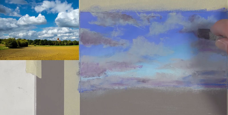
We’ll continue layering colors, including a red-purple in areas. Our goal is create the illusion of form by creating contrast in values. At the same time, we’re adding depth and interest to the color by layering.
As we go over the top of some of the pastel applications, you’ll see that some mixing occurs. We’re starting to get some of that material to look a little bit softer and more blended. It might be helpful to look at the negative shapes in between the clouds to help you get the shapes in the right place, but allow yourself some freedom here. It doesn’t have to be at an exact copy or replica of the photo.
Then, it’s back to that darker gray that leans a towards purple. Layering is so important to create depth in color. Be patient during this process and allow your layers to do the work for you. We can refine the shapes as we go with these different versions of different colors and slowly, our clouds will start to take shape. You just have to be patient here.
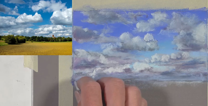
We’re going to start putting in some of the highlights and now our clouds are going to start to gradually look more three-dimensional. Our light source is originating from the upper left. We’re going to see these highlights primarily on the top parts of the clouds and more dominantly so on the left side of the clouds.
As we start to add these bits of lighter value, some additional blending occurs and our drawing is actually starting to look more like a painting. Keep in mind that you can vary the intensity of the value by adjusting the amount of pressure that you place on the pastel. If you put more pressure on the pastel, the color is going to be stronger and more intense. You can put less pressure to create more of a slow change into the darker values around these highlights.
Drawing the Trees on the Horizon
Now let’s move on to the middle ground. I’m going to start with a very dark brown, establishing the shapes of the trees that overlap the horizon line. We need a bit of variety on the top edge where the tree shapes are different. Then we’re going to go back with a dark green initially to add a bit of color. We’ll leave open some of the areas where we see the brown. We’re just establishing contrast and variety in the color.
A bit of dark gray, followed by a touch of blue is added for the shadows. I avoid using black, since it is so strong and may possibly make the drawing look flat. We make the color green by combining yellow and blue. Yellow is the lighter of the two colors, but it’s also the warmer of the two. So if we use blue for the shadowed areas, it makes more sense for something that’s green like a tree.
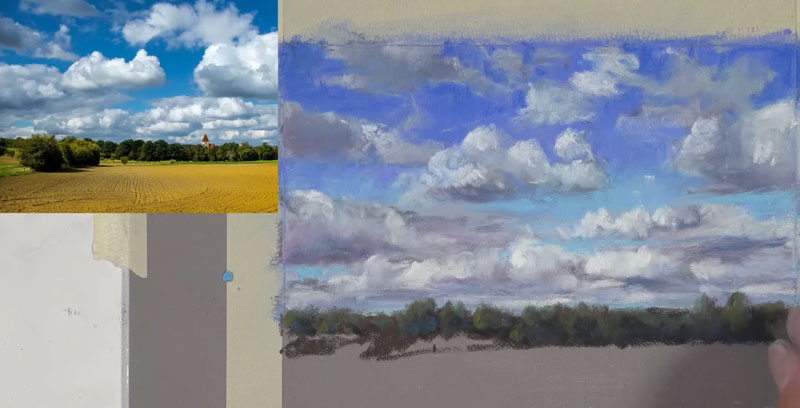
For the highlights, we use a lighter yellow-green, considering the light source. Since the light source is coming from the left side, the left portions of these trees are going to be highlighted. I’m also using a little bit of burnt ochre here and there to add a little bit more variety to the color. If you look closely at the tree line, you can see some of those oranges popping through.
With a bit of distance from the piece, you can see how this illusion is starting to make sense. We can see the clouds and we can see them overlapped by the line of trees. Now, in between some of the areas of the trees and also on the lower part of the edge of the trees, I’m using a much darker green here. This is a cooler green, but it is much darker than the greens that we’ve used so far.
I decided to just use the pastel sticks for the building, but pastel pencils are also an option. I’m going to start with the roof using a little bit of burnt ochre. Initially, we’ll use the dark brown to create a shadowed shape, followed by a very, very light yellow-green for the edge of the building. That front edge is picking up most of the light, so it’s slightly lighter in value. We will use a darker brown to create the shadow, and then we’ll go back over the top of it with that very light yellow green.
Drawing the Field in the Foreground
Now we’ll move on to the foreground. We’re going to allow the foreground to overlap the middle ground. I’m going to start with yellow ochre, defining the shape of the yellow parts of the field. Once the overall shape is defined, we’ll add a bit more of a bolder color. This is still somewhat of a yellow ochre, it’s just more saturated. Then stepping up the saturation scale even further, we’re going to go with a yellow that’s more like a primary yellow.
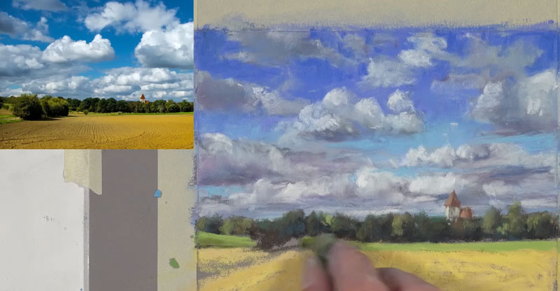
I’m using my directional strokes here to indicate the texture in the field. You could go in with a darker brown to make it more visible, but in this case, I’m going to insinuate the texture. We’ll add some light yellow-green in the background for some of that grass that’s off in the distance.
Then, we’ll go a bit darker. There is quite a bit of variety in the value and color in these green sections, so a slightly darker yellow-green and then an even lighter yellow-green to make some of the highlights stronger. With just three colors, we have quite a bit of variety in that green grassy section. Using a yellow-green, we’ll go ahead and define that small strip of grass on the left side of the picture plane. We’ll use a lighter version and a darker version to add variety.
Now, we’re going to go ahead and define the shapes of the trees in the foreground. We’re just concerned about the shape initially. We’ll go ahead and pull out some indication of the cast shadow on the field. Again, we’ll use a bit of dark blue on the shadowed sides of these trees. We know that these trees are green so we’re using blue in the shadowed section. Then we use that dark gray again to create some darker shadows before going back over the top of it all with a bit of yellow green.
A touch of burnt ochre is added as well. If you squint, you can see these bits of orange. Then with a bit more pressure, we will bump up the intensity of the highlights with the yellow-green.
Completing the Drawing of a Landscape with Clouds
We’ll continue to add more texture in the field and the foreground. I’m going to let some of the texture of the paper still show through here in the foreground just to get more variety in the value. Then we’ll use just a touch of cream to add the road around the grassy area in the foreground. Then, it’s time to peel back our tape because at this point I’ve spent around an hour on this pastel sketch.
Landscape Drawing with Pastels – Conclusion
While pastels are applied dry, making them a drawing medium, the process and the end result is more like painting. For this reason, we must think and work as a painter. Instead of lines, we should think in terms of shapes of color and value. Since layering is integral to our success, we must be patient as well and let the drawing develop into a finished painting.
If so, join over 36,000 others that receive our newsletter with new drawing and painting lessons. Plus, check out three of our course videos and ebooks for free.