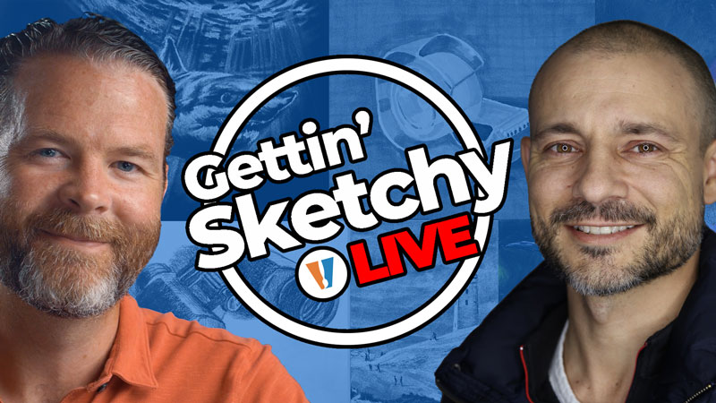
Gettin’ Sketchy: Season 14
Episodes
About Gettin’ Sketchy – Season 14…
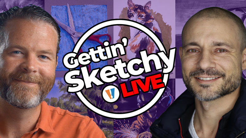
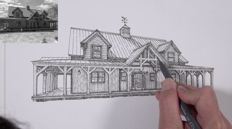
Gettin’ Sketchy Live is an original live broadcast. The goal is produce a sketch within 45 minutes while providing art instruction and entertainment. In this season, Matt and Ashley choose their own subjects and materials. Each episode is a new adventure with different subjects and drawing media.
Episode 1: Wolf with Pastels
In this live art lesson, Ashley will have 45 minutes to create a drawing of a wolf with pastels on black paper. In this lesson, we’ll develop shapes of color and value to create a painterly drawing.
Episode 2: Dancer with Charcoal
In this live art lesson, Matt will have 45 minutes to create a figure drawing of a dancer with black and white charcoal on gray paper. In this lesson, we’ll focus on proportion, shape and value to create the drawing.
Episode 3: Pills with Graphite
In this live art lesson, Ashley will have 45 minutes to create a still life drawing of pill medicine using graphite on white drawing paper. In this lesson, powdered graphite, graphite pencils and erasers are used to render the unusual still life subject.
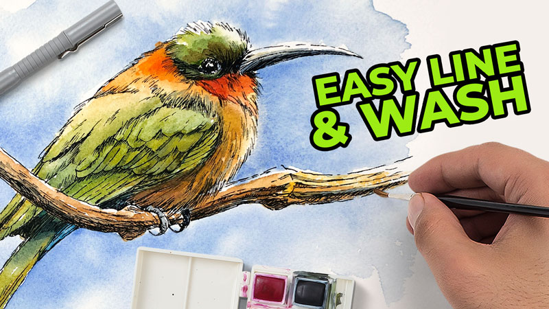
Episode 4: Birds with Watercolor
In this live art lesson, Matt will have 45 minutes to create a watercolor painting of a couple of colorful birds on watercolor paper. In this lesson, we’ll draw the contours with graphite before adding watercolor and watercolor pencils to complete the painting.
Episode 5: Rocket
In this live art lesson, Ashley will have 45 minutes to create a drawing of a rocket or spaceship with markers, pens and gouache on marker paper. In this lesson, we’ll draw the contours with pencil before layering markers and gouache.
Episode 6: Stormy Seas
In this live art lesson, Matt will have 45 minutes to create a drawing of a boat in rough seas with pastels on dark gray PastelMat paper. In this lesson, we’ll draw the boat from a reference photo, but develop the background and foreground from imagination.
Episode 7: Subway
In this live art lesson, Ashley will have 45 minutes to create a drawing of the inside of a train station that features linear perspective with charcoal on white drawing paper. In this lesson, we’ll use both additive and subtractive techniques to develop the drawing.
Episode 8: Space Walk
In this live art lesson, Matt will have 45 minutes to create a drawing of an astronaut walking on the moon with PanPastel, pastel, pastel pencils and gouache on dark blue pastel paper. In this lesson, you’ll learn techniques for figure drawing and mixing media.
Episode 9: Hare
In this live art lesson, Ashley will have 45 minutes to create a drawing of a hare (rabbit) with graphite pencils on textured Bee stipple paper. In this lesson, you’ll learn techniques for drawing with graphite on heavily textured paper.
Episode 10: Falling Man
In this live art lesson, Matt will have 45 minutes to create a drawing of a man falling from the sky with graphite on white Stonehenge paper. In this lesson, we’ll combine powdered graphite and graphite pencils to develop dark values and use the eraser to develop highlights.
Episode 11: Season 14 Review and Critique
In this live drawing critique, we look back on the drawings we created during Season 14 of Gettin’ Sketchy and quickly critique each piece. We choose our favorite drawings and encourage you to choose your favorites as well. Join the chat and join in the discussion as we look back on what we created.
Resources for this Lesson…
Distributing any content downloaded from this site is strictly prohibited and against the terms and conditions of use.
References
Here’s what you’ll need…
(Disclosure: Links to art materials are affiliate links which means we make a small commission if you purchase at no additional cost to you.)
Episode 1: Wolf
Episode 2: Dancer
- Gray Drawing Paper
- Vine and Compressed Charcoal
- Whiter Charcoal
Episode 3: Pills
- White Drawing Paper
- Graphite Pencils
Episode 4: Birds
- 140 lb. Cold Pressed Watercolor Paper
- Watercolor Paints
- Watercolor Pencils
Episode 5: Rocket
- Marker Paper
- Prismacolor Markers
- Black Ink Pens
Episode 6: Stormy Seas
Episode 7: Subway
- Vine and Compressed Charcoal
- White Drawing Paper
Episode 8: Space Walk
Episode 9: Hare
- Bee Stipple Paper
- Graphite Pencils
Episode 10: Falling Man
- White Drawing Paper
- Graphite Pencils
- Powdered Graphite
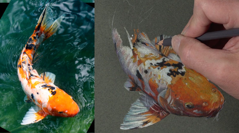
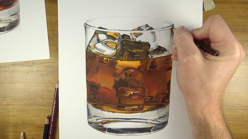
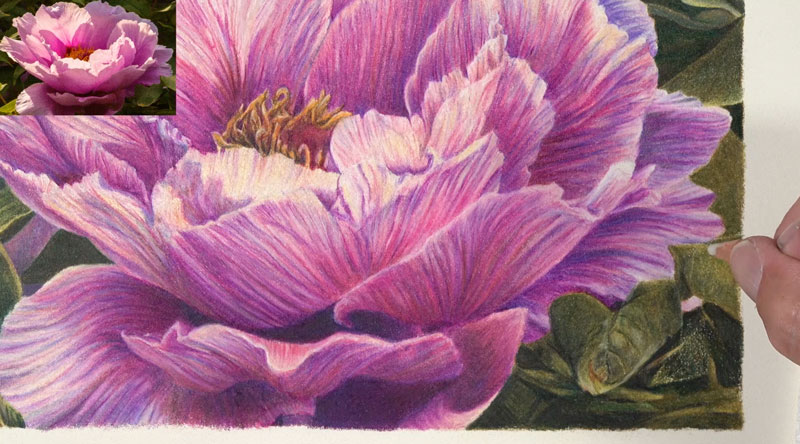
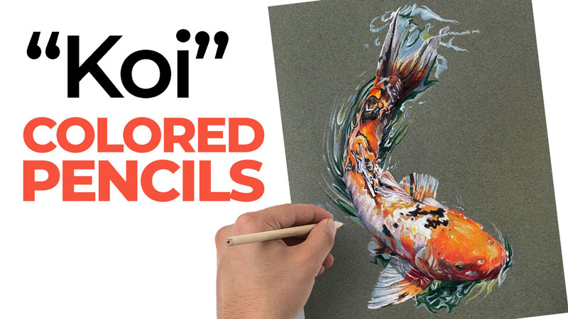
Secrets to Success – Colored Pencils
Success with Colored Pencils
Colored pencils are one of the most rewarding mediums to work with. A finished colored pencil drawing, when done correctly, can resemble a painting. But colored pencils are perhaps the most misused medium on the planet. In this lesson, I’ll share 7 secrets to success with colored pencils that you can apply to your own colored pencil drawings.
Secret # 1 – Layer and Mix Colors
Colored pencils are designed to be layered. When they are layered, mixing naturally occurs. Mixed colors have a more realistic appearance. When colors are mixed and layered, the complexity of the resulting color has more depth and interest.
This means that when you layer and mix colors, your colored pencil drawing is more realistic and more interesting. So instead of trying to find a pencil that is a perfect match, consider creating this color by layering and mixing.
Secret # 2 – Work on a Slightly Textured Paper
Because layering is so important with colored pencils, we need to work on papers that will allow multiple layered applications. This means that papers with a slightly heavier tooth will perform better. Avoid papers with a super heavy texture and look for papers that have a medium texture.
Papers such as Canson Mi-Tientes paper, PastelMat paper, and Stonehenge papers are all wonderful surfaces for colored pencils. Also consider papers that have a tone or color. While most of us assume that colored pencil drawings must be created on a white surface, colored papers are sometimes a better choice.
See also: Best Papers for Colored Pencils
Secret # 3 – Build Up Solid Applications
Colored pencils are at their best when the applications are solid. When colored pencils are layered, more of the material is applied to the surface. Our goal should be focused on filling the tooth of the paper completely with the colored pencil medium. This leads to an appearance more like a painting instead of a drawing.
Most people who are new to colored pencils assume that they should be used in the same way as a graphite pencils. But colored pencils are a completely different medium and look their best when most, if not all, of the paper is covered.

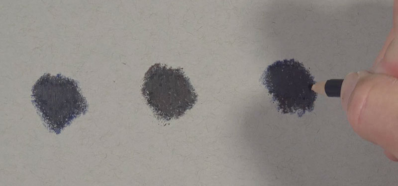
Secret #4 – Burnish and Blend Applications
Burnishing with colored pencils is the process of smoothing or blending applications with a tool or solvent. By burnishing, we create smooth transitions between colors and values. This is an essential part of drawing with colored pencils.
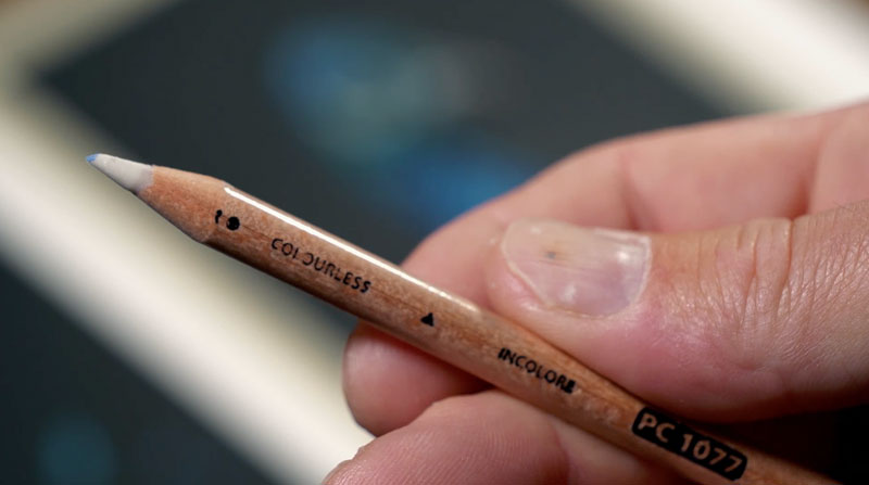
Burnishing can be accomplished by using a special pencil, called a colorless blender. This pencil has a core of colorless colored pencil medium. When applied over areas of color, the wax of the pencil works to blend and smooth applications, working the material into the tooth of the paper. The result is a more consistent application with smoother transitions.
Burnishing can also be accomplished using a light colored pencil. Lighter grays, Creams, and White can be used to burnish applications. Keep in mind, however, that burnishing with a light pencil will also lighten the values of the colors in that area.
You can also burnish areas using a solvent. Gamsol, mineral spirits, and baby oil are all acceptable solvents for burnishing. These solvents can be lightly applied with a brush over areas of color, producing similar results as a colorless blender.
See also: How to Blend Colored Pencils
Secret #5 – More Colors are Better
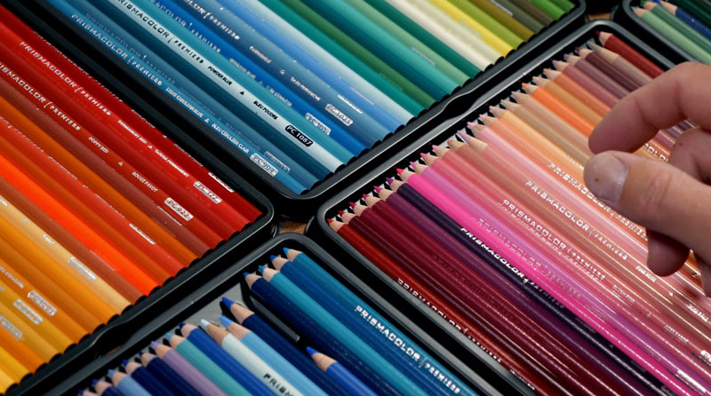
With traditional painting mediums, like oils, acrylics, and watercolor, we can mix almost any color with just a handful of pigments. With colored pencils, mixing is more difficult. This means that we are limited in the colors we can create through mixing. Because of this, it’s better to have more choices when we create our drawings.
Having more colors at your disposable means that you have a better chance of matching and mixing colors that you need to complete a drawing. With just a few colors, your options are limited. So unlike other mediums, having more colors is better.
See also: The Best Colored Pencils
Secret #6 – Be Careful with White and Black
The colors white and black are neutral colors. These colors are essential for mixing different values of colors. But, when white or black is used on its own in a colored pencil drawing, the result can look unnatural. Instead, consider lighter or darker values of colors. For example, you may consider using 90% Cool Gray instead of black – or 10% Cool Gray instead of white. These colors result in a more natural appearance and keep your drawing from looking flat.
If you need a black in an area within a drawing, you can mix your own. By layering Indigo Blue and Dark Umber, the result is a more colorful black. You can control the temperature of the black as well. By adding more brown, you create a warmer black. By adding more blue, you create a cooler black. Make sure your blacks and whites have a little color in them in order to create more natural looking colored pencil drawing.
Secret #7 – Work Slowly
When used correctly, colored pencils are one of the slowest mediums available to artists. Layering and mixing takes time to develop. Filling the tooth completely is also a slow process. Burnishing also requires time. Be prepared to work slowly when working with colored pencils. I like to work in small areas within a drawing, completing these areas as I go. This gives me small wins along the way and encourages me to continue.
If you hurry through a colored pencil drawing, your results will reflect this. Instead work slowly, take your time, and let your drawing develop at its own pace. While it will take more time to complete a colored pencil drawing, your time will be well spent in the end – if you work slowly.
If so, join over 36,000 others that receive our newsletter with new drawing and painting lessons. Plus, check out three of our course videos and ebooks for free.
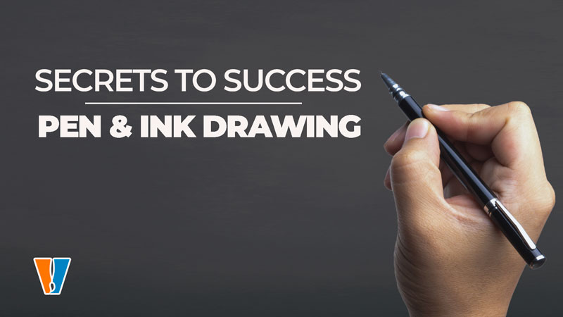
Secrets to Success – Pen and Ink Drawing
Success with Pen and Ink Drawing
Pen and ink is a wonderful medium for creating impactful drawings. The use of black ink on white paper results in maximum contrast. However, some people are intimidated by the permanence of ink and are afraid to push the medium to its fullest potential. But pen and ink should not be scary. If you know a few secrets, which I’m going to share with you, you can find success with pen and ink.
Secret # 1 – Work on Papers with a Smooth Tooth
The texture of the paper that you work on is commonly referred to as tooth. For pen and ink drawing, smoother papers typically perform better than those with a heavier tooth. Heavily textured papers produce inconsistent, broken lines and can wear out your pen quickly.
Smoother papers, however, allow your pen to glide over the surface – resulting in more controlled, clean lines. For cleaner pen and ink drawings, consider working on papers such as Bristol Smooth or papers specifically designed for pen and ink – like pen and ink paper.
See also: All About Drawing Papers
Secret # 2 – Start with a Light Pencil Drawing
Some people believe that you should never create a pencil drawing prior to adding ink. They argue that a pen and ink drawing should be purely pen and ink. However, most accomplished pen and ink artists always start with a pencil underdrawing.
Starting with a pencil drawing ensures accuracy and allows you study the subject prior to making permanent marks with ink. You can work out in your mind how you plan to address certain areas of the drawing before committing to marks that are impossible to erase. A pencil is more forgiving and allows you to make mistakes in the early stages of the drawing.
Just be sure to create your pencil drawing with a light pencil – like an H or 2H and use a light touch when making marks. Avoid shading with the pencil and keep as little graphite on the surface as possible. Any remaining pencil marks can easily be erased after the ink has dried.
Secret # 3 – Practice with Line
Line is one of the 7 elements of art. In fact, it is the most foundational of the elements. Line is arguably the most important element of art when it comes to pen and ink. We use line to define the edges of subjects – but it does more than that.
We also use line to develop value relationships in a pen and ink drawing. This means that when hatching and cross hatching are used – line is the main element used to develop value. And value tells the viewer about the light within the scene, the form of the subjects, and the texture.
This is why line is so important in pen and ink drawing. If you want to improve your pen and ink drawing, then you must focus on practicing drawing with line.
Secret #4 – Use Directional Stroking
The direction that you push or pull your strokes plays a role in the success of a pen and ink drawing. When developing values on the subject, you should consider the form and texture of the subject. This will help determine the direction that you make your strokes with the pen.
Strokes should be pulled over the form of the subject, changing direction according to the specific plane of the form. This type of line is called a cross contour line – since it flows over the contour of the subject.
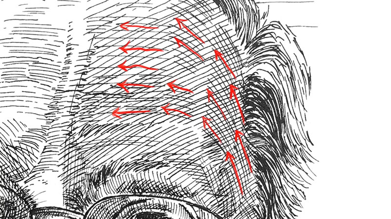
Use cross contour lines when developing the shading with hatching and cross hatching. Avoid using flat lines since this will make your drawing appear flat as well. By pulling lines over the form of the subject, we not only develop the values, but also the form of the subject.
Secret #5 – Vary Line Quality
I like to think of line quality as the thickness or thinness of a line. Instead of using just one thickness of line, be sure to vary the line – especially around the outer contours of the subject. Allow your line to get thicker in areas of shadow or where the subject gets thicker.
Create variety. It can be subtle – but even subtle changes in line can go a long way in creating a more interesting drawing. Your lines don’t have to be complete lines either. Including broken lines can help indicate highlights or areas of lighter value. Variety is the spice of life, but it’s also a principle of art. By varying the line quality we create more communicative and interesting pen and ink drawings.
Secret #6 – Be Consistent with Your Applications
There are lots of different ways to mark marks with pen and ink. There’s hatching, crosshatching, random lines, stippling and more. While it may be tempting to incorporate every technique you know into one drawing – it’s better to stay consistent with just one technique.
While we need variety in our drawings, we also need harmony – another principle of art. To ensure harmony in a pen and ink drawing, pick an application technique suitable for the subject and stick with it. If you start with cross hatching – stick with cross hatching. If you start with stippling – stick with stippling. Try not to mix methods. In other words, don’t use stippling with hatching and vice versa.
Secret #7 – Experiment
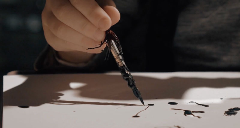
There are many different ways to apply ink to the drawing surface. Most of us simply use a technical drawing pen. However, you can create a broader variety of marks by experimenting with different techniques. While I love my technical drawing pens, I also love using dips pens. While this technique is more labor insensitive, I find that I have more control over my marks and can create more variety when ink is applied in this manner.
You can apply ink using just about anything – from a brush to a stick. If you’ve never tried a different way to apply ink, experiment to discover new ways to create marks.
If so, join over 36,000 others that receive our newsletter with new drawing and painting lessons. Plus, check out three of our course videos and ebooks for free.
Secrets to Success – Pencil Drawing
Success with Pencil Drawing
Graphite pencils are usually the very first medium we reach for when we first begin drawing. This makes this medium a comfortable choice for many artists. But if you want to use the medium to its fullest potential, there are few secrets to keep in mind. Implementing the strategies that I’m going to share in this video will greatly improve your pencil drawings. Let’s dive in.
Secret #1 – Use a Variety of Grades of Graphite
Graphite comes in many forms, but most of use are most familiar with graphite pencils. The graphite in each pencil is graded based on the softness or hardness of the pencil. Pencils with an H are harder and thus produce a lighter mark. B pencils are softer and produce a darker mark. The higher the first number on the pencil, the more intense the hardness or softness.
Accomplished graphite artists use a range of pencils to create their drawings. H pencils are mostly used for preliminary sketching, while B pencils are mostly used for shading. In order to create a full range of tone and value in our drawings, we must use pencils that are dark enough to create dark tones.
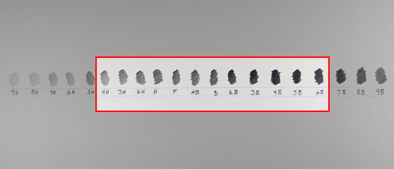
You don’t need every pencil ever made. I recommend having just 3-4 grades. Typically I work with an H pencil, a 2B, a 4B, and a 6B. This usually gives me the range I need to create a fully developed graphite drawing. Using just one pencil limits the range of value that you can create, so use several grades for better pencil drawings.
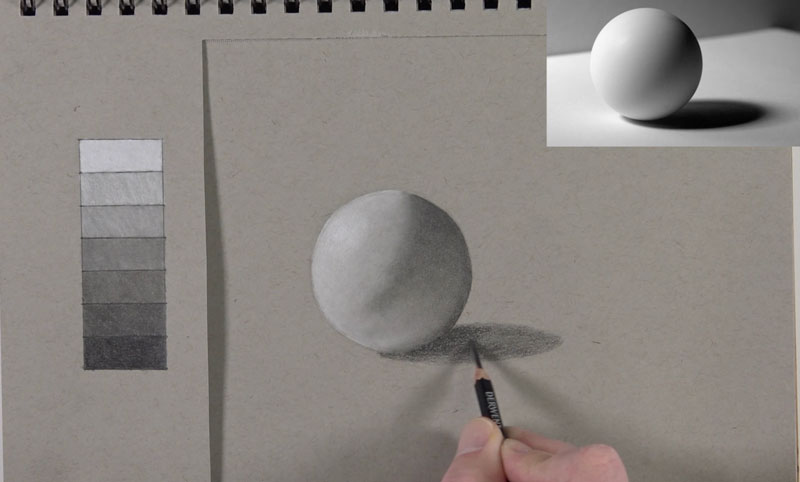
Secret #2 – Work on Paper that Has a Slight Tooth
The paper that you use to create your drawings plays a major role in your success. All papers have a texture associated with them that is usually referred to as “tooth”. Papers with a heavy tooth produce a grainy effect, while smoother papers produce a smoother texture.
See Also: All About Drawing Papers
With graphite drawing, smooth papers have a limited amount of material they can receive. Working on a smoother surface can enhance graphite shine, which is something we want to avoid. Heavily textured papers have too much tooth and result in an overly-textured appearance.
To be successful, we should strive to work on papers that feature a light tooth. Papers such as Stonehenge paper, provide a soft touch with ample texture – suitable for blending and controlled applications. Other papers suitable for graphite drawing include Bristol Paper with a vellum surface and many hot press watercolor papers.
Secret #3 – Use A Blending Stump
Many beginning artists use a finger for blending and smudging. While this can create a smoother appearance, it does more to mar the surface. When you blend with your finger, you introduce the oils produced by your hand to the graphite material. This makes erasing and controlling the graphite more difficult.
Instead, use a blending stump. A blending stump provides precise control over the material and prevents the oils of your hand from mixing with the graphite. Blended areas can be erased easily when a bending stump is used and you have considerably more control over the material.
Secret #4 – Use the Circling Technique
You don’t have to use a blending stump to create soft, smooth transitions with graphite. Once technique I like to use, that I call “circling”, is one in which you make small circular strokes with the graphite pencil. You’re not making circles per se, but instead moving the pencil in a circular motion. With a slightly duller pencil, you can create smooth applications of the graphite, without visible pencil strokes. You have to work very slowly to make this work, but with some practice, you can control the graphite even more so that with a blending stump.
Secret #5 – Gradually Build up Applications to Avoid Graphite Shine
Graphite is a shiny medium. There’s no getting around this. But we can minimize graphite shine by carefully thinking about our applications. Graphite shine is more pronounced when the tooth of the paper is flattened. New artists have a tendency to reach for a 6B pencil when an area is dark and put heavy pressure on the pencil. When you do this, you flatten the tooth of the paper which results in a shiny appearance.
Instead, work your way up to your darkest pencil. In dark areas, start with a 2B pencil and use medium pressure. Then, go over this section with a darker pencil, like a 4B, again using medium pressure. Lastly, add the 6B, again with a medium pressure. By working up to the darkest application, we preserve more of the tooth of the paper, while still achieving a dark value – just without as much shine.
Secret #6 – Use Your Eraser as a Mark Making Tool
Many people believe that the eraser is just for fixing mistakes. While the eraser is obviously great for this, it’s not its only function. The eraser can be used for mark making as well. Use your eraser to remove portions of graphite to create texture and details. By adding and subtracting the graphite material, we have full control over the drawing. I like to use an electric eraser for extra power to remove the graphite completely when needed. For a lighter touch, consider using a kneaded eraser to lift the graphite from the surface without sacrificing texture.
See Also: Erasers For Drawing
Secret #7 – Work Slowly
When we start a new drawing, we can’t wait to see the finished result. If we are too impatient, then we tend to rush through drawing. Not only can this lead to mistakes, but it can also lead to drawings that are below our potential. Slow down and take your time. Be patient and take breaks often. Draw much slower than you usually do and see what happens. Take the time to closely analyze the shapes and values that you see. Often, when you work much slower than you usually do, you’ll find that you’re more skilled than you thought.
See Also: Realistic Drawing Hack
If so, join over 36,000 others that receive our newsletter with new drawing and painting lessons. Plus, check out three of our course videos and ebooks for free.
How to Get Better at Drawing
How to Get Better at Drawing
Drawing got you frustrated? You’re not alone. Any new skill is a challenge to learn and develop, but the good news is that any skill – including the skill of drawing, can be mastered by anyone. In this lesson, we’ll look at 6 basic principles that will help you get better at drawing plus a bonus tip. Let’s dive in…
Principle #1 – Practice Daily – Make Drawing a Habit
Developing any skill requires practice. The more that time that you devote to practice, the faster you’ll see results. This seems pretty simple, but the fact is our practice needs to be focused practice. Just doodling in your sketchbook will not get the results that you want.
We need to practice with a goal in mind. This means that you need to draw with a purpose. If you are struggling with values, practice drawing subjects with a value scale as a reference and ensure that you use every value in your sketch. If you’re struggling with textures, practice drawing various different textures and make notes on how you accomplished the illusion.
If you want to get better at figure drawing, practice drawing figures from life – at the park or from reference photos. You get the idea – practice every day – but make sure that practice is something that can be measured and not just mindless doodling.
Principle #2 – Draw Simple and Difficult Subjects
When choosing subjects to draw – don’t get stuck drawing the same subjects over and over again. Diversify what you practice. Simple, everyday objects make great subjects for practice in your sketchbook, but don’t be afraid to try challenging subjects as well. Don’t fall into the trap of reserving more difficult subjects for “when you get better”. Draw the difficult subjects along with the easier ones.
Often, when we challenge ourselves, we improve faster. Lifting heavier weights in the gym, make us stronger – faster. But those lighter weights help to build tone. So both the heavier weights and the lighter ones are important. With drawing, draw both easy subjects and more difficult ones consistently to see noticeable improvement in your drawing skills.
Principle #3 – Take the Time to Learn
You don’t know what you don’t know. If you don’t take the time to learn techniques or basic foundational principles, then developing the skill of drawing will take longer to achieve. Teachers and experts have spent countless hours learning and developing. Along the way, they have acquired knowledge that they share with students. This knowledge can be passed on to you, saving you those countless hours in experimentation. Take advantage of this.
Take structured classes – online or in person – instead of just watching countless YouTube videos. While these videos may be great for inspiration, without an ordered and structured approach to teaching, you’re only getting random pieces of the puzzle. Online classes or in person classes are mostly taught in a progression, ensuring that the information that you receive builds on what you’ve learned. You get the whole puzzle with all of the pieces and a plan for how to put it all together. And if you don’t want to invest in a course or a class, then learning how to draw really just isn’t that important to you.
The Virtual Instructor offers a ton of classes for drawing – View Our Library of Courses and Classes
Principle #4 – Draw From Life or Photos – Not From Other Drawings
It can be tempting to draw from other people’s drawings – especially simple cartoons. But this is somewhat a trap to your development as an artist. While it’s encouraged to study other people’s drawings, I wouldn’t recommend copying them. The artist has already interpreted the subject through their eyes with their hand.
It’s better to draw from your own photo references or better – from life. This forces you to make the decisions and for you to interpret the subject in your own way and then make marks with your own hand. Although it may be gratifying to finish a drawing of your favorite anime character, it doesn’t help you get better at developing your drawing skill – you’re just get better at copying someone else’s style.
Principle #5 – Explore Different Drawing Mediums
When most of us get serious about drawing, our tool of choice is usually a graphite pencil. It’s a comfortable choice since its so familiar to us. But the world of drawing features many mediums, and graphite is not your only choice. Colored pencils, charcoal, pastels, and pen and ink all have their own unique characteristics.
Some artists gravitate to ink and its ability to communicate through line. Others prefer charcoal for its forgiveness and rich blacks. Some prefer colored pencils for its ability to develop precise details. But if you’re just using a graphite pencil, you may be missing out on a medium that suits you better.
Try different mediums without judging the results. Learn how these mediums work and practice with them. I didn’t use pastels until I was in college – now its one of my favorite mediums. I missed out on years of development because I didn’t know what I didn’t know. Don’t be afraid to try new things – don’t let fear of failure stop you from experiencing all that’s available to you.
Principle #6 – Stop Comparing Yourself to Others

In today’s age with social media and the internet, a countless number of incredible artworks are shoved in our faces everyday. My instagram feed is filled with stunning works of art that seem endless. It’s easy to get overwhelmed and feel deflated when we compare ourselves to these artists. We may tell ourselves, “I’ll never be that good, why bother.” This is a trap! Don’t fall for it.
See also: Dealing with Artistic Frustration
You are on your own art journey and we travel that journey at different paces. Focus on your own development and not on what others have done. When we compare ourselves to others, we never win. But when we compare ourselves to ourselves, then we can see how far we’ve come. There will always be someone better than you at drawing – but this is not where we find gratification from making art. Drawing isn’t a sport – there isn’t a champion.
There is merit in everything you create. Your journey is yours alone. Stay focused on this and you’ll continue to practice and improve. If you let doubt creep in, your art materials will start to get dusty because you’ll stop using them.
Bonus Principle – Drawing Well Doesn’t Require Talent
We’ve all been conditioned to believe that skills are talents. They’re not. Skills are learned. Drawing is a skill – not a talent. Some of us acquire these skills quicker than others. Some of us are programmed to develop faster than others. But all of us can learn any skill that we wish. It simply requires desire, knowledge and practice.
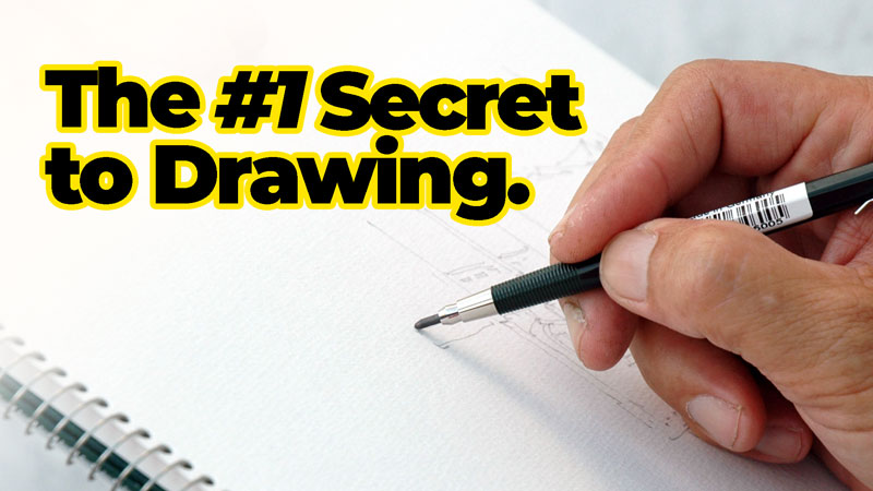
See also: The #1 Secret to Drawing
If you think it requires talent, then you’re doomed to fail from the start. Once you encounter a challenge, you’ll blame your lack of talent for your failure. Eventually, you’ll give up – believing that you are lacking talent. This belief is stopping countless numbers of people from living their life to the fullest. If drawing well is your desire, then it is attainable. It won’t happen overnight – but talent is not required and it shouldn’t hold you back from what is possible.
If so, join over 36,000 others that receive our newsletter with new drawing and painting lessons. Plus, check out three of our course videos and ebooks for free.
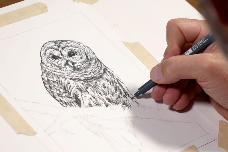
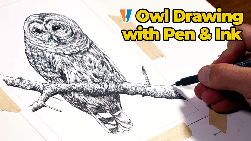
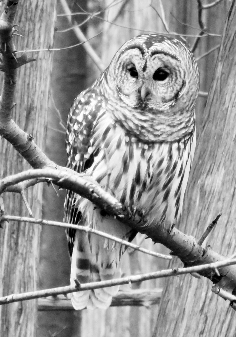
Pen and Ink Paper – Owl Drawing
Drawing on Pen and Ink Paper
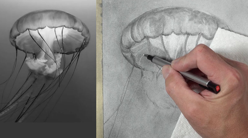
In this pen and ink drawing lesson, we’ll draw an image of an owl with pen and ink on pen and ink paper. Here’s a look at the finished drawing…
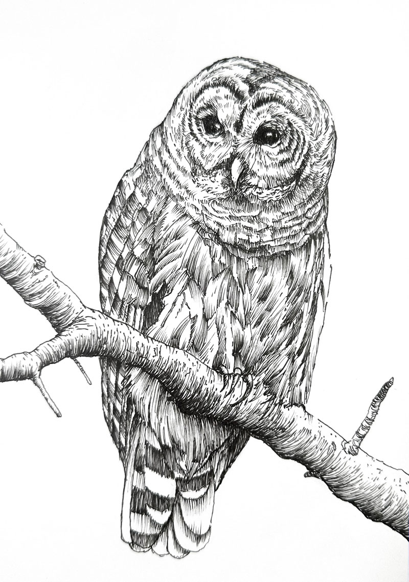
A photo reference is used to complete the drawing. Here’s a look at the photo reference…
Pen and Ink Paper
As is the case with any work that we create, the paper plays an important role in your success with the medium. For beginning artists, the surface is often overlooked to the detriment of the art.
When it comes to pen and ink drawing, we have quite few choices when it comes to the surface. There are a variety of papers that are suitable for pen and ink drawing. Bristol paper, hot press watercolor paper, and traditional drawing papers are all suitable surfaces for pen and ink applications.
Pen and Ink Paper I Recommend – Pen and Ink Paper
Pen and ink paper is the smoothest surface I have ever worked on. The lines created by the smooth surface are clean and precise. This is an advantage over the other papers I mentioned.
However, this paper is not perfect. For starters, the paper is quite thin. It will wrinkle easily and care must be taken not to damage the paper inadvertently. Secondly, because of the super smooth surface, it is quite easy to smear wet ink. You must be aware of what portions of your drawing are still wet while drawing to prevent this. A third drawback is that this paper is not suited for ink wash. Some artists like to combine pen and ink with washes of ink. I can see this paper buckling severely if washes are applied. This means that combining watercolor with and ink drawing is out if this paper is used.
But, if your drawing is purely pen and ink, then this surface is a great choice – perhaps the best available.
If so, join over 36,000 others that receive our newsletter with new drawing and painting lessons. Plus, check out three of our course videos and ebooks for free.
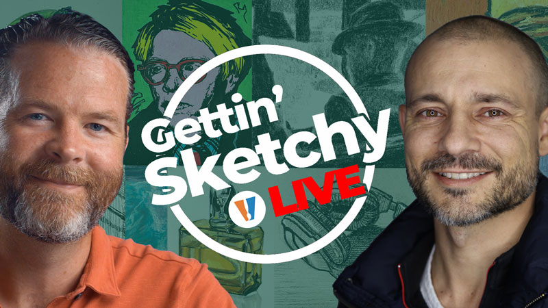
Gettin’ Sketchy – Season 13
Gettin’ Sketchy: Season 13
Episodes
About Gettin’ Sketchy – Season 13…
Gettin’ Sketchy Live is an original live broadcast. The goal is produce a sketch within 45 minutes while providing art instruction and entertainment. In this season, Matt and Ashley choose their own subjects and materials. Each episode is a new adventure with different subjects and drawing media.
Episode 1: Horseback Rider
In this live drawing lesson, Matt will have 45 minutes to create a drawing of a person riding a horse with graphite pencils on white drawing paper. In this lesson, we’ll start the drawing by analyzing shapes and create a contour drawing. From there, we’ll complete the drawing with shading and erasing.
Episode 2: Portrait
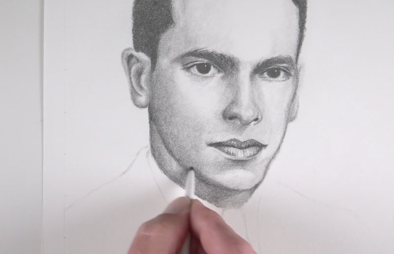
In this live drawing lesson, Ashley will have 45 minutes to create a portrait drawing with graphite pencils on white drawing paper. In this drawing lesson, we’ll focus on facial proportions and capturing the likeness of the subject.
Episode 3: Landscape
In this live drawing lesson, Matt will have 45 minutes to create a landscape drawing with pastels on PastelMat drawing paper. In this drawing lesson, we’ll focus on shapes of color and value to create the impression of the scene.
Episode 4: Glass of Water
In this live drawing lesson, Ashley will have 45 minutes to create a grayscale drawing of a glass with water using markers, colored pencils and charcoal. In this drawing lesson, we’ll focus on capturing values to create the illusion.
Episode 5: Lion
In this live drawing lesson, Matt will have 45 minutes to create a drawing of a lion with charcoal on white drawing paper. In this drawing lesson, we’ll use vine and compressed charcoal to develop the drawing.
Episode 6: Scissors
In this live drawing lesson, Ashley will have 45 minutes to create a drawing of scissors with oil pastels on toned paper. In this drawing lesson, we’ll use oil pastels to complete the image and use the borders of the picture plane to “fool the eye”.
Episode 7: Red Bull
In this live drawing lesson, Matt will have 45 minutes to create a drawing of a Red Bull can with markers and colored pencils on marker paper. In this drawing lesson, we’ll create a marker underpainting and apply colored pencils to refine the drawing.
Episode 8: Fire Hydrant
In this live drawing lesson, Ashley will have 45 minutes to create a drawing of a fire hydrant with pen and ink on white drawing paper. In this drawing lesson, we’ll draw basic shapes and lines using negative and positive space for comparing before developing the values and textures with pen and ink.
Episode 9: Cat
In this live art lesson, Matt will have 45 minutes to create a watercolor painting of a cat on cold pressed watercolor paper. In this lesson, we’ll draw out the contours before applying layered applications of watercolor to complete the painting.
Episode 10: Welder
In this live art lesson, Ashley will have 45 minutes to create a pastel drawing of a welder on black paper. In this lesson, we’ll focus on the relationships between light and dark shapes, leaving the black of the paper for the darkest values.
Episode 11: Season 13 Review and Critique
In this live drawing critique, we look back on the drawings we created during Season 13 of Gettin’ Sketchy and quickly critique each piece. We choose our favorite drawings and encourage you to choose your favorites as well. Join the chat and join in the discussion as we look back on what we created.
Resources for this Lesson…
Distributing any content downloaded from this site is strictly prohibited and against the terms and conditions of use.
References
Here’s what you’ll need…
(Disclosure: Links to art materials are affiliate links which means we make a small commission if you purchase at no additional cost to you.)
Episode 1: Horseback Rider
- White Drawing Paper
- Graphite Pencils
Episode 2: Portrait
- White Drawing Paper
- Graphite Pencils
Episode 3: Landscape
Episode 4: Glass of Water
Episode 5: Lion
- Vine and Compressed Charcoal
- White Drawing Paper
Episode 6: Scissors
Episode 7: Red Bull
Episode 8: Fire Hydrant
- White Drawing Paper Technical Drawing Pens
- Graphite Pencils
Episode 9: Cat
Episode 10: Welder
How to Make a Watercolor Mixing Chart
Watercolor Mixing Chart
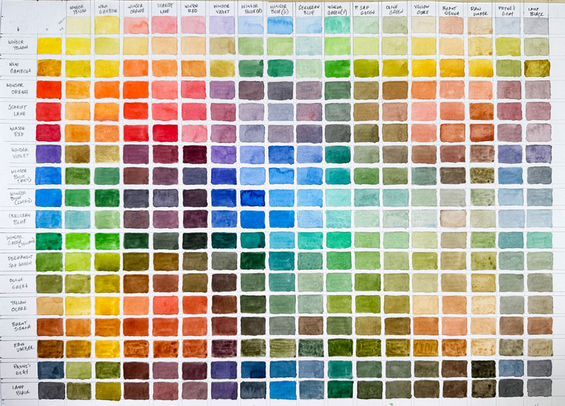
Creating a watercolor mixing chart is a great exercise to see what colors you can create with the watercolors that you have. By making your own chart, you’ll have a better understanding of how your colors will mix and you’ll discover new exciting colors. In this watercolor painting lesson, we’ll create a watercolor mixing chart. I’ll break down how to lay out your chart to maximize its benefits. Here’s a look at the completed chart we’ll create in this lesson…
Preparing the Watercolor Chart
The first step is to create your gridded chart. Be sure to create your chart on watercolor paper so that you can reduce buckling of the paper and get clean, bold color mixtures. For my chart, I chose to work on hot pressed watercolor paper, which provides a smooth surface. Cold pressed watercolor paper is another excellent choice.
Before drawing your grid, you’ll first need to count the colors. For my chart, I used my set of professional watercolors by Winsor and Newton which has 17 colors. This means that my grid will consist of 17 rectangles by 17 rectangles. I also chose to create a staggered chart so that I could create 2 different intensity versions of each color mixture. Be sure to work on a paper that is large enough to accommodate the entire grid.
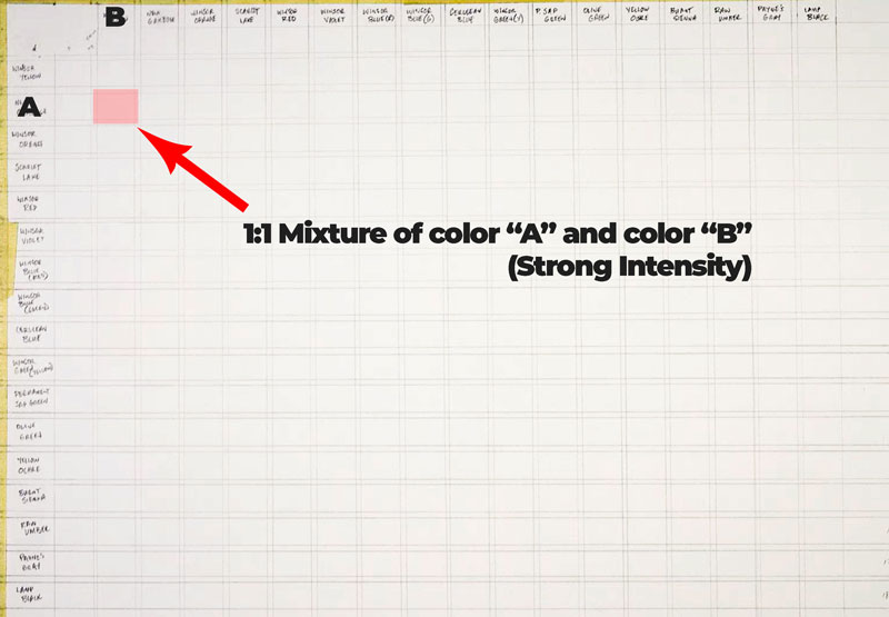
Here’s a look at the grid I created…
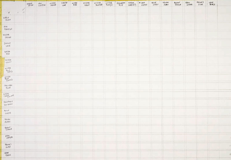
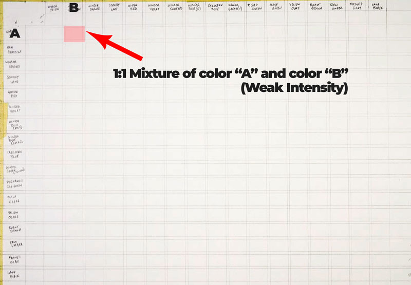
As you can see, across the top and down the left side, I listed each color. This means that each color is listed twice. The order of the colors is the same order that the colors were in when I opened my new set. I also arranged the colors in the same order on my palette to avoid any confusion.
I left open spaces between each color and mixture so that I could see the contrast against the white paper. You’ll have to do some measuring to create your grid based on how large you want each rectangle and how much space you want left open between each rectangle. Be sure to make each rectangle large enough so that you can paint comfortably.
Adding “Pure” Colors
With the grid prepared, we can start filling in colors with our paints. We’ll start with just the pure colors using water to create different intensities. These colors will fall across the top row, down the left side, and through the center.
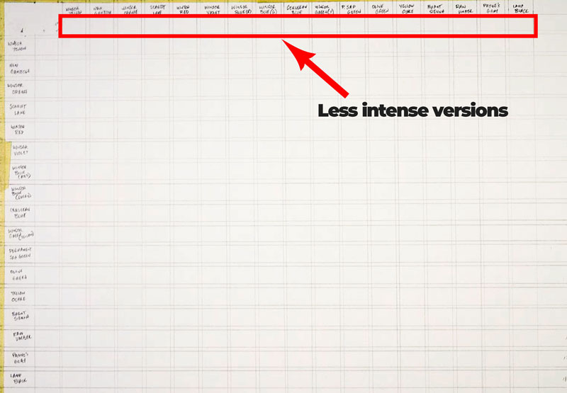
Colors across the top will be light intensities, meaning we have quite a bit of water in the mixture.
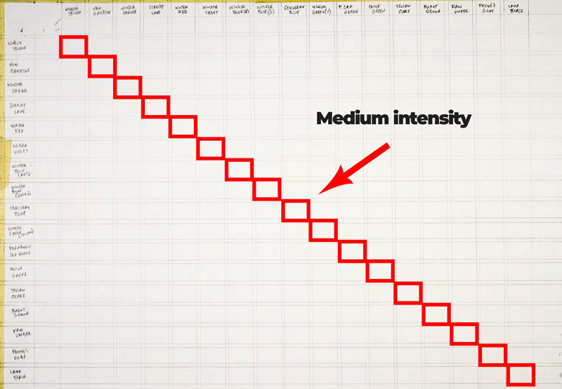
Colors in a diagonal through the middle of the grid will feature medium intensities of the color, meaning that we are using a medium amount of water.
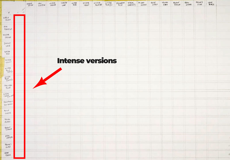
Colors down the left side of the grid will feature colors with a strong intensity, meaning that we will use just a little water.
Adding Mixtures to the Chart
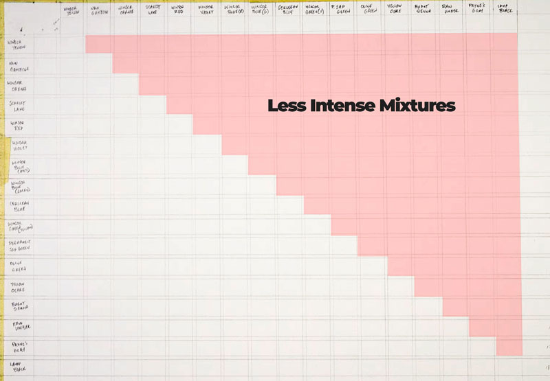
With our pure colors and intensities in place, we can now begin creating mixtures of colors to fill in the rest of the chart. Our mixtures will consist of equal parts of each color. We’ll use water to create different intensities of the colors.
As you may expect, we’ll simply mix the two colors that are found along the top and the down the side to fill in each rectangle. Colors that are found on the upper right half of the grid will be less intense versions of these mixtures. This means that after mixing the color, we’ll add a bit more water to create a less intense version of the color.
For color mixtures within the lower left half of the grid, we’ll create a more intense version. This means that we’ll use less water.
This part of the process is slow and tedious. Just take your time and enjoy the process.
Once you have filled in the mixtures, you’ll see that the less intense versions of these mixes are found in the upper right corner of the grid.
The more intense versions of your mixtures will be found in the lower left corner of your grid.
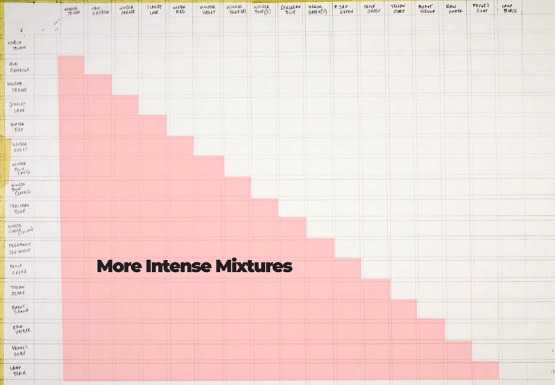
By laying out your grid in this manner, we end up with two different versions of your mixtures – one with less intensity (likely lighter in value) and one with strong intensity (likely darker in value). It’s amazing how different a light intensity version and strong intensity of the same color can be.
Making a Watercolor Chart Conclusion
Watercolor mixing charts make it easier to find the color that you need. Just use the chart that you make as a reference and save the time of experimenting on your palette. You’ll also discover new colors and color mixtures that may be unexpected. Creating a watercolor chart is not just a process of making a tool for you to use. It’s also a great exercise to practice mixing and controlling your paint applications. So, if you’re stuck between projects and are currently lacking inspiration, why not make a watercolor chart?
If so, join over 36,000 others that receive our newsletter with new drawing and painting lessons. Plus, check out three of our course videos and ebooks for free.