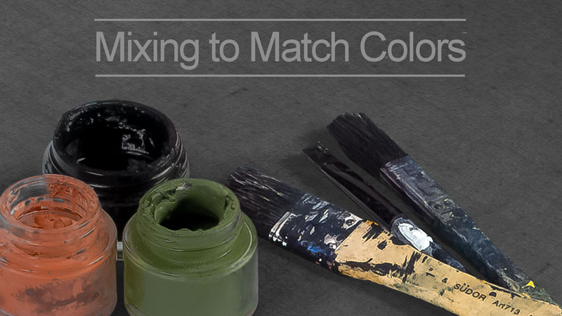
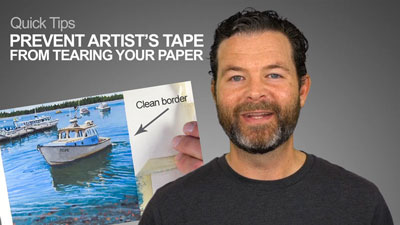
My work week would start with about three hours of color mixing and matching. Using the original painting as a guide, I premixed 15-25 colors in large quantities and saved those colors in metal tins. I would then paint all week, remixing those same colors the next week, until the order had been filled. The colors had to match perfectly from week to week. It was like an oil painting assembly line but the experience I gained was invaluable.
My hope is to share both what I learned then and what I’ve learned since about matching colors below.
Reasons to Match Colors through Mixing
There are several reasons a painter might need or want to mix an exact match.
- To repair a damaged painting.
- To complete an unfinished area from a previous painting session.
- To match colors from an observed subject.
- The subject of a painting has a distinct and familiar color.
Matching Paint to Paint
The first variable to consider when matching a color is the paint itself. For example, tempera and gouache paints dry lighter in value than they appear when wet. This characteristic complicates color matching. When using these paints, I prefer to repaint passages with a fresh mixture over trying to match wet color with dry color. If that’s not possible (in the case of retouching), then expect more trial and error with theses paints. Mix slightly darker values than desired. Wait for test swatches to dry before making adjustments to the mixture.
Dry acrylic and oil paint colors more closely correlate with their wet counterparts so they are less frustrating to match. (I use oil paint in the video below.)
Choosing Pigments
Starting with the right pigments is essential to matching colors through mixing. I like to have as few colors on my palette as possible. Less colors means that I am more likely to remember or even guess what I mixed together in the past to arrive at a certain color. This improves my chances of matching a color.
What works for me is using both warm and cool primary colors. A combination of warm and cool primaries offers enough options to match nearly any color. Using primaries simplifies the process and is a key to becoming a master of color control.
The pigments I recommend are as follows:
- Warm Primaries: Cadmium red medium, Cadmium Yellow Medium and Ultramarine blue
- Cool Primaries: Alizarin Crimson, Chrome Yellow and either Cerulean Blue (for landscapes) OR Phthalo Blue
Besides these primary colors, I keep Titanium white (the whitest white) on my palette. I try to avoid using any black at all.
*PRO TIP – each color added to a mixture results in a duller mixture. If, while attempting to match a color, the mixture becomes markedly duller than the target color, then the mixture is likely a failure and the artist should start over. Attempting to “bring a color back” often results in even greater waste. It is better to waste a little than a lot.
The Color Matching Process
Step to Matching Colors with Paint
- Identify the hue of a color from the color wheel. Each color is more or less like the 12 colors on the wheel. Even brown and grey colors lean toward a hue. Often browns lean more toward orange or red. Grays sometimes lean toward blue, green or purple. Forcing myself to name the hue that I see gives me a starting point. So if a brown leans toward orange, it is an orange in my mind. Start there.
- Mix the hue that you see from the primaries, if it is not a primary. Don’t use both the cool and warm options of a single hue in your mixture. That is, don’t use both Cadmium Red and Alizarin Crimson in the same mixture.
- As required, use white in your mixture to reach the approximate value of the color target.
- Once the base hue is identified and mixed, use the complement of that hue to manage/reduce the brightness of the mixture until reaching the desired color. The ability to use complementary relationships to control color intensity is the single most important skill to learn as a colorist. Complementary pairs are red/green, blue/orange, yellow/purple.
*PRO TIP – To better judge whether two colors match, those colors need to “touch” one another, whether on the palette or the canvas. Subtle differences are revealed as soon as two colors come together.
Matching the Color of the Subject
Matching a previously mixed color is one thing, but what about matching the color of a subject; a sky, a face, a piece of fruit? The disadvantage in this case, is that the artist cannot always touch their color mixtures to their target colors.

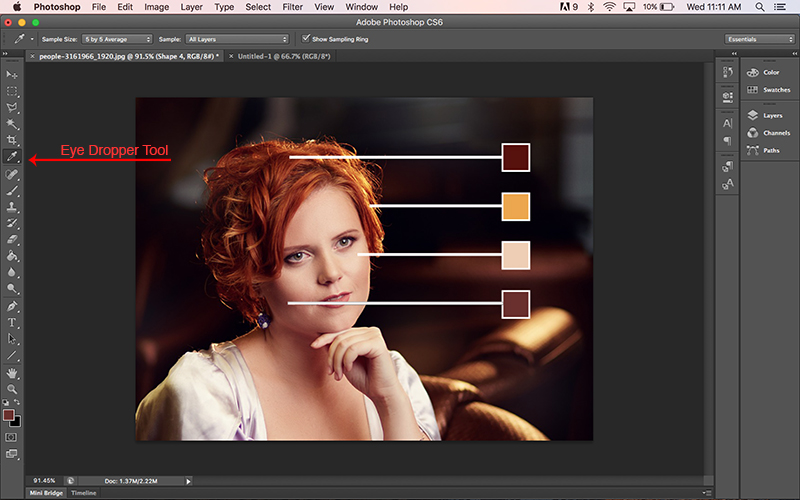
But I have good news – it is the twenty-first century. I believe in taking advantage of technology to advance my painting. Often, I’ll photograph my subject and import it into Photoshop (or another photo editing program). I’ll then take samples of the certain colors using the eyedropper tool. After printing these swatches, I’m then able to match my colors directly to those swatches (see the demonstration video above).
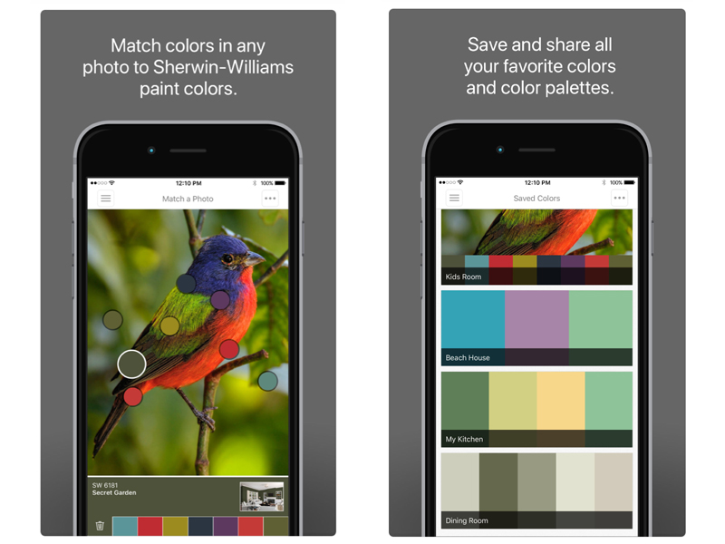
Sherwin-Williams created an app that does the same thing. The app matches the colors of a photograph to paint colors offered by Sherwin-Williams in an effort to sell their paints. To use this app and others like it with artist’s paint, just take a screenshot of the apps swatches, print the screen shot and start matching color.
The Relativity of Color
Remember, color is relative just like height. I like to stand next to shorter people to make myself look taller (I’m not tall). Similarly, the artist can manipulate a color’s appearance with its surrounding colors. If a color is matched well but looks wrong in the painting, then the problem could be the surrounding colors.
The Secret Weapon of Color Matching – Shhh!
Some opaque paints, like oils and acrylics, offer an opportunity for color correction even after the colors have dried. The technique for doing so is called glazing.
A glaze is a thinned down, transparent solution that acts as a filter over a painting. You can brighten a color by glazing over it with it’s own hue or dull a color by glazing over it with its complementary hue.
Conclusion
Color is like icing on a cake. It may add to the painting, but without it you still have a cake. Value is the cake. Without it you have nothing. So take some pressure off of yourself when it comes to color matching. Get your colors close but your values perfect.
If so, join over 36,000 others that receive our newsletter with new drawing and painting lessons. Plus, check out three of our course videos and ebooks for free.

Markers and Colored Pencils – Time Lapse
Creating an Underpainting with Markers
Markers and colored pencils simply work well together. By using alcohol-based markers, we can cover larger areas quickly while concentrating on laying down colors and values early in the process. This not only saves time, but it also creates an underpainting in which colored pencil applications can be layered upon. Essentially, we can use the markers to establish initial colors and values broadly and use the colored pencils to develop the details of the drawing.
More lessons that feature markers and colored pencils…
Drawing Surface For This Lesson
This combination of media can be applied to most drawing surfaces, however smoother surfaces will produce better results. Smoother surfaces tend to accept marker applications with ease, however they do limit the number of layered applications that you can apply with colored pencils. The key is finding a drawing surface that accepts the markers but also allows for layering of colored pencils.
Paper specifically manufactured for markers works exceptionally well for this combination. Marker paper is smooth and semi-transparent, however there is just enough tooth to accept colored pencil applications over the markers. Because the surface is smooth however, you are limited to number of layers that you can apply with colored pencils. It is advisable to work as much as you can with the markers before developing the details with colored pencils.
Another consideration is the thinness of the paper. Since the marker paper is thin, some wrinkling may occur while you work. You can tape the paper down to a support to prevent this to a certain degree. Marker paper is white, but toned drawing paper also can be used if the tooth is rather smooth.
If you love the control that you get from colored pencils, but don’t like the time it takes to cover the surface, you may consider this combination. The markers not only cover large areas quickly and create additional depth, but also speed up the process, allowing you to get to details (the fun part) quicker.
If so, join over 36,000 others that receive our newsletter with new drawing and painting lessons. Plus, check out three of our course videos and ebooks for free.
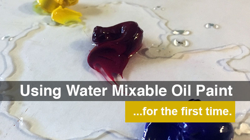
Using Water Mixable Oil Paint For The First Time
We’ll answer these questions and maybe a few more. A working concept of oil and acrylic paints will help the reader understand the properties of water mixable oil paint. If you have never painted before, this article will still help you decide if water-mixable-oil-paints are a suitable option for you.
What is Water-Mixable Oil Paint?
In short, water mixable oil paint is oil paint that has been modified to accept water as a solvent instead of, or in addition to, more volatile organic solvents such as mineral spirits and turpentine. One way to modify the paint is to change the binder (oil) on a molecular level so the oil itself is more hydrophilic. Another way to modify oil paint is to formulate a paint mixture that includes a surfactant of some sort. A surfactant is basically soap. The paint featured in this article’s accompanying video is Winsor-Newton’s Artisan paint. It utilizes the latter method described above.
How Does Water Mixable Oil Paint Compare to Other Artist Paints?
Throughout the Middle Ages, Western artists used egg tempera paint. Egg tempera is water mixable but not as deep and rich in color as oil paint. Oil paint came into being during the early Renaissance, giving artists an opportunity to create a wider range of value and intensity, resulting in more realistic representations. From that time onward, oil paint has been the “king of artist’s paints”. Today, watercolor and acrylic paint are also popular paint media.
Watercolor is entirely transparent and does not compare to oil paints. Acrylic paint, developed in the mid 20th century, was meant as an alternative to oil paint. Like oil paint, acrylic paint is opaque but can be thinned to create translucent glazes. The similarities end there. Oil paint dries slowly. Acrylic paint dries fast. Oil paint is thick and buttery. Acrylic paint is less dense. Oil paint generally looks the same whether wet or dry. Acrylic paint shrinks a bit when it dries, causing impasto strokes to flatten out.
After making a painting with water mixable oil paint for the first time, I believe that it is the best alternative to traditional oil paint. To be sure, acrylic paint has some special properties that make it a worthy paint medium unto itself. However, if one is looking for a traditional oil paint substitute, then water mixable oil paint is the way to go.
Usage
The techniques used to create this article’s accompanying image include direct painting, wet-into-wet, scumbling and glazing. I found that water mixable oil paint worked and felt like traditional oil paint from start to finish. Some oil painters use a medium to control the viscosity of their paints. Water mixable mediums are available in addition to the paints. Both a medium and water will thin water mixable oil paint.
Water mixable oil paint also mixes well with traditional oil paints and mediums, but the water solubility of the paint is reduced as a greater ratio of traditional materials are introduced.
PROS and CONS
The pros and cons of using water mixable oil paint are subjective. The characteristics below are a determining factor for some artists.
We’ll begin with the pros:
Less fumes – I have never been bothered by the smells and fumes associated with traditional oil paint. Quite the opposite in fact. However, many people are either highly sensitive to the fumes of traditional solvents or they don’t have a place to paint with adequate ventilation. In either case, water mixable oil paint is a great alternative. Water mixable oil paint is particularly appropriate to use in a class/school setting. When an entire room full of painters have open jars of turpentine and traditional mediums, the fumes are overpowering.
Dries Slowly – This characteristic of water mixable oil paint is the most subjective. Artists that prefer to use many layers in a single painting session want paint that dries quickly. These artists may find that they prefer acrylics. Generally speaking, water mixable oil paint is dry to the touch in about 4-8 hours and is fully dry in about two days depending on thickness, temperature and humidity.
For artists that feel like acrylics dry too quickly and oil paint dries too slowly, water mixable oil paint is a dream come true.
Cleans-up with water – Perhaps the most attractive feature of water mixable oil paint is that it cleans up with only water. This is advantageous for reasons other than fume management.
Painting on location – Since the Impressionist period, oil painters have enjoyed painting outside, often referred to as plein air painting. Carrying oil painting materials up trails and over hills is cumbersome. By not having to carry special solvents the artist can lighten his or her load. Just one container can carry the water needed for painting, cleaning brushes and even drinking. Water is everywhere, often available in the field, lightening the load even more.
Disposal of chemicals – Not all artist follow best practices when it comes to chemical disposal. Waste chemicals should be collected in special chemical containers, then taken to designated disposal centers. Chemically soiled rags should be disposed of at those same facilities. Medium to large cities have such facilities but a rural location may not. Transporting chemical waste to the proper disposal facilities is time consuming. Additionally, rags saturated in traditional solvents present a fire hazard. Water is a safer, time saving alternative in this respect.
Brush preservation – Strong solvents like mineral spirits and turpentine are harder on brushes than water. For that reason, many artists wash their oil paint brushed in a traditional solvent first, then have to wash away the solvent with soap and water to keep the bristles supple.
Time and money – Water from the tap is nearly free, unlike turpentine. Some specialty solvents found exclusively in art stores are even more expensive.
And now for the cons:
The most obvious draw back to water mixable oil paint is speculative and may prove to be a non-issue. Will water mixable oil paint stand the test of time? Who knows for certain? Traditional oil paintings from four hundred years ago still retain their aesthetic qualities. Most problems with cracking are usually a result of an artist’s technique.
Acrylic paint is a plastic, which is extremely durable. The oldest acrylic paintings have only been around since the mid-twentieth century but they still look as strong as the day they were painted.
Only time will prove water mixable if oil paint is durable or not. I have no reason to doubt that water mixable oil paint is not any less permanent than traditional oils.
Conclusion
Why not give water mixable oil paint a try? If, after purchasing water mixable oil paint, you decide that thinning them out with water is not for you, just use them with your traditional solvents and paint and you’ve lost nothing while gaining experience along the way.
If so, join over 36,000 others that receive our newsletter with new drawing and painting lessons. Plus, check out three of our course videos and ebooks for free.
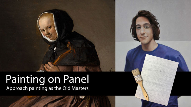
Painting On A Panel
With any art making process, the surface plays an important role. It seems that many times, we get so obsessed with the process or the medium that we overlook the importance of the surface.
When it comes to painting, canvas stretched tightly over a light wooden frame is the most popular material, but it is not the only option. Wooden panels, common during both the Middle Ages and the Renaissance, are experiencing a resurgence.
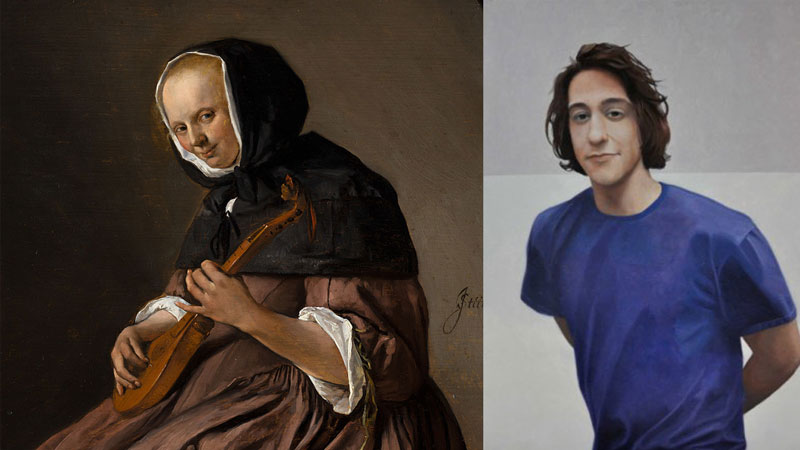
A few years ago, I embarked on a personal quest – to paint like the “old masters”. At the time, I was painting on stretched canvas with heavy, impasto strokes in an impressionistic style. On my journey, I embraced Renaissance and Late Middle Ages techniques which included painting on wooden panels with smooth, thin layers of paint. I haven’t looked back since.
In the beginning, I purchased wood from hardware stores and prepared it for painting over the course of a few hours (most of that time is spent waiting for layers of primer to dry). After a couple of years preparing panels this way I started seeing factory-made wooden panels for sale at both the “big box” art supply stores and online distributors. As it happens, many of us were looking for an alternative to canvas and the market responded. These ready-made panels offer most of the same benefits as self-made panels.
Let’s take a look at both the benefits and drawbacks of painting on a wooden panel.
Painting on Panel vs. Canvas
A wooden panel is heavier that a stretched canvas. Masonite is a brand of hard board – a composite wood product. Masonite is thinner than other wood products making the weight of a panel less problematic than in the past but a canvas is still much lighter. When painting large scale or on location, the weight of a panel may be cumbersome to some.
On the plus side, however, with that extra weight comes durability. (I happen to own a nice painting on canvas that has an unfortunate hole in it.) Canvas is more easily damaged than a panel. The same careless mistake that damaged my nice painting on canvas would have barely left a mark, had my painting been on a panel.
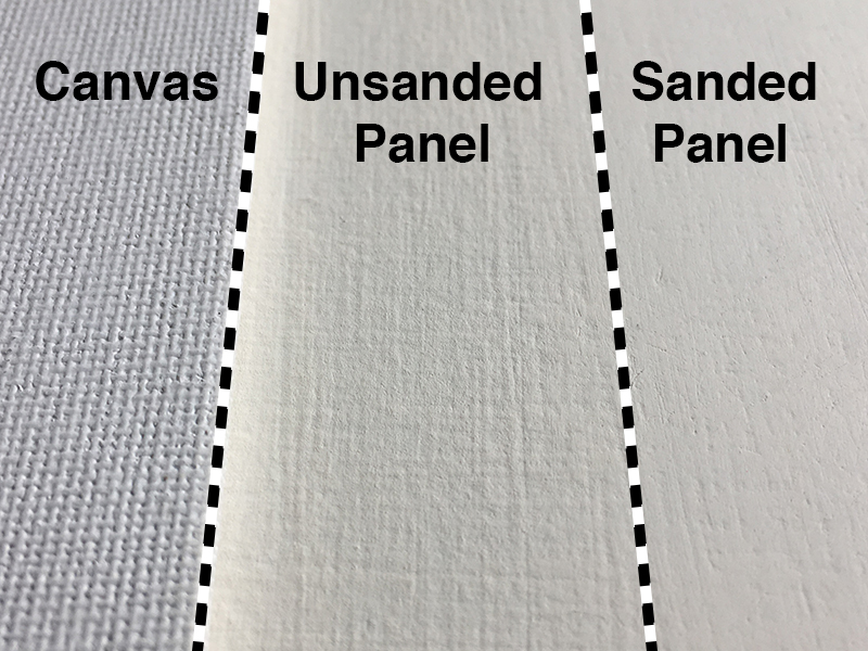
A panel also has another advantage over canvas – surface customization. The panel has no visible texture prior to priming. A canvas, on the other hand, has a visible woven texture. Unless heavy layers of paint are used, that woven texture is a part of the artwork, like it or not.
Using a panel, the artist can create any surface texture he/she wants. During the priming stage (discussed below) a variety of surfaces are attainable. This flexibility gives the artist more control over the final product and another opportunity for expression.
Related: See our Painting Lessons
Canvas currently enjoys an advantage over panels in the marketplace. Canvas is available from more retailers and in a wider variety of options – rectangles, squares, circles, ovals, gallery wrapped, fine weave, coarse weave, primed, unprimed, by the roll, etc. Panels are closing the options gap quickly, but most art suppliers limit the sizes of the panels they offer to less than three feet in any one dimension.
Preparing A Panel for Painting
Reasons to make a panel instead of buying one
- It is cheaper to make panels than to buy either prefabricated panels or canvases. Like cooking at home vs. eating out, tackling the preparation ourselves saves on labor costs that are built into the price.
- Quality assurance. If you make your own panel, you can be certain of the quality of materials used.
- Total surface control from start to finish. Like store-bought stretched canvas, most prefabricated panels options have a homogenous surface. Artist-made panels have a unique surface.
- Most importantly, it’s fun!
Materials for Painting on Panel
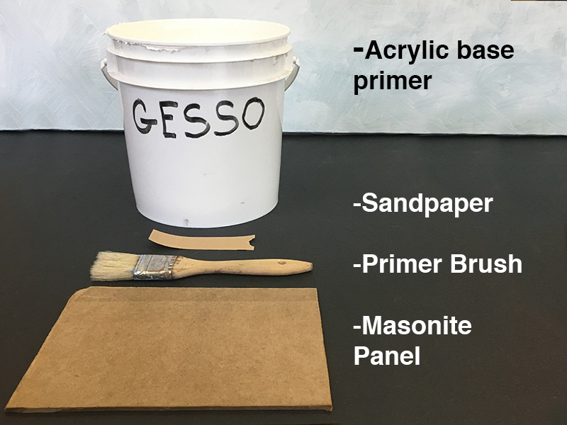
- Wood – As mentioned before, Masonite is a popular choice and is the substrate featured herein. Plywood with a birch or maple veneer is also a nice option but will be heavier and more coarse. 1/8th inch Masonite is suitable for artwork fewer that 24 inches across. For paintings above 24 inches I recommend using 1/4th inch Masonite.
- Gesso – Gesso is a thick, nonporous acrylic primer used to prepare any surface for acrylic or oil paintings.
- Gesso Brush – 1 ½ inch or larger, depending on the overall size of your panel.
- Sandpaper – 220 and 400 grit sandpapers are appropriate for sanding the brush strokes out of gesso. Any grit rating lower that 220 is too course and will make grooves in the gesso.
Procedure for Preparing Panel for Painting
1. Cut Masonite or other wood panel to the desired dimensions. A circular saw is perfect for this. Hardware stores sell Masonite in 2×2, 2×4 and 4×8 foot sheets. Lowe’s, Home Depot and other hardware stores will cut those sheets into different sizes, sometimes at no charge.
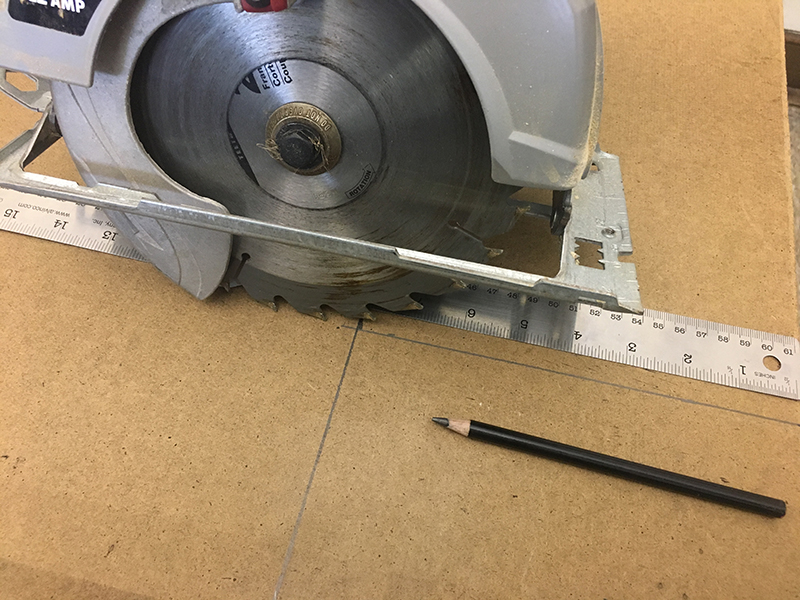
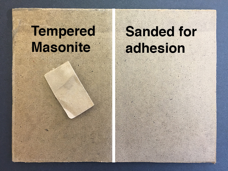
2. Sand for better adhesion. If the Masonite (hardboard) is ultra-smooth with a sheen then it is tempered and should be lightly sanded before applying gesso. If it is light in color and not shiny then it is not tempered and sanding is not necessary.
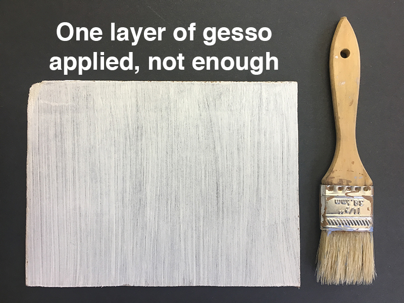
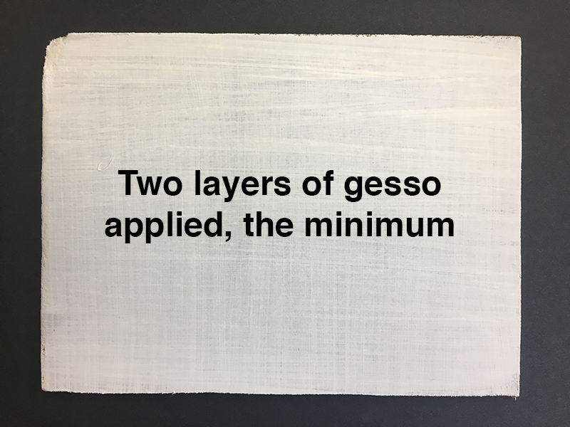
3. Apply gesso. Do not attempt to completely cover a panel with only one coat of gesso. It should take two or more coats of gesso to properly cover your panel. Make strokes in one direction.
Once dry, apply a second coat of gesso in a direction perpendicular to the first. Doing so will ensure an even application of gesso. At this point, the panel is ready for painting.
If a rough, unique surface is desired then mix other materials (sawdust, dirt, grass, seed beads, etc.) into the gesso prior to priming. If, however, an ultra-smooth surface is preferable then apply 2-4 more coats of gesso in various directions and move on to the next step.
Pro Tip #1 – After the first coat has dried, make an “X” on the back of the panel with gesso to counter any subtle warping that might occur due to the drying (and shrinkage) of the gesso layers. This is not necessary on panels less than 10 inches.
Pro Tip #2 – A hair drier will speed up the drying time between layers.
4. Using a circular motion, remove some or all of the brush strokes with sand paper for a smooth surface. A dust mask is recommended when sanding. Before painting, be sure to remove any excess gesso dust with a damp cloth.
The Panel Experience
The weave of the canvas creates friction that pulls paint from the brush. A smoother surface like sanded Masonite creates less friction between the brush and the painting surface. Your paint will spread farther and more easily on a smooth panel. Oil painters typically use course bristle brushes to apply paint. Long-handled synthetic brushes (instead of bristle brushes) are softer but may adequately spread paint on an ultra-smooth Masonite panel.
Also, painting on hard surfaces like panels give some artists a strong feeling of control when compared to using stretched canvas. Brushes are flexible (even floppy) and a stretched canvas is somewhat flexible as well. When pushed on with a brush, stretched canvas gives some. A panel does not react to pressure from a brush.
The hard surface of a panel offers control in another way as well. The artist can rest his/her hand right on the surface for detail work. Doing so with stretched canvas may warp the surface and is not advised.
Conclusion
Whether store bought or hand-made, painting on a panel is a different experience than painting on canvas and worth exploration. If you’ve never painted on panel, you may try in your next work. You may find the control and finished look that you’ve been looking for.
If so, join over 36,000 others that receive our newsletter with new drawing and painting lessons. Plus, check out three of our course videos and ebooks for free.
Painting in Virtual Reality with Google Tilt Brush
Art in VR
Creating a work in virtual reality is unlike anything I have experienced before. You are entirely immersed in your creation. You can walk around it, look it at from all angles, and even go inside of it. It is a world that you have created, literally from the ground up.
Although the world within the goggles is completely “virtual”, it becomes very real when are wearing them. When the goggles are removed, you expect to turn around and see the creation behind you. The bird that I painted in VR was as tall as I am and was approximately five feet long. However, if I wished to make it smaller or expand to gigantic proportions, I could have made that happen.
Sharing Your VR Art
When we finish a painting or a drawing using traditional mediums we may hang them on a wall. We can also share digital versions, prints, or other reproductions of the work. Clearly, art made in virtual reality differs. We cannot hang this form of art on the wall and we cannot share prints. But, we can share the work that we’ve created and it can be experienced by others in ways that haven’t been possible before.
New sharing platforms are beginning emerge that allow us to experience art made in virtual reality. Some of these platforms allow you experience the art in virtual reality yourself, while others allow you to embed and share 3-Dimensional versions of your work. Google has created the site, poly.google.com, which allows you to share your work in this way. Below, you’ll see the bird that I painted, shared via Poly.
To interact with the art, click and drag with your mouse over the art to change the view. Scroll forward and backwards to zoom in and zoom out…
As an embedded interactive image, you get a better understanding of the work but it still doesn’t compare to the experience you get in VR.
One of the more interesting features of sites like Poly is that you can use the VR art created by others in your own work. (Artists have the option of making their creations available to other artists or not.) As new works are created, a library of VR creations grows and more possibilities begin to emerge.
Painting with Google Tilt Brush
Tilt Brush by Google is one of the quickly growing number of programs for creating in virtual reality. To my knowledge, it was the first introduced. Google seems to be investing a lot into this technology and the app is getting updated with new features and capabilities on a regular basis. They have since released an additional program called “Blocks”. I have not yet used this program, but when I do, I’ll share my experience.
The program was free with the purchase of the HTC Vive (the virtual reality set that I am using) but the cost is relatively modest if you need to purchase it separately (currently $19.99 on Steam).
Get the HTC Vive (Affiliate Link)
Using the program is fairly intuitive. You don’t have to be “techie” to use it. I even handed the goggles and controllers over to my 8 year old. She went straight to work and never asked a question.
The HTC Vive has two controllers. In the VR environment, one controller becomes your palette while the other one becomes the paint brush. Swiping between palettes is as easy as sliding your thumb over the sensitive pad on the controller.

One palette of brushes is designed to mimic traditional art making mediums while a second set is animated and cannot be described as “traditional”.
Some of the traditional brushes make flat marks, but in 3-Dimensional space. This takes some getting used to, but after a few minutes, you have a good understanding of how your marks will behave.

At any point, you can make changes to the environment that you are in including slight alterations to the light sources.
How VR Will Affect The Art World
We can only speculate how this new medium will affect the world of art moving forward, but we can look into the past for some indicators.
Perhaps many of you remember when digital art was brand new. Perhaps you even used Microsoft Paint to draw very simplistic images at some point in the past. Now if we “fast forward” to today, we see how quickly digital art has progressed and how far it has come in a short period of time.
Art created in VR is still in its “Microsoft Paint days”, but the technology is progressing very rapidly. In a few years, the level of realism that an artist can create in VR may be staggering.
Sure, this form of art may not hang on a wall, but it does open the possibilities for incredible installations that viewers and patrons can experience in new and exciting ways. Imagine walking right into a digital painting and experiencing it on a scale that has never before been possible.
What Would Leonardo Do?
This medium allows us to create and experience art in a new way. It is not a competition between old mediums and new mediums and I think that this is something to strongly consider.
It seems that there is a level of dissension among some traditional artists when it comes to art produced in a digital medium. Some folks are resistant to change and new processes and technologies. I can understand this to some degree. We don’t want to lose the mediums that have been used for centuries and the joy that they bring us when we create. We don’t want to lose the tactile texture of the paint, the smell of the painting, and the artifact that we can hold and touch.
I don’t see digital art as a threat to traditional mediums. Instead, I see it as something new and different. It will never replace traditional mediums and the sensory experience that comes from its creation. There’s plenty of room in the art world for new mediums like this.
When a new medium or process is introduced, I often ask myself, “What would Leonardo do with this?”
In this case, I have no doubt that Leonardo da Vinci would have embraced the new technologies available to us today and would have created amazing things with them.
We have what Leonardo didn’t have and these opportunities should not be wasted. No, there’s no better time to be alive as a creator. We can paint, draw, and sculpt with brushes, pencils, and clay AND we can paint, draw, and sculpt using computers, tablets, and virtual reality.
If so, join over 36,000 others that receive our newsletter with new drawing and painting lessons. Plus, check out three of our course videos and ebooks for free.
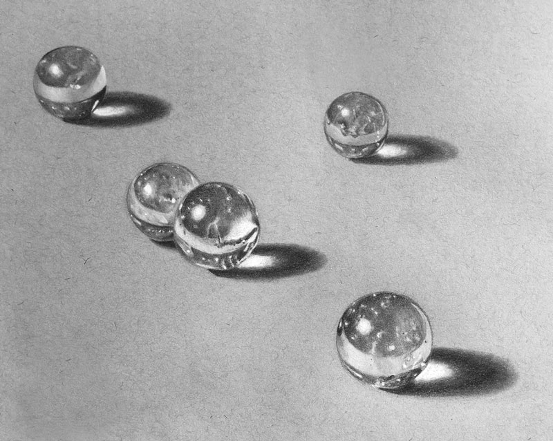
How to Draw Marbles – Lesson Excerpts
Creating the Illusion of Reflection and Transparency
Texture plays an important role in any drawing or painting that we create. Texture, one of the seven elements of art, is heavily dependent on value, contrast, and directional stroking. It is the arrangement of values and the contrast of these tones that is perhaps the most important.
Surfaces that are reflective often feature high contrasting values that are positioned next to each other. We are likely to find dark values right next to light values without a gradation. This high contrast is what creates the illusion of a highly reflective surface, the type of surface that we are dealing with when drawing marbles. For this reason, we should pay special attention to shapes of light and dark values and how they are positioned in order to create a convincing illusion in our drawings.
Reflective surfaces can be intimidating for beginning artists to recreate in a drawing. But if we simply remember that’s it all about shapes of tone, then it becomes much easier.
Resources that feature reflective or transparent subjects…
- How to Draw Water Droplets
- How to Draw Glass with Colored Pencils
- Photo References for Drawing Reflective Surfaces
- Photo References for Drawing Glass
Combining Graphite with White Charcoal
White charcoal is a versatile medium that is “charcoal” in name only. Clay constituents and pigment are added to the medium which makes it closer to a form of pastel or conte. Clearly, white charcoal is frequently used with traditional charcoal (black) but it also pairs nicely with graphite.
White charcoal cannot cover heavy applications of graphite so some care must be taken to preserve areas of lighter value. This includes areas of highlight.
Toned paper is perhaps the best choice when this combination of media is used. Gray drawing paper is used in this lesson series, but any toned paper is a good choice.
Toned paper allows the artist to start near the middle of the value scale. This makes is easier to push the drawing to a full range of tone. Darks are developed through layered applications of graphite, while lighter values are created with applications of white charcoal.
Tutorials that feature white charcoal…
- How to Draw a Realistic Bird
- Portrait Drawing – White Charcoal on Black Paper
- Charcoal Portrait Sketch
Creating a Smooth Surface Texture
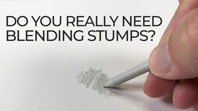
The tooth or texture of the paper can produce a grainy appearance when graphite and charcoal is applied. The surfaces of the marbles are smooth and a grainy surface texture will detract from the illusion that we are trying to create. To create a smooth surface texture, we can use blending tools (such as blending stump) to “work” the graphite and white charcoal into the tooth of the surface. This creates an even application that more closely matches the surface texture of the marbles.
If so, join over 36,000 others that receive our newsletter with new drawing and painting lessons. Plus, check out three of our course videos and ebooks for free.

The Results Are In. The Next Course Is…
As many of you already know, one of the goals of this website is to bring you the highest quality art instruction that covers a widely diverse spectrum of art making media, techniques, and subject matter. Along with this, it is my desire to design courses that exceed your expectations and reflect what you want to learn.
At the conclusion of each course that is created for you, I reach out and ask you what you’d like to see developed next. Students are able to vote on course options by participating in a simple survey.
When the survey is complete, the results are analyzed and work begins creating the next course in which you have voted on.
Each course that is developed is lovingly designed and structured to maximize learning. Each course module includes a video and an accompanying ebook that is released to members every week or two until the entire course is complete. Each course that is created is archived and becomes a part of the ever-growing library of courses for members. There are currently 11 courses available covering the following topics…
- The Secrets to Drawing
- Pencil Drawing – The Guide to Graphite
- Pastel Landscape Mastery
- The Colored Pencil Course
- Oil Painting Master Series
- The Acrylic Painting Academy
- The Watercolor Workshop
- The Pen and Ink Experience
- Portrait Drawing The Smart Way
- Creative Mixed Media
- Basic Photoshop for Artists
Voting for the next course ended on January 14, 2018 and the winning course is quite clear. Thanks to all that voted. And now for the results…
Here are the options that were offered…
- Option #1 – “25 Days to Better Drawings”
- Option #2 – “The Charcoal Drawing Course”
- Option #3 – “Line and Wash – Drawing with Ink and Painting with Watercolor”
- Option #4 – “The Ultimate Guide to Perspective”
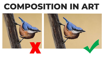
- Option #5 – “Composition”
- Option #6 – “The Ultimate Guide to Shading”
- Option #7 – “Procreate – A Digital Drawing Adventure”
- Option #8 – “The Ultimate Guide to Sighting, Measuring, and Proportion”
And here’s a graphical breakdown of the results…
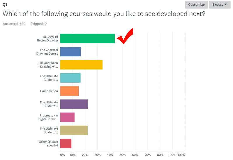
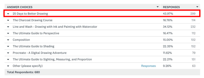
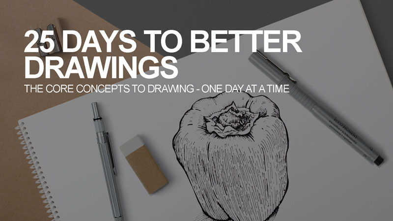
The clear winner is Option #1 – 25 Days to Better Drawings.
So here’s a preliminary look at what will covered in the next course…
“25 Days to Better Drawings”

Course Description: Learn a new drawing concept and skill every day for 25 days. Each drawing concept taught includes a short drawing exercise (less than one hour) that reinforces the concept taught. Students can go through the course in sequential order and choose to have an emailed link sent to them each day of the course; or they can take the course at their leisure, taking each day as they find time.
Concepts and projects that will be covered include (but are not limited to):
- Observational drawing techniques
- Line drawing techniques
- Shading techniques
- Texture studies
- Developing depth and space in drawings
- Perspective drawing
- Facial and figurative proportion
- Light and shadow
- Graphite, charcoal, and ink drawing
- Compositional strategies
- Drawing with white media on black paper
I’m excited to get started and I hope you are too. I expect to release the first modules for “25 Days to Better Drawings” to members by the end of March, 2018. Of course, as each set of modules are released, I’ll be sure to let you know through the newsletter. If you don’t currently receive the newsletter, you can sign up it for here. (It’s free.)
Additionally, voters could write in an option if they didn’t like the choices that were offered. I was surprised to see how many folks wrote in “colored pencils”, “pen and ink”, “pastels”, “portrait drawing” and “acrylics”. (We already have courses on these subjects.) You can check out all of our courses here.
Thanks again for voting! I’m excited about the new addition to the course library and I can’t wait to get started. As always, I’d love to hear what you think. Just leave your comment below…
If so, join over 30,0000 others that receive our newsletter with new drawing and painting lessons. Plus, check out three of our course videos and ebooks for free.
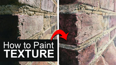
How To Draw Texture
Introduction to Texture
Not once did my drawing mentor talk about texture with me. Texture is one of the seven elements of art and design. So why did my drawing teacher never discuss it?
The answer is this – texture is subordinate to all the other elements of art. Simply put, texture is both the least important and the most challenging. My drawing professor instead focused on the basics, value and proportion. He taught me to do the same.
In some ways texture needs the other elements of art (shape, form, value, color, line) more than they need texture. For example, a portrait can capture the likeness of it’s subject without showing each strand of hair. Conversely, a bunch of stringy lines where the hair goes will not contribute to a portrait’s likeness. Why is that?
How to Draw Hair
It is because shape and form (3-Dimensional) do more to help us recognize a subject than does texture. Shape and form must take first priority. Only then can texture be used with satisfactory results.
Think of texture as icing on a cake and think of the cake as form. Icing makes a cake look great but even without the icing it is still a cake. Without the cake, however, the icing is just a pile of goop.
Don’t worry, texture can add both beauty and grit to your artwork and this article is still about drawing texture, just don’t forget to see the form underneath.
So What Is Texture In Art?
Texture is the way something feels to the touch or looks as if it may feel if it were touched. For many, the word texture implies roughness but texture should refer to any tactile quality; smooth, rough, shiny, fuzzy, bumpy, soft, etc.
*NOTE* The following concepts about drawing texture apply to drawing pattern as well. Texture and pattern are like siblings. They both perform similar functions in art. They add visual weight and emphasis to a subject.
Common Texture Problems?
Of all the textures in all the world, the question I get most is about drawing hair. Grass and leaves are a close second while things like rocks and wood are not far behind.
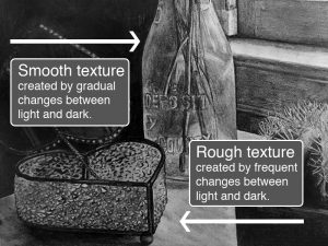
All of these rough surfaces are created by placing many light and dark marks close together. It is the character of the marks, however, that accounts for the many different textures. By using a variety of light/dark, narrow/broad, hard/soft marks, any texture is drawable. A measure of patience is required as well.
Types of Texture
There are four types of texture in art. These types are best understood as a set of pairs.
Actual vs. Implied – Actual texture is touchable. It’s real. Think about a drawing that makes use of collage. The collaged element would stand in relief against the supporting paper, giving the artwork a texture you can both see and feel. Implied texture is the illusion of a textured surface created through changes in value using mark-making.
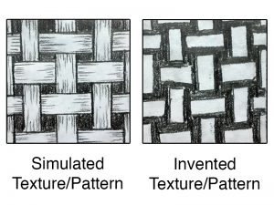
Invented vs. Simulated – Invented and simulated texture are really two sub-types of the implied texture mention above. Both create an illusion of texture so the difference is slight. Simulated texture attempts to copy the nuance of a surface as exactly as possible. Invented texture is typically a simplification of sorts, still communicating the essence of a texture or pattern.
How To Practice
A great way to practice simulating texture is to first make a rubbing of a textured surface and then attempt a freehand copy of that rubbing.
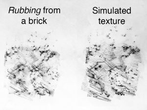
To make a rubbing you will need a thin sheet of paper (copy paper works great), a soft drawing medium (charcoal or ebony pencils are perfect) and a rough surface (bricks, a basket or tree bark work well).
1. Lay your paper on the textured surface. Use tape to hold your paper if the surface is vertical.
2. Using the side of your drawing tool (not the tip) make side-to-side strokes across your paper. Try to keep the strokes together and avoid any gaps.
3. Start with light pressure. If the marks are not apparent enough then increase pressure gradually until the texture begins to appear. Too much pressure may actually obscure the texture you intend to capture.
Once you have captured a few textures using the rubbing technique try to recreate the marks as exactly as possible on a separate sheet of paper. This exercise will help you develop both the delicate touch and the patience to work-up a simulated texture.
*NOTE* It feels a bit like cheating but you can even use rubbings in your actual artwork as long as your drawing paper isn’t too thick.
The Bottom Line
Drawing texture boils down to mark-making and edge quality (hardness and softness of a contour). If you make the same type of marks with your drawing tools you will get the same texture over and over. Each unique texture requires a unique mark. Compare the surface texture of the five spheres below.
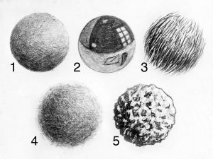
Spheres 1,2 and 4 appear smooth because there are few gaps of raw paper showing through the pencil strokes. These three spheres are different types of smooth textures due to edge quality. Spheres 1 and 2 feel hard because their edges are sharp. Sphere 4 feels soft because it’s edge is irregular and made with loose marks.
While both spheres 1 and 2 feel hard, one seems to have a matte surface and the other a shiny/reflective surface. It is the sharp shapes and highlights within the shape of sphere 2 that create that impression of a reflective surface.
Spheres 3 and 5 are obviously more roughly textured than 1,2 and 3. Though neither are smooth, 3 feels soft next to 5, again, because of the looser edge quality. Sphere 3 is made of lines while sphere 5 is rendered with little dark shapes.
Both of the rough spheres demonstrate how a mingling of light and dark create the impression of texture. Note that, except for the reflective ball, the spheres all demonstrate a clearly defined light source, creating an even change from light to dark. Value and form must always dominate texture.
Conclusion
I’ll leave you with three main points concerning drawing textures…
- Each texture requires a unique mark.
- Value creates texture.
- Form dominates texture.
For some us, it is best to think about shading with textured marks. Approach texture this way and you will never loose the light.
If so, join over 36,000 others that receive our newsletter with new drawing and painting lessons. Plus, check out three of our course videos and ebooks for free.