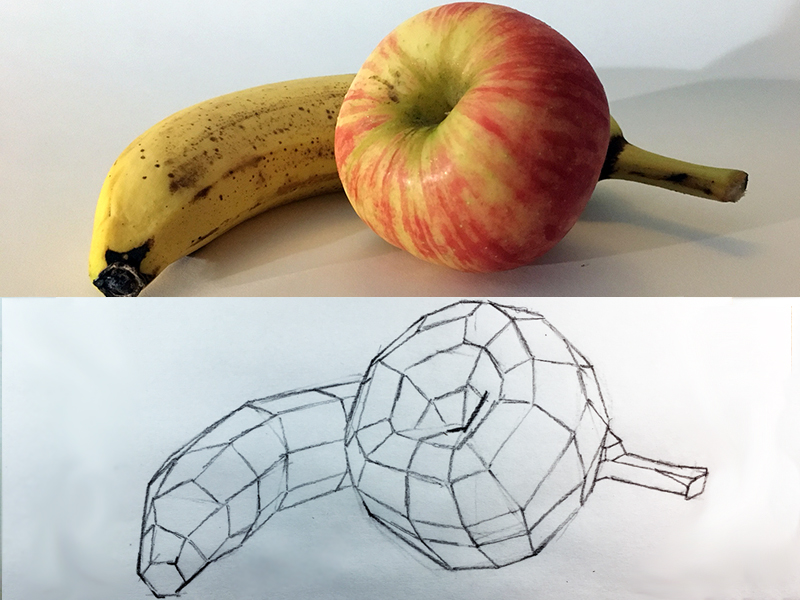
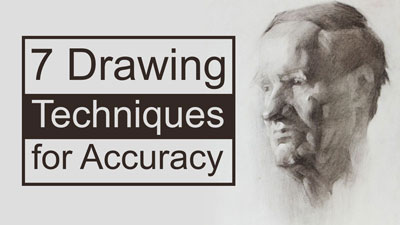
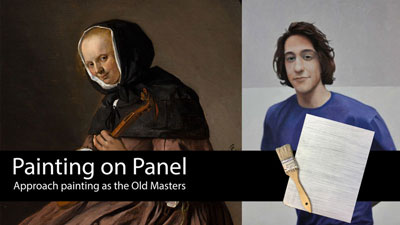
How to Sketch a Crab
Practice makes perfect. And although perfection cannot be achieved in any drawing that we create, we can always improve our drawings skills through practice. Sketching is an excellent way to practice your drawing skills. Although a sketch is not a finished drawing, we still use and exercise the same observational “muscles”.
Gettin’ Sketchy is designed to provide you with a little drawing instruction through a fun drawing challenge. If you missed the previous episodes of Gettin’ Sketchy, you can check out the last three episodes here…
- Gettin’ Sketchy – Sketching a Bird
- Gettin’ Sketchy – Sketching a Frog
- Gettin’ Sketchy – Sketching a Paint Tube with Pen and Ink
This sketching exercise is timed. The goal is to produce a fairly accurate sketch live within 30 minutes. This makes things a little more dramatic, but it’s important to remember that finished drawings require much more time to complete. In this exercise, we couldn’t complete the drawing in 30 minutes. It ended up taking a little more time (45 minutes), but that’s not a problem. By setting a time goal, we at least get started and once we start, we have a good chance of finishing.
Here’s the step by step process for drawing the crab…
- We’ll first simplify the shapes of the crab, looking for the most basic shapes.
- While moving our entire arm, we’ll loosely sketch the shapes that we see. In this case, we’ll start with the shape of the shell and then add the shapes for the legs extending out.
- Using these basic shapes as a guide, we’ll draw in the contour lines (outlines). We can vary the line quality to make the drawing more interesting.
- To finish things up, we’ll add some quick value and shading. This creates the illusion of the light source, texture, and form.
You don’t need any fancy drawing tools for some sketching practice. For this drawing, a basic sketchbook by Strathmore and a mechanical pencil by Steadtler (2B graphite) was used.
(Some of the following links are affiliate links which means we earn a small commission if you purchase at no additional cost to you.)
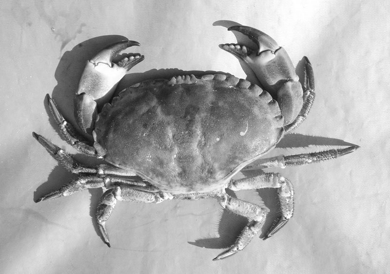
Check out Pixabay.com for free resources for drawing and painting. I picked up this reference from this site and edited it a little with Photoshop. I simply removed the color and cropped the image. If you want to draw along, check out the reference photo below…
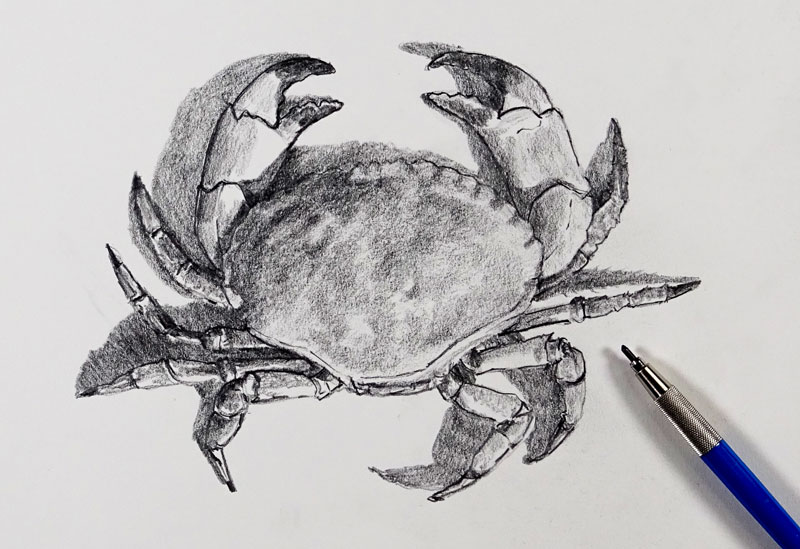
Here’s a look at the finished sketch of the crab…
If you enjoy this kind of thing, be sure to join us live. We’ve made “Gettin’ Sketchy” a semi-regular event. We broadcast live on YouTube (whenever possible) on Wednesday evenings somewhere between 8:00 PM EST to 8:30 PM EST.
Make sure that you’re a subscriber to the YouTube channel so that you won’t miss an episode. You can subscribe here.
If so, join over 36,000 others that receive our newsletter with new drawing and painting lessons. Plus, check out three of our course videos and ebooks for free.
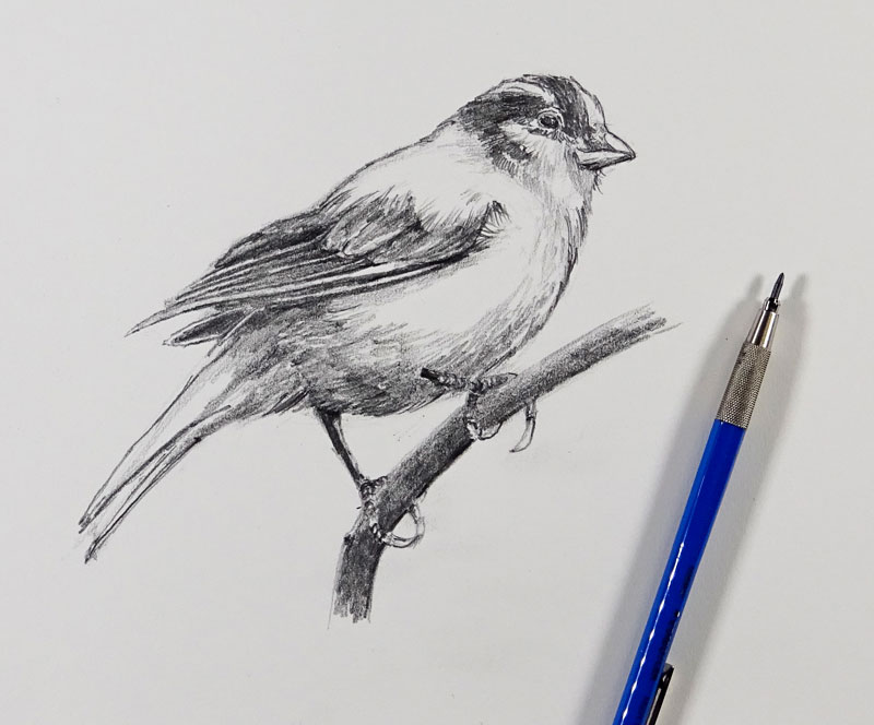
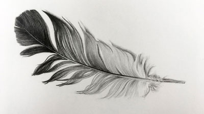
Sketching a Bird – 30 Minute Drawing Exercise
How to Sketch a Bird
Regular time spent sketching in your sketchbook or even loose paper will dramatically improve your drawing skills over time. No matter how new you are to drawing or how long you’ve been at it, practice is a key component to improvement. Even if we create a quick sketch, we’re still working the same “art muscles” that we use when we create a more polished drawing or painting.
Gettin’ Sketchy is designed to help you practice your drawing skills while receiving a little instruction. If you missed the first three episodes of Gettin’ Sketchy, you can check them out here…
- Gettin’ Sketchy – Sketching a Skull
- Gettin’ Sketchy – Sketching a Paint Tube with Pen and Ink
- Gettin’ Sketchy – Sketching a Frog
To make this segment a little more fun, we’ll time the exercise and keep the entire process under 30 minutes. You’re welcome to spend more time on your drawing, if you like. Plus, the segment is broadcast Live on YouTube, adding a little bit of drama. Ultimately, it’s all about having a little bit of fun and improving your drawing skills at the same time.
The process we’ll follow is fairly straight forward…
- We’ll first lay out the basic shapes of the bird, looking for the most simple shapes possible.
- We’ll draw these shapes loosely, using our entire arm, while making multiple marks.
- With basic shapes in place, we’ll draw in the contours (outlines). As we add the contours, we’ll consider the line quality and add a bit of variety to the line.
- Lastly, we’ll develop the form, light source, and texture through the use of value and directional stroking.
Want to see the process of drawing a bird with a more polished drawing, check out this lesson…How to Draw a Bird with Graphite Pencil and White Charcoal
We’re using basic materials for this exercise. The paper is from a sketchbook by Strathmore. It features 70 lb. drawing paper with a medium to fine tooth (texture). The mechanical pencil is by Staedtler with 2B lead. I absolutely love using this pencil. It’s easy to sharpen quickly and provides a nice long tip, suitable for fine detail work or softer shading.
(Some of the following links are affiliate links which means we earn a small commission if you purchase at no additional cost to you.)
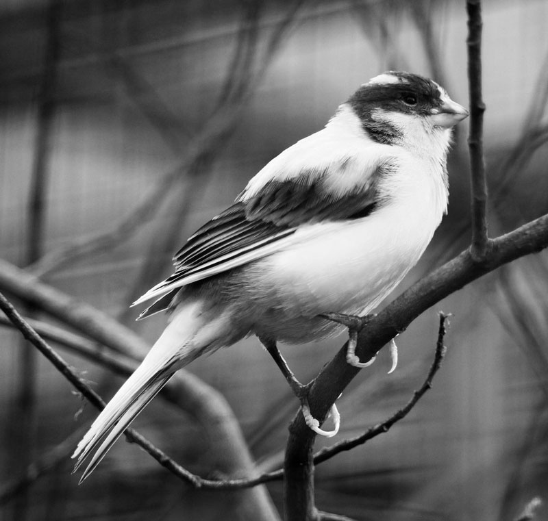
The photo reference for this sketch comes from Pixabay.com, a free resource for photo references. It has been edited slightly from its original state. I removed the color and cropped the image down to a suitable size. Here’s a look at the edited reference, if you want to draw along…
Here’s a look at the finished sketch…
“Gettin’ Sketchy” is now a semi-regular event on the YouTube channel. Join us each week (whenever possible) on Wednesday evenings at around 8:00 – 8:30 PM EST for some live sketching fun.
If you’re not a subscriber to the YouTube channel, you can subscribe here.
If so, join over 36,000 others that receive our newsletter with new drawing and painting lessons. Plus, check out three of our course videos and ebooks for free.
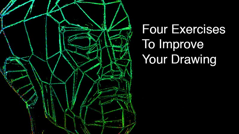
Four Exercises To Improve Your Drawing
Art, unlike baseball, is always in season but spring training reminds me that it is okay to practice, even if you are in the major leagues. Drawing practice looks quite a bit different than baseball practice but there are some commonalities. These commonalities extend to other disciplines as well – music comes to mind.
What makes practice effective?
Effective practice has both a goal and a targeted exercise to realize that goal.
Whether performing drawing or sports exercises, practice doesn’t always look like the real thing. Take batting practice for example. A coach may throw the same curve ball over and over so that a player can learn to hit that one pitch. However in a game, the batter does not know which pitch is coming.
Basketball practice often targets a specific skill as well – three players may repeat a passing and shooting sequence at half speed to perfect their timing and position before attempting the same maneuver in a game.
Likewise, art training does not always result in a piece of art but it does hone our skills. This article showcases some of the skill building exercises that have helped me and countless others improve our drawing skills. A version of these exercises may even become a part of your standard drawing process, as they have mine.
4 Exercises To Improve Your Drawing
Blind contour drawing is an important exercise. It is the most well-known of all the exercises we will cover and requires the least amount of skill to perform. Blind contour drawing benefits artists of all skill levels.
The Process
At first, blind contour drawing is uncomfortable. There are a few rules to follow:
- Don’t look at your paper.
- Only look at your subject.
- Keep your pencil on the paper for the duration of the drawing.
The drawing is made from one continuous line. Since the pencil stays in contact with the paper, there should be only one beginning and one end to your line. You may have to retrace your line to move around in the drawing or simply leave out parts of your subject. It doesn’t matter. What your drawing looks like is not the point of this kind of practice.
The Benefits
Blind contour drawing does two things. First, Blind contour drawing develops eye-hand coordination. Not the type of coordination used to catch a ball out of the air. That type of action depends on coordination between the eye and gross-motor functions. Blind contour drawing coordinates fine-motor function with the eye. It tethers the hand and eye like a wagon is tethered to a horse. The eyes are the horse and the hand just follows along.
The second benefit of blind contour drawing is the breaking of a bad habit. Novice artists are in the habit of looking at their artwork too much and looking at their subject to little. The answer to all our drawing problems is right there in front of us. If we would only look at our subject more often, we would find more success. Blind contour drawing trains us to look at our subject more, constantly checking what we see against what we are drawing.
I remember the first time I was asked to make a drawing using only straight lines. It was a figure drawing class and our model that day was a portly man in his golden years. He was all curves and wrinkles – no straight lines to speak of. This straight-line approach to drawing became my standard mode for beginning any drawing, not just when practicing.
The Process
Some subjects have truly straight edges, but even an organic shape has some segments along its contour that bend at greater and lesser degrees. The more gently bowed segments of a curve are changed to straight lines while strongly curved segments become corners. This process results in a useful simplification of the subject.
The Benefits
When we change the curves to straight lines we are forced to analyze each curve to determine where along that curve the corners should go. Each straight line is a conscious, meaningful decision about the subject.
Once a straight-line drawing is made, the artist can then change those straight lines and corners to curves. The result is a drawing that accurately captures the nuance of each curve.
Before describing the process of a plane-analysis, it’s worth noting that the exercises described in this article gradually increase in challenge level. Plane-analysis is suitable for intermediate through advanced level artists.
The Process
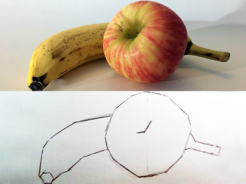
Begin by making a contour line drawing of an organic subject using only straight lines. The subject may be simple, like a piece of fruit – or complex, like a self-portrait from a mirror. After finishing my straight-line shape, I ask myself, “If this form had a corner, where would it be?”
Try to identify the shape of generally flat planes. Most of the shapes I use in this exercise have 3-5 sides. Make an edge or corner where the various planes seem to change direction.
When done correctly, the subject will appear as though it is made of facets like a cut diamond. Similar to the straight-line drawing, this exercise results in a stylization of the subject.
The Benefits
This mode of drawing helps the artist to internalize a subject’s form. By purposefully drawing each plane, the artist will likely memorize the form and be able to draw it from imagination after the exercise.
A plane-analysis improves the artist’s shading as well. It helps us to see subtle plane distinctions that might otherwise go unnoticed. There is no denying that each plane should have a unique value since each plane is uniquely tilted in space. My own drawing and painting acquired a more solid, sculptural quality after completing a few plane-analysis drawings.
The Process
Set up a still life with lots of empty space. Use long, thin items and be sure that everything overlaps and is visually connected (see video example).
Now draw the parts of the still life where edges meet – where they visually intersect. Include any hard corners that may be a part of the objects. Do not draw whole contours but instead work to arrange the “intersections” so that the missing portions of the drawing are easily imaginable as implied edges/lines.

The Benefits
Have you heard the phrase, “can’t see the forest for the trees?”. It is a colloquial expression meaning that a person is only focused on an individual thing and cannot understand how that thing is part of something greater.
Intersection drawing trains the artist to see the whole forest and not just the individual trees. When the artist is capturing an intersect he/she is capturing a relationship of two or more parts at once. The result is a more accurate, unified drawing in which the space between and around the subject is part of the subject too.
Conclusion
Make these drawing exercises a part of your warm-up routine and it won’t even seem like practice. If you don’t have a warm-up routine, then now you do.
If so, join over 36,000 others that receive our newsletter with new drawing and painting lessons. Plus, check out three of our course videos and ebooks for free.
Sketching a Frog – 30 Minute Drawing Exercise
Sketch a Frog
It’s time for some more sketching practice and in this episode, we sketch a frog. If you missed the first two episodes of Gettin’ Sketchy, you can check them out here…
This new series of lessons is designed to help you develop a regular practice of sketching. A little drama is thrown in since the drawing exercise is timed (30 minutes) and the lesson is broadcast live. It’s all about having fun and improving while doing so.
We’ll first loosely define the basic shapes of the frog and then define the contour lines. From there, we’ll quickly add a bit of value and tone to complete the sketch. This approach of drawing basic shapes first can greatly improve our speed as well as accuracy.
For more on increasing your speed and accuracy by drawing basic shapes, check out this lesson…Drawing 101 – Simplify for Success
For this exercise, I’m working in a sketchbook by Strathmore. The paper is a small step up from regular sketch paper, consisting of 70 lb. “drawing” paper. I’m also using a mechanical pencil with 2B graphite by Staedtler. This pencil is fantastic and provides quite a bit of control and produces a variety of marks.
(Some of the following links are affiliate links which means we earn a small commission if you purchase at no additional cost to you.)
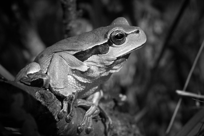
The photo reference for this sketch comes from Pixabay.com, a great resource for photo references. I decided to edit this image a little. I flipped the positioning of the frog so that it faced the right and removed the color information, leaving only the black and white values. Here’s a look at the edited reference if you want to draw along…
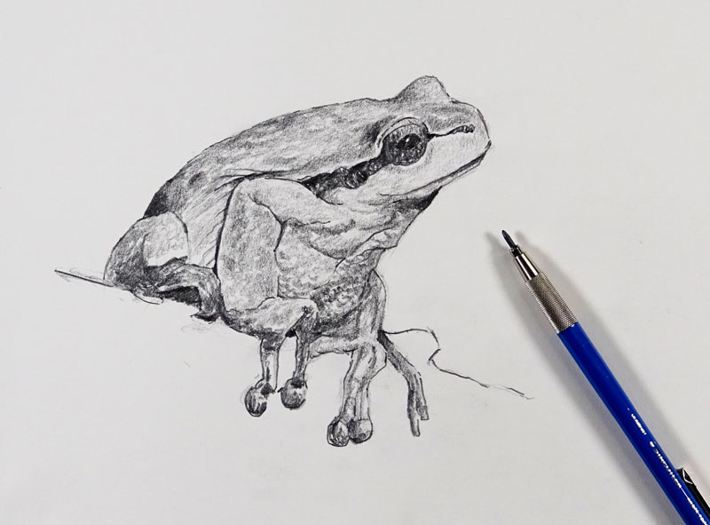
Here’s a look at the finished sketch…
“Gettin’ Sketchy” is now a regular event on the YouTube channel. Join us each week on Wednesday evenings at around 8:00 – 8:30 PM EST for some live sketching fun.
If you’re not a subscriber to the YouTube channel, you can subscribe here.
Want some more practice with graphite drawing? Check out our pencil drawing lessons.
If so, join over 36,000 others that receive our newsletter with new drawing and painting lessons. Plus, check out three of our course videos and ebooks for free.
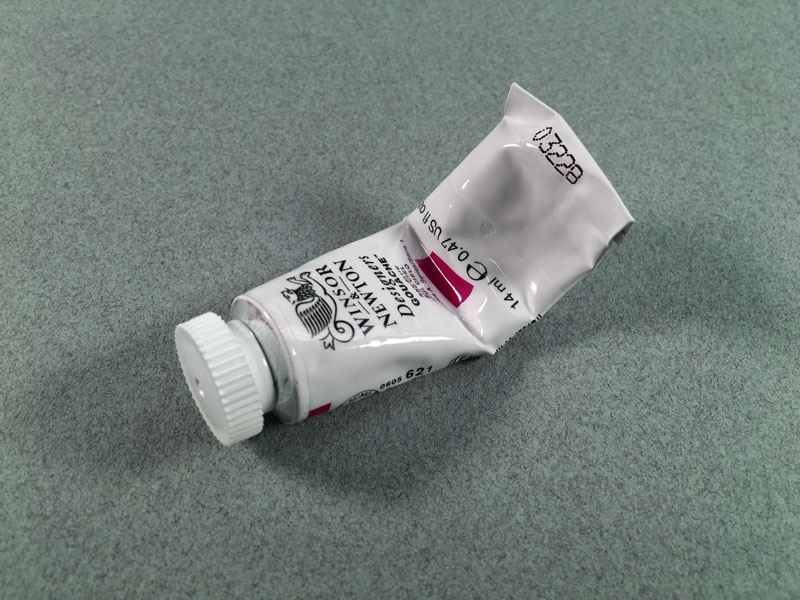
Sketching a Paint Tube – 30 Minute Drawing Exercise
Gettin’ Sketchy – Sketching a Paint Tube in 30 Minutes
A regular practice of sketching should be a part of every artist’s routine. If you practice daily for just 30 minutes, you will see improvement in your drawing skills.
It doesn’t matter what you draw, just as long as you’re drawing something. You can practice your observational drawing skills with just about any object that you have laying around. It’s just a matter of grabbing that sketchbook and taking a few minutes to sit down and draw.
Even when we create a loose quick sketch, we’re practicing the same skill set required for more polished drawings. While some sketches can stand on their own as a finished works of art, most sketches are created for practice.
In this episode of Gettin’ Sketchy Live, we create a quick 30 minute drawing of a paint tube and finish the sketch with pen and ink.
Here’s the photo reference, if you want to draw along…
“Gettin’ Sketchy” is now a regular event on the YouTube channel. Join us each week on Wednesday evenings at around 8:00 – 8:30 PM EST for some live sketching fun.
If you’re not a subscriber to the YouTube channel, you can subscribe here.
Want some more practice with pen and ink drawing? Check out our pen and ink lessons.
If so, join over 36,000 others that receive our newsletter with new drawing and painting lessons. Plus, check out three of our course videos and ebooks for free.
How to Paint Texture
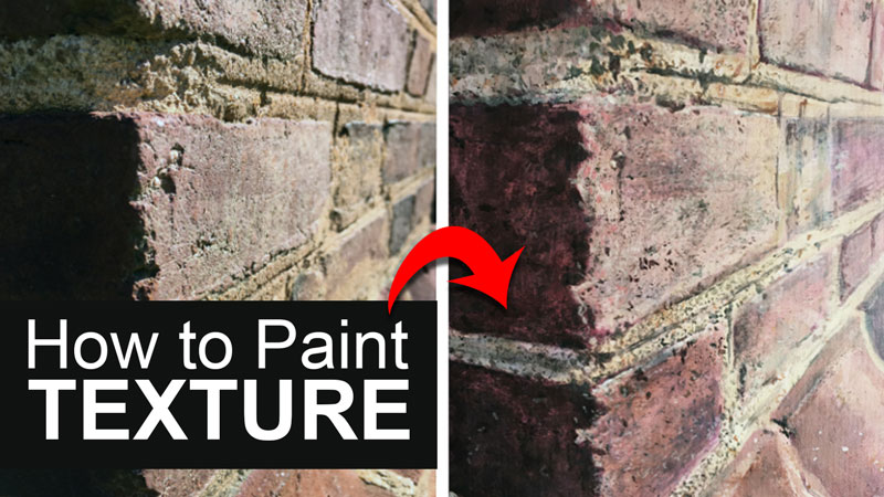
What Kind of Texture are We Talking About?
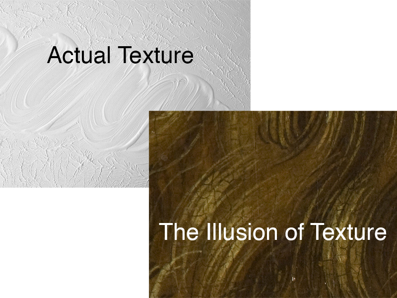
In terms of painting, texture refers to either the way something looks as if it may feel or to the actual surface of the paint. This article is about the former and not the later, although using brush strokes in relief can also add to the illusion of a subject’s texture.
Problems with Painting Texture
Some problems are fun to solve. Texture is one of those problems. Each texture is unique, requiring a fair measure of creativity to work through.
Painting texture is really about mark-making. The illusion of texture is created through a frequent alternation between light and dark marks.
The marks used to paint a wispy field of grass are different from those used to paint a rocky canyon wall. Each texture is its own painting experience, challenging even with the most practiced artist. The artist must find new ways to make marks for each texture. Some artists vary their hand motions with brushes to achieve the variety of marks needed to differentiate between textures. Other artists find or make painting tools that produce the character of marks they desired.
Most textures are represented through the application of an uncountable number of marks. Painting texture requires patience, time and a keen eye.
Approaches to Texture in Art History
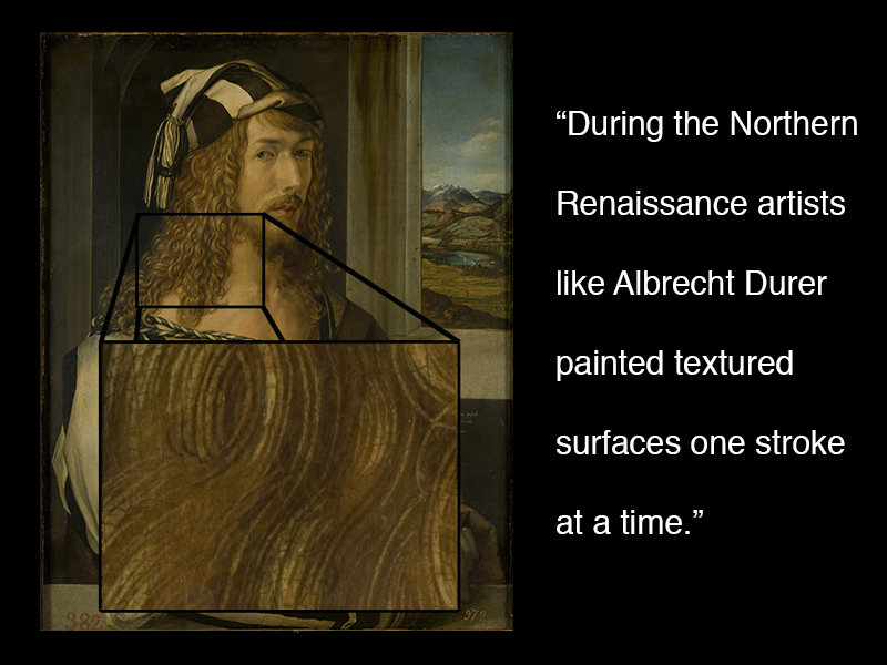
Before the Twentieth Century, artists seem to fall into two general categories regarding texture. Some artists laboriously worked to capture observable textures through the application of many careful brush strokes. During the Northern Renaissance, artists like Albrecht Durer painted textured surfaces one stroke at a time. In Durer’s Self-Portrait, he first painted the hair a general color. Then he worked in layers, alternating between lighter and darker strokes, until finally reaching the desired complexity of texture. No part of the hair is spared from Durer’s relentless rendering of texture.
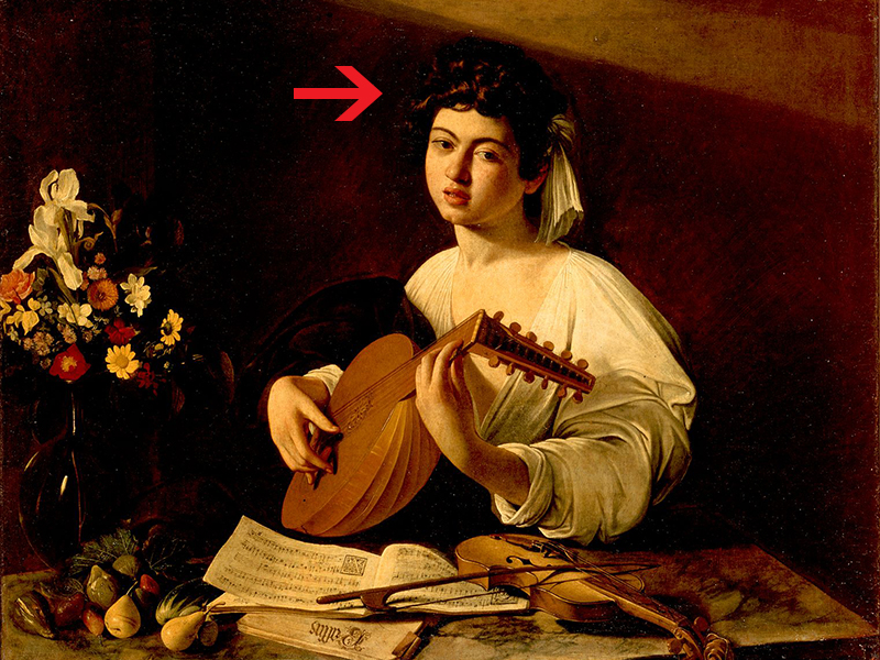
Contrarily, Caravaggio, an Italian Master from the Baroque period only suggested texture when necessary, instead focusing on form and color to bring his subjects to life. In The Lute Player, Caravaggio uses only a few strokes to suggest the texture of hair. The entire right half of the hair is just a solid color.
Painting A Texture
Unfortunately, there is not a single process used to paint all textures, since each texture is unique. There are, however, some general steps I take to create most textures.
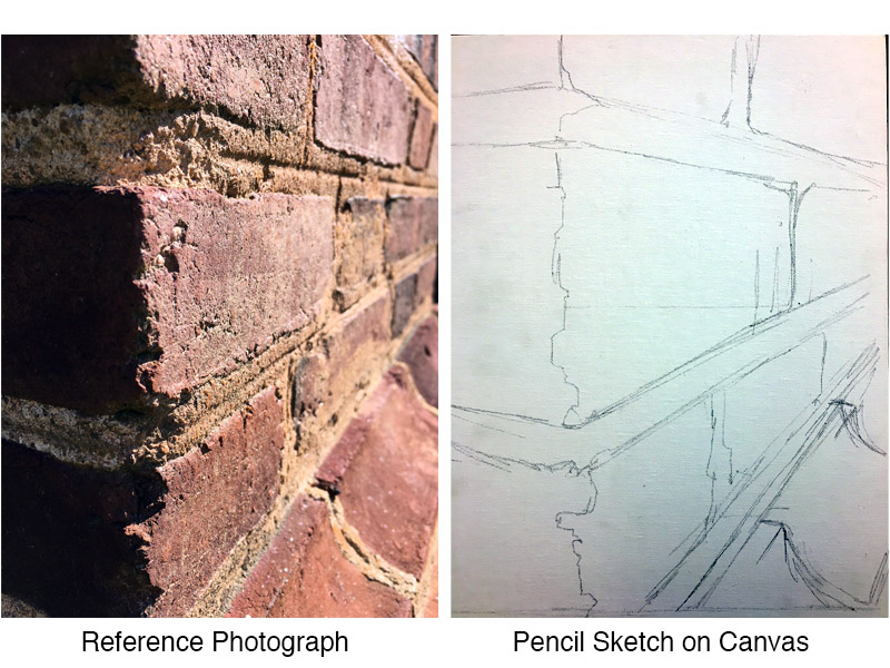
For this article, I’ve selected a corner of bricks as my subject. I’ll share my thought process as I work through this texture.
Painting a Texture – Step One
Scale – Scale, in this case, refers to the size of an artwork. Since textures are often rendered with small marks I like to work larger than life whenever possible. I could never make marks as small as those that I can observe in my subject. By enlarging my subject I’ve enlarged the size of the marks I’ll need to paint as well, giving me a better chance of success.
Step Two
Paint Selection – Like Albrecht Durer’s rendering of hair, I plan to build up several layers of small marks. I prefer to use oil paint. However, the fast drying-time of acrylic paint is advantageous when building up layers of marks. With acrylics, I can paint several layers on a given day instead of having to wait as many as two days between each layer, greatly speeding up my process.
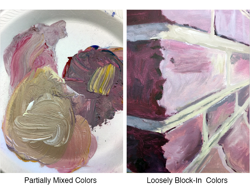
Step Three
Paint Mixing – Variety is a principal of art and a hallmark of texture. I try to show variety in a texture from the first brush stroke onward. When I mix colors for a textured subject, I do not completely mix the paint. This allows for some unplanned, random variance of color.
Step Four
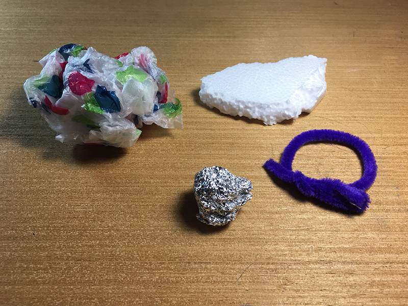
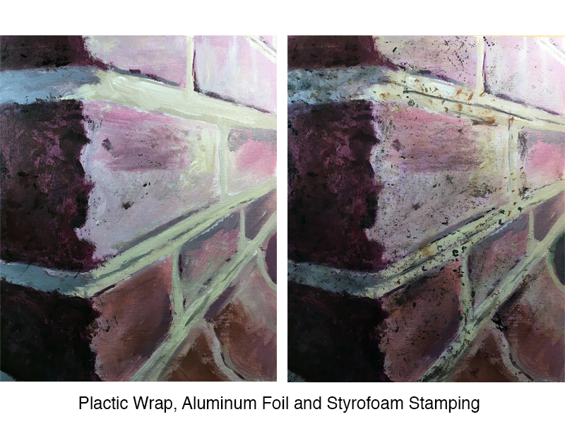
Painting Tools – Brushes may not be the perfect tool for making all marks-types of a certain texture. It is fun and creative to find and make tools specific to certain textures. It almost feels like cheating when I find just the right tool. I often use wads of paper, tissue, foil and cloth. Painting texture with a texture just makes sense. For the bricks, I mostly relied on the textures of broken Styrofoam and crinkled aluminum foil.
Step Five
Speed – If my marks need a lot of variety I work faster. If I need more uniformity to my marks I work slower. For the bricks, I built up marks quickly, using non-traditional tool. I made marks deliberately but not carefully in an effort to create the random quality of marks that I observed in my subject.
Step Six
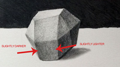
Finding Order – After feverishly applying random marks across my canvas, I need to go back to the brush and bring some order to the chaos. In this step, I look for places to clarify the shapes of light and dark. I also identify marks that are not working and paint those marks out.
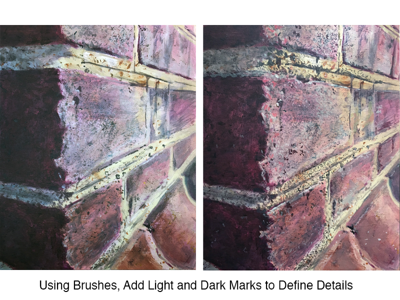
During this stage, I slow down and focus on the areas where light and shadow meet. These areas reveal the most about a texture.
Step Seven
Color Correction – Sometimes the color gets away from me while I focus on texture. Applying a colored glaze (thinned, transparent color) over my texture will do two things.
First, it gives me a chance to “fix” the color of my subject. Notice that my painting was too cool in terms of its overall temperature. By applying an orange glaze over the entire surface I’ve brought the temperature more in line with my reference photograph.
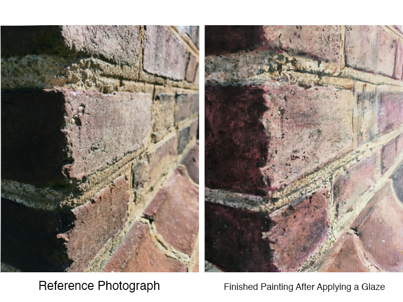
Second, it unifies my paint marks. Sometimes, the thousands of marks used to build a painting have a feeling of disconnectedness with each mark being separate from the next. A final glaze of color pulls these marks together, giving them a quality of oneness or unity.
Summing It All Up
There are an endless number of methods that we as artists can use to create textures in a painting. Sometimes, creating the right texture for your work requires a little “outside of the box” thinking and some experimentation. Texture boils down to the relationships of values and the marks that you make. How you make these marks and create these relationships of value are where your creative powers come into play. So get creative and start making some texture magic happen in your paintings.
If so, join over 36,000 others that receive our newsletter with new drawing and painting lessons. Plus, check out three of our course videos and ebooks for free.
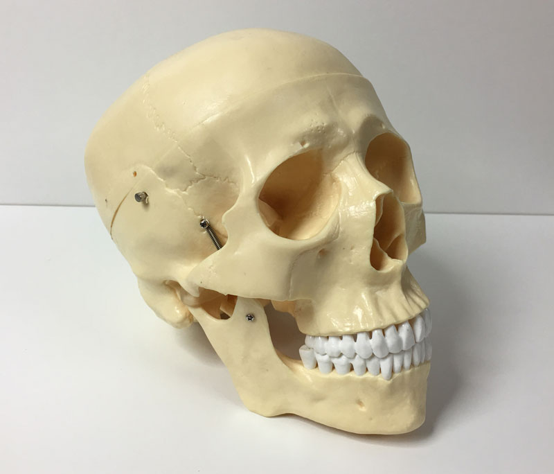
Sketching a Skull – 30 Minute Drawing Exercise
Gettin’ Sketchy – Sketching a Skull in 30 Minutes
A practice of regular sketching should a part of very artist’s routine. Sketching, a looser and quicker form of drawing, helps to train our brains to see the world as an artist. There are other benefits to regular sketching such as relaxation, improving concentration and focus, and improving hand-eye coordination. But for artists, perhaps the most important benefit is the drawing improvement.
It can be hard for some of us to make time for a practice of regular sketching. Luckily, sketching doesn’t require a big time commitment and you can accomplish quite a bit in a short period of time. Spending as little as 30 minutes a day sketching in a sketchbook or on “scratch paper” can make a huge difference in your drawings skills.
A New Segment for You
In this first episode of a new segment called “Gettin’ Sketchy”, we create a quick sketch of a skull. Some folks may look at a subject such as this and become intimidated by the details. But even a complex subject like this can be broken down into basic shapes and forms.
We’ll set the timer for 30 minutes and then look for the most basic of forms – a cube and a trapezoid. If we begin by drawing these basic forms and then turn our attention to the contour lines, the process becomes much easier. Starting with basic forms also helps us with our accuracy and speed.
After drawing the basic forms, we can then draw the contour lines with more confidence. We can adjust the line quality to add a bit of variety and then add as much shading and value in the remaining allotted time.
Here’s the photo reference for you to use with this exercise…
I hope to make “Gettin’ Sketchy” a regular event on the YouTube channel. If you enjoy it, I’ll continue to bring it to you. It should make a nice addition to all of the lessons that we produce for you each week.
If you’re not a subscriber to the YouTube channel, you can subscribe here.
If so, join over 36,000 others that receive our newsletter with new drawing and painting lessons. Plus, check out three of our course videos and ebooks for free.
Experiment When Choosing Background Colors For Paintings
Use Photoshop to Experiment with Your Art
You’ve probably been there before. You dove headfirst into a drawing or a painting and completed the main subject and now it’s time to address the background. You know that you want the background to compliment the subject, but you’re not sure what to do. You’re afraid that your decision may ruin the work. As a result, you’re frozen with fear.
Of course, this common dilemma can easily be avoided by creating thumbnail images before you even start on the final work. Thumbnail sketches are recommended so that you can work out all of the composition problems, the balance of values, color relationships and so on.
But even though you may create thumbnails and have a solid idea of how the finished work will materialize, things change. It’s great to have a plan but sometimes we change our mind along the way. We may move a subject in the composition, use different colors, adjust values, or any other number of things that happen during the art creation process.
When these things happen, which they do quite often, we have to make adjustments to our original plan. Instead of guessing and hoping for the best, we can use a bit of technology to help us make the best decisions regarding composition, color, etc.
Photoshop and other photo manipulation programs are invaluable resources for modern artists. Obviously, these programs can be used to alter photos and even make art from scratch, but they can also be used as an “in-progress thumbnail machine”.
In a recent Live Lesson series, we ran into the issue of background color choice. My original plan for the work was to develop a neutral background (lighter cream color) after completing the details of the bird and the small tree he is perched upon. But during the painting process, I started to second guess that decision. I had already painted the majority of the body of the bird so it wouldn’t have made much sense to hop over to the background to “experiment” with colors.
I could have just stuck with my original plan of keeping the background neutral but my instincts were telling me that the work needed more contrast. The lighter background that I had originally planned may have washed out the subject and possibly a different color or darker value would be a better choice.
So, before I made the final decision, I jumped over to Photoshop to do a bit of experimenting. Using Photoshop, I was essentially able to create in-progress thumbnails so I could see how different color relationships would affect the finished work.
It doesn’t take very long to do this and the number of in-progress thumbnails that you can create is limitless.
If so, join over 36,000 others that receive our newsletter with new drawing and painting lessons. Plus, check out three of our course videos and ebooks for free.