Materials for This Drawing
For this lesson, we’ll use two distinct forms of drawing media. We’ll create an underpainting with markers and then apply wax-based colored pencils over the top. We’ll apply the two mediums to marker paper, which will help prevent any bleeding from the markers and provides a smooth surface for creating transitions of color and value.
The markers are capable of filling in larger areas of color quickly and allow for layering. However, it can be difficult to develop details with the markers. The colored pencils, on the other hand, are designed and better suited for details. However, covering large areas with colored pencils can be very time-consuming.
Luckily, we can easily combine colored pencils with markers since these two mediums work well together. This allows us to use the best characteristics of each of these mediums for our benefit.
The Reference Photo
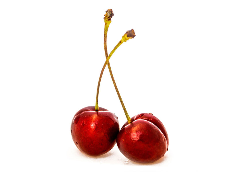
The reference image used for this drawing comes from Pixabay.com. This is a free resource for finding photo references. It has become one of the first places I look for a reference if I cannot create what I need myself. In most cases, I find an image that will work for the drawing or painting I wish to create and then edit it in Photoshop. This reference image required little editing. All I did was crop the original image down to make the composition vertical. (A horizontal composition left too much negative space around the subject.)
Here’s a look at the edited reference photo…
How to Draw Cherries Step by Step
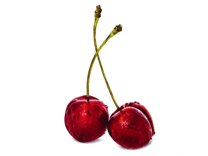
After we have created a light contour line drawing of the cherries on marker paper using an H graphite pencil, we can begin creating our marker underpainting. We’ll begin filling in most of the body of both cherries with an application of Carmine Red. We’ll avoid the areas of strongest highlight.
We can then begin broadening the range of value and tone. We’ll first address the lighter values with a Blush Pink and Pale Vermillion. Then, the darker tones are addressed with a Crimson Red.

See Also: How to Draw with Markers and Colored Pencils
Additional Marker Applications
As we continue to layer marker applications, we can begin to develop a bit more depth in the color. We can use a few neutrals to change the value of the colors that we have in place. First, 20% Warm Grey is applied over both cherries while continuing to avoid the highlights. This color is also used for the cast shadows found under each of the cherries.
After 20% Warm Grey, we can push the value range a little further with an application of 50% Warm Grey – and then a little darker with 70% Warm Grey.
By broadening the range of value, the form and texture of the cherries begins to make a bit more sense.
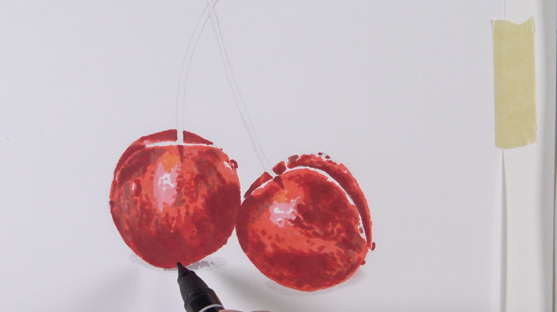
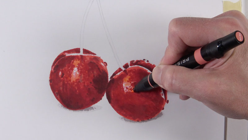
The marker applications alone produce a splotchy appearance. We’ll smooth out things a bit when we begin applying colored pencils, but we can unify the drawing a bit further with additional marker applications.
To help to unify the colors on the cherries and to add a bit more consistency, we’ll go over the body of both cherries with a Poppy Red.
For the areas of lighter value, we can further unify the transitions with a bit of the color, Peach.
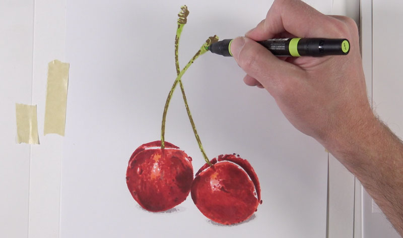
We’ll continue developing the marker underpainting by now turning our attention to the stems of the cherries. First, an application of the color, Lime Peel is applied to the body of the stem. Again, we’ll avoid the highlights, leaving the white of the paper.
A bit of the color, Dark Brown is applied to the top portion and down the shaft of each of the stems. To provide a bit more depth to the color, Cream and Chartreuse are applied.
For the darkest tones found mainly at the bottom of the stems, 70% Warm Grey is applied.
Colored Pencil Applications
Now that our marker underpainting is in place, we can begin applying colored pencils over the top. Since we’ve created a nice base for our drawing, we can now use the colored pencils to develop the details and intensify the colors. We’ve saved ourselves quite a bit of time by creating an underpainting since some of the marker applications will still show through the colored pencil applications.
We’ll begin with Tuscan Red, addressing mainly the darker tones on the first cherry. For the lighter values, we’ll use Light Peach. For the strongest highlights, white is applied.
Once these initial applications are made, we can brighten the color a bit by applying Crimson Red.
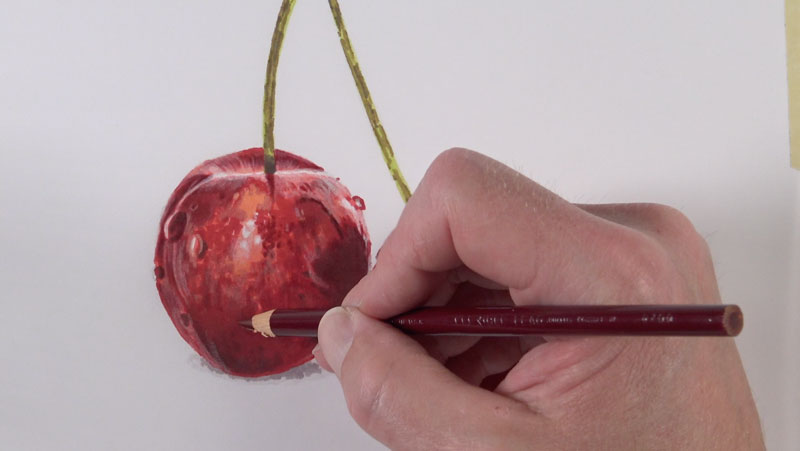
To add a bit more variety and to address some of the orange undertones, Salmon Pink and Mineral Orange are applied. The darkest areas of shadow are strengthened with a bit of Dark Umber.
Since the surface of the cherries is a smooth texture, we’ll need to be sure that this is captured in the drawing. Although the tooth of the paper is relatively weak, we still can notice a coarse texture produced by the colored pencils. To smooth this texture, we’ll need to do a bit of burnishing.
To burnish the applications in place, we’ll use a colorless blender. A colorless blender is a colored pencil devoid of any color. When applied, the wax from the pencil works the color of the applications already in place into the texture of the paper. The act of burnishing with this special pencil creates a smoother appearance to our drawing and more closely resembles the texture of the cherries.
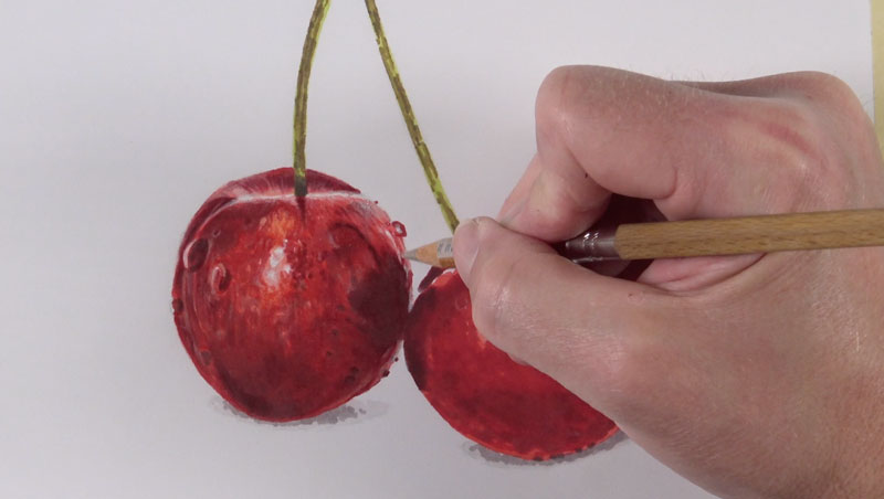
We’ll follow the same steps to develop the colored pencil applications on the second cherry. Again, we’ll begin with Tuscan Red, Light Peach, and White.
To add a warmer, orange undertone, Salmon Pink and Mineral Orange are again used. Darker tones are addressed with Dark Umber and the color is brightened with Crimson Red. Again, we’ll burnish the colors with a colorless blender.

Now we’ll move on to the stems of the cherries. We’ll start with an application of Lemon Yellow with a medium to heavy application. Then we’ll apply a bit of Green Ochre to develop some of the darker tones – at the top of the stem and along the shaft.
We can add a bit of warmth to the stems of the cherries with an application of Burnt Ochre and darken up the shadowed areas at the bottom with a Dark Umber.
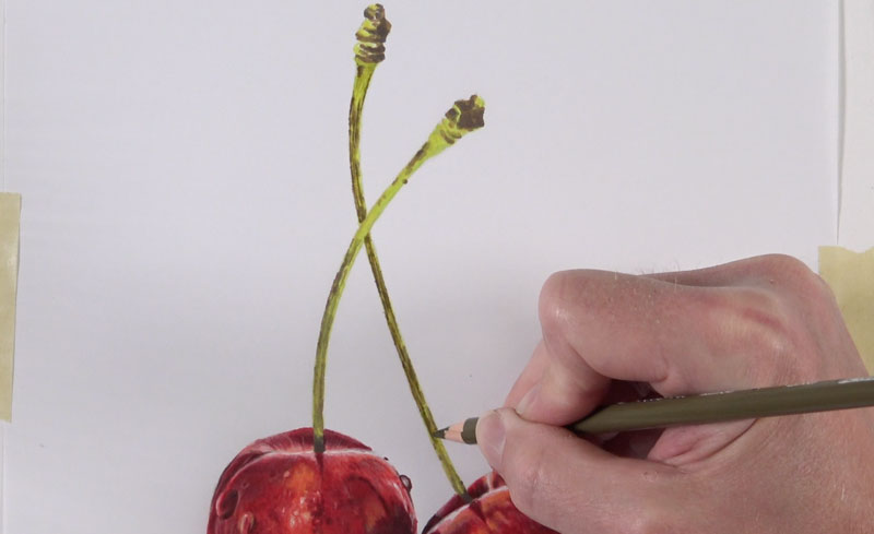
We’ll next apply colored pencils to the cast shadows under the cherries. First, 20% Cool Grey is applied, followed by a darker 50% Cool Grey.
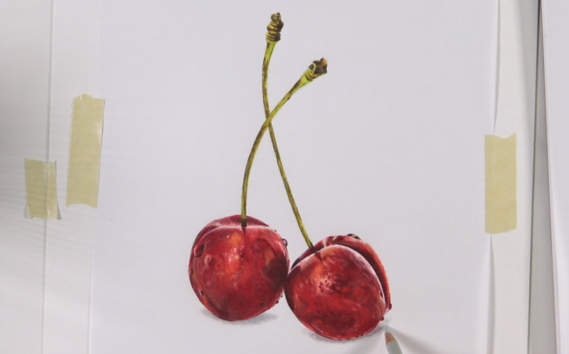
To complete the image, we’ll revisit the body of the cherries with Scarlet Lake. This color acts to unify the variety of reds and oranges and smooths the transitions of value further.

Conclusion
When we mix drawing media, we can take advantage of the strengths of each medium that we use. In this case, we saved a bit of time by creating an underpainting with markers. Since colored pencils are suited for finer details, we used them to develop the details in our drawing. No matter the medium or combination of media that we use, patience is important for drawing success. We often must work slowly and allow our drawing to develop through layered applications.
If so, join over 36,000 others that receive our newsletter with new drawing and painting lessons. Plus, check out three of our course videos and ebooks for free.
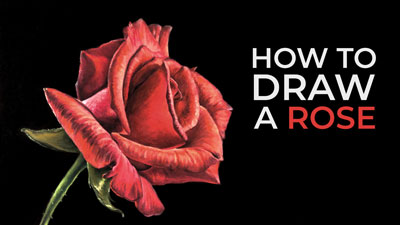
How to Draw a Rose – 30 Minute Drawing Exercise
How to Draw a Rose
Like all of our live “Gettin’ Sketchy” episodes, the goal is to create a quick sketch of a challenging subject within a 30 minute time constraint. Sometimes, we get the drawing finished within this time frame, and sometimes we don’t. In this sketching exercise, we went a little over. The entire sketch took just under 45 minutes to complete – so just a little longer than 30 minutes.
But the time constraint and creating the drawing within it is not really the point of this exercise. The true mission is to help you develop your drawing skills and encourage you to develop a regular sketching practice. Even if we create a quick sketch of a subject, we’re still using the same “artistic muscles” that we would if we created a drawing that took 20 hours.
With this rose, we begin the process in the same manner that we would if the drawing was to be finished in a more complete way. We start by locating general shapes and draw these loosely with rougher marks. Once these simple shapes are in place, we can refine the drawing by adding smaller shapes and then begin adding the contour lines. If we begin with just the contour lines, we’re likely to notice some distortion in the drawing.
By starting with the shapes, we have a better chance of capturing the rose as we see it. We add the contour lines or outlines after we’ve established the basic shapes and can use them as a guide.
Regular sketching practice should be a part of your artistic development. If you just spend a few minutes everyday in your sketchbook, you’ll notice improvement. For many of us, just getting started is the tough part.
Gettin’ Sketchy is designed to provide you with a little drawing instruction through a fun drawing challenge. If you missed the previous episodes of Gettin’ Sketchy, you can check out the last three episodes here…
- Gettin’ Sketchy – Sketching a Boat on the Water
- Gettin’ Sketchy – Sketching a Crab
- Gettin’ Sketchy – Sketching a Bird
Here’s the step by step process for drawing the rose…
- We begin with a general, rigid shape for the outer boundaries. Within this shape, we can draw a smaller shape that is somewhat like a cone.
- From there, we can continue to build out progressively smaller, more detail-oriented shapes.
- Once we have the simplified shapes in place, we can draw in the contour lines and begin focusing on the details that are observed.
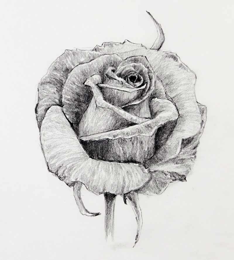
- Lastly, we add a range of value using directional stroking with the graphite pencil. The directional strokes should flow over the form of each petal. These types of strokes are called cross contour lines. This not only develops the value but also further helps to define the form of the rose.
We use only basic drawing supplies for this exercise. A simple pencil (2B) and drawing paper is required. A kneaded eraser is used, but not required.
- Staedtler Mechanical Drawing Pencil (2B Graphite)
- Drawing Pad
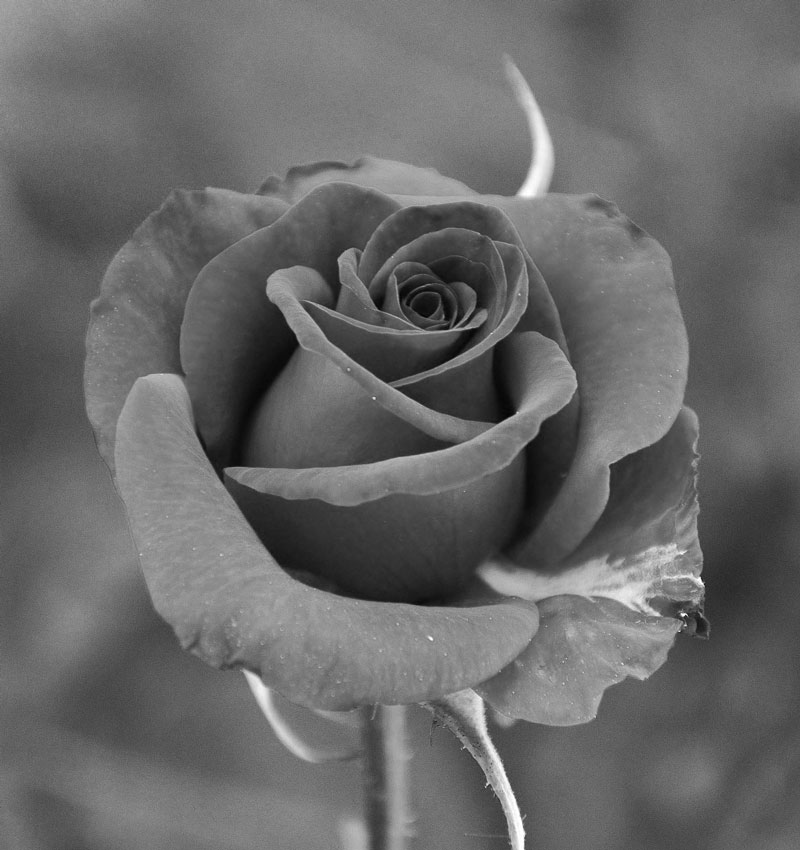
If you’re looking for photo references, you may check out Pixabay.com. I picked up this reference image from there. I slightly edited this image in Photoshop by taking out the color and brightening it a bit. If you want to draw along, check out the reference photo below…
Here’s a look at the finished sketch of the rose with graphite pencil…
If you enjoy this kind of thing, be sure to join us live. We’ve made “Gettin’ Sketchy” a semi-regular event. We broadcast live on YouTube (whenever possible) on Wednesday evenings somewhere between 8:00 PM EST to 8:30 PM EST.
Make sure that you’re a subscriber to the YouTube channel so that you won’t miss an episode. You can subscribe here.
If so, join over 36,000 others that receive our newsletter with new drawing and painting lessons. Plus, check out three of our course videos and ebooks for free.
How to Draw a Lizard with Pen and Ink
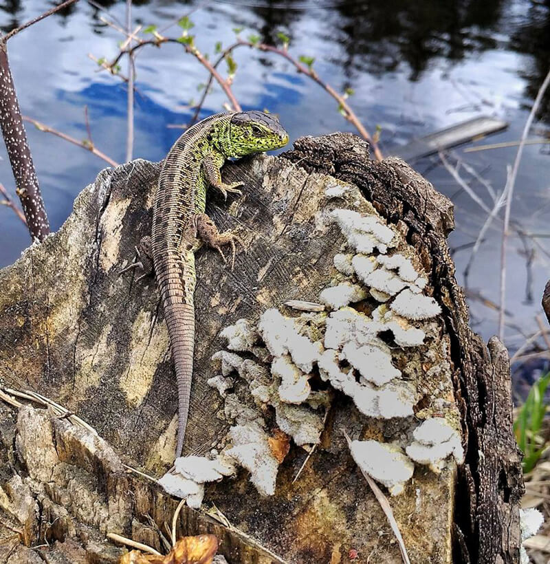
This wonderful lizard was sitting on a tree stump and apparently, tried to warm itself. I came closer, and trying to be as quiet as possible, I took a photo with my phone. Luckily, the lizard didn’t flee!
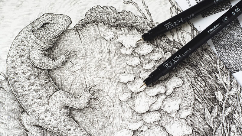
I couldn’t imagine a better option for drawing with pen and ink! This animal has such an adorable, detailed skin texture. So today, I invite you on an artistic journey. Let’s draw and explore the natural world together!
The main subject of this tutorial is drawing a lizard, but I’m also going to cover the following topics:
- How to use a photo of a lower quality as a reference and be creative with it;
- How to work with various textures, including the texture of scales and tree;
- How to balance details;
- How to create a drawing, using just a couple of pen and ink liners.
The Art Supplies for This Drawing
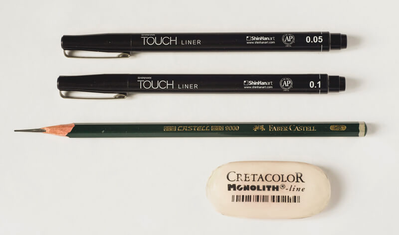
For this project, I’ll be using two ink liners (the width numbers are 0.05 and 0.1). The brand isn’t important; please work with the liners that you love or have at your disposal.
A graphite pencil and an eraser are useful tools for creating preliminary sketches and an underdrawing.
The size of my artwork is close to a standard A4 size or around 8.5″ by 11″; I slightly shortened the length of the paper to make it fit the composition.
Transforming a Photo into a Personal Artwork
Some artists like to create drawings that reproduce a photo like an exact copy with all of the details. Other artists, on the contrary, prefer to grasp just the general features of the subject using a photo reference. Then add the remaining parts from imagination or other sources.
It’s up to you which way you choose to work. In my case, I’ll use my photo as a guideline and change several things to make the resulting artwork more impressive and personal.
Also, I feel like there are some additional elements that work to improve the overall look (and the viewer’s experience) by conveying the mood more efficiently.
I start with miniature sketches, keeping in mind the compositional rule of thirds. My first attempt – the one on the left side in the following image – is based on observing the photo. I outline the main contours, making sure that I understand the essence of the objects: a smooth flow of imaginary lines and the characteristics of shapes.
I asked myself while drawing, “What is this lizard thinking about and how can I describe its personality?”
At this step, you can also play with the elements and make changes to see what’s working.
Let this process be as natural as possible. There is no need to rush through the steps and make everything perfect. Create two, four, ten or even a hundred preparatory sketches, if this is what it takes to explore the options!
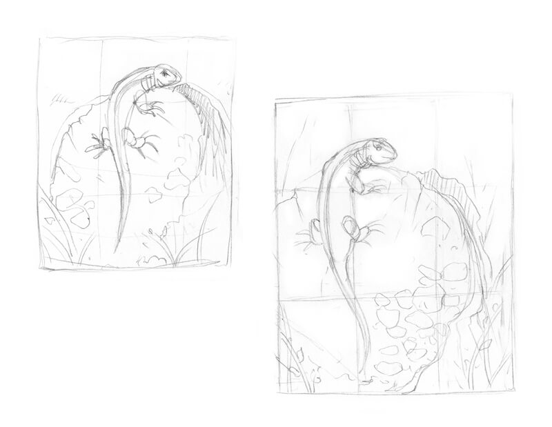
Another mini sketch that I drew (on the right side in the image above) is a more refined version of the result I wanted to achieve. This time, I was focused on the composition.
I moved the lizard’s figure, especially on the tail, so it became aligned with the thirds’ grid. When the tail is shifted to a side, the figure is more dynamic and conveys action – like this lizard is ready to run away at any moment.
I also added some plants to the foreground. They’ll help to differentiate the planes in the drawing.
If you have a reference, you may want to crop the photo in a photo editing program to explore various composition options. Sometimes, a small tweak works wonders!
My sketches usually are quite stylized and messy, but they serve one purpose – eliminating the fear of the blank page. Before I jump straight into the process of working with my final drawing, I need to “dump my brain” with all the ideas and options that I have for this artwork.
Please remember that there is no need to make a “perfect preparatory sketch” – if you feel the urge to change something later on, absolutely do it.
Thinking about the Details
The Individual Objects and Categories
At this step, we already know what elements will be included in the drawing: a lizard, a tree stump with mushrooms growing on it, some plants and twigs.
However, I don’t feel quite confident yet. On my photo, the mushrooms look like the unintelligible light-colored shapes. Plus, I’d like to draw the leafy plants in the foreground; that’s why I need to explore the possibilities for handling these elements.
If the reference photo is imperfect or just lacks the important details, one of the options is to search for additional photos showing similar objects. This is especially effective if you are drawing something complex that you can’t depict from memory or experience.
Another option is to use your imagination or the visual library in your mind – if you created many drawings in the past, you may have plenty of images in your mind. You can use those images in hundreds or thousands of different combinations!
When it comes to thinking over the details of this artwork, I decided to use a bit of my memory. I sketched a couple of twigs and examples of tree mushrooms, using the graphite pencil. The reason for this is speed; drawing with a pencil is, in my case, quicker – than drawing the same objects, using ink liners.
I also sketched a part of a stem that has many small dots on it; you can find this object in my reference photo. It would make a wonderful inclusion!
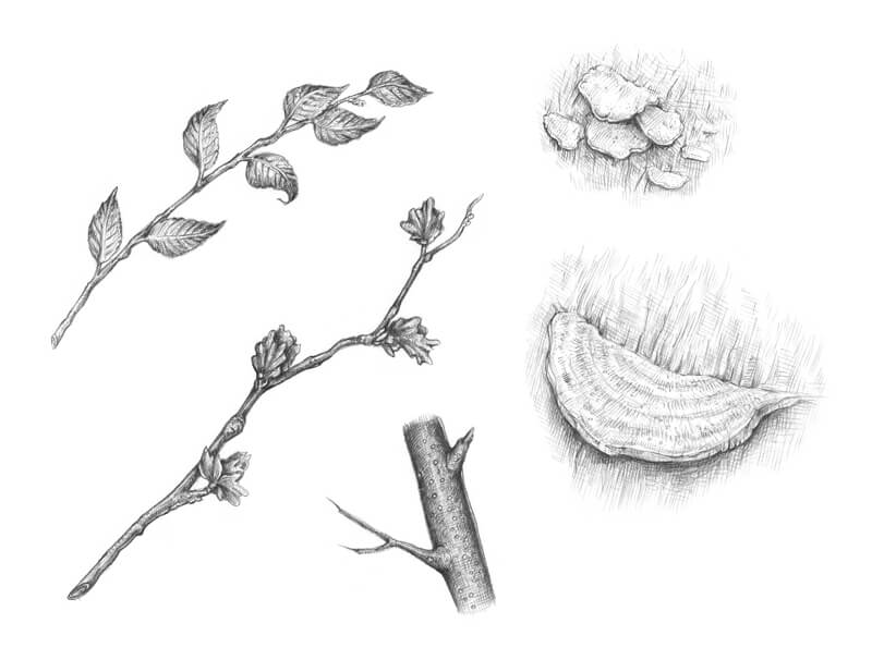
I don’t strive for total correctness. The purpose of these sketches is to help you understand the objects, literally sensing their features and particular details. Chances are, not all models that you’ve drawn will appear in the artwork, but you’ll get a a few ideas to choose from.
Perhaps you know the feeling when you can ‘see’ something in your mind, but when it comes to transferring this image to a drawing, it seems difficult? One of the ways to add confidence to an idea is to join it with something you know and include it in the drawing.
The Textures
Basic lines
I already shared my process of analyzing textures and creating samples in the previous tutorial. In brief, making small samples of flat textures is a great exercise that helps to grasp the main features of a texture and create its illusion in a drawing.
For this step, I usually work with the core medium of my finished art (in other words, if the resulting drawing is created with ink, I draw the samples with ink as well).
With the samples, we deal only with the relief of the texture itself – there are no signs that it’s a surface of a three-dimensional object. Think of a sample like a small patch with a simple pattern.
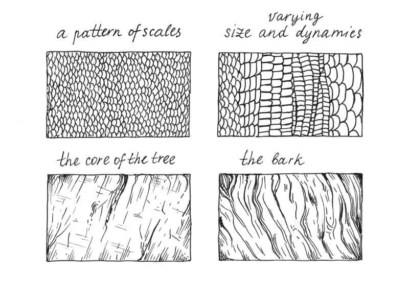
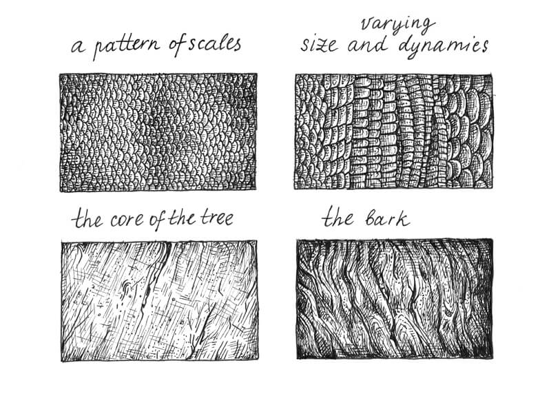
The skin of a lizard features overlapping scales made of keratin; this provides protection from the environment and reduces water loss through evaporation. The size of scales and the width of rows may vary.
I draw two examples of the scaly texture (the upper row in the image below). The first variant is a uniform pattern – the scales are all a relatively equal size. However, the best option is to allow some imperfections because they create a sense of dynamism.
Another sample is more varied; the scales here differ in size, shape, directions and even in the width of rows.
I also add the samples of the tree core and bark, basing it on the photo and adding some arbitrary features. Drawing natural textures with all the smooth, organic lines is fun, isn’t it?
As you can see, the first step is outlining the structural elements of a texture, as if we’re marking its relief with lines. I used the 0.1 ink liner for that.
Sometimes you can’t create a sample of a texture from memory. In such cases, the best option is to use a reference photo – or several photos.
Working only from memory may lead you into the trap of repeating the same elements or style over again, without seeing and observing any real-life models. This can be dangerous, since it doesn’t allow your art to get any “fresh air” and keeps your skills from growing.
Completing Texture Studies
The second step is to apply layers of hatching to the samples. Scales are small, close-fitting elements, so I use the thin 0.05 liner to visually seperate the rows and the individual scales.
It’s possible to develop a pattern of lighter and darker scales – just add more hatches to the elements that you think should be accentuated. I recommend leaving the external edges of scales untouched or slightly lighter than their ‘bodies’; this simple trick will help to keep the relief of the texture.
A similar principle applies to the tree samples: I use thin-line hatching to accentuate the darker areas. In the case of natural textures, it’s helpful to allow some spontaneity in the relief; otherwise, the texture may look too monotonous.
I’ve noticed that the core of the tree in my image has an interesting pattern of cracks (the vertical, slightly inclined wider lines) and thinner, almost parallel lines (probably they were made during the cutting). The lines are crossing each other, sometimes in a whimsical order.
The structure of the tree’s core is rough, so I add dots to my sample to accentuate this feature.
You may ask, why even bother making all these samples? Obviously, our final artwork doesn’t need too many details; we don’t see the objects that we’re going to draw with all of the textural information.
Understanding of a texture makes you prepared. If you are familiar with the nuances, you know what to discard and what to accentuate. The texture sample exercise is also an important step in the process of transforming a blurry, abstract idea into a concrete and credible piece of art.
Creating a Pencil Underdrawing
Let’s set the foundation for our future ink drawing. I use an HB graphite pencil to outline the main objects. The lizard can be constructed as a set of simple, stylized shapes.
While drawing, I imagine all the shapes as three-dimensional forms.
It’s also great to leave a thin frame of white paper in the perimeter. The borders will make your artwork pop and provides a bit of contrast.
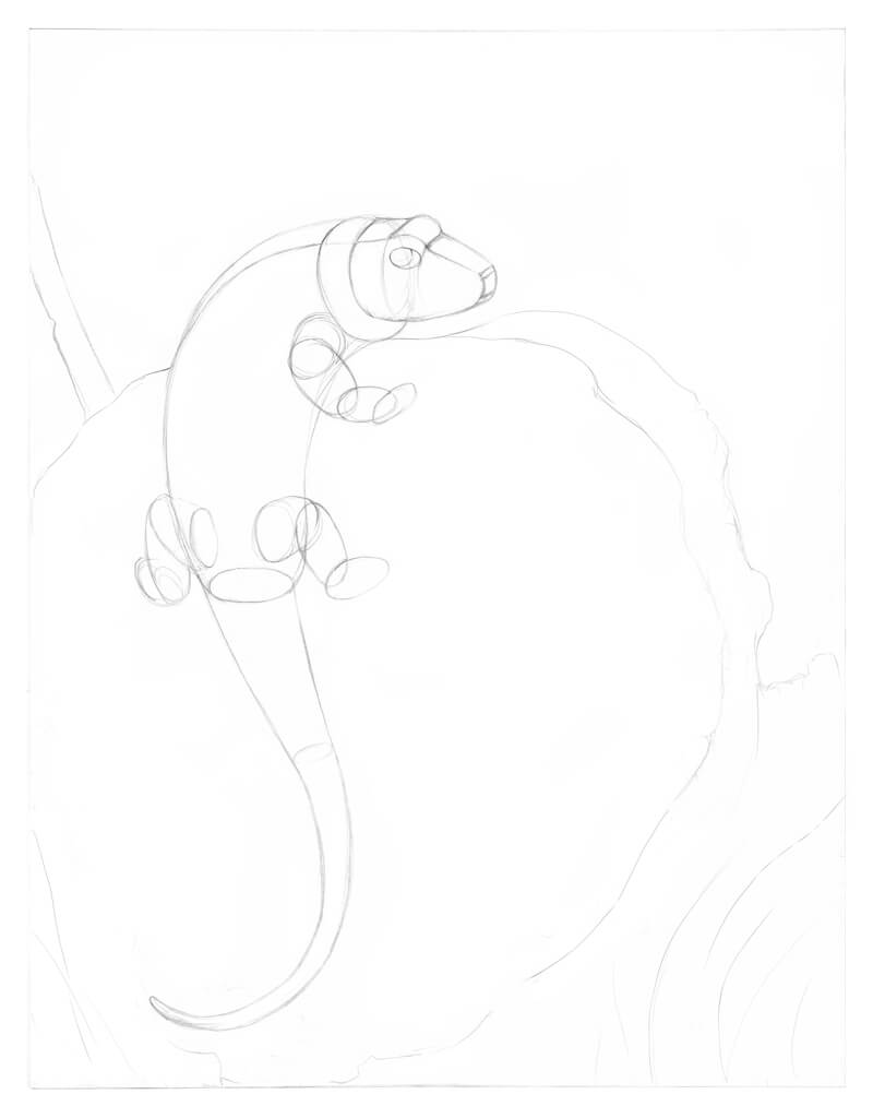
I refine the outline, observing my reference photo and adding new details.
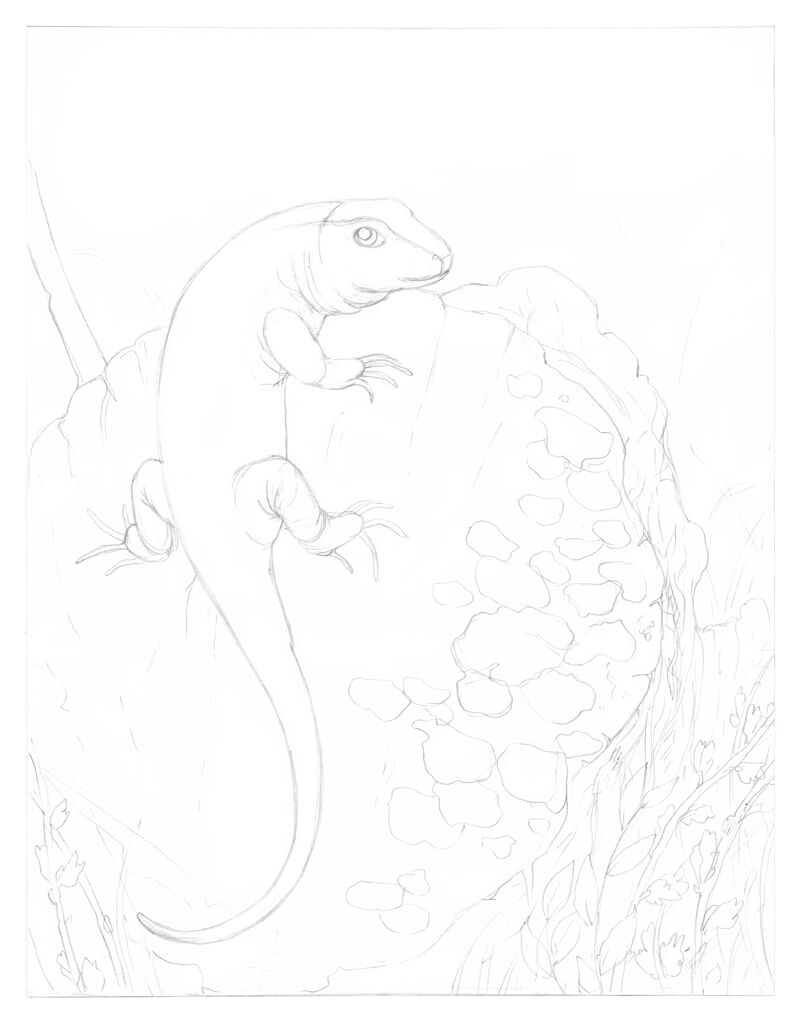
At this stage, your preparatory work and all the sketches you’ve created are your friends. Pay attention to them, but don’t be afraid to change something in the finished drawing. For example, I decided to alter the position of the lizard’s feet just a bit.
I also add the details that, as I feel, should be present – otherwise I can miss them at the later stages. Such details are the skin folds in the areas of the reptile’s limbs and neck, the leaves on the twigs and the mushrooms, including the smallest of them. I vary the size of the mushrooms (the individual ones and the groups) to make the final version as interesting and balanced as possible.
This is just a rough outline, so feel free to add additional details later on. The drawing process is always a kind of improvisation!
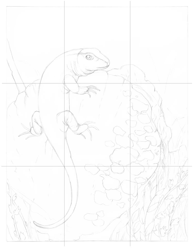
As a concluding step, let’s check the composition of this piece.
At this point, it’s close to the miniature sketch that I created in preparation; three points of the grid are in the right places (note the intersections near the upper limb, tail, and the border between the bark and tree core).
Let’s Add Ink!
Now begins the fun part! I’ve divided this tutorial into specific sections. But, the parts dedicated to the stump and plants are combined because these objects are similar from a technical standpoint.
If you like working on an artwork gradually, keeping it as a whole at each step of the progress, you are more than welcome to follow your process.
Drawing a Lizard with Ink Liners
I start with the lizard because it is the most complex element of the drawing and it is the focal point.
I outline the contours of the head, including the eye and then add a pattern of relatively large scales using the 0.1 ink liner. Avoid creating rigid, consistent lines with no gaps as this will make your artwork look too stylized.
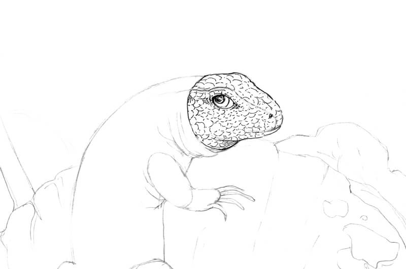
I continue developing the drawing with the same liner.
The scales on the body are smaller so I mark them with thin rounded lines. I pay attention to the character of the lines as a whole – allowing some variety among the ink hatches which makes the artwork more interesting.
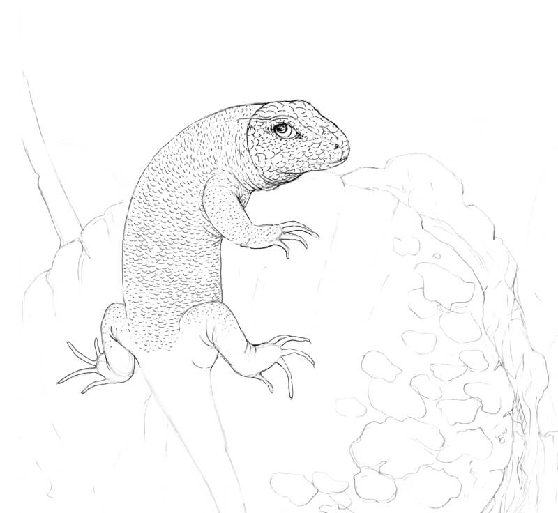
The upper part of the lizard’s tail has changes in the pattern – the scales here are longer, more rectangular in shape.
Careful observation of the reference photo helps me to see where this pattern ends. I fill the rest of the tail with short hatches and dots, creating the illusion of a subtle texture.
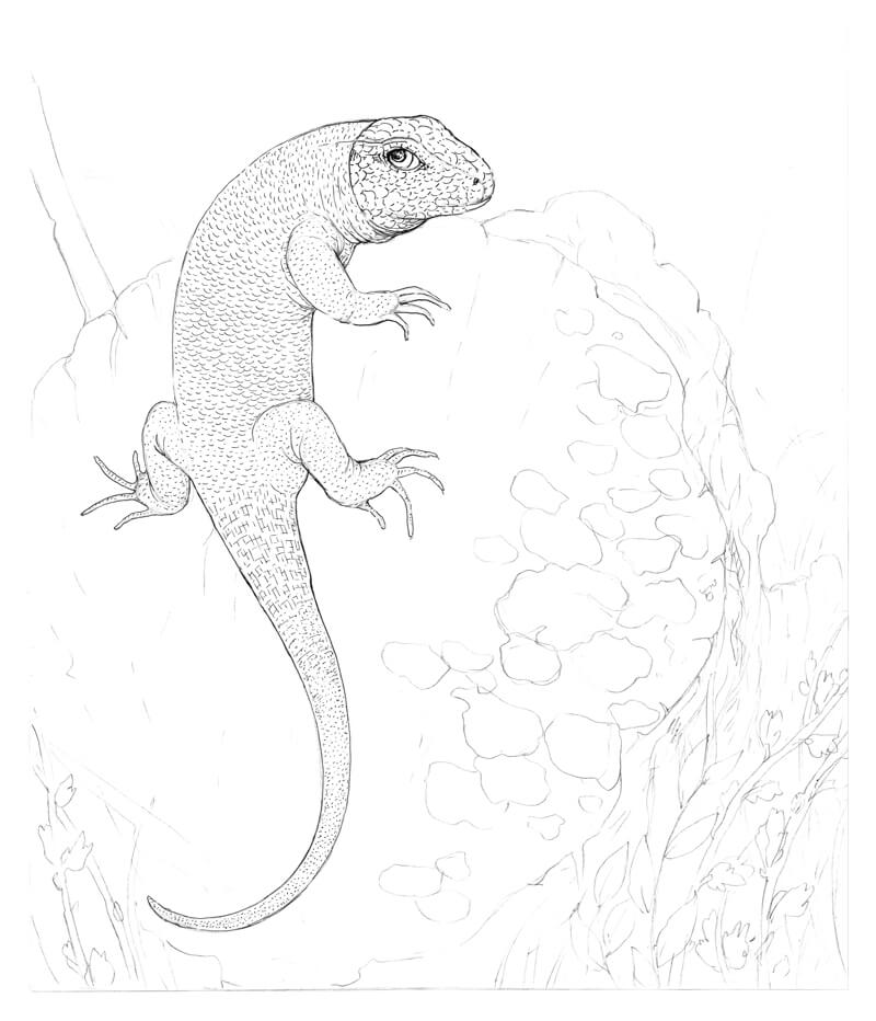
It’s time to develop the pattern of the lizard’s skin. With the 0.05 ink liner, I add the groups of short parallel hatches that imitate the spots. I’ve taken some placements of spots from the photo, but some are just a result of improvisation.
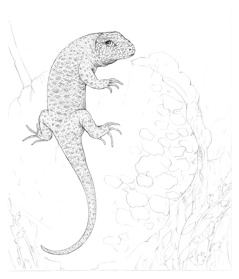
I’d like to give the lizard more volume. With the 0.05 liner, I apply contour and cross-contour hatching to the sides of the animal.
You can see a fragment of hatching right next to the actual drawing in the image below. The hatches are thin and refined – this creates an attractive set of layers.
Please don’t rush the process. You can add more hatching layers in future steps, but it’s almost impossible to ‘undo’ excess ink covering.
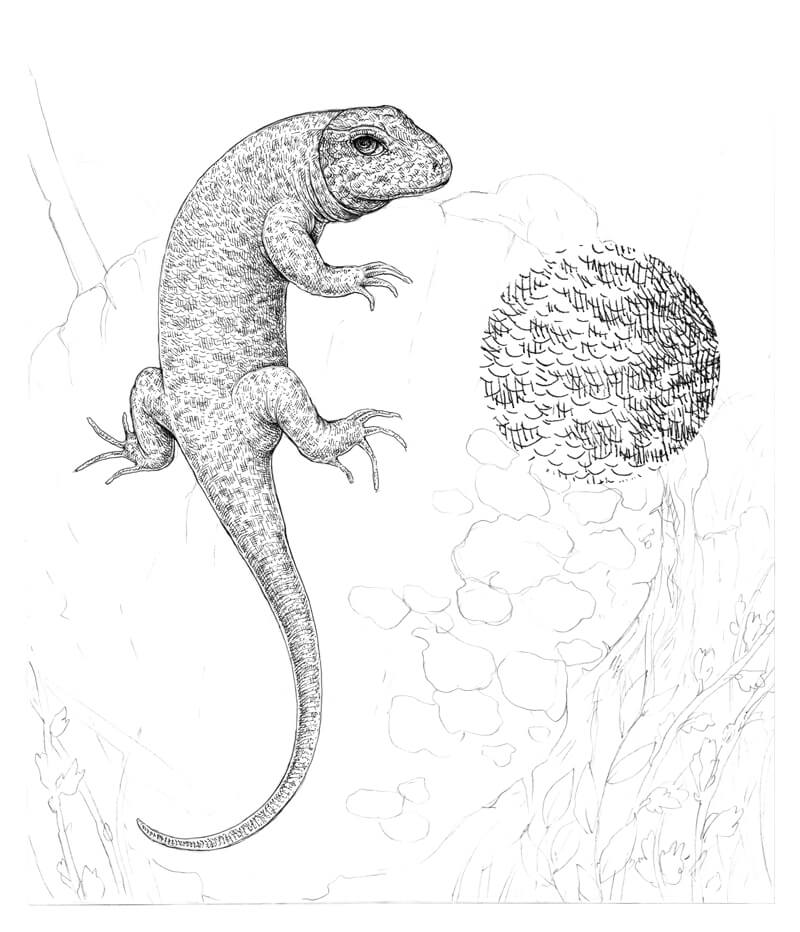
I add dots to the lizard’s skin texture, using the 0.1 liner. My goal is to make it appear grainier.
At this stage, the lizard looks lonely and isolated. We can’t say if it’s complete because the surrounding environment is bare; so let’s leave the lizard as it is for now and proceed to the tree stump.
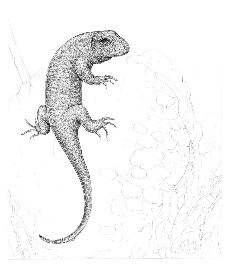
Drawing the Tree Stump with Ink Liners
I add groups of long, parallel hatches to the core of the tree, using the 0.05 liner. The relief starts to reveal itself. I also mark the cracks. The photo suggests the variants where the cracks may be, but don’t feel compelled to copy any reference exactly.
I create a dense shadow under the lizard. The belly of the animal is relatively dark, so I make sure to leave a thin line of reflected light and make the cast shadow a bit darker than the core shadow of the lizard.
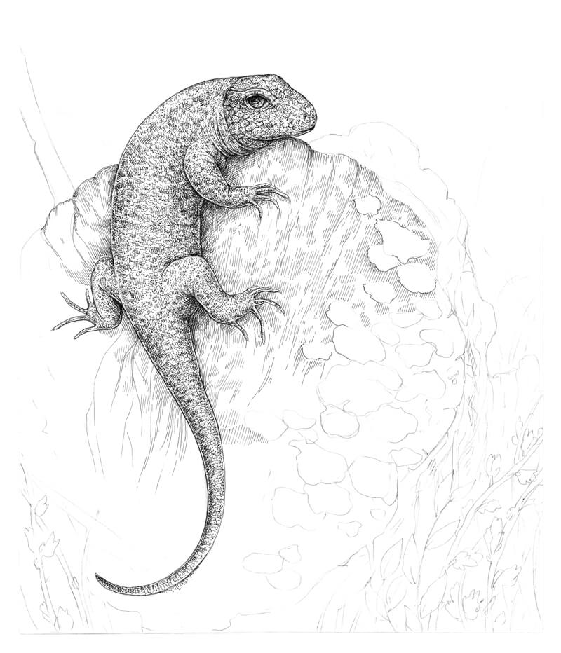
I continue working on the tree core, using the 0.05 ink liner. The layers of hatching create interesting effects.
The shadow under the lizard becomes even more accentuated. I also outline the contours of the mushrooms, adding a couple of new pieces near the existing ones.
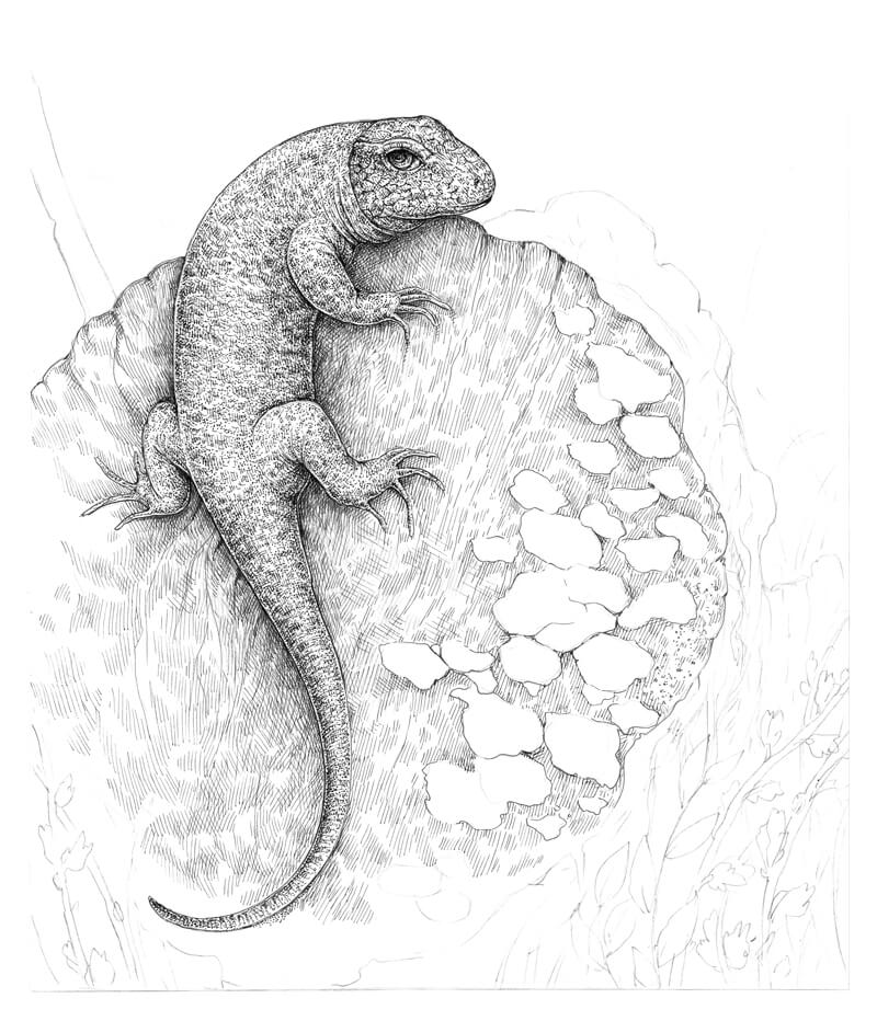
With more layers of 0.05 hatching, I complete the basic texture of the tree’s core. I darkened the side of the stump to keep the light consistent.
We have some elements in the foreground, so I leave the front part of the stump untouched, just to be sure that I won’t cover any significant object that we may later add.
As you might notice, I’ve changed the shape and position of the trunk’s top plane.
In the image below, you’ll see layered thin-line hatching that is used. If you look at a drawing created in this technique from a distance, it’s possible to assume that it was drawn with graphite pencils. It’s a fun trick, isn’t it?
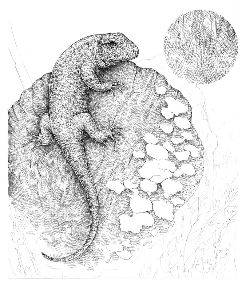
Let’s add life to the mushrooms. They are the lightest group of objects in our drawing, so I’ll do my best to limit the number of hatches and dots that I apply here.
With the 0.05 liner, I mark only the darker areas, accenting the relief of each element and the cast shadows.
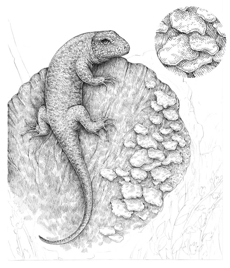
With the 0.05 liner, I outline the main contours of the bark that is covering the tree trunk. I also create a hint of relief, applying the groups of hatches and alternating areas of lighter and darker values.
The bark is relatively far from the viewer, so I avoid adding high contrast here.
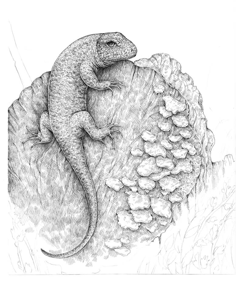
I’m going to give more depth to the bark area. The key is to emphasize the lines of texture that are visible on our tree, using the wider 0.1 liner, then support them with hatching applied with the 0.05 liner.
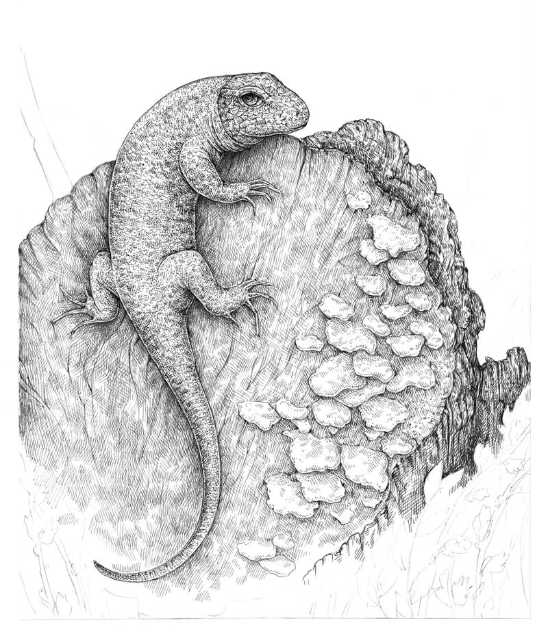
Now it’s time to time to draw the elements of the foreground – the plants and twigs.
With the 0.1 liner, I outline the contours of the twigs. Some lines cover the existing pencil lines, but I also draw new stems and leaves directly with the pen.
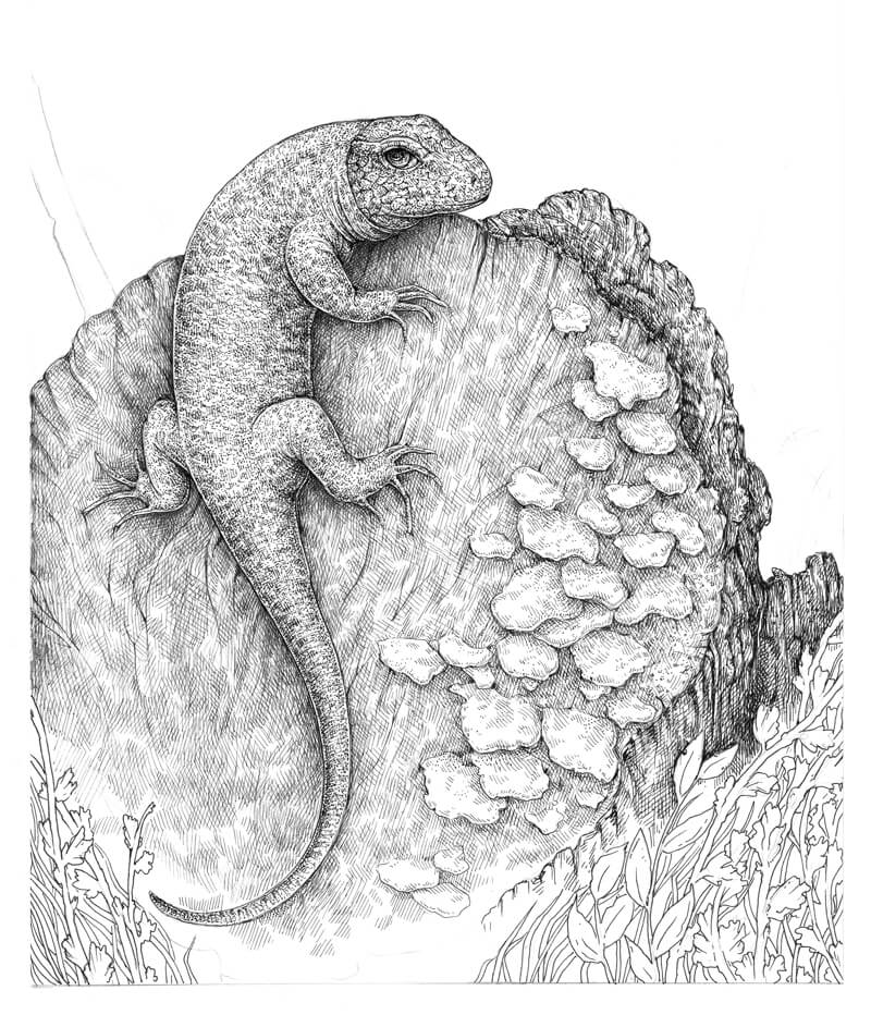
I add groups of vertical hatching to the gaps between the twigs to create the illusion of depth, using the 0.05 ink liner. I also touch the twigs and leaves here and there to give them a hint at some volume.
At this point, the foreground shouldn’t have strong contrast.
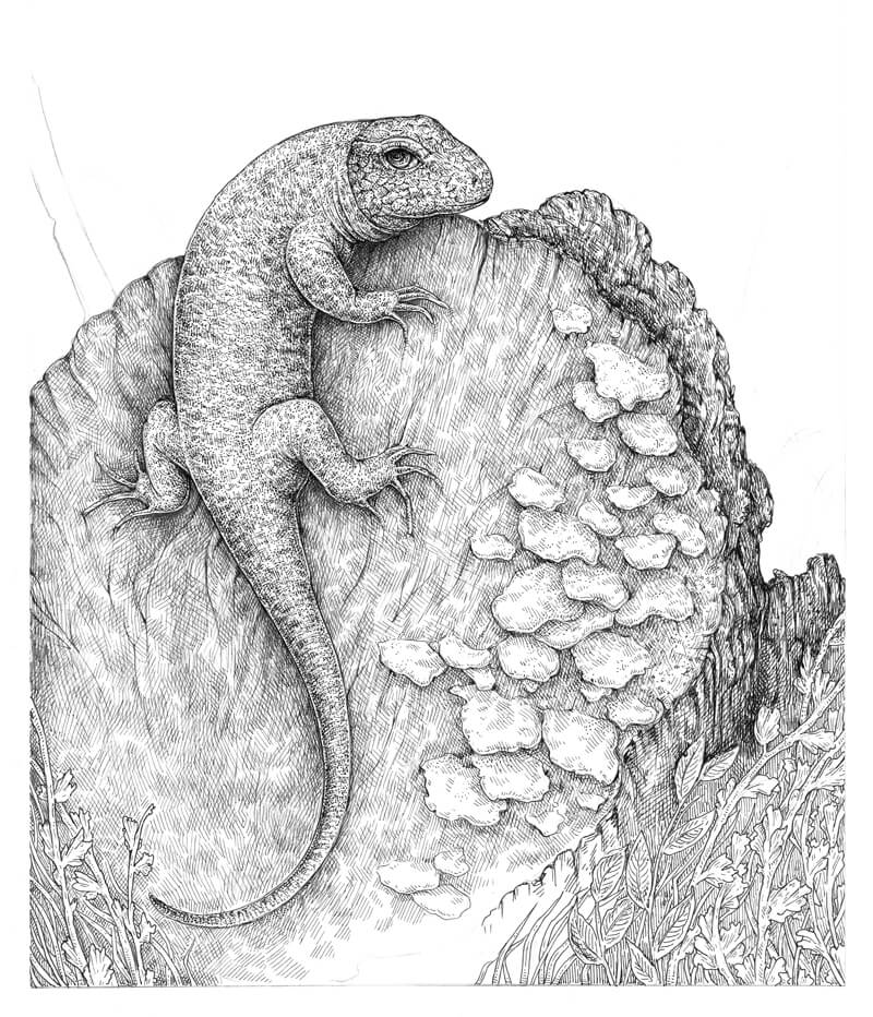
I add more dots and hatches to the gaps between the foreground objects, using the 0.1 liner. The reason why we use a wider-line liner is simple: a foreground is a plane that is closer to the viewer, so it has more contrast and details.
I apply hatches in a way that they create an illusion of depth. It seems that some details of the bark are visible in the middle ground. This effect is achieved by playing with darker and lighter areas without any rigid contours or distinct spots.
I also work on the twigs – in this case, dots and short hatches are a perfect choice.
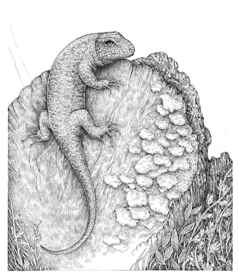
I cover the bottom part of the tree with hatching, using the 0.05 liner. I also develop the form of the trunk’s outer side and develop the illusion of bark’s texture by darkening the hollows.
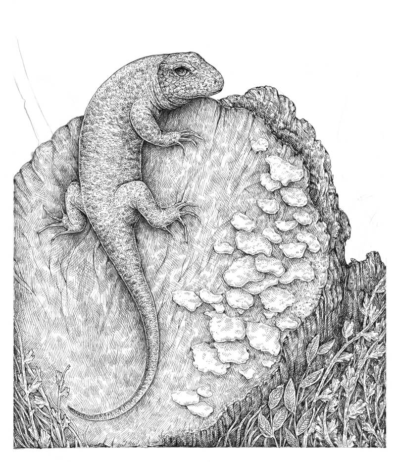
The stump’s plane doesn’t look harmonious at this point since some areas are too light. There are a plenty of them in the bottom part of the drawing so I add a couple of hatching layers there, using the 0.05 ink liner.
I also accentuate the cracks in the wood and include the adorable imperfections that make the drawing more realistic.
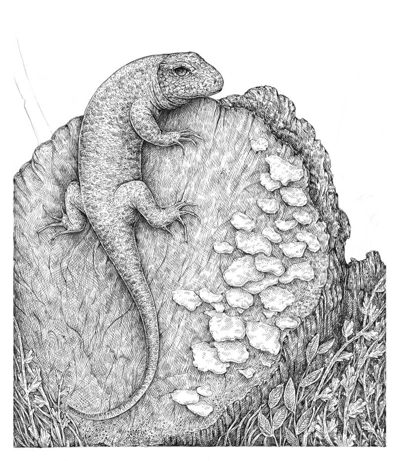
A pattern of growth circles isn’t evident in my reference photo, but I think it would make a wonderful finishing touch.
With the 0.05 liner, I draw the rounded lines that are extending from the core of the tree. The more organic these lines are, the better.
I vary the width of the lines by applying additional ink strokes right next to them. To transform these lines into circles, I support them with groups of hatches that extend and blur the initial lines.
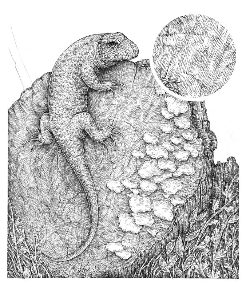
I draw the dotted stem in the background, using the 0.1 ink liner. Small rounded lines are added here to mark the circles.
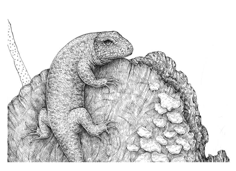
I cover the shape of the stem with contour and cross-contour hatching, using both 0.05 and 0.1 liners while varying the pressure on the tools.
Thinner marks look lighter, somewhat grayish (especially if your liner has started getting drier).
The dots are barely visible as my intent is to create a spotty, blurred pattern with a low contrast. This object is in the background, so we don’t want it to attract too much attention.
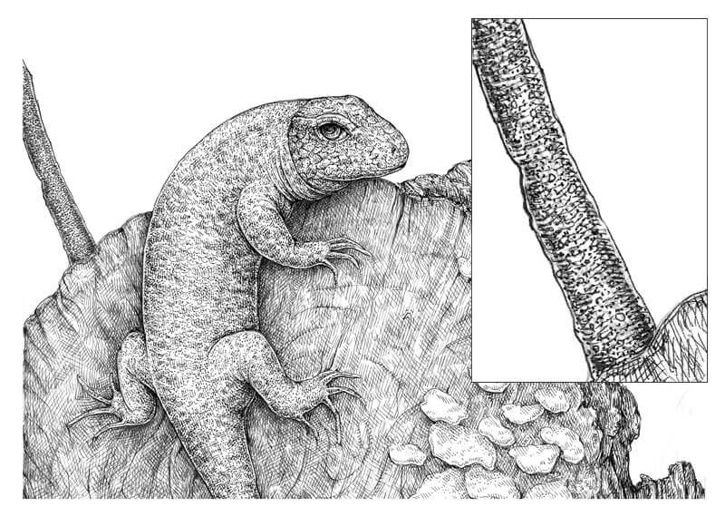
With the 0.05 ink liner, I draw the thin twigs in the background.
Let’s consider the rule of atmospheric perspective. As the distance between an object and a viewer increases, the contrast between the object and its background decreases (and the contrast of the details within the object also decreases). Based on this rule, the twigs should be stylized and light, so I avoid creating any bold contours or dark spots there.
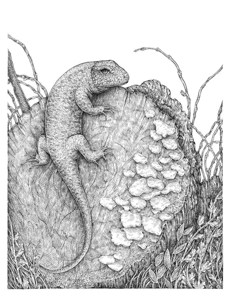
The artwork is almost complete. To be honest, I like it the way it is right now, but without a background in the upper part, it looks unfinished.
I add groups of diagonal, slightly curved hatches to the top of the drawing, using the 0.05 liner. My hand movements are fast, and I press on the liner very lightly. Although this tool doesn’t provide a significant amount of line width variation, you still can create some variety. Alternating the areas of lighter and darker value create an illusion of movement, but don’t distract from the artwork.
This background doesn’t replicate the mass of water with all those beautiful highlights that we see in the reference photo. However, that was an intentional decision – I don’t want to overwhelm the drawing with too much visual information.

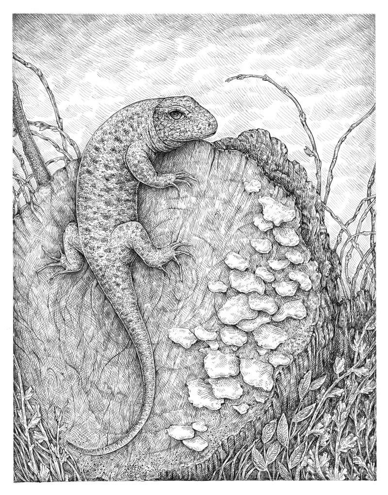
I evaluate my drawing. Remember, we want the lizard to be “the star of the show” and make sure that it fits within the environment.
Now that we have everything in place, I think that the lizard’s skin pattern lacks darker tones. I add some hatching to the spots, using the 0.1 liner.
I’d say that the lines of the reflected light near contours of the lizard’s body are quite bright. But I find them fitting to my personal style, so I’ll leave them in place.
As a finishing touch, I darken the shadows between the mushrooms and on the bark (near the top plane of the stump). Looks nice!
Conclusion
Thanks for joining me on this wonderful journey! We’ve covered a lot, and I hope you discovered some useful tips for your creative process.
If this tutorial inspired you, but you feel like some of the steps are too complex, please take a look at the great in-depth course The Pen and Ink Experience here on The Virtual Instructor. It explains the fundamental things that help you to understand the building blocks of drawing with pen and ink.
May your walks and outdoor adventures bring you much creative fun and inspiration!
If so, join over 36,000 others that receive our newsletter with new drawing and painting lessons. Plus, check out three of our course videos and ebooks for free.
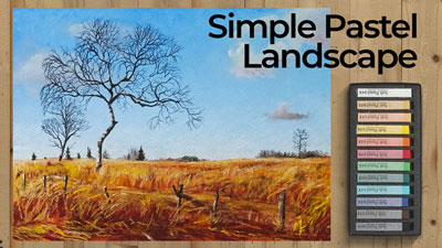
How to Paint a Tree with Pastels
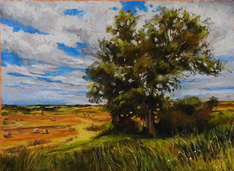
Materials for This Painting
For this lesson, we’ll use two different brands of pastels. (Keep in mind that soft pastels differ greatly from oil pastels. Although you can use oil pastels to create a similar image, the approach would be different.)
For broader areas and for more intense applications, softer Rembrandt pastels are used. For details and some refinements of color, the harder NuPastels are applied. In many circumstances, a combination of different forms of pastel are used to complete an image. This could be any combination of soft pastels, PanPastels, pastel pencils, or hard pastels (NuPastels).
- Rembrandt Soft Pastels
- NuPastels
- Vine Charcoal
- Canson Mi-Teintes Pastel Paper (Smooth side is used)
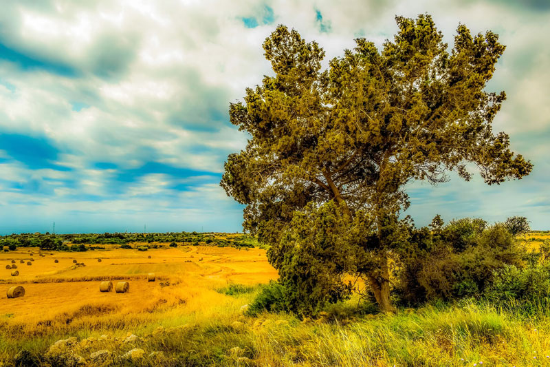
Preparing the Reference Photo
Pastels are inherently a looser medium. Although they can be used with a great level of detail, they lend themselves to a painterly approach where details are implied instead of described completely. To help us recognize the shapes of tone and color and to eliminate some the details, we can use Photoshop to prepare the reference image for painting with pastels.
The reference image that we’re using for this lesson comes from Pixabay.com, a free resource for images.
In Photoshop, we can use the Camera Raw filter to make the necessary adjustments. In this case, we’ll adjust the exposure, contrast, blacks and whites, and most importantly – the clarity. Here’s how to use the filter…
- Open the image that you wish to edit in Photoshop.
- Duplicate the “Background Layer” in order to preserve the original photo. (You may not like what the filter does and you’ll want to have the option to adjust the original image.)
- Make sure that you are on the duplicated layer and select Filter > Camera Raw Filter from the top menu.
- Use the sliders to make your adjustments and watch how the image changes as you make these adjustments.
By tuning the “clarity” option, we can tone down the details. This is especially helpful when creating a looser, more Impressionistic painting since we don’t want the details to impede us from recognizing the shapes of value and color.
If you don’t have Photoshop, or you don’t want to bother with these steps, you can always squint your eyes to remove some of the details.
See Also: Basic Photoshop for Artists (Course)
Here’s a look at the edited reference photo…
Step by Step Breakdown of the Process
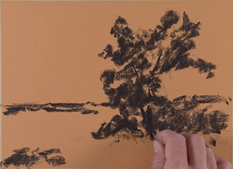
We’ll begin on toned pastel paper with a stick of soft vine charcoal. An orange surface is chosen since it will contrast nicely with the blues of the sky. It will also help to create a warmer feeling to the piece, reflecting a summer day.
Using the vine charcoal, we’ll begin blocking in the darker shapes of value along with the main shapes of the tree and the bushes underneath. The horizon is also defined along with a few of the darker tones that exist there.
See Also: The Ultimate Guide to Drawing Trees
Painting the Sky
Once we have blocked in the composition with vine charcoal, we’re ready to begin adding pastel applications. Since we can layer pastel applications, we address the background (sky) first. We’ll then move on the middle ground and foreground, working mostly from areas further away to areas that are closer to the viewer.
We’ll add the blues for the sky with a combination of lighter blue and a medium blue. We usually have a natural tendency to apply blues that are lighter than they should be when addressing the sky. For this reason, we’ll make sure to use a blue that is slightly darker to ensure strong contrast between the blue sky and the lighter clouds. We can always go back and make the blues a little lighter if needed.
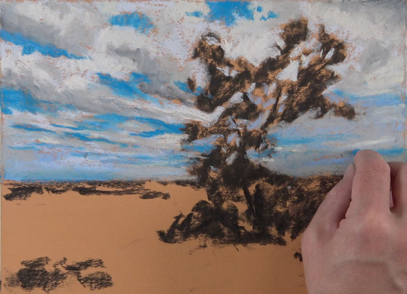
A much lighter blue is used for the shapes of the clouds, before adding a touch of gray for the subtle shadows. A very light yellow is applied for subtle highlights, before adding a darker gray to push a few of the shadows darker. We must not forget that clouds also have form, so we’ll need to develop both lighter and darker values to create this illusion.
The darker grays can be softened with an additional application of lighter gray to create a slight transition, while the highlights can be pushed lighter with a touch of white.
Painting the Middle Ground and Foreground
With the sky in place, we can begin developing some of the colors in the middle ground and foreground. We’ll start with the prominent tree since it will become the main focal point within the scene.
Using a dark yellow-green, we’ll block in the shape of the tree. We can apply the pastel directly over the charcoal sketch. As we do so, some of the darker charcoal will mix with the pastel, creating a slightly darker value. In locations where the shadow is strong, we can apply a light touch of black. This application is rather strong when it is first applied, but as we continue to layer colors, it will become less intense.
We’ll also apply the dark yellow-green to the mass of bushes under the tree and just underneath the horizon.
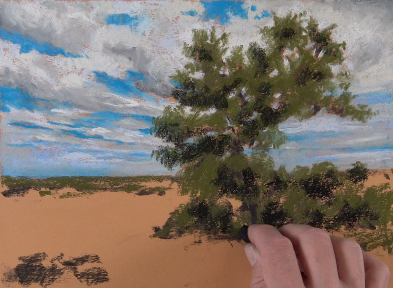
We’ll continue to layer observed colors to develop the mass of the tree. Lighter yellow-greens are applied to the highlighted collections of leaves, while darker yellow-greens are applied to the shadowed areas. A bit of burnt sienna is added in areas as well, including along the trunk and extending branches. A rich blue is layered over the shadows to create a cooler version of the color.
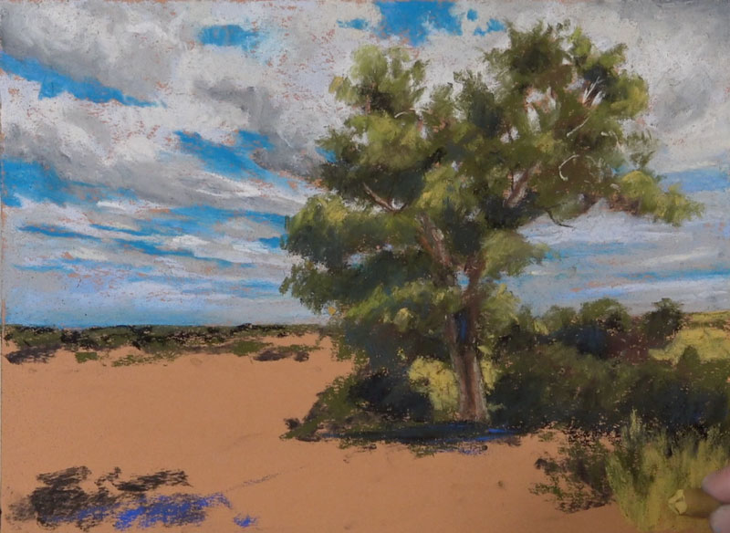
The process of patiently layering pastel applications continues. Yellow ochre is applied to the distant field and foreground along with a few bits burnt sienna.
On the tree, we continue to push the value relationships as the form begins to take shape. Around the outer contours, a light application of black is used to create a few impressions of leaves and branches. Since we have most of the tree blocked in at this point, we can paint in portions of the sky visible through parts of the tree. The light blue that was used for the shape of the clouds is used for this.
Within these negative spaces, we can add a few glimpses of branches using black and a very light cream.
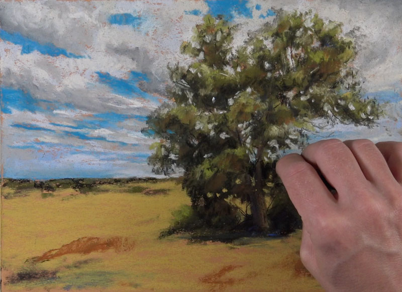
For the distant field, we’ll continue to generalize details with simple shapes of color and value. A variety of yellows, browns, and burnt sienna are used along with a light cream color for the highlights.
In the foreground, we can begin developing the tall grasses. A dark yellow-green is used for the initial applications using directional strokes that will help pull the viewer’s eye to the tree. Along with dark yellow-green, a bit of rich blue and burnt sienna is also applied.
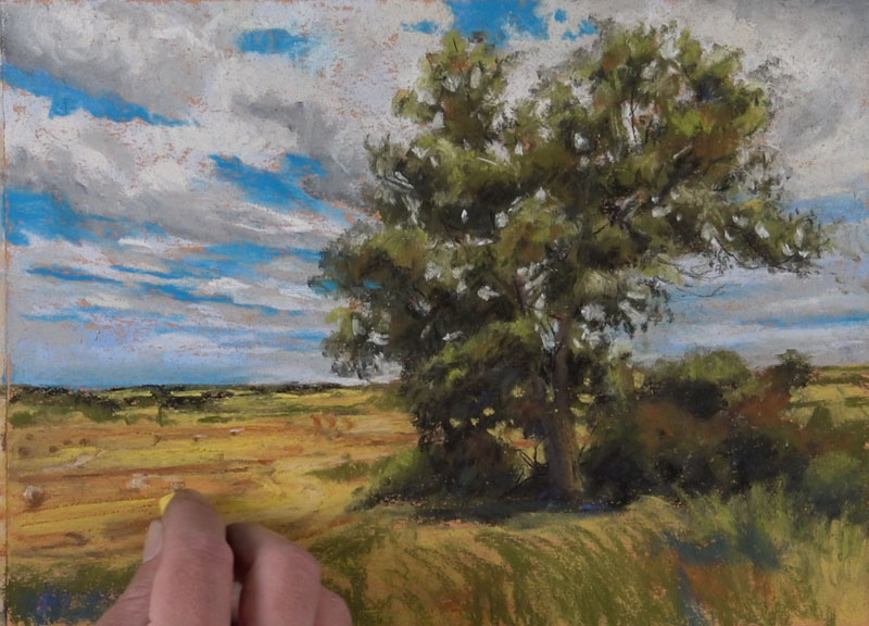
In most circumstances, the contrast of value is strongest in locations that are closest to the viewer. This image is no different as we see darker values next to lighter ones. A bit of black is used to create some of the darker tones and softened with an application of dark yellow-green.
Over the top, we can begin pulling strokes for the lighter grass blades with yellow ochre and lighter yellow-greens.
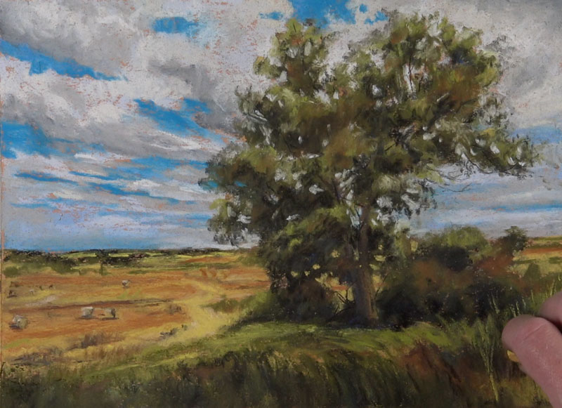
We’ll continue layering progressively lighter strokes to develop the grass blades in the foreground. Yellow ochre and light yellow-greens are applied. A very light yellow-green is used for the strongest highlights.
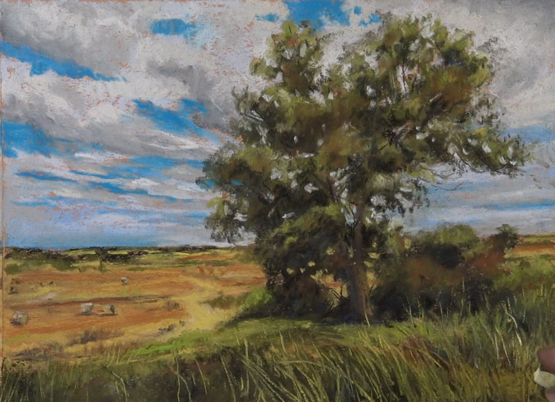
To complete the image, a few marks are made with a pure white to create the impression of a few wild flowers in the extreme foreground.

Conclusion
It’s important to remember that we shouldn’t allow the details to overcome us when painting with pastels. The key is to focus instead on the relationships of color and value. The “details” can be implied and are often filled in by the viewer’s mind. Stay loose and patient and allow the image to slowly develop. Success with pastels often requires multiple layered applications which results in colors that are rich and have depth.
If so, join over 36,000 others that receive our newsletter with new drawing and painting lessons. Plus, check out three of our course videos and ebooks for free.
Proportion – A Principle of Art
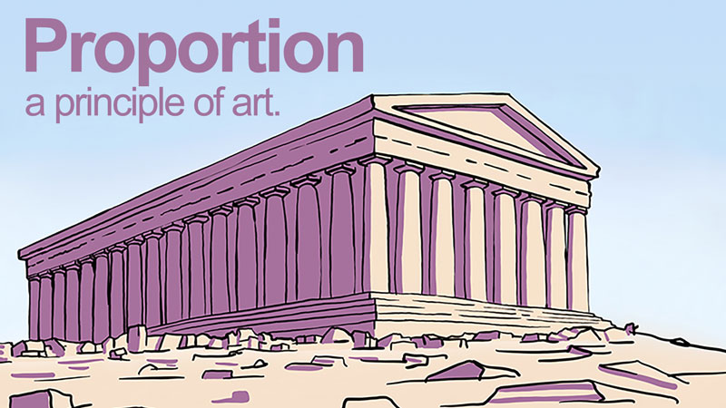
Proportion is largely about the relationship of the size of one element when compared to another. When drawing or painting realistically, proportion is important. If the proportions are incorrect, then the resulting image will look less realistic or abstracted.
Alternatively, artists can use proportion for effect. By manipulating proportion, the artist can make his/her subject seem strong, weak, funny, mysterious, etc. We can exaggerate proportions to emphasize a meaning or an element within the scene. For example, a caricature artist distorts proportion in order to create a stylized image of the subject.
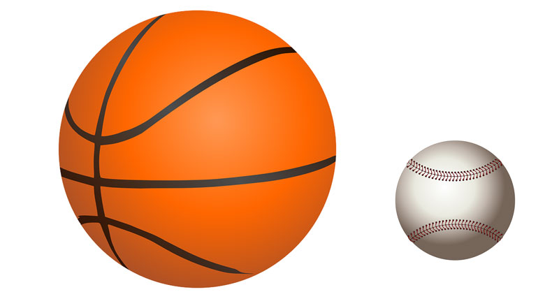
Before going forward, let’s define proportion as it deals with visual art. Proportion does not refer to overall size, but rather the relationship of the sizes of two or more subjects or elements. In art, the size of an element is referred to as scale. For example, a basketball and a baseball are different in scale but share the same in proportion.
Compositional Proportion
For a millennia, artists have sought the most aesthetically pleasing way to arrange visual components in a composition. From two-dimensional artwork to architecture, artists look for proportions (ratios) that please the eye. One popular concept was discovered by the ancient Greek mathematician, Euclid. He called this ratio the Golden Mean (The ratio expressed in numbers: 1.6180:1).
The Golden Mean is often illustrated as a line that has been divided at a particular point. The line is divided into two segments. The relative relationship of the one part is to the second part as the second part is to the whole – sounds confusing, right? The Golden Mean is best understood visually (see the diagram below).
To explain, C is to B as B is to A.
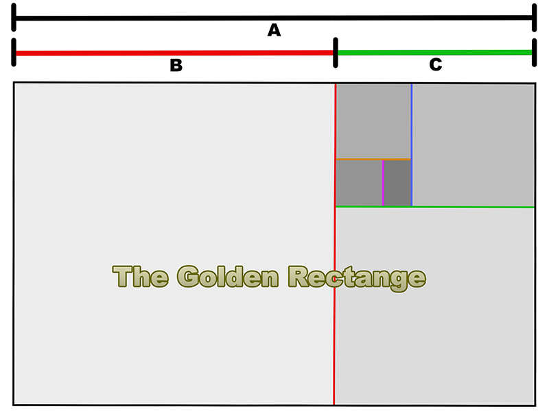
Euclid also applied this ratio to a shape and called it the golden rectangle. The process of dividing the rectangle by the Golden Mean is infinitely repeatable as the illustration demonstrates.
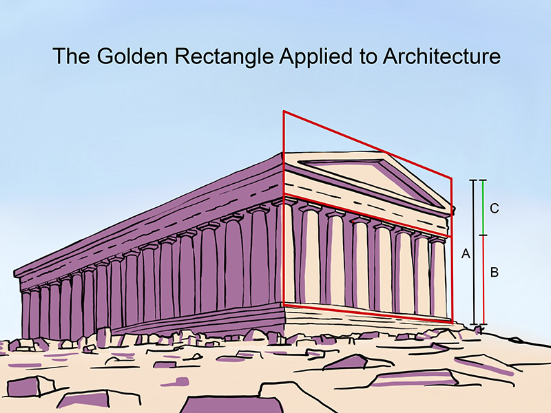
Artists have used the Golden Mean to help them make decisions about the the placement of important visual elements – not only in paintings – but also to direct the size and spacing of architectural elements.
We can use the Golden Mean to create visually pleasing artwork by placing important subjects based on the ratio in our art.
The Vitruvian Man
The Golden Mean appears in nature as well. In the first century, a Roman architect named Vitruvius studied proportion. He believed that the human body was aesthetically, the best example of proportion. He applied human proportions to his own architectural designs.
Building on the concept of a universally aesthetic proportion, Leonard Da Vinci attempted to illustrate the ideal human proportions laid out by Vitruvius centuries before. He called this the “Vitruvian Man”.
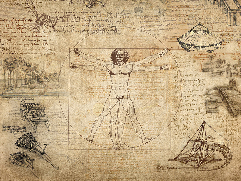
At the time, artists believed that if a perfect proportion were discovered and used, then their art would enjoy a special advantage and lead to certain success.
Proportions of the Human Body
There may or may not be an “ideal” human proportion. Realistic human proportions fall within a narrow range. That range accounts for the variety of observable body types. To be sure, lengths of arms, legs, and torsos may vary greatly but proportional variations are slight. A short individual has short arms and legs while a tall individual has long arms and legs. The arm length to leg length ratio is nearly the same for both persons, even though one is tall and one is short.
In art, we talk about human proportions in relation to the head. The variance in body size is greater than the variance in head size among humans. The average “height to head” ratio for humans is seven and a half to one. This means that the height of a person’s head divides into their overall height 7.5 times on average.
What are your proportions? Measure your head from the top to the chin then divide that measurement into your overall height. For example, I am 68 inches tall and my head is 9 inches tall. 68 divided by 9 is about 7.5. I am 7.5 heads tall, the average human proportion.
See Also: How to Sketch the Human Figure Quickly – Gesture Drawing
Two people can be the same height and have different proportions, just as two people can be different in height but have the same proportions. See the illustration below.

Proportions of the Human Face
Being familiar with the average proportions of the human face is beneficial for two reasons. First, knowing the average proportions helps to prevent the artist from making major mistakes when working from imagination. Second, the average proportions act as a baseline from which to judge individuals when capturing a likeness. How we differ from “average” is what makes us recognizable to one another.
- The human head is generally taller than it is wide.
- The face shape is approximately symmetric around a vertical axis.
- Eyes fall across an imaginary line that divides the head horizontally through the center.
- The bottom of the nose falls across a second imaginary line between the “eye line” and the bottom of the chin.
- The mouth is closer to the nose than the bottom of the chin.
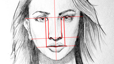
Furthermore, on an average proportioned face, the space between the eyes is as far apart as one eye is wide. The nose is as wide or slightly wider than the space between the eyes and the mouth is as wide as the center of the eyes are far apart. See illustration below.
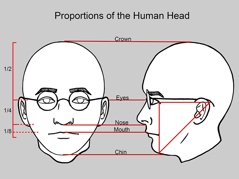
In profile, on an average human, the back of the ear is as far from the outer corner of the eye as the outer corner of the eye is from the bottom of the chin.
See Also: How to Draw a Face – The Basic Proportions of the Head
Unrealistic Proportions
Sometimes exaggerated or distorted proportions are purposefully used to convey a particular meaning or message. By widening, lengthening, shrinking, and bending parts of the human body, the artist can create a feeling or mood around the subject. Let’s consider two historically acclaimed artists and their respective styles – El Greco and Picasso.
Born in Greece, El Greco lived and worked in Spain. A large portion of his artworks are religious in nature. He chose to exaggerate the human figure in nearly all of his paintings. His method of exaggeration was elongation. El Greco felt that by “stretching” the human form, he was directing his audience to look upward and to think about God. His figures certainly stretched toward Heaven. Also, by elongating his subjects, El Greco lent them an otherworldly, spiritual sense of being.
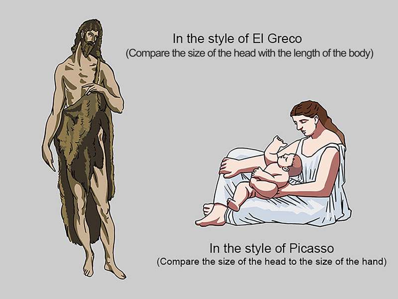
Picasso, also from Spain, worked in and pioneered several styles. In the early 1920s, he made a series of paintings about the relationship between a mother and her child. In this series, figures are thick and heavy looking. Picasso exaggerated the width of the body in comparison to the head, giving his figures a stable, sculptural feeling. This stable feeling communicates a secure, unshakable relationship between a mother and her child – the type of relationship he hoped his children would have with their own mother.
Conclusion
As artists, we can choose to use color or not. We can choose to use emphasis or not. There is, however, no escaping proportion. One simply cannot “leave it out”. Proportion is an important tool for the artist. With accurate proportions, we can create drawings and paintings that are realistic. By manipulating proportion, we can emphasize elements and communicate ideas. Proportion is a powerful principle that should be understood by every artist.
If so, join over 36,000 others that receive our newsletter with new drawing and painting lessons. Plus, check out three of our course videos and ebooks for free.
Sketch a Boat on the Water
How to Sketch a Boat on the Water
In this timed sketching exercise, we’ll tackle a challenging subject in color. The goal is to draw the entire image from start to finish in just 30 minutes. And although we don’t complete the image within the time constraints, we still benefit from setting a timed goal. By setting a time constraint, we at least get started and once we start, we have a good chance of finishing.
Regular sketching practice should be a part of your artistic development. If you just spend a few minutes everyday in your sketchbook, you’ll notice improvement. For many of us, just getting started is the tough part.
Gettin’ Sketchy is designed to provide you with a little drawing instruction through a fun drawing challenge. If you missed the previous episodes of Gettin’ Sketchy, you can check out the last three episodes here…
- Gettin’ Sketchy – Sketching a Crab
- Gettin’ Sketchy – Sketching a Bird
- Gettin’ Sketchy – Sketching a Frog
Here’s the step by step process for drawing the boat on the water…
- We’ll first draw the basic contours of the boat with a white colored pencil. We’ll leave out any details since we’ll develop the background before addressing the boat.
- Using PanPastels, we’ll develop a gradation of tone and color for the water. The top portion is a light orange that slowly transitions to a rich blue at the bottom.
- Once the water is addressed with a soft transition, we’ll use colored pencils over the top to draw the details of the boat. We can easily apply colored pencil applications over the PanPastels.
- Once the boat is in place, we’ll add in the reflection and slight shadow underneath, echoing some of the colors that we used on the boat.
You’ll need a few materials to complete the drawing. If you don’t have PanPastels, you can always use traditional soft pastels and blend them to create the transition of color and value.
(Some of the following links are affiliate links which means we earn a small commission if you purchase at no additional cost to you.)
The photo reference used for this drawing exercise is from Pixabay.com. I edited the image a little in Photoshop by intensifying the colors and cropping the composition. If you want to draw along, check out the reference photo below…

Here’s a look at the finished sketch of the boat on water with PanPastels and colored pencils…
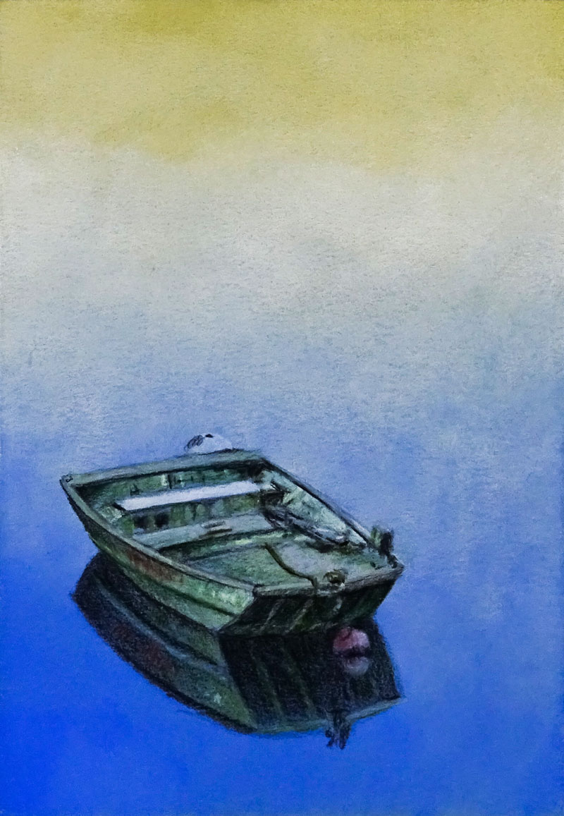
If you enjoy this kind of thing, be sure to join us live. We’ve made “Gettin’ Sketchy” a semi-regular event. We broadcast live on YouTube (whenever possible) on Wednesday evenings somewhere between 8:00 PM EST to 8:30 PM EST.
Make sure that you’re a subscriber to the YouTube channel so that you won’t miss an episode. You can subscribe here.
If so, join over 36,000 others that receive our newsletter with new drawing and painting lessons. Plus, check out three of our course videos and ebooks for free.
Drawing With Ink Liners: Natural Textures
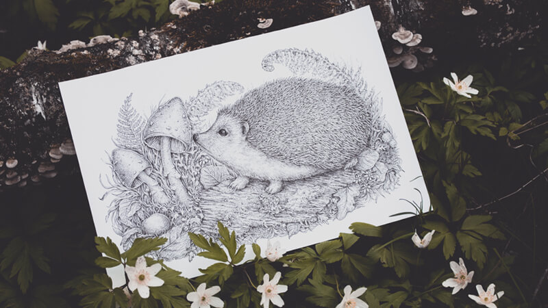
But before jumping into the inking process, we should prepare our drawing. Everything starts with an idea – the message you want to convey in a visual form. Then you can think over the details; and, as a result, you get something like a roadmap for performing the technical part (which is drawing itself).
I invite you to an exciting artistic journey; let’s have fun and learn some useful tips to enhance our skills!
A Drawing with Multiple Objects: How to Gather Ideas
There are many approaches to finding ideas for a new drawing. Inspiration is everywhere: among images on the web, inside or outside your home (in real life), in reminiscences or even in a dream.
When I was looking for this drawing’s idea, my attention was focused on things I love most: animals and nature. Spring is an adorable time – it seems like every existing creature wakes up and rejoices in warm summer days. This is definitely worth capturing!
Another part of the task was to choose the objects with interesting and challenging textures.
From an artistic standpoint, it’s great to choose things you like (and feel comfortable with) to create drawings and paintings; but what actually makes your skills grow is a deliberate practice. This means, you consciously choose to practice something that is your weak point.
Now we should think about the secondary objects that support the primary idea and help to develop the concept into a detailed illustration.
I use a method of finding associations – ideas that have something in common with each other.
For example, a wooded location is a natural habitat for our hedgehog; there are various kinds of trees, florals, plants, leaves, etc. In a forest, we can also find mushrooms and stones of any kind. All these objects will be included in my drawing.
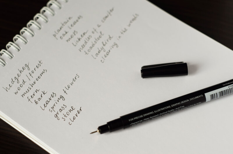
To get specific, I use my visual library – since I’ve drawn many types of leaves, plants, and mushrooms, there are many examples of them in my mind, already waiting to be drawn.
Another great way to get the visual material and reference images is a simple Google Images or Pinterest search. (Remember about the copyrights! Make sure that you use images that you have permission to draw.). I usually don’t copy images that are fitting my concept, just observe the main features and particular details that will help me to draw the object correctly.
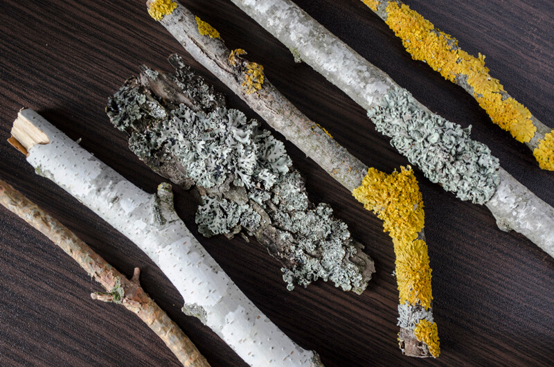
I highly recommend observing the real objects before drawing anything that should look like them. It’s extremely useful to be able to touch, rotate, even smell something – believe it or not, all these tiny details and impressions are perceptible by the viewer.
Here are some examples from my “tree texture” collection. These pieces of wood demonstrate not only a variety of bark textures, but also the intricate decorations of moss and lichen spots.
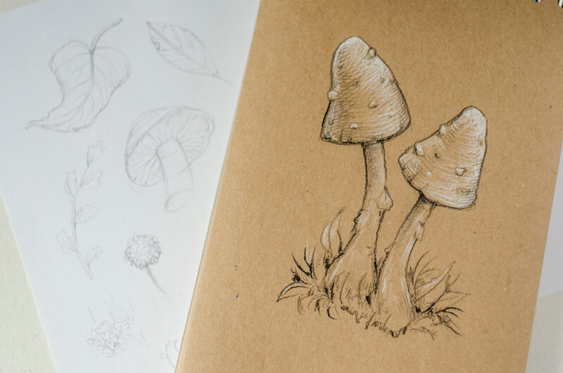
Sometimes you choose a familiar object for a drawing; you know exactly how it looks because you interacted with it before and drew it many times. In this case, creating preliminary sketches isn’t necessary.
However, some sketching can be useful, even if you feel quite confident – it refreshes your memory and warms up your drawing hand.
A Summary of the Process
There are four questions to ask yourself for including multiple objects in a drawing.
1. What do I want to draw? (Your primary idea.)
2. What other things are related to this object? (The associations.)
3. How do these things look in general and in detail? (The research.)
4. What elements of the same category can I use? (For example, various kinds of leaves.)
Analyzing a Texture and Learning to Draw It with Ink Liners
Now you have your list of objects – this allows us to gain some insight into the set of textures of your future drawing. It’s helpful to take some time and explore them. Create samples of the most substantial and complex patterns.
In my case, the most extensive and remarkable surfaces are the hedgehog’s spines and hair, the texture of the mossy tree bark, the mushroom caps, and a composite texture of various botanical objects – we’ll have plenty of them in the drawing.
Any texture can be divided into components or layers. Let me dwell on this for a moment…
Please take a look at the image below. This is a stylized example of the tree bark texture. I’ve built it with three layers of lines, hatching, and a subtle inclusion of dots to make this sample look more organic.
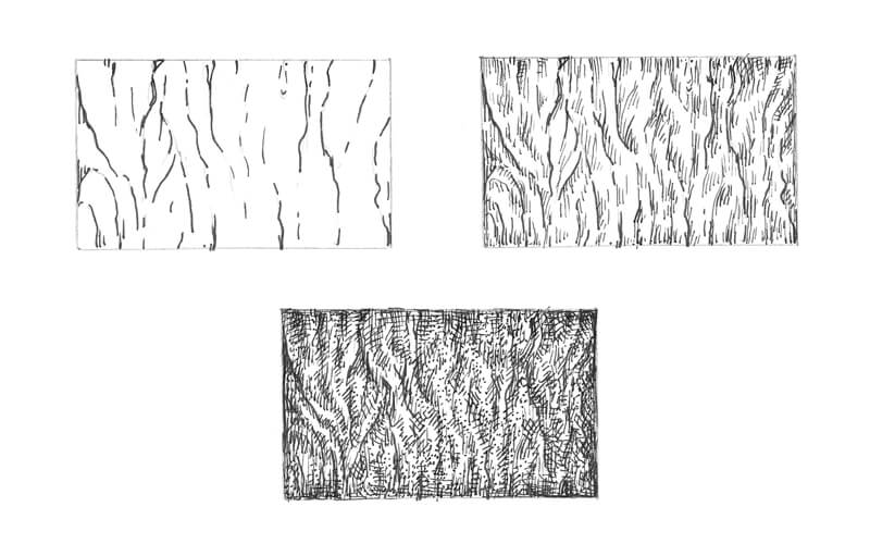
Here is my checklist for drawing a texture:
1. Find the pattern – stylize the object’s surface and outline the boldest and most prominent lines of the texture, grasp the rhythm.
2. Add shadows and accentuate the relief (various types of hatching work great for this step).
3. Create the details and add the individual features.
Examples of Textures Drawn with Pen and Ink
In this tutorial, we’ll explore the process of drawing a variety of textures, following a similar process. Please remember: there are no strict rules how an artist should approach textures, so if you feel like your process is slightly different from someone else’s, that is completely fine.
You can practice creating a sample of texture in two forms. The first one is drawing just a flat shape with a textural pattern (like the bark example above). In this case, you deal only with the relief and values of the texture itself.
Or you can complicate the task and draw a miniature sample of the texture, imagining that it is located on a three-dimensional form. For example, this could be a part of the tree trunk covered with bark. In this case, the shape has its own range of value, which determines and affects the values of the texture.
Here is my worksheet with the texture study. There are three samples of the tree bark, the hedgehog’s spines and hair, the mushrooms, and a combination of botanical elements.
I started with finding the general pattern of each texture and marking the darkest areas with hatching.
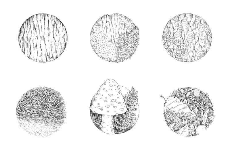
Then I applied ink hatches and dots to create an illusion of contrast and depth. The majority of samples are flat – to make them more attractive, I darkened the inner periphery of each circle.
The sample with a mushroom is slightly different because the cap is three-dimensional.
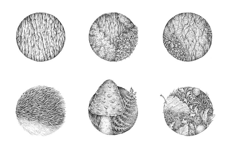
You can always create your own samples of any texture. Just draw any shape (for example, a rectangle or a circle) and fill it with a pattern that you wish to practice. It can also be a three-dimensional model like a cube or a sphere. Just be creative and have fun!
Why is texture practice important?
If we work with black ink, a texture becomes one of the most influential components of the drawing. It affects the viewer’s impression greatly and helps them to understand the subject. It makes the subject appear more realistic and elaborate.
And, after all, practicing textures is a pleasant, meditative process that helps to grow your observational skills tremendously.
Now we’ve done our homework and are ready to dive into the drawing process.
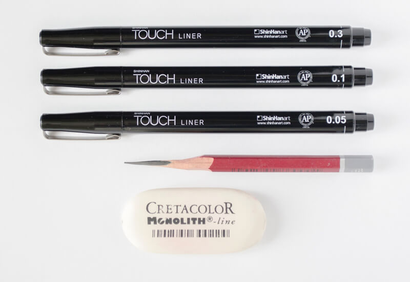
The Art Supplies
For this artwork, I’ll be using:
• A graphite pencil; the HB type is an optimal choice.
• An eraser, as may be necessary.
• Ink liners, the width numbers are 0.05, 0.1 and 03. Any brand of the liners will work just fine.
• Thick drawing paper with an even surface – please use any kind of paper you like. The paper format of this artwork is close to A4.
Creating a Pencil Underdrawing
There are two diametrically opposite opinions about the necessity of a pencil underdrawing for pen and ink artworks. Here are some thoughts on this point…
А decision to outline the clean copy art with the light pencil marks before inking is completely up to an artist. Art is a set of individual preferences and decisions, right? There is nothing wrong with an intention to be prepared and relaxed while using the ink liners.
Ink drawings that were created without a pencil sketch underneath may look more spontaneous. However, the main advantage of having your pencil underdrawing in place is a certainty – you have the clarity in your artistic vision for this particular artwork. It’s not just a knowledge of where the borders of the objects exist on the sheet of paper, but also an opportunity for your brain to think out the artwork beforehand.
My goal is to create an interaction between the elements of the drawing. I think that the artwork will be more interesting, dynamic, and fun if the hedgehog is facing the mushrooms, as if it is smelling them.
I start the drawing with light pencil marks, outlining the rough shapes of the hedgehog, the mushrooms, the piece of tree bark, and the core lines of the fern leaves in the background.
I also mark the borders of the artwork itself. I’m going to limit the drawing, so there will be relatively large spaces of the white untouched paper in the perimeter.
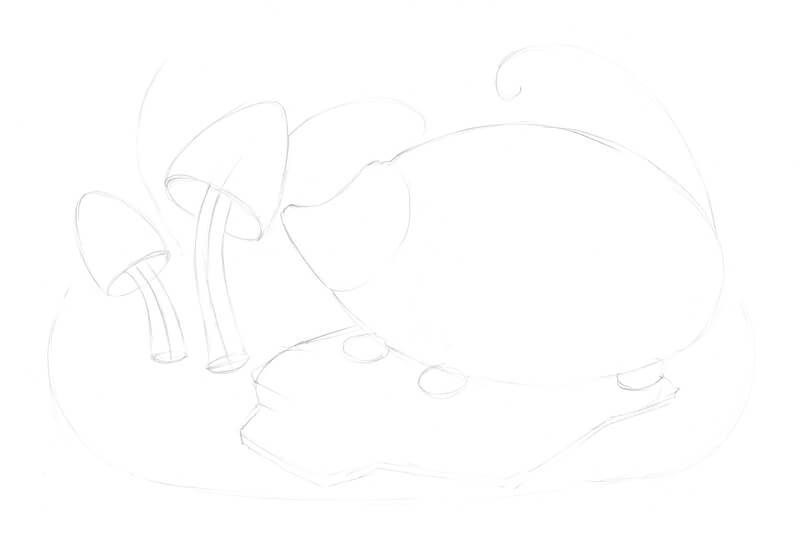
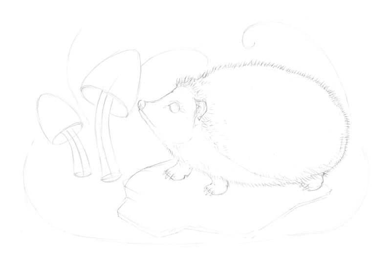
Then I refine the drawing, starting with the largest and the most important element – the hedgehog. One of the reasons why we started with a list of ideas and the overall preliminary research is to help us to get clarity on what we are going to draw and in what sequence.
I’m aiming for a balance between the accuracy of details and saving time, so depicting all the spines with a pencil probably isn’t a great idea.
I make sure I’ve captured the distinctive feature of the hedgehog’s body, especially a small hollow in the neck area, and the overall roundness of the silhouette.
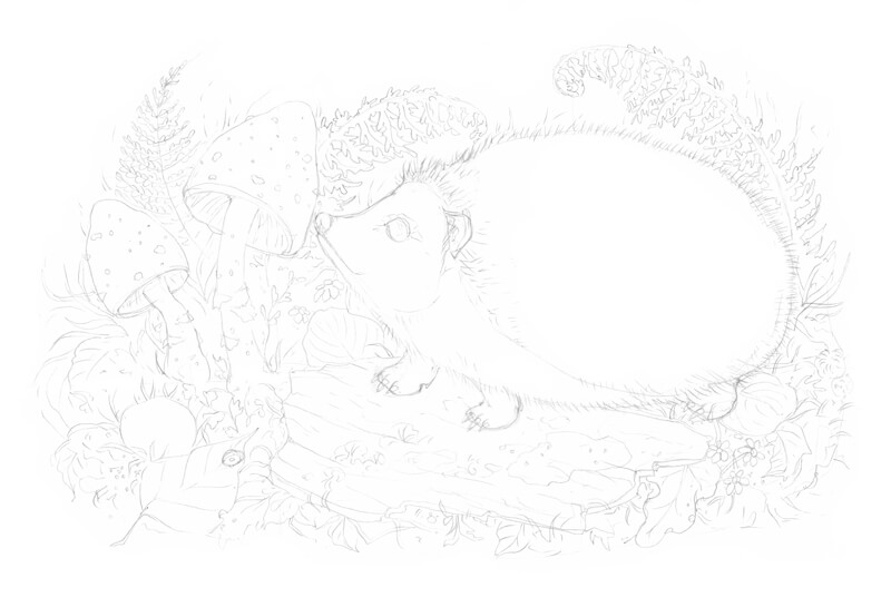
Now I refine the mushrooms, adding the small bumps to the caps, and mark the areas of moss and lichen on the tree bark.
I also fill the remaining space with the secondary elements, based on my list of associations and sketch ideas. Don’t be afraid to use the same element several times. For example, if you draw a leaf several times in slightly different positions, this will look natural and harmonious.
Deciding how many objects or details to include is always up to you.
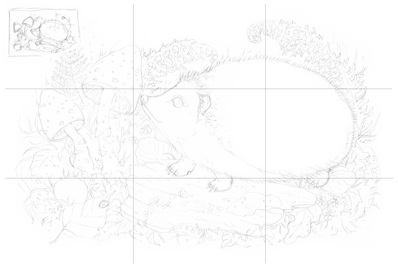
And what about the composition of this piece?
Let’s resort to the compositional rule of thirds. If I put a set of crossing lines on top of the sketch and check the points of intersection, I see that the drawing is aligned quite neatly with these points.
The shapes of the fern leaves in the background have a special function, too. Their core lines twist in a spiral; this creates harmony and unity. Plus, the spiral-like elements attract the viewer’s attention to the front elements of the drawing.
The best way to make sure that your composition is successful is to play with variants beforehand. Try creating some rough miniature sketches – chances are, you’ll get several new ideas for your concept.
The pencil underdrawing is complete; now we can pick up the ink liners!
Drawing with Ink Liners
Below you’ll find my process of inking an artwork; I should note that there are various methods of drawing.
For example, I usually start with one particular piece of the work and develop it until it looks almost complete. Then I proceed to another piece nearby. This approach works fine in the case with ink or ink liners, but I can’t say the same regarding other mediums (for example, colored pencils or pastels).
Some artists like another approach – working on the whole picture at the same time, adding the ink marks here and there, and evaluating the drawing in total at each step.
As you will notice, I start drawing with the most complex object – the hedgehog. One of the reasons for that is a human psychology. Once we are done with the most difficult part, it’s much easier to complete everything that remains. It’s also relaxing and fun!
My method of combining the hatching, cross-hatching, and stippling layers may seem quite intricate, but it’s rather an illusion. If you understand the principles, everything else falls into place.
However, your drawing may have fewer layers and be created in a simpler manner. You are the master of your process!
How to Draw a Hedgehog
I start with the hedgehog’s snout. With the 0.1 liner, I draw the lines that imitate single hairs – they form an illusion of the hairy covering.
I also darken the eye, leaving just a small highlight and a line of the reflected light.
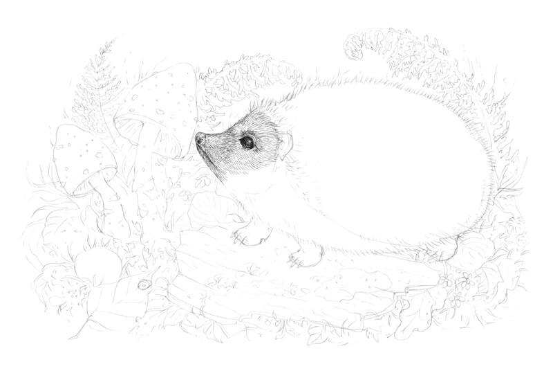
I add more thin hatches and dots to the same area, using the 0.05 ink liner. I increase the contrast of the texture near the eye and in the bottom part of the snout.
Then I draw the ear and the first rows of spines, using the 0.1 liner. The intervals between the spines should be dark and contrasting.
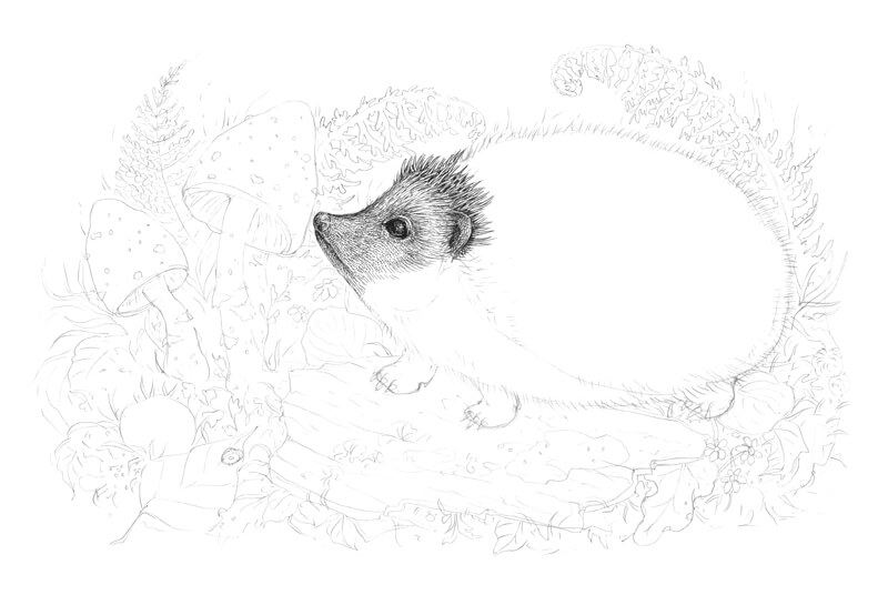
Let’s work on the spines. I add more and more of them, using the 0.1 liner. You don’t have to draw every single spine separately, it’s enough just to imitate a distinctive spiky pattern.
I also pay attention to the overall look of the spines; they should be slightly different in size and direction. Having some spontaneity here is key to a natural feel of the hedgehog’s back.
In the image below, you can see an enlarged sample of this texture near the actual drawing.
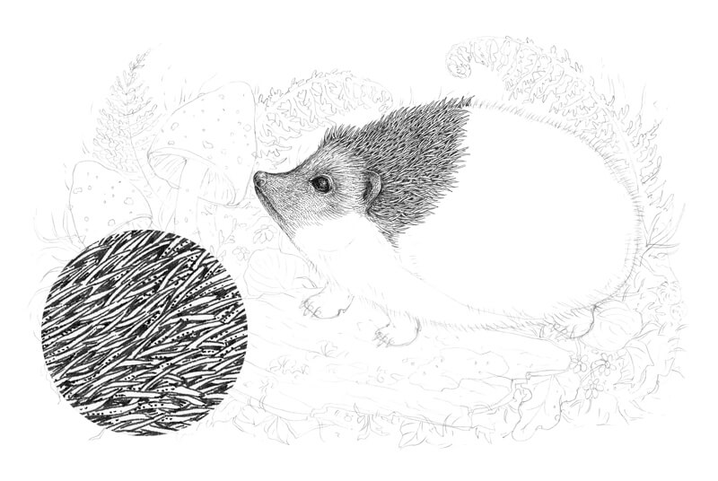
I add more spines and hairs, using the 0.05 and 0.1 liners. Please keep in mind that the elements that are closer to the viewer are more contrasting; you can use heavier lines for them.
With the 0.1 liner, I add small dots to the spines here and there to vary the texture.
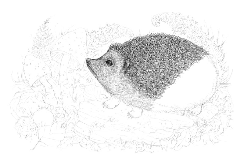
I complete the pattern of the spines, using the 0.1 liner. The spines on this part of the hedgehog’s body may be thicker and longer. Plus, they often change direction here, as if they’re bristling a bit.
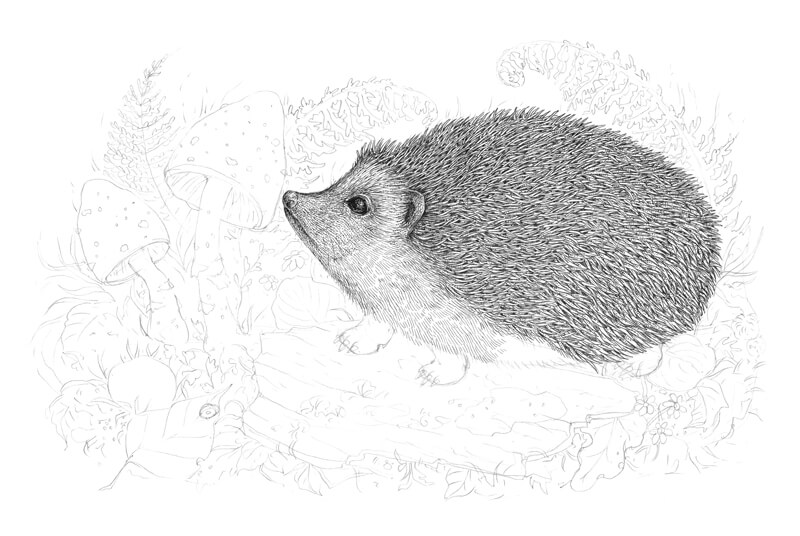
The hatches on the hedgehog’s feet should be thin and uniform, so I use the 0.05 liner to draw them. I also darken the bottom part of the body and add a cast shadow on the feet.
At this stage of our work, the figure of the animal looks like it is cut out. We’ll soften this later, after other elements of the drawing are covered with ink lines.
The hedgehog is almost complete. Later I’ll get back to it to make sure that it fits in with the other elements.
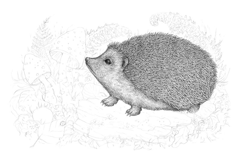
How to Draw the Tree Texture
With the 0.1 ink liner, I mark the general lines of the bark, creating the distinctive pattern. I also mark several zones of moss and lichen, accenting the most prominent details.
Don’t forget that a piece of bark has thickness; such small nuances add to the credibility of the drawing. The foreground objects, like the grass blades, overlap the piece of bark in some places, so I avoid creating a solid contour line.
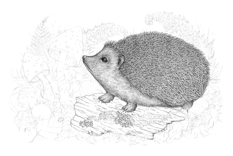
With the 0.05 ink liner, I add the groups of long hatches that accent the relief of the bark.
The place right under the hedgehog is the darkest area of the object, so I put a couple more layers there.
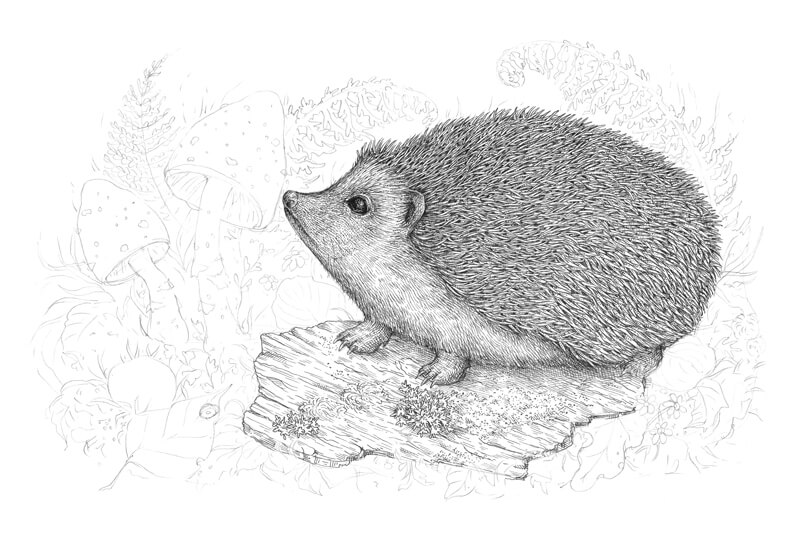
I increase the contrast even more, applying the hatching with the 0.1 liner. It’s great to use stippling, too – it creates a blurry effect in the drop shadow and adds a natural feel to the tree texture.
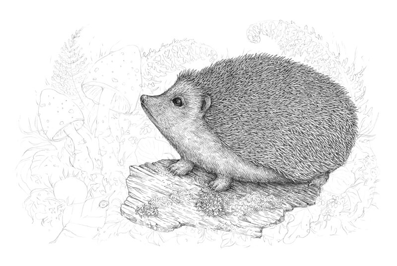
I continue working on the tree bark in the same manner. Horizontal hatches accentuate the direction and the position of the object.
Keep the relief in mind; the lighter and darker areas are very close to each other and alternate.
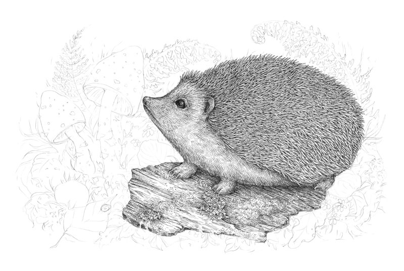
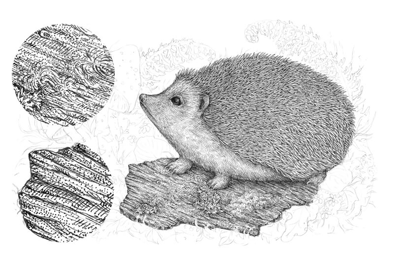
In the image below, you can see the enlarged sections of the texture near the actual drawing.
I complete the tree texture, using the 0.1 ink liner for hatching, then also add some bigger dots with the 0.3 liner. The front part of the bark should be slightly darker and more contrasting than the middle and back parts.
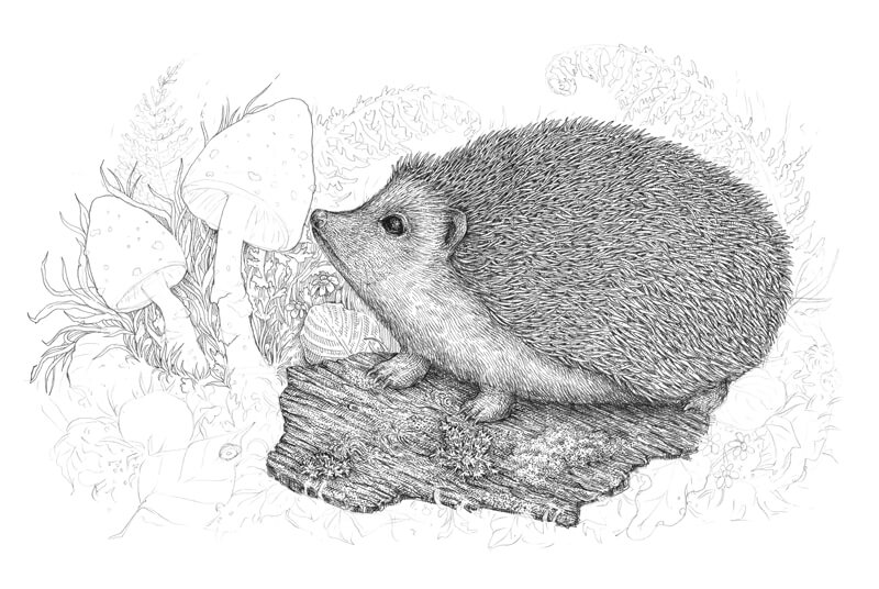
How to Draw Mushrooms, Leaves and Other Botanical Elements
With the 0.05, I outline the contours of the mushrooms and leaves on the left-hand side of the drawing.
I recommend playing with the lines – they should be as organic and varied as possible. Try to change the pressure and angle while drawing; an ink liner doesn’t allow as much of the line variety as a nib does, but you still have options.
I also add some basic parallel hatching to the darker areas. This type of hatching works perfectly in the background because it is uniform and provides a hint of stylization.
With the 0.1 liner, I add more hatches and dots to our botanical background. Avoid making the elements too dark; this may confuse and overwhelm the viewer. Our goal is to add a little bit of depth.
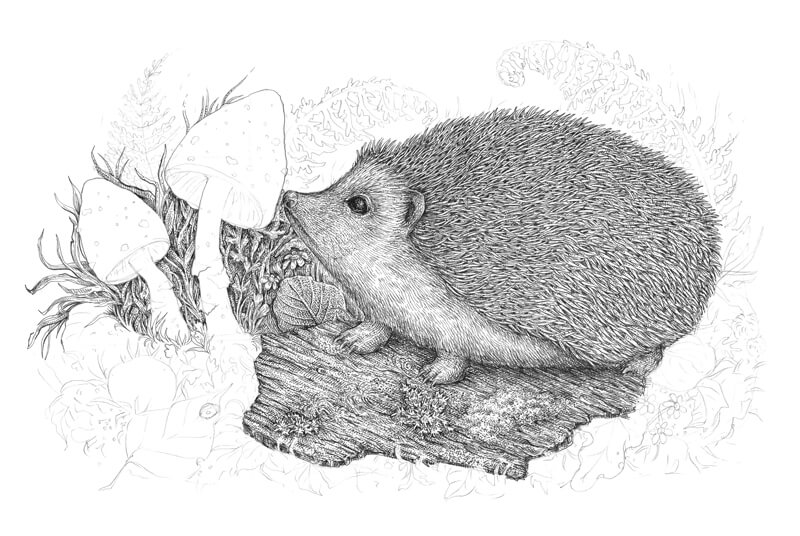
With the 0.1 liner, I mark the relief of the inner parts of the mushrooms’ cups. I add the contour hatching to emphasize a transition from darker to lighter values.
I also mark the prominent details of the cups.

The top parts of the cups and the stems are relatively light, but we need to make the mushrooms three-dimensional (or rather create an illusion of volume).
I apply the contour hatching to create an illusion of volume, using the 0.05 ink liner. The central parts of the cups and stems remain light.
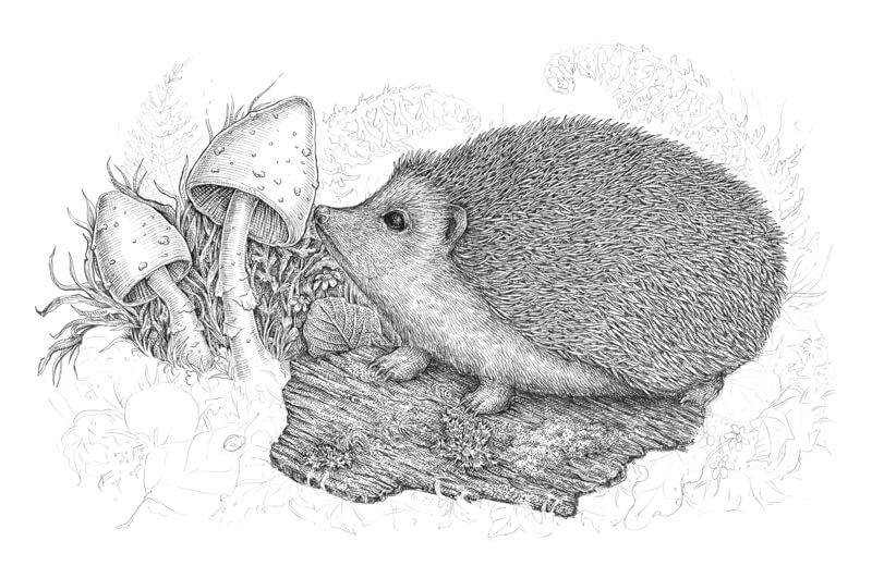
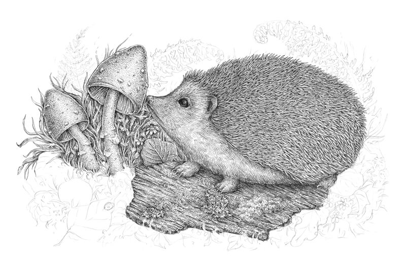
I cover the mushrooms with dots, using the 0.1 liner. Stippling is a great way to create a pleasant, velvety texture.
It’s possible that I’ll add something here later, but let’s leave the mushrooms like this for now.
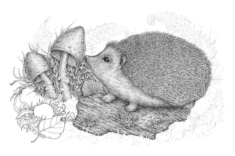
With the 0.3 liner, I outline the elements of the forefront. I use relatively thick lines, because the front objects have heavy contrast and detail.
I recommend making gaps in your lines; thick unbroken lines will create a stylized impression, as if our drawing is a page from a coloring book.
Including small unexpected elements is fun – that’s why I’ve put a ladybug on a leaf.
I work on the objects in the foreground, adding the groups of hatches with the 0.1 liner.
I add some contour hatching to the sides of the stone to create the illusion of volume. A stone is a smooth object with an even texture (in contrast to the tree bark or spines).
Having something with a different texture in your drawing is useful; it creates variety and allows you to rest a bit.
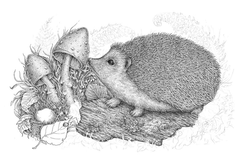
I add another layer of hatching to the stone and leaves, then increase the contrast by adding dots to the darker areas. Bigger dots created with the 0.3 liner work perfectly here.
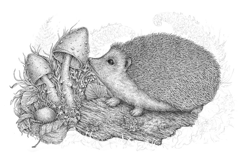
I work on the foreground, including the objects on the right-hand side. With the 0.1 and 0.3 liners, I outline the contours of the botanical elements. The reason why I use both liners is quite simple – this creates the line variety.
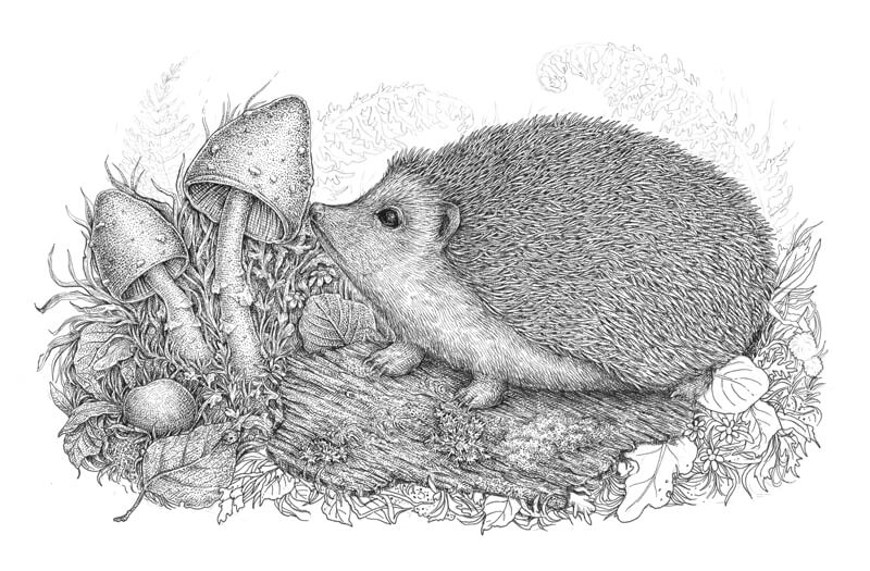
I add layers of hatching and stippling, just as we did with the foreground objects on the left-hand side.
The distinctive “lacy” or “refined” feel of the ink layers is created by using the thin-line liners and taking the time to build up the layers. Ink drawings can be spontaneous and sketchy, or they can look very accurate and elaborate. As I mentioned earlier, the manner you approach your work is totally up to you.
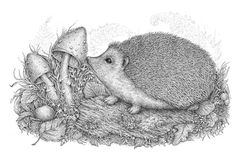
With the 0.05 ink liner, I draw the fern leaves in the background. I use the thinnest liner because the objects in the distance have minimal contrast (or at least less contrasting than the objects of the foreground or middle ground).
I apply only a few lines to draw the fern; just outline the main contours and add some hatching to accentuate the directions of the leaves’ small segments. I make sure that the leaves look like a soft, blurred silhouette.
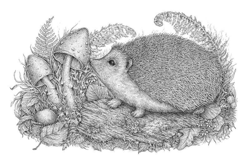
The artwork is almost complete. I evaluate it to find the things to improve…
I think that the hedgehog needs more volume, so I darken the bottom part of its back (where the spines are). With the 0.05 ink liner, I add hatches to the gaps between the spines, leaving their ends untouched. This method guarantees that you won’t lose the texture and the arrangement of values will remain accurate.
I also darken the stems of the mushrooms just a bit, using the 0.05 liner.
And, as a finishing touch, I make the nose of the hedgehog much darker. Now it looks more realistic!
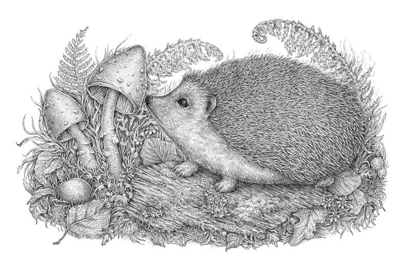
The Conclusion
Congratulations, well done! You’ve followed me through the whole process; maybe you were even drawing alongside and now you have a beautiful result.
I hope that this tutorial was interesting and helpful. My goal was to show you the power of basic tools and techniques for creating ink drawings. There are many approaches to creating art. Take the drawing tips that work for you, explore various options, and enjoy the journey.
If this tutorial inspired you, but you feel like some of the steps are too complex, please take a look at the amazing in-depth course The Pen and Ink Experience here on The Virtual Instructor. It explains the fundamental things that help you to understand the building blocks of drawing with pen and ink.
Thanks so much for your attention. I wish you much inspiration and fun!
If so, join over 36,000 others that receive our newsletter with new drawing and painting lessons. Plus, check out three of our course videos and ebooks for free.
Balance – A Principle of Art
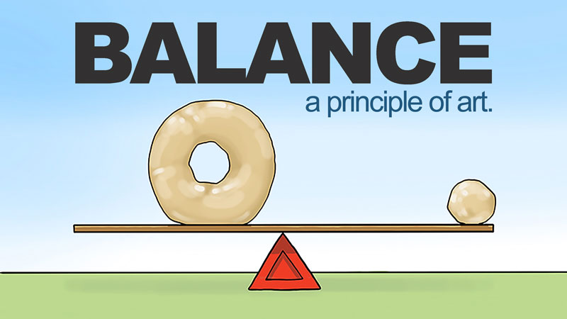
We all have our own inherent sense of visual balance as well. The way we landscape our lawns or arrange our furniture or compose our artwork reveal our feelings about visual balance. All people have similar feelings about what makes an artwork balanced or imbalanced, with small, personal variations of course.
Balance is one of the principles of art and design. The principles differ from the elements of art. The elements of art are the basic components that make up a work of art…line, shape, form, value, texture, space, and color. The principles deal with how the elements of art are arranged in a work of art. In essence, the principles of art deal heavily with composition.
See also: 5 Tips for Better Compositions
Balance refers to the overall distribution of visual weight in a composition. A well-balanced composition feels comfortable to look at.
Each visual component of an artwork has visual weight. Different than actual weight, visual weight is not measured using a scale but must be observed instead. Visual weight balances around an artwork’s axis. The axis may be vertical, in which visual elements balance on both sides of the axis. Artworks may also balance around a horizontal axis, in which visual elements balance from top to bottom.
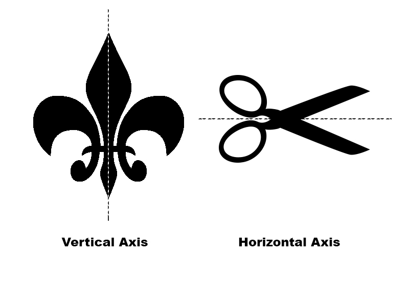
There are three types of balance: symmetric, asymmetric and radial. Symmetric and radially balanced artworks use formal balance. Asymmetric balance is quite different and is also referred to as informal balance. Let’s take a closer look at the three types of balance and then consider how to manage the feeling of balance in art.
Symmetrical Balance
Symmetry is a type of formal balance in which two halves of an artwork mirror each other. This type of balance is familiar and common. The human body is balanced symmetrically as is our planet, our cars, clothes, furniture etc. Symmetry imposes a strong sense of order and stability on both the composition and the subject.
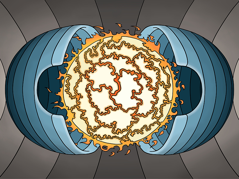
Approximate symmetry is just symmetry with a touch of variety. When using approximate symmetry, elements on either side of a compositional axis are similar in size and shape and number but are not mirror images of one another.
Radial Balance
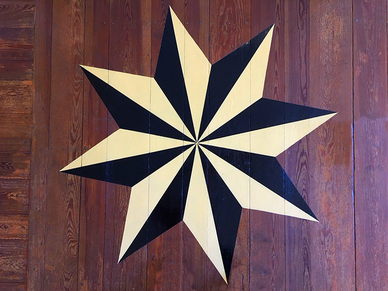
Radial balance is symmetry in several directions. Visual elements are arranged around a central point in the composition, like the spokes on a wagon wheel. Often, radially balanced designs are circular. Other shapes lend themselves to radial balance as well – squares, hexagons, octagons, stars, etc.
In nature, we most easily observe radial balance in the form of flowers.
Radial balance is prevalent in human design as well; car wheels, architectural domes, clocks, man-hole covers, a compass, etc.
Asymmetric Balance
Asymmetry is informal and seems less organized than symmetry. The two halves of a balanced asymmetric artwork do not look the same but have similar visual weights. Asymmetric balance is more subjective than both symmetry and radial symmetry. Asymmetry allows for more variety in a composition than symmetrically balanced designs. It provides the same “comfortable” feeling as symmetry without using like elements on each side of a central axis.
Many artists appreciate asymmetric balance because it feels less rigid and more realistic than symmetric balance. Although symmetry makes clear the artist’s desire to present a visually balanced image, asymmetric balance does not happen by accident, but instead requires planning and intention.
How to Create Balance in Art
Below are four variables that impact the balance of a composition. What follows is not an exhaustive collection of balancing forces, but these variables may serve as a starting point for exploring balance in your own art.
1. Size
Larger objects have more visual weight than smaller objects, all else being equal. If two objects of different sizes need to balance one another then the smaller object will need a boost in visual weight. This visual weight may come in the form of additional smaller objects or perhaps ample negative space around the object.
2. Color
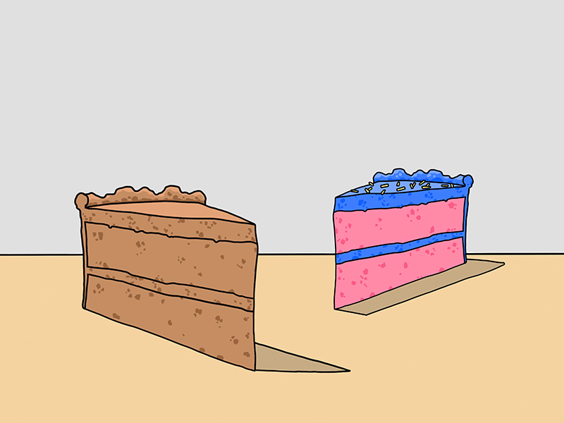
Bright colors are visually heavier than dull colors. Beyond that, if two colors are of similar intensity, then the warmer of the two colors has more visual weight.
Consider the image below. The slice of cake on the left is closer and, therefore, larger in appearance. Both slices of cake are similarly arranged relative to the imaginary vertical axis that divides the composition. The large slice should outweigh the small slice except for the color. The brighter colors make up for the difference in size so the two slices have the same visual weight.
3. Position
In at least one way, the two-dimensional arrangement of visual components is informed by our real-world experiences with weight and physics. Consider the playground see-saw. If two children on either end of a see-saw are the same weight, then they will balance each other.
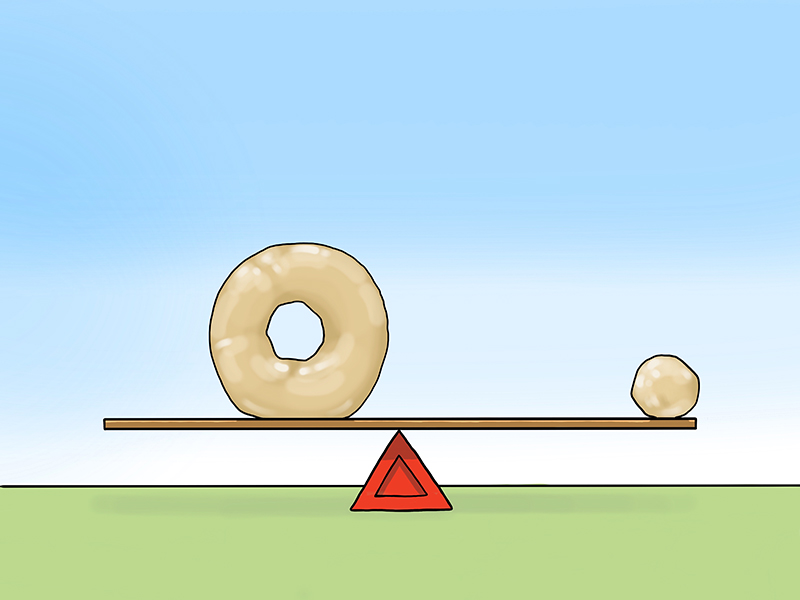
However, if one child is larger than the other, then the larger child will need to move towards the center to balance the smaller one. It is the same in art. So, the closer a visual component is to the edge of a composition, the heavier it becomes visually. Likewise, the closer a component is to the center, the lighter it becomes.
Look at the image below. See how the smaller doughnut hole on the far right visually balances the larger doughnut just left of center.
It’s worth mentioning that even as a visual component becomes lighter near the center, it’s perceived importance may increase due to the more central location.
4. Texture and Pattern
Texture and pattern are similar concepts in art. Each is defined buy frequent changes in contrast, usually created through value (the lightness or darkness of a color). Texture and pattern add visual weight. You can tweak the balancing forces in art by either adding or reducing the amount of texture and pattern in a given area.
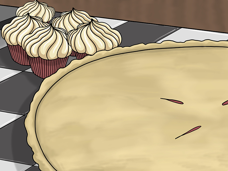
A large area of smooth, even values will balance with a small area of pattern/texture. Look at the asymmetric image below. The pie and the cupcakes are both rendered in colors of low intensity. Therefore, color is not a factor in their comparative visual weights. The size of the pie makes it visually heavy. The cupcakes and checkered surface balance the pie because their patterns add enough visual weight.
Conclusion
Once you are consistently creating balanced compositions you should consider what balance communicates to your audience. An imbalanced composition is not always wrong. Imbalance creates an unnerving feeling in the viewer that is sometimes appropriate when representing a frightening or dangerous concept such as war or uncertainty.
It doesn’t matter whether you prefer symmetric or asymmetric balance. Each has its own purpose in composing your artworks. What matters most is that you purposefully manage and use balance in your art, choosing the best form of balance based on your subject matter and message.
If so, join over 36,000 others that receive our newsletter with new drawing and painting lessons. Plus, check out three of our course videos and ebooks for free.


