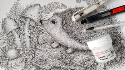
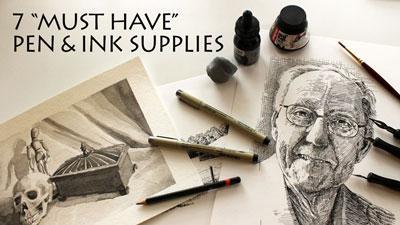
Materials for this Drawing
For this lesson, we’ll use technical drawing pens by Staedtler. These pens are a little more expensive than the popular Micron pens by Sakura. However, they last a little longer and the tips are less likely to bend under pressure.
We’ll work on Bristol paper with the vellum surface. Smooth Bristol paper is also acceptable and some may find it a better surface to work on.
Using Line to Communicate Form and Value
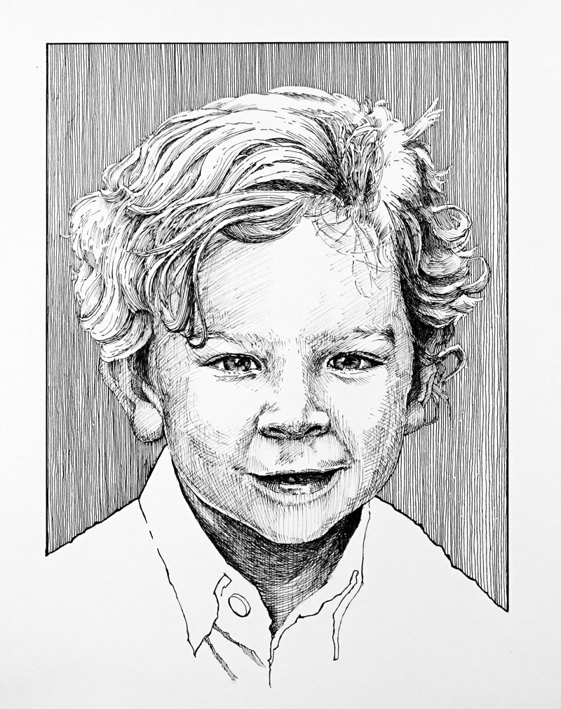
As mentioned before, we’ll be using line to develop the light and form in the drawing. There are a variety of different techniques that can be used to accomplish this. In this case, we’ll stay consistent with our technique and use hatching and cross hatching to develop the image.
We can develop darker tones and values by crossing the lines and placing them closer together. This means that we’ll also need to leave some areas open, allowing the white of the paper to show through to create areas of lighter value.
To help communicate the form of the face, we’ll allow some of our lines to flow over the form of the face. This means that the lines may curve as the form of the face changes in space. These types of lines are called cross contour lines. It is essential to use them in a pen and ink drawing in order to fully communicate the form of the subject.
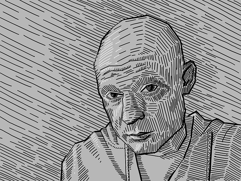
Here’s a look at the photo reference…
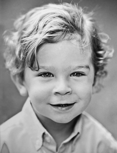
Since we’re creating a black and white drawing with black ink on white paper, the color has been removed from the photo reference. When creating any drawing or painting that is void of color, it’s a good idea to remove the color from the photo reference. This allows us to focus on the values and removes any distraction of color.
Create a Light Sketch of the Subject
We’ll begin with a light contour sketch of the subject with an “H” graphite pencil. Some pen and ink purists may frown upon starting with a graphite sketch. However, when accuracy is important, there’s nothing wrong with starting with a light sketch. Remember, the end result is what is most important.
If the thought of drawing the subject freehand (or with the aid of a grid) intimidates you, you may use a graphite transfer or light board to transfer the drawing.
Start with the Eyes
The eyes will naturally become the focal point in any portrait that you draw. In many cases, it is a good idea to start the development of a drawing with the focal points. For this reason, we’ll start with our ink applications with the eyes.
With a .05 mm pen, we’ll slowly begin the process of developing the relationships of dark and light value. The pupils are dark, but care is taken to preserve a strong highlight. Instead of filling in the pupil with a solid application of ink, we’ll use a bit of hatching and cross hatching to build up to a darker tone. This will ensure some consistency in the drawing.

For the iris, lines are drawn extending outward from the pupil. This will help to communicate the pattern of the iris while developing the necessary tone.
From the pupil and iris, we’ll progressively work our way outward, addressing the eyelids and the eyelashes.
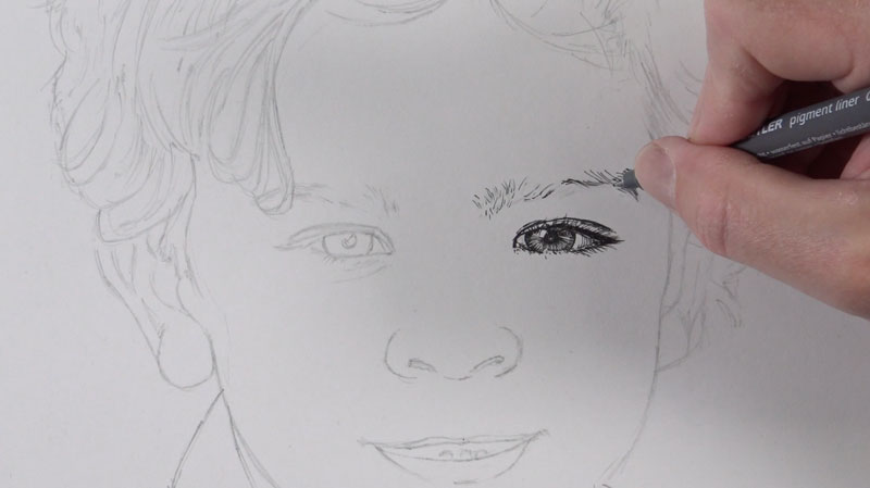
The eyebrows are simply addressed with small marks that extend out in the manner that the hair grows. Each mark tapers as it extends outward from the head. Remember, we can always add additional marks if necessary so it’s best to add a few at first and slowly build up applications. You can always go back and add more if needed but removing lines is not really an option.
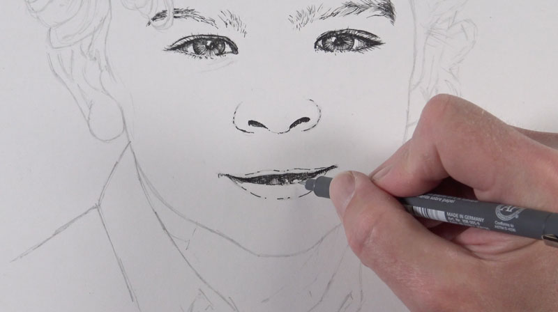
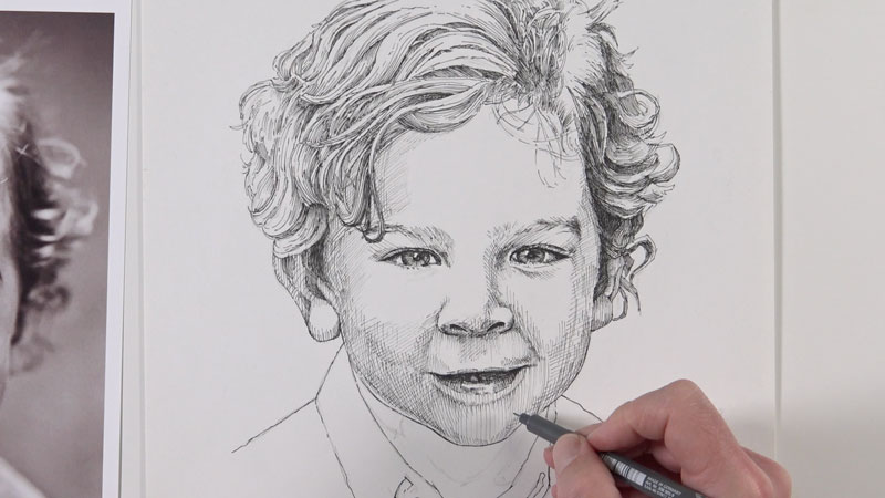
Addressing the Nose and Mouth
Next, we’ll work our way down the face and address the nose and the mouth. Broken lines are used to strengthen the contours of the nostrils and the lips. The shadowed areas are darkened with hatching and cross hatching.
Even though we think of teeth of being white, in most cases they are in shadow. This means we’ll need to create a slightly darker value with a bit hatching. The top lip is usually darker in tone since it protrudes outward from the face. The bottom lip usually features a highlight and is generally lighter in value than the top lip.
Outlining the Hair
With the features of the face in place and outlined, we’ll turn our attention to the hair. Instead of drawing a million tiny lines for the hair, we’ll think of it in terms of form. This means that we’ll first establish groupings of hair and then add hatching and cross hatching to create the impression of form. This will lead to a more representational look.
We’ll start by first establishing the forms within the overall shape of the hair with contour lines.
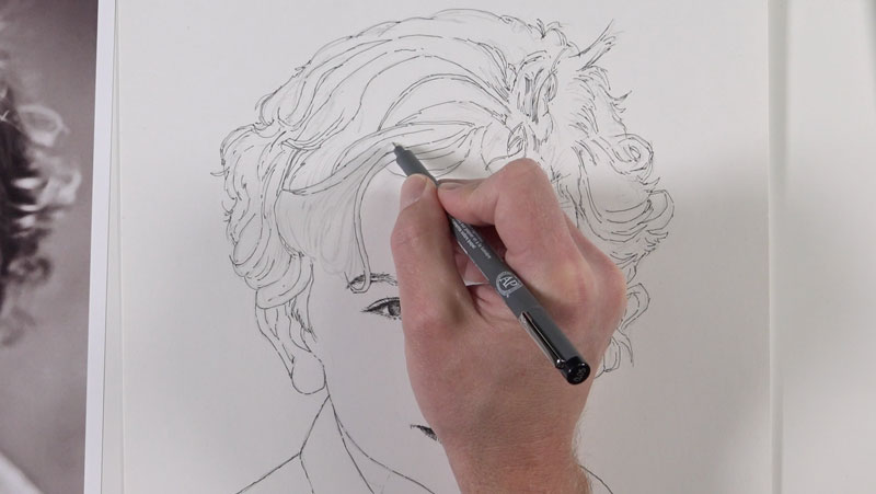
Develop the Form of the Hair
With the collections of hair defined, we can go back and develop the value and texture. We’ll use mostly hatching to accomplish this. The lines that we create here should flow over the form of each collection of hair. These lines may not flow over the entire length of each collection. Instead, they should be concentrated at each end, indicating a bit of shadow.
In most cases, the values in the hair are darker around the sides of the face and in locations where the hair “parts” or changes direction.
See also: How to Draw Hair
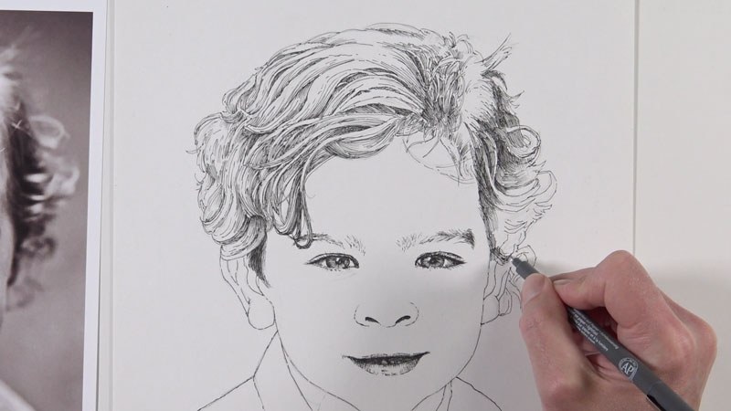
Planning the Values on the Face
Now we’re ready to begin adding the tones on the face and neck. Before diving right into this step with the pen and ink, we’ll first plan the shapes of darker values with a graphite pencil. Using a light pencil (“H”), we’ll draw light shapes to indicate the areas of shadow.
In most cases, the areas that protrude outward are lighter in value while the areas that recede are darker. This means that the bridge of the nose, the cheeks, chin and forehead are typically lighter in tone. The sides of the face, areas underneath the nose, the recesses around the eyes, and underneath the chin are usually darker in tone.
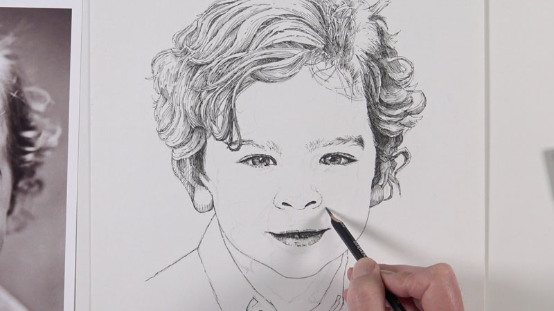
Developing Values on the Face
With the shapes of darker value planned, we can begin developing these sections with the ink. We’ll start with loose diagonal strokes to begin the process.
We can then slowly begin crossing lines to make the value slightly darker. These additional lines that are added may curve and change direction based on the form of the face. Essentially, we are adding cross contour lines to further develop the tone but also to communicate the form of the face. Here again, we’ll keep in mind that additional lines are easily added, but removing marks is nearly impossible. It’s OK to be cautious as we develop the value.
Darkening the Shadows Under the Neck
Since the face protrudes, we’ll find some of the darkest tones on the neck under the chin. Here again, we’ll use a combination of diagonal lines and cross contour lines to develop the shadows. In this case, the cross contour lines begin downward before curving back up around the form of the neck.
The darkest tones in this area are found right below the chin and close to the edges of the clothing.
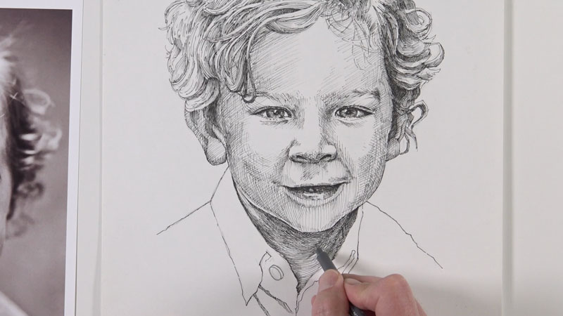
Instead of developing any of the shadows on the shirt, we’ll simply reinforce the contour line here. This is simply a “design decision”. If we were to develop all of the values of the shirt, it could take focus away from the face and hair.
Addressing the Bakground
We’ll now address the background and add a design element. We’ll first create a border around the area above the clothing that frames the face and head using the graphite pencil.
To add a bit of tone, we’ll use vertical, parallel lines to fill in the space. I’ve chosen not to use a ruler here to preserve an organic feeling. This is time consuming and requires quite a bit of patience and attention. However, this bit of tone helps to balance the values of the face, creates contrast with the white shirt, and makes the drawing more interesting.
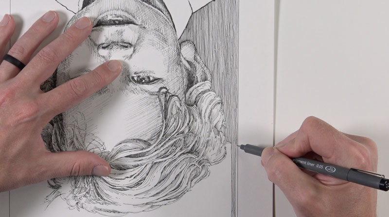
Finishing the Portrait with Pen and Ink
Lastly, with the background tone in place, we can go back to the hair and face and darken any areas to increase contrast and balance the image.
The outer line of the framed background is also reinforced using a thicker pen and connected to the contour of the shirt.
Now our pen and ink portrait is complete. We can allow the ink to dry completely and erase any remaining graphite lines with a kneaded eraser.
If so, join over 36,000 others that receive our newsletter with new drawing and painting lessons. Plus, check out three of our course videos and ebooks for free.
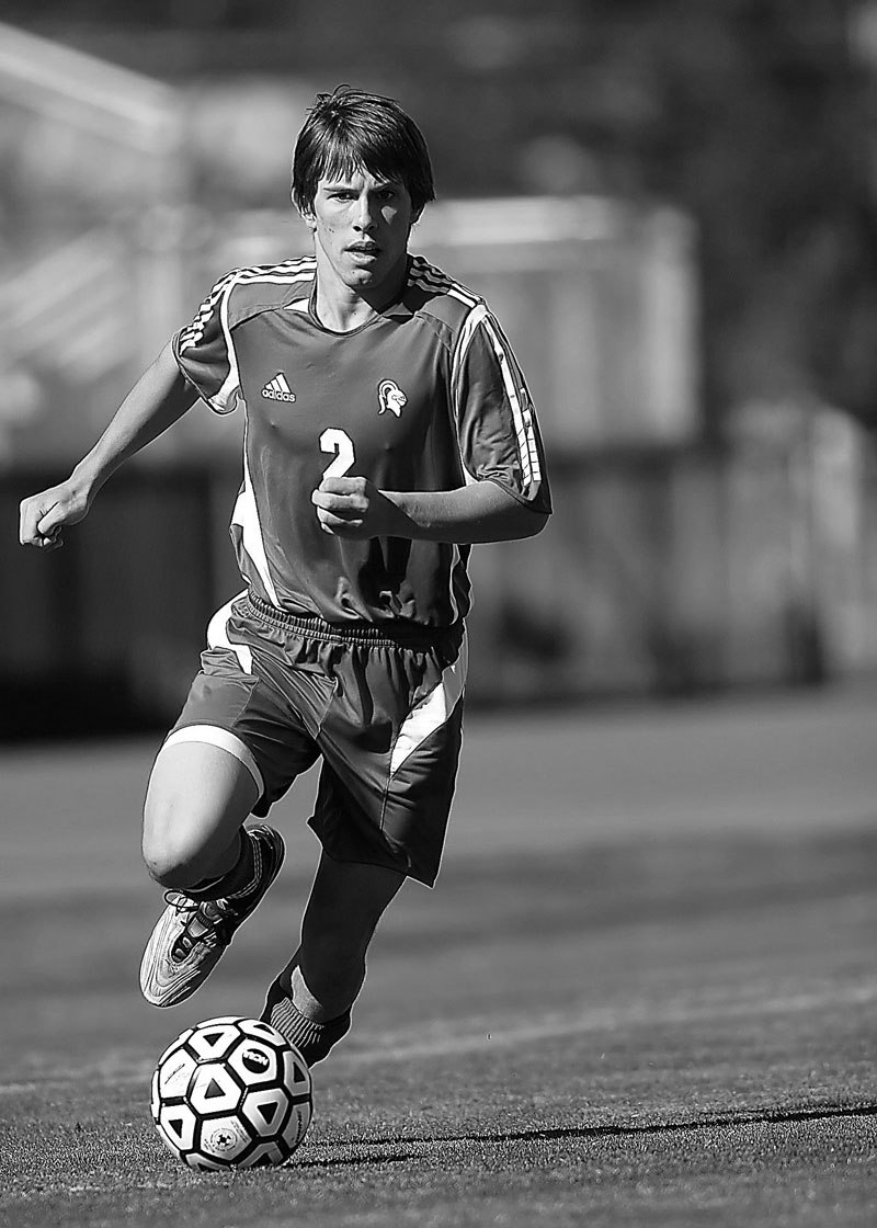
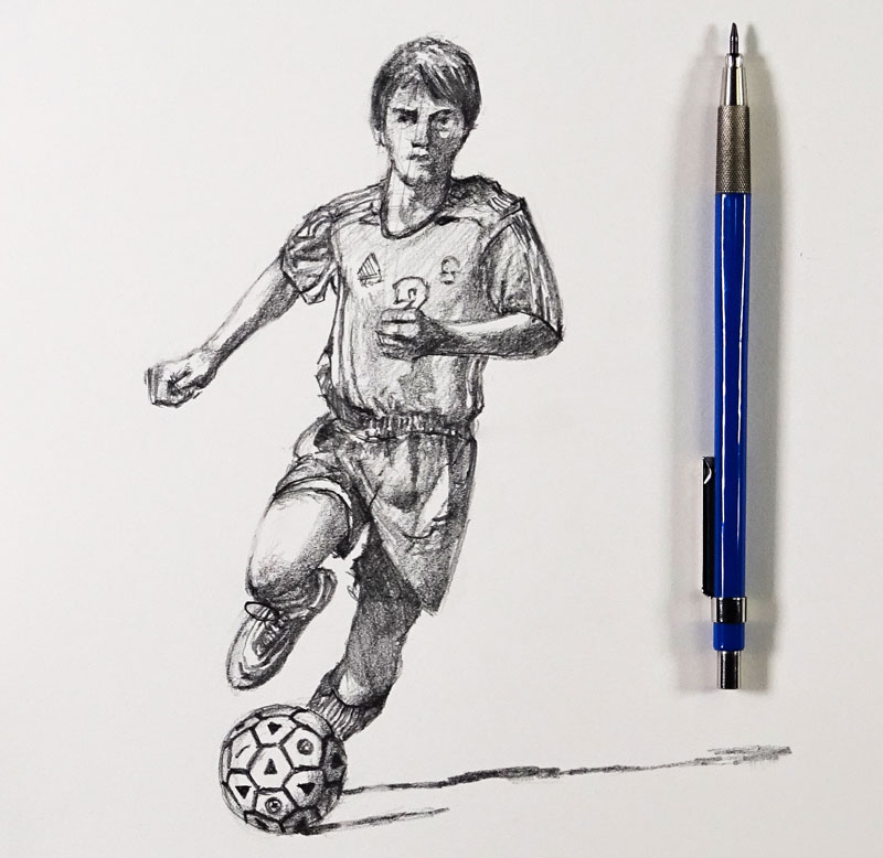
How to Sketch a Soccer Player – 30 Minute Drawing Exercise
How to Draw a Soccer Player
In this drawing challenge and timed exercise, we’ll draw a soccer or football player in 30 minutes. The finished result is a sketch and should not be considered as a “finished piece of art”. But this isn’t the point of an exercise like this. Our goal is to practice and improve our drawing skills by using the same observational skills that we would with a longer drawing.
The time constraint simply makes the drawing exercise a little more exciting and also helps us realize that there is a starting time and stopping time. Even if we go over a bit, we at least get started. For some of us, getting started is the hardest part. So if we know that we’re only going to spend a few minutes on the drawing, we’re more likely to get started and finish the exercise.
With this soccer player, we’ll approach the drawing in the same manner if we were to complete the drawing in a more finished manner. We’ll begin with looser marks and progressively get more precise as the drawing develops.
Drawing the human figure is challenging. Every person is different and body shapes vary greatly. Although there isn’t a formula for drawing the human figure that works for everyone, we can still take a structured approach to drawing the figure with some accuracy.
Before we get into the step by step approach, I’ll remind you that regular sketching practice should be a part of your artistic development. By spending just a few minutes each day with your sketchbook, you’ll notice improvement in your drawing skills. Drawing is a skill that can be learned by anyone, but it does require a commitment to learning and practice.
Gettin’ Sketchy is designed to provide you with a little drawing instruction through a fun drawing challenge. If you missed the previous episodes of Gettin’ Sketchy, you can check out the last three episodes here…
- Gettin’ Sketchy – Sketching a Rose
- Gettin’ Sketchy – Sketching a Boat on the Water
- Gettin’ Sketchy – Sketching a Crab
Here’s the step by step process for drawing the soccer player…
- We begin with a line from the head to the feet. This will ensure that we get the entire figure within the picture plane.
- Next, we’ll draw a couple of loose lines – one for the shoulders and another for the waist. In this case, these lines are at a slight diagonal.
- Using these guidelines, we can draw the bone structure. If it helps, you can think of this as a “stick figure”. For the hands, feet, and head, we’ll draw basic shapes.
- With the bone structure in place, we can thicken things up by drawing the contours of the arms, legs, and torso.
See also: Gesture Drawing – How to Draw the Human Figure Quickly
Since this is a simple sketch, we’ll only use basic drawing supplies – a graphite pencil and a sketchpad is sufficient.
- Staedtler Mechanical Drawing Pencil (2B Graphite) *Affiliate Link
- Drawing Pad
The photo reference for this drawing exercise comes from Pixabay.com. The original image was in color, but the color was removed to make recognizing shapes of value a little easier. Here’s a look at the reference image…
Here’s a look at the finished sketch of the soccer player with graphite pencil…
“Gettin’ Sketchy” a semi-regular event. We broadcast live on YouTube (whenever possible) on Wednesday evenings somewhere between 8:00 PM EST to 8:30 PM EST.
Make sure that you’re a subscriber to the YouTube channel so that you won’t miss an episode. You can subscribe here.
If you’re thinking of taking your drawing skills to the next level, you may want to check out our membership program or one of our courses. You may consider starting with the “25 Days to Better Drawings” video course. You can check out this course by clicking on the link below…
If so, join over 36,000 others that receive our newsletter with new drawing and painting lessons. Plus, check out three of our course videos and ebooks for free.
Unity, Harmony, and Variety – Principles of Art
That same person, however, may struggle to verbalize the differences between some of the principles of art. Two specific principles – unity and harmony, come to mind. The principles of art can create a feeling about an artwork and feelings are difficult to quantify.
This article explores three of the principles of art. These three principles are best understood as a group since they are related. The first two, previously mentioned, are harmony and unity. The third is called variety.
Harmony and Variety in Art
Harmony
Harmony is the principle of art that creates cohesiveness by stressing the similarities of separate but related parts.
One should note that harmony is not the same as unity. Harmony does, however, enhance unity in a work of art. Specifically, harmony uses the elements of art (color, line, shape, form, value, space, texture) as a vehicle to create a sense of togetherness amongst otherwise separate parts.
A set of colors that relate according to a specific scheme creates harmony.
Likewise, a uniform texture of brush strokes across the surface of a canvas creates harmony.
Another way to guarantee harmony is to choose compositional components that are similar in shape and contour. For example, a composition that utilizes only curvy shapes will have more harmony than a similar composition that includes both curvy and geometric shapes. The parts of the image below are in harmony because every contour is a curve.
Even a narrowed range of value can contribute to harmony in a work of art.
Variety
For many people, performing the same task or following the same routine over and over again leads to boredom. That is why vacations are such a pleasure. A vacation is an interruption of life’s routines. Some people are active when on vacation while others do nothing at all. One thing is certain – vacations look different than the routines they interrupt. Vacations are a measured dose of variety in a person’s life. Art needs variety also.
All harmony and no variety is boring. A favorite professor of mine used to say, “Variety is the spice of life”. He was not life-coaching. He was talking about art.
Variety is the principle of art that adds interest to an artwork.
Variety works through juxtaposition and contrast. When an artist places different visual elements next to one another, he/she is using variety. Straight lines next to curvy lines add variety. Organic shapes among geometric shapes add variety. Bright colors next to dull colors add variety.
Note: If an artist uses variety to draw the viewers attention to a specific area in a composition then variety morphs into emphasis, also a principle of art. Principles of art bleed into one another. They overlap.
Harmony and variety are really opposite expressions of the same nebulous concept. To emphasize one is to de-emphasize the other. Harmony and variety play tug-of-war in a composition. Too much harmony is boring while too much variety is aimless and incomprehensible.
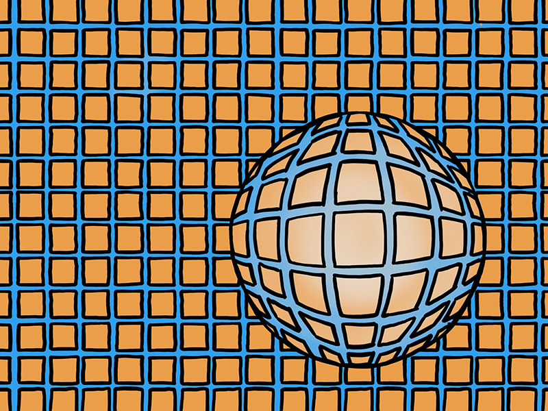
Look at the image below. Both harmony and variety are evident. The orange squares and the blue grid that surround them are in harmony based on both color and shape. The round form of distorted squares adds variety. The ball breaks the monotony of squares and adds interest.
Unity
Unity is the principle of art that gives an artwork a feeling of “oneness”. Unity and harmony are similar, but unity is more broad. There are numerous ways to create unity in art. Some of those ways are particular to individual artist’s style.
Unity is about separate parts working together. We can better understand unity by thinking about a car. A car’s purpose is to provide transportation. When the many parts of a car are working together, it moves. No part of the car, separated from the whole, is capable of providing transportation. When the car functions as it should, the parts are working together in unity.
Like harmony and variety, unity is not easy to understand at first. Different from the elements of art, unity is an impression – a feeling the artwork conveys to the viewer.
One can imagine a solitary shape and hold that shape in the mind. One cannot, however, simply imagine unity and hold that concept in the mind. We must evaluate unity by looking and analyzing. Therefore, developing unity in artworks requires the artist to pay attention to its development throughout the process of creating.
Here are some proven methods that ensure a unified composition…
- Simplicity
- Repetition
- Proximity
Let’s take a closer look at each of these techniques…
Simplicity – Simplicity refers to purposely reducing the amount of potential variety. For example, a graphite pencil drawing is likely to exhibit some measure of unity, given the lack of color. By eliminating color, the image is simpler than it potentially could have been if color was introduced.
A personal favorite is to make a drawing by hatching with only straight lines. Straight lines are less complex than curvilinear lines and will unify a composition.
Look at the image below. The simplicity of the line-type and the lack of color are simplifications of the original reference. Much of the visual information has been intentionally left out. The result is a unified image.
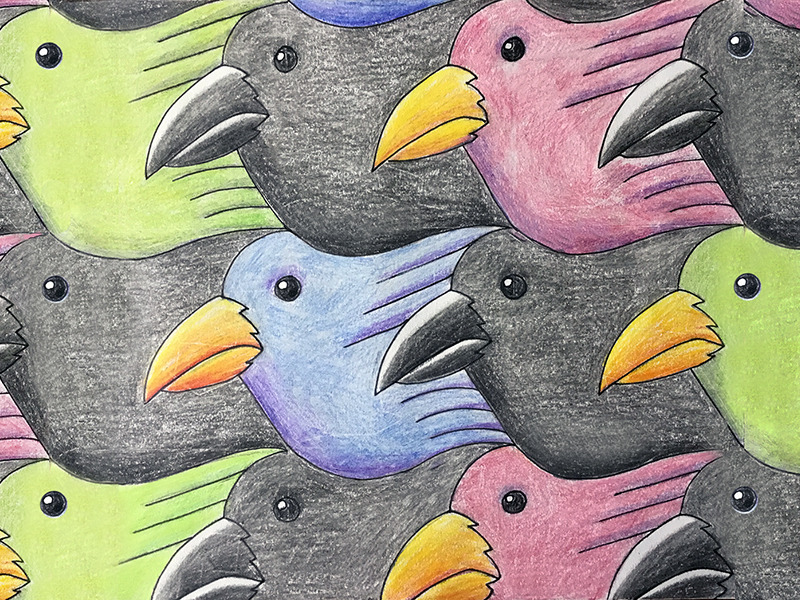
Repetition – Repetition within a composition will guarantee a feeling of unity. Tessellations are an obvious example of how repetition unifies a composition. A tessellation is an arrangement of shapes that fit together in a repeated pattern without gaps.
Repetition can also unify an entire series of artworks, like a group of paintings. A certain shape, object or texture that is repeated among a group of paintings acts as a motif, helping each painting to feel as though it is part of a greater whole.
Proximity – Proximity refers to the closeness of different components in a work of art. By placing parts close together, the mind is able to see the parts as one thing, a mass.
Negative space is the space between elements in a work of art. It can refer to the “empty spaces” within a drawing or painting. The more limited the negative space, the more unified the areas of a composition may feel.
The tessellation below depends on both repetition and proximity, resulting in a highly unified image. Due to the complete lack of negative space, the repeated bird shapes feel like one pattern.
If so, join over 36,000 others that receive our newsletter with new drawing and painting lessons. Plus, check out three of our course videos and ebooks for free.
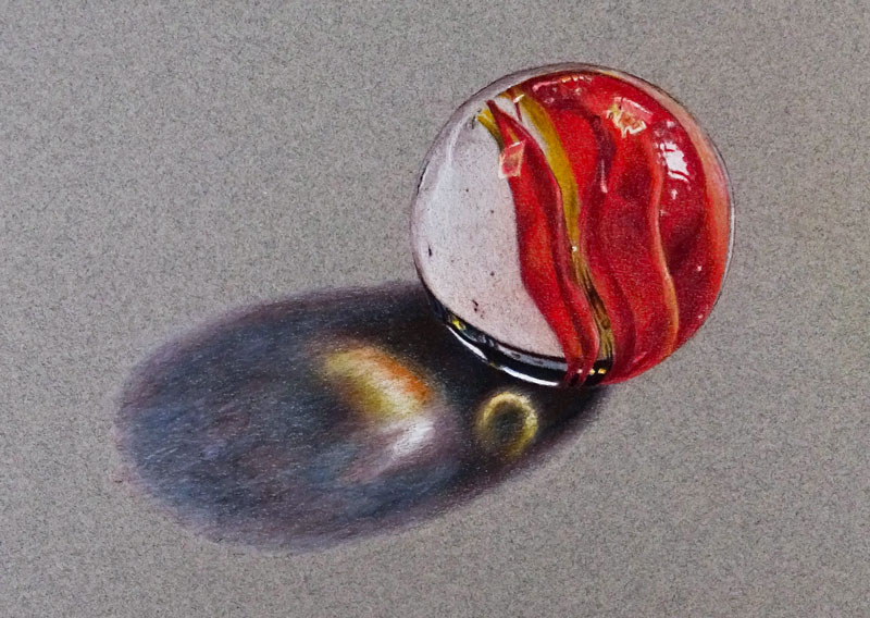
How to Draw a Realistic Marble with Colored Pencils
Materials for this Drawing
For this lesson, we’ll use the softer, Prismacolor Premiere colored pencils. These buttery colored pencils layer exceptionally well and make burnishing a breeze. They get a bad reputation for breaking easily, but it’s a sacrifice that’s worth it considering how soft they are.
We’ll work on toned Canson Mi-Teintes pastel paper. This paper features a course texture on one side and a softer, less textured surface on the other. Both sides are suitable for accepting multiple, layered applications of colored pencils. For this demo, we’ll use the softer, less textured side.
A toned surface helps us to establish value relationships quickly. As we add colored pencil applications to the surface, we can make better decisions regarding the value since we already have a neutral midtone on which to work.
Capturing Reflection and Transparency with Colored Pencils
Capturing reflection and transparency in a drawing or painting is dependent on the use of value. Value, one of the seven elements of art, is the darkness or lightness of a color. The manner in which we develop and position values in a drawing is what ultimately leads to the illusion of light, form, and texture. Value is perhaps the most important element of art that we use in our drawings.
Reflective surfaces feature high contrast in value. We’ll often see dark values positioned right next to light values. This is especially true in areas where we see strong highlights. If we manage to recreate this relationship of values in our drawing, then we have a good chance of creating the illusion of a reflective surface.
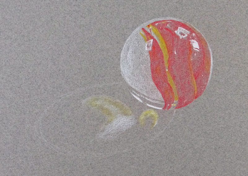
Our marble is also partially transparent. The key to creating this illusion is also dependent on the positioning of values. In the case of our marble, we have several bands of color that meander through the middle. Since these bands fold slightly, we see subtle changes in value. These gradual folds create gradations of value and areas of shadow where they overlap. We’ll also notice that these bands of color do not extend all the way to the top edges of the marble. Instead, we see a small band of a more neutral color along the top edge of the sphere.
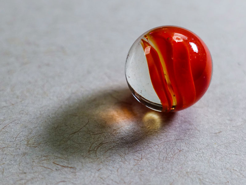
Here’s a look at the photo reference…
We also have strong light that passes through the marble’s core. Because the marble is glass, this light is intensified as it passes through. In this case, this produces two distinct highlights on the surface behind the marble. These strong highlights are found within the core shadow and reflect the colors found within the marble itself. A core shadow still exists since parts of the marble are not transparent.
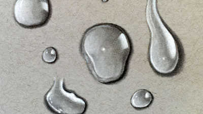
See also: How to Draw Water Droplets
Draw the Contours
We’ll start by first drawing a circle. If you have trouble drawing a circle freehand, you may use a circular object and trace a circle in place. In this case, I used a lid from a container of acrylic gel medium, but any circular object will do.
We’ll use White or 10% French Grey to lay in the contours with a light touch. Be sure to apply a light touch so that you don’t create indentations in the surface of the paper or make marks that may prove difficult to cover later. White is easily covered with subsequent applications of colored pencils if a light application is made.
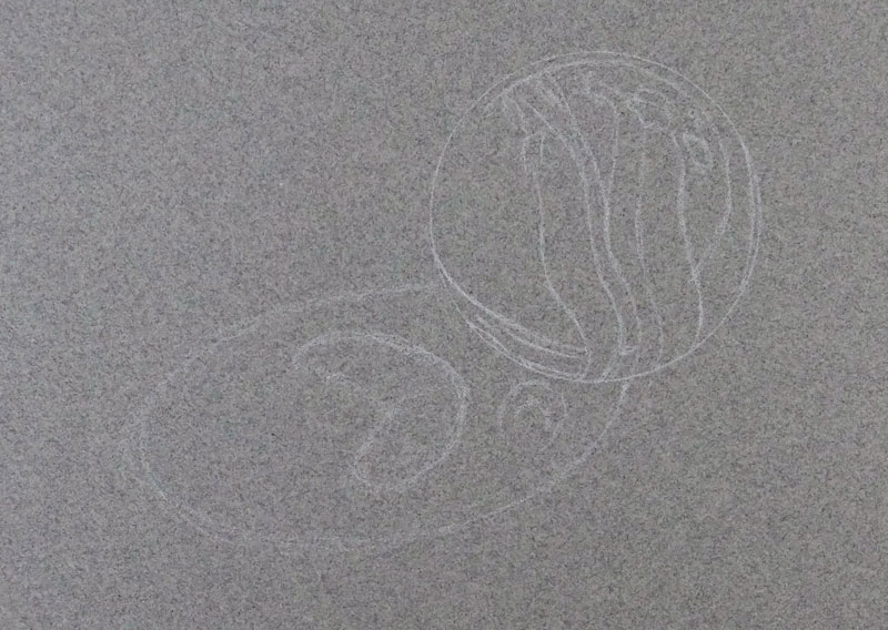
With the circle defined, we’ll lightly define the shapes of color within the marble as well as the shapes of highlight and shadow with contour lines. After we’ve established these shapes, we’ll draw an elliptical shape for the cast shadow and add the shapes for the strong highlights.
If you don’t feel comfortable drawing the contours freehand, you can always transfer the information from the reference using a graphite transfer.
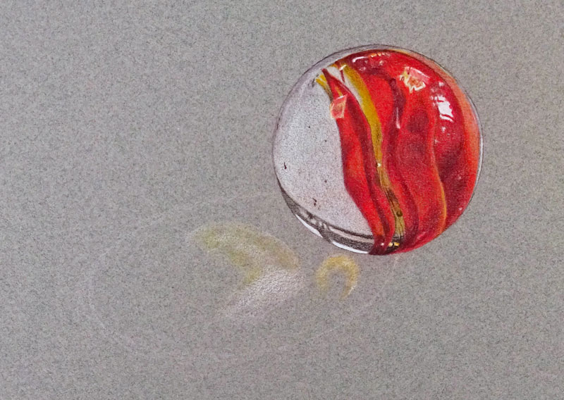
Layer Initial Colors
Starting with Scarlet Lake, we’ll carefully begin filling in the local color in the red areas of the marble. As we do so, we should be careful not to overlap our locations of strongest highlight. These areas should be preserved so that our highlights remain strong and pure when they are added. The applications are light at first, using medium pressure to apply the color.
The yellow areas receive an application of Sunburst Yellow. Again, as this color is added, the highlights are avoided. Some of the Sunburst Yellow is applied over the bands of red to create additional interest and depth to the color, mainly in the areas where the value is slightly lighter. Sunburst Yellow is also applied within the strongest highlights found within the cast shadow.
With our initial reds and yellows in place, we can add the strong highlights with White. Heavier pressure is used in locations where the highlights are at their strongest. White is also applied within the strongest highlights found within the cast shadow.
A combination of White and 10% French Grey is applied to the body of the marble on the left side.
Strengthen Colors
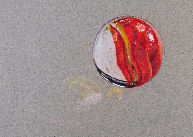
Now that our initial colors are in place, we can begin intensifying the color. In the darkest areas within the red bands, we’ll add Tuscan Red. Once the Tuscan Red is in place, we’ll go over the red bands again with another application of Scarlet Lake. In the lighter areas within the red bands, another application of Sunburst Yellow is applied. As we add these layered applications, we can refine the shapes of color and add any nuisances that we see.
The tooth or texture of the paper is suitable for accepting multiple applications of color but produces a grainy texture. The surface texture of the marble should appear smooth. We can soften the texture to a degree by burnishing the applications that we have in place with a colourless blender. A colourless blender is simply a colored pencil void of pigment. When it is applied, the wax from the pencil blends and smooths the color already on the surface. It helps to eliminate the grainy appearance by working the medium into the texture of the paper. Using medium to heavy pressure, we’ll burnish the colored pencil applications in place with the colorless blender.

Increase the Contrast
Now we can turn our attention to broadening the range of value and increasing the contrast. To do this, we’ll begin adding Dark Umber to darken the shadows within the bands of color. Dark Umber is a dark brown and is chosen to keep the shadows warm. Black is avoided, since it tends to make colors appear flat and unnatural.
Dark Umber is also used to reinforce the outer contour and to establish a base application within the darkest area on the lower left quadrant of the marble. A few specks of darker tone are also added with Dark Umber to communicate a few imperfections within the glass of the marble.
After applying the Dark Umber, we can intensify the color further and brighten the red bands. Poppy Red is applied over the red bands with a medium to heavy pressure.
We’ll also apply another application of 10% French Grey and White over the left side of the marble. After these applications are made, they are burnished again with the colourless blender, lessening the grainy appearance produced by the texture of the paper.
Additional Contrast
As mentioned before, we are avoiding using black. Black, when used on its own in a color drawing, can flatten a drawing and command unwanted attention. Dark Umber on its own however, is too warm for some of our darker values. Fortunately, we can combine Dark Umber with Indigo Blue to produce a more natural “black”. This combination also adds a bit more flexibility. If we want the black to appear cooler, we’ll allow Indigo Blue to dominate. If we want the black to be warmer, we’ll simply allow the Dark Umber to dominate.
Using Indigo Blue, we’ll go over the darkest portion on the marble in the lower left quadrant where we previously applied Dark Umber. If you find that this application produces a result that is too cool, simply add another layer of Dark Umber.
The strong highlights within this area of dark value are not without a hint of color. A light application of Indigo Blue is applied over portions of the highlight with a light touch before applying another layer of White. A touch of Sunburst Yellow #917 is applied over the warmer sections of highlight in this area as well.
Drawing the Cast Shadow
Now we’re ready to begin adding colors to the cast shadow. We’ll start by first adding additional colors to the highlighted portions. A bit more of Sunburst Yellow and White is added first, followed by a touch of Orange.
Next we’ll add Dark Umber to the rest of the shape, applying more pressure to the pencil in the darkest areas of shadow. Over the top, we’ll apply Indigo Blue #901 in the areas where the shadow is at its strongest.
The shadow slightly fades around the outer edge, so the pressure that we place on the pencil should also reflect this.
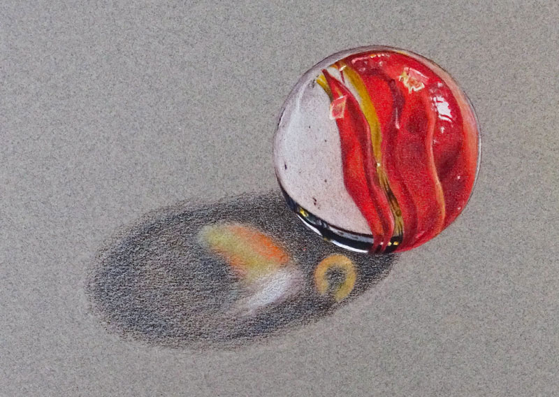
Darkening the Cast Shadow
We’ll continue gradually and patiently layering applications of Dark Umber and Indigo Blue to progressively build a darker tone. We’ll allow a bit more of the texture of the paper to show through in this case, so that it can contrast the smoother texture of the marble. Nonetheless, we’ll still burnish these applications with the colourless blender, allowing the blues and browns to mix. The blender is also used to soften transitions from dark to light where the darkest values meet the lighter highlights.
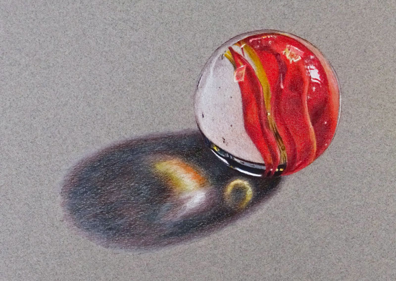
I like to include a bit of color in cast shadows. In this case, I’m allowing some of the Indigo Blue to dominate portions of the cast shadow. By doing so, the cast shadow contrasts with the warmer colors of the marble. This is simply an artistic decision.
Finishing the Colored Pencil Drawing of a Marble
Lastly, we need to increase the contrast within the cast shadow. Working in from the outer edges of the shadow, we’ll add a medium application of 20% Warm Grey. This lightens the value slightly and also smooths the texture a bit more. We’ll also apply this color around the entire outer edge of the cast shadow to help smooth the transition from shadow to raw paper.
In the darkest areas of shadow right underneath the marble, a bit of 90% Warm Grey is applied to darken the tone further.
Now our drawing of a single marble is complete.
If so, join over 36,000 others that receive our newsletter with new drawing and painting lessons. Plus, check out three of our course videos and ebooks for free.
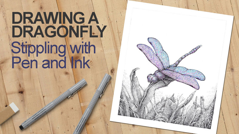
Drawing a Dragonfly: Stippling with Pen and Ink
Beginning ink artists usually choose stippling as a starting point technique because it’s forgiving – a couple of odd dots probably won’t ruin the artwork. It’s also relatively easy to control the accuracy of dots (and the drawing in general) – probably easier than dealing with a variety of hatches.
On the other hand, creating a multi-layered net of dots requires quite a bit of time. There are many opinions on whether it is appropriate to combine stippling with hatching. Some artists prefer “pure” stippling while some choose to include lines and various types of hatching in the stippled artwork.
Let me show you my approach and the process of combining different techniques in an ink drawing. In this tutorial, we’ll create a drawing of a beautiful dragonfly, mixing black and bright, colorful dots. Stippling is not limited to just one color after all!
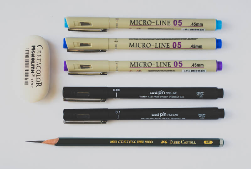
The Art Supplies for This Drawing
For this project, I’ll be using:
- Black ink liners, the width numbers are 0.05 and 0.1.
- Colorful pens – light blue, dark blue and purple.
- HB graphite pencil and eraser for creating the underdrawing.
The size of my artwork is relatively small, 17×23 cm (or roughly 6.5″ by 9″). The choice of paper is up to you, but I prefer the smooth white paper. Another option is smooth or vellum Bristol paper.
Please use ink liners or pens of any brand you like or have. Of course, a creative approach is welcome – choose any additional colors, if you wish!
Basic Stippling Technique
When to Use Stippling
Before we dive into the process of outlining the “final” artwork, let’s explore the possibilities of the stippling technique. It’s worth considering what’s possible in a drawing such as this, since stippling has many ways it can be used.
Some of them are:
- Creating illusions of sand, soil, dust and similar types of textures;
- Drawing clouds, sprays and mist;
- Various velvety, fluffy, fleecy textures;
- Depicting delicate and, especially, transparent objects, like the wings of insects;
- Light objects in a drawing;
- Emphasize the dramatic change from a darker to a lighter value;
- Accentuate the darker values and strengthen the shadows without overworking the drawing in general;
- Anything that has plenty of thin, refined details;
- Drawing objects that are far from the viewer and located somewhere in the background.
In addition to this list, stippling is a great way to draw anything that has subtle value changes, including a wide range of objects or unobtrusive blurry backgrounds. Even a couple of dots added in the right place may enhance your artwork and make it more interesting.
How to Develop Stippling in a Drawing
Simply said, stippling is a creation of a pattern that consists of dots.
The more dots are put on the paper and the closer those dots are to each other, the darker the value becomes. By layering more and more dots, we can create an illusion of shadow and develop a smooth transition between lighter and darker values.
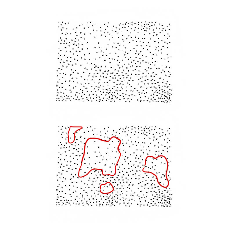
It’s important to train your eyes and hand to place new dots in the gaps between the existing ones, creating a harmonious pattern. This concept may seem obvious but also complex. It’s just a matter of balancing areas of the filled and blank surface within the picture plane.
The illustration below shows an example of how the gaps between the dots can be an expressive tool itself, forming shapes and silhouettes, creating an illusion of relief and texture. That’s why it’s important to use this space wisely.
Let’s take a look at some examples of shading with stippling.
In the image below, you’ll find an interesting effect that is achieved by adding more even layers of dots (from one layer to four):
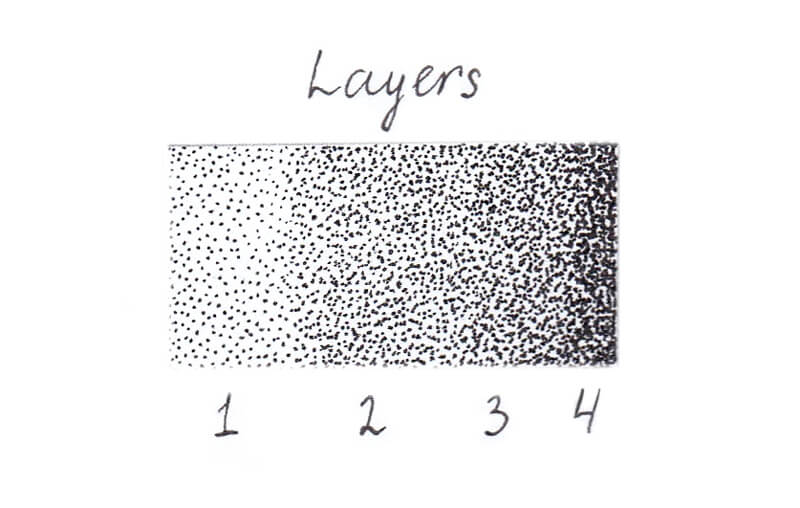
Remember, the higher the concentration of dots, the darker the value!
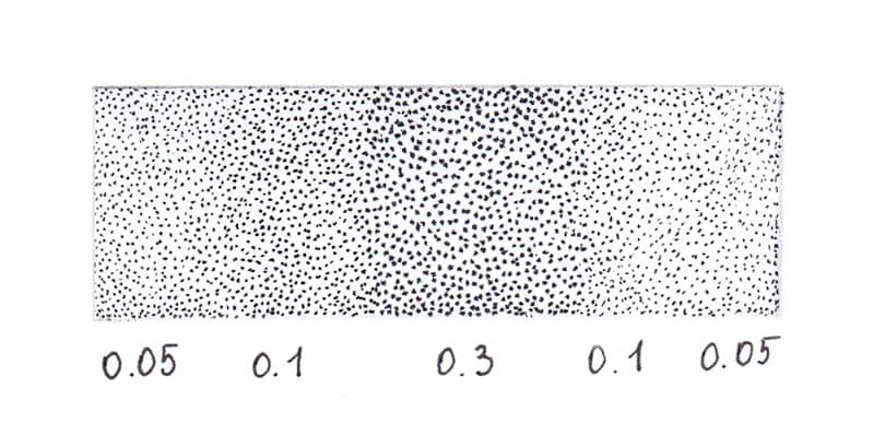
And here is an example of stippling a gradation of value.
I’ve created this gradation in value using the liners of different width numbers: 0.05, 0.1 and 0.3. Bigger dots create a more pronounced, rough pattern, and smaller dots create the impression of a delicate texture that is almost smooth.
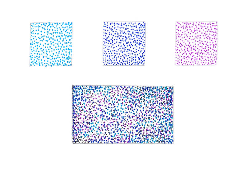
Adding dots of a different colors expands your possibilities greatly. In this project, we’ll have three subsidiary colors supporting and varying the pattern of black dots.
Together, these colors create a sample full of lovely nuances!
Become More Confident with Stippling
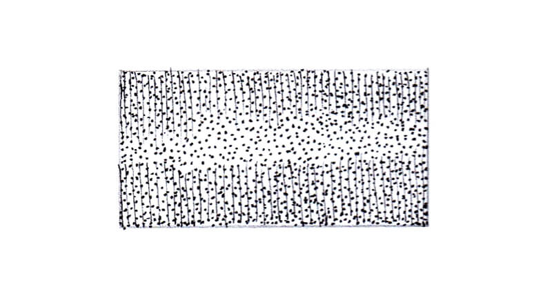
It’s useful to practice stippling before proceeding to your final drawing. You can draw a couple of small rectangles, using a pencil and a ruler, and fill them with dots. Here are some suggestions:
- Create an even layer of dots, using any liner you like. Pay attention to the gaps between the dots – the intervals are as important as the pattern of dots.
- Create a transition from lighter to darker value, using just a single liner.
- Play with liners of different widths, making larger and smaller dots.
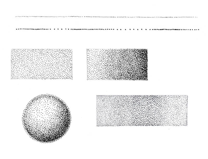
- Draw a ‘line’ that consists of dots. Try varying the intervals between the dots.
I also recommend drawing a shape (for example, a circle/a sphere) and filling it with dots to create a basic, stylized illusion of volume.
If you’re going to use colorful dots in a combination with black ones, try creating an appropriate sample too. It’s important to know how all these dots would look together!
Stippling Tips and Advice
Nuances matter and the following list of variables should be considered…
- The way you hold your tool
- The amount of pressure you place on the pen
- The angle between the pen liner and the paper are important
- The placement of the paper. (If you have a habit to rotate your artwork while drawing, this will affect the result you get.)
In some cases (especially, if stippling is the only technique used in your artwork), consistency in the way you create your dotted pattern helps to achieve a desired result.
Sometimes having a support for your paper that has an angle instead of drawing just on a flat table makes a difference too. To put it simply, experiment and find out what works best for you.
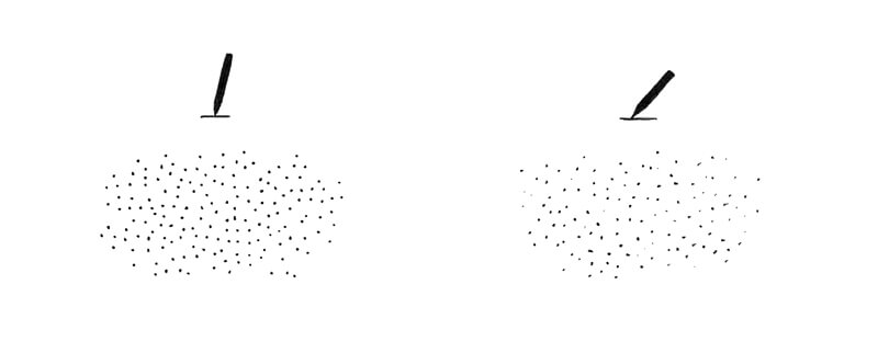
Many artists prefer to stipple, holding a liner or a nib pen at a 90° angle relative to the paper. Changing the angle will affect the character of dots – they may become distorted or faded. Below is an illustration of this concept.
While drawing, keep your hand as relaxed as possible and make sure your movements are quick when you lift the pen tip from the paper. The indecisive movements may create unpleasant tail-like marks that result in sloppy, irregular commas.
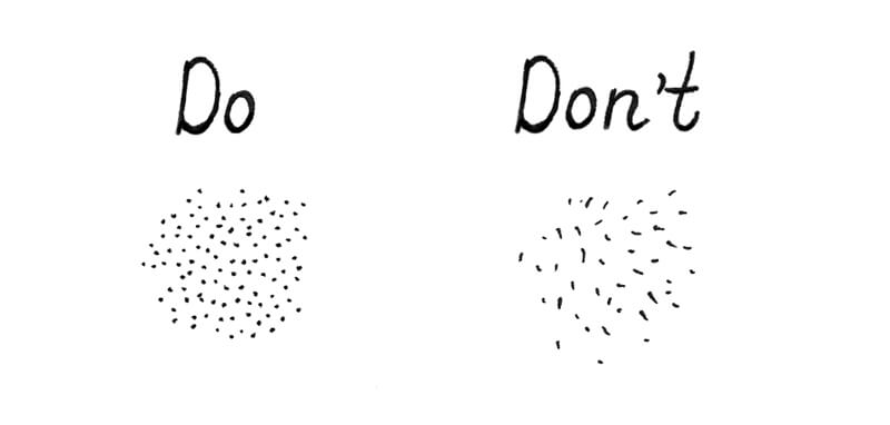
However, there are no strict rules in art. If you like drawing dots with spontaneous ‘tails’ and this gets you the desired result, please feel free to continue doing what makes you happy!
Make light touches with your liner. The process of stippling may make your hand a little tired. Taking a short break with a couple of exercises for the fingers and wrists is a good idea. Plus, an excessively hard pressure on your tool will damage its tip and reduce its life span.
If you have to create big, bold dots, it’s a better to use a liner with a wider tip that makes such dots naturally, rather than trying to create those big marks with a thinner-width liner.
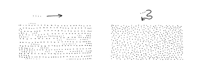
While developing values, try to place your dots in a spontaneous, slightly chaotic way. The result will have a more natural feel. Sometimes the better option is to keep to a defined pattern and place dots in an even row, but these cases are rare and the result may look “stiff” and somewhat mechanical.
Stippling is a time-consuming technique and it requires patience and dedication. If you’re a beginner, I recommend starting with small exercises and smaller artworks, varying the rhythm and pressure to find what fits you. Take breaks as often as you feel necessary.
Stippling can be a kind of meditation or a way to reach your own “state of flow”.
See also: Pen and Ink Drawing Lessons
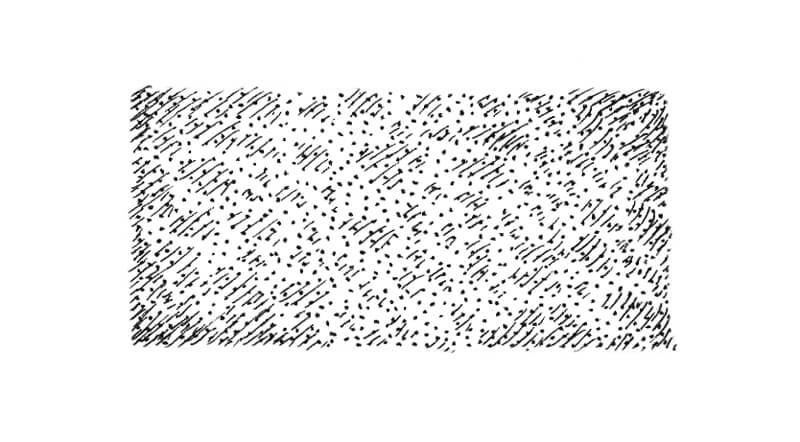
How to Combine Stippling, Lines, and Hatching
If you are interested in the “pure” stippling technique with no inclusion of lines or hatching, feel free to skip this part. Here we’re going to explore a couple of simple, yet effective, ways to create harmony between different inking techniques.
One of the advantages of combining techniques is speeding up your process. Adding some hatching allows you to save time, which is also a bonus for anyone lacking patience.
The first method applies to the contours in the drawing. You can use both dots and short hatches to create a broken, dashed line.
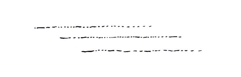
I personally like this trick because it helps to make the contours in your drawing quite clear and “readable”. Stippled artworks can often have a slight “blurry” feel and creating clear contours can be difficult.
The closer an object appears in a drawing, the thicker and more continual the contour line. Objects that are far in the distance require a thinner edge and more dots in the contours. This creates a feeling of atmosphere.
Even the parts of a contour line that are continuous should feel organic – a strict line, like one drawn with a ruler, may become a conflicting element.
Another great approach is to place hatching on top of a dotted layer. The opposite way works too. You can create a layer of hatches and then cover it with dots.
The type of hatching used is up to you. Sometimes, describing a contour with hatching is the best option and in other cases, just a layer of simple parallel hatching works.
You can see an example of this combination in the image below.
It’s important to choose your tools wisely. Hatched marks that are too thick will be distracting. That’s why I prefer using a thinner ink liner for hatching and wider liner for stippling. The sample above was made with 0.05 and 0.1 ink liners and the result is more harmonious.
Using this approach, you can add depth to your drawings, accentuate the relief of objects, and create an illusion of volume.
A combination of dots and hatching is a powerful tool for creating the illusion of texture. Below you’ll find an illustration of how a layer of stippling and groups of short hatched marks work together to develop texture and relief.
I used the 0.05 liner for hatching and the 0.1 liner for stippling.
Mixing techniques with a success requires skill and experience. Let me share with you one of my experiences.
Many years ago, I experimented with an illustration depicting various characters in a medieval castle. I used hatching for the interior, clothes, and all the objects. But when it came to shading the faces, I decided that my nib’s tip is too wide – and went for stippling.
The result wasn’t as pleasing as I imagined. The dots created a weird, uneven texture that contrasted with everything else in the drawing.
There’s nothing wrong in making poor decisions that don’t work. We learn this way! So don’t be afraid to experiment.
Drawing the Dragonfly
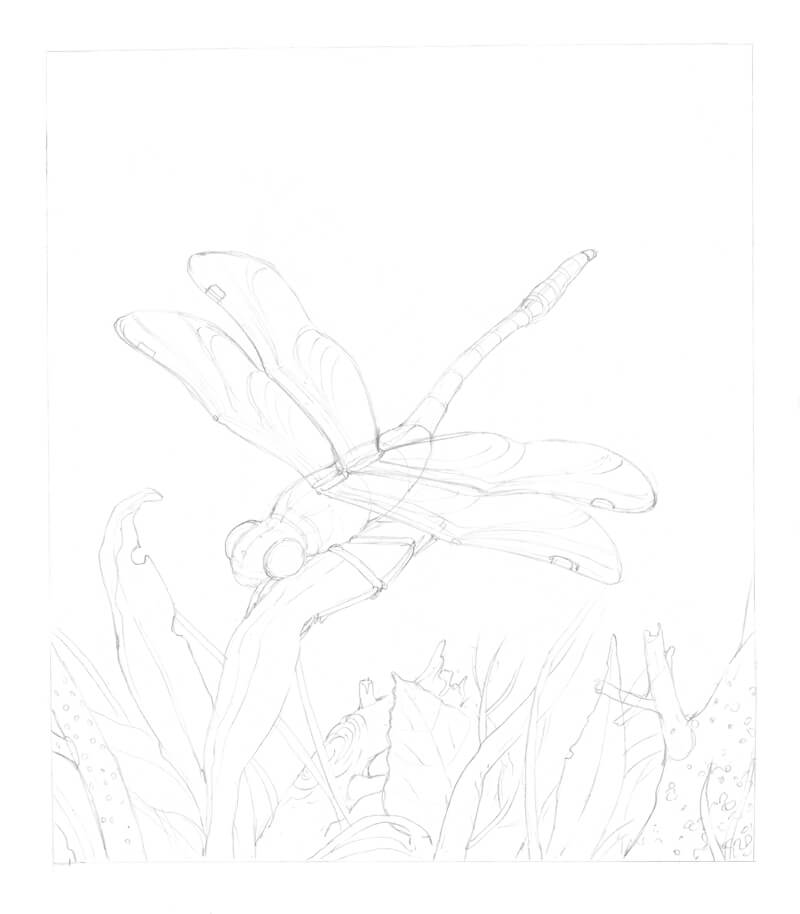
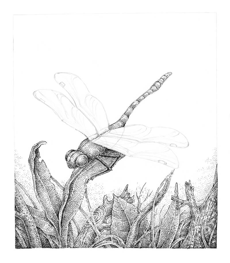
Now we’re ready to move forward. Let’s start with a pencil sketch.
My goal is a stylized artwork, so I won’t be using any particular reference photo of a dragonfly. But if you feel it necessary to use a photo reference, please do.
I outline the main contours of the dragonfly, constructing it with loose shapes. I also add the general contours of the surrounding botanical elements. A thin border around the outer edges is left to balance and frame the artwork.
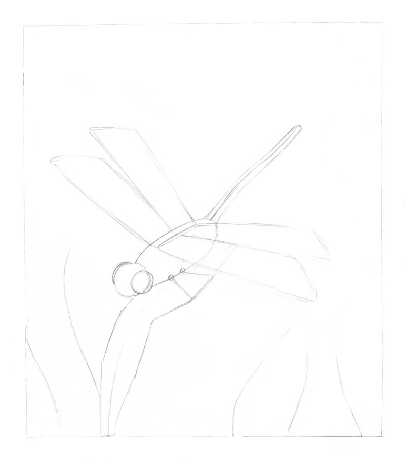
The dragonfly wings are the focal point of the drawing. They are located in the center of the artwork and feature a whimsical, refined pattern. Colorful dots are to be added to the wings and portions of the body. But before we proceed to the inking steps, we have to better understand the pattern of the wings.
Below you’ll find an image of a portion of the wing. This is just a stylized option since dragonfly wings are variable in size, proportion, and pattern.
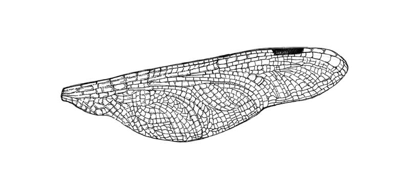
It may appear slightly overwhelming. To fill the shape of the wing with smaller elements, an artist has to see and understand the smaller segments. This set can look like this:

The close-up above is created with thin lines and dots.
In our finished artwork, where the dragonfly has context and is located at some distance, we won’t be able to use lines to convey all the tiny details. That’s why my suggestion is stippling. Let’s continue with the underdrawing.
I refine the contours of the dragonfly and then add details to make the insect look believable. The segments of the abdomen, thorax, and wings are all addressed. Feel free to invent some individual elements to add interest to your dragonfly!
I also define the natural environment by drawing the contours of the long leaves, twigs and a fragment of a tree. The goal is to fill the bottom part of the artwork with interesting plant life.
Let’s start inking!
With the 0.1 ink liner (black) I apply dots to the dragonfly’s head, including its big eyes and body. The lighter areas, like the top of the head and central line of the “tail”, require fewer dots.
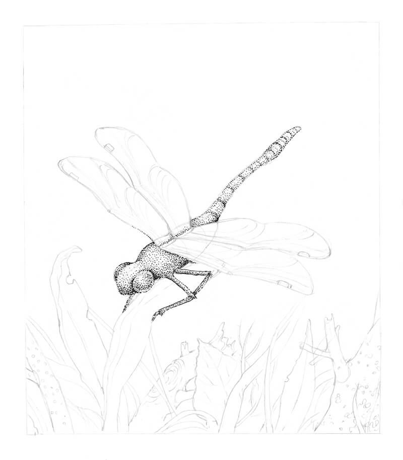
I outline the contours with dots and short lines, using the 0.1 liner.
I also accent the darker areas of the environmental elements, applying dots and keeping the intervals approximately equal. The only exception is some spots of the tree bark texture.
I add another layer of 0.1 stippling to the elements in the bottom part of the drawing. It’s time to increase the contrast, but we’ll work slowly to do so. When it comes to ink, even small dots aren’t easy to remove!
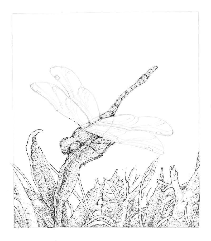
I also use short hatches to add the details of the tree texture and draw the small circles of the twig’s bark pattern on the left side of the drawing.
I add the groups of thin hatches made with 0.05 liner to the darker areas, adding depth to the drawing. I pay a special attention to the cast shadow under the dragonfly and everything that is near the bottom edge of the artwork.
The objects that belong in the foreground should be detailed since this area is closer to the viewer. I leave the dragonfly’s segmented abdomen (the ‘tail’) relatively light, allowing it to blend with the background slightly.
I also add groups of small dots to the background, creating a blurry effect.
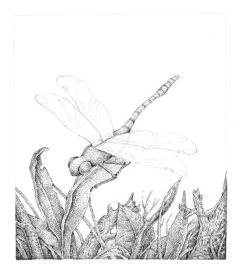
I develop the wings with colorful dots, mixing the light blue, dark blue and purple. I also some of the dots to the dragonfly’s eyes and body.
There is an order in creating colorful lines and patterns. The upper part of the wings is mainly light blue, then dark blue, and finally, purple – closer to the head. Of course, you can also include additional colors if you like.
The individual dots here are quite larger since I’m working with the .5 pens, which are 0.45 mm in width. Although the pens have a consistent width, you can vary the pressure. A lighter touch creates a smaller dot.
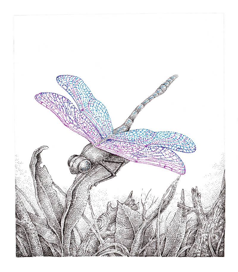
The colorful dots attract too much attention and stand out too much on their own. That’s why I dilute them with small black dots made with the 0.05 black liner. The goal is to create an application that mutes the pure brightness of blue and purple dots.
Subtle black stippling creates a pleasant smoothing effect and unites the wing in appearance. I apply more dots to bottom sides of the wing (the lines that are closer to the head).
The wings are transparent, so I add a hint of them on the body and leg that are visible.
I also make sure to darken the distinctive black spots near the tips of the wings.
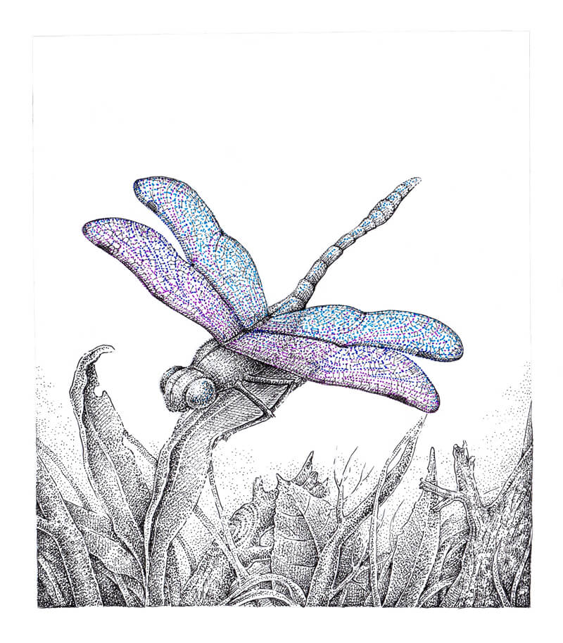
As a finishing touch, I add some light blue and purple dots to the head and body of the dragonfly.
To increase the contrast, I add more 0.05 black hatches to the cast shadow under the dragonfly.
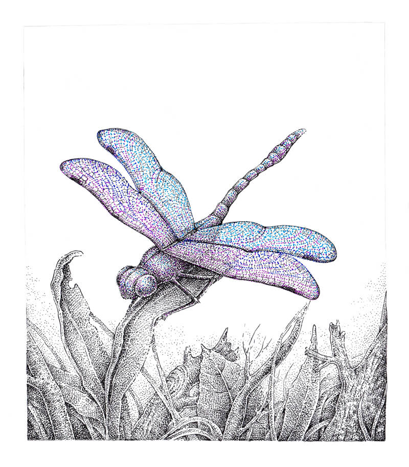
The artwork is now complete! I considered filling the upper part of the artwork in the background with small dots, but eventually decided against it. My goal is to leave the drawing as light, fresh, and atmospheric as possible.
Conclusion
Congratulations – we’ve created a nature-inspired pen and ink drawing with stippling! Thanks for joining me on this wonderful journey as we explored ways to apply stippling and balance the colors. We’ve covered a lot, and I hope you discovered some useful tips for your creative process.
If this tutorial inspired you, but you feel like some of the steps are too complex, please take a look at the great in-depth course The Pen and Ink Experience here on The Virtual Instructor. It explains the fundamentals and provides the basic building blocks of drawing with pen and ink.
I wish you much creative joy and inspiration!
If so, join over 36,000 others that receive our newsletter with new drawing and painting lessons. Plus, check out three of our course videos and ebooks for free.
New Feature: Certificate of Completion for Courses
To save and print your certificate of completion, simply complete all of the modules from the course of your choosing and on the “Conclusion” page, click on the “Take the Quiz” button. After passing the quiz, you’ll see a link to download your personalized certificate of completion.
Why Not Sooner?
You may be wondering why this feature hasn’t been added sooner since other programs offer something similar. The answer is integrity. We wanted to make sure that there was a level of accountability associated with completing a course and that a certificate of completion from The Virtual Instructor held some credibility. We didn’t want to offer a certificate for simply playing videos without the student retaining anything of substance.
To add this level of credibility, we created quizzes for each of the courses with questions taken directly from the videos and ebooks. Upon passing the timed quiz, you’ll see a link to download your certificate.
CEUs for Art Teachers
CEUs, or “Continuing Education Units”, are required for teachers to renew their licenses in most school districts. For some teachers, especially art teachers, these credits can be hard to come by.
With our new certificate system, we wanted to address the needs of the art teachers that use our program on a regular basis. On our certificates, we’ve included a suggested value for CEUs. In most circumstances, one hour of instruction is equivalent to .1 CEU. This means that courses like The Secrets to Drawing, which includes over 5 hours of course video, may be worth .5 CEUs.

It’s very important to note that every school system has their own system for tracking and evaluating CEUs. Some school districts have their own systems for issuing CEUs and as a result, may not consider courses that you take at The Virtual Instructor for CEUs. Please check with your system administrator to see if our courses qualify as credit for you.
However, since our courses are all taught by a qualified instructor and feature academic-based instruction that is used by art teachers across the world, our courses may provide the CEUs that you need for your subject area.
New Features Coming in the Future
We’re committed to continue providing the best program for learning and teaching art. Over the years, we’ve continually worked hard to add new features, courses, and functions without compromising our core beliefs of affordability, quality, and integrity. We’ll continue to do so as we innovate new features, learning experiences, and resources for artists and art teachers.
If so, join over 36,000 others that receive our newsletter with new drawing and painting lessons. Plus, check out three of our course videos and ebooks for free.
Vote for the Next Course
At the conclusion of each course, I reach out to you guys for input on the next course that will be developed. Everyone is able to vote! When the voting results are in, I share the results with you and begin work creating the next course. As each course is created, it is simply added to the library. Members don’t have to wait until the entire course is created however, since modules are released as they are completed (every week or two). (All courses are included with membership as well as all of the Live Lessons, Member’s Minutes, and lesson plans. So the library of educational content just continues to grow.)
It’s now time to vote…
Based on your suggestions and previous voting options, I have provided a list of possibilities for the next course. Below you’ll find a listing and a brief description of each of the possibilities. After reading through, be sure to click on the “vote now” button to cast your vote. Voting begins June 4, 2018 and will end on July 5, 2018. The winning course will be announced on July 8, 2018. (You may vote for more than one, if you wish.)
Course Options
Option #1 – “Oil Pastels” – Learn how to use oil pastels, the often overlooked painterly medium, to create beautiful works of art. This medium-based course will provide the learner with an in-depth experience with the medium, exploring a variety of techniques and subjects through concise modules that include videos and ebooks.
Option #2 – “The Charcoal Drawing Course” – Learn how to draw with charcoal in various forms while covering a variety of subjects and concepts. Just like our other medium-based courses, this course will provide the learner with an in-depth experience with the medium, designed to encourage mastery.
Option #3 – “Line and Wash – Drawing with Ink and Painting with Watercolor” – Learn how to combine line drawing and painting as we develop a number of works using ink and watercolor. Like the other courses, this course will cover a variety of concepts and subjects using this specific combination of media.
Option #4 – “Animals with Pastels” – Learn how to use pastels to create a variety of works with pastels – all centered on the subject of animals. This subject-based course will provide the learner with strategies for creating wonderful animal portraits with pastels.
Option #5 – “Landscape Painting with Acrylics” – Learn a variety of acrylic painting techniques on a variety of surfaces while we explore the subject of landscape painting.
Option #6 – “Landscape Painting with Oils” – In this course, we’ll dive into the world of landscapes and explore traditional and non-traditional techniques for creating landscape paintings with water-mixable and traditional oil paints.
Option #7 – “Procreate – A Digital Drawing Adventure” – Grab your iPad Pro and an Apple pencil and explore the groundbreaking app, Procreate. Learn how to use this program to make digital drawings and paintings that resemble art created with traditional materials and see why this medium may be the future of art creation.
Option #8 – “Watercolor Portraits” – Learn how to create expressive and representational portraits using the unique medium of watercolor. Learn how to use this medium to create beautiful portraits that communicate the subject in a manner that can only be expressed with watercolor.
Don’t see a course possibility that appeals to you? You can “write in” a suggestion as well through the voting process.
I’m excited to develop the next course for you! Thanks for voting! Results will be released on July 8, 2018 and new course modules will be released starting in August of 2018.
If so, join over 36,000 others that receive our newsletter with new drawing and painting lessons. Plus, check out three of our course videos and ebooks for free.
Emphasis – A Principle Of Art
In a story, the main character, sometimes referred to as the protagonist, is not hard to identify. In a book, the protagonist usually has the most dialogue while in a movie, the most screen-time. However, there is no dialogue in a painting and every pictorial element gets the same amount of screen time, or rather, “canvas” time.
So how do we, as artists, designate the main character in a painting? How do we get our audience to look where we want them to look?
The answer to those questions is emphasis. Emphasis is the principle of art that helps the audience put the story of a painting together in their own minds.
Any object or area of emphasis is called a focal point. The focal point is meant to be the part of an artwork to which the viewer’s eyes are first attracted. Artworks can have multiple focal points. The degree to which the focal points stand out determines the order in which the viewer notices them.
In the remainder of this article, we’ll explore a variety of ways to create emphasis.
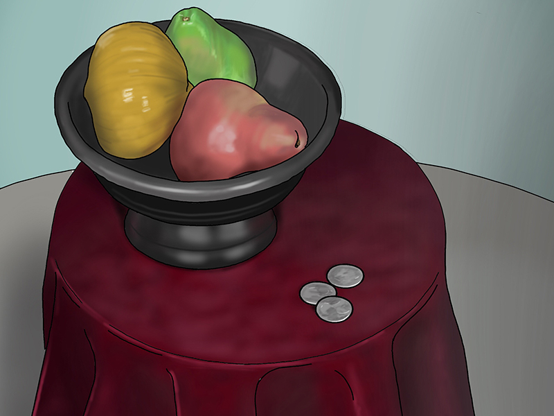
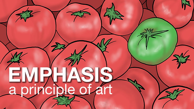
Contrast
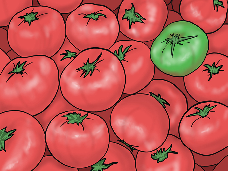
Take a look at the image of tomatoes below. The green tomato is mixed into the red tomatoes but does not get lost in the group. It is clearly the focal point because of a strong contrast of color.
Three elements of art: color, value, and texture, are useful in creating emphasis through contrast. Using texture in only one spot or placing a light object in an otherwise dark environment will attract the attention of the viewer.
Let’s take a closer look a how color creates emphasis.
Bright color is usually attractive. Road signs and traffic lights are brightly colored for a reason – to get our attention. Below are three specific ways you can use contrast to add emphasize in your own art.
- Complementary Colors
- Isolated Color
- Absent Color
Complementary Colors
Complementary colors are arranged across from one another on the color wheel. They are far apart. Compliments are as different in hue as possible. Examples include red/green, blue/orange, and yellow/violet.
Often complementary colors are used to organize an entire composition. They can also attract the viewer’s eyes to a focal point when place alongside one other. Complementary color relationships are visually, the loudest color relationship. The expression, “the squeaky wheel gets the grease” indicates that loudness draws attention – even if the loud “noise” is visual in nature.
Isolated Color
Isolated color is a color found in only one spot in a composition. An object with isolated color stands out because it does not harmonize with the rest of the color palette. Since this color is only found in one location, it draws our eyes to it.
Absent color
Similar to isolated color but more severe, a single-color note in an otherwise colorless artwork draws our eyes to it. There will be no doubt in the audiences’ mind what the artist means to emphasize if only one object is in color.
Isolation
Isolation is a straight-forward way to ensure the “main character” of a picture is noticed. Place an object of emphasis outside of a grouping and you will force your audience to take notice of it.
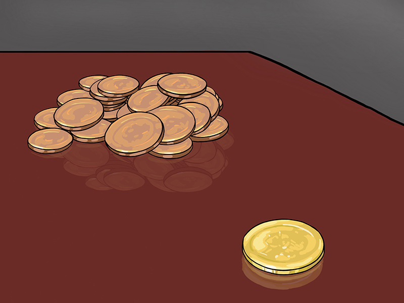
Look at the drawing of coins below. The large pile of coins on the left may be worth more than the single coin on the right, but the coin on the right seems more important simply because it is isolated from the rest.
Location
Using a bulls-eye as an example, the location of a compositional element contributes to our feelings about emphasis as well. The bulls-eye on a dart board is in the center for good reason. All things being equal, a viewer will look at the center of a composition first. Placing important objects or people near the center of a canvas will add to their emphasis.
A word of caution – Important objects should be placed near, but not directly in the center. If your focal point is in the exact center of a composition you will greatly de-emphasis everything else in the composition such that the viewer may not consider the entirety of the image.
Convergence
Lines and edges can work like arrows to indicate a focal point. Not only obvious lines work but implied lines (invisible lines) as well. For example, the direction of a person’s gaze can indicate to the audience where to look next.
Try it yourself. The next time you are standing outside with other people, just stare intently into the sky for a moment and others will begin to follow your gaze with their own.
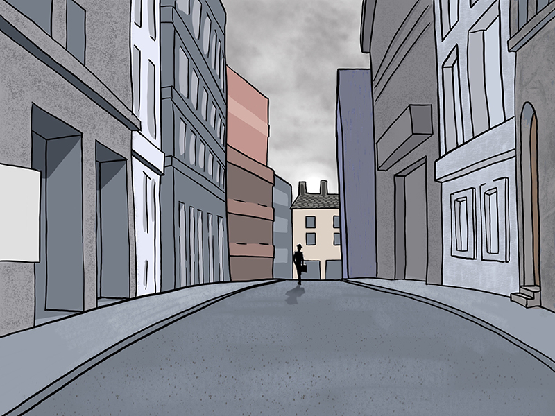
In the drawing below, the architectural features point towards, or converge, at the small figure in the road. Additionally, the figure is located near the center of the composition to help the audience find him.
The Unusual
A fun way to create emphasis in a composition is to have one element stand-out because it is so different – a round object among angular shapes, a line of people with one facing the wrong way. Think of it as the “twist” at the end of a movie. If you are changing what the audience expects to something unexpected, then you will create a striking point of emphasis.
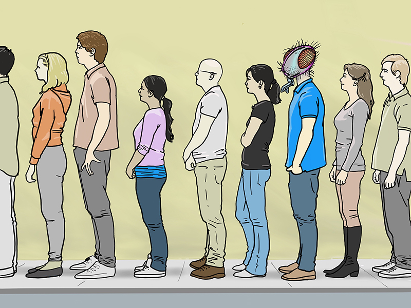
Look at the line of people in the illustration below. See how the person with the head of a fly just pops-out and demands your attention.
Level of Rendering
In reality, any one thing is as undeniably real as any other thing. People, trees, cars and buildings all share the same level of “existence”, the same “completeness”. In a painting or drawing however, the artist decides the degree to which various pictorial elements are rendered. Think of it as finished vs. unfinished or tight vs. loose. A sharp/clear area in an otherwise loose composition acts as a focal point.
Conclusion
By using Contrast, Isolation, Location, Convergence, the Unusual and Level of Rendering in your own artwork, you will begin to control how your story unfolds and control how your viewers interact with your art.
If so, join over 36,000 others that receive our newsletter with new drawing and painting lessons. Plus, check out three of our course videos and ebooks for free.