I must admit that the act of drawing in itself is exciting to me and, from my perspective, any subject is worth drawing.
In fact, I like drawing hammers, screws, pencils, and other types of tools. I know these objects are not inherently exciting to look at but they are fun to draw. It is my job as an artist to make them fun to look at.
What Makes A Subject Boring?
If beauty is in the eye of the beholder than “boringness” is in the other eye. What excites me, another will surely find boring. Having said that, let us still attempt to establish a set of characteristics that are, in fact, boring – or less interesting to most.
1. Lack of color – Some colorless things are interesting to look at. For example, a zebra is visually attractive because of the high contrast pattern that defines it. Even so, I feel safe saying that a colorless subject is more boring that a colorful subject. Think parrot vs. crow.
2. Orientation – A subject defined by vertical and horizontal contours creates a sense of rigidity in our artwork. Diagonals and curves are comparatively more dynamic.
3. Symmetry – This one is touchy. Many artists love and use symmetry in their artwork. I’m not talking about composition but rather, shape.
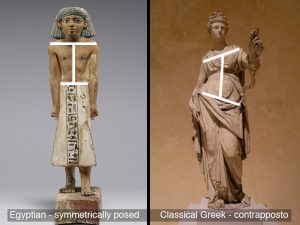
The development of figure sculpture throughout ancient times demonstrates a gradual shift away from a rigid vertical orientation and symmetry. Below, the sculpture on the left that stands at attention (a symmetric pose) is less exciting than the sculpture on the right represented in contrapposto (less symmetrical).
4. Familiarity – Common place, every day subject matter is boring. It’s like watching a movie for the fifth time, it is no longer compelling.
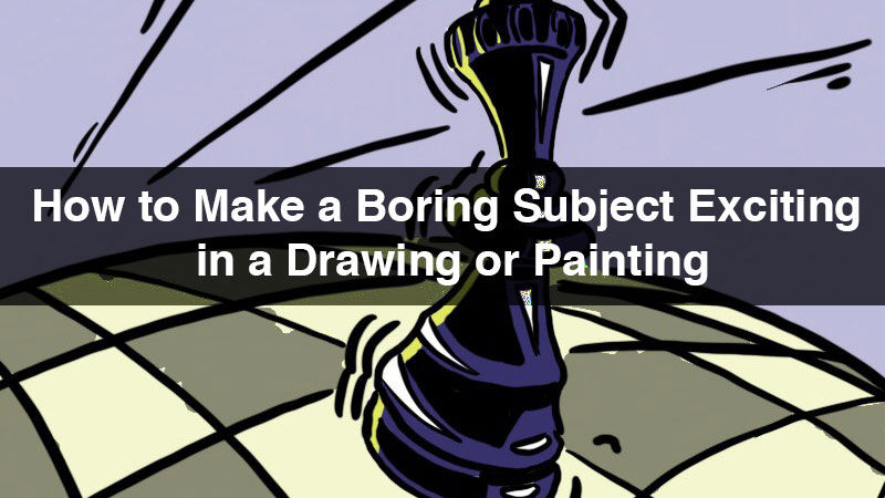
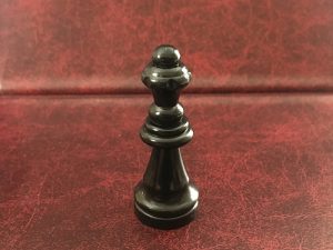
But even subjects that some may categorize as “boring” can be made “exciting” with a few strategies. For this article, I chose to use a chess piece as my boring subject matter. If you happen to play and enjoy chess, you may not find my selection boring because of what it represents to you. However, a chess piece does meets the criteria listed above: colorless, symmetric, vertically oriented and familiar.
Six Ways To Add Excitement
I’m sure there are more than six ways of adding interest and excitement to a boring subject with even undiscovered means of doing so. In my effort to illustrate each of these ways I was not able to entirely divorce one from another. Therefore, you will observe some overlap in the following examples. But we should take note that when these mehtods are combined, the result is even stronger.

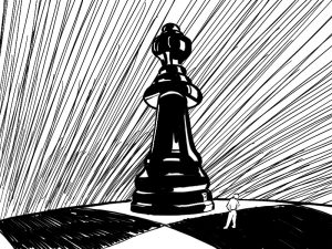
Unusual Perspective
Some subject matter we see from a specific point-of-view. We usually see sky scrapers from below. We see people at eye-level. We look down on chess pieces. So, drawing a skyscraper from above or a chess piece from below creates a new, unfamiliar experience. It is exciting to see something familiar in a new way.
Chess pieces are small and the example illustration below uses a low angle to make the chess piece seem large. If this illustration were meant for a wall and not a computer screen I would make the dimensions of the artwork huge, to further convey a sense of mass and size. Depicting imagery larger than life makes it exciting.
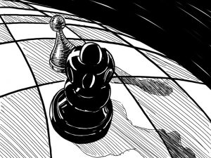
Tell A Story
If an otherwise boring subject is part of a compelling story then it is no longer boring. Take the well known story by Lewis Carol, Alice In Wonderland. That story has any number of boring objects to showcase. A broken tea cup, illustrated, could represent the shattered mind of the Mad Hatter. The tea cup is made interesting by the story it represents.
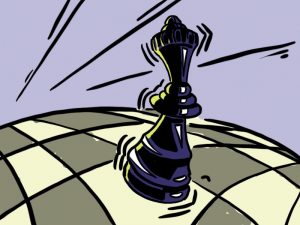
My example illustration below doesn’t have a developed story behind it. Instead, I used the unbalanced relationship between a pawn and a queen to create the drama of a story.
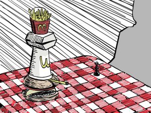
The Unexpected/Weird
Throughout the history of art, a few artists have made a name for themselves by representing their subject in an entirely unique and unexpected way. One such artist was Archimboldo, an Italian portrait artist that took portrait painting in a new direction.
A few hundred years later the Spanish artist, Salvador Dali, used Surrealism to coax excitement from otherwise boring subject matter.

In my example I’ve used fast food to reconstruct my chess piece in a similar fashion to Arcimboldo’s portraits.
Create Emphasis
Emphasis, a principle of art, is used to draw attention. By placing emphasis on a certain element in your composition you communicate value and importance. Emphasis is a way of saying, ‘Hey, look over here.’ A few ways to create emphasis in a work of art include:
1. Local color (a hue isolated in a composition)
2. Linear elements (using lines to direct emphasis, like an arrow)
3. Location (the middle of your artwork)
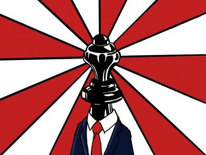
In the example illustration below I thought about the propaganda posters featuring twentieth century dictators. Nothing says excitement like propaganda.
Use The Power of Color
Great color application can make any subject more exciting to look at. Matching the natural color of your subject is not the only option.
1. Saturation level – Pump up the color, especially in the neutrals. If you observe brown or gray in your subject, then try and see a color in that neutral. Force yourself to name a color from the color wheel that you can see. Some grays lean toward green or even purple. If you can name the “color” of your neutrals then you make them less neutral. “Colorful” neutrals are exciting.
2. Color Schemes. – Some colors have a special relationships. These relationships are categorized as color schemes. The brightest, most exciting color scheme is named complementary. Complementary schemes use colors that are directly across from one another on the color wheel.
These pairs of colors are as different as black and white. Like black and white, they help one another stand out, adding excitement. I chose the complementary pair, purple and yellow, to add excitement to my monotone chess piece. Feel free to use colors schemes even if the colors are not a part of your subject.
Style
I have stylized most of my example drawings. Stylization takes the first step toward abstraction by depicting imagery in a recognizable but non-realistic way. I chose to stylize my drawings by using curved lines in place of straight lines. I also curved the gesture of my chess piece in the illustration above.
Embrace your own personal style and let it be a part of your drawings and paintings.
Conclusion
Challenge yourself. Pick a boring subject and see how many exciting ways you can draw it! Then, when you need to make a boring subject exciting, you’ll be ready.
If so, join over 36,000 others that receive our newsletter with new drawing and painting lessons. Plus, check out three of our course videos and ebooks for free.
How To Varnish And Protect Paintings
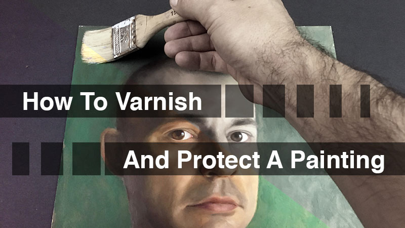
Well, do you have antivirus software to protect your computer? Do your children have winter coats to protect them from the cold? Our paintings need a coat too. Not a winter coat, but a coat of varnish. Varnishing your art will go a long way in preserving it for years to come and may even make them look better too.
Related: See our Painting Lessons
Why Varnish a Painting?
What are we protecting our paintings from anyway? Well air, for one thing. Air contains a variety of pollutants that cling to the surface of a painting. Over time these pollutants will alter the colors. Besides the air, we protect our paintings from moistures, liquids, dust, and other contaminants as well. Spills, sneezes, and even humidity can contribute to the deterioration of a painting.
Varnishing a painting may seem like a permanent alteration, but it’s not. After a varnished painting has lost it’s luster over time, the varnish layer can easily be removed, taking the built-up of pollutants and particles with it. (As a general rule, varnish should be removed and reapplied every fifty years or so.)
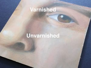
Beyond protection, there’s another good reason to varnish a painting and it deals with aesthetics. By applying varnish, we create a unified surface. Sometimes a finished painting will have both shiny and dull areas. This distracting variance can happen for several reasons…
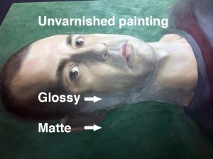
1. Mixing paint brands. Different brands of paint use different ratios of ingredients (binder/pigment). Some brands use “filler” materials as well. This inconsistency results in a ranging level of sheen.
2. Medium. Oil painters often use medium to control the viscosity of their paint. Some medium(s) are glossy. Unless your paint has the same amount of medium in each stroke you are likely to end up with an uneven surface.
3. Glazing. Glazing is a wonderful technique used to create subtle, gradual changes in color. A glazed layer of paint will dry glossy. If you glaze only parts of your painting you will definitely need to use a coat of varnish to even out the surface sheen.
Thankfully, when varnish is applied, it eradicates these inconsistencies and we are left with a painting that not only is protected, but also looks great.
Types Of Varnish
The type of varnish that you choose depends on the type of finish that you desire. Some varnishes dry to glossy finish and make the colors more intense, while others dry to an even matt finish and mute the colors.
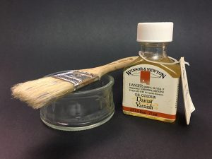
Damar Varnish
Without a doubt, the number one varnish used on oil paintings is Damar Varnish. It is made from only damar resin, turpentine, and alcohol. Damar varnish dries to a high gloss finish and can be applied with a brush or as a spray.
Gloss Varnish
As the name implies, this form of varnish dries to a high gloss finish. This varnish can be applied with a brush, but it is also available as a spray which some folks may prefer.
Matt Varnish
Matt varnish dries to a flat finish without any gloss or shine. You won’t get any reflection with this varnish, but the colors will look duller. This varnish can be brushed on or applied as a spray.
Satin Varnish
Satin varnish dries to a semi-gloss finish. If you’re looking for a slightly glossy finish, but high gloss is a little too strong, you may consider this varnish.
Retouch Varnish
Retouch varnish is used during the painting process to even out the sheen of a painting. Retouch varnish is also used to refresh dull areas of an older painting that has already been varnished.
Some Varnishes are Medium Specific
There are other factors to consider besides just the finish. You also need to consider the painting medium.
While traditional varnishes like Damar varnish, are recommended for oil paintings, it is suggested to use a specially formulated varnish for acrylics or water-mixable oils. Manufacturers have developed special varnishes for acrylics that can be removed. These varnishes are brushed on. Spray varnishes can be used for these types of paintings but it may be hard to remove the varnish if you need to in the future.
For water mixable oils, Winsor and Netwon recommend their Artisan varnishes which are available in a range of finishes including gloss, matt, and satin.
To Brush or Spray?
Varnish can be applied with a brush or it can be applied in aerosol form. Both forms of application methods have their benefits and drawbacks. Applying as a spray can help ensure an even application, but it does encourage contaminants (dust, dirt, small bugs) which could dry into the surface of the varnish. Brushed applications provide more control and a thicker application, but some may find it difficult to apply an even amount of varnish. For heavily textured paintings that make use of Impasto painting techniques, a sprayed application is recommended.
The Varnishing Process
Varnishing a painting with a brush is fairly straight forward process…
1. Wipe the surface of your painting with a clean, dry cloth and choose a dust free environment to apply varnish.
2. Lay your painting on a flat surface. Varnish is thinner than paint and applying it vertically may lead to drips/runs.
3. Stir or shake the bottle of varnish then pour an appropriate amount into a wide dish that your brush will easily fit into.
3. Apply the varnish with a wide soft brush in even rows using long strokes from top to bottom. Don’t worry about visible brush strokes – the varnish will self-level.
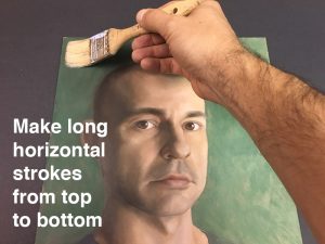
4. Do not apply heavily. Do not brush over areas repeatedly. If, after one coat, the painting’s surface is still uneven in terms of sheen, apply a second or third coat.
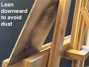
5. Protect your painting from dust while it dries. Use a plastic cover called a “tent” or wait about ten minutes for initial drying, then lean your painting so that the surface tilts slightly downward. This will prevent dust in the air from settling on the surface while it finishes drying. The varnish will dry to the touch in about 30 minutes. If a second coat of varnish is needed, wait at least twenty-four hours and apply in strokes that are perpendicular to the previous coat.
NOTE: Wait six to twelve months before varnishing an oil painting. Though oil paint dries to the touch in just a few days, it retains some level of moisture for months. If you use Impasto brush strokes you will need to wait the full year. Patience is definitely a virtue here. Varnishing a painting too soon causes cloudiness to develop in a painting. That cloudiness is called blooming. It is actually moisture trapped under the varnish.
Beyond the Varnish
Picture frames enhance a paintings presentation but serve another purpose as well – protection. A frame protects the edges of an artwork and provides a means of carrying and transporting an artwork without having to touch it.
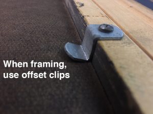
If you are framing an oil or acrylic painting, be sure to use proper hardware. Avoid using staples or nails to secure a painting into it’s frame. The likelihood of damaging a painting while removing the nails is far greater than if proper fasteners were used. Both hardware and art supply stores carry the offset clips seen in the photograph below.
What About Watercolors or Gouache?
Works on paper (like watercolors) need protection too. Liquid varnish is not a good choice for protecting watercolor paintings. Liquid varnish will penetrate the watercolor paper and become a permanent part of the artwork, even altering the color.
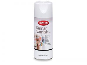
Although it is not recommended to varnish watercolor paintings, Krylon makes a synthetic spray varnish called Kamar Varnish. It is suitable for oil as well as water-based paints including watercolors. Kamar varnish provides some UV protection as well.
For protection, watercolor paintings should be framed behind glass. Unfortunately, viewing artwork through reflective glass can be distracting. “Museum” glass (such as Tru Vue) eliminates the glare. It’s more expensive than regular glass but worth the extra cost.
Be sure to use either a mat or spacers between a frame and the watercolor painting so that it doesn’t make contact with the glass.
Another Choice for Acylics
Acrylic paint is a new medium relative to the history of painting. It is quite literally plastic. How acrylic paintings will stand the test of time remains to be seen but the nonporous characteristic of plastics bode well for the medium. Perhaps acrylic paintings will endure millennia.
Even still, an acrylic painting should receive varnish as further protection. Beyond the choices above, a popular choice is a wax-based varnish. Apply with a cloth and buff the surface to desired sheen.
Conclusion
Whether you are a collector or a painter, buying and making paintings are major investments in money or time. So take the extra time to properly varnish your paintings and protect your investment for years to come.
If so, join over 36,000 others that receive our newsletter with new drawing and painting lessons. Plus, check out three of our course videos and ebooks for free.
Vote for the Next Course
 “Pencil Drawing – The Guide to Graphite” is now complete, making it the eleventh complete course added to our library of courses – which are all available to members. The addition of this course brings the total of course video hours up to 38 with well over 1000 pages of ebooks included. (Each course includes logically sequenced modules that include videos and downloadable ebooks.)
At the conclusion of each course, I reach out to you guys for input on the next course that will be developed. Everyone is able to vote! When the voting results are in, I share the results with you and begin work creating the next course. As each course is created, it is simply added to the library. Members don’t have to wait until the entire course is created however, since modules are released as they are completed (every week or two). (All courses are included with membership as well as all of the Live Lessons, Member’s Minutes, and lesson plans. So the library of educational content just continues to grow.)
It’s now time to vote…
Based on your suggestions and previous voting options, I have provided a list of possibilities for the next course. Below you’ll find a listing and a brief description of each of the possibilities. After reading through, be sure to click on the “vote now” button to cast your vote. Voting begins December 2, 2017 and will end on January 14, 2018. The winning course will be announced on January 16, 2018. (You may vote for more than one, if you wish.)
Course Options
Option #1 – “25 Days to Better Drawings” – Learn a new drawing concept and skill every day for 25 days. Each drawing concept taught includes a short drawing exercise (less than one hour) that reinforces the concept taught. Students can go through the course in sequential order and choose to have an emailed link sent to them each day of the course; or they can take the course at their leisure, taking each day as they find time. (I’m really excited about this one and this innovative approach to online learning.)
Option #2 – “The Charcoal Drawing Course” – Learn how to draw with charcoal in various forms while covering a variety of subjects and concepts. Just like our other medium-based courses, this course will provide the learner with an in-depth experience with the medium designed to encourage mastery.
Option #3 – “Line and Wash – Drawing with Ink and Painting with Watercolor” – Learn how to combine drawing and painting as we develop a number of works using ink and watercolor. Like the other courses, this course will cover a variety of concepts and subjects using this specific combination of media.
Option #4 – “The Ultimate Guide to Perspective” – Take a journey into the world of linear perspective. Learn how to apply one-point, two-point, and three-point perspective to create the illusion of space in your drawings. Apply perspective techniques to multiple subjects including buildings, interiors, non-objective drawings, and the human figure.
Option #5 – “Composition” – Learn how to compose your drawings and paintings using a variety of strategies and techniques.
Option #6 – “The Ultimate Guide to Shading” – Master texture, contrast, form, and tone as we delve deeply into shading, a fundamental skill required for drawing.
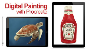
Option #7 – “Procreate – A Digital Drawing Adventure” – Grab your iPad Pro and an Apple pencil and explore the groundbreaking app, Procreate. Learn how to use this program to make digital drawings and paintings that resemble art created with traditional materials and see why this medium may be the future of art creation.
Option #8 – “The Ultimate Guide to Sighting, Measuring, and Proportion” – Learn a variety of techniques and approaches for drawing from observation. Use these techniques to ensure accuracy and improve your drawing skills.
Don’t see a course possibility that appeals to you? You can “write in” a suggestion as well through the voting process.
I’m excited to develop the next course for you! Thanks for voting! Results will be released on January 16, 2018 and new course modules will be released starting in February 2018.
If so, join over 30,0000 others that receive our newsletter with new drawing and painting lessons. Plus, check out three of our course videos and ebooks for free.
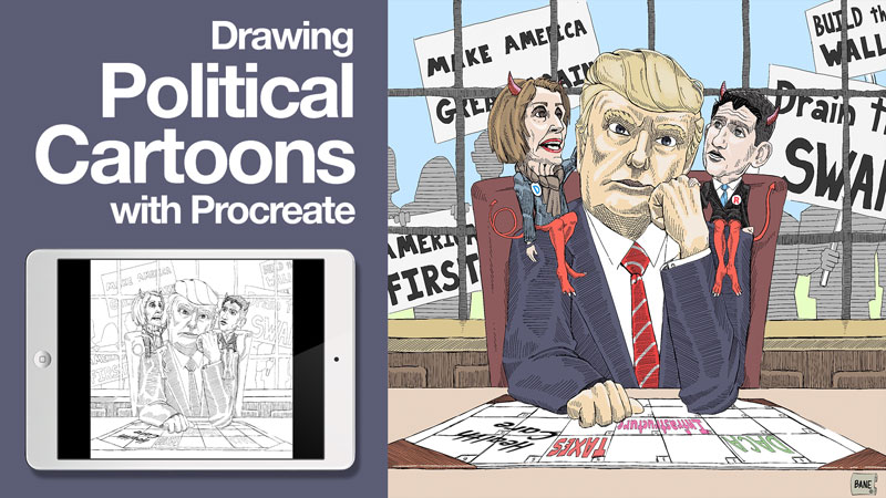
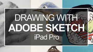
Drawing Political Cartoons Using Procreate – Start To Finish
I remember the world before Photoshop, iPads and digital cameras. It was an analog world – cassette tapes and Cable TV were kings. Pencils and paint brushes were my tools. I was first exposed to an early version of Photoshop in college and at the time, it seemed unsuited to traditional drawing and painting media.
All of that has change inside of two decades. I’ll admit, I was resistant to digital drawing and painting at first. I worried about the viability of “virtual” artwork.
I was wrong.
Whether you are a professional illustrator or you draw for fun, there are many advantages to drawing on a tablet. Let’s first consider those general advantages and then take a look at a specific application, Procreate. Designed for the iPad, Procreate offers a slick and intuitive drawing experience.
4 Reasons To Draw Digitally
1. Mistakes
To draw well, you must embrace the fact that erasing happens. Erasers have a bad habit of leaving marks and marring the surface. Of course, nothing erases as completely as a pixel. When you work in Procreate there are no eraser marks. Besides erasing, you can undo numerous steps in most applications. Procreate allows you to “undo” every mark you make because it stores your sequence of marks in memory, from start to finish.
2. No More Photographing Drawings
When I was an art student, I had to learn how to photograph artwork well. Good quality photographs improved your chances of getting into art shows or selling cartoons. Today, most editors review illustrations digitally, even when they are meant for print. If your art is digital to begin with, you can cut out the photography step – saving time, money and effort.
3. Create Multiple versions
Cartoons created for the internet are often in color. However, many publications only print in black and white. Working digitally, you can duplicate a file (drawing) midway through the process. Finish one version in color and the other in black and white. This time saving trick allows the cartoonist to submit the most appropriate version of their cartoons to each publisher.
4. Work Anywhere
Artists have been working outside of the studio for sometime now, carrying essential drawing tools with them – paper, pencils, pens, markers, etc. Drawing digitally (especially using Procreate) lets you go a step further and take your entire studio with you, not just the essentials. Of course, an iPad with Procreate is not only a portable studio but a portable office. Make and sell your art all in one place or in any place.
Using Procreate to Create Drawings
The remainder of this article focuses on Procreate only. There are many applications built for artists that share some of the features of Procreate but, in my experience, Procreate has everything I need and none of what I don’t. It is a powerful drawing and painting platform. Let’s look at some advantages to using Procreate, then we will go through the process of creating a political cartoon, step-by-step.
Why Procreate?
Familiarity – At this point many in the art and design industry are familiar with Photoshop. But you don’t need to be an expert in Adobe Photoshop to use Procreate to it’s fullest. However, if you have experience with Photoshop you will be up and running almost immediately since there are similarities. For example, if you are accustomed to using dozens of layers to build your images or you use masks to isolate individual elements, you can still do these things in Procreate.
Cost – For the cost of one sketchbook or canvas you can have Procreate forever. That’s a great value. Of course you have to buy a touch sensitive iPad and Apple Pencil first (It’s worth it, if you’re wondering).
File Size – I used to draw with Brushes, a program that is available for the iPad. It is a simple program with many limitations. For one, the file size/resolution matches the screen size. This limitation prevented me from doing serious work in Brushes. Using Procreate, I can make a canvas as large as 16,000 pixels wide! For cartooning I like to make my files double the intended print size.
Customizable – You will probably find all of the tools that you’ll need built in to Procreate. My favorite brushes came pre-installed. However, on the off chance that you can not find a tool that makes the mark you want, you can create/upload your own brushes as well, giving your work a unique look. You can also visit the Custom Brushes Board on Procreate’s forum to download more FREE brushes and brush sets.
The Cartooning Process
NOTE: As an example, I have drawn a political cartoon that is rather innocuous, poking fun at both the left and right sides of the political spectrum. It was my intention to create an example and not to make a strong political statement or to alienate you, the reader, with a divisive position.
The following process is a logical approach to cartooning using Procreate. Should you choose to cartoon using Procreate you will likely develop your own process. One goal of this article is to give you a framework to begin your own path of discovery. This article is, by no means, a definitive explanation of Procreate’s utility.
Related: First impressions of the app, Procreate
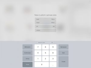
Step One – Create A Canvas
Open Procreate and select a canvas size or customize a canvas size and proportion by selecting “New Canvas”. Many single-panel cartoonist use a 24 X 19 pica rectangle which converts to 384 X 304 pixels. I double those dimensions to 768 X 608 pixels.The example herein makes use of a square panel.
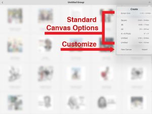
Selecting “New Canvas” offers the options pictured below.
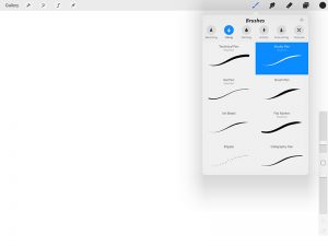
Step Two – Create A Sketch
Time to draw. Begin by choosing a tool that gives you a desirable mark. I like to use the studio pen for it’s range of line quality. You can adjust the pen size on the right edge of your screen (left side for left handed artist). Create a layer and begin a loose sketch. Don’t draw on the “background” layer.
Sometimes, I make my sketch on paper beforehand. Using the iPad camera, I’ll photograph the drawing and import the photograph into Procreate. In the example video, the sketching step was done entirely in Procreate.
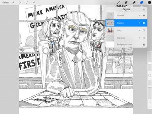
Step Three – Contour Lines
Create a new layer above your sketch layer and, at the same time, reduce the opacity of the sketch layer to about 30 percent. Now you can carefully make a clean, detailed contour line drawing over your sketch layer. Once complete, delete the sketch layer. You no longer need it. As you create layers, be sure to name them to avoid drawing on the wrong layer in subsequent steps. Sometimes I use several layers to make a clean contour drawing, giving me the option to move or resize individual elements of the composition until I am satisfied.
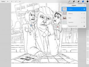
Step Four – Line Work
One hallmark of political cartooning is extensive line work. Hatching and cross-hatching are common techniques used to create value with pen tools. Create a new layer below your outline layer. Name it “shading” or something similar. Now you can work up the value in your drawing and make edits to your shading without affecting the contour drawing layer.
Step Five – Color
Not all political cartoons use color. If you plan to work in color open a new layer under all other layers (except background) and name it “color”. Sometimes I have several color layers that I later “merge” into one. Start in the background and forward. Zoom-in as you add color to ensure that your colors bump right up against the outlines of the contour layer.
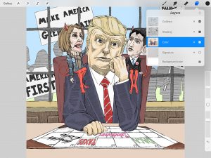
Step Six – Sign Your Work
Of course you have to sign your artwork. Create a signature on a separate layer. You can then copy your signature from one drawing and paste it into another to guarantee consistency. You may also add a web address to your signature to help others find your artwork. If you start cartooning for a specific publication, your signature may include the publication’s name instead of a web address.
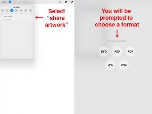
Step Seven – Export and Share
Procreate automatically saves your progress as you work. Once complete, export your work as a JPEG, PDF, PSD (preserves layers) or PNG file. You can also export the entire process as a movie file! Share your work on social media or sent it via email to appropriate publishers for review.
Bonus Tips
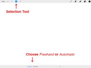
Shading With Color
Some artists prefer to shade with color instead of lines or in addition to lines. You can use the selection tool (set to automatic at the bottom of your screen) to isolate an element in your composition. Then, using a large, soft airbrush tool, shade that element without getting any color/value on the surrounding imagery. This keeps the process neat and controllable.
Adding Text
Whether you intend to add words below your cartoon or in your cartoon, they must be legible and consistent. You can carefully write your words but this is time consuming. As an alternative, type the text using Pages (Apple’s word processing application). Once complete, simply take a screenshot and import the words as an image into your cartoon. The selection tool will isolate the words from the white space around them. Delete the white space and you now have words without a background. Move and resize them to fit the intended space.
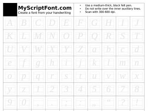
It gets better. There are several websites that will walk you through the steps to create your own hand-written font. I recommend calligraphr.com (previously know as myscriptfont.com). Just write your letters into a downloadable template (partial sample below), then scan and upload your new font to calligraphr.com. They generate a font file that you can then import into Pages. Now you can type your handwriting, saving loads of time.
If you like cartooning, give Procreate a try. I’m sure that you’ll find it to be worthy investment in your artistic arsenal.
If so, join over 36,000 others that receive our newsletter with new drawing and painting lessons. Plus, check out three of our course videos and ebooks for free.

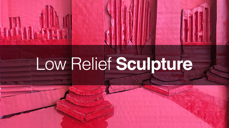
Low Relief Sculpture
It could be that artists are responding to market demands or it could be that sculpture is no longer taught with the same regularity and emphasis as in the past centuries. Some art teachers simply avoid teaching sculpture. Sculptural processes can be expensive to teach and teachers must work within the budget allotted to them. Sculpting in metal, for example, requires welding equipment, plasma torches and sometimes a forge. Clay and wood sculpture have limiting factors as well.
Another reason sculpture may take a “backseat” to two-dimensional art is space. Sculpting typically demands a larger work space and, once a piece is finished, many sculptures need a room or dedicated space for exhibition.
Low relief sculpture is different. It doesn’t require a major investment and since most of these sculptures are quite small, they don’t require a lot of space to store or display. This makes low relief sculpture an excellent choice for introducing your students or yourself to sculptural processes.
Below are the steps to a low-cost, space-saving sculpture project meant to introduce sculpting as a means of expression. Before jumping in, let’s first define the three types of sculpture.
Types of Sculpture
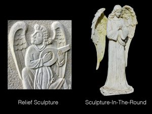
When most people think of sculpture they think of “sculpture in the round”. Sculpture in the round has a front and a back. It is meant to be seen from all sides.
In most cases, sculpture in the round is displayed on a pedestal or in an environment that encourages the viewer to view the sculpture from all sides.
 (Above images are from the Creative Mixed Media course.)
Another form of sculpture is called relief sculpture. Relief sculpture is meant to be seen from only one side. There are two subcategories of relief sculpture – high relief and low relief, also called bas relief.
High relief sculpture stands out from the flat surface, sometimes to a great degree. In contrast, low relief sculpture does not stand out as much and may feature parts that are indented into the flat surface. As you may imagine, the line between these two forms of relief sculpture can be very thin and determining whether a relief sculpture is high relief or low relief can be quite subjective.
Cardboard Low Relief Sculpture
This following step by step features a low relief sculpture that is inexpensive to make and doesn’t require any more space to display than a drawing on paper.
Materials
For this project, you will need:
- Corrugated cardboard (11 x 14 piece to use as a base, plus extra scraps for cutting out shapes.)
- Drawing paper
- Scissors
- Hobby knife (X-acto)
- Reference image(s) with a foreground and a background
- Glue gun and glue sticks (or Elmer’s glue)
- Cutting mat or another protective barrier (optional)
Incorporating the Elements of Art
This project makes use of the elements of art, shape, space and texture.
Shape – a 2D enclosed space.
Space – the area above below within around and between things.
Texture – the way something feels to the touch or looks like it may feel if it were touched.
Low Relief Step by Step
Step One: Make a simple line drawing of your subject on a sheet of paper that is the same dimensions as your card board base. Focus on shape. You may also draw directly onto the cardboard base but using a separate sheet of paper helps in cutting out your shapes from the cardboard.
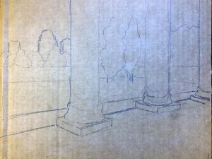
Step Two: Cut out the shapes made by the outlines of your drawing as though you are making a puzzle.
Step Three: Lay your paper shapes on your card board and trace around them. Now you can accurately cut out your shapes from the corrugated cardboard. If you made your contour line drawing right on the cardboard base then cut out the shapes to match your drawing. You can lay them on the base and trim them until they match the drawn shapes.
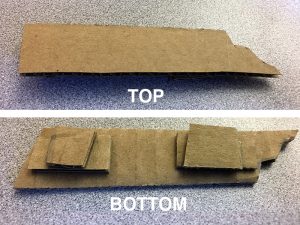
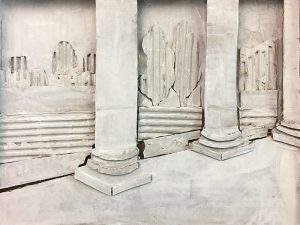
Step Four: Begin building your relief sculpture. As the example demonstrates, you may make all or parts of your background by cutting and removing the top layer of paper from your cardboard base, revealing the corrugate pattern underneath (see example). Then begin gluing down your shapes, starting in the background and working toward the foreground.
Step Five: You will need to buildup the thickness of your shapes as you work from the background to the foreground. My advice is to keep the maximum height of your cardboard relief sculpture to about one inch (approx. 2.5 cm)
Low Relief Tips:
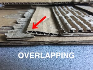
- Cut your background and middle ground shapes a little long on the bottom edges so that the next closest shapes overlap those edges (see below). Overlapping is one of the ways to indicate space in an artwork.
- Tear the top layer of paper off of some of your cutout shapes to add more visual separation (contrast) to your pictorial elements.
Finishing Your Sculpture
Presentation is everything, especially when you are using low-grade, disposable materials. A nice presentation will lend credibility to your artwork. That is, if it looks as though you care about your artwork then others are more likely to care as well.
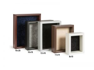
As long as you use a standard size (11″ x 14″ recommended) for your cardboard sculpture’s base, you can purchase a nice shadow box and simply insert your relief sculpture into it as a means of hiding the rough edges.
If you are a purist (like myself) you can use cardboard to finish the edges of our sculpture. Measure the maximum height of your sculpture. Cut long strips of cardboard to approximately ¼ inch wider than the maximum height. Attach/glue the strips around your relief sculpture. For a neat and clean look, use as few pieces of card board as possible. Bend or fold the strips around the corners of the base as opposed to having the edges of two strips meet at a corner.
Your sculpture is ready to display as is. However, you can push this project further, particularly if the look of raw cardboard is not appealing to you.
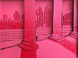
Painting a Low Relief Sculpture
Relief sculpture can occupy a unique position between painting and sculpture in the round. You might embrace the dual nature of relief sculpture and paint or draw on your sculpture once the construction is complete.
I believe painting is the best option. Acrylic, tempera, oil paints, and even spray paint are suitable for painting on cardboard. If you use acrylic, tempera, or spray paint you might first prime your sculpture with white so that your colors are vibrant. If you choose to use oil paint, then you must prime your piece with gesso. Otherwise the oil will penetrate the cardboard and your artwork will begin the slow process of rotting away.
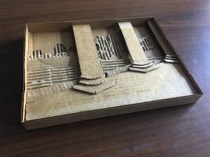
I chose to spray paint my piece a light red. Then I added a slightly darker red using acrylic paint for additional contrast.
Conclusion
We live and operate in three-dimensional space, just like a sculpture. Sculpture directly correlates with our intuitive understanding of space. Relief sculpture is an excellent way to dip your toes into the world of sculpture without making a major investment in tools or materials and without requiring a vast amount of studio space.
If so, join over 36,000 others that receive our newsletter with new drawing and painting lessons. Plus, check out three of our course videos and ebooks for free.
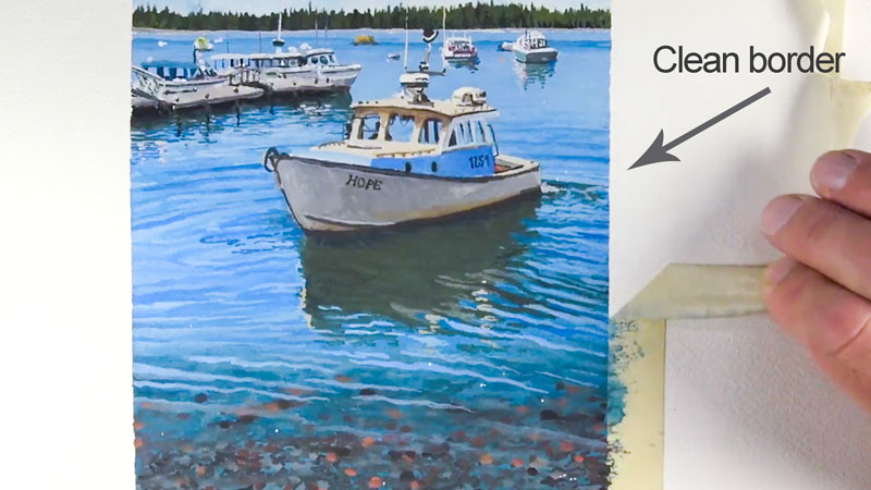
How to Prevent Artist’s Tape From Damaging Your Paper
Masking tape, however, has a nasty little habit of tearing the paper when removed. In fact, I’ve even seen it damage the artwork itself. It’s happened to me before. It’s quite depressing to spend countless hours on a drawing or painting with a taped border, only to pull the tape away and watch some the medium and paper leave with it.
Sure, speciality tapes are available. Painter’s tape, “Artist’s” tape, and drafting tape are all viable choices. But even these tapes can destroy the surface and some are simply too weak to block out the medium enough to create a strong border.
So what’s the solution? How do we get those clean borders without the constant fear of the tape ruining our surface. In today’s quick tip, I’ll share with you two things you can do to keep that tape in place and remove it completely without it ruining your day.
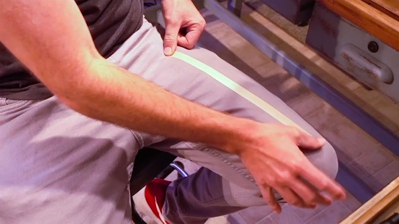
Tape Your Pants
The tape that you use needs to be adhesive enough to make a strong connection to the drawing surface, but not so strong that it removes the paper. So, we need to find a happy medium of adhesion.
Cheaper, lower quality tapes will almost always have too much adhesion with very little paper backing. When lower quality tapes are used, they are very difficult to remove. They tear easily and remain stuck to the paper. These masking tapes will almost always destroy your paper, no matter what steps you take to prevent this. Spend a few cents more and buy a higher quality roll of tape. Higher quality tapes have a little more paper backing and are much easier to remove.
Since we need the adhesion to be just slightly less effective, we need to remove some it before applying it to the surface. This is easily accomplished by taping your pants, shorts, or another article of clothing. The lint from your article of clothing will be picked up by the sticky side of the tape, reducing its “adhesive effectiveness”. Don’t worry, there’s still plenty of adhesion left to create those clean edges.
Pull Away at a 90 Degree Angle
The second tip deals with the manner in which the tape is removed. It’s easy to get so excited to see that border, that you pull away the tape quickly without much thought as to how it’s removed. If you pull the tape too quickly though, you’re likely to tear the paper. Instead, pull the tape slowly and gently and let it release from the surface gradually.
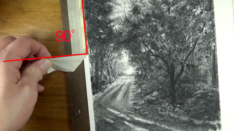
Also consider the angle at which you pull the tape from the surface. Instead of pulling the tape along the same direction in which it is applied, pull away in a perpendicular fashion. This creates a 90 degree angle between the tape and the direction that you are pulling outward. This action releases the tape away from the artwork. In the event that the tape does happen to pull up some of the paper, you can be assured that it won’t damage the art as well.
Longer Drawings and Paintings
Most, if not all, generic masking tapes are not acid-free or archival. For drawings and paintings that are completed within a few days or even a week, this is likely not going to be an issue. But for drawings and paintings that may take longer to complete, you may want to purchase a masking tape that is acid-free. Most masking tapes that are produced specifically for artists are acid-free. If you generally spend several weeks on a drawing or painting and need the tape to stay in place over this period, then it’s worth the extra investment to ensure that your paper is protected.
It Can Still Happen
Even when these steps are taken, the tape can still remove small bits of the paper. But, if you are careful and reduce the adhesion prior to applying to the surface, then tearing of the paper almost never happens.
If so, join over 36,000 others that receive our newsletter with new drawing and painting lessons. Plus, check out three of our course videos and ebooks for free.
How To Clean And Care For Art Brushes
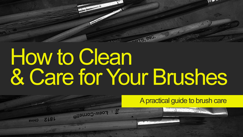
To keep your brushes performing at their best, you need to clean them. This may seems fairly obvious, but many overlook its importance. But how do you clean your brushes properly?
Below we will explore the best practices of brush care so that you get the most out of every brush, how to clean and store them. First, let’s take a look at the parts of a brush.
Parts of a Brush
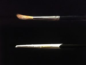
Properly caring for a brush starts with brush anatomy. There are three parts to a paint brush – the bristles, the ferrule and the handle. Each of these parts require a measure of care to maximize the life of any brush.
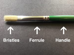
Bristles are either natural or synthetic. Natural bristle brushes are made from the hair and fur of animals including sable, hog, goat, camel and others. Synthetic bristles are typically nylon. They are cheaper and easier to care for because of their durability but many artists still prefer the feel of painting with natural bristle brushes.
The ferrule is the metal part of a brush found between the handle and bristles. Using glue and crimped ends, the bristles and handle are fixed inside of the ferrule. Thicker gauge metal indicates a higher quality brush.
Handles are probably the easiest part of the brush to care for. They are usually made from painted wood. Sometimes they are plastic. Wipe away wet paint and solvents from your handles as you paint to keep them in good shape.
Nothing Lasts Forever
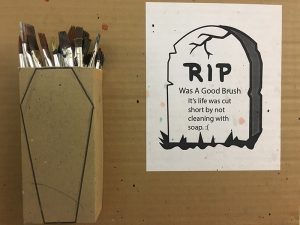
No matter how well you care for a paint brush it will expire with regular use. Brushes are damaged primarily due to our painting technique and secondarily by our washing and storage habits. By learning to better preserve our brushes we can avoid extra trips to the supply store, saving both money and time.
Don’t Wait to Clean Your Brushes
For some of us, shifting from producing art to “cleaning up” can be a difficult mental transition. After you’ve poured yourself into a work, it can be tempting to just get up and admire your work for a while and leave the clean up for “some other time”. But waiting to clean up your brushes can wreak havoc on them. It’s best to clean them up immediately after you’ve finished using them. The longer you wait, the harder it will be to clean your brushes and it may even ruin them.
Using Water and Soap to Clean Your Brushes (Water-Based Paints)
If you paint with watercolor or acrylics, then your solvent is water and it will not damage your bristles. Cleaning your brushes after painting with a water-based medium is as simple as using a bit of soap and water.
Dishwashing liquid is preferred by some artists, while others prefer a specialized soap. When choosing a soap for cleaning brushes, manufacturers of art materials are your best bet, since they produce specialized soaps that won’t harm the bristles of the brush.
(Some of the following links are affiliate links which means we earn a small commission if you purchase at no additional cost to you.)
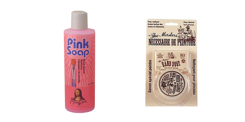
One option is to use “Pink Soap” by Mona Lisa. Pink Soap not only cleans the wet and dry paint from your brush, but it also conditions it bringing it back to its original condition.
Another option is to use Masters Brush Cleaner and Preserver. This hand soap and preserver combination is a popular choice for many artists that want a hand soap as well – after all our hands get dirty too!
Using Solvents to Clean Your Brushes (Oil-Based Paints)
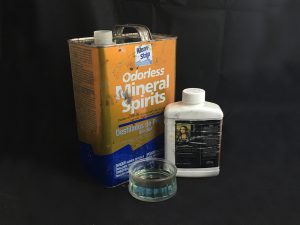
If you are an oil painter then you have some flexibility. Historically, artists have used turpentine or mineral spirits to clean oil brushes. These solvents are harsh and could, over time, contribute to brittleness and breakage of natural bristles. So after using solvents for your initial cleaning, take an extra moment and wash the solvent from your brushes using soap and and water. The brand, Dove, is a good choice as it has a built-in moisturizer.
Beside the traditional solvents, some art supply companies such as Mona Lisa offer top tier cleaning solutions that both clean and condition natural bristles (see soap options above).
Washing Technique For Cleaning Brushes
The proper technique for washing brushes is to make strokes through a container of cleaner. For water-based paints, water will suffice. For oil-based paints, use the solvent of your choice.
Too often I see student artists take a fist-full of dirty brushes and attempt to clean them all at once by pounding them into the bottom of a cleaning jar. Haste makes waste and this type of action forces the bristle to splay out in every direction and may even push paint up into the ferrule – big mistake. Doing this to a round brush may cause the bristles never to go to a point again.
For cleaning water based paints, I like to swirl the bristles into the cup of my hand while water gently runs over them.
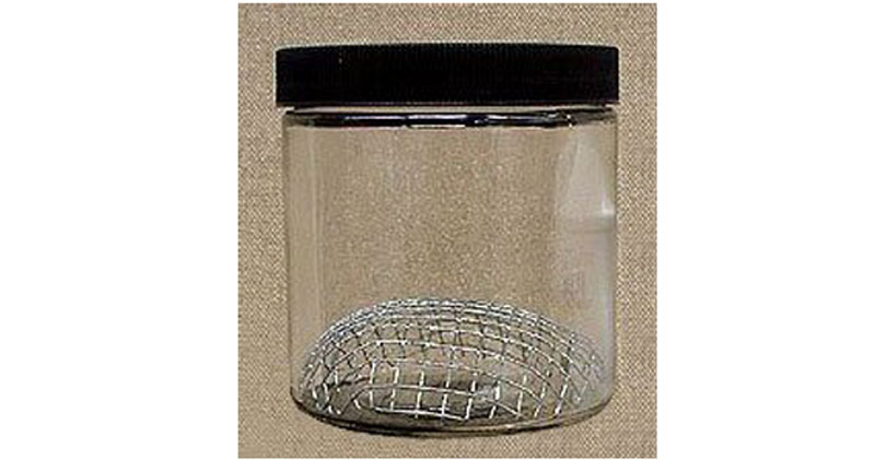
For oil based paints, invest in a brush cleaning jar with a metal screen inside. Such a cleaning jar makes clean-up a breeze. The paint falls through the screen and settles at the bottom of the jar allowing you to use the same jar of solvent for an extended period of time.
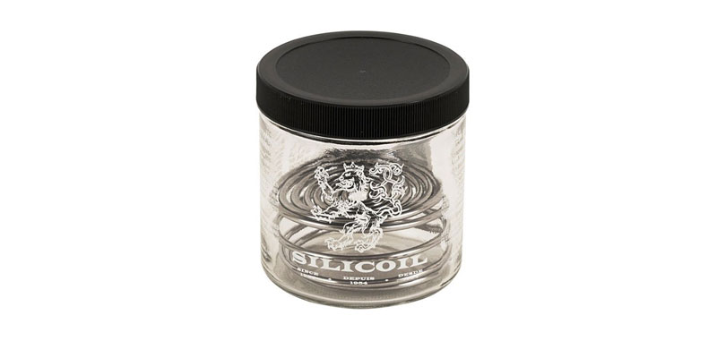
There are several “cleaning tank” options for artists. Winsor and Newton makes a Silicoil Brush Cleaning Tank which provides a smooth aluminum coil that won’t damage the bristles of your brush while keeping them safely away from the paint sediment at the bottom.
Another option produced by Mona Lisa is a simple tank with a galvanized screen. This cleaning tank provides a rigid surface for cleaning your brushes while keeping the sediment safely away from the bristles.
Storing Your Art Brushes Properly
Proper storage is imperative to extending the life of your brush. Placing brushes into a container with the bristles down will cause wet bristles to dry out of shape, making them harder to use the next time.
I was taught to store brushes upright after cleaning so that the bristles dry in their proper shape. However, storing clean, wet brushes upright will cause the ferrules to become loose. Moisture runs down into the ferrule and causes wooden handles to first swell and then, as the wood dries, shrink. The glue inside of the ferrule separates from the handle due to this cycle of swelling and shrinking. Painting with a loose brush is frustrating.
So after washing a brush, shape the tip with either your fingers or, if it’s a soft brush, a quick flick. Then lay it flat to dry. Now gravity will not draw moisture into the ferrule. Once dry, you can store the brush upright without the ferrule loosening.
For long term storage of natural bristle brushes throw in some moth balls or you might find gaps in your bristles the next time you are ready to paint. Don’t worry about the nylon bristles – apparently they are not on the menu.
How to Fix Broken Bristles
Despite our best efforts we sometimes get in a hurry and, through carelessness, allow a brush to dry out of shape. Now you have a brush with bristles shaped like a banana. Not to worry, we can fix this!
Simply re-wet your bristles and tape a small strip of paper around your bristles to hold them in place. This will retrain your bristles to take their former, preferred shape.
Painting Technique
Our painting techniques contribute greatly to the longevity of a brush. Do you mix oil paint with your brush? Do you load paint onto your brush like you are scooping peas onto a fork?
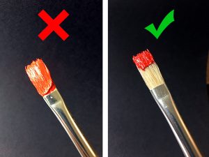
If so, you may get paint onto areas it doesn’t belong. In a perfect world we would only load paint on the bottom half of our bristles. Keeping paint away from the ferrule is important. Here’s why…
When we clean our brushes, the paint is worked out of the brush by the action of the flexing bristles and by the swishing of solvent between those bristles. Near the ferrule, the bristles don’t bend as much and the solvent doesn’t penetrate as well. Over time, small particles of paint build up in the tops of the bristles. This spreads the bristles apart enough to keep the brush from closing to a tight point or edge.
The best way to keep paint from creeping up the bristles is to mix your colors with a palette knife and to use larger brushes whenever possible.
Our “mark-making” may wear out a brush as well. Some artists make light, gentle strokes in the direction of the bristles. Others (myself included) scrub back and forth as we paint. A scrubbing motion is harder on bristles and forces them to bend farther and more quickly. The bristles are more likely to break.
That being said, your personal “mark-making” is a unique part of your art and should take precedence over the life of your brushes. Sure, we all want our brushes to last as long as possible, but our priority must remain the artwork itself. If you never have to replace your brushes then you are not painting enough.
If so, join over 36,000 others that receive our newsletter with new drawing and painting lessons. Plus, check out three of our course videos and ebooks for free.
Six Reasons to Draw On Toned Paper
Why Is Paper White?
Walk into any art supply store and you will find aisles of canvases and sketchbooks, nearly all of which are white. At the end of the sketchbook aisle you’ll probably find a rack single sheets of paper in a variety of grays, browns and muted hues. Ask a store employee and they might advise that these papers are for pastel.
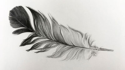
They are partly right. These toned papers have a smooth side and a rougher side. The rougher side is great for pastel. However, all drawing media are appropriate for toned paper drawings. In fact, working with just black and white media on toned paper is a great way to stretch your skills.
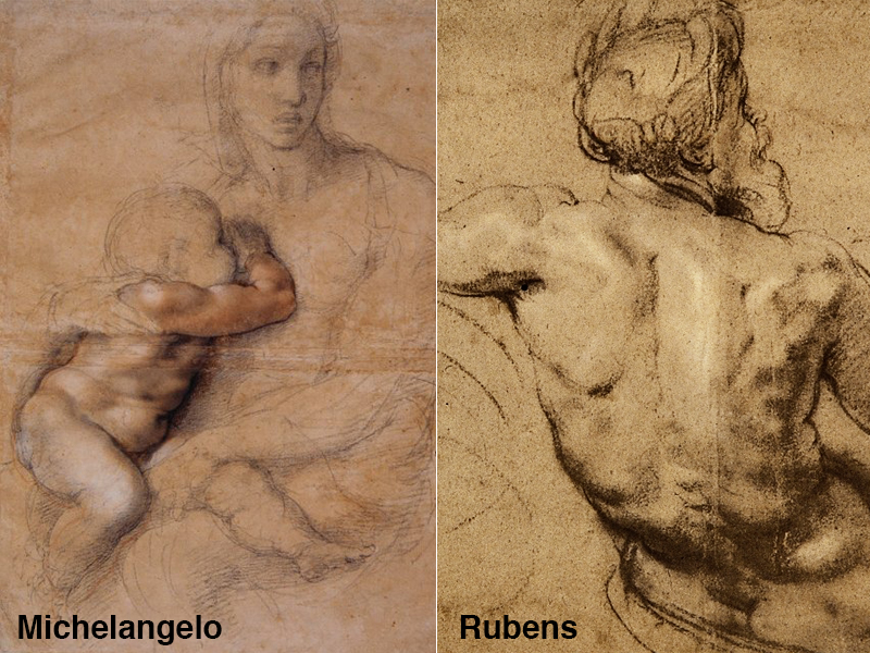
During the Renaissance and the Baroque Period, artists such as Michelangelo and Peter Paul Rubens commonly drew on light brown or light gray paper, not in pastel but in ink, charcoal, conte crayon or any other drawing media.
Below we’ll consider some of the advantages to drawing on a toned surface. We’ll also walk through the steps you might take in creating an artwork on toned paper yourself. Of course, the approach explored here is not definitive. It is just one approach, but it is one that is likely to lead to success.
1. Working on Toned Paper Often Leads to More Realistic Results
I can still hear my own drawing instructor saying “There is no white in life. There is the sun, and everything else is darker than that.” His point was that our artwork should have little or no white left in it to create the most convincing, realistic depiction.
Therefore, if your paper is darker than white then you avoid, by default, one of the main reasons some drawings don’t seem realistic enough. An otherwise accurate drawing may even seem unfinished to the viewer if too much of the white paper lies bare.
It’s easier to push a drawing darker if you start with toned paper. Then, if you choose add some white highlights, you are doing so with intention and your work will seem more complete.
2. It’s Easier to Hide “Mistakes”
Unless you are Anthony Van Dyck, famous for rarely erasing, you will make mistakes. Mistakes are a part of the process. If, however, your goal is to make a highly refined drawing then you might not wish to see any eraser marks on your paper.
I have good news. Mistakes made in the primary stages of a drawing on toned paper are easier to hide. It’s not magic, it’s contrast. Or rather, a lack of contrast. Your dark marks on white paper stand-out more than those same marks would on gray paper. When you erase those marks from the toned paper, any residual material left on the sheet is likely to melt into the value of the paper and later stages of your drawings.
3. A Toned Surface Increases Your Speed
These days, artists commonly use photographic references. However, for artists working before the advent of photography, quick sketching as an ability was a must. Drawings made without the aid of a photo were a race against the setting sun and the fatigue of weary models. Artists would capture their reference imagery in a sketchbook and then work from those sketches to complete a larger, more involved painting.
Using toned papers allowed these artists to save time. They could shade the darks, use white for highlights and allow the paper to do the rest. Unfortunately, the contemporary habit of drawing from photographs promotes a more sluggish approach. Drawing on toned paper can counterbalance the effect.
“If you can’t paint a man falling from a five story building before he hits the ground, you will never make a monumental painting.”
A quote by Eugene Delacroix, painter of “Liberty Leading the People”, expresses the importance he placed on speed and efficiency, – “If you can’t paint a man falling from a five story building before he hits the ground, you will never make a monumental painting.”
4. Drawing on Toned Paper Enhances Your Painting Skills
Drawing on white paper means that we mostly work in one direction, from light to dark, since our paper starts us off at one extreme of the value scale. When we paint, however, we begin with a range of values/colors on our palettes. We then make light and dark marks all at once, thus working in both directions on the value scale. Drawing on toned paper is a valuable bridge between these two approaches to rendering light and form.
5. Toned Paper Unifies Your Composition
Unity is a guiding principle of art and design. It refers to the overall cohesiveness of an artwork. Drawing on toned paper, particularly a paper of color, practically guarantees a sense of unity in your artwork. The tiny bits of color, spread across your composition, peaking through your marks, creates that unity and can be used to convey an defined mood in your artwork.
6. Encourages a Full Range of Value
Working on toned paper helps to ensure that you create a full range of value and tone in your drawing. A full range of value should be included in nearly every work of art. Value is incredibly important. It describes the light within the scene, the form of the object, and the texture. We should make is as easy as possible to create a full range.
When we start with a white sheet of paper, we begin at one extreme of the value scale. We then have to work to progressively add darker values in order to produce a full range of tone. If we start with a toned surface, somewhere in the middle of the value scale, we only need to push the values slightly lighter and darker. This increases the chances that we will create a full range of value in the finished drawing.
Working on a toned surface also helps us to better understand the contrast of the values that we add. Take a look at an excerpt from a recent question and answer sent in for “The Member’s Minute”. The question is essentially asking why pastel papers are toned…
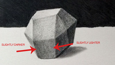
Create a Drawing on a Toned Surface
Follow the steps below and make your own still-life drawing on a toned surface.
You will need:
- A piece of gray or tan paper
- A pencil (2B or Ebony)
- A white colored pencil or white charcoal pencil
- White tempera, acrylic paint, or gouache
- A few small objects
- A camera and printer
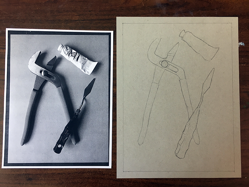
Step One – Gather Your Materials and Lay Out The Objects
Choose a light gray or brown sheet of paper and arrange a small collection of object on it. Take a reference photograph of your objects from directly above without using your a flash. Lay your paper, with objects, next to a window to ensure that the shadows are strong.

Step Two – Create a Contour Line Drawing of the Objects
Make a line drawing of your object. Be sure to consider proportion. Pay special attention to the size and shape of the empty spaces between the objects.
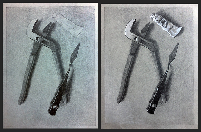
Step Three – Add Tone to the Background
Identify the darkest area of the background and begin shading there, gradually lightening your pressure as you work toward the lightest area of the background. Don’t use any white in the background yet. You may only shade a portion of your page before the natural value of the toned paper matches the reference. That is fine. Late in the process you can use some white to push the background farther.

Step Four – Shade The Darker Values on the Objects
Now shade the objects. Be sure to identify the parts of each object that you believe are the value of the paper and lighter. Erase those areas out if you shaded over them when covering your background and darken the rest of your objects according to the reference photograph.
Avoid using white until you think you are finished with the graphite.
Step Five – Add Lighter Values with White
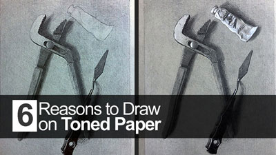
Now is the time add “pop” to your work with the addition of white media. I like to use the white pencil first. On the grey paper the white pencil is less bright than paint. After applying the white pencil to every area that is lighter than the natural value of the toned paper I’ll then determine if white paint is needed.
If you choose to use paint, use it conservatively. In the example I’ve mostly used white pencil on the pliers and white paint on of the tube.
The only real downside to drawing on toned paper is that you have to carry two pencils instead of one – which is not much of a downside at all.
If so, join over 36,000 others that receive our newsletter with new drawing and painting lessons. Plus, check out three of our course videos and ebooks for free.