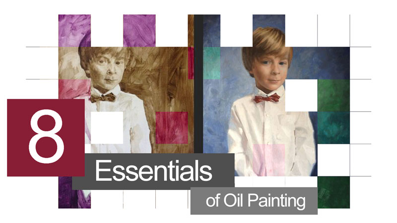
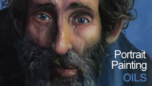
Oil Paint Changed The Art World.
Every so often a technological advancement trusts humanity into a new age. In the last few decades, the computer has changed how we work. Centuries earlier the printing press brought reading to millions and around that same time, the development of oil paints brought pictures to life – like never before.
Almost six hundred years later, galleries and contemporary art museums are still filled with fresh oil paintings. Many art supplies have come into being since artists first spread oil paints across their wooden panels. Acrylic paint has been in use for half a century, but has not replaced oil paint in the way oil paint replaced egg tempera. So if you haven’t worked with oil paint, I encourage you to do so.
Knowledge Is Half The Battle
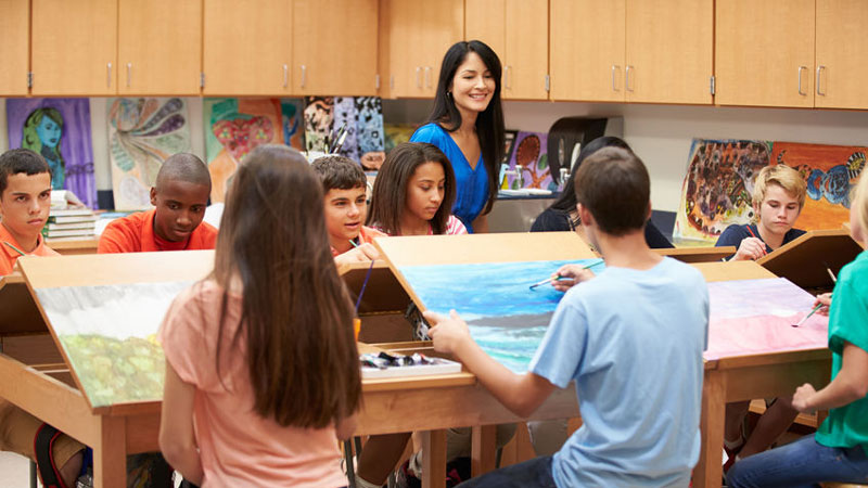
When I was thirteen years old I found myself in an two-week long summer enrichment art program. Somehow, I was in an intermediate level oil painting class having never painted before. In our studio, a huge table of supplies were provided from which to choose. The instructor would respond to our questions but did not guide us through the painting process. With my limited experience, I didn’t even know what questions to ask. I was in the wrong class. My paintings were total “failures”.
It was frustrating. I felt like giving up, but thankfully, I didn’t. My problem wasn’t a lack of desire or talent. It was a lack of basic knowledge. The information in this article is not definitive, but it helped me to become a better painter and it may help you as well.
Creating a successful painting begins with solid material choices. It ends with a methodical approach to building a painting. The following oil painting essentials address both of these broad topics. Now, on to the eight essentials…
1. Choose the right support.
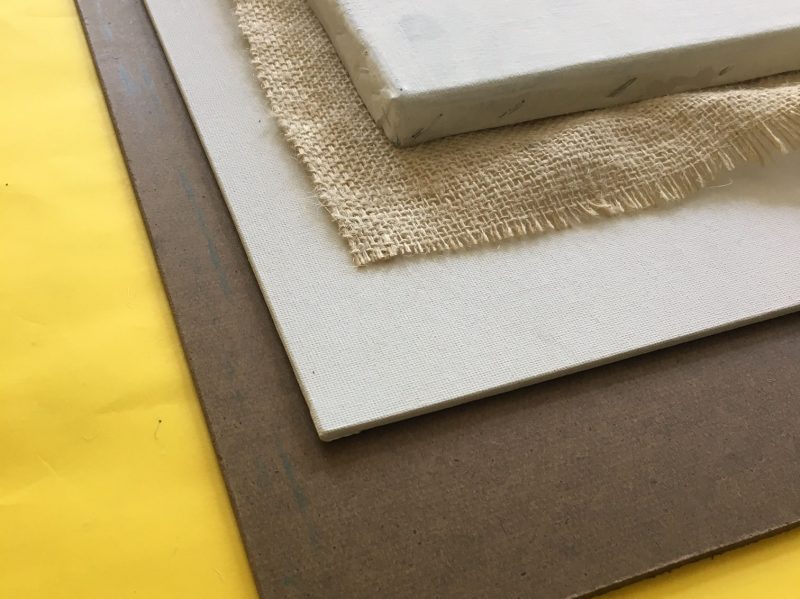
In terms of art, a “support” is the actual surface you paint upon. The most popular support for oil painting is a stretched canvas. Consider a stretched canvas as a medium textured surface, suitable for most paintings.
For a smoother surface, choose oil-primed linen or wood (my favorite). Masonite works well. These smoother surfaces are employed by artists that like to paint thinly with little to no visible brushwork. Fine detail is always easier to achieve on a smoother surface.
Conversely, to cover a rough support such as burlap, thick brush strokes are required and the physical texture of the cloth is likely to become a part of the artwork. The level of achievable detail is reduced, but the artwork will feel looser and more painterly by default.
Of course, all supports must be primed before using oil paint on them. Supports are typically primed with Gesso – a thick, white, acrylic paint.

2. Choose Proper Brushes.
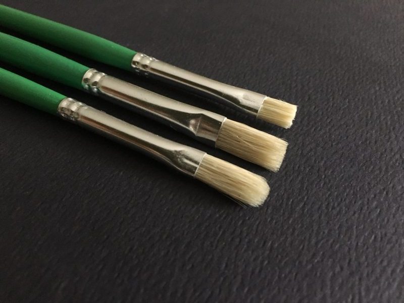
Oil paint is thick and heavy. Stiff brushes called ‘hog bristle brushes’ are recommended in most circumstances.
Beside the bristles, you must also choose between brush shapes. My advice is to experiment with the four main brush shapes – flat, bright, round and filbert. Find out which give you the marks that you desire. I personally favor the filbert. It is somewhere between a flat and a round, making it a versatile choice.
Want More Information on Brushes?
Check the ultimate brush guide…How to choose the right paint brush.
3. Use Medium
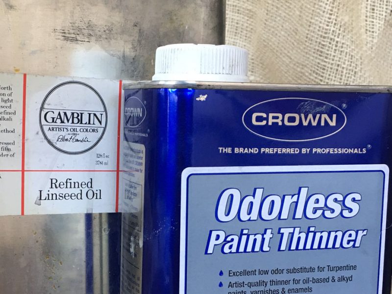
Medium is basically translucent, nearly colorless, thin oil paint. It is translucent because it has no pigment and it is thin because it is a mixture of both linseed oil and a solvent which increases viscosity. The purpose of medium is to improve “flow” so that you can easily spread your paint over an area or make long brush strokes.
Make your own medium by mixing 50% linseed oil with 50% turpentine OR mineral spirits OR paint thinner. You can also purchase pre-formulated mediums with special properties such as fast-drying or special finishes such as “high-gloss”.
4. Make a low frustration palette.
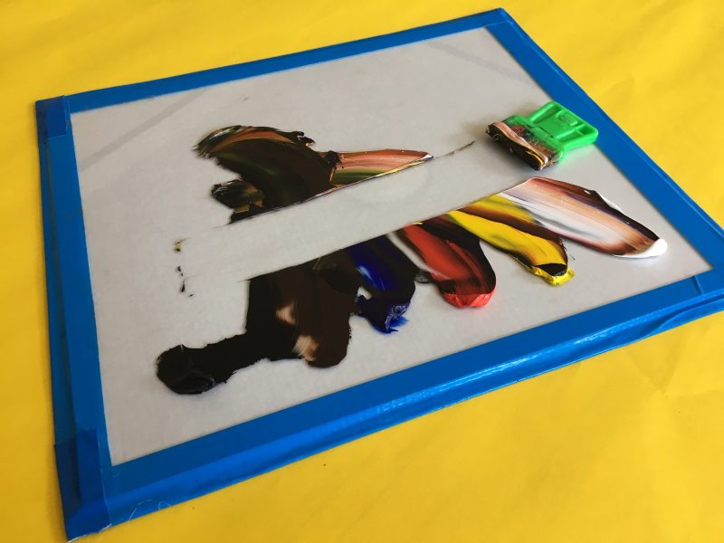
A palette is more that what you squeeze your paint onto. It is a work station and needs to be organized. I arrange my palette with white and black on opposite ends with a spectrum of colors between them. For neutrals such as brown – I put at the end, just before the black.
Wooden palettes have been popular since the dawn of painting but they are dark and stain easily. Dry paint is hard to remove from the porous surface. For these reasons, I am a believer in white, glass palettes.
The white surface makes it easy to judge your color mixtures and because it is glass, you can scrape away any dried paint with a razor blade (preferably one in a handle for safety). Your palette will look new for years if it’s made of glass.
Make a Glass Palette
Learn how to create a glass palette like this one in Oil Painting Master Series.
5. Beat the fumes
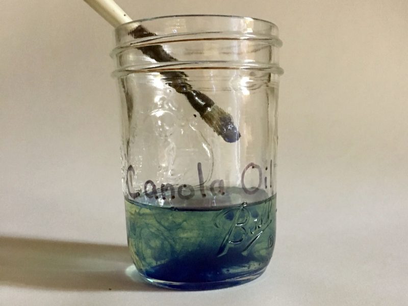
I’ve known a few artists to switch from oils to acrylics simply because of the fumes. This is unfortunate because there are ways around the fumes associated with oil painting. The paint itself smells mildly musty but the solvents used in the medium and during clean-up, give oil paint it’s smelly reputation.
The solution is two-fold. First, instead of making medium, purchase a medium with less odor. I recommend Liquin. Made by Winsor-Newton, it speeds drying time to about a day and has a comparatively weak smell.
Second, use a cooking oil to clean your brushes when you are finished painting. Cooking oils such as canola or safflower are cheaper than solvents and, surprisingly – they work. After using cooking oil to remove the paint in your brushes, regular hand soap will wash out the oil and keep your bristles in good shape (and make them smell nice).
6. Simplify your pigments
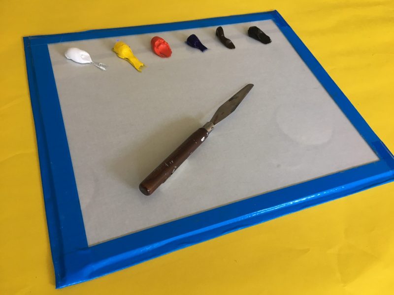
Too often I see hobby painters with dozens of paint tubes in their paint box. Instead of purchasing every color you observe in nature, choose a few versatile pigments and learn to mix your colors.
The best advice I can give beginning painters is to keep a simple palette. Start with one red (Cadmium), one yellow (Cadmium) and one blue (Ultramarine) – plus black and white. All colors cannot be mixed from this particular set of primaries, but by limiting your pigments, you’ll create harmony between your mixtures. You will have made every color in your painting from a small set so they will share a commonality, much like a family is related by a common ancestor. This quality unifies a painting.
An Example of a Beginner’s Palette…
- Cadmium Red
- Cadmium Yellow
- Ultramarine
- Ivory Black
- Titanium White
Eventually you can add an additional red, yellow, and blue, giving you enough variety to mix almost any color you observe. Stay away from buying secondary colors (orange, purple, and green) since doing so will discourage color mixing. The exception here is for landscape painters who might want a tube of either Hookers Green or Sap Green.
An Example of an Intermediate/Advanced Palette…
- Cadmium Red
- Alizarin Crimson
- Cadmium Yellow
- Lemon Yellow
- Yellow Ochre
- Ultramarine
- Phthalo Blue
- Burnt Umber
- Burnt Sienna
- Ivory Black
- Titanium White
7. Start With An Underpainting
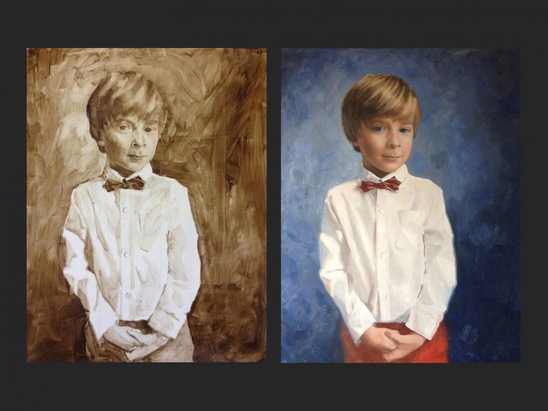
An underpainting (usually monochromatic or grey-scale) is an initial layer of paint. You might think of the underpainting as a rough draft. Whether it is loose and sketchy or refined, it’s purpose is to establish the general proportions and values of your subject without the complications of mixing and matching color.
Once the underpainting is dry, you can paint on top of it in full color. If you make a mistake in terms of color or value, just wipe away the mistake and try again. Starting this way allows you to concentrate completely on color choices during the final layer since the correct values and proportions are already established.
8. 90% of Quality Painting is Quality Drawing
I would be remiss if I failed to advise you to regularly practice your drawing skills in addition to pursuing painting. Much like an underpainting lays the foundation for a successful oil painting – drawing is at the heart of painting. In fact, color is flexible and interpretive but value is rigid and unforgiving. You can paint a person’s skin blue, but if your values are accurate, your portrait will still look just like them.
Better yet, make a drawing of your subject in pencil or charcoal, then create your painting. You’ll more fully understand your subject and make a better painting because of it.
If so, join over 36,000 others that receive our newsletter with new drawing and painting lessons. Plus, check out three of our course videos and ebooks for free.

The Art of Teaching Art – How to Teach Art
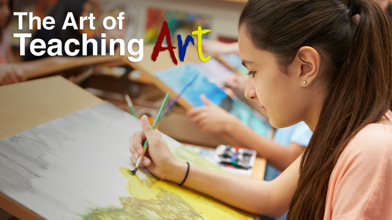
Can Art Be Taught?
Art is a discipline that can be taught. In fact, I believe that anyone can be taught to be a great artist. If I didn’t believe that as an art teacher, I would be in the wrong profession.
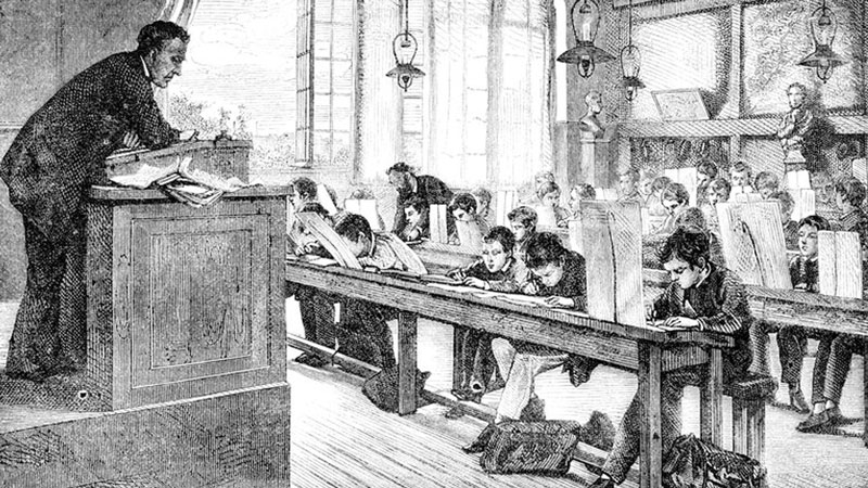
But art can only be taught by an effective art teacher. Unfortunately, there are far too many bad art teachers out there – those that sit behind their desks and simply hand out assignments.
If you’re an art teacher, you don’t want be a bad one. You want to be a great one – one that your students love and respect.
Teaching art is an art in itself and in this post, I’ll share with you how to be one of the great art teachers.
What Makes a Strong Teacher?
We’ve all had teachers in our lives that are memorable. Unfortunately, we remember some of them as poor teachers. For some, we only remember a little and maybe have forgotten their names or any of the details of the class they taught.
But for a few teachers, we remember them in detail and what we’ve learned in their class has stuck with us for many years. In some cases, the direction of our lives has been changed forever because of the influence of these special folks.
These teachers are the special ones. For most of us, we’ve been lucky enough to have at least one of these “super teachers” in our lives.
If teaching is your profession, then this is the kind of teacher you should strive to become.
Effective teaching is an art form. And like most forms of art, there are skills involved. Thankfully, these skills can be learned and developed. When these skills are implemented with passion and purpose, they become a characteristic of the teacher. These are the characteristics that define the strongest, most memorable, and most effective teachers.
Below, we’ll take a look at some of the unique challenges that art teachers face, how to overcome them, and most importantly – how to become an effective and memorable art teacher.
Teaching Art Is Challenging
Teaching ain’t easy. Teaching art is even harder. If you went into this thinking it would be easy, and you don’t like a challenge – then you may be in the wrong profession. But if you embrace the challenge, and pour yourself into it, then there aren’t too many greater pursuits in life – to give the gift of creative expression to a generation of students and to change people’s lives.
Art teachers unfortunately face challenges that teachers from core subjects usually don’t have to deal with. Identifying these challenges and knowing how to handle them is essential to your success.
Fighting the Myth of Talent
Many people believe that artists are born that way – that talent can’t be taught – and that you are just an overseer of people that have “talent”. If you believe that you must have talent to acquire artistic skill, then what business do you have in art education. Talent is a myth and you must believe this.
The problem is, many people do not believe this. Instead, they buy into the lie of talent and conclude that since art is a talent – you either got it or you don’t.
As an art teacher, I deal with this misconception daily. People make excuses based on this misconception, and if you’re an art teacher and you buy in to it, your students will suffer. The first principle in becoming an effective art teacher is to drop the word “talent” from your vocabulary.
If your students believe in talent, and have never been labeled as “talented”, then chances are, they will never truly believe that they can create good art. And if you believe the myth of talent yourself, you may not believe that they can produce good art either. This handicaps you right from the start. So, get rid of “talent” and make your students aware of your position.
Micheal Jordan is perhaps the greatest basketball player to have ever lived. Some would venture to say that he is also the most “talented” basketball player to play the sport. Here a few interesting facts about him…
- Holds the record for regular season career scoring average. (30.12 points a game)
- The only player to score 40+ points in a game at age 40 or older.
- In 1989, he recorded 10 triple doubles in 11 games.
- The only player to win the scoring title and Defensive Player of the Year – in the same year.
- Cut from the high school basketball team.
Did you pay attention to that last stat? He was cut from the high school basketball team!
That’s right, Michael Jordan was not “talented” enough to make the basketball team at his own high school the first year he tried out. Was it because he wasn’t talented? No, it was because he hadn’t worked hard enough and practiced enough to hone his skills. He had not developed his skills, he needed work.
We aren’t born with talent. We develop skills and over time people begin to recognize these skills and label us as “talented”. Anyone can become “talented” if they are willing to learn and practice. This is true for all of your students. Any of your students can become incredible artists. But first, they must believe that this is possible and you must believe it too.
A Lack of a Pacing Guide
You do not have a defined pacing guide that spells out what you should teach and when you should teach it. This freedom is great, but it can present challenges to art teachers. Math teachers, for example, know what they are to teach and what day they should teach it. It’s very straight-forward. We don’t have this.
You must be organized enough to plan a defined curriculum for your students. Your curriculum should be logically sequenced and designed to maximize the success of your students. It should be well-paced and complete.
A Lack of Respect From Core Teachers and Administrators
We often don’t get the same respect as teachers in the “core” subjects – from other teachers, administrators, and parents. This disrespect carries over to our students, so we have to work harder to get it and keep it.
We can gain the respect of other teachers and administrators by taking steps to display the work and progress of our students. Artwork should be prominently displayed around the school and even throughout the community. Create art events at your school to involve the community and communicate the importance of your program.
The more that the community notices, the more that your administrators will support your program. With additional support, you may find that your allotted budget grows as well. Administrators will put money in programs that make the school look its best. Make sure that your program is a shining star!
No, teaching art ain’t easy, but it’s what we do and I’d like to share with you how to come to P.E.A.C.E. with it all.
P.E.A.C.E. in the Art Classroom
Effective teachers produce students that create quality artwork. It doesn’t matter where you teach. It doesn’t matter your budget. It doesn’t matter your school’s demographics or socio-economic factors. If you are a strong teacher, you will have strong art students.
Producing strong students doesn’t happen overnight – it is the direct result of you and how you conduct your classroom. Finding peace in your classroom and becoming an effective art teacher is all about…
- P – Preparation
- E – Expertise
- A – Art Activities
- C – Curriculum
- E – Empathy
Let’s examine each of theses strategies and characteristics a little deeper…
Preparation
One important key to success is self-confidence – an important key to self-confidence is preparation.
Planning is essential. You cannot over plan. Plan your entire year’s curriculum before the year begins. This makes ordering materials much easier as well.
Planning every minute in a class period is not overdoing it. Also planning exactly what you are going to say isn’t either.
To illustrate its importance, let’s examine planning from another profession. Pilots must go through rigorous pre-flight checks before taking off. These safety checks are clearly essential for our safety. We know that pilots and operators make preflight checks before flight, but you may not know how much goes into it all. Each preflight check takes about an hour to complete and includes an impossibly long list of items to check.
What you may not know is that pilots are paid only for their time when they leave the terminal until when they dock. This means that they are not paid for their time when they are preparing for flight.
Teachers don’t get paid for their planning time either, but it is just as crucial to our success.
We shouldn’t plan because we are forced to do it. We should plan because it is crucial to our success as a teacher.
Expertise
Have you ever avoided teaching a particular medium or lesson because you felt that you were too inexperienced to teach it? If so, then you’re being lazy. You’re also hindering the growth of your students because you are limiting what they can do and achieve.
As an art teacher, you must be skilled in a variety of techniques and methods – most if not all of them.
You have to show that you credible – that the students should value what you have to say. You must demonstrate to your students that you are qualified to give them instruction. Having a degree doesn’t matter to them. (Some of my former students didn’t think you needed to have a degree to teach art.) Going to art school doesn’t give you credibility either. You must actively and continually demonstrate that you are an expert.
This means that YOU must demonstrate processes to students in order for them to listen to what you have to say, and most importantly – respect it. If you are not an expert on a subject or medium that you are expected to teach, then you must become one.
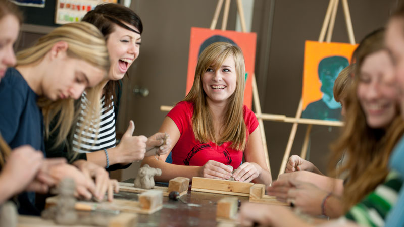
Art Activities
Art activities or art-making experiences should be designed so that they reinforce the concepts that you teach.They should not be designed purely to produce a product. Our jobs are to equip students with the knowledge necessary to produce quality works of art – not just to guide them through the production of a product that doesn’t require the thoughtful implementation of the concepts that we have taught.
Create creative and relevant experiences for your students to learn and grow. Teach through these experiences. Focus your experiences on learning, not for the county-wide art show. Don’t put a huge emphasis on grading, instead focus on growth. Make sure that when you’re designing your experiences, provide many ways for students to be successful along the way.
Teach the curriculum, but do it in a way that breaks the mold. The students will respond. They will look forward to your class and they will soak up everything you have to offer.
The key to your students creating quality artworks or products is focusing your efforts on teaching concepts effectively – then reinforcing those concepts through an art-making experience. Sometimes the result of the product may not be aesthetically successful, but as long as the concept is engrained in the student, then future products will be.
The product must be congruent with the concept taught and must be designed to reinforce the concepts taught.
It may seem obvious, but don’t introduce color theory and then have your students create a line drawing. A better idea would be to introduce “line” and then have your students create a work that uses pen and ink. Make sure that the work that they create incorporates all of the concepts about “line” that you just taught them.
The order of art-making activities presented should be presented in a specific order and should follow a logical progression. Art instruction is linear. The products that your students create should demonstrate growth so that by the end of the year, there is clear improvement.
Curriculum
Your curriculum should be designed and tweaked each year to maximize your effectiveness as a teacher and maximize your time with students.
You should design your entire year’s curriculum before you meet the first student on your roster. You should see the big picture. You are the captain of the ship, the pilot of the plane – you should know where you are going.
You would never get in the car to go somewhere without knowing where you are going. It doesn’t make sense to jump from project to project without a defined goal for your students. You must guide them and you must know where you want them to be.
Your curriculum should be planned and follow a logical progression. We learn addition before we learn subtraction. There’s a reason for this. We learn multiplication before we learn division. We can’t divide unless we fully understand how to multiply.
Therefore, it doesn’t make sense to teach painting before we teach drawing. We shouldn’t teach form before we teach shape, etc. Yet so many teachers jump right into a concept like color theory before even teaching the concepts of value and light. No wonder students get confused.
Over the course of the year, we should evaluate the effectiveness of our lessons. When a lesson fails, replace it. When a lesson succeeds – improve it.
You should see what your students produce improve each year as your delivery and quality of the lesson improves. Keep making your lessons better until they are perfect.
Empathy
Many teachers say they believe in all of their students, but really believe in maybe 80%. In order to teach art effectively, you must believe in all of your students and show it, especially when they don’t believe in themselves.
This may be a real challenge at times. You will always have those students that it seems you’re not reaching. If you’re consistent and authentic, whether you believe it or not, they are listening. Focus on each student as an individual and let them know (frequently) that you are there and genuinely interested in their success. (If you aren’t genuinely interested in their success, get out of teaching.)
Students will respond to authenticity. It may take a while for some students, so don’t give up.
You also must demonstrate that you relate to your students – that you understand their pressures and their schedules – art is not their only class.
Making quality art takes time – set deadlines and expectations but allow students to turn in work late without punishment. We are not tyrants – we are mentors and allies. We are confidence builders not slave drivers.
I once had a very skilled student that took “ages” to complete her art. At the end of the first quarter, she had only turned in half of her assignments, although she was still working on them. I had no choice but to give her an “F”. After the quarter had ended and report cards had been passed out, she turned in the missing assignments. The work was amazing!
What was I to do? Deadlines are important and if art is your job, you get fired for missing them. Should I leave her grade as it was and “teach her a lesson” or should I change it?
The reality is that art was not her job as a student. It was one of her classes – her favorite class. She had several other classes, extracurricular activities, and a job after school. The art assignments were demanding and she cared about the quality of the art that she produced – not the grade that she received. Was she to be punished for this?
I changed her grade. It was the right thing to do. My decision to do so even affected the direction of her life. She later went on to receive a full scholarship from a very prestigious art school. Do you think that she would have gotten that scholarship with an “F” in art on her record?
Confidence goes a long way in making your students successful. You should look for every opportunity to build a student’s confidence. Your words (and actions) are heavy. What you say to students stick with them. Success only happens when it is believed to be possible. You must make students believe that it is. This means that you must fight the talent myth and give students the opportunity to find success. If a student doesn’t believe that they can succeed, then they never will.
More Thoughts
To be an effective teacher, you must be an actor – play yourself!
Try to include a congruent example to illustrate your point. In this post, I included at least one congruent illustration to help you remember the concept and why it is important for every point I made.
Involve your students and let them be active participants in their learning. Ask questions, invoke discussions.
Allow the students to see the real you. Be completely authentic. Students don’t really care what your personality is like, they just want you to be real. It’s okay to make mistakes and admit them. In fact, your students will respect you for it. And if they respect you, they will learn from you.
Lastly, enjoy your job. If you like what you’re doing, it will show. Students will like learning from you. They can smell it when a teacher is not enjoying their job. That teacher’s effectiveness will suffer because of it. Enjoy what you do and effectiveness naturally follows.
Love what you do and let it show every single day. Invest yourself in your craft.
Love your students and even on the worst days, try to remember that you are one of the most important people in their lives.
If so, join over 36,000 others that receive our newsletter with new drawing and painting lessons. Plus, check out three of our course videos and ebooks for free.
The Multiple Rights of Art
We’ve all been taught throughout our lives there is one right answer to problems. There is the “correct” answer and then an infinite number of incorrect answers.
In math, “2 + 2” will always equal “4”. All other answers are wrong.
There is a solution – one solution – and everything else is wrong.
For the most part, we continue to train our students to think this way. We train them to respond with the correct answer – in the classroom and on the test. We tell them that there’s one answer and it can be found at the back of the book. These days, problem solving is no longer about the process, but more so about the answer.
Unfortunately, this has trained some of us to believe that art functions in the same way. Our years of schooling and experiences have forged a belief that there is one correct way to approach art creation and that all other ways are incorrect or somehow less successful.
Some of us spend years and even decades trying to find that one, elusive, correct way. Many others give up in frustration because the answer doesn’t come quickly or doesn’t seem attainable.
We have been trained to find answers based on formulas, so we search for one to improve our art. Formulas for drawing and painting can be useful, but these formulas do not always lead us on a path to art success. For some, formulas hinder and can be limiting. The path to success in creating art is more personal, more rewarding, and more ambiguous.
We can’t approach our art-making with the expectation that there is one right answer – one perfect solution for our subject with the medium of our choice. The one correct answer doesn’t exist. But what does exist is many correct answers – an infinite number of correct answers.
The artist doesn’t find the answer – he creates it.
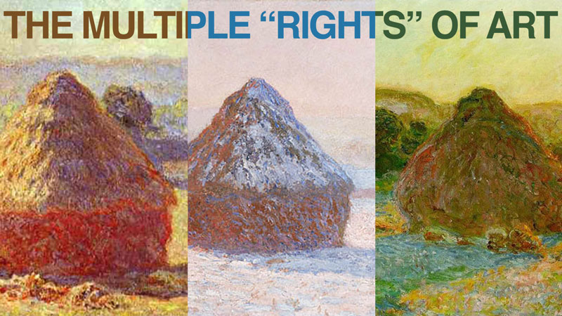
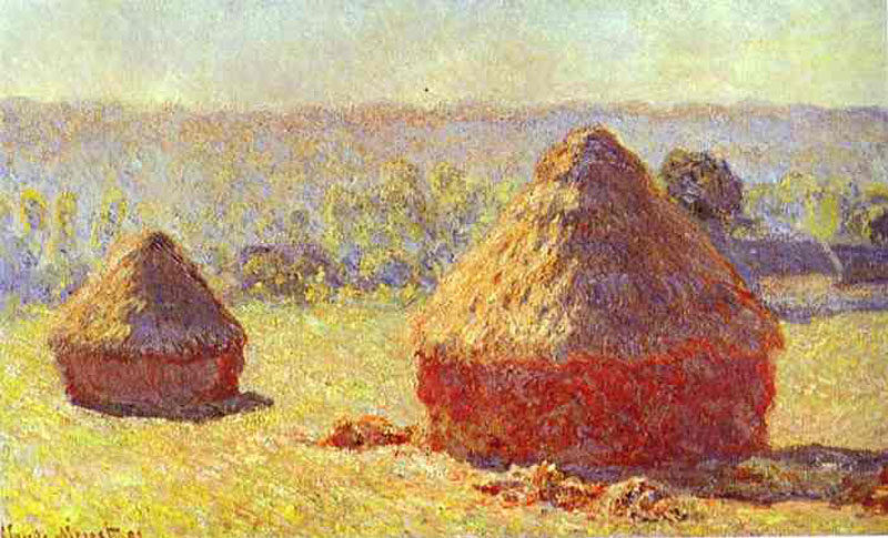
Monet’s Multiple Rights
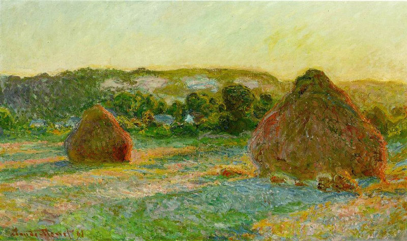
We need not look further than Monet’s Haystacks series as an example of “multiple rights”. Monet created a series of paintings of the same subject, haystacks, at different times of the day and different times of the year. The series of around 30 paintings was a study of light and season.
Some of the paintings are bright while others are solemn. The composition of each work is slightly different, but the subject stays the same.
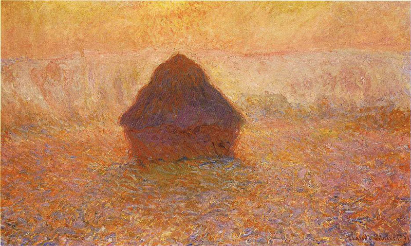
Each painting is its own unique interpretation of the subject. Even though the same subject is depicted with the same medium, by the same artist, each painting stands on its own as a successful solution.
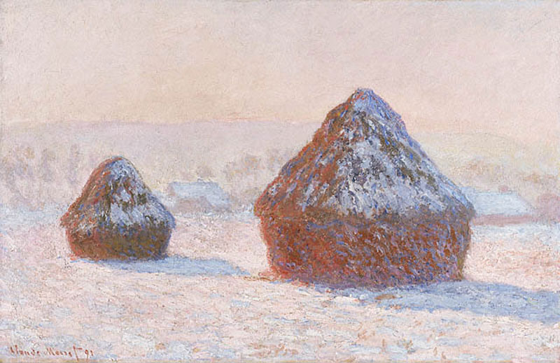
Monet was focused on capturing the light and the subtle nuances of color that resulted. He often continued to work on the paintings in his studio after beginning them in the field, pulling out colors and harmonizing his palette.
Each of the paintings is an answer – an answer to the same question. Each painting is a correct response – a right answer.
We should also be free to create without restriction or apprehension of being wrong. We should make each stroke of the brush without fear of “messing up”. Each mark that we make should be made with confidence knowing that what we create is our answer – our unique, correct response.
Skill and Artistic Voice
Just as there are many paths to the same destination, there are many ways an artist can arrive at a solution in a drawing or painting. And just as a vehicle is often required to carry a passenger to a destination, skill is required to carry an artist to their solution.
Drawing and painting skills are required. Craftsmanship is important. This is different from our unique artistic voice – the one that we speak with when we present our solution in a work of art. Skill is what we use to speak through.
Therefore, we should continue to develop our skills so that we may speak more eloquently through the works that we create and the answers that we offer.
Monet worked tirelessly on manipulating the colors in his paintings and the spontaneity of his brush strokes. He worked to develop his skills with a demanding eye for perfection so that his solutions were as complete as possible.
Monet could not manipulate color without a knowledge of color theory. He could not paint with a level of mastery without a knowledge of the medium that he used.
We too should approach our art in the same manner. We should not compromise and present an answer void of skill. Instead, we should put ourselves in a constant state of improvement and betterment, learning as much as we can and crafting our skills as we learn.
As we learn, grow, and continue to develop our skills, we should accept the answers (the artworks) that we create along the way as our “correct” answer at the time – the one that fit the moment.
We should stop looking for the “correct” answer and instead begin looking for our answer. Our skills will be at different levels at different times, but the answers that we present can all the right ones.
If so, join over 36,000 others that receive our newsletter with new drawing and painting lessons. Plus, check out three of our course videos and ebooks for free.
Art Not Improving? These May Be The Reasons Why
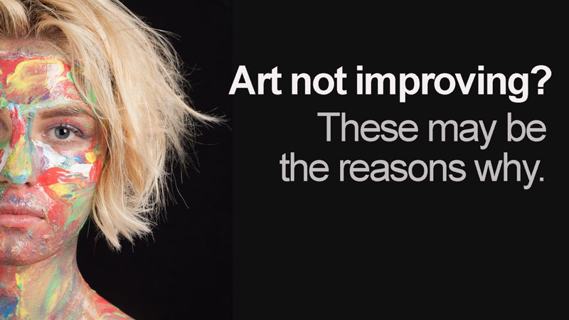
No matter your current skill level, we all want to improve as artists. Some of us are more interested in improving our drawing skills while some of us are more interested in developing our painting skills. We may have a specific medium that we’d like to master or a style that we’d like to develop. Or perhaps, we want to improve upon our artistic voice.
It can be frustrating when we want to see improvement, but it just doesn’t seem to happen. We look at our drawings and paintings and don’t notice any changes.
Frustration starts to eat at us and we begin to believe that maybe this just isn’t for us. We begin to doubt ourselves and before long – we’ve completely pushed our art off to the side.
We make excuses like, “I just don’t have the time for this right now”. Or we may say, “I’d like to do this, but I just don’t have this talent.”
Deep down, we feel bad because we know that we are denying ourselves something that we love. Our “internal compass” is trying to guide us, but like too many other things in life, we make excuses for why we can’t do it.
The truth is that we all have felt this way at some point. It doesn’t matter if you are an absolute beginner or if you’re a seasoned professional – we’ve all felt this resistance. It can be strong and for far too many folks – it is debilitating.
I’ve taught thousands of students over the years and counseled artists of all ages. Over this period, I’ve noticed several commonalities with students that don’t seem to be improving. They express a desire to improve, but it just doesn’t seem to be happening for them.
If you’re struggling to see improvement in your art, read on to see if any of these pitfalls are holding you back.
You’re Not Invested in Your Art
When we have “skin in the game”, we give a bit more of ourselves. When we are invested financially, then we are more likely to see an endeavor through. We have something to lose if we don’t.
We may like free things, but we really don’t value them – no matter how wonderful or life changing they potentially may be.
If improving your art is really important to you, then you must invest in it. Are you serious about improving your skills or are you just a “dabbler”?
Purchase higher quality materials, invest in art courses, and spend some real, quality time studying and practicing.
You’ll never learn how to swim if you just dip your toe in the pool. At some point, you have to jump in.
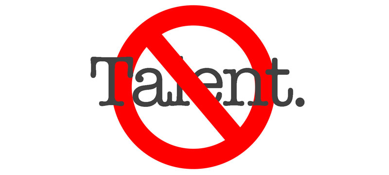
You Think You Have to be Talented
Drawing and painting are skills that can be learned – by anyone. It doesn’t matter your background. It doesn’t matter what anyone has said to you before. If you really want to draw and paint well, then you can – no matter how “talentless” you think you are.
Anyone can learn to read music and play an instrument. Sure, some of us may learn faster and some may have to work a little harder – but we all can do this if we want. Learning how to draw and paint is no different.
We can learn how to see as an artist, practice our skills to improve and eventually become a “master” – if we want. But this only happens if we believe that it’s possible.
If we believe that it takes talent – that you either have or you don’t, then we are likely to make excuses for why we can’t. Instead, we should be looking at all of the reasons why we can. And we ALL can. But – it must start with a belief that you can, not a belief that it takes talent. The way most of think about talent is just wrong.
If you’re willing to work hard, commit to improvement, and believe that it will happen – you will improve.
You Aren’t Being Patient Enough
We have all become accustomed to “instant gratification”. We eat “fast” food. We have an encyclopedia of information at our finger tips. We can communicate with people instantly and share our photos and videos without delay with anyone in the world. All of this is fantastic, but as a side effect, we have begun to believe that all things should happen quickly. We have become impatient.
The most meaningful accomplishments in life happen slowly. They don’t happen quickly. They require a time investment. They require commitment.
Just think about your finest accomplishments – the ones that you are most proud of. I willing to bet that they took time to accomplish. They didn’t happen overnight and they didn’t come easily. If they did, then you wouldn’t be proud of them.
When it comes to drawing and painting, improvement happens slowly. We have “aha” moments along the way, but the real improvement is gradual. Sometimes the improvement is so gradual, that we fail to notice it. And if we fail to notice it then we think that it’s not happening.
Sometimes you just have to “stick to it”. You have to keep going. After a period of time, you’ll look back and see just how far you’ve come. But you’ll only notice this if you stay on the path for long enough.
You’re Expecting Perfection
Perfection is the goal of the artist, while perfectionism is the enemy. No work of art is “perfect”, nor will any be. There are “mistakes” in every piece of art – some that we notice – others that are known only to the artist.
There’s nothing wrong with striving for perfection. But there’s something terribly wrong in believing that you’ll achieve it.
You must allow the mistakes to happen. This is how we grow, and often – it’s how a work of art evolves throughout the process. Each stroke of the pencil or brush is simply a solution to a problem – unique to the work, the subject, and the artist. None of the “solutions” alone are perfect, but as a whole – they engage us and satisfy us.
It’s not about perfection. It’s about how you as an artist presents solutions through the medium that you choose and the subject that you communicate. If you become too wrapped up in perfection and try to craft a perfect “solution” with every stroke, then you may lose what it means to be an artist.
You’re Comparing Yourself to Others
You are unique. Of the billions of people on the planet, there is only one of you. No one thinks exactly like you. No one talks exactly like you and no one can create art exactly like you.
We all learn, make marks, and speak visually in vastly different ways. It’s what makes us unique as artists. We must be careful of comparing ourselves with others because we risk losing what makes us original when we do.
It’s okay to admire the works of others, to study their works and processes. It’s okay to feel pride in what you create and work to develop your skills. But it’s dangerous to compare. Instead of being envious of another’s skill, figure out what makes their work so successful. Study and learn. Then practice and grow. But never lose what makes you unique as an artist.
You’re Not Allowing Yourself to Play
The best creative discoveries happen when our minds are in a state of “play”. We have to create a little room for ideas to grow.
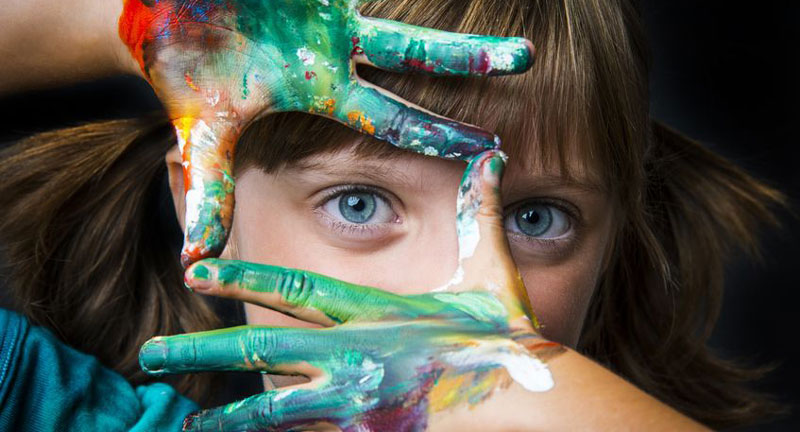 Photo Credit: Copyright: verastuchelova / 123RF Stock Photo
If you’re approaching your art too rigidly or without an element of “fun”, then you’re likely to get frustrated and eventually quit over time. You’re also likely not to find much improvement in your work because you’re looking at it too closely.
Work hard to develop your skills, but make sure that you’re having fun while doing so.
You’re Not Taking Action
Improvement doesn’t happen by watching. It happens through action. We can watch, learn, and gain knowledge but if we never actually put that knowledge into action, then nothing will happen.
We could watch hundreds of basketball games, but if we never go the court and actually play, we’re not going to become good at basketball. Practice is essential.
Art making is no different. We can’t watch time lapse video after time lapse video on YouTube and expect our art to improve. We have to seek out quality instruction and then actually take action to apply what we learn to our own work.
It’s seems so obvious, yet so few actually take action. It doesn’t have to happen all at one time and it certainly won’t. But all action starts with one simple, deliberate step forward.
If so, join over 36,000 others that receive our newsletter with new drawing and painting lessons. Plus, check out three of our course videos and ebooks for free.
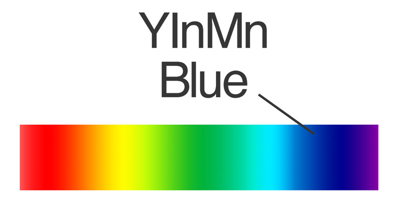
The New Blue – YInMn – A Brilliant Primary is Born
That’s right – YInMin. It’s a new blue, well at least a new pigment. And before you get all excited and run out to the art store to buy a tube, you should know that it’s not commercially available yet as a paint. But it will be. And it should be available very soon.
You may be thinking, a new primary color? Yep, that’s right! A new primary is on the horizon and for artists, it could mean a new world of possibilities are just around the corner.
What Is YInMn Blue and Why is its Name So Strange?
Just like many other discoveries, YInMn Blue was an accident. It was discovered back in 2009 when a student working under the tutelage of chemist Dr. Mas Subramanian at Oregon State University, combined Yttrium, Indium, and Manganese Oxide in a furnace. The result was a brilliant blue that is similar to Ultramarine, but brighter. The researchers weren’t looking for a new color, they just happened to find one.
The name is a combination of the ingredients and my guess is that this name will not be the name that gets used forever. Some have already started calling it the easier to read, “Yin Min” and one company, Derivan, is calling the color “Oregon Blue” in honor of the location in which it was discovered. Crayola has even gotten in on the color naming game by running a contest to a name a new blue crayon inspired by the discovery. If you’ve ever wanted to name a color, here’s your chance. You can cast your vote here.
Why Is This Blue Significant to Artists?
The significance of this new blue is yet to be seen, but there are many promising signs that this new blue could be a big “game changer” – and not just for artists as we’ll discuss in a moment. But first, let’s consider its significance to artists.
To put this discovery in perspective, we must consider that the last time a new blue was discovered was in 1802 when Louis Jacques Thénard discovered Cobalt Blue. This isn’t just a new color either – it’s a primary. This means that it opens the possibilities for a new spectrum of colors that can be mixed.
Let’s take a closer look at this…
The primary colors that we use to mix a secondary color greatly influence the color that results. When it comes to color theory, we know that when we mix blue and red, we get a purple. But when it comes to the science of color mixing, the purple hue that we actually create depends on the primary pigments that we use. So in reality, there is a great number of “purples” that we can create based on the primary pigments that we use to mix them.
For example…
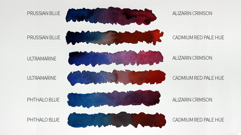
- Prussian Blue (Blue) + Alizarin Crimson (Red) = A specific purple
- Prussian Blue (Blue) + Cadmium Red (Red) = A specific purple
- Ultramarine (Blue) + Alizarin Crimson (Red) = A specific purple
- Ultramarine (Blue) + Cadmium Red (Red) = A specific purple
- Phthalo Blue (Blue) + Alizarin Crimson (Red) = A specific purple
- Phthalo Blue (Blue) + Cadmium Red (Red) = A specific purple
We can see how this looks when watercolors are mixed. The results are six different purples. And keep in mind that this doesn’t include all of the blue pigments and all of the red pigments…
So with a new blue in the mix, so to speak, we potentially get a brand new set of colors that can be mixed from it. That’s a whole lot of new purples and greens.
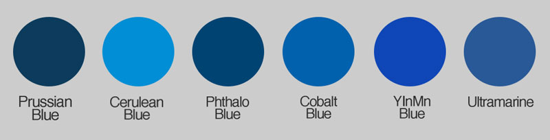
Where Does This New Blue “Fit” with the Other Blues?
YInMn blue is most similar to Ultramarine, but brighter. It’s also close to Cobalt Blue, which some artists prefer to use as their “primary blue”.
All primary colors “lean” warm or cool. This is dependent on their location on the color wheel, although there is some debate when it comes to blue pigments specifically. Blue is considered a cool color and there’s no doubt about this. It is the coolest of the colors.
Some argue that blues closer to red on the color wheel are warmer. This means that the blues that lean towards purple are considered the “warm blues”. Those under this school of thought consider Ultramarine as a warm blue. Since YInMn is close to Ultramarine, then we must also consider it to be a warm blue.
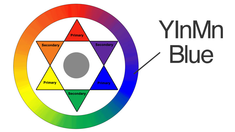
Some folks believe that since the color wheel is simply the color spectrum bent into a circle, we should consider the color spectrum instead. If we do this, then Ultramarine is far away from red. If we look at things this way, then Ultramarine is clearly a cool blue, and therefore the new blue must also be a cool blue.
For other primaries, there isn’t a debate. We can clearly see that Alizarin Crimson is cooler while Cadmium Red is warmer. It’s just blue that gives us fits and causes such discussion (sometimes heated).
I think that we as humans just have a hard time understanding the color blue and its different versions. And when it comes to practical applications, arguing whether a particular blue is warmer or cooler is really not a good use of time. We could better spend that time experimenting with mixes and keeping a record of the results in a color chart, for example.
Other Potential Benefits from the New Blue
YInMn Blue is proving that it may be a superior blue. For starters, the color is showing promising signs of being fade-proof. In comparison, Ultramarine is notorious for fading over time.
In addition to being fade-proof, the color is also very vibrant. In fact, it reflects only blue waves of light, absorbing all traces of red and green. This could mean that this new blue may be the purest blue in existence.
The color is also non-toxic which is in stark contrast to Cobalt Blue, which is toxic if inhaled or ingested.
Another interesting benefit is the color’s heat resistance. This could mean that the color could be used on products that need to stay cool or on roof and car tops.
How Are You Going to Use It?
Although the color is not quite available as a paint, you may already be considering how you’re going to use it. Could it become your new primary blue for mixing? Possibly, but some experimentation is in order and we won’t be able to do that until the color is available in paint tubes. What do you think? Are you excited about this new color? What are your plans for it? I’d love to hear what you think in the comments section below.
Resources
If so, join over 36,000 others that receive our newsletter with new drawing and painting lessons. Plus, check out three of our course videos and ebooks for free.

Pastel Portrait Speed Painting
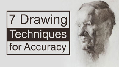
Ensuring Accuracy in a Portrait Drawing
When drawing a portrait, accuracy is of upmost importance. The facial features must be positioned in the correct locations and the relationships or proportions of the those features must also be accurate. While we could draw the subject from pure observation, a quicker and more accurate method involves transferring the reference onto the drawing surface. For this method to work, the photo reference must be the same size as the finished drawing. So transferring the image is not ideal in every situation. Other means to ensure accuracy could be used if transferring the image is not possible.
These methods include:
- The Traditional Grid Technique
- The Triangular Grid Technique
Although not directly tied to portrait drawing, additional methods for ensuring accuracy in a drawing can be found here…7 Drawing Techniques to Ensure Accuracy
For this lesson, we transferred the image using white pastel.
After the basic contours of the image are transferred, the lines are refined through observation. Although this provides us with a nice starting point and ensures a bit of accuracy, we still have to apply pastel applications through pure observation.
Pastel Applications
In this lesson, traditional soft pastels are applied first using various “skin tones”. These initial applications of color provide a base for more refined pastel pencil applications to be applied later in the process. A finger is used to blend the applications, creating smoother transitions of color and value.
After a base of color is in place, the details of the face are refined with pastel pencils. Layered applications of pastel pencils are applied, bringing the features to life.
Only after the face and arms are developed do we move on to the clothing. After establishing a base color for the dress with soft pastels, we can concentrate on the patterns which are addressed with pastel pencils.
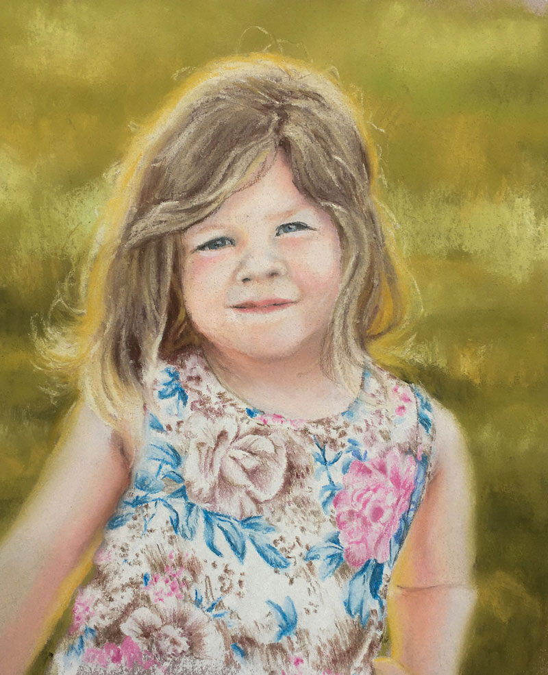
The background is addressed with various greens and yellow-greens allowing for some variance in tone and color. The contrast is increased lower on the picture plane in order to accentuate the illusion of space.
Once the background is in place, the hair of the young girl is addressed. This begins by applying darker tones as a base color with soft pastels. Lighter values are applied over the top to build up the illusion of form and to make the color of the hair match the subject.
Pastel Materials Used in This Lesson
Both traditional soft pastels and pastel pencils are used in this lesson series. Soft pastels are used mainly to provide looser base applications, while pastel pencils are used to refine details. Although sometimes confused, soft pastels differ from oil pastels. Oil pastels have a binder of oil making them similar to a crayon, while soft pastels are powdery and chalky. (Oil pastels and soft pastels actually differ greatly and are not recommended to be used together.)
(Some of the following links are affiliate links which means we earn a small commission if you purchase at no additional cost to you.)
Pastel products and surface used in this series…
A variety of surfaces can be used for pastel applications. The surface chosen is often dependent on the subject and the approach that the artist plans to take. Papers with a heavier tooth (or texture) can accept more layers of pastel applications, but often do so at the sacrifice of smooth transitions of color and detail. Smoother papers are limited as to how many layers of color can be applied, but allow for smoother transitions of color and provide a surface more suitable for details.
Canson Mí Tièntes pastel paper is a versatile paper for pastel artists and is used in this lesson series. One side of the paper is heavily textured, while the other is smoother. Both sides are suitable for multiple layers of applications. (The smoother side of the paper is used in these lessons.)
More on Drawing and Painting with Pastels…
If so, join over 36,000 others that receive our newsletter with new drawing and painting lessons. Plus, check out three of our course videos and ebooks for free.
Charcoal Landscape Live Lesson Excerpts
Materials Used in This Lesson
Charcoal is applied in various forms in this drawing. Vine charcoal is used for the preliminary marks and blended into the surface to create the initial shapes of the forest. These initial shapes establish the relationship between the positive and negative space within the scene and help to define the focal point. Vine charcoal is easily blended, erased, and manipulated on the surface.
To increate the contrast and refine the locations of darker value, compressed charcoal is applied. Compressed charcoal is much darker than vine charcoal and is quite a bit harder to erase. A charcoal pencil is also used to draw the branches of the trees and add details.
With any charcoal drawing, erasing plays a role in the mark making. Vine charcoal is easily lifted or erased with a kneaded eraser. This allows the artist to work back and forth between darker and lighter values. Charcoal can be added and lifted until the right tone is found. For areas that require a bit more precision, an eraser pencil is used to remove the charcoal.
Blending stumps are used for blending areas within the drawing. While a finger can be used to smudge the charcoal in larger areas, a blending stump provides more control in areas that are more detailed. This is especially true around the edges of the trees where some variety of tone and texture are required to create the illusion of leaves.
The paper used in this lesson is Canson Mí Tièntes pastel paper. This surface provides a nice texture that accepts multiple charcoal applications.
More on charcoal drawing…
- Charcoal Drawing Lessons
- How to Draw a Portrait with Charcoal
- How to Draw an Old Tree with Charcoal and Sepia Tones
- How to Draw a Bird with Graphite and White Charcoal
A Quick Tip for Using Charcoal
Charcoal as a medium is most related to pastels. However, some folks approach charcoal drawing as they would graphite or colored pencils. Using the medium in this manner can often lead to frustration. While charcoal can be used with great precision, in most circumstances, it’s best to start with loose applications and gradually refine the details as the drawing progresses.
I like to compare charcoal drawing to working with clay. We start with a ball of clay and the more that we work with it in our hands, the more the clay begins to take the form of what we are creating. We start loose with clay and slowly define the details as we work with it. The same is true for charcoal drawing. We can start with broad, loose applications and define the basic shapes and composition with larger areas of tone. As we work the relationships of value, by adding charcoal and removing it with an eraser, we slowly start to develop the details. The details are almost pulled out of the drawing when we approach it this way.
If so, join over 36,000 others that receive our newsletter with new drawing and painting lessons. Plus, check out three of our course videos and ebooks for free.
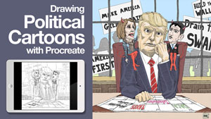
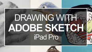
Digital Painting with Procreate
Related: My Experience with Adobe’s Sketch App
I’ve had my iPad Pro and Apple pencil for quite a while but really never invested much time in drawing digitally using this platform. Adobe makes some very powerful apps for drawing and painting on the iPad Pro and I was impressed with what is possible with them.
It was suggested by a friend of mine to check out some of the other options for the iPad Pro and Procreate was highly recommended. I downloaded the program from the App store for a modest $5.99, played around with it for a few minutes and went back to creating traditional art with traditional media.
There the app sat on my iPad for quite a while without much thought. My Apple pencil sat on a shelf in my studio collecting dust.
Even though I consider myself to be a traditional artist, I’ve always had a strong interest in digital drawing and painting. My program of choice has always been Adobe Photoshop. Of course, you have to be tied to a computer and a tablet to draw effectively with this program. However, the results that are possible can mimic that of traditional media when the right brushes are used.
So the thought of being able to create similar results without being bound to a computer is naturally appealing. I didn’t really think that was possible. That is until I really “sunk my teeth” into Procreate.
The app isn’t perfect and there are plenty of benefits for sticking with a computer and a powerful program like Photoshop, but I am impressed with what you can create – especially at such a low price.
Related: Sketching With Photoshop
Like with any traditional drawing or painting medium, it takes some getting used to and a bit of time to find your way around. But I am excited with what possibilities lie ahead for me as I continue to dive deeper into what is possible.
Drawing with The Apple Pencil
The Apple Pencil has the feel of a real pencil. The weight and shape are very similar. Some styluses are light, but the Apple Pencil has a nice weight that balances naturally. While making marks on the smooth surface of an iPad Pro feels much different than a sheet of paper, the responsiveness of the Apple Pencil is not too far behind what I can achieve on my Cintiq. And considering that the Apple Pencil is a fraction of the cost of my Cintiq, this is quite remarkable. (The Apple Pencil is just $99.)
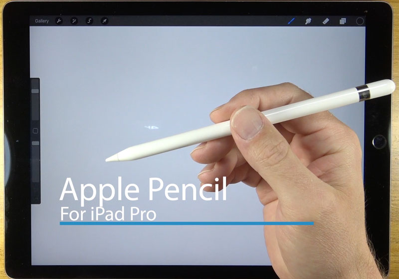
Of course, if you want to use the Apple Pencil, then you’ll also have to have an iPad Pro. This makes the total price for the required equipment quite a bit more. The iPad Pro / Apple Pencil combo though is far cheaper than purchasing a tablet, a capable computer, and Photoshop.
- Buy The Apple Pencil $99 (*Affiliate Link)
The shape of the pencil is round. And while this makes it feel more like a real pencil, it can roll off of surfaces easily. It seems study enough, but I’m sure that a few falls from a table will do more harm than good.
Charging the pencil is quick and mysteriously fast. Just pop the small end off of the end and plug it into the iPad Pro’s port. The pencil charges for 30 minutes of use in just 15 seconds and fully charges in about 7 minutes.
Using Procreate
Procreate is powerful. It is capable of doing most of what a digital artist (or a converted traditional artist) requires. It has clearly been designed with the traditional artist in mind and most of the options are intuitively located. In other words, you don’t have to be “tech savvy” to find success.
That being said, it does take some getting used to. But all drawing and painting mediums, whether they be traditional or digital, require this as well.
Brushes in Procreate
There are a broad variety of brushes available in app. From graphite to pastel and acrylics to watercolor, Procreate has many of the traditional brushes that you would expect. Each of the brushes is fully customizable as well, so you have full control over the mark that the brush produces.

My only complaint is the way the brushes are organized. For example, under the “Painting” header, we find brushes organized based on the shape or texture of the brush, while under the “Artistic” header, we find the painting mediums that we would expect – watercolor, acrylics, gouache, and oils.
The amount of pressure placed on the pencil affects the opacity and with some of the brushes – the thickness of the mark. When using the “Inking” tools, for example, the line becomes much thicker with added pressure. Because the opacity changes based on the pressure, we can create a glazing effect when layering applications. This creates the impression of mixed colors.
Working with Layers
Just like with Photoshop, we can work with multiple layers in Procreate. It’s simple to create a new layer as the layer palette is always accessible in the upper right corner.

Having layers makes it easy to experiment. If you don’t like what you’ve created on a specific layer, you can simply delete the layer. If you’re apprehensive about the next section of the painting you’re about to tackle or if you’re unsure about your color choice, just work on a new layer. You can also use the layers as you would expect, creating multiple visual elements that you can move around or edit at any point in the process.
Other Editing Features
Also available are a few basic editing features that most digital artists use frequently. You can easily transform elements on a layer, changing the size or distorting the selection. Using this option makes changes to areas easy without having to redraw or repaint when you see an inconsistency later in the process.

Several adjustments can be applied to layers as well. You can change the opacity of the layer, add a motion blur, change the hue and saturation, or apply a Gaussian blur to name a few.

When you’re done working on the art in Procreate, you can easily export the image in a variety of formats. You can export the file as a PDF, JPEG, PNG or even as Photoshop document. When exported as a PSD (Photoshop document), all of the layers that you created in Procreate are exported as well. So when the file is opened in Photoshop, you can edit the document and all of the layers.
The resolution of the art isn’t compromised when exported. So if you want to print out the image on a traditional surface like watercolor paper, you can!
My Impressions
At this point, I’ve only created two paintings with Procreate and I’ve only spent about 7 hours using the app. These paintings were experimental and allowed me to appreciate what is possible. I’m looking forward to exploring more of the brush options in the future.

This post and video is clearly not a proper tutorial, but rather an introduction. But I do feel that some of you out there may want to see some tutorials using this app – perhaps even a mini-course. If you would, let me know in the comments below. Also, if you’ve used the app before, let me know your impressions.
If so, join over 36,000 others that receive our newsletter with new drawing and painting lessons. Plus, check out three of our course videos and ebooks for free.