It may be a little comforting to know that all of us have felt this frustration before. The yearning to be creative is there, but the inspiration isn’t. The search for ideas just adds to the fire, making the angst to create that much stronger.
But I suggest that it’s not the absence of ideas that is the problem. Instead, it is the harnessing of ideas when they hit at those weird times, in those weird circumstances.
Inspiration for Artworks
Inspiration is a curious thing. It hits at strange times and in strange places (shower, etc.) For most of us, inspiration finds us at times when we can’t act on it. Unfortunately, our brilliant ideas float away from us, never to return, only haunting us knowing that we had a brilliant idea that was lost. Then, when it’s time to be creative, the ideas and inspiration dare not show themselves to us, instead leaving us staring at a blank canvas or sheet of paper in humiliation.

Now, mind you, I may be speaking of my own experiences here, but I’m sure others have felt the same.
So, how do we, as artists combat this phenomenon? How do we lay claim to our brilliant ideas before they leave us? How can we be prepared to create when the time comes and have our inspiration at our finger tips?
Well, the answer is really simple.
Make a List of Your Ideas
We make a list. And more importantly, we keep our list with us everywhere we go. This seems like such a simple solution to a seemingly complex conundrum, but it works.
I keep my list on my smart phone. My phone allows me to quickly vocalize my idea. So on my long commute into work, I can simply pull out my phone and tell it my idea. The idea is then stored in a list, that I can recall when I’m ready to be creative. It’s worked pretty well for me. I now don’t loose ideas (as frequently) as I did before, and I can spend more time creating and producing instead of staring at a blank sheet of paper, or thinking of ideas.
Don’t have a smart phone? Why not pick up a small sketchbook and make notes when ideas come to you? Carry it around with you so you’re prepared when inspiration hits.
Sometimes a simple solution is right under our noses.
If so, join over 36,000 others that receive our newsletter with new drawing and painting lessons. Plus, check out three of our course videos and ebooks for free.
Turn a Photo into a Painting for Free

The name of the website is PyskoPaint.com. It is the creation of Pyskosoft (psykosoft.net), a mighty cool-looking place to work. (By the way, they are hiring.)
The site is not only fun and educational (I’ll get to that part later), but it is also very well-built. A vistor is greeted with the option to paint or watch a short video of the product. A small gallery of created paintings scrolls along the bottom. When the option of “Start Painting” is selected, the loading screen turns your cursor into a make-shift paintbrush.
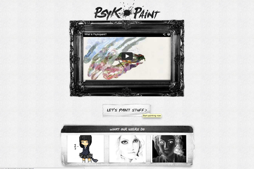
Next, the visitor is allowed to choose to paint or explore. If you choose to explore, a gallery pops up of recent works, with a human hand that holds a card describing the work. It is worth the while to take a look at the gallery, just because how cool it is designed alone. If you choose to paint, you are then asked to choose a photo or use one of your own.
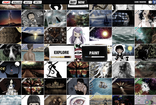
I choose to use a photo from their database, but I will be revisiting the site to make a painting from my own photo stash. When the photo is chosen and the size decided upon, you can get to painting.

This is where the education part comes in. You have the option to choose from different brushes. The brushes are named after the artists whose brush work is similar to the mark made by the program. I opted for the Van Gogh brush, but other options include Seurat, Renoir, and Degas. (This is fun way to introduce students to artistic style.)
After painting over the photo, this is the result I came up with…

What makes this site so cool is the manner in which the paint spreads and blends like real oil paint. Pull your brush over orange into a blue area, and that color is carried over, just like a real painting.
Now for a caution, in order to save the image, you must register. You can register using Facebook, or the traditional way (Username, email). There are a lot of other features to the site, but some of them require building up fake “money”. You can also have your painting printed directly on canvas, but that will cost you a little dough.
This has got to be one of the coolest sites I’ve come across in a while. It’s well worth your time to check it out!
If so, join over 36,000 others that receive our newsletter with new drawing and painting lessons. Plus, check out three of our course videos and ebooks for free.
Sculpting Materials for Beginners

Before we look at sculpting materials, let’s briefly discuss sculpting processes. There are basically two “umbrellas” sculpting processes fall under. These two “umbrellas” are additive processes and subtractive processes.
Additive sculpting processes involve adding materials to “build up” the sculpture, where subtractive processes rely on the removal of the material to “reveal” the sculpture. Additive techniques include modeling and assemblage. Materials typically used for additive processes include clay, wax, and plasticine.
An example of a subtractive processes is carving. Typical materials used for subtractive processes include wood, plaster, and marble.
Obviously, some of these materials may not practical for beginners. So, let’s take a look at a few that are.
Materials for Additive Sculpture Processes
Model Magic – Model Magic is made by Crayola. It is a non-toxic and inexpensive sculpting material that air dries. It can be painted with water-based paints when it is dry. It’s fairly sticky stuff and will adhere to an armature pretty well. Art snobs may turn their nose up at Model Magic, but it’s an interesting sculpting medium that’s perfect for beginners that want to have an experience with modeling without the mess or the expense.
Plasticine Clay – Plasticine clay is colored, oil-based clay. It’s what most of use think of when we think of modeling clay. Because it is oil-based, it will not dry out. Most plasticine clay is labeled as non-toxic, but I wouldn’t recommend using it with smaller children. It’s also pricey. If you are considering a larger sculpture, then plasticine clay may “break the bank”. But for smaller sculptures, maquettes, or just playing around, plasticine may be the way to go.
Polymer Clay – Polymer clay is actually PVC. Liquid is added to make it pliable enough to be formed and shaped. Pigment is added to the clay to give it its color and it comes in a wide variety of them. The more you work the polymer clay, the easier it is to work with.
Small or weak hands may have some problems manipulating this modeling material when they first start working with it. Polymer clay can be baked in the oven to fix it into shape. This makes it a popular material for making small pieces of jewelry. Polymer clay, however is the most expensive modeling material on this list. You are pretty much limited to small sculptures with this material.
Air Dry Clay – There are a few companies that make air dry “clay”. Each of these products vary greatly in quality and price. For children, your best bet may be with Crayola Air Dry Clay. It’s very inexpensive, non-toxic, and can be painted when its dry. For more developed artists, AMACO Marblex Self-Hardening clay may be the way to go. It’s relatively inexpensive and can result in professional results.
Home Made Play Dough – My mom made me homemade play dough all the time growing up and I loved it. It was warm and mushy and she would make it any color that I wanted. It’s incredibly easy to make, non-toxic and fun. But this medium is pretty much for kids and open-minded adults. Don’t expect professional results from homemade play dough. Here’s a recipe.
Materials for Subtractive Sculpture
Soap Sculpture – Soap is a great material for carving. It’s safe and well-very clean. Dull blades can be used and still create good details. Soap is also inexpensive and perfect for a class project. The best part is that the cheaper soaps are better suited for sculpture!
Plaster of Paris – Plaster of Paris is easy to find at most art stores. It’s inexpensive and easy to mix. Pour it into empty paper milk cartons. Peel away the paper after it sets, and you’re ready to create a sculpture. Use a rasp and sand paper to remove the plaster to reveal your sculpture.
Balsa Wood – Balsa wood is soft and pliable. It’s extremely easy to carve. It makes a suitable wood for beginning carvers. Balsa wood can be picked up at most art stores, but larger pieces might have to be special ordered. Balsa wood is not very expensive, but it’s not cheap either. Carving with Balsa wood might not be suitable for younger artists, since sharp knives are recommended for carving.
This list should get the beginning sculptor on their way.
If so, join over 36,000 others that receive our newsletter with new drawing and painting lessons. Plus, check out three of our course videos and ebooks for free.
How to Become a Better Artist
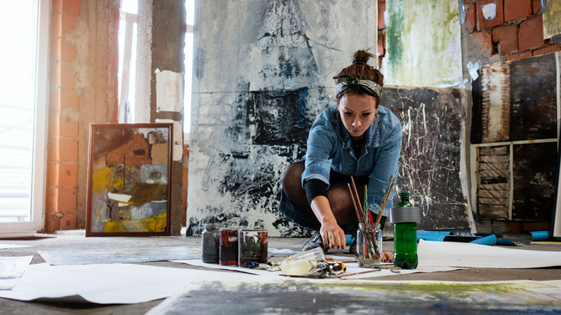
Some of us consider technical skill to be the definition of an artist, while some of us consider the vision or “voice” of the artist to be more important. In order to become a better artist, you need to decide what your definition of a better artist actually is.
Once you’ve determined what’s more important to you, you can focus on practicing and developing what you want to improve upon.
But, let me offer my opinion.
Personally, I think that great artists exhibit mastery over both skill and vision. While technical skill can be taught and developed, artistic voice and vision cannot. Artistic voice comes from within and often separates “artists” from “artisans”.
Many people throughout history have developed amazing skill in drawing or painting but have never received “great artist” status. This, of course doesn’t mean that these individuals weren’t or aren’t great artists.
It just means that they their artistic voice or vision was either not accepted, understood, or was entirely non-existent. So, in my opinion a great artist is able to balance both technical skill while expressing themselves through a clear and unique artistic voice.
I also feel that the path to becoming a great artist is one that demands an open mind. An artist must be willing to make changes. After all, you can’t make things better without changing them. Many aspiring artists are so convinced that their vision and voice is effective, when it just isn’t well received. A great artist is a great communicator.
When the line of communication is broken between the artist and the viewer, the artwork-in my opinion, is a failure. A great artist knows when to make alterations to the way their message is delivered so that their artistic voice can still be heard by their audience.
A great artist also has to have a pioneering spirit. The famous artists throughout history are famous mostly for their contributions that were unique and new and ultimately changed the direction of the art world.
Picasso, for example, is famous for Cubism, while many forget his incredible skill in representational drawing and painting exhibited at an early age. In order to be a great artist and not just a highly skilled artisan, you have to be willing at some point to take a chance with your art. And when that chance is taken, the great artist must be willing to focus on their audience. (Which sometimes means ignoring critics.)
Becoming a better artist ultimately starts with wanting to be a great artist.
If so, join over 36,000 others that receive our newsletter with new drawing and painting lessons. Plus, check out three of our course videos and ebooks for free.
Colored Pencil Product Review – Prismacolor Premier
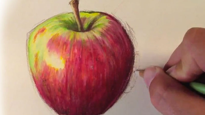
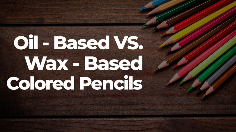
The pencils that we are looking at in this product review are the Premier line of Prismacolor pencils. The Premier line features soft wax much like “B” grades of graphite. The Verithin line of Prismacolor pencils have harder wax and are similar to “H” grades of graphite.
Prismacolor is made by the reputable maker of art accessories, Sanford out of Illinois, USA.
So, let’s take a closer look at the pencil set…
Features:
- Nice tin case for the pencils. (These pencils are so soft, they do need protection from breakage)
- Soft wax pigment easily spreads over different surfaces.
- Waxy pigment can be thinned with solvent and can be painted and spread over the surface.
- Layered colors build up quickly.
- Huge variety of colors that are sold individually.
Cons:
- Pricey – but hey, you get what you pay for.
- These pencils are so soft that sometimes they break internally making the pencil life shorter.
- Can ruin an electric pencil sharpener.
Prismacolor pencils are so soft and behave so much unlike any other colored pencils on the market, that they almost should be their own art medium. They really do elevate the art of drawing with colored pencils.
When used correctly, Prismacolor drawings can take on the appearance of a painting. In fact, once layers are built up, the subsequent layers are added in a manner similar to translucent glazing techniques used in oil painting.
These pencils are so soft and velvety that almost anyone can be successful with them.
Finished drawings in Prismacolor pencils are vibrant and bright. Most of the colors are lightfast, but a few are not. If you’re worried about the lightfastness, Prismacolor makes a set that features only its lightfast colors.
So, let’s take a look at the pencil in action…
If so, join over 36,000 others that receive our newsletter with new drawing and painting lessons. Plus, check out three of our course videos and ebooks for free.
The Technology Divide in Education

There is a divide among most in education and the world of technology. If this divide is not narrowed, traditional education will undoubtedly suffer.
When you speak to some (often those that make decisions about education) about technology, you will most likely hear about PowerPoints or perhaps document cameras. True, these are uses of technology in a classroom, but these technologies are already becoming antiquated. Additionally, these technologies only make a teacher’s presentations more appealing.
They do little to really prepare students for a world dominated by the actual use of technology. This is where we need to be focused as educators if we are truly preparing students for the 21st Century (again the majority of these students’ lives have been lived in the 21st Century, some entirely in the 21st Century).
Some teachers and districts have recognized this and are taking steps to really change the way information is consumed in the classroom. Unfortunately though, many are not.
Technology changes, it seems, overnight. It is a daunting task to stay on top of it. But we, as educators, owe it to our students and communities to stay on top it. We actually need to stay ahead of it, if we are to succeed in educating this generation of students. We need to do more than just make PowerPoints and use document cameras in our classrooms.
We need to use or develop ways to help our students consume information in school in the same way that they consume information out of school.
So how do our students consume information? Apps, tablets, and interactivity.
Apple has already taken a giant leap in the direction of preparing students with the iBooks textbook program. In this program, anyone can design an interactive textbook for the iPad. Teachers can use this, design an interactive textbook for their class and give it away to students. The limitation here, of course, is that every student needs to have an iPad. But despite the limitation, it is a step in the right direction.
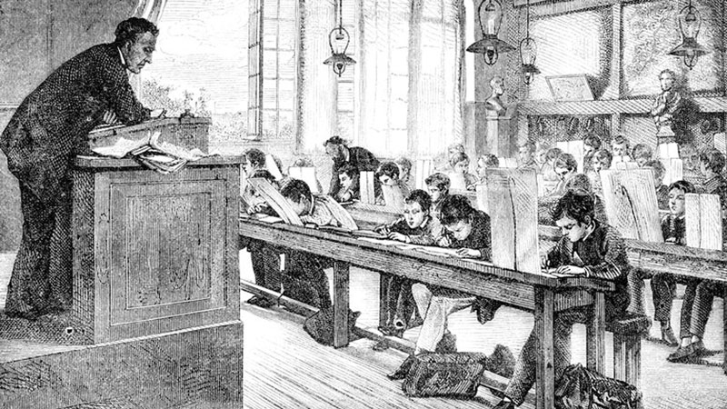
Teachers need to be innovators here. We need more programs like this. Workshops in school districts should focus on app development, interactive textbook design, and web design. We need to prepare our teachers to teach the way that students learn. The old way of standing up in front of a crowded class and speaking is inefficient.
If so, join over 36,000 others that receive our newsletter with new drawing and painting lessons. Plus, check out three of our course videos and ebooks for free.
101 Drawing Ideas for Your Sketchbook
I decided to do some of the brainstorming for you and create a list of 101 drawing ideas that you can include in your sketchbook or turn in to finished works. The items on this list are meant to challenge you a bit, but can still be completed in a short amount of time – making them perfect subjects.
Remember, we can always use the ideas that we conceive in our sketchbooks and turn them into finished works of art. A sketchbook is great place to practice, but it’s also a great place to plan and find some inspiration.

We’ll begin with the easy subjects. Defining what’s considered easy will be different for everyone. It all depends on how much time and effort you want to put into your work. These items are considered “easy” simply because the shapes used to sketch them are rather simple.
Here’s a list of easy drawing ideas…
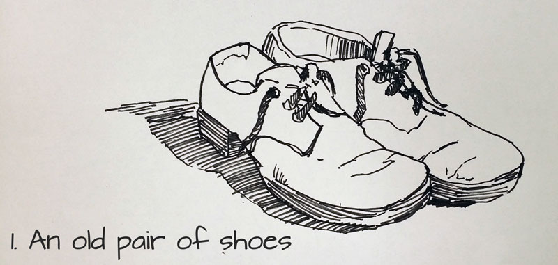
- An old pair of shoes – Look no further than your closet to find a weathered pair of shoes – the older the better.
- A stack of books – Find some old books lying around and stack them up. Try to configure them in an interesting way.
- An open book – Now take one of those books and open it. Sketch it from an interesting angle.
- Wine bottles – A classic subject. Look for an interesting label for an additional challenge.
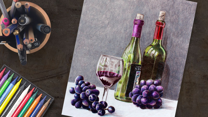
- A wine bottle cork – Does that wine bottle have a cork? Use that too as a separate exercise.
- A stapler – A stapler is made up of simple shapes that are very easy to draw. Once the shapes are in place, then it’s just a matter of adding the details.
- Several eggs on a table – Line up a few white eggs allowing them to overlap. When you look at the eggs, pay close attention to the gradual changes in tone and shade accordingly.
- A hammer – Tools make great subjects for drawings. A hammer is rather simple and should be fairly easy to pull off.
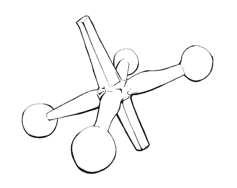
- Game pieces – Pull out a board game and check out the pieces. Some of them may make a nice subject for sketching.
- Sea shells – You may find some inspiration in the form of a sea shell.
- Objects in your pocket – Got stuff in your pocket? Pull it out and sketch it.
- A thumb drive – Like the stapler, a thumb drive is made of simple shapes.
- Children’s toys – Most toys are designed with simple forms, making them an easy subject. Plus, most are brightly colored.
- Fruits – Fruits are great subjects for practice. Any fruit will do – a pear, a banana, or a strawberry. For an added challenge, slice it open.
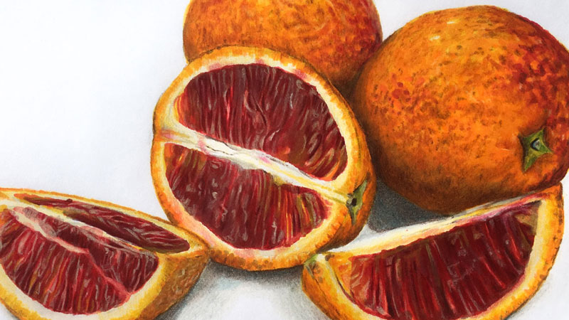
- An apple – Okay, I know an apple is a fruit but apples are great subjects for exploring different mediums. Try the same apple with colored pencils, pastels, graphite etc. This lesson may help you – how to draw an apple with pastels.
- Vegetables – Just like fruits, vegetables are great for sketching practice as well.

- Candy – When it comes to food, you don’t have to just stick with the stuff that’s good for you. Here’s a lesson that may give you some inspiration – how to draw a piece of candy.
- Items in your refrigerator – Close your eyes and reach in. Use whatever you pull out.
- A pair of socks – Find a pair that’s clean please.
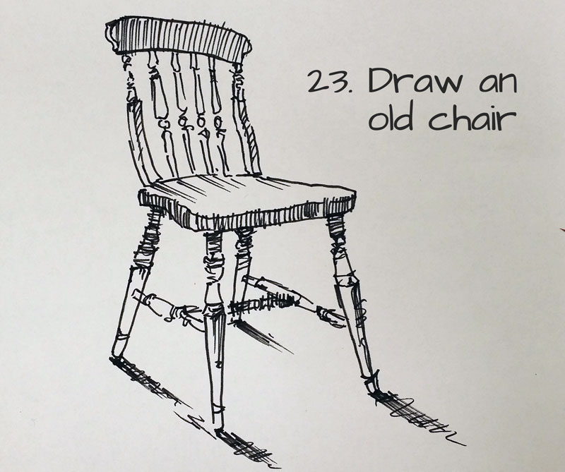
- An old chair – A chair may seem complex, but it’s really just a few simple forms pieced together.
- A doorknob – This is a more of a challenge than you may think. Pay attention to the changes in value.
- A video game controller – Even everyday items like this make great subjects for your sketchbook.

Sometimes you want to practice, but there just isn’t a suitable subject to work from life. That’s when it’s time to look to your imagination for inspiration.
I should point out that the best way to get better at drawing from your imagination is to spend a good amount of time working from observation. When you practice working from observation, you learn how to translate what you see into a work of art.
When you’re working from imagination, you have to rely on what you’ve learned from your observational practice.
Here’s a list of drawing ideas when working from imagination…
- A person from history without a photo reference – Imagine what a person from ancient history would have looked like and sketch your vision.
- A scene from history – Think back to some of the events in the history of the world and envision the scene as if you were there.
- A person peeling off their skin – Make this one as gory as you like or make it funny – let your imagination go where it likes.
- Design a typeface – Design a few letters and try to create a brand new font.
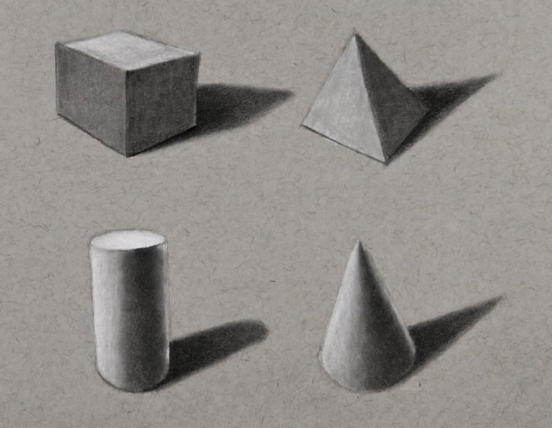
- Simple forms – Imagine a small still life made of cubes, cones, spheres, etc. Think about the light source and keep it consistent. Here’s a lesson that may help you – how to draw basic forms.
- A Cubist portrait – How would Picasso interpret someone that you know?
- Yourself as a cartoon – What would you look like if you were a cartoon?
- A fictional woodland character – Draw a woodland creature that doesn’t actually exist.
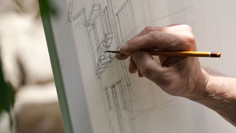
If you want to get better at anything, then you have to challenge yourself. If you spend all your time sketching things that come easy for you, then you won’t see much improvement. We have to tackle some of those subjects that may seem difficult. In many cases, the subjects aren’t quite as difficult as we think they are. But we only discover this if we take on the challenge.
Here’s a list of ideas designed to challenge…
- A glass of water – Reflection and transparency are some of the hardest things to master. Here’s a lesson that will help you out – how to draw a glass of water.
- A pile of unfolded laundry – Folds and values galore. Throw those clothes up in the air and draw them how they land.
- Use with your non-dominant hand – If you’re right-handed, sketch an object with your left hand.
- A scene in a restaurant – Most restaurants are fairly dark so noticing the values will be a challenge. Set up in the corner and start sketching.
- Your hands – There’s a great subject waiting for you at the end of your arm. You always have it with you, so there’s no excuse here. Here’s a lesson that may help you out – how to draw hands.
- Your art supplies – Brushes, paint tubes, etc. are also great subjects for practice.
- A person laying down – You can always sneak up to someone sleeping to pull this one off.
- A person sitting in a chair – Grab a friend to pose for you.
- Different types of trees – Get outside with your sketchbook and find a nice shady spot. Here’s a lesson that may help you out – how to sketch trees.

- A caricature of yourself – This one is a little different from drawing yourself as a cartoon. You’re going to need a mirror.
- The same object with different techniques (hatching, cross hatching, stippling, etc.)
- Your favorite pet – If you haven’t got a pet, then here’s a good reason to get one.
- A copy of your favorite master’s painting – What artists inspire you? Find one of their artworks and make a sketchy copy.
- A crumpled piece of paper – What a great challenge! Look closely for all of the tonal changes. This one is sure to help improve your shading skills.
- A brown paper bag – Think the crumpled piece of paper was a challenge? This one is even tougher!
- An old person’s face – Find an image of an older person that you know. All of those wrinkles should be a challenge, but oh what character and interest!
- An old radio – Only if you can find one.
- An old car – I’m talking really old here. If you see one out in a field – even better. Take photos whenever you come across a subject that may make a great piece of art.

- An old camera – And speaking of photos, why not an old camera? The buttons, ellipses, and text should give you a nice challenge.
- A pair of glasses – Just like the glass of water, there’s plenty of reflection and transparency here.
- A bicycle – The circles, spokes, handle bars etc. make this a classic subject for your sketchbook.
- Anything made out of metal – Metal objects are usually reflective and present their own set of challenging textures.
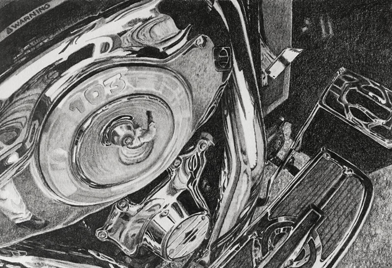
- Tree bark up close – All of those wonderful textures!
- Ocean waves – Anything in constant motion is going to be a challenge. You might want to work from a photo on this one. Here’s a lesson that may be helpful – how to paint waves.
- A pile of rocks – Look for the basic shapes first and then add the values and textures.
- A cup of pencils – Put at least three pencils in a cup and start sketching.
- A reel mower – Now this is tough one – but first you have to find one. Take your time and try to be as accurate as possible.
- A pine cone – A simple object from nature with all kinds of complexity.
- Your favorite sea creature – What’s your favorite creature that lives in the deep? Here’s a lesson that may help you out – octopus with ink and watercolor.

- An old cabin – Work on your linear perspective skills and draw an old cabin.
- An old factory – If you live in the city, grab your sketchbook and venture out in search of an old factory. Try to capture the years of aging.
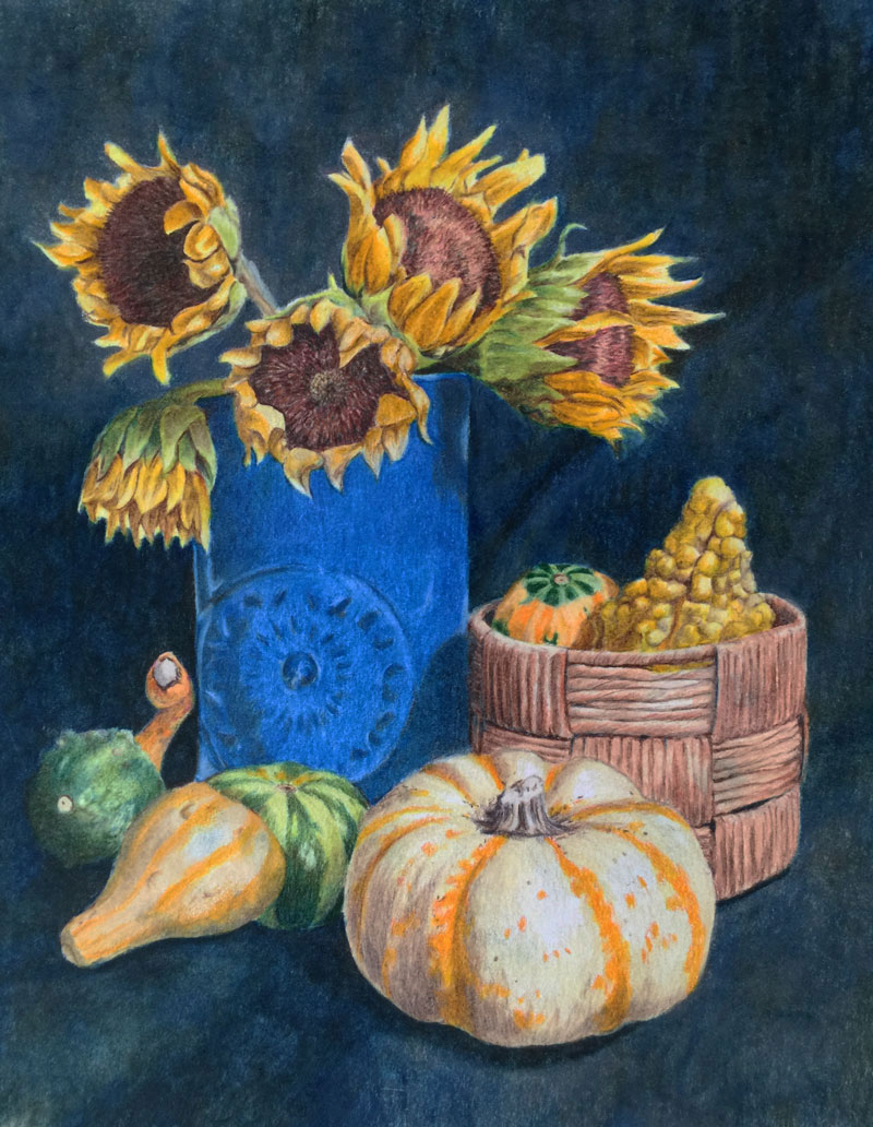
- Flowers in a vase – Another classic subject for practice.
- Old farm equipment – Much like the old car idea, old farm equipment is often weathered by the elements and features wonderful textures.
- A sailboat – If seascapes are your thing, then why not include a sailboat. Here’s a lesson that may help you out – how to draw sailboats with mixed media.

- People standing in a line – The human figure is the quickest way to improve your skills. The human figure is perhaps the most complex subject out there.
- A bowl of peanuts – Any repetitive subject will prove to be challenge. Why not start by with a bowl of peanuts?
- A bowl of nails – Peanuts too easy for you? Try drawing nails.
- A bowl of popcorn – Nails too easy for you? How about a bowl of popcorn?
- Bushes or shrubbery – Bring me a shrubbery!
- Your favorite insect – Insects are quite complex. Even the most simple insects are more complex than they seem. Here’s a lesson that may help you – how to draw a beetle.
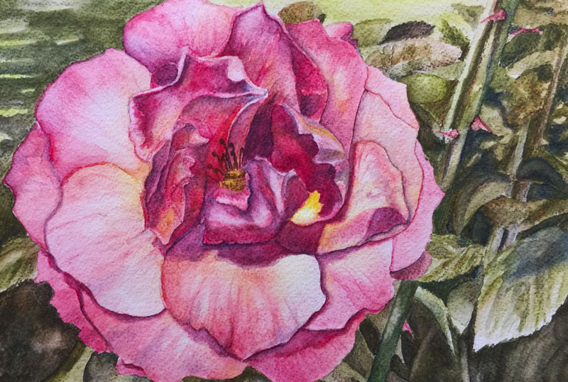
- A flower up close – Once you’ve drawn a vase full of flowers, pick one out and sketch it from the perspective of a bee. Here’s a lesson on this subject – how to draw a rose.
- An exotic fish – Well, any fish really. Here’s a lesson – fish with pen and ink.

- A feather – Light in weight, but heavy in challenge. Sketch a feather as realistically as possible. Here’s a lesson on this subject – how to draw a feather.
- Any detailed machine – Machines these days have become more sleek in their design. If you want a real challenge, think in terms of an old typewriter. An antique shop is a great place to look for inspiration like this.
- The insides of a watch or clock – Sticking with the detailed machine theme, perhaps you have an old watch you can pop open.
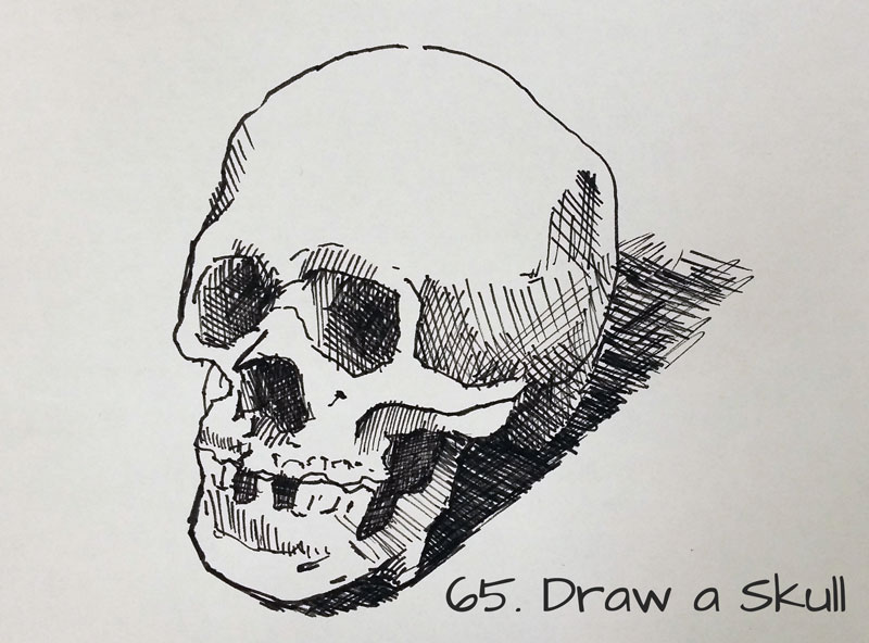
- A skull – When it comes to portraits, you must have a strong understanding of the structure of the head. A great place to start is with a skull. Here’s a timed sketching exercise on this subject – how to sketch a skull in 30 minutes.
- A portrait of someone that is a different race from you – This one is self-explanatory.
- Water coming from the faucet – A moving subject is always a challenge.
- A creek in the woods – Be sure to include the elements that surround it as well like perhaps a grassy bank.
- An object that is moving – This can be anything that moves like a motorcycle, airplane, or car. Try to draw it from observation without the aid of a photo.
- A view from a window – Look outside, there’s lots to see out there.
- A candle in the dark – The key to being successful with this idea is all in the value. Try to create a lot of contrast.
- A set of keys – This subject may see rather easy, but it’s more complex than you think.
- Your hand holding an apple (or other object) – The way we approach hands changes dramatically when we put objects in them.
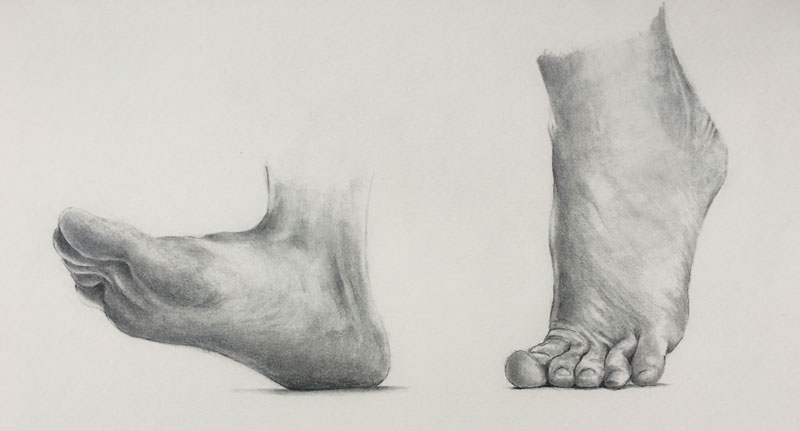
- Your feet – They’re easier than you think, but if you need a little help, check out this lesson – how to draw feet.
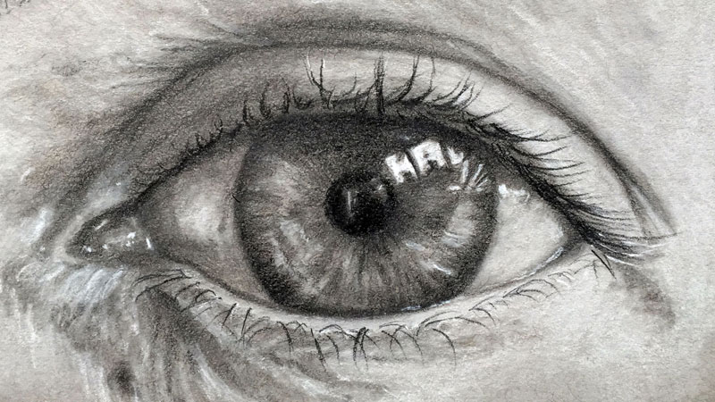
- A close up of grass – Why not try this one with colored pencils or another colored medium.
- An object three times in different lighting – Set up a still life with only one object. Sketch the object three times, changing the direction of the light source each time.
- A pile of jewelry – Make sure that you own it.
- Someone’s hair – Leave the spaghetti for dinner. Hair as a form, not a collection of lines. Here’s a lesson – how to sketch hair.
- A bird in flight – Might want to use a photo for this one. Here’s a little help – how to draw a bird.
- A pile of yarn – Talk about a challenge!
- A stack of dinner plates – This is another idea that may seem easy at first, but once you start dealing with all of the ellipses, the challenge is realized.
- A trompe l’oeil image – Trompe l’oeil images are designed to fool the eye in believing that what you see is real and not part of an artwork.

- Hung drapery – Take a sheet and hang it from a door or wall and set up a strong light source. Get lost in all of the folds.
- A water sprinkler – As an added challenge, sketch it with water coming out.
- Water that is reflective – The key here is the elements around the water. They should be reflected in your image.
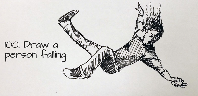
- A person falling – This one is really better suited under the imagination section, but it’s also a wonderful challenge!
- Just sketch something!
Deciding What to Draw
Hopefully you’re now filled with inspiration and you’re ready to get started. Each of these subjects have been carefully thought out and were chosen for specific ways that they’ll help improve your skills. So you may be wondering, which of these should you tackle first. This will depend on where you are currently in your artistic journey. We’re all at different skill levels.
I may suggest making a game out of your sketching practice. Why not think of these suggestions in terms of a scavenger hunt? Instead of just picking a few, why not tackle them all. Grab a sketchbook with at least 100 pages and draw each idea one by one until you’ve filled it up completely. Then compare your first sketch to your last. You’ll notice a huge difference. You will be get better over time.
More Places to Find Ideas for Drawing
So maybe you’ve scanned the list here and you don’t see anything that appeals to you. Maybe some of the subjects sound too difficult or perhaps you’ve already drawn them before and you don’t want to revisit them. (Revisiting subjects is not always a bad thing. Sometimes, when you revisit a subject for the second time, you find that you’re more successful.)
Fortunately, there are other places to look for drawing inspiration other than this list you may have just stumbled upon. Here are a few more places to look for inspiration and activities that may spark your creativity…
Go For A Walk and Get Ideas

When we explore a bit and move our bodies, an interesting thing happens. Sometimes the act of moving around opens our mind up to new ideas. Perhaps it has something to do with blood flow. You may have seen how people pace back and forth while involved in a moment of deep thinking. Moving helps our minds to work. When you’re trying to come up with new inspiration, try moving around a bit.
It also helps to change our environment. It’s great to get outside and take a look around. This also helps to get our creative juices flowing. I often get my best ideas when I’m out on a jog or just walking around the neighborhood.
Going for walk does two things for us. It changes our environment and also gets us moving.
Look At Other Drawings – Get Inspired By Other Artists

Another great place to be inspired is by looking at art produced by other artists. Sometimes it’s hard to imagine what a finished work of art will look like by simply searching for photo references. The “magic” in a finished artwork is often the result of the artistic decisions that are made during the drawing process. By looking at art produced by someone else, we can get inspired. We may begin to envision what our art would look like if we were to emulate their style or use the same medium. Sometimes this is just the extra push that we need to get started.
The internet is a wonderful resource, but looking at art in a physical book or better yet – a gallery or museum is the best option.
Listen to Music Without Lyrics to Get More Ideas
Some people are inspired by other forms of art outside the realm of visual art. Music can be a great source of inspiration and may give you some ideas for your drawings. I’ve found that music that has lyrics is often too literal and is less inspirational. But music without lyrics allows you to paint a scene in your mind and may lead to more than just a quick sketch. You may find that the right music gives you an idea that you can build on and you end up creating a work that is well beyond a simple sketch.
If so, join over 36,000 others that receive our newsletter with new drawing and painting lessons. Plus, check out three of our course videos and ebooks for free.
Learn 3D Computer Animation for Free

The first thing that keeps us from using and learning 3D animation software is money. Professional 3D animation programs like Autodesk’s Maya or NewTek’s Lightwave are expensive. These programs can cost thousands of dollars to purchase, not to mention the cost of the hardware that is takes to run the software.
Who wants to drop thousands of dollars on software that you don’t even know how to use? Especially, considering that the learning curve with these programs is pretty high.
The second thing that usually keeps us from using 3D animation software is the learning curve. Because of all of the options within a 3D animation program, the interface can be quite intimidating. Most of us don’t want to waste time poking around to figure out how to use a program. Instead, we simply want someone to instruct us on the basics.
Most people incorrectly believe that in order to learn a 3D animation program, you need to attend a school for that. This may have been true in the past, but this belief is changing.
So, where can you get 3D animation software for cheap and learn how to use it?
Well, instead of cheap, how about free?
Blender 3D is a free 3D animation program that is surprisingly powerful. It has come quite a long way in the past few years and is now starting to be a real competitor with the expensive big boys. And since Blender has a huge community and open source support, the sky really is the limit.
Best of all, Blender.org is totally supportive to teaching people their program. You can be “blending” in no time by visiting the site and taking a look at several of the tutorials. Blender 3D is also great for teachers on tight budgets that want their students to experience 3D animation.
Check out the video below to see just what is possible in Blender 3D…
If so, join over 36,000 others that receive our newsletter with new drawing and painting lessons. Plus, check out three of our course videos and ebooks for free.


