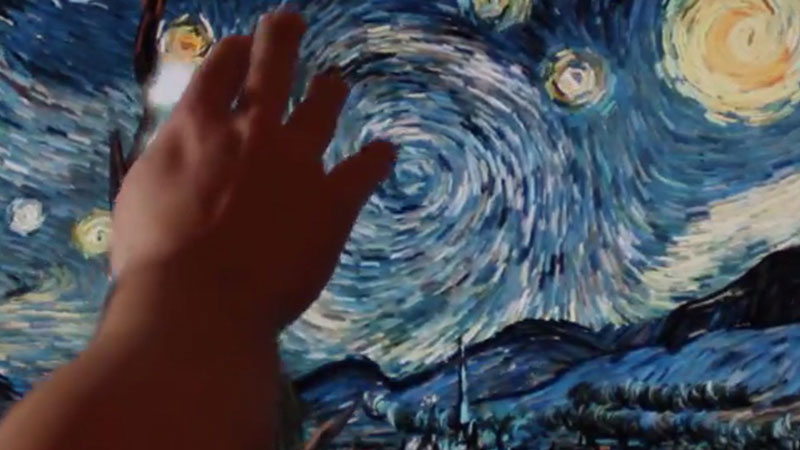
Van Gogh definitely falls into the category of an artist that used brushstrokes to convey movement in his art. The large directional brushstrokes forces your eye to follow patterns, while at the same time coveys the feeling of physical movement in the artwork.
Teaching this concept to students can, at times, be difficult. Recently, however, a Greek Digital artist, Petros Vrellis has made teaching this concept a bit easier with his interactive Starry Night.
His creation is a fully interactive digital version of Van Gogh’s famous work. When someone runs their hand or fingers over the surface, the digital interface reacts, producing a change in sounds and brushstrokes. The painting then returns to its original state, but the brushstrokes continue to swirl in the direction that were painted by Van Gogh. The painting literally moves, helping students to actually see the movement inherent in Van Gogh’s brushstrokes.
So, how does this work? Well, the short answer is probably with some complicated coding. For more information about the technical aspects involved visit creativeapplications.net
If so, join over 36,000 others that receive our newsletter with new drawing and painting lessons. Plus, check out three of our course videos and ebooks for free.
Think Like a Sculptor to Improve Drawing
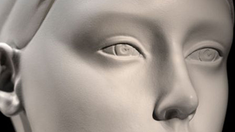
When we are able to put these basic forms together to create the illusion of an object, our drawing improves. In fact, better drawing skills come from understanding the structure of the objects that we are drawing.
Sculptors must understand the objects that they are emulating in order to create a representational sculpture. They must understand the forms, create the forms and then mold the forms further. Drawing is similar to sculpture in many ways, but two similarities stick out to me…
1. Sculptors that use modeling techniques start loosely – Modeling is a sculpture technique in which soft, pliable material is molded into shape. Clay hand-building is an example of modeling. Sculptors that use this technique start with very loose forms and slowly form them into the finished sculpture. Successful drawing often mimics this technique. We may start with loose lines designed to “find” the shape. Once the shape is defined, it is modeled using value until the final illusion of form is achieved.
2. Sculptors put simple forms together to create the finished, more complex sculpture – The second similarity between drawing and sculpture can found in how these two types of artists approach the creation of the artwork.
Sculptors observe and find the forms of the object that they are sculpting and then create forms to mimic what they observe. When drawing, we do the same.
We find the shapes and then draw the shapes that we see. When we are successful in putting the shapes together, we are successful with our drawings.
Take a look at the following video and watch how the sculptor does these things. She starts with loose forms, then adds to them to create the finished, well-developed sculpture. Think like a sculptor when drawing, and your drawing skills will improve.
If so, join over 36,000 others that receive our newsletter with new drawing and painting lessons. Plus, check out three of our course videos and ebooks for free.
Color Wheel Chart for Values
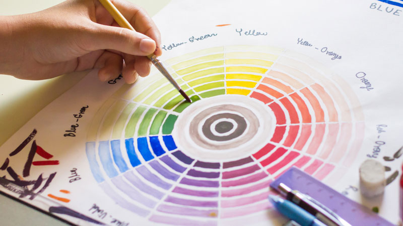
You must also understand practical applications of using color theory in your artworks and designs. Seldom are colors used as their pure hue. Most often, color combinations or color schemes, implore a variety of values and intensities of the colors used. For example, if you were to use a complementary color scheme of red and green, you might use pink and a darker green. Pink, you’ll recall is really the color red- a tint of red.
It seems that beginning artists really struggle with this concept. It is hard for them to separate color and value. And understand that although related, color and value are different.
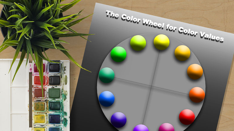
To better help my students understand the relationship between color and value, I decided to create a color wheel chart that demonstrates different values.
I put each range of value for each specific color at its native location on the color wheel. This helped the students to see the color but also understand that each color also has a range of value.
To see some of the other color wheel charts I created, visit color wheel charts for teacher and students.

Feel free to download this color wheel chart and use it for yourself or with your students. (Just click on the image, then right click, save as.)
If so, join over 36,000 others that receive our newsletter with new drawing and painting lessons. Plus, check out three of our course videos and ebooks for free.
The Expressive Qualities of Line
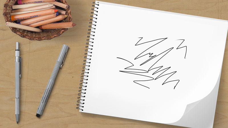
These types of lines are called contour lines, but most commonly called “outlines”. Line can also convey movement either through repetition or by showing lines coming off of the surface of an object that is moving. Line can also create the illusion of form through hatching or cross hatching.
I could go on and on about the varied uses of line. I want to address one of the most overlooked uses of line. Line’s ability to be expressive Line is perhaps one of the most expressive elements of art. Color, of course is important as well.
We can prove line’s ability to communicate expression with a simple game. If you are teacher, this a great way to make a point about the expressive qualities of line. (Don’t look ahead to the drawings at the bottom of the page.)
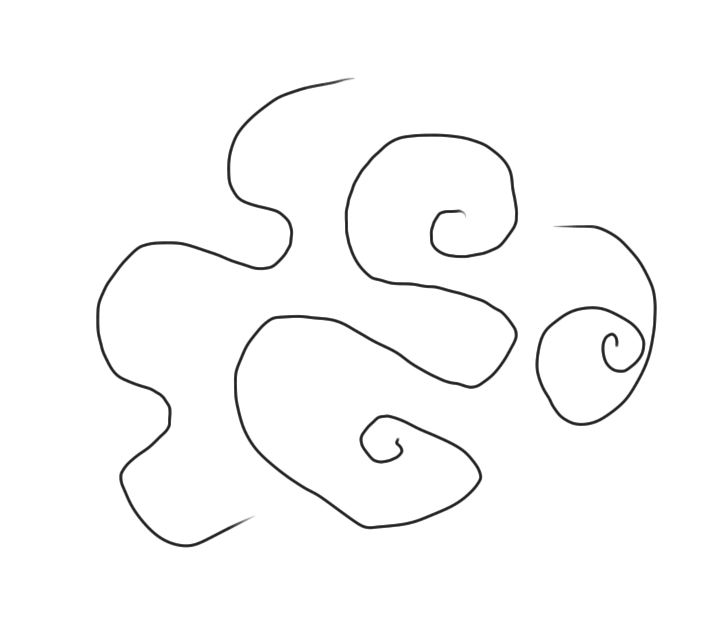
Here’s how the game works. Begin with a “happy line”. Just draw a line on your paper that you think would be happy. Not a happy face, mind you, but a “happy line”. Now put that paper to the side.
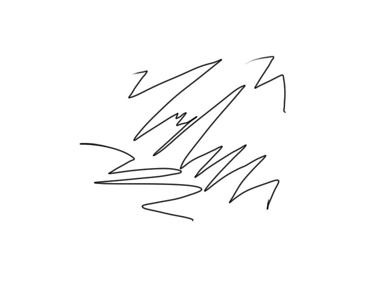
Next, draw an “angry line”. Just envision that the line you are drawing is really mad about something. What would it look like? Now put that drawing to the side.
The last line you should draw is a “confused line”. What would a line look like if it was confused?
Expressive Line Examples…
Now, let’s discuss the results.
Look at your “happy line”. It is likely that your “happy line” has some type of curve in it. In fact it may be a complete curve, spiral, or circle. We associate curves or rounded lines with happiness. So, it makes sense to include curved lines in your drawings, paintings, or designs in which you want to express happiness.
Now, let’s take a look at the “angry line”. It is likely that your “angry line” has some type of jagged mark in it. Changing directions abruptly, like in the case of a jagged line, can communicate the sense of anger. Therefore, if you are trying to communicate anger in a work, it makes sense to include jagged lines.
Lastly, let’s take a look at the “confused line”. Here we tend to see the widest variety of interpretations, but often the “confused line” will include as many different lines as the artist can imagine. It may include a curve, a jagged line, spirals, light marks and dark marks. Very simply, it will include a broad variety.
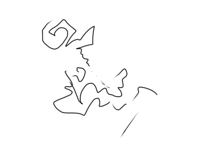
So, we can safely conclude that line is much more that a device used to indicate where an object ends. It is also expressive. And when used intelligently and creatively, it can really spice up our artwork.
If so, join over 36,000 others that receive our newsletter with new drawing and painting lessons. Plus, check out three of our course videos and ebooks for free.
Art Education-Process vs. Product

The Debate
There is debate among art teachers as to whether or not process or product is more important in art education. In this case, process refers to the learning that takes place during an assignment or lesson. Product refers to the actual artifact that is produced. Of course, both of these are essential in art education.
Some teachers feel that one should take precedence over the other. So where should the focus be in the lessons that you present to students? Should you focus on process or product?
In my opinion, it should be both. Introductory levels should be focused on process while upper levels may focus more on product. You see, if you are effective in your lessons that focus on process, then the product will follow.
Teaching is like Coaching
In some ways teaching art is like coaching a sport. Let’s take basketball as an example. If you were coaching a beginning level basketball team, you would not focus totally on winning. Instead, you would focus your team on learning and developing. Winning would just be a plus.
It would be absurd to go out to each game and put pressure on young athletes to win when they are brand new to the sport. Not many little league basketball programs emphasize winning, and if they do, then they are probably bad programs for kids. The old saying goes, “It doesn’t matter if you win or lose, it’s how you play the game.”
At the beginning levels, art is the same way. You shouldn’t expect beginning students to create masterpieces. It’s just not going to happen. You shouldn’t focus your instruction on product at the beginning levels. Instead your focus should be on process.
How are your students learning? Are they progressing? How can you make them better? If your focus is on process at the beginning levels, then the end product at the advanced levels will be better, maybe even amazing. In fact, I’ve seen this play out in my own classes.
So when do you focus on product? Well, the answer to this can be tricky.
The Product Results from the Product
As art educators, we should be educating our students. They should be learning from us. So-to be fair, we should never focus on product, because the product naturally follows when the art instruction is quality.
Don’t misunderstand me, product is important. It is important as an indicator of what is being learned. When the product is quality across an entire class, you know that you have done your job as an art educator. The students have learned in the process and as a result created a great product.
It is really our job to help students know how to get to the quality product.
Let’s look at the basketball coach analogy in relation to advanced art students. These students may have developed skills just like a more developed basketball team may have. The focus of the basketball team is now on winning. But what is the job of the coach?
Isn’t it still the coach’s job to teach and show the team how to win?
Even though the focus has changed, the job of the coach remains the same. The same is true of the art educator at the advanced level. The focus of the assignment may be on the product, but the focus of the teacher remains on the process.
There are many ways to teach art effectively. This is just my opinion on process vs. product. What do you think?
If so, join over 36,000 others that receive our newsletter with new drawing and painting lessons. Plus, check out three of our course videos and ebooks for free.
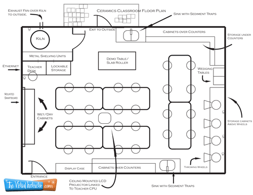
Ceramics Classroom Floor Plan
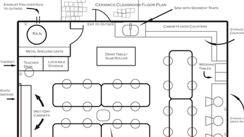
- Where will your students work?
- How will they work?
- Where and how will lessons be presented/ demonstrated?
- Where will the materials be stored?
- Where will the projects be stored?
- How will the students clean up?
- How will the computers be positioned?
- Is there enough power?
- Can the students escape the room quickly and orderly in case of an emergency?
These are just a few of the critical questions that need to be asked and answered as you design your plans.
It is always a good idea to make a plan of your classroom. Floor plans are easy to draw and can go a long way to creating an effective classroom layout. When you draw a floor plan of your classroom, consider the essential functions of the classroom and provide a place for everything that you will need. Include the dimensions of the furniture that you will using in your classroom, if that information is available. Below you will find a sample floor plan that I created for a ceramics classroom…
If so, join over 36,000 others that receive our newsletter with new drawing and painting lessons. Plus, check out three of our course videos and ebooks for free.
How to Grade Artwork

He simply replied, “I use the stair technique.”
When asked what the stair technique was he said, “I find a flight of stairs and assign each stair a letter grade. The bottom stair might be an “F”, the next stair up, a “D”. The next stair up may be a “C”, then “B”, and the highest stair- an “A”. I then take all of the student artwork, and while standing on the flight of stairs, I throw them into the air. Whichever stair the artwork lands on is the grade the student receives.”
Sometimes grading artwork can feel like this when there is not a standard procedure in place.
Grading artwork has traditionally been a subjective activity. This can cause problems for art teachers, especially when questions arise about where the grade came from. Opinion sometimes creeps into the art teacher’s grading process and as you can imagine, wreak havoc on a student’s grade.
This should never be the case. Grading artwork doesn’t have to be subjective. Students should have a clear idea where the grade has originated from and understand completely why they received that particular grade for the assignment.
So how do we give students a clear idea of where their grade will come from in art? The first answer is simple. We provide a clear rubric. A rubric is essentially a guide that explains the requirements to receive a certain grade. For example, an “A” project may meet more requirements than a “C” project.
In a rubric, the requirements are clearly spelled out. That way when grading time comes, there is no question as to why a student received a “C” instead of an “A”. Rubrics are pointless unless they are given to a student before the project begins. This way, the student is clear on what is required to make the grade that they desire from the start.
In my opinion, rubrics should should be specific for each project assigned. Click here for a look at a generic rubric
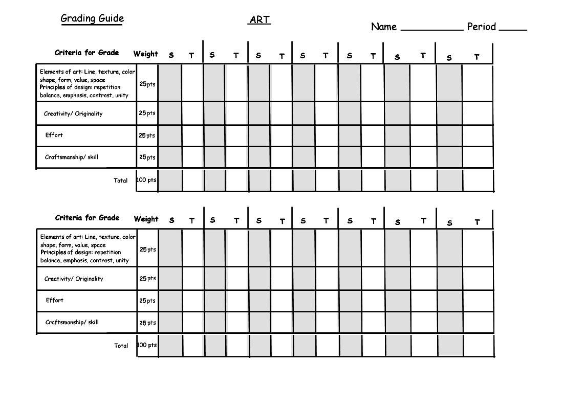
Another way to remove the subjectivity in grading artwork is to provide students with what I call a “grading guide”. As students finish their artwork, they fill out their grading guide which has a place for them to evaluate themselves. After all, self-evaluation is incredibly important in the development as an artist.
These grading guides show the students the numerical values for each of the properties that I will be grading them on. They evaluate themselves first and turn in their artwork with the grading guide. On the grading guide there is a “S” column for “student” and a “T” column for “teacher”.
When I grade their artwork, I consider what grade they have given themselves. When students receive their artwork back from me, they also receive their grading guide. This way, I can clearly explain on each section why they received their grade and what they can improve upon on the next assignment.
You are welcome to download the grading guide that I use below. (Right click on the image and select “Save as”)
The easiest question you should ever have to answer as a teacher is, “Why did I get this grade?”
If so, join over 36,000 others that receive our newsletter with new drawing and painting lessons. Plus, check out three of our course videos and ebooks for free.
Fun with Complementary Colors
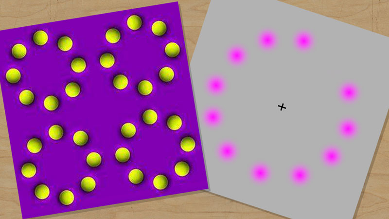
Learning about the effects of complementary colors on a viewer’s experience in a drawing or painting is one thing. But to actually have proof that these relationships exist and witness “the power” inherent in them is quite another thing.
Take a look at the animation below. Stare at the black “+” in the middle. After a few seconds, a yellow-green circle will appear to be moving around the center. After a few more second, the red-purple circles will disappear completely leaving only a yellow-green circle moving around the center.

Now what makes this really cool is the fact that there is no yellow-green circle at all. The red-purple circles are just disappearing in a sequence. Your mind creates the yellow-green circle.
Why yellow-green?
Well, yellow-green is the complement of red-purple. If you take a look at a color wheel chart, you will see that yellow-green and red-purple are directly across from each other on the color wheel.
What’s even more interesting is that this works for any complementary color scheme. For example, if you changed the red-purple circles to blue, an orange circle would appear. If you changed the red-purple circles to yellow, a purple circle would appear.
More Fun…
I came across another example of how complementary colors can create a cool effect and thought I’d share it with you below.
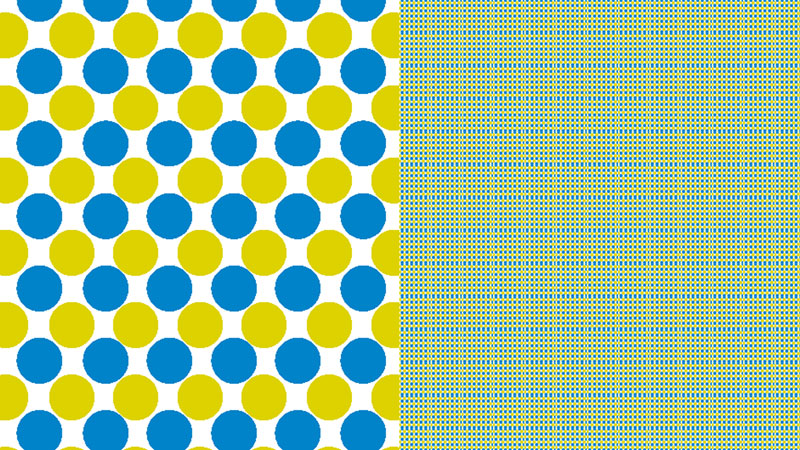
Take a look at the circles. If you move your eye from one set of circles to another, you might notice that the circles look like they are moving. The circles, of course, are not moving. Instead, they appear to be moving because the colors are of a high level of contrast. Yellow and purple are complements and this effect is achieved because of this.
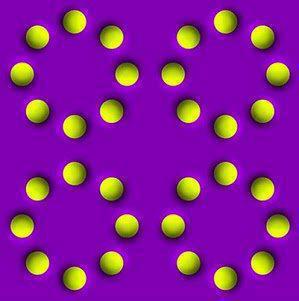
Color is such a strong tool. Use it wisely!
If so, join over 36,000 others that receive our newsletter with new drawing and painting lessons. Plus, check out three of our course videos and ebooks for free.

