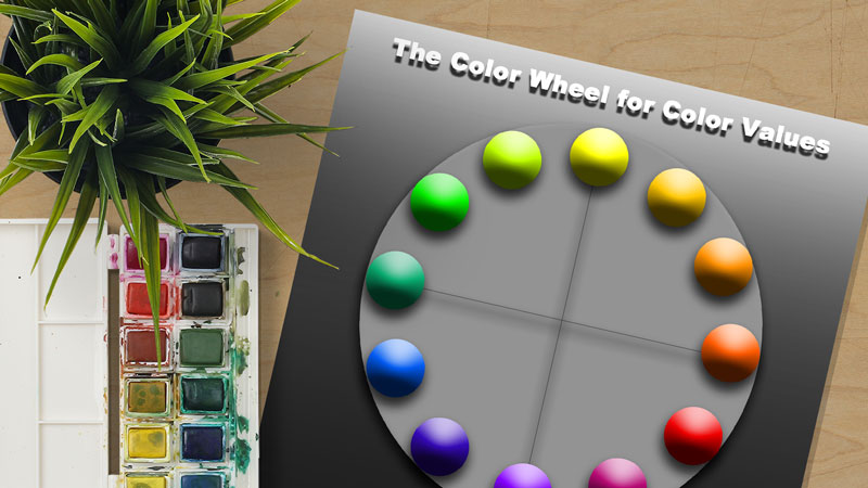
You must also understand practical applications of using color theory in your artworks and designs. Seldom are colors used as their pure hue. Most often, color combinations or color schemes, implore a variety of values and intensities of the colors used. For example, if you were to use a complementary color scheme of red and green, you might use pink and a darker green. Pink, you’ll recall is really the color red- a tint of red.
It seems that beginning artists really struggle with this concept. It is hard for them to separate color and value. And understand that although related, color and value are different.
To better help my students understand the relationship between color and value, I decided to create a color wheel chart that demonstrates different values.
I put each range of value for each specific color at its native location on the color wheel. This helped the students to see the color but also understand that each color also has a range of value.
To see some of the other color wheel charts I created, visit color wheel charts for teacher and students.

Feel free to download this color wheel chart and use it for yourself or with your students. (Just click on the image, then right click, save as.)
If so, join over 36,000 others that receive our newsletter with new drawing and painting lessons. Plus, check out three of our course videos and ebooks for free.


