When it comes to representational drawing however, there comes a point when we need to push our concept and understanding of line and its purpose for defining edges.
Line doesn’t need to be used as a defining element for all edges. At least not in the way we may understand it to be.
How We Comprehend Line
Let’s first examine how we see line. Our minds usually translate and comprehend the edges of objects because of contrast. These areas of contrast may manifest through value, color, or texture. Our mind notices these differences and when start to draw them from observation, the natural tendency is to communicate them through the use of line.
If we are to take our drawing skills further, we must shift our use of line in a drawing. While it can and should be used for defining the shape and locations of objects within the picture plane (especially in the preliminary stages of the process), it should not become the only factor for defining objects.
Implied Lines
Because our concept of line stems from an observation of contrast, our tendency is to use it in our drawings in the same manner. Often times, the contrast that is added in the drawing is much stronger than the contrast that is actually observed or is drawn in a manner unlike what is observed. This happens because our analytical left brain intercedes in the drawing process and formulates a “plan” for communicating the edge.
Instead, implied lines should be used to define objects and create the necessary “edges” of objects.
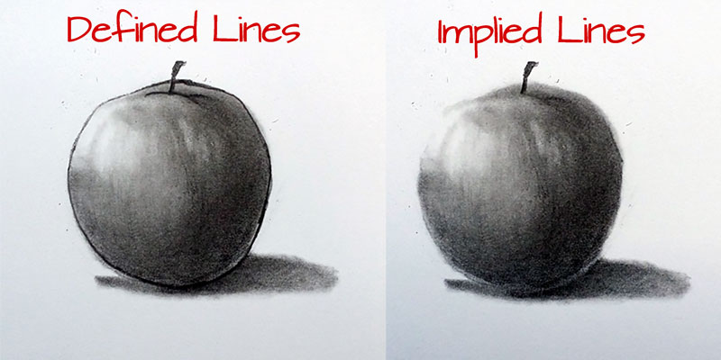
Implied lines are more closely related to the way our minds “see” objects. By understanding implied line and recognizing the approach that should be taken to create them, we can bypass our analytical left brain and create a drawing that is more accurate to what is observed.
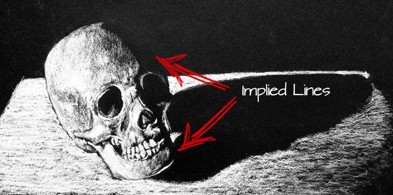
Implied lines most often happen on areas where the contrast between the object and the surrounding objects or elements is subtle. They may exist on the edge of an object that is receiving light, producing an area of highlight set against a light background. Or conversely, in an area of shadow against a dark background.
Practice This Concept
Once the concept of implied line is understood, it is easy to apply to our drawings. Understanding what we are actually seeing, without letting our “left brains” intercede is an essential part of representational drawing. Simply acknowledging the influence of our left brain on our use of line is a huge step.
We can reinforce this concept and train our minds to function as our eyes do by drawing without line completely.
Find a relatively simple object to draw. In “The Secrets to Drawing Course”, an egg is used for this exercise.
Place the object on a surface or in a setting that closely matches it’s texture, value, and color to make the exercise a bit more challenging.
Draw the entire scene within a defined picture plane on drawing paper or in your sketchbook, but do not use line. Instead, draw using only value. Allow the contrast that happens between the value, color, or texture create the “lines” in the drawing.
If so, join over 36,000 others that receive our newsletter with new drawing and painting lessons. Plus, check out three of our course videos and ebooks for free.
Break the Rules With Your Art
If truth be told, I bet most of us are rule followers. We are content to stay within the “boundaries”, protected by the walls of the rules. After all, the nail that sticks out gets the hammer, right?
The Rules Are Safe
Following the rules is safe. It won’t make you stand out, and it won’t get you in trouble. Safe.
But when it comes to making art, the rule followers aren’t rewarded for their conformity, nor do they receive any accolades for matching the status quo.
There are many “rules” that are seemingly associated with making art. Hold your pencil this way, or mix your colors that way, or paint on this surface with this specific medium – and the list goes on.
It is true that there are certain limitations to mediums that artists use, and knowledge of those limitations is important for success. Honestly, it is sometimes easy to get caught up in all of these regulations and believe that similar regulations exist for how we create. They don’t.
Art is art because it is made by an artist. Our artistic creativity should be limited by our creativity, not by some method of production.
True artists possess knowledge of media processes and are skilled in using the medium to communicate the idea. The vehicle in which the idea is communicated by the artist, the “voice” of the artist, is where the rules are shattered.
Ever Heard of Charles Pollock?
Let me offer an example of why “shattering the rules” is important. Did you know that Jackson Pollock had a brother that was an artist?
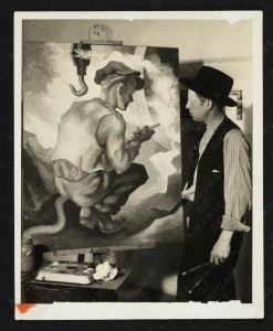
Charles Pollock was the eldest brother of the Pollock family and was a technically skilled artist. Yet, many of you probably never heard of him.
Considered a Social Realist, his work was decidedly different from that of his famous brother. It was safe. Charles Pollock was a rule follower.
Charles Pollock’s work actually appeals more to my own opinions about aesthetics than that of his younger brother. However, his work did not “break the mold” or change the “status quo”, so it remains relatively unknown to the world.
Later in his life, Charles begin to paint more abstractly, perhaps influenced by his brother’s success. But his later works never produced the acclaim of that of his brother.
Unlike his brother, Jackson Pollock was not afraid to break from the artistic conformities. His art, whether you like it or not, was different. It was this difference – this non-conformity, that set him apart, that placed his legacy in the art history books.
This non-conformity of “famous” artists is repeated looking back through time. It is the artists that change perception, or break the conformities that are remembered and revered. DeKooning, DuChamp, Monet, Picasso, Van Gogh, El Greco, and others are examples of artists that challenged the “standard”, setting themselves apart as not just artists, but visionaries.
The Challenge
Therein lies the challenge for artists today. With so much history behind us and with so much already pioneered in the visual arts, where do we make our brushstroke on the world? How do we set ourselves apart?
“There are more copies than originals among people.” – Picasso
There’s clearly no defined answer to this question. I think it important to continue to develop our technical skills, to become masters at them, while along the way search for our voice. And when the artistic voice is found, it must be shouted to be heard.
If so, join over 36,000 others that receive our newsletter with new drawing and painting lessons. Plus, check out three of our course videos and ebooks for free.
How to Sign Artwork

Believe it or not, this is a common conundrum for artists. At the conclusion of every artwork, artists are faced with decisions on how to handle the signature. So, if you’re facing this, you can take comfort knowing that you’re not alone.
Don’t Make a Hasty Decision with Your Signature
If you’re reading this, then you probably don’t into the first category of “signers” that simply slap a signature on the artwork without much thought of the aesthetic implications. The fact that you are reading this indicates that you are giving the signature some thought. And it should be given thought – lots of it in fact, since the signature can add to the work, if used correctly. It can also detract from the work if it is added without considering its aesthetic influence.
Unfortunately, I see far too many students make a hasty decision and just add their signature quickly, without thought. Sometimes, this thoughtless decision can wreak havoc on the finished artwork.
Here are a few examples of hasty decisions on signing that may destroy an otherwise successful work…
Signing the artwork with a huge or oversized signature – Your signature should be proportional to the picture plane. In other words, a larger painting may require a larger signature, but you shouldn’t place a large signature on a small painting.
Signing too close to the edge of the paper or canvas – Elements placed too close to the edges of the picture plane may create negative tension in the composition, pulling focus from the elements that you want people to see in your artwork. Signing too close to the edge will make your work nearly impossible to frame without partially covering the signature.

Signing with black on a color artwork – Black is a very strong color and will clash with an artwork that is color. This strong contrast will pull the viewer’s eye to the signature, instead of the artwork.
Considerations for Signing Artwork
Do You Really Need to Sign the Artwork? – Not all works require a signature. I know that this may sound strange, but many artworks are never signed.
When might you not sign the artwork?
Artworks that are commercial in nature will not require a signature. Illustrations that are produced for publication are not about the artist. Therefore, a signature can be left off entirely. I know that I may be causing a bit of controversy including illustration as an art form, but I’ve already addressed my opinion on the matter in this post.
Does the Signature Add or Detract from the Art? – Sometimes the signature can demand too much attention way from the artwork itself if not approached with care and thought. The color used, the placement on the surface, the size, etc. will all play an important role in determining whether or not your signature will enhance the artwork or destroy it.
Pick colors that will complement your work. Sign your work using colors that already exist in the art in order to harmonize the composition. But keep in mind that by doing so, you may attract more attention to your signature.

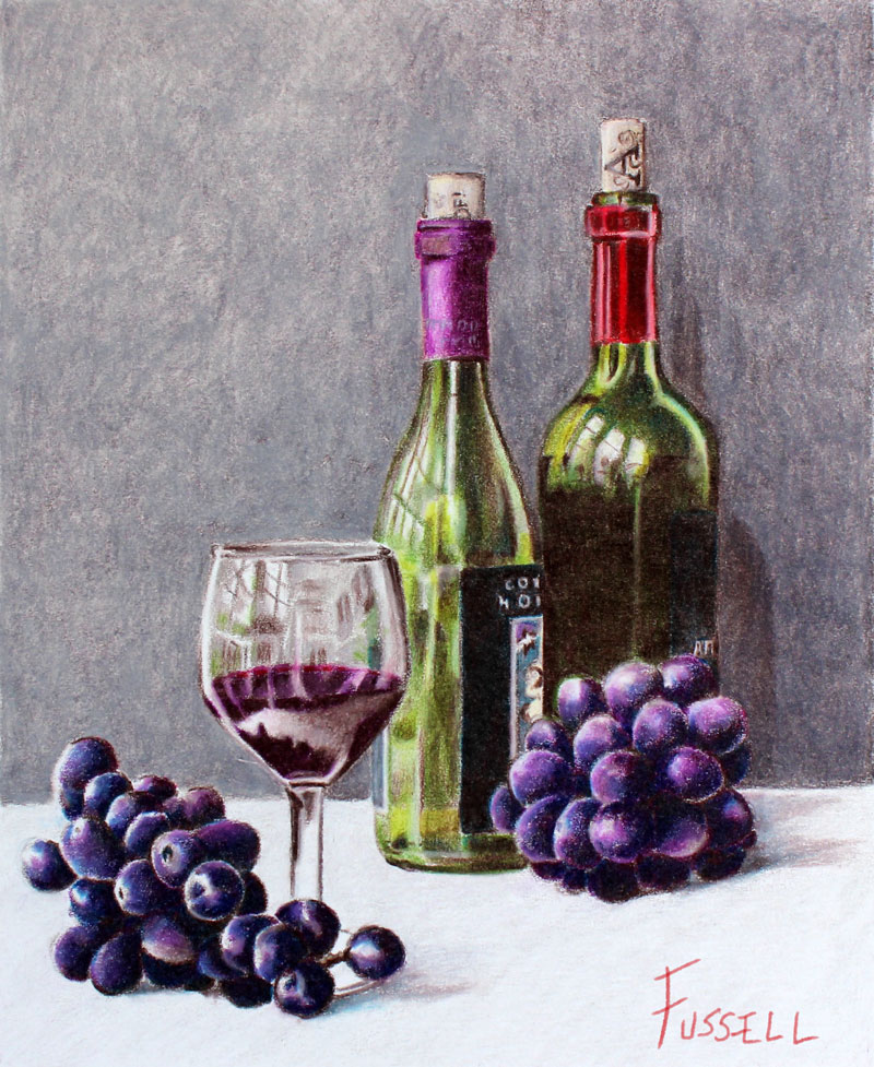
Another option is to sign the work in a less obvious location. In the following the example, the artwork is signed vertically next to the stem of the wine glass. This signature blends in with the artwork and is not too obtrusive.
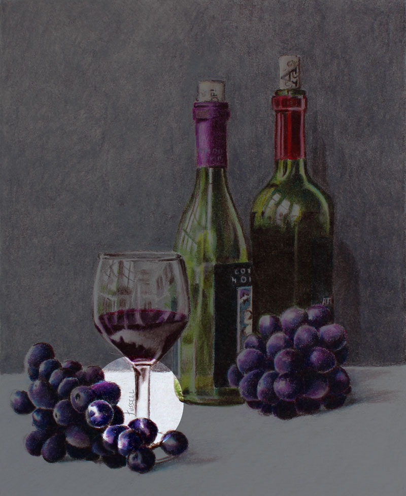
Will the Signature Enhance the Chances of Your Work Being Sold? – Are people more likely to purchase your art based on the name that is on it. Picasso lived a very productive life as an artist, producing many works. Not all of his works were “Masterpieces”. In fact some of them may have been considered outright “duds”. But people will pay large sums of money for his “duds” simply because his name is on them.
Do you fall into this category? Will people be drawn to purchase your work because it has your name on it? If so, then you need to find a way to work the signature into the composition and perhaps make it very prominent.
Truthfully, most of us do not fall into the “Picasso” category and people are not buying our work because of the name in the signature.
Because we are not all Picassos (yet), we need to be careful that we don’t become too pretentious with our signature, because not only can that hurt the aesthetic success of the artwork, but we can also turn people off in general.
Be Consistent – Your signature is seen as a trademark of sorts – almost like a logo. People will mostly see your signature as an image instead of a collection of letters. Therefore, I think it is only wise to be consistent with your approach to signing your artwork. I wouldn’t recommend using your entire name one day and then deciding to switch to your initials the next, especially if you are already making art professionally.
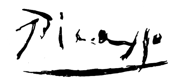
Picasso’s signature was a model of consistency. It is super easy to recognize and was used consistently – right down to the underlining.
Final Thoughts
Ultimately, your signature is yours – just like your artwork. The manner in which you decide to sign your work (or don’t sign your work) is a personal decision. My opinion is to approach the artist’s signature like you would any other factor within the artwork – as an aesthetic element.
If so, join over 36,000 others that receive our newsletter with new drawing and painting lessons. Plus, check out three of our course videos and ebooks for free.
The Best Drawing Pen – It’s Not What You Think
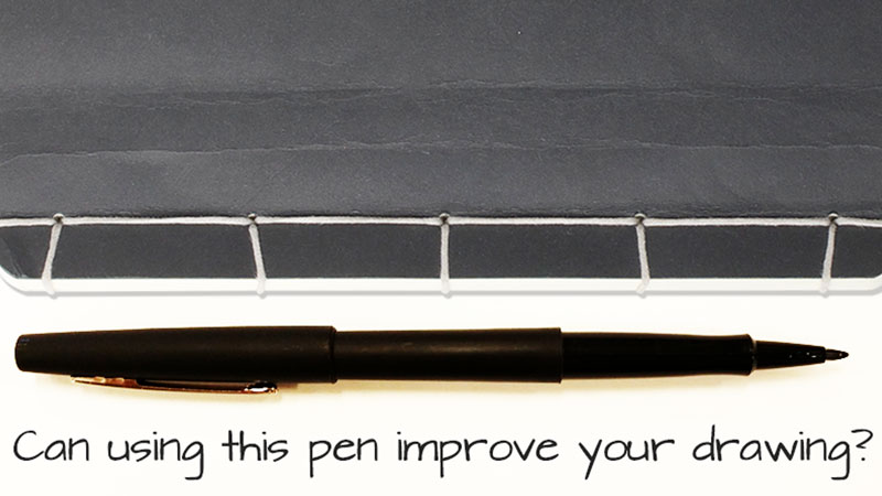
But, let me make something clear right from the start – this post is not about which manufacturers I recommend or which pens are the best for creating finished drawings. The truth of the matter is that a drawing pen is a personal choice for the artist. Different pens do different things, and are suitable for different applications and different situations. (I will post in the future about my recommendations for drawing pens, but for now – onward…)
The Best Pen for Improving Your Drawing…
This post is about a pen that I have found helps in improving your drawing. In other words, this pen will help you to draw better – simply by using it.
The pen is not expensive – in fact, it’s almost free. It is not hard to find, and you probably already have one.
So, what pen am I talking about?
I’m talking about a regular ‘ole felt tip pen. Yep, the felt tip pen.
I absolutely love this type of pen and I have noticed improvement in my drawing from using it. When I work in my sketchbook, I try to use a felt tip pen as much as I can.
There are several reasons why using a felt tip pen for sketching and drawing will help improve your overall drawing skills. Let’s take a look at a few of them…
You Must Be Deliberate with Your Marks
With a felt tip pen, you are forced to be deliberate with your marks. You can’t timidly add lines to the surface – or erase the marks that you make.
This forces you to carefully consider the marks that you do make.
Some painters believe in making the fewest brushstrokes as possible to complete a painting, attempting to make the brushstroke as effective as possible. When you draw with a felt tip pen, you can start to develop this mindset pertaining to drawing.
Marks should have purpose and the more that you sketch with an unforgiving medium, the better you will understand the purpose of the marks that you make. This naturally leads to improvement in the drawings that you create with a more forgiving medium like graphite or charcoal.
Line Quality Can Be Manipulated with Pressure
Line quality is the thickness or thinness of a line. The line quality in a drawing should be varied. Thicker lines can help create the impression of mass or communicate an area of shadow.
Unlike other types of pens, the felt tip pen allows you to vary the line quality in a drawing by adjusting the amount of pressure that is applied to pen. You are able to create a greater variety of marks with a felt tip pen that you simply cannot duplicate with other types of pens.
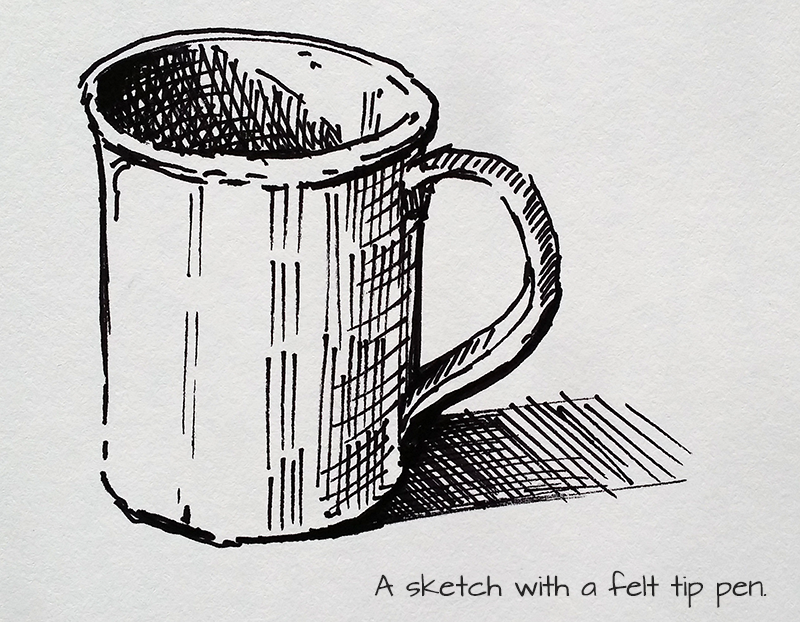
You can draw a bit more naturally and intuitively because of the pen’s ability to produce a variety of line.
Resistance is Similar to Graphite or Charcoal
Some pens glide over the surface when marks are made with them. Many pens are designed for writing, so it’s no wonder that they are designed to feel this way.
However, the resistance or “feel” of the marks made with a felt tip pen are similar to marks made with a graphite or charcoal pencil. There is more of a “grip” to the surface, like you may find with a medium that would be used for a finished drawing.
Drawing with a felt tip pen may not produce a “finished” or “professional” drawing, but it will help you develop a mindset for making marks that will improve your approach to creating a finished drawing. Why not give it a try?
Ultimately, it doesn’t matter what tool that you use to draw, as long as you are drawing. Whether it be with a pencil, a pen, or anything else – just draw with something. If you are not drawing, then you aren’t improving. After all, it is the practicing that will have the greatest impact on your development.
If so, join over 36,000 others that receive our newsletter with new drawing and painting lessons. Plus, check out three of our course videos and ebooks for free.
Pushing Contrast in Value
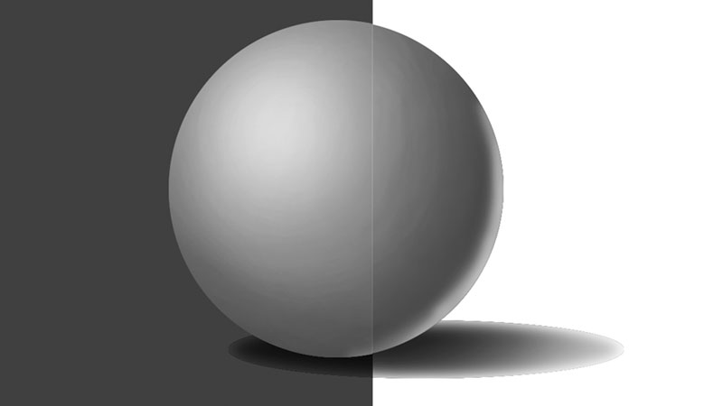
The Importance of Value
We see the world around us because of light. Without light, we see nothing. So, it only makes sense that if we are to draw the world around us, then we must understand light as artists.
The manner in which light manifests in a drawing or painting is dependent on how the artist includes value in the work. Lighter values are used for areas in which light is hitting the subject. These “tints” are shown as highlights and areas of lighter value in the drawing. For example, a red object may have an area of pink (tint of red) on areas where light is landing. Conversely, darker values are used for areas in which light is not landing on the subjects, or is landing to a lesser degree. Again, with a red object, the “shades” will be created using a darker form of red.
The reality is that most of what we see consists of a complete range – the darkest “darks” and lightest “lights”.
It is the relationship of the dark and light values that create the illusion of light in the image, and ultimately the illusion of form that we are after. Considering this, it becomes clear just how important value is in the creation of a drawing or painting.
Adjusting the Perception of Value with Contrast
While a full range of value in artworks is important, it is the perception of the contrast in value that is ultimately what matters. As artists, we can control the perceived value of the color by juxtaposing contrasting values of varying degrees around the subject.
The contrast that results from these arrangements affects how our viewers perceive the value and ultimately the object in the work.
Take for example the following image in which two circles are positioned on different colored backgrounds…
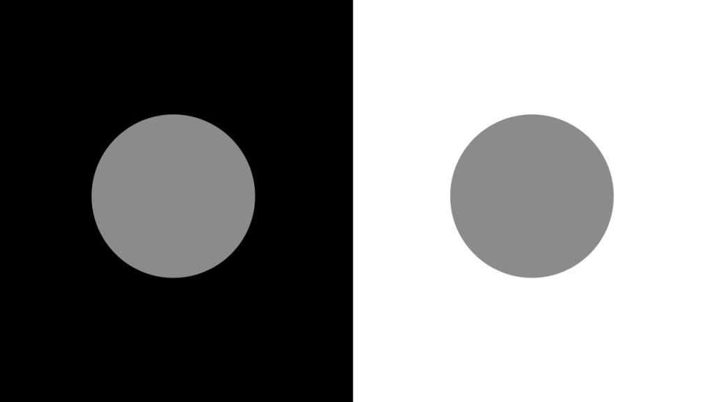
While the two circles are the same value of gray, the perceived value is different because of the value around them. The dark background makes the circle appear lighter, while the white background makes the circle appear darker. Therefore, the contrast in value is important in how the object is perceived.
Here are a few more examples of how contrasting values can affect the perceived value of the object. In these examples, we’ll exchange the circle for a sphere that includes a full range of value.
In the first image, a white background is used. The contrast in value makes the sphere appear darker in overall value.
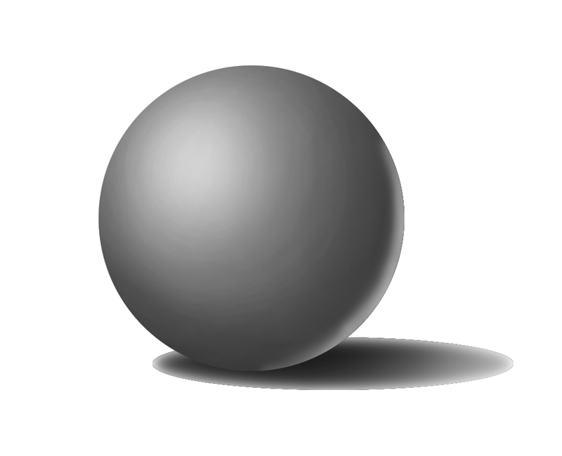
Next, we’ll add a neutral gray background to the same sphere and take a look at the perceived value. Notice how the sphere appears lighter than the first example, simply because the background is darker in value.
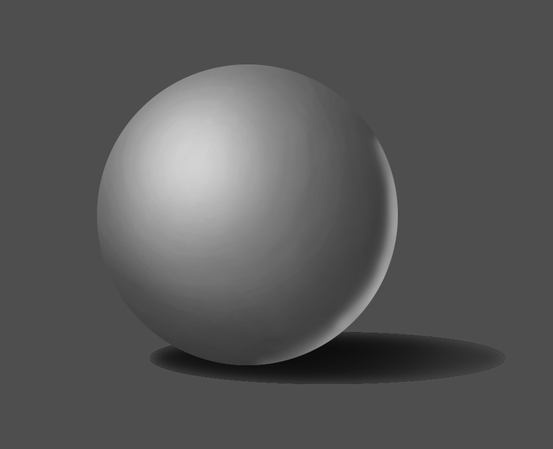
Now, for a third example. In this image, we’ll switch out the gray background for an even darker version. Now, the sphere appears very light in comparison…
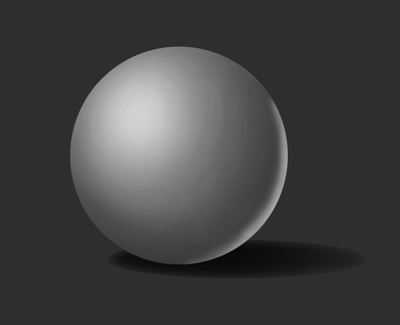
The surrounding values clearly have an effect on how the value on the subject is perceived. When analyzing values in your subject, consider the background and surrounding values as the contrast in those values will play a role in how the light of the scene and the illusion of form are visually translated.
If so, join over 36,000 others that receive our newsletter with new drawing and painting lessons. Plus, check out three of our course videos and ebooks for free.
10 Essential Drawing Materials and Tools for Beginners
But as we grew and developed as artists, the materials and tools that we chose became more important. The connection between quality art materials and quality artwork becomes noticeable along the way and it’s no wonder that emerging artists desire to have the very best materials possible.
If you are starting to get serious about your artwork, no matter what age, you may also be starting to get serious about the materials that you use.
In this post, I’ll offer 10 essential drawing materials and tools for artists that are just starting to get serious about their drawing. (This list is focused on black and white drawing media only.)
1. Quality Drawing Pencils
We’ll start off with the most obvious essential – quality drawing pencils. When it comes to drawing pencils, each artist will find a brand that they connect with. There’s no way to know which brand will become your favorite until you try a few.
Drawing Pencil Sets
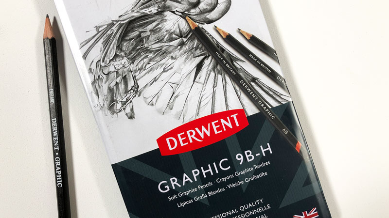
Pencil sets usually come packaged in nice tins and can be great because they often include the full spectrum of graphite grades. Many sets include pencils with harder graphite (9H) through softer graphite (6B). Harder graphite makes lighter marks and keeps a sharp tip longer, while softer graphite makes a darker mark, but needs constant resharpening. These sets give the artist the ability to work with many different values and varieties of mark. Learn more about the different grades of graphite here.
As far as pencil brands go, there are plenty of great options. Derwent graphite pencils are consistent in their quality and is the brand I recommend.
Individual Pencils
Many artists will find that they don’t use all of the pencils in a drawing pencil set. Instead, they may find that they only use a few of the pencils. For example, 2H, HB, 2B, and 4B pencils would be plenty of range for most of us. If this is the case, then a pencil set would not make sense. Instead, purchasing the individual pencils as they are needed may be the better approach.
Although graphite pencils aren’t very expensive, purchasing individual pencils can be more pricey than just buying a full set of pencils. You may also find yourself hunting for them at the art store.
2. A Sketchbook
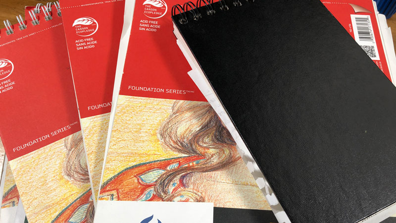
A sketchbook is one of the most important things an artist can have. I should point out that I am referring to an “active sketchbook” – one that receives attention on a daily basis. Anyone can “own” a book with blank pages of drawing paper. But the one that actively gets drawn in – on a daily basis is the one of value.
Let me make an analogy to a sketchbook’s importance. Let’s compare a professional athlete’s life to that of an artist.
The professional athlete may workout for hours daily in the gym or on the track to enhance their performance on “game day”. Though the world may never see the hours of hard work that have been put into the workout, the exercise is important – if not crucial to the athlete’s success.
An active sketchbook is the artist’s “exercise”. It is the “hard work” that goes into the development of the artist and it is the breeding ground for innovative, artistic ideas. Though the sketchbook may never be seen by the world, it is the often driving factor in successful artworks and successful artists.
Since a sketchbook is recommended for daily practice, it is important to choose one that is durable and has plenty of pages for all of your ideas. I suggest a sketchbook that has a hardcover so that it will stand up to repeated use and travel. A hardcover keeps the corners of the pages inside nice and clean and will help keep the pages flat if you use mixed media applications.
3. Quality Drawing Surfaces
A drawing can be made on any surface, but the quality of that surface is sometimes just as important as the medium that it is used upon it.
There are a few considerations for choosing a drawing surface that will affect the finished result.
1. The “Tooth” – The “tooth” of the surface is the texture of the paper. The texture of the paper plays a role in how the drawing material is accepted on the surface. Heavier textures will produces lines that may appear “broken”, while smoother textures will produce smoother lines and gradations of value. Some artists will prefer heavier textures while others will prefer a smoother surface. Learn how the tooth of the paper can affect the application of the medium here.
2. Paper Weight – The weight of the paper refers to how much a ream (500 sheets) of that paper weighs. For most papers, the weight of the paper will be directly related to the thickness of the paper. (It should be noted that some papers may have a heavier weight but actually be thinner.) For example, 80 lb. paper will typically be thicker than 60 lb. paper, while 100 lb. paper will be heavier than 80 lb. paper.
3. Acid Free – Paper that is “acid free”, without going into all of the technical details, will stand “the test of time”. This paper is will not yellow over time and is more resistant to fading that can occur when exposed to UV light.
Here are few recommended papers that you might experiment with…
Drawing Paper – Medium tooth paper that is suited for drawing with a variety of drawing media including graphite, charcoal, and colored pencils. There are ton of options for drawing papers, but Strathmore papers are recommended.
Charcoal paper – Heavier tooth paper that is lightweight – almost semi-transparent. Excellent for creating texture. (A variety of media can be used on charcoal paper – not just charcoal. I love it for graphite drawings.)
Bristol Paper – Smooth tooth paper that is heavier (think cardstock). This paper is quite rigid and is excellent for creating smooth gradations of value or detailed line work with ink.
Want to learn more about drawing papers? Check out this lesson…All About Drawing Papers
4. Variety of Erasers
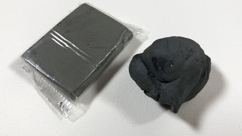
Erasers are for mistakes – right? Think again. Erasers can be a great mark-making tool as well. Each eraser creates a different mark and should be used as necessary according to the specific drawing medium.
Here are a few recommended erasers…
Rubber Eraser – Your standard eraser for erasing graphite. This eraser uses friction to remove any material from the surface.
Kneaded Eraser – This eraser lifts material from the surface, instead of using friction to remove it. It can be pulled and fashioned into different forms to create specific marks. This eraser gets dirty over time, but can be cleaned by pulling and “kneading” it.
Gum Eraser – “The Crumbler”. This eraser is great for removing media from surfaces that are sensitive to tearing. A gum eraser removes the medium through friction, but crumbles as it does so – preserving the surface.
Vinyl or Plastic Erasers – This eraser is the toughest of the bunch. It can erase almost anything. But be warned – this eraser can tear the paper if you’re not careful.
Some manufacturers produce inexpensive sets of erasers like this one from Prismacolor…
You can read more on the differences between erasers here.
5. A Good Pencil Sharpener
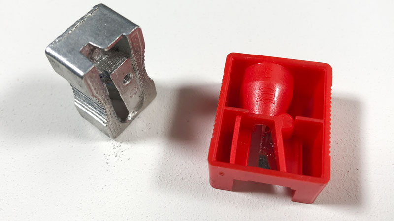
Pencils need to be sharpened with a quality pencil sharpener. Use a poor quality sharpener and you could be out of a pencil in a matter of moments.
Pencil sharpeners generally fall into two categories – Manual and electric.
Electric Pencil Sharpeners
Electric pencil sharpeners can vary in price and the old saying, “you get what you pay for” is true for what you get here.
A quality electric pencil sharpener will sharpen your pencil without eating it all up.
Electric pencil sharpeners are nice to have for a quick sharpen of the pencil, but should not be used with colored pencils. The waxy binder found in colored pencils can build up within the blades of the sharpener, ruining the device.
An Extreme Solution
I’ve had the pleasure of working with the X-Acto Commercial sharpener. It is a MAJOR pencil sharpener. This pencil sharpener sharpens pencils in a split second and is incredibly durable. It should last you years.
The only negative is that smaller pencils can get caught inside of the sharpener. This sharpener is definitely on the extreme side of things, but a cool commodity to have around.
Manual Pencil Sharpeners
While an electric pencil sharpener has its appeal, a manual pencil sharpener will do for most of us.
Like electric pencil sharpeners, the manual varieties come in different forms. My favorite is a simple, handheld metal sharpener. It’s a cheap and easy solution that is portable and easily replaced. Remember, if you’re sharpening colored pencils, then a manual pencil sharpener is what you should be using.
6. Charcoal or Conté
There are more options to black and white drawing other than drawing with graphite. No artist’s toolkit would be complete without charcoal or conté.
Charcoal provides a broader range of value and mark-making than what’s possible with graphite. The manner in which marks are made is different as well.
Charcoal comes in both stick and pencil form. Sticks of charcoal are usually either “vine” or “compressed”. Vine charcoal is softer and produces lighter marks, while compressed charcoal – which is concentrated, produces darker marks.
Charcoal pencils can be sharpened like graphite pencils, making them great for details.
Conté is similar to charcoal in richness of color – however the makeup of the material is different. Charcoal is burnt organic material, while conté is made of clay constituents.
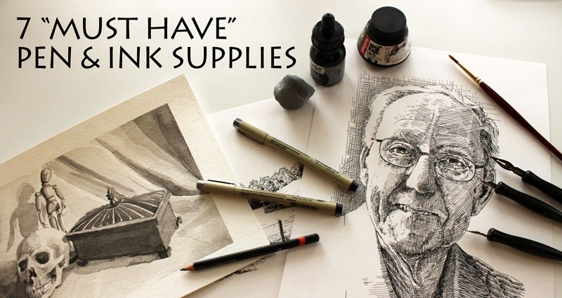
7. Drawing Pens / Ink
When we draw with ink, we’re forced to master the use of line. Line is used to develop the illusion of form, texture, and light. Technical drawing pens are affordable, easy to find, and portable – making them great for every budding artist to have. Sakura Micron pens and Steadtler technical ink liners are both fine choices.
When you’re ready to take your ink drawings to another level, you may consider working with a dip or nib pen. This traditional approach to pen and ink drawing requires bottled ink. This approach does require a little more skill and is obviously less portable, but the resulting drawings have more character and are more interesting.
Felt tip pens are another option. I absolutely love felt tip pens. Felt tip pens allow the artist to create a variety of marks. The tip of the pen allows the artist to create a broad range of line quality.
An added benefit to a felt tip pen is the psychological effect that it can have on the artist.
Using a medium that cannot be erased forces the artist to be more deliberate with their marks. As a result, a bit more thought is put into the marks that are made. You can actually improve your drawing skills simply by using a felt tip pen while sketching.
8. Blending Stumps / Tortillions
Blending stumps are essential for the artist wanting to smudge or move material around on the surface. A blending stump allows the artist to create gradations in value without introducing the oils of the finger (through finger smudging) which can make a drawing look dirty or uncontrolled.
Blending stumps also allow the artist to create gradations and smooth applications of value in areas of detail that may be hard to get to otherwise.
You can learn more about using blending stumps and blending tortillions in drawings here.
9. Quality Colored Pencils
Colored pencils are everywhere. You can buy them just but anywhere. But this doesn’t mean that every colored pencil brand out there will get the best results. Quality matters and so does the type of colored pencil that you choose.
Prismacolor Premier
Prismacolor wax-based Premier pencils are soft and buttery, allowing the artist to layer colors to build up a solid application that often compares to a painting. Some people complain that they break easily and they do. But this is due partly to the soft core of the pencil which is also why they are so easy to use and build up on a surface.
Faber-Castell Polychromos
Faber-Castell’s Polychromos pencils are oil-based and behave slightly differently from wax-based pencils. These pencils require several layers to build up depth in color, but the results are fantastic. They’re expensive, but well worth the investment if colored pencils are your medium of choice.
Caran D’ache Luminance
Luminance pencils are wax-based, premium pencils. They layer nicely and are a little harder than Prismacolor Premier, meaning they break less often. These pencils are, in my opinion, the brightest colored pencils. So if you plan on working on darker surfaces, these pencils may be your best bet. They are expensive, so consider it an investment if you decide to go this route.
Learn more about the different types of colored pencils here…Colored Pencils vs. Watercolor Pencils vs. The Others
10. Artwork Storage / Portfolio
Your artwork is important. Even those works that you’d rather not let anyone else see are important. They need to be treated with respect and stored in manner that will keep them preserved and protected.
There are more than a few options for storing artwork, but the most popular option is a portfolio.
There are many different portfolio options out there on the market – each with their own benefits and drawbacks. If you are looking to add a portfolio to your collection, I would suggest looking for a couple features.
1. Rigidness – Look for a portfolio that will keep your artwork from bending. Most portfolios will do this, but there are a few cheaper versions that may not. Look for a portfolio that has a rigid support system.
2. Size – When purchasing a portfolio to store your work, be sure that you provide yourself some room for larger works. Don’t just purchase the 18″ by 24″ portfolio because all of your works up to this point are smaller than this size. Chances are good that you’ll produce drawings that are larger in the future and you’ll wish you would have opted for a larger sized option.
You don’t have to buy a portfolio when you can build your own. With a couple of rigid pieces of cardboard and tape, a portfolio can be created fairly quickly.
BONUS – Art Material Storage
Taking care of your artwork is important – but taking care of your materials is important too.
Finding a suitable storage solution is easy. Let me offer three different solutions for three different situations.
1. The Portable Container – When I was an art student in college, I carried around a tackle box filled with my art materials. No manufacturers had tapped into the demand for portable art storage containers back then, so we were all forced to carry around theses modified tackle boxes. They did the trick.
These days, there are plenty of portable solutions that are fortunately designed for artists. Many of these feature stackable trays and levels and are long and deep enough to accommodate brushes and other important tools.
2. The Semi-Portable Container – Larger varieties of the portable option exist as well. I call these “semi-portable” because while you can lug them around – they are really too large for daily use. But, they can provide exceptional organization for your art supplies and tools.
3. The Permanent Stack – If the need doesn’t exist to be carrying your art materials all over the place, then a more permanent solution might be the best option for you.
I’ve already posted on art material storage and the solutions that I use over here. You can check that out to learn more about what solutions may work for you as well.
Summing it Up
By no means are all of these materials and tools required for serious drawing. (You really only need a mark-making medium and a surface.)
But, if you are getting serious about your work, then you’re probably getting serious about your materials and tools as well and this list is what I consider to be “the essentials”.
If so, join over 36,000 others that receive our newsletter with new drawing and painting lessons. Plus, check out three of our course videos and ebooks for free.
Build an Online Portfolio Website – A Step by Step Guide
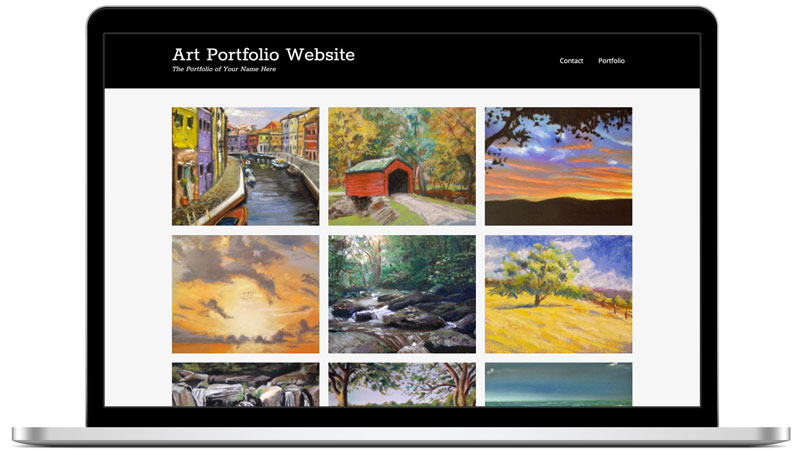
The good news is that building one is easier than you may think. Don’t worry, you don’t need to know any coding (or even have a clue as to what you are doing.)
I’ll show you how you can be up and running in a just a matter of moments. In fact, you can have your website up and running in under 5 minutes.
Customizing your site will take a little longer, but if you follow this guide, you can have your portfolio website completely set up in about 30 minutes.
This video will walk you through the entire process – from start to finish…
(Be sure to use the coupon code “TheVirtualInstructor” and get 25% off your hosting)
Here are the steps to building your portfolio website…
Step One – Purchase your domain and hosting (5 Minutes)
The cost will be about $20 for your domain and first month’s hosting. Then, hosting can be as cheap as $3.95 a month after that. If you purchase your domain and hosting through Hostgator.com, then you can use my coupon code “TheVirtualInstructor” and get 25% off your hosting fees. Hostgator.com makes the process of purchasing the domain and hosting seamless and easy. Click here to start. (This link will open in a new window so that you can continue to follow this guide.)

Click on the “View Web Hosting Plans” to view the available plans…
For most websites, the “Hatchling Plan” will be more than sufficient. Click on the plan that best suites your needs…

Next, you’ll need to choose your domain name, which is the “.com” or “.net”. (Not sure what a domain name is or what hosting is all about, I’ll explain it in just a moment.)
Your domain name might be “yourname”.com, but it can be whatever you want. Just type it into the box and HostGator will search and see if it is available.
 Next, confirm your plan.
 Next, you’ll be asked to put in your financial information…
Uncheck all of the add ons that are automatically added. For a portfolio website, you really don’t need any of these things.
 You can put in my special coupon code, “TheVirtualInstructor” to receive 25% off of your hosting. Be sure to validate it by clicking on the “Validate” button.
Agree to the “Terms and Conditions” and click “Create Account”.

Next, check your email to receive your login information.

The email that you receive contains a link to your “C-Panel” (control panel), your username, and a password.
You’ll use this information to login to your “C-panel” which we’ll cover in the next step…
Since there are places that you can build free websites out there, you may be wondering why should pay for your domain and hosting.
There are several goods reasons why you should NOT use a free website…
1. You do not own or control the website – If you create a website at blogger.com for example, your site can be taken down without any notice. You do not control the website.
2. Unprofessional url – If you have a website at blogger.com, your url is “www.yourwebsite.blogspot.com”. The “blogspot.com” at the end tells viewers and potential clients that you don’t care enough about your own artwork to have your own website.
3. Customization Limitations – If you want to customize your website and have full control over how it looks and functions, then you need to own the domain. Free websites limit how much can be customized and even limit the sizes of files and content that can be included on your site.
4. It’s So Cheap and Easy to Be Professional – It’s simply so easy and cheap to set up and maintain your own professional portfolio website, it just doesn’t make sense to go the free route.
What is the Domain?
Your domain is the “www.yourwebsitename.com”, or the url. The domain that you choose is very important. Since you are building a portfolio website, it may be best to purchase a domain that is your name, for example – “wwww.yourname.com”. (My portfolio site is MattFussell.com) If the .com for name is not available, you can choose a .net extension.
What is Hosting?
Hosting is simply storage of information on a server. It is the act of storing the information (your website) in a location (on a server) so that it can be accessed by users of the internet.
Step Two – Install WordPress (2 Minutes)
(Here again, Hostgator.com makes this pretty darn easy for us.) Once you have paid for your domain and hosting, you’ll need to check your email. There you’ll find your username (admin name) and a password to use to log in to your C-Panel (Control Panel). You’ll also find a link to the C-Panel. Click on the link and use the information to log in to your site.

Tip: You can also access your C-Panel by going to www.yourwebsite.com/c-panel
Once logged in, you can click on the “Get Started With WordPress Today” icon and start installing WordPress.

You’ll next be presented with a screen to install WordPress. Click on the “Continue” button.

You’ll need to enter an admin email address, name your website (can be changed later), pick an admin username, and put in your first and last name.

Then click Install. (It may take a few seconds to install – you can watch the progress bar underneath.)
When the install is complete, you will be provided with your admin username and a password. Write the password down exactly as it appears. There is also a link to access the admin area of your new portfolio website. Click on the link. (It may take a few minutes for the link to work and for your new website to show up. Don’t panic – this is normal.)

Enter the admin username and the generated password to access the admin area of your website.

Congratulations! You now have your own website! Next, we’ll customize it and turn it into a portfolio website.
WordPress is a CMS, or Content Management System. It was originally created to make blogs, but now WordPress can be used to create virtually any type of website.
Step Three – Customize Your Portfolio Website (15 Minutes)
Now that your site is up and running, the only thing left to do is to customize your portfolio.
Install a Theme
One of the advantages to using WordPress are the many themes that you can choose from. The theme is the way the site looks and behaves and choosing a good theme is important. Your theme makes an impression on your visitors and affects how they will interact with your content.
Many themes are free and will work just fine. (The theme that we’ll install in this demonstration is a free theme.) Paid themes, however provide more functionality and support. I like to use the themes over at ElegantThemes.com. It’s a minimal fee to have access to all of their themes. I use the “Divi” theme on my own portfolio site (MattFussell.com).
To install a new free theme, simply go to “Appearance” in the sidebar of the admin screen, and select “Themes” from the slide out menu.

Select the “Add New” tab.

From here, you can search for keywords that may relate to a theme that you are looking for. You can also search for specific colors and layouts. For this example, I’ll search for “Portfolio Press” since I already know that this theme is good for a portfolio website.

Click on the “Install Now” link under the “Portfolio Press” option.

Add the Images
We’ll first populate our media library with the images that we’ll be including in our portfolio. To do this, go to “Media” in the dashboard of the site and select “Add New”. From there, you can upload all of the images that you would like to include.

Select “Select Files” on the next screen, and select the files that you wish to include in your portfolio. Then double-click to upload.

Create a Portfolio Page
For this theme, we’ll create a page for our portfolio and posts for each individual work of art. (Pages are static webpages and posts are generally for dated material.)
To create a page go to “Pages” in the dashboard area and select “Add New”.

We’ll give this page a title of “Portfolio”.

Tip: Be sure to “Trash” the default “Sample Page”
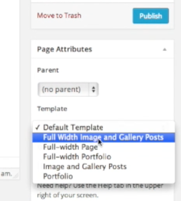
Next, we’ll need to format the page to function as a portfolio page. To do this, look on the right side of the screen and change the template setting from “Default Template” to “Full Width Image and Gallery Posts”. Then, click on the “Publish” button to publish the portfolio page.
Create “Posts” for Each Work of Art
To create the posts, which will be used to each artwork within the portfolio, go to “Posts” in the dashboard and select “Add New”.

Add a descriptive title for your first artwork in the title box. You can add a description underneath in the main text box area if you like.

Next we’ll change the format of the post, so it will be presented as an image. To do this, look on the right side of the screen and change the “Format” from “Standard” to “Image”.

We also will need to set the “Featured Image”. Again, on the right side of the screen, look for the “Set Featured Image” link. Click on the link and choose the artwork or image that you would like to be shown.

Click the “Publish” button and you now have one work in your portfolio.
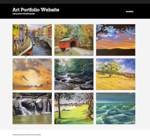
To add more art, we’ll simply repeat the process of creating posts for each piece. For this example, I’ll add 9 pieces to the portfolio, but you can add as few or as many as you would like.
Once all of your artworks are added as posts, you can check out how your portfolio page looks by clicking on its link in the menu at the top of your website.
Further Customizations
Let’s make the site a bit more professional by changing the tagline and removing and editing some of the sidebar widgets.
Edit the Tagline
We’ll start with the tagline, which is the one line description under your website title. By default it reads “Just Another WordPress Site”. This is absolutely no good, so let’s change it.
To change the tagline, we’ll go to “Settings” in the dashboard and select “General”.

On this page, you can change the tagline to read whatever you wish, or leave it completely blank of you like. Be sure to click the “Save Changes” button at the bottom.

When you return to your site, you’ll notice that the tagline has been changed.
Editing the “Widgets”
Next, let’s deal with the widgets – the list of the links in the sidebar on the right.
In the dashboard, select “Appearance”, then “Widgets”.

You can click and drag any widgets that you want to remove from the sidebar and add any widgets that you may want to include. It’s probably a good idea to include an “About the Artist” widget, so I’ll add one here.
To add this sidebar widget, select the “Text” widget from the “Available Widgets” section and drag it to the location that you want it in the sidebar. Then, you can give it a title and add whatever description that you want in the box below. You can also add HTML here too – or an image.

Tip: Developers have created tons and tons of widgets that you can add to your site. Just go to “Plugins” in the dashboard. Select “Add New” and search for a new widget.
Change the Home Page
The home page is the page that visitors will see when they visit your website. By default, WordPress creates your site with a list of blog posts, which may be perfect for you. But you may also want to direct visitors to a specific page, like the portfolio page that we have built.
Here’s how to change the home page to the portfolio page…
First, go to “Settings” in the dashboard and select “Reading”.

On the next page, change the “Front Page Displays” from “Your latest posts” to “A static page”. Then choose your portfolio page from the options under “Front page”.

Add a Contact Page
Sharing your portfolio is one thing, but it is also important to provide a way for people to contact you. So, we’ll add a contact page.
We’ll use a plugin for this, so go to “Plugins” and select “Add New”.

Search for “contact” and you’ll find quite a number of options.
I’ll choose the “Contact Form – Clean and Simple” plugin.

Go ahead and install and activate the plugin.
Next, we’ll edit the settings for our contact from. To do this, go to “Settings” and select “Contact Form”.

Make any changes on the settings page for the contact form…
Copy the short code at the top of the contact form settings page.

Next, create a new page and title it, “Contact”. In the text area underneath the title, paste the short code.
Then hit “Publish” and you can visit your portfolio site and check out your professional looking Contact Page.

And there you have it – a professional portfolio website in under 30 minutes. Now, if you are new to things, it may take you just a touch longer.
Building your own portfolio website is easy and cheap! It used to be more difficult to create a website, but now it’s not – and anyone can do this!
So are you ready to get started? Just click on the link below to start building your portfolio and share your work with the world.
Get Started Building a Portfolio Website
(Be sure to use the coupon code “TheVirtualInstructor” and get 25% off your hosting)
If so, join over 36,000 others that receive our newsletter with new drawing and painting lessons. Plus, check out three of our course videos and ebooks for free.
Still Life Photo References – Harmonious Arrangements
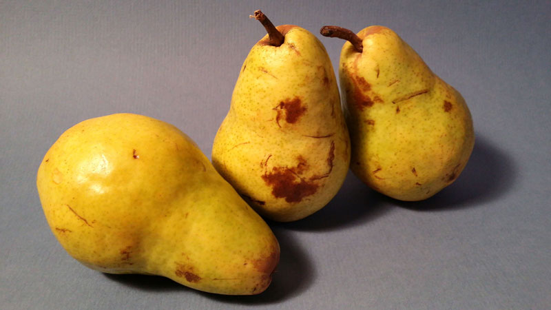
Photo References – Forms
Photo References – Reflective Surfaces
Photo References – Glass
Photo References – Fruit
Still Life Photo References
Before I share these photos with you, I want to talk about the arrangements themselves. The truth of the matter is that if you are working from a photo reference, you are going to be somewhat dependent on the photo itself in regards to the finished drawing or painting. (I know that this may seem a bit obvious, but some people forget this when they are photographing a scene to draw.) If you are taking the photos yourself, and you have control over the arrangement, you should start your compositional planning at that moment. As objects are placed within the scene think about how the finished image will read as a drawing or painting.
Still life arrangements should be harmonious. There should be some sense of continuity in the scene. So how can this sense of unity be achieved? Here are a couple of tips…
Include Multiples
An easy way to create harmony in an image is to include multiples of the same object. Repetition creates unity. So it only makes sense to include multiples of an object when harmony is one of the goals of the still life. Shape and size can also play a role here. If you include similar sizes or shapes of objects, then the objects do not necessarily have to be the same objects. The shape or size of the object can help create a harmonious composition.
Think “3”s
When considering multiples of any object or subject in a composition, think odd numbers. I’m not sure why odd numbers are more aesthetically pleasing – but they are. Consider arranging objects in groups of odd numbers when you photograph so that the drawing or painting that is produced from the photo is compositionally stronger. (The photo references below include arrangements of 3 fruits for this reason.)
Consider a Color Scheme
When working in a colored medium, the scheme in your reference photo will also be a factor. Specific color combinations should be considered when choosing objects and their surrounding environment. A few color schemes that may be considered include analogous, complementary, split-complementary, warm, or cool. I’m not going to go into what each of these schemes entail here, but if you want to learn more about them, you can check out the interactive color wheel.
Variety
Even though your goal should be to create a harmonious scene, you don’t want to create a boring one. Therefore, you may include a bit of variety to the scene. The trick is to create “variety within unity”. In other words, include enough variety to make the still life interesting, but not so much that it becomes stagnant. (When setting up these still life arrangements, I moved a fruit here and there to break up the monotony.)
Ok, enough with the rationale, here’s a look at a few still life photo references for practice. I hope that you are able to find them useful…
If so, join over 36,000 others that receive our newsletter with new drawing and painting lessons. Plus, check out three of our course videos and ebooks for free.


