What is Optical Color Mixing?
Optical color mixing is a phenomenon that happens when a viewer perceives color in an image as a result of two or more colors that are positioned next to, or near each other. The perceived color is not actually on the surface. Instead, the color that the viewer perceives is what color(s) would result from the mixing of the colors that are actually on the surface. In other words, if yellow and blue are placed on a surface in close enough proximity to one another, the viewer may perceive that the color green is present – even though it is not on the surface at all.
Since pure colors are laid next to each to create this effect, the intensity of the perceived color is arguably stronger than what would result from mixing those colors with paint or another colored medium. Of course, some artistic control of the resulting perceived color is sacrificed for the stronger intensity.
Here’s How Optical Color Mixing Works…
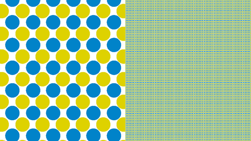
A combination of yellow and blue dots can be found in the image below. When these dots are enlarged, we clearly see each dot as yellow or blue.
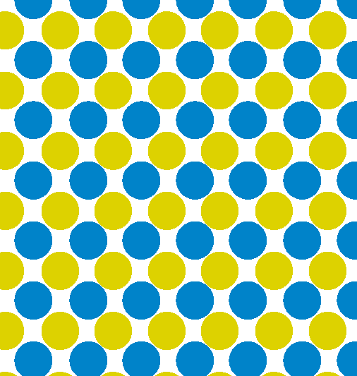
But, if we take this pattern, make it smaller, and repeat it – then we see this arrangement as green. Green, of course is what color we would get if we were to mix yellow and blue pigments together. However, in the image below, the colors are not mixed. They are simply laid next each other in close proximity to one another.

The white spaces between the colors also play a role in the perceived value of the color. So, it is clear that optical mixing can also affect not only the color, but also the value that is perceived by the viewer.
Optical Mixing Affects Value
Black and white lines, when applied with controlled spacing, can be perceived as gray. This type of optical color mixing is exploited frequently by pen and ink artists. Controlling the amount of negative space between black lines allow the pen and ink artist to create gradations or gradual changes in value in drawings.
Here’s how it works…
In the image below, a series of black lines are drawn on a surface. Each black line is the same width, but the amount of negative or white space between the lines increases from left to right. When enlarged, there is little to no gradation of value perceived from left to right.

However, when this same grouping of lines is reduced and repeated, a gradation of value is easily perceived by the viewer.

Pointillism
Pointillism refers to a painting methodology in which small dots of color are added to the support with the intent of relying on optical color mixing for color translation. In other words, pure color is added on the painting surface in a manner so that adjacent colors will affect how that color is perceived by the viewer.
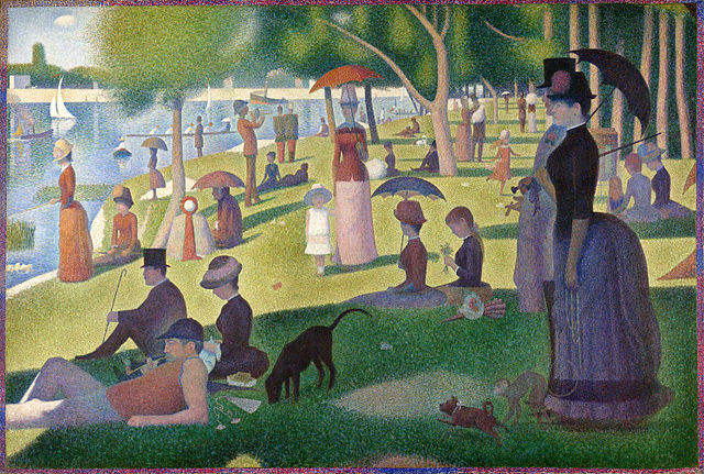
Perhaps the most well-known artist that used this technique was the French Post-Impressionist painter, Georges-Pierre Seurat. His most famous painting that utilizes this technique is entitled, “A Sunday Afternoon on the Island of La Grande Jatte”. The painting is quite large measuring 81.7″ by 121.25″. It took him two years to complete it (1884-86).
Other Mediums
Optical color mixing can be used and exploited with other media including pastel and colored pencils. Both pastels and colored pencils rely on layering. As colors as layered, some of the underlayment can be allowed to show through. Applying colors in this way affects how the top layer of colors are perceived. This is most often observed when colors are scumbled over layers without any subsequent blending.
Put It To Work
If you’re looking to try your hand at optical color mixing, I think the best colored medium to start with are oil pastels. Oil pastels are easy and quick to make marks, so results can be measured quickly. Experiment with color combinations and judge how they will be perceived by a viewer. Try a variety of sizes of mark and evaluate your success. After a bit of time with oil pastels, you’ll be ready to tackle more challenging mediums like oil paint.
If so, join over 36,000 others that receive our newsletter with new drawing and painting lessons. Plus, check out three of our course videos and ebooks for free.
5 Grips for Holding a Pencil for Drawing – My Favorite Grip is #2

It’s no secret that the way in which you hold your drawing pencil will affect the marks that you make on the drawing surface. By holding the pencil the same way – all of the time – in all of your drawings – you are limiting what is possible as far as mark-making goes.
It’s also no secret that variety is an important factor in our drawings. Variety, one of the eight principles of art, creates interest in our drawings. It keeps us exploring the picture plane and makes our viewers more engaged in what we produce. In fact, Plato even acknowledged the importance of variety in artistic composition.
By holding the pencil in different ways, we can instantly create variety in our drawings. Beyond this however, expanding the possibles of how the pencil is held will lead to new ways of making marks, expanding our drawing possibilities.
So, let’s look at a few ways that you can hold your pencil to create different marks in your drawing…
Pencil Grip #1 – Traditional
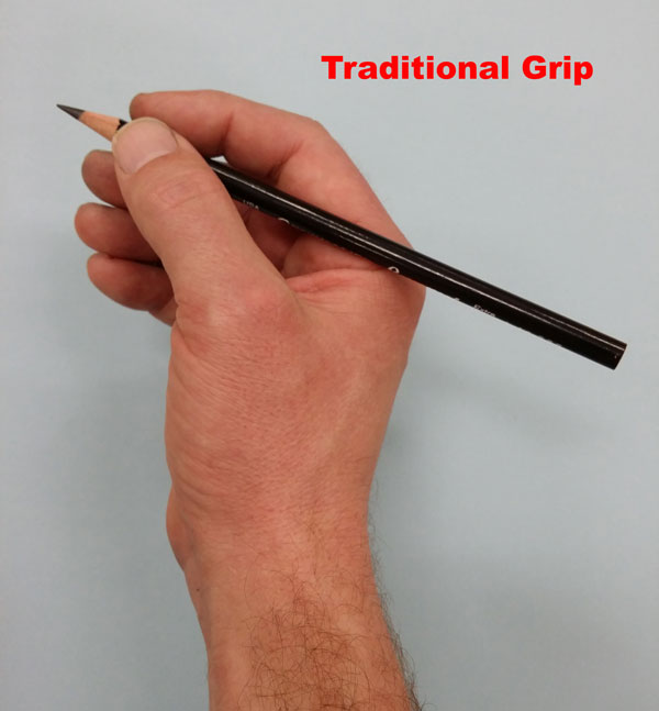 The traditional grip is exactly what the title suggests. This is the way that most of us have learned how to grip a pencil from the time we first started learning how to write. For many people, this is the only grip that is used for drawing. I’ll admit, this is still my “go to” grip. When I sit down to draw something, I’ll usually hold the pencil with this grip initially. It’s just natural to grab a pencil in the way that we are most familiar. But using this grip only limits what we can do with our drawings. The tip of the pencil is what makes contact with the surface. There is quite a lot of control with this grip, which makes it great for details.
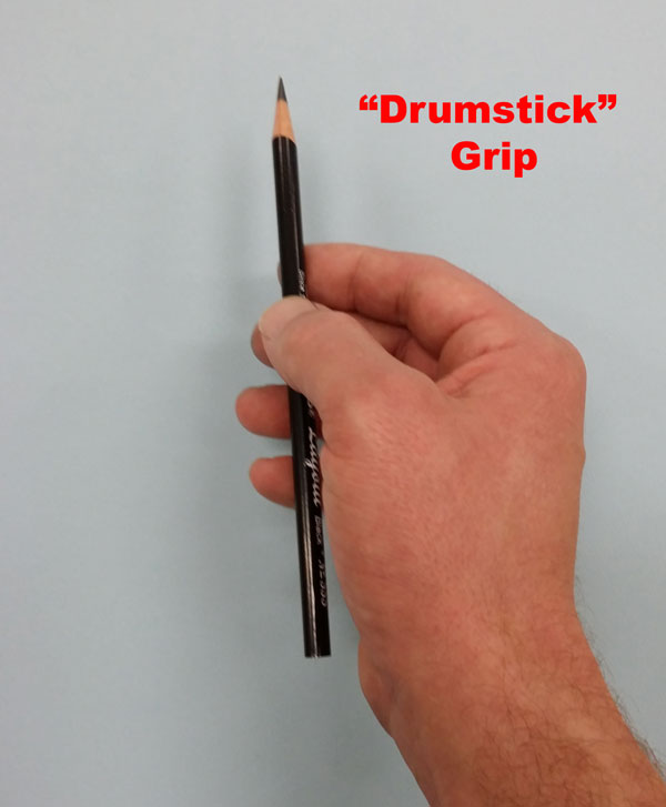
Pencil Grip # 2 – The Drumstick Grip (My Favorite)
Now this grip is favorite for a couple of reasons. It’s not the grip that I use most often, but it’s one that encourages better drawing. More on that in a moment.
I’m calling this grip “The Drumstick Grip”. Not many people know that I’m a drummer and this grip is very similar to how one should hold a drumstick. The pencil is held loosely between the index finger and the thumb, while the other fingers act to stabilize the pencil. Holding the pencil in this manner allows for the marks to originate from side of the exposed graphite (or charcoal, or colored pencil), instead of the just the tip.
Now, why is this grip my favorite? This grip forces you to draw with your shoulder instead of just your wrist. This is essential to “loosening up” with your drawing, which will actually lead to better drawing. This grip is perfect for loose marks and laying out drawing for this very reason. For drawing large, this grip is – by far, one of the best. You can also create the greatest variety of marks using this grip as well.
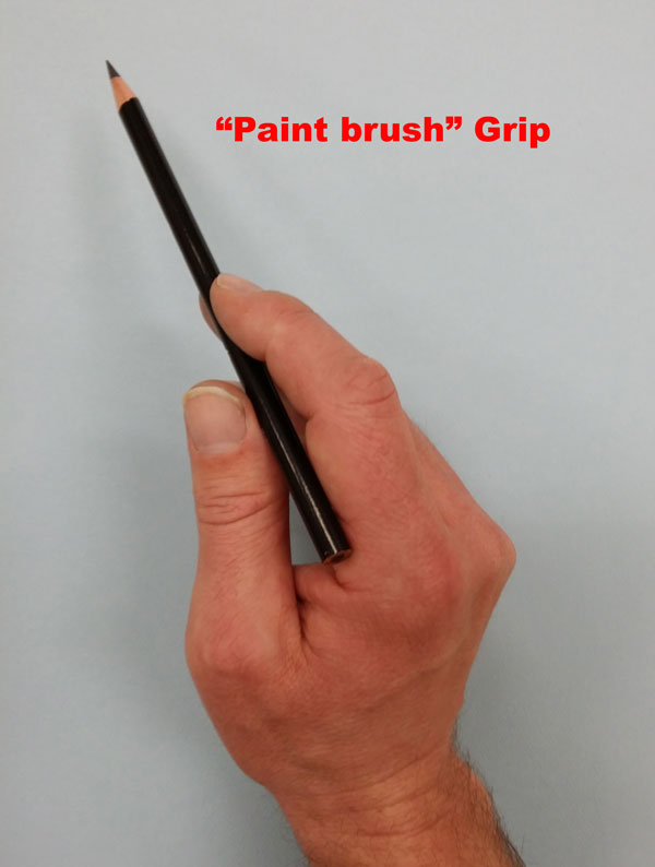
Grip #3 – The Paint Brush Grip
With the “paint brush” grip, the pencil is held in a similar manner to holding a paint brush. The pencil is held upright and the back edge rests on the crease between your index finger and the base of your thumb. This grip is perfect for creating light and delicate marks. It’s also great for when you are making visual comparisons on the surface and laying out the composition. Generally the tip of the pencil is what makes contact on the drawing surface.
Grip #4 – Tip Heavy Overhand Grip
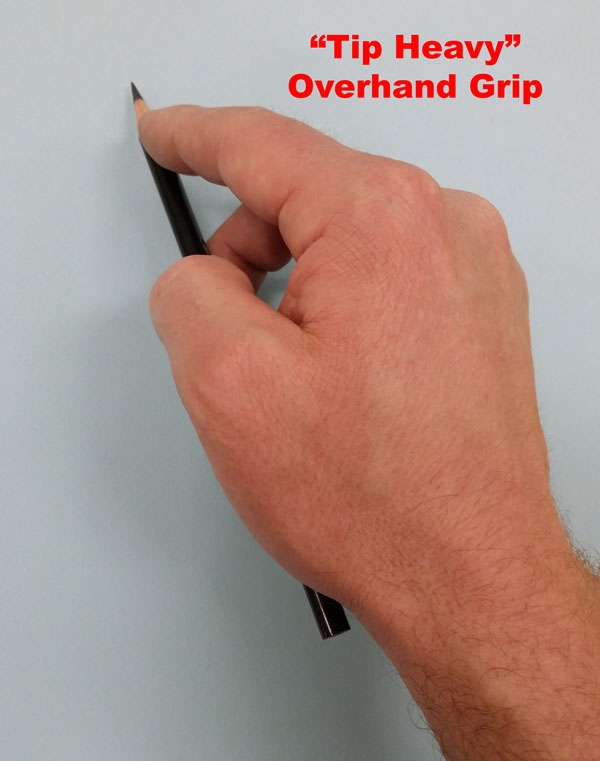
This grip is used for forceful applications of the material onto the surface. The midsection of the pencil is held between the middle finger and the thumb while pressure is exerted onto the tip of the pencil. The pencil lays almost parallel to the drawing surface, forcing the side of the tip of the pencil to make contact. The result is a strong mark that has potential for width variance. This grip is great for filling in large areas of the medium quickly. This grip also forces the use of the shoulder in the drawing process.
Grip #5 – The Inverted Grip
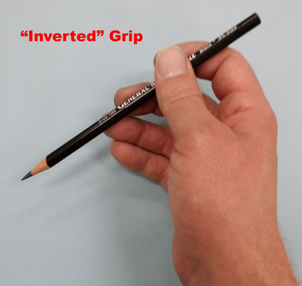 For this grip, the pencil is held by resting it upon the forefinger and stabilizing it with the thumb and lower fingers. The pencil should actually point back towards the artist. Marks are made with the tip and the backside of the tip of the pencil. This grip allows the artist to clearly see the marks as they are made since the hand and the fingers are out of the way.
Take Action
Which grip do you use most? Are you stuck with a particular approach? It’s time to take action and start experimenting with different pencil grips. I promise you that by trying out a few of these grips, you’ll start to see some improvement. It may feel a bit strange at first, but with a touch of practice you’ll start seeing the benefits of using these grips in your drawings.
If so, join over 36,000 others that receive our newsletter with new drawing and painting lessons. Plus, check out three of our course videos and ebooks for free.
Fighting Artistic Limitations
Managing Limitations
Limitations are a part of our daily lives. It’s the reality of life – right? You can do this – you can’t do that. We are all used to this, and as a result we tend to put limitations on ourselves. These self-imposed limitations show themselves over and over again with students learning to become artists.
We believe that we can do this – but we can’t do that. Often, these beliefs form who we become as people. They craft the very essence of our existence.
Unfortunately, many of these beliefs were formed as we grew – when we were impressionable. We accept them and move on. Some of us move through life ignoring our passions because we believe that we are incapable of achieving success.
Letting Go of Limitations
Those of us that believe that we have limitations to our artistic abilities were told at some point, either directly or indirectly, that we were incapable. (It’s very easy to to give up and blame it on a lack of “talent”.) Perhaps, it was a teacher, a parent, or a peer that planted that belief – and over time it grew. For many, they can remember the exact moment when that belief was planted.
 As children, we draw and paint without fear of judgment. Artistic limitations do not exist and everything created is a work worthy of pride.
“Every child is an artist. The problem is how to remain one once you grow up.”
-Picasso
But over time, children are told of perceived limitations by others and these comments mold our perceptions of ourselves.
If we can silence perceptions in our minds and approach creating art without preconceived notions, our limitations vanish. We are free to pursue our life passions without judgment – without fear of failure.
This is how I suggest students approach creating art – without preconceived notions – without limitations.
Do not fear mistakes – they are part of the journey. Do not suppress passions – they are the essence of life!
If so, join over 36,000 others that receive our newsletter with new drawing and painting lessons. Plus, check out three of our course videos and ebooks for free.
Organizing Art Supplies
Considerations for Organizing
The reasons to organize your materials may be obvious, but I’ll go ahead and mention them…
1. To know where your supplies are when you need them
2. Keep your supplies in good shape so they’re ready for use when you need them
3. Keep materials dry, protected, and separate from each other
There are lots of ways this can be accomplished – even some incredibly creative ways – but most people choose to organize art materials in a container or bin. Some of these containers are portable while others are more permanent solutions.
Here’s a look at a few options for storing art materials…
Portable Art Supply Storage
There are quite a few products on the market for storing art materials for portability. Manufacturers have created “tackle-box like” containers that feature multiple compartments, and the larger versions will hold a lot of stuff! Different sizes of containers are available based on the need. Smaller containers are best when you actually have to carry your materials around with you – like to a class or workshop. The larger containers, while portable, can still work as complete organization solutions.
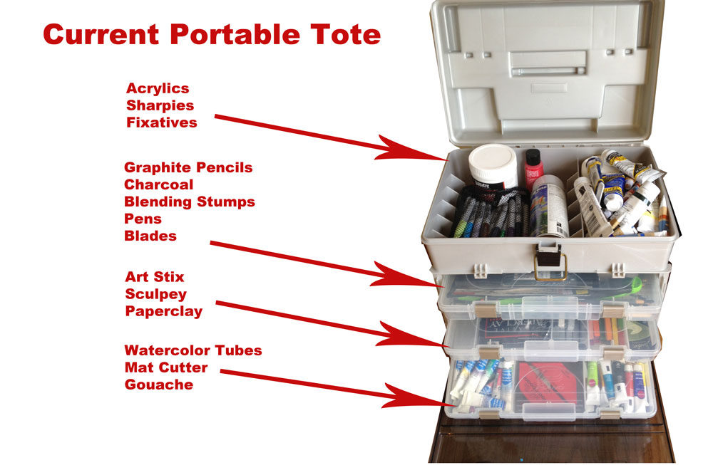
For quite a while I used a large portable container to hold much of my art supplies. Here’s a look at that container and how it’s currently organized…
Each compartment keeps the materials dry and separate. This container is definitely one of the larger ones on the market.
Since I don’t currently have the need to tug around these supplies, I’ve switched over to a more permanent solution.
Art Supply Organization for Lots of Materials
If you have a large quantity of materials to organize, a portable container most likely will not be enough. In this case, it’s time to look for more permanent solutions.
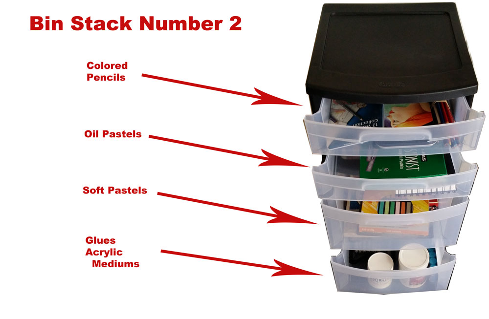
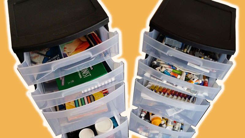
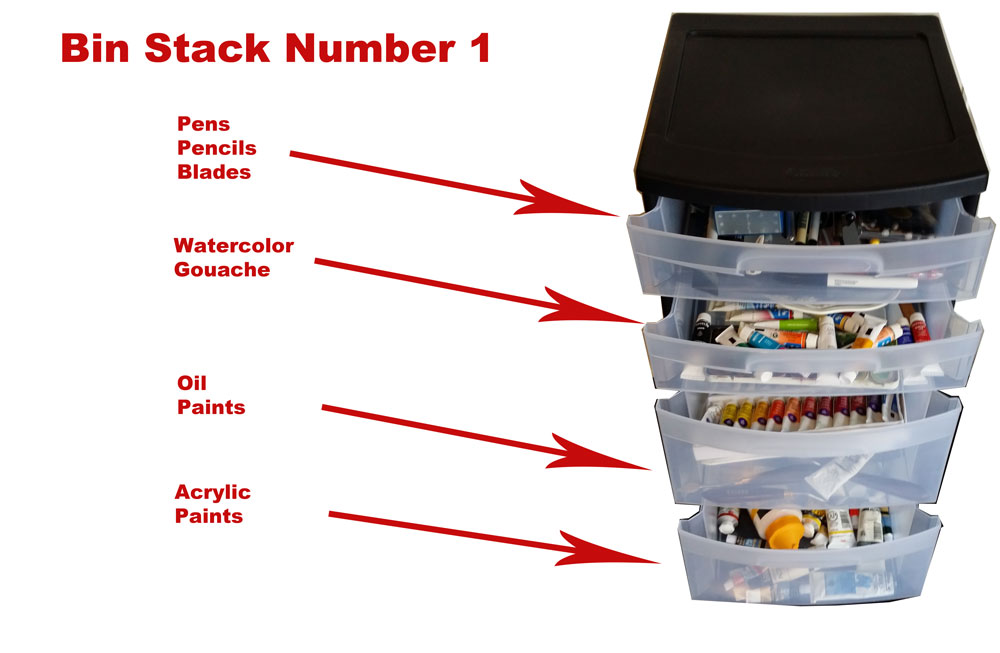
I have my supplies organized in two vertical bins that are about 2.5′ tall. The bins feature rollers so I can move them around if need be.
Here’s a look at how I have them organized…
 And here’s a look at bin number 2…
For pencils and brushes that I use often, I use a pencil and brush kiosk…
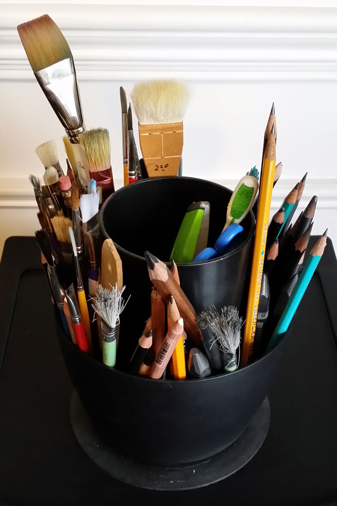 The solutions that I use for organization are inexpensive. There are more expensive solutions available that are more attractive, but these do the trick just as well.
How do you organize your supplies? Got any ideas to share?
If so, join over 36,000 others that receive our newsletter with new drawing and painting lessons. Plus, check out three of our course videos and ebooks for free.
Forms for Drawing
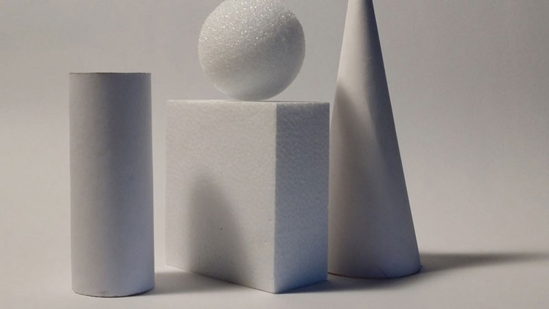
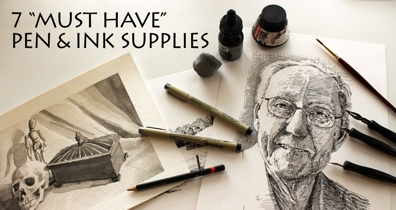
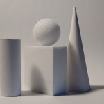
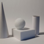
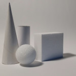
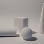
In this post, I’ll offer a few photo references for practicing with value.
The goal should be fairly simple – create the illusion of light and form through value.
Each simple geometric form will have a few defined areas of light and dark areas. Here’s s quick look at these areas…
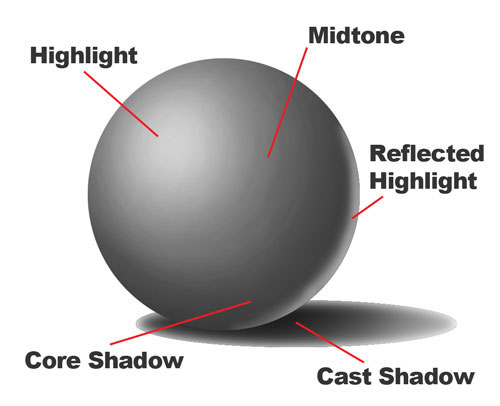
The highlight is the area where light is hitting the object and will be defined by a light value or tint of the color.
The midtone is the middle value and will be defined by a value in the middle of a value scale.
The core shadow is the area of darkest shadow on the form and will be defined by a darker value or shade of the color.
The cast shadow is an area on a surrounding area (maybe the surface) that is darker in value because light is prevented from reaching that surface. This area will be defined by a darker value or shade of the color.
The reflected highlight is the area on the form that is receiving light that may be reflected off of a surrounding object. This area is typically made up of a middle value or lighter value (tint) of a color.
It should be your goal to locate these areas on forms and draw them in the correct locations. Doing this will create the illusion of form and light.
It should also be noted that a full range of value should be used in your drawing. Use as many values as possible in your drawing…
 So, let’s get practicing. Below, you’ll find five photos of forms for practicing drawing with value. Remember to look for the areas of value and create a full range in your drawings…
If so, join over 36,000 others that receive our newsletter with new drawing and painting lessons. Plus, check out three of our course videos and ebooks for free.
More Drawing Exercises

When we exercise, whether it be physical or mental, we become stronger. You can’t expect to become better at drawing without actually drawing.
Over three years ago, I posted a list of drawing exercises. And while this list is very short, it proved to be one of the most popular posts here on the blog. People are simply hungry to improve. So, here’s an updated look at some drawing exercises that are sure to help you improve.
Drawing Exercise #1 – Draw Your Hand From Different Angles
Your hand is always with you, just hanging out there at the end of your arm. Why not draw it? In fact, draw it several times.
Many people believe the hand to be one of the most difficult subjects to draw. This makes it all the more appealing as a challenging subject. (The fact is though, hands aren’t hard to draw. Hands can be broken down into easy to draw shapes – no matter what position they are in.)
Challenge yourself here further and set a timer. Give yourself five or ten minutes to draw your non-dominant hand. Perhaps hold a few items to add to the challenge. Stay focused and make several drawings – perhaps an hour’s worth. You’ll be mentally exhausted at the end – but it’s worth it!
Drawing Exercise #2 – Drawing a Reference Upside Down
Drawing on the Right Side of The Brain by Betty Edwards is the most widely used drawing instruction book. It has sold more than 1.7 million copies. I remember my instructors using it years upon years ago. One of the exercises in this book really had an impact on me regarding drawing. The exercise is to draw an image from a provided reference both “right-side up” and then “upside down” and then compare the results.
Typically the image drawn upside down is considerably better.
The goal of the exercise is help students recognize that drawing is about observation. When we focus purely on observation, and remove any notions of “what we are actually drawing”, we are successful.
The exercise in the book is simply a line drawing, but we can apply this exercise to more complicated images like photographs.
No need to draw it “right-side up”, instead complete the entire drawing from a photo reference upside down. This exercise will help your brain “get in the habit” of seeing lines, forms, shapes, textures, and values when you draw. Practice it often, and you’ll be surprised how you start seeing the world around you – truly as an artist.
Drawing Exercise #3 – Speed Drawing
Many artists want to be able to draw faster. We’ve all seen artists that can quickly make a few marks on the surface and almost magically, an incredible image starts to manifest itself.
Of course drawing quickly happens as a result of practice. The key to drawing quickly is allowing yourself to make what many people consider to be “mistakes”. (Often, these stray marks aren’t really mistakes at all anyway.)
Set up a timer for about 10 minutes. Then, draw as many different items around you within that time frame.
Since you have to draw quickly, you’ll find that you draw more with your whole arm and less with just your wrist. You’ll also find that you are looking at the object that you are drawing almost just as much as you are making marks.
Drawing Exercise #4 – Non Traditional Drawing Tools
There are more ways to draw than with the traditional drawing pens and pencils that we are all accustomed to. Why not try something different?
Grab a container of black India Ink and few items around your house or from your yard. Sticks, rocks, feathers – whatever will transfer the ink to the surface.
Create a drawing by dipping these items onto the ink to make marks on a drawing surface.
This exercise will really make you focus on the textures and lines that are created with these tools. You might find that you really like drawing in this manner too!
When you go back to using traditional tools, you’ll find that you consider your marks a bit more and may focus on making them more interesting.
If so, join over 36,000 others that receive our newsletter with new drawing and painting lessons. Plus, check out three of our course videos and ebooks for free.
Photo References for Drawing Reflective Surfaces

Before I pass on these challenging images, I’ll spend just a brief moment discussing the core concepts of creating the illusion of a reflective surface.
Concept One – Texture
Of course a reflective surface, or any surface for that matter, has a texture. Texture plays an incredibly important role in the success or failure of a drawing. Unfortunately, sometimes texture is completely, but inadvertently overlooked.
For a reflective surface, texture plays a huge role. The ultimate goal should be to create simulated texture, which refers to the actual texture on the object. This is the observed texture.
So, what’s the key to creating the illusion of texture on a flat surface?
The key is value.
Value is the darkness or lightness of a color. Value is one of the seven elements of art and I’ll argue with anyone that it is the most important one of all.
Value is responsible for how we perceive light and how we understand objects. You can read more on value here.
It’s the arrangement of values (darks and lights) which ultimately leads to texture that we perceive in a drawing.
With a highly reflective surface, the value contrast is important. Typically, dark values can be found right next to lighter values. Often these divisions are abrupt with a defined light between the darks and the lights.
Get these abrupt changes in value in your drawing and define them with a strong line and you’re half way there.

Concept Two – Reflection is Just That – “A Reflection”
When many people look at reflective metal, they immediately think that they are seeing grays. And while they may be seeing some grays, what is really observed is a reflection. Therefore, it is the reflection that should be drawn. Depending on what objects are reflected, a variety of colors may be present.
What is reflected is what should be drawn.
There may be grays that are seen, but often on closer inspection, it is the colors of the objects around the metal.
Concept Three – Distortion
The form of the object itself will affect the manner in which the reflection is viewed. Typically, this means distortion.
This distortion will manifest according to the contours of the object. Reflected objects may be “stretched” or “squashed” and should be drawn to reflect this distortion.
 Now, it’s time to practice.
Here are six images that you can use to practice drawing highly reflective metal. Just remember – look for strong contrasts in value to create the texture, realize that you drawing a reflection, and distort where needed.
If so, join over 36,000 others that receive our newsletter with new drawing and painting lessons. Plus, check out three of our course videos and ebooks for free.
Drawing Glass – Reference Photos for Drawing and Painting
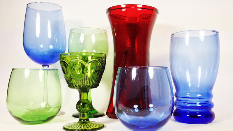
This makes drawing or painting glass all the more worthwhile.
It’s the challenges that make us grow after all. It’s the struggles that make our work stronger. We shouldn’t shy away from them. Instead, we should embrace the benefits of the challenge.
Now, back to glass. Glass presents two major challenges for the artist. The first is transparency and the second is reflection. Get the transparency and the reflection right, and you have created the illusion of glass in your artwork.
So, let’s look at how this may be accomplished.
How to Create Transparency in Drawings
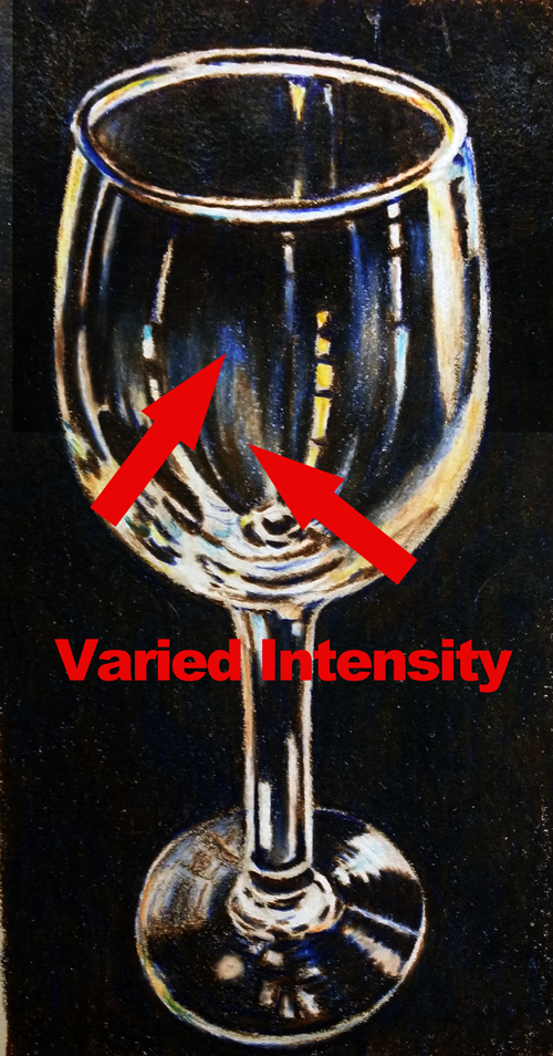
The key to transparency will lie in the handling of the intensity of the colors. Intensity deals with brilliance and is the dullness or brightness of a color. Intensity is affected by adding grays to a color. Intensity can also be affected by the amount of material that is applied to the surface.
Varying the intensities of colors will lead to the illusion of transparency. Have a look below…
By varying the intensities of blues and oranges, the glass appears transparent in areas.
How to Create Reflection in Drawings
Transparency by itself does not lead to the illusion of glass. Instead, transparency will need to be coupled with reflection. Reflection can be created by manipulating contrast.
Typically, glass will strongly reflect light. This will cause areas of intense contrast in value that will be defined by a distinct line or shape. Have a look below…
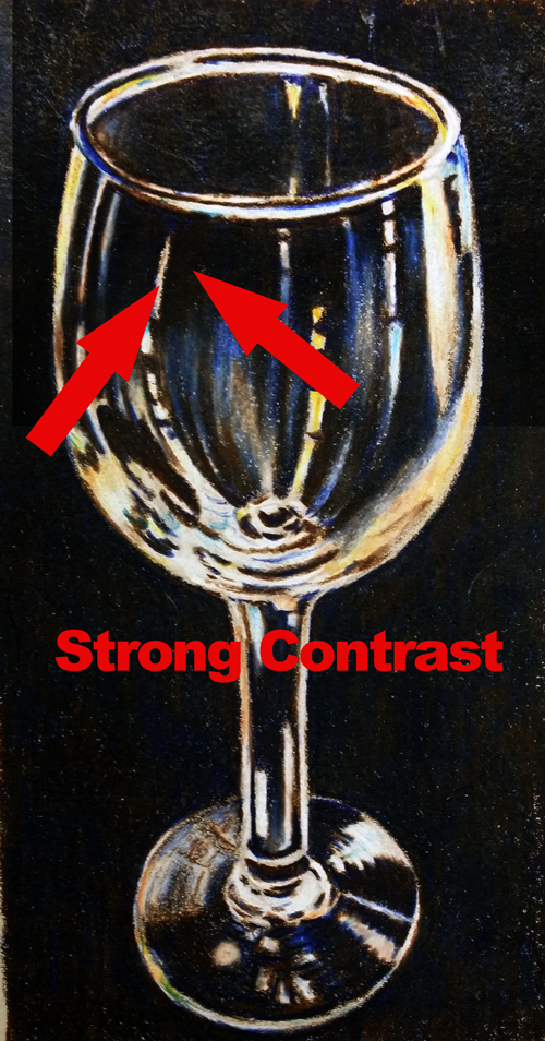 Notice the shapes of light values right next to dark values. These areas of intense contrast defined by hard edges are creating the illusion of reflection.
The combination of reflection and transparency will lead to the illusion of glass.
Ready for some practice?
Photo References of Glass for Drawing and Painting
What good is knowing a concept if you don’t practice it – right?
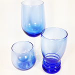
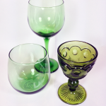
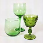
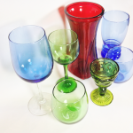
Here is a collection of glass still life arrangements for you to practice with. Just remember – look for the areas of transparency and reflection and exploit them in your drawing or painting.
If you’re looking for some more inspiration, why not check out artist, Janet Fish. She is a real master at capturing the illusion of glass in her works.
If so, join over 36,000 others that receive our newsletter with new drawing and painting lessons. Plus, check out three of our course videos and ebooks for free.


