Of course, observational drawing requires you to have a reference or a live subject. You clearly cannot draw from observation without a subject to observe.
So what happens when we don’t have the subject in front of us and we have no reference in which to work? How to do we create convincing drawings without a reference?
Most artists have the desire to draw without reference material, but when they “give it a go”, the results aren’t what they expected.
Drawing From Memory
When we find ourselves without a reference, we have to rely on our memory. We have to pull information from our past drawing experiences and apply it to the drawing that we create from our memory. And like drawing from observation, this takes a bit of practice.
Drawing from memory is a skill that can be developed. Fortunately, there are a few steps that we can take to develop this skill.
We’ll quickly look at an overview of the steps involved and then we’ll break each one down. Then it’s up to you to apply them…
- Practice From Life
- Develop a “Drawing Formula”
- Practice From Memory
- Compare Results
- Repeat
Practicing From Life
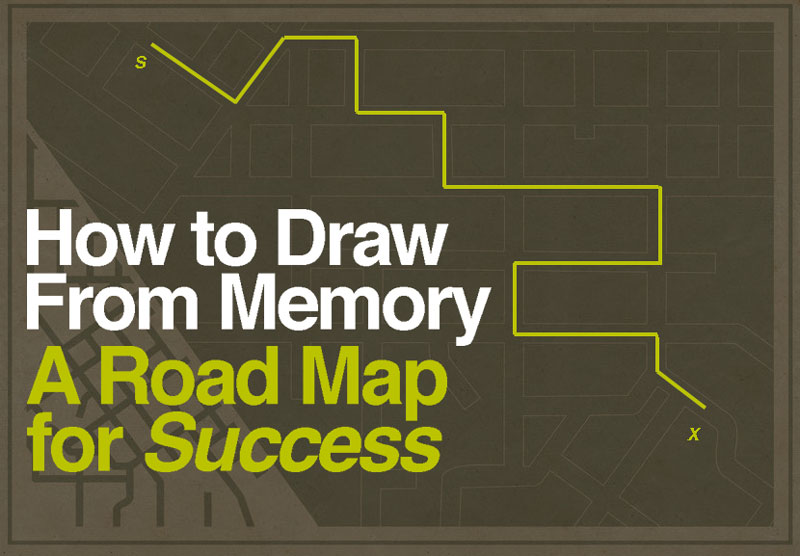
In order to draw from our memory, we must create memories. This means that we need to practice drawing from observation. By practicing, we start to develop a “road map” for creating a drawing of that specific subject.
Consider this example. You just got a new job and your new workplace is on the opposite end of town. You’re not very familiar with this part of the city. In fact, you’ve only been to that side of town once or twice and you have no idea how to get there again.
You made it to your interview, but there were lots of turns and it was a little confusing. There’s no way you’d get there again without directions.
You don’t want to be late on your first day of work, so you put the address in your GPS system and go to work. You use your GPS again to get home. And just to be safe, you use it for the rest of your first week.
But the next week, you no longer need it. You know how to get to your new job. In fact, you are now starting to enjoy the drive. You find that you begin to notice things along the way that you didn’t see when you were following the GPS. You notice specific houses, shops, and little details that escaped you before.
It’s now the sixth month of your “no longer new job” and you’ve memorized every detail of the journey. The details of the trip have become engrained in your memory. You can even give directions to others, citing landmarks along the way.
We can compare this example to drawing. When we draw a subject from life, we have our “GPS”. We can see the details on the subject. We have a guide.
The first few times that we draw the subject, we need the “map”. The more practice that we get with the subject, the more details that we notice in the process. Pretty soon, we can draw a fairly convincing version of the subject without even looking at it because we have memorized the process – we know the way.
Drawing Formulas
A drawing formula is a step by step approach to drawing a specific subject using defined relationships (proportions). Formulas exist for drawing many subjects: figures, portraiture, architecture, and animals to name a few. While accomplished artists throughout the years have devised formulas for drawing specific subjects, we can also develop our own.
When we practice drawing from life, we begin to develop these drawing formulas. We are essentially creating a “road map” for drawing the subject.

I am trained as an illustrator. Illustration majors in art school were, and still are, required to take many classes in figure drawing. In fact, I was in a figure drawing class for four consecutive years. That’s a lot of figure drawings.
When I first started, I had no idea where to start with the figure. Our professors just told us to draw the figure and walked around the classroom offering little critiques, but of course – little instruction.
For those first few drawings, I would start with the head and work downward. I soon learned that this approach wasn’t the best for drawing the entire figure.
As I continued to draw, I started to develop a formula that worked for me. It only developed from drawing from observation, but it could be applied to drawing the figure from my imagination.
I had created a drawing formula for drawing the figure through practice.
The best part is that not only could I now apply that formula to drawing the figure without a reference, but I could also apply it to drawing the figure from observation. So both skills improved as a result of the repetitive practice.
Practice From Memory
Once you’ve developed a formula for drawing the subject, the next step is to practice drawing from memory. Grab that sketchbook and start drawing the subject without a reference.
Try drawing the subject from different angles and note any issues that you encounter along the way.
You may notice that your drawings from memory are stylized, and this is perfectly acceptable. Keep in mind that for highly representational drawings, you’ll always need some sort of reference.
Compare Results
Once you complete a drawing (or drawings) from memory, make comparisons of your work with your drawings from observation.
- What details did you leave out?
- How could your drawings from memory be improved?
- How can you adjust your drawing formula to lead to greater accuracy?
Give yourself a little critique and decide how you can improve your process.
Repeat
Skills, like drawing, are developed through repetitive practice. Unfortunately, there isn’t a “magic bullet” that will make your drawing skills better over night.
The good news is that you are only limited by your dedication to the craft. And if you’re willing to put in the work, then the “sky is the limit”.
To improve your drawing from memory, you’ll need to repeat the steps above. Perhaps many times. This is great practice for your sketchbook and you’ll notice the results.
If so, join over 36,000 others that receive our newsletter with new drawing and painting lessons. Plus, check out three of our course videos and ebooks for free.
Develop a Drawing Habit
Once a habit is formed, it usually “sticks”. This is why it is so important to commit to creating good habits in our life and ridding ourselves of the habits that hinder us.
It’s easy to talk about starting a brand new habit, but it’s another thing to develop one. Developing a habit takes dedication and will power in the beginning. Over time, the habit becomes easier to repeat, but it’s tough at the start.
So, why I am talking about habits here?
Well, drawing is a skill. Skills take time and persistent practice to develop. And like any other skill, they need continual attention, without long time periods between practice sessions.
Clearly, if your desire is to draw well, then you need to create a drawing habit.
Making a commitment to draw everyday, for even just a few minutes, will lead to drastically substantial results. You may not see these improvements everyday, but you will over time. Creating a drawing habit, and sticking with it, will improve your skills – it’s almost guaranteed.
Remember, drawing is not a “talent” that some are born with and others are not. It is a skill that anyone can learn and develop.
Okay, so maybe you recognize that you need to develop a drawing habit. So, how do we develop a habit of drawing when we know that habits are hard to start?
In order to create a drawing habit, we need to understand how habits are developed and how our minds work when it comes to habits.
How Habits Work
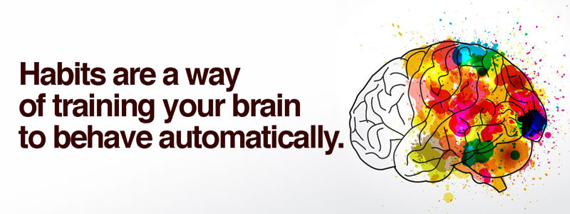
Habits, in a way, are a method of training your brain to behave automatically. However, when we start a new habit, there’s nothing automatic about it. We have to commit and force ourselves into the activity, doing it even though we may not feel like it.
I run everyday, well almost everyday. I don’t particularly like it that much (sometimes I do). But, I know that it is important for my health. I feel better when I run. I have more energy. I’m more creative. (I’ve always been athletic, but I’ve always hated to run.)
Even though it’s not my favorite activity, I can still recognize the importance of the benefits that it gives to me. You see, I run for the health benefits – not for the joy of running.
I’ve formed a habit with my running, but it definitely wasn’t easy when I first started. This particular habit has taken some time to become “entrenched” in my every day life. It definitely didn’t happen when I first made the commitment to start exercising. And I made some mistakes when I was trying to develop this habit.
My First Mistake
The first mistake I made was to run when I “had the chance”. I didn’t set up a routine or a schedule, I just told myself that I would run when I could, but do it every day.
As you can imagine, this didn’t work at all. I ran the first day and when I was sore the second day – I found I didn’t “have the time” to run. My habit had no chance of forming. It was doomed right from the start.
My Second Mistake
A few weeks later, I decided to give it another go, but this time I had a better plan. I decided that I would run as soon as I woke and hopped out of bed. I made a commitment to myself to never, I mean never, miss a day.
I was much more successful with this new approach, but I also made another fatal flaw. More on that in a moment.
My second attempt at forming a running habit was great for the first few weeks. That’s right, I actually got up every morning and ran. This lasted for about 5 weeks. I felt great, I was losing weight, and I felt like I had actually created a new habit for myself – a good one too.
Then it happened. I missed a day.
Remember, I had committed to never, I mean never, miss a day. And when I did – I felt awful. Not physically, but mentally. I felt like I was a bit of a “failure”.
But something else happened too. I saw that the world kept on going, even though I skipped a day. In fact, I kind of liked the extra time I had because a didn’t run. And guess what happened. That’s right, I missed another one. And another one. After a week, my habit was gone.
You see what happened there?
I was successful for those 5 weeks because I set my new habit to occur with another activity that I was already doing – waking up. When I woke up each morning, it became a “trigger” and I knew that the next thing I was to do was to start running. This is why the habit worked for so long.
But maybe you can also see where I failed.
When I missed a day, I felt terrible, because I had set my expectations too high. I had not “set my mind” to forgive myself when I missed a run. So, when I did, I felt like I had failed. And that feeling of failure eventually led to my demise.
If I would have just made the commitment to not miss two days in a row.
So, when I tried again several months later, this is what I committed to. I told myself, “If I miss a day – it’s ok. I can run on the next day.”
And guess what? I’m still running today. If I miss a day – it’s ok. I just pick up where I left off. My habit has stuck now and I almost don’t even think about whether or not I will run – I just do it.
So what did I learn about forming a habit?
I am by no means, a “habit specialist”, but I did learn a couple of things about forming a habit when I decided to start running. And if your desire is to start a drawing habit, then these principles can be applied to ensure that you are successful.
1. Make a Commitment – The first thing is to do is to make a commitment to improving yourself with your new habit. Understand that you are establishing this new habit for the benefits that will result, not necessarily for the joy that the activity will bring to you.
By establishing a drawing habit, even for just a few minutes every day, you will see results in your skill. Drawing is fun most of the time, but many times it takes real work. And real work isn’t always fun.
But you’re not making the commitment to form a drawing habit because drawing is fun. You are forming this habit for the benefits of drawing improvement that will result. This means that there will be days that you don’t feel like doing it. But if you’re committed to the benefits then it’s a lot easier to work through and continue.
2. Group Your Drawing Habit with a “Trigger” – I found success with my running habit when I committed to do it when I woke each morning. Waking up was my trigger. It’s what told my brain that it was time to do the next activity – which was running.
Decide what trigger you can “group” with your drawing habit. Maybe it’s that morning coffee. Maybe it’s right after dinner. Think of an activity that you know you will not be “skipping” and group your drawing habit with it. That way you are more likely to complete it every day. Over time, your brain will “tell you” that’s it’s time for drawing when you do that daily trigger.
3. Expect to Miss Some Days – Nobody’s perfect and it should be expected that you will miss a day or three. When this happens, don’t get too down on yourself. Don’t let it be the end of your habit. Instead, simply make the decision to not miss two days in row. If you skip a day, just pick up on the next.
4. Set a Time Limit – Our time is important and you may tell yourself that you just do not have the time to start a new beneficial habit like drawing every day. Saying that you “don’t have the time” is really just an excuse. Wake up 30 minutes earlier, or skip that hour of TV.
Setting a time limit to the activity helps as well. Commit to drawing for just 30 minutes, or even just 15 minutes every day. Surely, you can find 15 minutes in your day to improve your skills.
So What Do I Draw?
Be prepared for the ole’ “artist block” when you start your new drawing habit. That blank sheet of sketch paper staring at you can be intimidating, but it doesn’t have to be. You can’t wait for inspiration to strike. You’ll end up waiting for a while if you do.
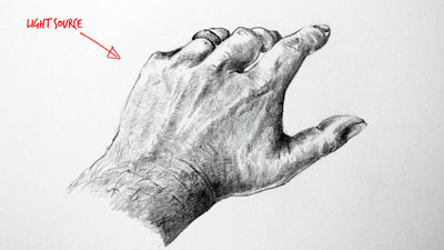
Inspiration usually results from some sort of action. So, make a plan for what you will draw ahead of “drawing time”. It can be anything. Objects around you, photos that you have lying around, or even your hand. The point is to just draw something. As you start making marks, and get to the work, your artistic inspiration may just “kick in”.
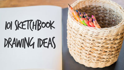
If you need a little help getting started, this handy list of 101 sketchbook ideas will get things going…
Start Your Drawing Habit
Ok, so now it’s time to get started. Drawing well requires a commitment to developing your skill. And skills are developed with practice. And practice requires a habit.
Make a commitment to yourself to start improving your drawing skills by developing a drawing habit. With a drawing habit in place, you’re sure to see improvement over time.
If so, join over 36,000 others that receive our newsletter with new drawing and painting lessons. Plus, check out three of our course videos and ebooks for free.
9 Must Have Colored Pencil Supplies
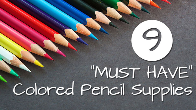
Every time I sit down to work on a drawing, I make sure that each of these supplies are within my reach. I may not use them for every drawing that I create, but they are an essential part of any colored pencil artist’s tool box.
Let’s have a look inside…
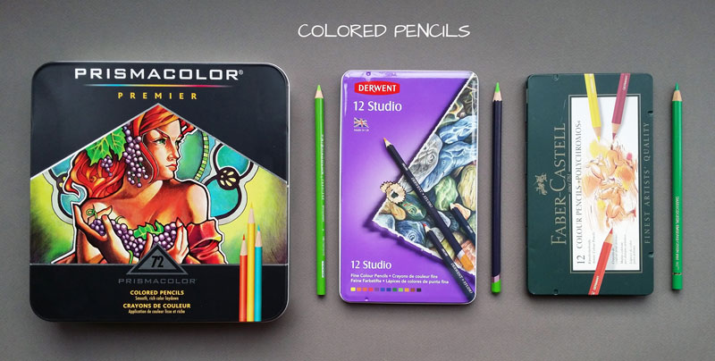
1. Colored Pencils
Okay, so this one is fairly obvious. You must have colored pencils to create a colored pencil drawing. But there’s a little more to this.
The quality of the brand of colored pencil that you use greatly affects the results that you will see in your drawing. You cannot expect to use sub-par materials and get professional results.
Even if you are just starting out, I would suggest going right for the higher quality pencils. Using a lower quality brand may just lead to unnecessary frustration.
(Some of the following links are affiliate links which means we earn a small commission if you purchase at no additional cost to you.)
My favorite brand is Prismacolor Premier. These pencils are soft and layer easily, producing rich colors quickly.
They are wax-based, so wax bloom could be an issue, and many people complain about how easy it is to break the core of the pencil. But despite these issues, they are still “far and away”, my favorite.
Of course, there are lots of great brands of pencils out there and I’ve tried many of them. A couple of other great brands out there include:
- Faber Castell Polychromos Color Pencils (oil-based)
- Derwent Studio Colored Pencils (wax-based)
If you want to learn my opinion on each brand that I have tried, you can check out the colored pencil comparison chart.
2. Bristol Paper / Illustration Board / Toned Paper
Okay, so two obvious ones on the list. You also need a quality to surface to work on. While your standard 60 lb. drawing paper in a sketchbook will accept the marks produced by colored pencils, it won’t produce the professional results that we’re after. You’ll need a higher quality surface that is better suited to accept multiple applications of color.
My favorite surface on which to work is Bristol paper. There are two different surface textures (tooth) to choose from – smooth or vellum. I prefer to work with the vellum surface which does have a slight tooth. The slight surface texture accepts the colored pencil applications with ease, allowing multiple layers of color.
Illustration board is also a great surface for colored pencil applications. Illustration board provides a surface that is similar to Bristol paper, but is backed with a rigid core. It is a bit pricer and it is hard to find in some art stores, so I tend to stick with Bristol paper.
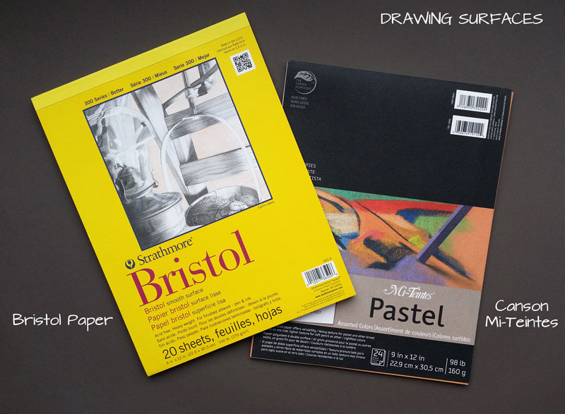
With any colored medium, you may find it an advantage to work on a toned surface. Working on a toned surface provides a neutral starting point for adding color, allowing you to work the values darker or lighter. You may also choose to allow parts of the paper to show through the finished drawing, with specks of color that enhance the overall appearance.
There are lots of toned paper choices, but my favorite is Canson’s Mi-Teintes paper.
This paper is designed for pastel applications, but also preforms well with colored pencils. It features a heavy tooth, so multiple applications of color are required (and so is a bit of patience).
3. Hand-Held Pencil Sharpener
It may be tempting to use that shiny electric pencil sharpener that sharpens pencils to a precise point in a matter of a second. However, an electric pencil sharpener can be ruined by colored pencils.
Wax-based colored pencils produce wax-based shavings that can get caught in the blades of an electric pencil sharpener. These shavings create havoc for an electric pencil sharpener and can cause it to stop working.
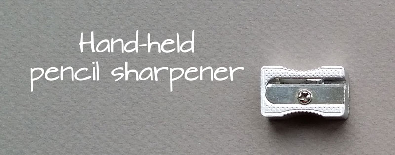
This is why I use a metal hand-held pencil sharpener. It is cheap and gets the job done. If the blade becomes dull, I can easily replace it, or just pick up another sharpener all together.
4. Kneaded Eraser and/or Vinyl Eraser
Every colored pencil artist needs a couple of erasers. I suggest having both a kneaded eraser and a vinyl one.
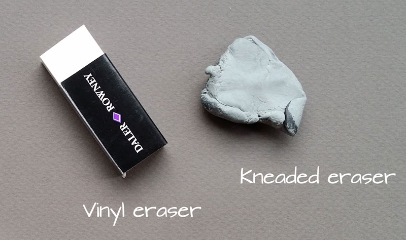
A kneaded eraser is great for “lifting” an underlayment of graphite before applying colored pencils to the surface.
However, a kneaded eraser is not strong enough to remove colored pencil applications from the surface, so this is where the vinyl eraser comes in. The tougher vinyl eraser is able to remove a good bit of material from the surface. However, you’re likely to find that it doesn’t remove it completely.
5. Colorless Blender
Burnishing is a process of layering colored pencils in order to create a solid area of pigment. It is done to eradicate the texture produced by the drawing surface. By removing much of the surface texture, a colored pencil drawing resembles a painting.
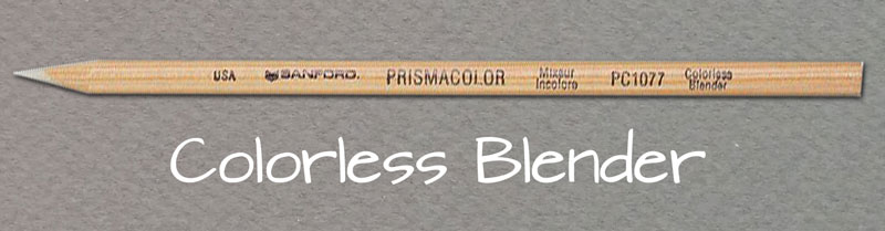
For wax-based pencils, burnishing applications of colored pencils is an integral part of the process. While lighter colors such as White or Cream can be used to burnish areas, a colorless blender is another option.
A colorless blender is a pencil (or marker) that features a waxy core of un-pigmented colored pencil medium. It can be applied directly over colored pencil applications to work the color into the tooth of the paper. It can also be used to smooth transitions of color and value in the drawing. Without a doubt, a colorless blender is a “must-have” for artists that work with wax-based colored pencils.
6. Turpenoid
Another way that colored pencils can be burnished is with a solvent. Solvents can be brushed directly onto colored pencil applications thinning the material “just enough” to work it into the tooth of the paper. Like with a colorless blender, applying a solvent can also smooth transitions between colors and values in the drawing.
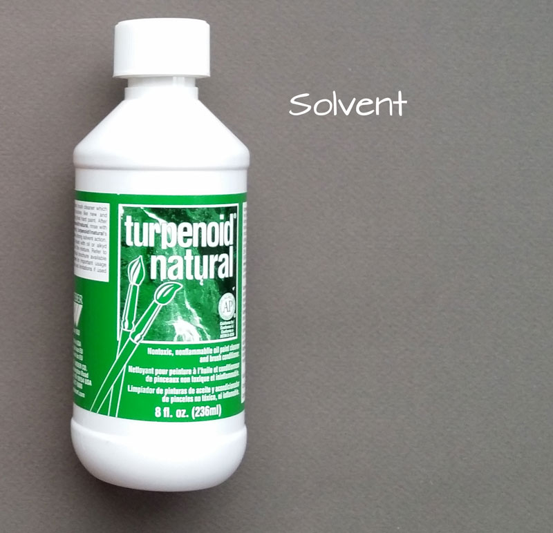
Different solvents can be used to create this effect. Some people prefer to use rubbing alcohol, but I tend to stick with a product called “turpenoid”.
Turpenoid is a relatively odorless, clear liquid that shares many of the same properties as turpentine. It thins the colored pencil applications with a good deal of control, just without the fumes.
7. Nylon Brushes
If you decide to use a solvent to blend your colored pencil drawing, you’ll need to have a few brushes. I prefer to use nylon brushes because they are strong and flexible, while providing control and precision.
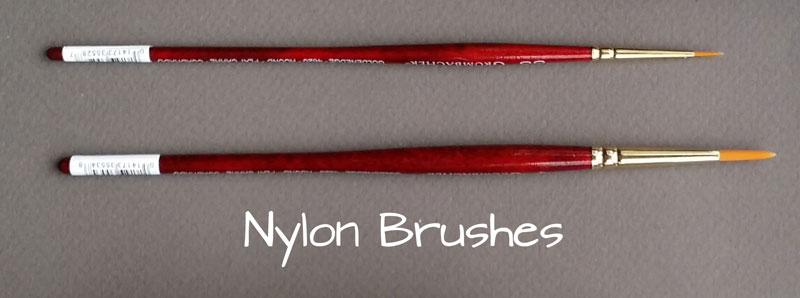
My favorite nylon brushes are the Grumbacher Goldenedge brushes. They are a bit pricey, but well worth the investment.
8. Drafting Brush
Although you won’t have to worry about any dust or powder with colored pencils, you may experience a few small pieces of the material landing on the surface as you make marks. These small pieces of color can accidentally get smeared by the palm of your hand if you’re not careful.
To prevent unwanted smearing, I use a drafting brush. An occasional swipe over the drawing removes these small specks of color.
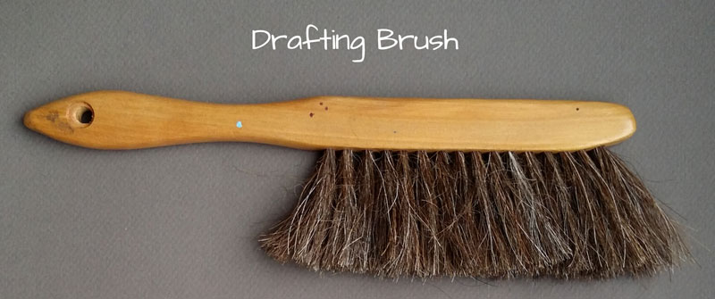
If you try to swipe the specks away with your hand, you’re likely to smear the color. However, the fibers of the drafting brush are able to pick up the material and remove it without any smearing.
9. A Blade
Another important tool is a blade. It could be an X-Acto knife, or a box cutter.
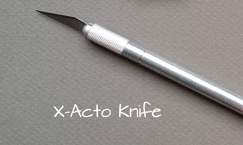
The blade serves multiple purposes. It can be used to cut down the drawing surface or to sharpen the pencils to a very precise point, which is sometimes necessary. If you do sharpen with a blade, be sure to make cuts away from your body.
One More…
One more supply that I use frequently is a masonite drawing board. I left this one off of the list because it isn’t considered a “must have”. Since most of my colored pencil drawings are relatively small (11″ by 14″ or smaller), I use a small board. I can tape the drawing on to the surface to prevent any “buckling” of the paper, but I can still turn the board to draw from different angles, if the need arises.
If so, join over 36,000 others that receive our newsletter with new drawing and painting lessons. Plus, check out three of our course videos and ebooks for free.
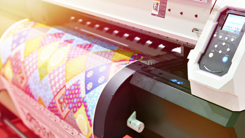
Make Prints of Your Art
But lets’ face it, every work that you produce is personal. The artist will always put a bit of themselves in every piece that they create. So for some, the thought of selling their work and “letting it go” to someone else is unbearable. For these artists, putting a price on something that you have literally poured yourself into is unimaginable.
The good news is that you don’t ever have to let go of the original work to share it with the world – and make a profit from it. Instead of selling the original work, you can sell prints.
The print market is huge and for years, it has been out of reach for many artists. In the past, you would have to find a print manufacturer to produce, distribute, and sell the prints for you. Or you could purchase prints directly from a printer and sell them yourself – but distributing them on a large scale was very difficult. These routes are still taken by some artists today, but if you want to maximize your profit, then the best solution is to print and sell them yourself.
Before we explore the options, let’s discuss the type of prints you’ll want to provide to your patrons.
Fine Art Prints
There are many options for printing your work. Your patrons will demand quality and you’ll want to provide them with this. For this reason, your prints will need to meet the industry standard.
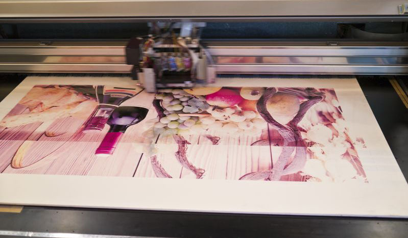
The best approach is to provide Giclée prints. Giclée (pronounced “zhee-clay”) is a process of printing that ensures a high level of longevity and quality to the print. It is also very “true” to the original work of art.
If you are are unfamiliar with Giclée printing, it simply refers to a high quality print, typically produced on a modern, large format inkjet printer.
For most of us, the standard inkjet printer in our homes will not produce a Giclée print. It may be capable of producing a beautiful reproduction, but not necessarily one that is considered a “Giclée”. To create a high quality Giclée print, several conditions must be met concerning the printer, the ink, the surface, and the resolution of the print.
Printer – Giclée prints are typically produced using large format inkjet printers that feature small spraying apparatuses that apply the ink precisely and match the colors equally well.
Ink – The ink must of high quality and considered “archival”. This is typically achieved using inks that are pigment-based instead of dye-based.
Surface – The surface is also important as a Giclée print must be printed on an “archival” surface. This could be watercolor paper, rag paper, canvas, or any specially-designed printing paper that is labeled as “archival”.
Resolution – Most digital photos are recorded at a resolution of 72 dpi, or “dots per inch”. While this resolution is acceptable for digital photos, it is not up to the standard of a print, which needs to be printed at a minimum of 300 dpi. The resolution, however, can easily be altered using a photo editing program such as Photoshop or Gimp prior to printing.
Printing Through a Print Company
Since there is a small barrier for entry into the print market, you may consider having a print company produce Giclée prints for you.
Printing reproductions of your work through a printing company can be expensive, but also worth the investment in some circumstances. You’ll need to be fairly sure that you can sell your prints before making the investment of using a print company. If you are sure that you can sell, then the quality of the print is fairly reliable.
There are several costs to consider. Many companies charge for the scanning and color matching of your work, sometimes referred to as a “setup fee”. Depending on the company that you work with, you may have to purchase prints in bulk. This is not always the case as some companies allow you to purchase individual prints, but at much higher cost. Most offer discounts on bulk printing, so it makes sense to purchase many prints. Beyond the cost of setup and printing, you’re also likely to have to pay for shipping. You can see how the prices can soar very quickly.
If you can charge enough for your prints to make a profit beyond the costs of printing, then using a print company offers a bit of reliability and quality assurance.
Print Your Art With Your Own Equipment
Because the cost to use a commercial printing company can be expensive, many artists opt to make their own prints.
One thing to carefully consider is the quality of the print. You do not want to produce prints that are not a good investment for your buyer. This means that you’ll need to produce prints that are high quality and will last for years. As mentioned before, the quality of the print all boils down to four factors:
- The quality of the printer
- The quality of the paper
- The quality of the ink
- The resolution of the print
Another factor to consider is the quality of the photo or scan of the work. The scan or photo must be as “true” to the original as possible. This means that you may have to do a bit of editing to the photo or scan using a photo editing program.
See also: How to Edit Photos of Your Art
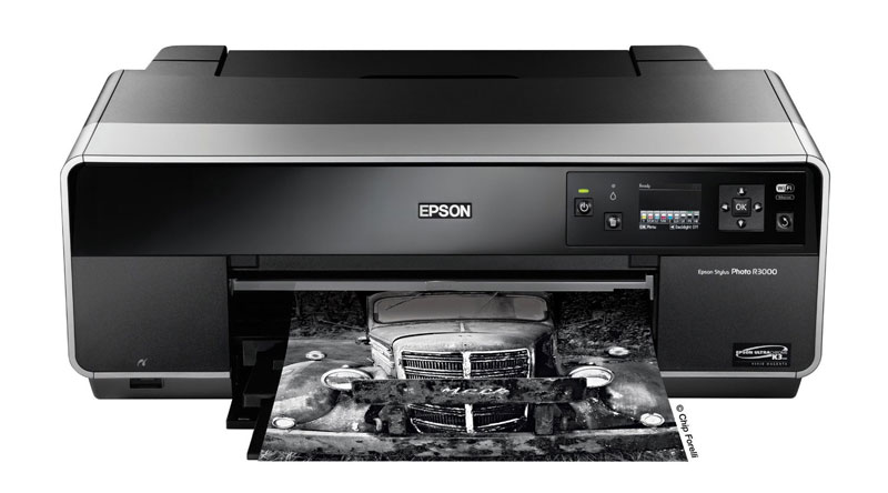
Printers for Giclée Printing
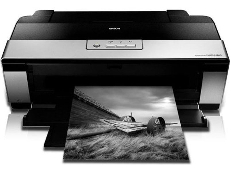
If you are considering creating your own prints to sell, you may consider investing in your own printer. When shopping for a printer, look for those that utilize pigment-based inks such as Epson’s UltraChrome K3 inks.
(Some of the following links are affiliate links which means we earn a small commission if you purchase at no additional cost to you.)
Here are a couple of options…
Marketing Your Prints
Once you’ve created your prints, you’re ready to sell them. Of course, there are many options on how to go about doing this.
You could sell them directly to patrons at local arts and crafts shows and this approach can be lucrative. But it also requires quite a bit of work. In this case, you have to print your work ahead of time, set up a booth, and spend your time at the booth.
A better approach may be to utilize the internet and the vast amount of potential patrons out there. You can sell your art through Etsy and market it through your own website. You can print the prints as orders are placed, maximizing your profits and your efficiency.
I’ve already written extensively about these subjects in the past, so I’ll link to these resources below…
- How to Build Your Own Portfolio Website (without coding and in just a few minutes)
- How to Market Your Art
- How to Sell Your Art on Etsy
- How to Price Your Art
Summing It Up
The barriers for artists to enter the print market are eroding fast and anyone that is producing quality art can begin selling their own prints. The term “starving artist” should eventually become a thing of the past and only refers to those that are not taking full advantage of the opportunities that are available to creative people today.
Image Credit – Copyright: photoncatcher / 123RF Stock Photo
If so, join over 36,000 others that receive our newsletter with new drawing and painting lessons. Plus, check out three of our course videos and ebooks for free.

The Next Course is…

Members of TheVirtualInstructor.com are able to vote on what courses are developed as part of the membership program. Voting takes place as the development and production of current courses conclude, the last being “The Watercolor Workshop”. At the date of this writing, the membership program currently offers 5 complete courses and one mini-course.
As new courses are developed, they are added to the library of courses, recorded Live Lessons, lesson plans, and Member’s Minute episodes that are already available to members. So, the library of educational content continues to grow over time.
Voting for the next member’s course concluded on June 20, 2015 with some very interesting results. Here’s a breakdown…
566 people took part in the voting. Participants were given the following choices:
- Portrait Drawing
- Figure Drawing
- Acrylic Painting
- Digital Drawing and Painting
- Photoshop Crash Course
- Art Marketing
- Other (Participants were able to write in votes)
Here’s a graphical breakdown how the voting went…
 As you can see, the voting was very tight, with “Portrait Drawing” squeaking by “Acrylic Painting” by one single vote.
So, what does this mean?
Well, in considering how close the voting was, I don’t think it’s fair to just create the course for “Portrait Drawing” and completely ignore the acrylic painters out there that have been waiting on a course. So, I have made the decision to create BOTH courses. But wait there’s more…(Always wanted to say that.)
Not only will I be releasing both of these new courses, but I will also be releasing a third!
I have been working behind the scenes to create a course on pen and ink drawing as well. So, starting mid-July, I will begin releasing course modules for all three courses as they are created.
A new course module (video and ebook) will be released every week or two for each course until all of the new courses are complete.
Here’s an overview of what will be covered in each of the new courses…
“Portrait Drawing The Smart Way”
This course will be focused on drawing representational portraits with graphite. The goal of this course is to provide the learner with a practical approach to drawing portraits that accurately depict the subject.
Concepts covered include:
- Facial proportions
- Understanding the planes of the face
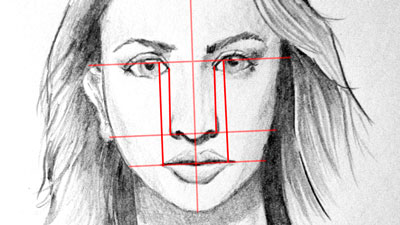
- Drawing the head from multiple angles
- Using triangulation and the grid technique for accuracy
- Drawing the eye
- Drawing the nose
- Drawing the mouth
- Drawing ears
- Drawing hair
“The Acrylic Painting Academy”
This course will be focused on acrylic painting techniques. The goal of this course is to provide the learner with a comprehensive learning experience in acrylic painting.
Concepts covered include:
- Materials and foundations
- Surfaces and tools
- Stretching and preparing canvas
- Color theory and mixing
- Using mediums
- Underpainting
- Glazing
- Knife painting and Impasto
- Scumbling
- Composition
- Still life painting
- Landscape painting
- Abstract painting
- Varnishing and finishing techniques
“The Pen and Ink Experience”
This course will be focused on drawing with pen and ink, but will also include ink wash techniques. The goal of this course is to provide the learner with a comprehensive learning experience in drawing with pen and ink.
Concepts covered include:
- Materials, tools, and surfaces
- Using line and value
- Shading techniques
- Creating textures
- Landscape drawing
- Portrait drawing
- Still Life drawing
- Ink wash techniques
I expect to start releasing course modules for each of the new courses mid-July. Each module will be released as they are developed (every week or two). Of course, as each module is released, I’ll be sure to let you know through the weekly newsletter. If you do not currently receive the newsletter, you can sign up here. (It’s free.)
I am excited about the new additions to the library and I can’t wait to get these new courses to you. As always, I’d love to hear what you think and what you’d like to see in each of the new courses. Just leave your comment below…
If so, join over 30,0000 others that receive our newsletter with new drawing and painting lessons. Plus, check out three of our course videos and ebooks for free.
7 Characteristics of Successful Artists
However, in order to reach this level, the individual must possess all, or at least several, characteristics that are frequently observed in successful artists. This means that the individual may be required to acquire some or all of the traits in order to find the success that they desire.
These traits, just like the skills associated with drawing and painting, can be acquired. You don’t have to be born with them – although a few are. We are adaptable. We can be or become anyone that we like.
These characteristics are fairly universal across all of the arts – music, dance, and theatre. They are not confined to the visual arts. In my years working with artists and student-artists, these characteristics are consistent.
Artists Take Risks
One of the most notable characteristics of an artist is risk-taking. Risks are not taken by the artist without some considerable thought however. The risks taken by the artist are calculated and based on experience.
Picasso was a risk taker. He was not afraid to make drastic changes in his art. But the risks he took were well-calculated. They were not reckless, but they weren’t safe by any measure.
If we are to adapt the characteristics of an artist, we must also must be risk-takers. They can be small – we may try a new medium or subject. Or they may be big. The artist finds excitement in risk and takes them often.
Artists Are Not Afraid to Make Mistakes
Fear is one of the most crippling emotions felt by an individual. Fear keeps us physically safe at times, but it also hinders us from experiencing so many wonderful things in life. Think of all things that you have considered doing in life, but didn’t because of fear.
Artist aren’t completely fearless, but they do recognize that mistakes are part of the creative process and they aren’t afraid to make them. Every work that has ever been created is not without at least one flaw.
So many of us stop at the first sign of an imperfection. The frustration grows and the work never gets completed. Artists don’t stop at this moment. They carry through, recognizing that no work with be perfect, nor should it be expected to be. Mistakes are noticed and may be amended, but they are never a reason to give up.
Artists Are Not Afraid Of What Others Think
To a certain extent, all of us are concerned with how others thinks of us. If we said we didn’t, we’d be lying. However, an artist does not fear the opinion of others. In fact, they crave feedback. They want to hear what others think – no matter if it is negative or positive.
They use the feedback as a means for improving their craft and don’t take what is discussed personally. They are able to look at their work as a product, instead of an extension of who they are as a person.
Those that shudder from other people’s thoughts or close themselves off from critique will never grow. Successful artists recognize that their “audience” is important and that their art is not “just for themselves”.
Artists Are Motivated
Perfecting a craft is hard work and takes time. Artists recognize this and do not expect immediate results. They understand that the process of creating may be enjoyable, but it does require hard work.
Artists are motivated to keep pushing forward. They have their eyes on the goal and they put in the hours to reach it. They are incessantly considering how they may improve and are taking action to do so. Over time they develop confidence in their work.
Artists recognize that there is no “magic bullet” or shortcut. If they are to be the artist that they desire to be, they must be in it for the “long haul”. They must be motivated to stay “on course” long enough to reach their destination.
Artists Are Ambitious
Not only are artists motivated to reach their goals, but they also set them very high. Some goals may never be realized, but this is accepted.
The ambition of the artist is not self-rooted. Instead, it is about the art. The ambition is cultivated from a love of the creative process – not from self promotion. In this way, the ambition of the artist is pure.
Ambition may start slow, but it grows over time, as works are created – as possibilities present themselves.
Artists Are Observant
Over time, artists begin to see the world differently. They notice things that are often overlooked by others. They may find joy in things that others find mundane. As they learn to “see”, in order to draw, their perception of the visual world changes.
Shadows, light, colors, and lines become the filter in which the world is viewed. Objects are analyzed and are no longer taken for granted.
Because of this heightened observation, they may also notice changes in how they perceive other people, relationships, and other aspects of life. They see people in their life in a different light and notice aspects about them that may have been overlooked previously.
Artists Are Original
Artists do not always come up with original ideas, but they learn to present them in original ways. They may borrow from others, but present ideas or subjects in new ways. This differentiates artists from “craftsmen”. In this way, artists are innovators.
Because they are innovators, artists are also problem solvers. Throughout the creative process, challenges present themselves. The artist is able to adapt and create original solutions, which result in a unique product.
The artist does not always accept standard approaches, although these may be best. Instead, they are open to new approaches and techniques and experiment frequently to discover what works for their vision.
What’s Missing?
We make the assumption that skill makes an artist. This simply isn’t the case. Skill is often the result of an individual that possesses (or acquires) these characteristics – no matter what the craft. There are artists all over the world at vastly different skill levels. Although their skills are at different levels, they are all artists.
Skill, in any field, can be learned and developed by anyone. It takes hard work and dedication and it isn’t easy. But it is accomplished by having the right mindset and by developing the characteristics of an artist.
If so, join over 36,000 others that receive our newsletter with new drawing and painting lessons. Plus, check out three of our course videos and ebooks for free.
Embrace Your Artistic Style

You may make a judgment about me here, but when I was younger I would experiment with changing my handwriting. In fact, for a period of time, I changed my handwriting so frequently that my teachers started to question if I was “outsourcing” my assignments.
I guess I enjoyed the change up. It made the mundane reports I was writing a bit more exciting. (Yes, people “hand wrote” reports in those days.)
Looking back, I think that it was about more than changing my handwriting. As strange as it may seem, I think it was more about defining myself.
Marks are Expression
We express ourselves through marks that are made with our own hand. Marks are personal. We each hold tools differently. We each think differently. We are unique.
Handwriting is so unique that we accept it as a check for identify. Experts in handwriting can identify the person who wrote the word just by examining the mark on the surface.
As I experimented with different styles of handwriting, I was trying to “find” who I was through the marks that were made. My handwriting said something about me. I think I recognized that somehow.
Art is no different. When we express ourselves through the marks that are made – they are personal. They are unique. They are ours. They say something about who we are.
It’s easy to look at works of art that have been deemed “famous” and identify the artist that created them. Especially when we consider the works of artists such as Picasso and Van Gogh. The mark clearly belongs to them – it is their style.
But what many of us fail to recognize is that this style only developed overtime, after experimentation, after they found it.

Would you recognize the painting above as a work by Van Gogh when compared to his works that are considerably more famous?
Look at how much Van Gogh’s style changed in just seven years…

Picasso’s story is even more extreme shifting from Realism to Cubism, which ultimately made him famous.
Van Gogh’s style is unlike any other. He was influenced by the Impressionists, but he allowed his own unique mark to show through.
We Have Unique Styles
We all have our own unique styles as well – just like Picasso and Van Gogh. Sometimes though we feel that our “styles” aren’t good enough. In some cases, these thoughts can keep us from creating the art that we love.
Here’s a quote that was posted on the forum that inspired me to write this post…
“…But I feel as though a lot of my artwork looks alike,and its not necessarily a good thing. Whether it be landscape drawings or anything, I feel as they all have some of the same aspects to it, although its hard to point out, that make it look like ‘my’ work…”
There’s more to the post, of course. There is some frustration expressed. But to summarize, the artist feels that their work is somehow inferior. He recognizes that practice is required to improve, but feels that some aspects of his work will always be recognizable as his work.
Some aspects of your work should always be recognizable as your work – it is your style. And instead of it being repressed, it should be celebrated and developed.
We all have artists that we “look up to” – those that we want to emulate. It is good practice to have influencers.
However, we should recognize that we are different people and our marks will reflect this. If we become too caught up in making art with someone else’s voice, we may loose our own.
If you are not developing your own unique style, then you are simply copying someone else’s.
Sure, we need to continue to improve ourselves with a deeper understanding of the elements and principles and with more experience with subjects and media. But we should always listen to ourselves as artists and let our marks speak. And let them speak in our own unique voice, in our own style.
We may never be the world’s next Picasso or Van Gogh, but at least we know that the marks that we make are ours and belong to no one else but ourselves.
If so, join over 36,000 others that receive our newsletter with new drawing and painting lessons. Plus, check out three of our course videos and ebooks for free.
Making a Game of Color Theory

Why is Color Theory Confusing?
I think the majority of the confusion stems from all of the names of pigments and all of the “made-up” names that some manufacturers assign to colors that they produce. What really is “Sky Blue” anyway?
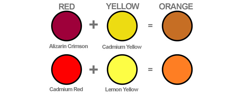
The fact is color theory is based on generic forms of colors – Red, Blue, Yellow, etc. Color mixing utilizes color theory but the results of the mixed color are dependent on the actual pigments used.
For example, you may mix “Alizarin Crimson” (red) with “Cadmium Yellow” (yellow) to produce an “orange”. Or you may mix “Cadmium Red” (red) with “Lemon Yellow” (yellow) to produce an “orange”.
In both cases, you are mixing “red” with “yellow” producing an “orange”. However, the orange that results from both mixtures is different because the pigments of the paints are different. (We discuss this in a bit more detail in Module 4 of “The Watercolor Workshop”.)
But I’m getting off topic here. So enough about theory vs. mixing for now.
The reason I’m writing this post is to share with you a resource that I’ve found that makes a game out of color theory. But before I share it with you and in order to make the most of the game, let’s review a few basics on color theory…
Hue
The word “hue” is used to refer to the pure color without any variation in value or intensity. Theoretically, all hues should exist on the color wheel.

Value
The value of the color is altered when the neutral colors of black or white are added to it. It is essentially the darkness or lightness of a color. Tints are the result of adding white to the pure hue. Shades are the result of adding black to the pure hue.

Tone
Tone is very similar to value, but it can refer to various intensities of the color as well as the value of the color. Value is altered with black or white, while intensity is altered by mixing gray with the color.
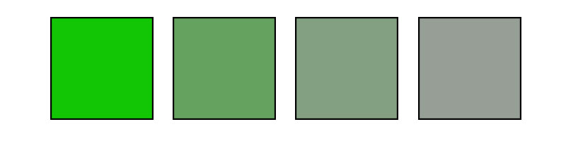
Saturation/Intensity
Saturation refers to the intensity or strength of the color. A color in its purest form, without any neutral colors added, is considered fully saturated. Any additions of neutral colors change the intensity of the color, desaturating it. Think “vivid” vs. “dull”.
Color Schemes
Color schemes are created by the relationships of colors based on their locations on the color wheel. While any combination of colors could be considered a “color scheme”, certain relationships exist that typically lead to aesthetically successful art.
*There are more color schemes that exist, but for the purposes of preparing you for the game, I’ll only touch on the schemes that are included with it.
Complementary
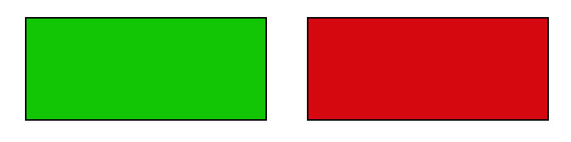
Complementary color schemes are made up of two colors that are directly across from each other on the color wheel. Complementary schemes provide high contrast and are often used for sports teams and logos.
Analogous
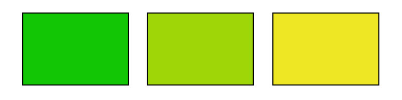
Analogous color schemes are made of 3-5 colors that are next to each other on the color wheel. Analogous schemes provide harmonious color relationships with little contrast.
Triadic
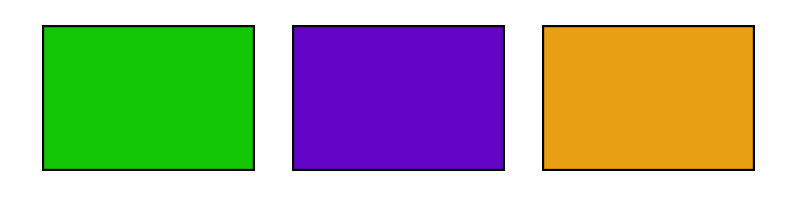
Triadic color schemes are made of 3 colors that are equidistant from each other on the color wheel. This relationship creates a triangle with the color locations on the color wheel. Triadic schemes provide high contrast.
Tetradic
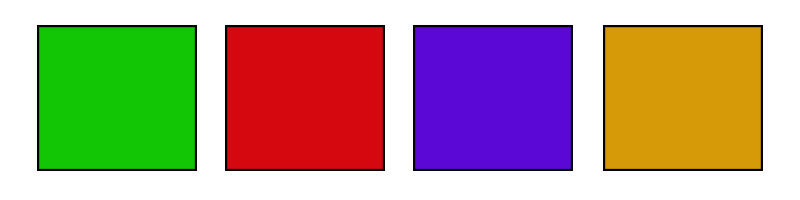
Tetradic color schemes are made of 4 colors that are equidistant from each other on the color wheel. This relationship forms a square with the color locations on the color wheel.
See Also: The Interactive Color Wheel
The Color Game
Ok, now to the game that I have come across. The game deals with how you perceive each element of color that we reviewed above. I’ll give you a bit of warning – it’s not as easy as it seems that it may be.
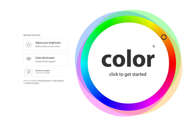
You are evaluated on how closely you are able to match the color, the saturation of the color, and the color schemes that are presented. There is a time limit and your goal is get an evaluation of “perfect” for each color match.

You are presented with a color or a group of colors in the center of the tool that you must match. The color winds down indicating the amount of time that you have left to make your match. Match the colors correctly by scrolling your mouse around the color wheel and get a perfect score.
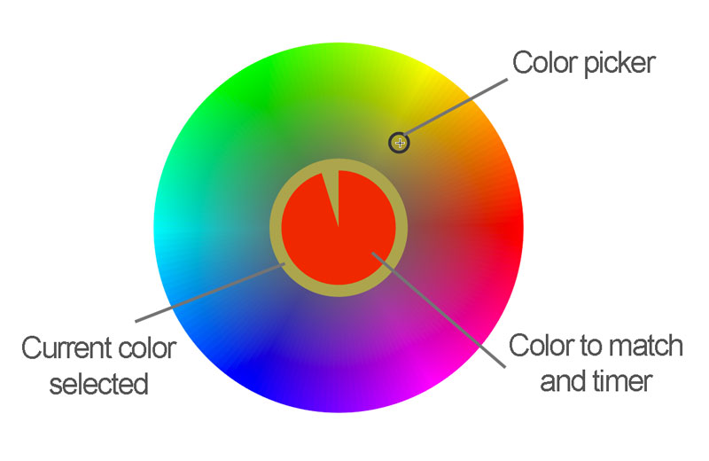
The game becomes progressively more difficult starting with hue, before progressing to saturation, and then on to color schemes.
After you have completed each of the tasks, you are given a score. Here’s a look at my score the first time I went through.
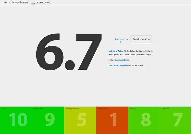
You can see that I really struggled with “Analogous”, but I think it was because I was getting accustomed to how the tool worked. (That’s my excuse anyway.)
The game is quite fun to play and fairly challenging as well. So, are you ready to test your skills? Can you beat my score? Feel free to post your score in the comments below.
If so, join over 36,000 others that receive our newsletter with new drawing and painting lessons. Plus, check out three of our course videos and ebooks for free.