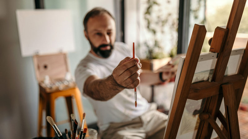
The very nature of creating is so personal that sometimes it’s hard to know when to stop.
The reality is that deciding when to stop “speaking” is tough for all of us. But knowing when and where to draw the line (no pun intended) is important to success.
We don’t want to overwork our art, but we also don’t want to stop before it has reached its full potential. We know that we need to stop at the peak, but we don’t know where we are on the mountain.
“You are the artist – the work is yours and yours alone.”
So how do you know when an artwork is finished? How do you know when it’s just the right time to stop and put the brush down?
Since creating is so personal, the answer to this question is ultimately personal as well. It is an answer that we must determine for ourselves, lest it be driven by anyone else’s opinions or dictations. You are the artist – the work is yours and yours alone.
With this being said, deciding if your work is finished is clearly difficult. Self doubt plays a role and if you let it – it will lead you down the path of overwork. But of course, other factors are at work as well.

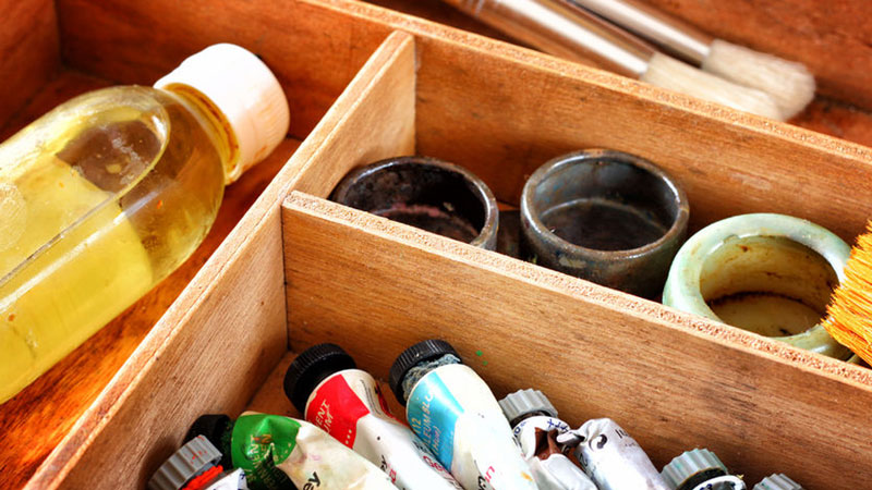
Use this infographic to determine if your work is finished…
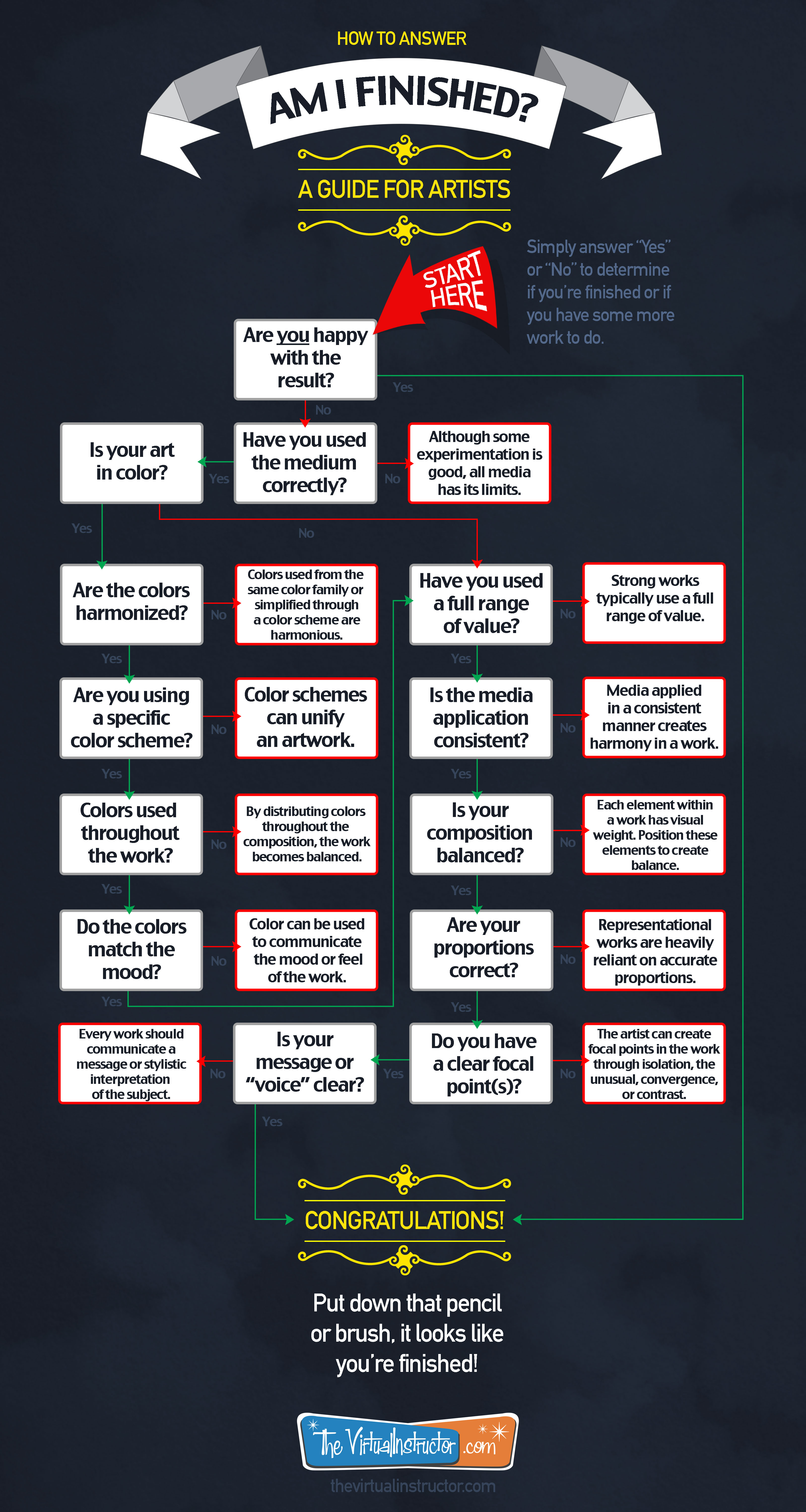
Is My Art Finished?
You must first face the reality that there will be imperfections in the finished work. You will see them and they will glare at you! No one sees the imperfections like the artist does and you must learn to accept them. (If you see no imperfections in your art, look closer – they’re there.)
With imperfections accepted, you then have to decide if you are happy with the result. If the answer is “yes”, then you are finished. It’s really that simple. The problem is that some artists don’t know how to determine if they are happy with their work or not. Or they fall in love with what they are creating and end up overworking it.
Let’s take a look at some factors to consider that may help you decide if you’re happy (finished) or if you have some more work to do…
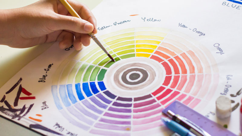
If Your Work is in Color
There are specific considerations for works in color. Here are a few questions that you can ask yourself in analyzing the work…
- Are the colors harmonized?
- Is there a specific color scheme?
- Are colors distributed throughout the composition?
- Do the colors help convey the mood?
Color is powerful and should be optimized if it is used. Disjointed use of color can make an artwork look flat, unnatural, and unfinished.
But when used effectively, color can have the opposite effect – resulting in a work that is harmonious, natural, and finished – even with minimal use.
“Half of art is knowing when to stop.”
-Arthur William Radford
Try harmonizing the colors that you use by simplifying your palette or by implementing a specific color scheme. Distribute the colors throughout the work to balance its usage and include colors that will help communicate your message or mood.
Additional Considerations
Here are a few more questions to ask to yourself…
- Have you used a full range of value?
- Is the media application consistent?
- Are your proportions correct?
- Do you have a clear focal point or points?
- Is your message or “voice” clear?
Use of Value – A full range of value is important in most works. Value is the darkness or lightness of color and when used correctly, it can create the illusion of form, light and shadow, and texture. Some artists struggle to create a broad range of darks and lights leading to a work that looks unfinished. Use a full range of value in your work to give it a more natural and finished appearance.

Consistency in Application – Media can be applied using a variety of techniques and approaches and if a work has too many of them, it can look unfinished and unbalanced. Try to apply the medium using one or a handful of techniques in order to unify the work.
Accurate Proportions – For representational artworks, proportion must be considered. Inaccurate proportions in an artwork that is meant to be realistic will look unpolished and incomplete.
Clear Focal Points – The artist can and should control the viewer’s eye movement through the work. Focal points should be planned and clear in the work. Focal points can be developed in a work through convergence, contrast, the unusual, isolation, and placement near the center of the picture plane.
The Artist’s “Voice” and Message – Your artistic “voice” should be clear in every work that you create. While there doesn’t have to be a specific message per se, your marks still communicate your style and the finished work is your unique interpretation of the subject.
Summing It Up
As an artist, the answer to the question, “Am I finished?” can only be answered by you. Sure, everyone has their own opinions, but ultimately it is about your satisfaction with what you have created.
Personally, when my art has reached a point where all of the formal qualities have been satisfied, and my unique style (voice) is visible – then I am finished.
What do you think? When do you know when your work is finished?
If so, join over 36,000 others that receive our newsletter with new drawing and painting lessons. Plus, check out three of our course videos and ebooks for free.

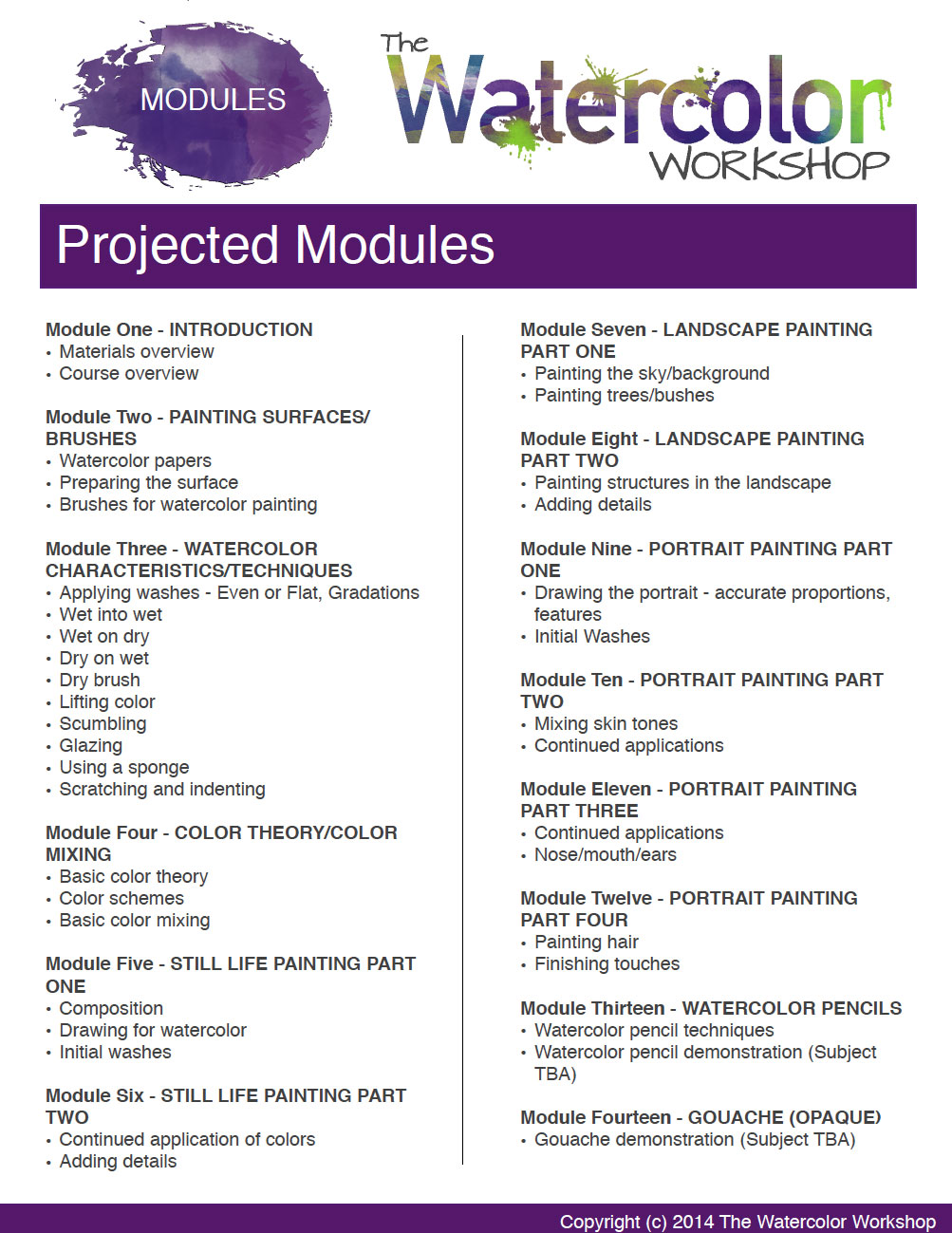
The Watercolor Workshop Modules
As most of you are probably aware, the next course is right around the corner for members. You guys voted, and a course on watercolor painting was the resounding winner!
It is my goal to provide you with the instruction that you want, so the watercolor course is in the works with modules to be released later this month (December 2014). The course will be called “The Watercolor Workshop” and it should be a great addition to the other courses that are already available to members.
But before I go too deeply into production, I want to share the planned modules with you. I want to hear from you, and I want your input.
As it stands, the course will feature 15 total modules (videos and ebooks). The 15th module not listed is the “Conclusion”, which will be a short recap of the course.
Take a look at the planned modules below and let me know if there’s anything that you’d like me to add or to adjust. I’m not promising anything, but your input is important to me. Just leave your ideas, comments, and suggestions in the comments section below the post.
Artistic Self Confidence – Why You Need it and Why it’s Important
It can also set in during the process itself while strokes are fresh. You second guess every decision, every mark, every color. The art-making process quickly becomes a mental struggle with yourself. The enjoyment of creating starts to fade along with your motivation.
You are losing the battle.
You decide that it’s just not worth it and you put your paints away.
It affects all of us. Well, most of us anyway. A lack of confidence can kill our creativity and stifle our art-making.
Confidence is important in all aspects of life, but especially in art. The creation process comes from within, and if your self confidence is weak then you are destined to fail from the start.
I often admire the artists that exude their confidence in their mark, boldly laying down strong colors with the simplest stroke. The resulting mark just seems to be perfect, working in harmony with the composition. This level of confidence doesn’t just happen.
So, how do we develop self-confidence? And more importantly, how to do we apply it to our art?
In this post, I’ll offer my suggestions for overcoming, or at least battling the mire of under-confidence. It’s something that I struggle with personally, so I don’t profess to have all of the answers on this subject. But perhaps I can offer a few suggestions that may help.
Here’s an infographic that outlines the highlights of growing your artistic confidence…
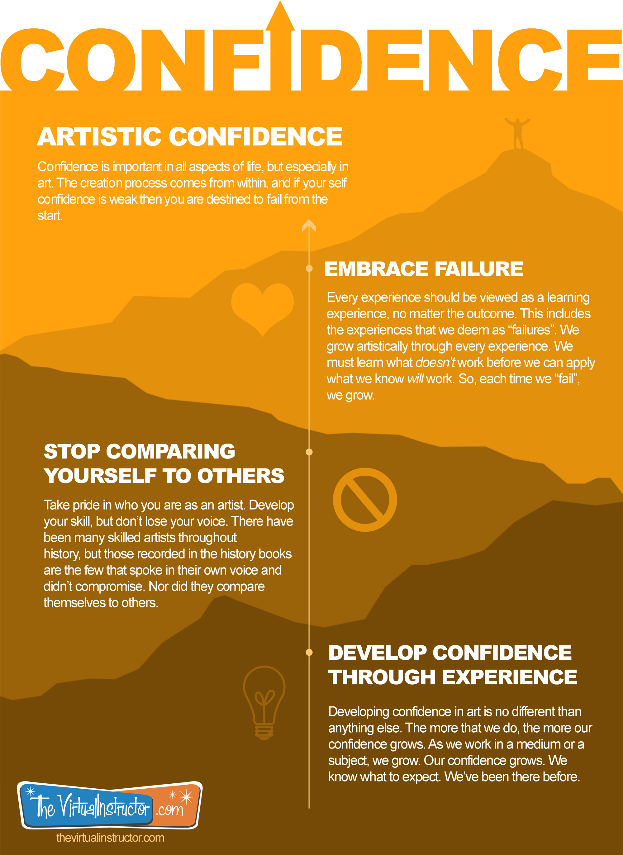
Embrace “Failure”
The word failure is in quotations because I don’t really believe in failures when it comes to art. Many times we start a work with a specific vision and in the end, the result doesn’t match the original vision.
We too often categorize these works as failures. Sometimes we don’t even complete them because we feel that we cannot meet our own expectations, so why even bother.
Over time, after we have experienced multiple “failures”, our confidence erodes. We begin to second guess our decisions and the enjoyment of art-making slowly dissipates. Our marks become timid and we are afraid to take chances. For some, the thought of drawing or painting even produces a feeling of anxiety.
With a simple shift in our thinking, however, we can view these experiences differently. And when we do, these “failures” can actually grow our confidence.
Let me explain what I mean…
No Experience is a “Failure”
Every experience should be viewed as a learning experience, no matter the outcome. This includes the experiences that we deem as “failures”. We grow artistically through every experience. We must learn what doesn’t work before we can apply what we know will work. So, each time we “fail”, we grow.
And this takes time. Sometimes lots of it.
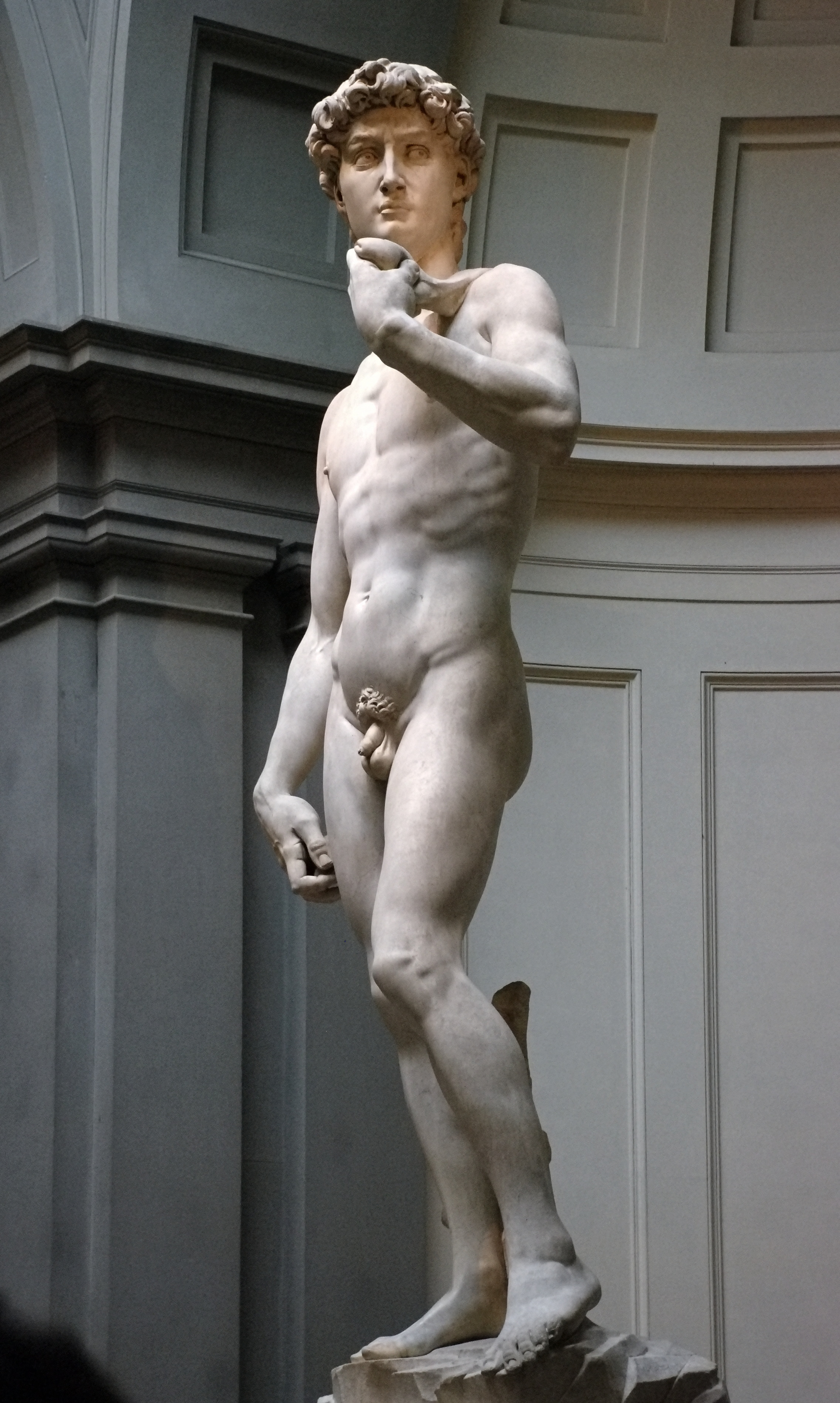
Michelangelo once stated, “If people knew how hard I had to work to get my mastery, it wouldn’t seem so wonderful at all.”
Mastery takes time – it requires failure. When we look at a master artist, we only see the end result and the confidence that he has developed. We don’t see all of the “failures” that forged his confidence.
This is why “failures” should be embraced by the artist. The path to artistic success is often illuminated by the lessons learned through our “failures”.
“Failures, repeated failures are finger posts on the road to achievement. One fails forward toward success.”
– C. S. Lewis
Stop Comparing Yourself to Others
While it’s perfectly acceptable to be influenced by other artists, it’s important not to lose sight of the fact that you are not them. If you start to compare yourself to others, you quickly forfeit your unique artistic identity.
As individuals we should embrace our differences. As artists, we should do the same.
If we don’t, we are in danger of losing confidence in ourselves and what we produce.
Instead, take pride in who you are as an artist. Develop your skill, but don’t lose your voice. There have been many skilled artists throughout history, but those recorded in the history books are the few that spoke in their own voice and didn’t compromise. Nor did they compare themselves to others.
Develop Your Confidence
I still remember the first time that I jumped from a high diving board into a pool. I was no more than 6 or 7 years old. I was terrified.
I remember inching myself to the edge, looking down to make sure that my mother was watching.
I held the right railing with two hands, my knees slightly bent. Each foot was carefully placed on the concrete as I worked my way to the edge.
After several moments of watching the light dance off of the water below, I closed my eyes, allowed my knees to buckle and my body fall.
I emerged from the water with a huge grin. I quietly swam to the edge of the pool, but this time with a renewed confidence.
My second jump was different from the first. I didn’t close my eyes, and I didn’t look down. I knew what to expect. I had confidence in how I would perform. I had been there before.
Our art is no different. The more that we do, the more our confidence grows.
As we work in a medium or a subject, we grow. Our confidence grows. We know what to expect. We’ve been there before.
It may take time and it will require “failures”. In the end, artistic confidence is about perseverance.
Do you struggle with confidence? How do you overcome a lack of it?
If so, join over 36,000 others that receive our newsletter with new drawing and painting lessons. Plus, check out three of our course videos and ebooks for free.

Value vs. Intensity
While value and intensity are different, they do have somewhat overlapping applications. This is one of the reasons that they are so often confused. Even though their applications are sometimes used interchangeably, knowing the difference between the two can help us make better aesthetic decisions in our drawings and paintings.
What is Value?
Let’s start by discussing value. Value, in terms of art, is the darkness or lightness of a color. Value is one of the seven elements of art and in many circles, it is considered to be the most important. Its importance in creating the illusion of light, form, and texture in a drawing or painting cannot be denied.
All values can be measured using a value scale, which theoretically has an infinite number of values. Most value scales are sufficient enough when showing 7-9 values.

All colors have an inherent value associated with them. For example, purely pigmented yellows are generally lighter in value when compared to purely pigmented blues, which are darker.
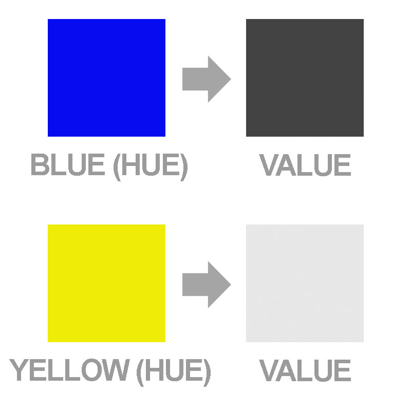
The pure color is generally referred to as “hue”. The value of a hue is adjusted by the addition of either pure black or pure white. Value is the measurement of the amount of black or white a pure hue has mixed.
By adding black to the color, the value is made darker, resulting in what is referred to as a “shade”. When white is added to a color, the result is a lighter value. Lighter values are referred to as “tints”.
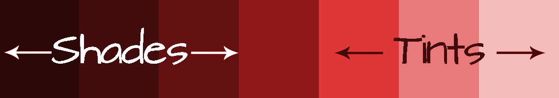
An example can be seen with the color red. The hue is red. A tint of red is what is commonly referred to as the color “pink” (red + white). A darker value, or shade of red, may be a color that we commonly refer to as “Burgundy” (red + black).
Other colors can be added to a hue resulting in an adjustment of value. But because the addition of these colors also changes the hue, white and black are commonly used as the measurement. Since these colors are neutral colors, they only affect the value and do not change the hue.
What is Intensity?
Intensity, on the other hand deals with the amount of purity in the hue itself. It can also be referred to as “saturation”. Primary colors are considered to be the most “pure” in intensity.
Intensity can also be considered as the brightness or dullness of a color.
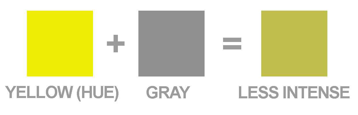
Intensity is adjusted by adding additional colors to the pure hue. A color can be made less intense by adding gray to the color. In some ways, intensity can be measured by the amount of gray in the hue.
Hues can only degrade in intensity. In other words, additional colors cannot be added to a hue to make them “more intense”. Each color that is added to a pure hue decreases its intensity.
Now This Is Where The Confusion Comes In…
When the intensity of a color is adjusted, the value also changes. In the same way, when the value is adjusted, the intensity changes but to a lesser degree.
In other words, a lighter value of yellow is also a less intense version of the hue. And a less intense yellow could be a lighter or darker version of the hue. I know – completely confusing.
So ultimately, although value and intensity are different, they are used interchangeably.
Practical Applications
Value and intensity can be exploited together to create desired illusions in drawings and paintings.
Areas or objects that are receiving light will be lighter in value. Conversely, areas that are not in light, or in shadow, will be darker in value.
Areas or objects that are receiving light are typically more intense in hue, while areas or objects in shadow are sometimes less intense chromatically.
The illusion of distance or space in a color drawing or painting can also easily be created using value and intensity. Space that is closest to the viewer (foreground) will have a greater likelihood of darker values. Colors will also be more intense in these areas. There is often more contrast between the darks and lights in these areas as well.
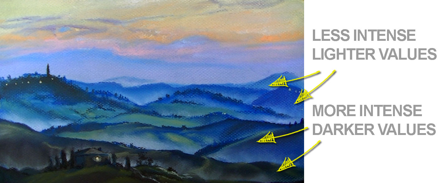
Areas of the landscape that are farther away (middle ground and background), can be depicted using lighter values and lower intensities. Mixing white will result in lighter values, while mixing grays will create duller hues. Less contrast between values is present in locations that are further from the viewer.
When used in conjunction, value and intensity can enhance the variety and depth of color used in an artwork and lead to more developed and interesting works.
If so, join over 36,000 others that receive our newsletter with new drawing and painting lessons. Plus, check out three of our course videos and ebooks for free.
It’s Time to Try a New Medium
It was in a special course for illustrators, appropriately named “Media and Methods”. It was taught by a visiting professor who was just barely out of Grad school. Looking back, I think that he taught this course only because the other “established” professors didn’t want to. They were “specialists” after all. How could a “painter” teach someone a drawing medium – absurd.
The course, as it names implies, was all about exposing students to different mediums and techniques. Students were required to produce works in ink, colored pencils, pastels, various forms of painting, and mixed media. In other words, many of us were to be forced from our “comfort zones”, as each of us had our own strengths and liked to stay within them.
In the competitive environment of art school, this was quite concerning for me. You see, I was an artist that worked exclusively in black and white. Graphite, charcoal, and pen and ink were my specialities. I had decided way back that this was the artist that I was meant to be. Color and I just didn’t get along. So, even in my second year of art school, colored pencils and pastels were a bit scary for me.
“So, even in my second year of art school, colored pencils and pastels were a bit scary for me.”
Scary or not, I was required to work in these mediums. But unlike so many of the other classes I had been in thus far, this experience was to be different.
None of my previous instructors, to this point, ever took the time to actually show us how to use a medium. Instead, they would just give us an assignment, a few days to complete it, and then tell us in the critique how we did it all wrong. Needless to say, this is not an effective way to “teach”. But that new, young, visiting professor took a different approach in his class.
On the first day of the class, he had us fill out a form. On it he asked, “What is your strongest medium?” Without hesitation, I wrote in “Graphite”.
The next day that class was in session, we were all given a schedule. Specific to our strengths, we were to teach the class a drawing or painting medium. I was to teach graphite. Others were assigned other mediums.
How I Found My New Loves
The class functioned in a unique way. Each artist shared their strongest medium and we all benefited by tips and techniques that we each had picked up along the way. Soon, the competitive nature of the class dissipated as we all collectively shared and grew together. No longer were we on “an island” of experimentation. We were learning together.
It was in this class that I grew the most during art school. I discovered a love for color, colored pencils, and pastels. One that would have never been found because of my stubborn obstinance against them prior to this experience.
But because I was forced to explore other mediums, and get serious with them, I was able to grow artistically. Without this exposure, I would have spent the rest of my time in art school and beyond confined to the mediums that I thought were “right” for me. Essentially, I would have not only limited my own breadth as an artist, but also the enjoyment that I have found in creating with the color mediums of pastel and colored pencils.
“Your artistic voice is found in your message, not in the medium that you use. When you expose yourself to other mediums, you may find that you actually have a lot more to say.”
So why do we as artists limit ourselves? Why do we feel that we must find our identity in the medium that we use?
Leonardo didn’t feel this way, neither did Michelangelo. These guys did not restrict their creativity to one drawing medium. So why should we?
It’s Good to Be Uncomfortable
It’s easy to get comfortable. It’s nice to be reinforced by success. When we try something new, we forego these things. I think that this is what stops many of us from exploring. Or perhaps, we’ve tried it before and failed.
Maybe it’s time for you to branch out as well. Maybe it’s time to try out that medium (or try it again) that is “scary” for you.
Here are a few tips to help ensure a better chance of success…
1. Educate Yourself on the Medium – Before diving in, read and watch everything that you can about the new medium that are about to undertake. Be careful that you aren’t overconfident and allow yourself to be open to other’s instruction. When you do this, you find that “Ah-Ha” experiences are plentiful. However, don’t go “overboard” with educating yourself without actually making marks and experimenting.
2. Let Your Style Shine – Our artistic style is as unique as our handwriting. You’ll find that your style will show itself in the new medium. Embrace it. Don’t get caught up in making your art look like someone else’s. Your style is yours and nobody else’s.
3. Be Open to Failure – Seldom will your first work in a new medium be a “Masterpiece”. In fact, in most circumstances that first work may look like a “failure”. But it isn’t a failure, because that work embodies growth and a learning experience. Recognize that this is part of it. Too many people try a new medium and expect immediate results. They hastily determine that they “can’t” and never try again. This is a mistake.
Your artistic voice is found in your message, not in the medium that you use. When you expose yourself to other mediums, you may find that you actually have a lot more to say.
So, what about you? What new medium are you going to try today?
If so, join over 36,000 others that receive our newsletter with new drawing and painting lessons. Plus, check out three of our course videos and ebooks for free.
Sell Your Art on Etsy

Let’s face it, the old way of selling your work through a gallery or dealer is a “tough road to plow”. You have to first fall in to the graces of a dealer or gallery. Then they have to sell the type of work that you create to their customer base of collectors. Then, they take a cut – usually a huge one. Some galleries will take 50% or more of the sale price. It’s no wonder that people think artists starve!
Let’s face it, the old way of selling your work through a gallery or dealer is a “tough road to plow”.
Sure, most galleries do the marketing for you. For most of us artists, that’s the hard part anyway. But there are so many ways to market your art today that the need for artist representation is going away.
You can sell your art in a number of ways online and if you haven’t been living under a rock, then you’ve probably heard of one of the most popular ways to do it. You can sell your art on Etsy! You don’t have to be a marketing genius to make good money selling your art on this platform either. Many artists and craftspeople make a full-time living selling their work on Etsy.
Sure, like a gallery or dealer, they take a portion of your profit – but it’s so low in comparison, it’s definitely worth a shot.
In this post, I’ll show how to set up an Etsy account, set up a shop, and post your first art work. I’ll also share a few pointers on selling your work on Etsy and how you can get the word out about what you’re selling.
Set Up Your Etsy Account
You’ll need an Etsy account to get started, so we’ll take care of this first. Head over to Etsy and click on the “register” button in the top right corner.

Now you’ll just need to put in your name, your email, create a password, and a username.

Next, you’ll need to confirm your account by checking your email and clicking on the confirm button.

Once your account is confirmed, you can login. You can go shopping if you like and see what others are selling. We are selling, so the next step is to set up our shop and our first product.
Set Up Your Shop
To set up your shop, scroll to the bottom of the page to the footer. There, you can click on the button that says “Open a Shop”.
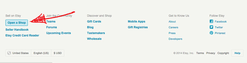
A page will open up that tells you all of the great things about owning a shop. You can (and should) familiarize yourself with how Etsy works.
The big things…
- It costs $.20 to post an item for 4 months (or until it sells)
- Etsy collects a 3.5% fee on the sale
- There are no membership fees
- A valid credit card or a PayPal account is required to sell
Once you are familiar, click on the “Open an Etsy Shop” button.

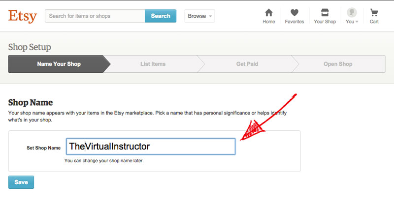
The next step is to name your Etsy shop. Be creative with your name. It’s how your customers will identify with you.
Post Your Etsy Product
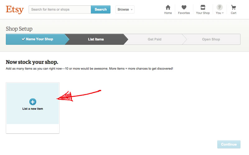
Now that your shop is set, you’ll need to fill it with your art. Remember, Etsy will charge you $.20 for each item for a 4 month listing. Click on “List a new item” to get started.
Next you’ll need to enter information about the art that you are wishing to sell. Be as detailed as possible in your listing and let your customer know exactly what they will be getting.
The first few sections are pretty straight forward. You’ll designate the who made it, what it is, and when you made it.
It’s important to point out here that if you wish to be commissioned to create a work, you can indicate that here.
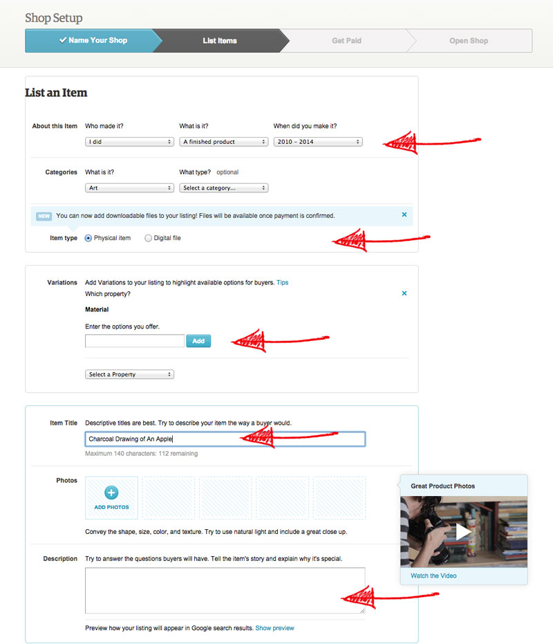
You’ll describe what material (medium) in which the art was created. Give the art a descriptive title (one that customers will be searching for) and a description.
Use as many words that you think people will be searching for in your description. This will increase the likelihood of your art being found on Etsy.
You’ll also need to upload a photo of your work. Make sure that your photo is presented well. If you need some help with photographing your art, you can check out this post.
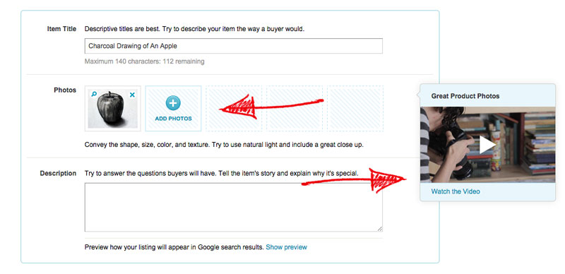
Etsy also provides a handy video on photographing your “product”.
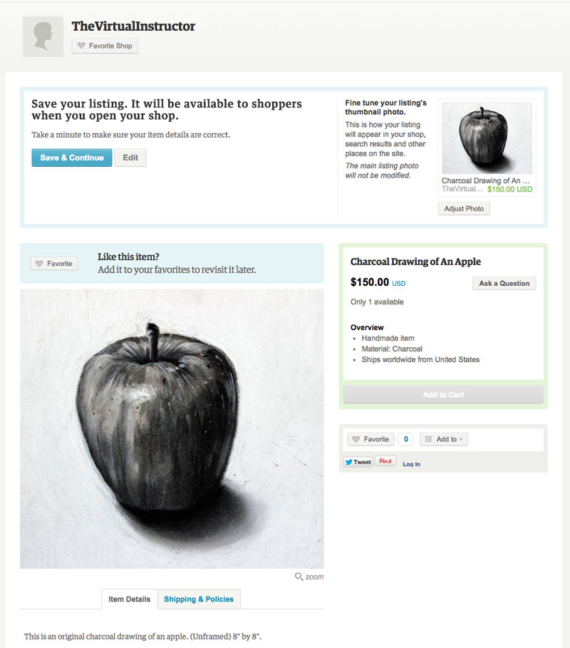
Now you can preview your listing on Etsy. This gives you an idea of what your customers will see when they click on your art.
The last step is to put in your bank’s information so that you can get paid when your work sells. This is also the account in which Etsy will withdraw their modest fees.
 Once your bank info is stored, you can customize your shop and start selling.
A Few Suggestions For Selling on Etsy
Here are few suggestions to help you find more success with your selling…
Take a Look at What’s Out There – Do a little “shopping” on Etsy and see what people are buying. This will give you an idea of what you can make and what people are willing to pay for.
Do a Price Check – While you’re “shopping”, check the prices that others are charging. Are you pricing your work too high – or worse, too low?
Consider Selling Prints – Many Etsy sellers create prints of their work. The benefit of doing this is that you get to keep the original while charging far less for the work. Most Etsy shoppers won’t mind buying a print. An added benefit is that you can resize the image and offer various sizes and versions, increasing the chance that someone will make a purchase.
If you do decide to sell prints, make sure to have high-quality prints made by a professional printing company. You need to be sure that the prints that you sell will “stand the test” of time.
Appeal to the Masses – Create art that centers around a specific theme or subject that appeals to a large number of people. Don’t get too “deep” or personal with the art that you are wanting sell. Keep it light and universal.
Getting The Word Out
Once you’ve got great art to sell and your shop is live, you’ll need to start sending customers to it. In other words, you’ll have to do a bit of marketing. Fortunately, this isn’t as hard or intimidating as it may sound.
Facebook – The first place to “market” is within your own networks. Share your new shop with your friends on Facebook and encourage them to share it with their friends. Many of them will do so and you will immediately have a small customer base.
Pinterest – Share your art on Pinterest. Create a board with your work and link back to your shop.
YouTube – Create a YouTube channel where you talk about your art, describe your process, and maybe show the steps that you took to create it. In the description section of the video or in the video itself, link to your Etsy shop or product.
A word of caution…Don’t be too “sales-y” in your videos. People will be turned off if you push too hard.
It will take some time to get YouTube followers, but overtime this can a great avenue to sell your work.
Never has it been so easy for artists to sell directly to their patrons. Why not take advantage of Etsy and start selling your work?
Are you already selling on Etsy?
If so, join over 36,000 others that receive our newsletter with new drawing and painting lessons. Plus, check out three of our course videos and ebooks for free.

Crush Artist Block and Work S.M.A.R.T.
You sit down to work and then it hits you.
Like a massive semi-truck barreling down the road at 75 miles per hour, the blank paper or canvas smacks you square in the face. You are now in “gridlock” – stunned and frozen by some mysterious force. You feel helpless and a little panicked as the white of the surface grows brighter and more intense. A sense of urgency grows inside. You look around as if you’ll see something to inspire you but nothing seems to spark. You don’t want to waste this creative motivation that you feel and it’s time to work, but nothing – just nothing.
Frustration comes next. Then hopelessness, as you feel the time drip away. Your creative juices turn to sludge. The motivation that you felt just moments before is fading. The diagnosis is bleak – you have “artist block”.
It happens to us all. As artists, we all face this dilemma from time to time. It’s part of being a creative person. It can feel so depressing when it happens. It’s amazing how strong the desire to create can be and how much pressure we often place on ourselves to produce.
Fortunately, there are ways to combat artist block. You can learn to absolutely crush it when it rears its ugly head, and put the beast away forever.
Before we delve into a few strategies, let’s examine what’s causing the issue in the first place.
Factors That Contribute to Artist Block
Artist block occurs when a few factors come together and join together to create a “perfect storm” of sorts. When these factors all happen simultaneously, artist block happens. The problem is that when they set in, the strength of enemy just grows and it’s hard to escape.
“Creativity needs to breathe. It becomes smothered when you place a time limit on it.”
The biggest factor is the pressure that you have placed on yourself. For many artists, the feeling to create something that is better than what they created before is very real. For some reason, many of us feel that we have to “one up” our previous artworks with every new thing that we produce.
Although having that aspiration is good, it can be a contributor to artist block. Just like it’s sometimes a bad idea to compare yourself to other artists, it’s also not good to compare yourself with yourself. You shouldn’t place unnecessary pressure on yourself to perform miracles with your art on every attempt.
While some pieces of art may change the world, the likelihood that your next work is going to be one of them is slim. So relax. The art that you create doesn’t have to be a thesis on the meaning of life.
Another factor is a lack of time. Have you ever noticed that artist block usually happens when you are on a deadline or have limited time. The limitation of time can make you feel a sense of urgency that can destroy creativity.
Creativity needs to breathe. It becomes smothered when you place a time limit on it.
To allow your creativity to breathe, plan ahead. Create a schedule for making art. Block out chunks of time to work and write them in calendar. That way you know, in the back of your mind, if you don’t produce today, there’s another opportunity scheduled in the future. You’ll be surprised how far this little bit of assurance can go.
A third factor is an obsession with materials. I know that this one sounds a bit strange, but let me explain.
Some artists are just media freaks. They collect art materials and feel the need to use them without having a plan or reason to. It’s no wonder that when they sit down to work, nothing happens. There was no creative spark in the first place – just an urge to use that new medium that they purchased.
Now I love materials as much as the next artist, but we need to realize that art materials are tools of communication. We need to know what we want to say, before we decide how we are going to say it.
You wouldn’t go to the hardware store and buy a hammer and then go home and decide what you are going to build with it.
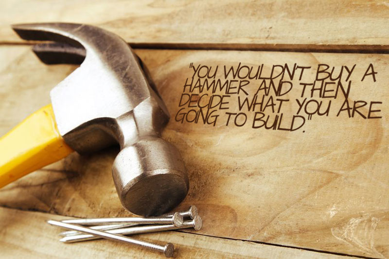
Decide what you are going to create first, then decide what materials will help you get the job done.
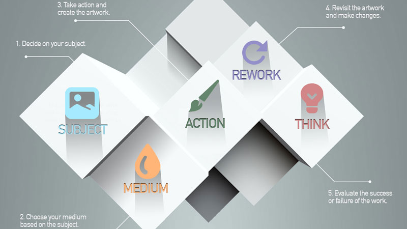
Work S.M.A.R.T.
To help overcome the perils of artist block, consider approaching your work as a process.
I like to think of the approach that I use as an acronym – S.M.A.R.T.
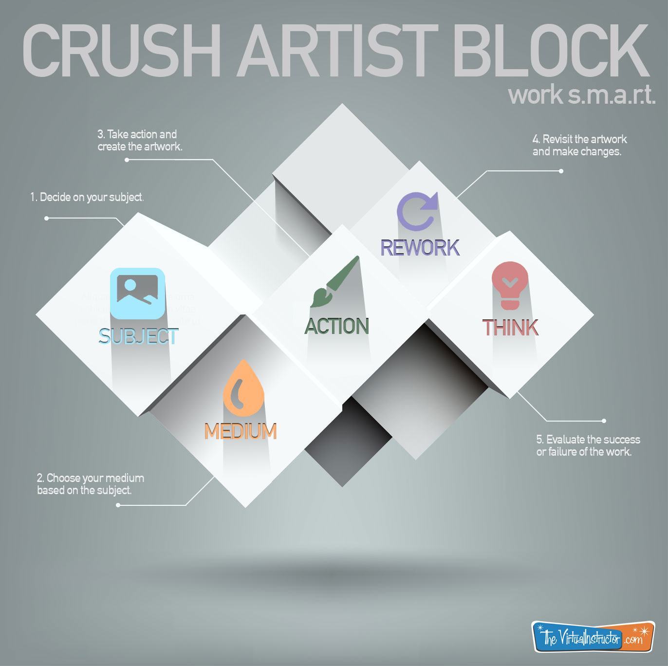
SUBJECT – Before even considering the medium or the technique, first decide on the subject. The subject of your work should influence the medium that you will use and the approach that you will take, so it only makes sense to start here.
If you are working from a photo reference, create it first. If you are working from life, find your subject.
If you haven’t got a subject in mind, then it’s not time to sit down and work.
Artistic inspiration will almost never happen while you’re sitting at an easel. Instead, it will strike when you least expect it. It may happen in the shower, at the park, or while you’re driving. But don’t expect it to descend from the heavens when you’re ready to paint.
In order to harness all of your ideas, consider carrying around a small notebook. Most of us have smart phones that keep our notes for us as well. I like to use an app called Evernote to keep up with my “moments of inspiration”.
Evernote is great because when I have an idea, I can just speak into the phone and it is saved. You can even add photos or handwritten notes. When I’m ready to work, I open the app and scroll though all of my ideas.
MEDIUM – Once you have your subject, then it’s time to consider the medium. Many artists prefer just one or two mediums and create art in those mediums exclusively. But others create art using a variety of media.
The manner in which you create marks with a specific media is unique. The strokes that you make while painting a landscape with oils will be different than the ones made by another artist.
“While some pieces of art may change the world, the likelihood that your next work is going to be one of them is slim.”
You need to understand who you are as an artist. We are all different and the way you use the medium will affect the success or failure of your artistic communication.
For example, if I were to create a landscape, the subjects within the reference would influence what medium I would choose. If the reference featured mostly organic objects, like trees, water, or rocks, I would most likely use a softer medium like pastel or oils.
If the landscape had more architectural elements, then I would likely choose a linear medium like pen and ink, graphite, or colored pencils.
ACTION – Now that the subject and medium have been decided, it’s time to take action and produce the work. Because you have done the prep work, the work should flow without any chance of artist block getting in the way.
REWORK – When the artwork is “finished”, plan to revisit it in the near future and make any necessary changes. You need time to let your mind reset and see your work with “a new set of eyes”.
THINK – When the work has been reworked to “perfection”, it’s time to think about the result and consider its success or failure. (Remember, it’s okay to fail.) Take a final look at the art and evaluate what specifically was a success and what was less successful. Ask for other artists’ input and be open to “constructive criticism”. Make notes on what could be improved in your process and make the changes the next time around.
Artist block is a killer, but it usually happens because of a lack of plan. Too often, it’s the result of trying to “put the cart before the horse”.
Let your creative moments happen when they do and don’t force them “on demand”. Make notes when they strike and when it’s time to create – get to work.
If so, join over 36,000 others that receive our newsletter with new drawing and painting lessons. Plus, check out three of our course videos and ebooks for free.

Understanding Your Learning Style
Sure, there are times when we are actively aware that we are learning – when we are “trying” to learn. But there are also times, when learning just happens.
Why is it that some things seem easy to grasp, while others seem impossible? Why do some bits of information “stick”, while others seem to get lost.
While we often think about what we are learning, we seldom consider how we are learning?
Think for a minute about something specific that you have learned. It could be a skill or a bit of knowledge. Maybe it’s something like how to ride a bike, throw a ball, or tie a shoe.
Can you remember how you learned this skill? Did it come easily, or was it a challenge?
Successful learning, whether it is related to drawing and painting or not, is often dependent on your own personal learning style. We tend to learn more efficiently if what we are learning is taught in a manner that matches our style of learning.
Therefore, it is important to recognize your own learning style so that you can find resources and teaching styles that provide you with the best chance for success.
If you are reading this, then you’re most likely interested in learning how to draw and paint. Or perhaps you’re interested in teaching drawing and painting more effectively. Either way, we’ll look at learning styles and how they relate to learning art efficiently.
Let’s first look at learning styles from a learner’s perspective and determine how to identify your learning style(s).
How to Identify Your Learning Style
Before we look at the most popular learning styles, it’s important to note that most of us learn best when a combination of teaching techniques are used. So, even though one of the following learning styles will be most effective for you, it is a combination of content delivery that leads to the highest levels of success.
Learning styles can be simplified into three groups, Observational, Cognitive, and Conditional.
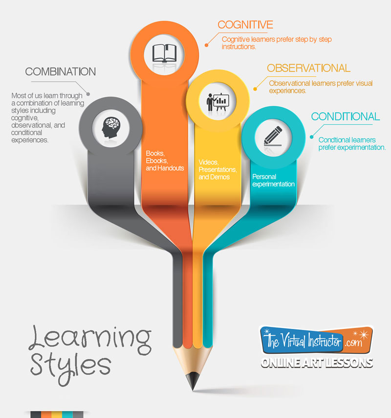
Observational Learners
Instead of learning from personal experiences, observational learners learn from watching and listening to the actions of others. They note the outcomes/consequences from the actions of those they observe.
Observational learning occurs when an expert is involved. An “expert” can be anyone that is highly qualified or someone who is simply more experienced than the learner. In educational philosophy, “experts” are referred to as “models”.
It’s safe to say that when it comes to learning art processes, observational learning plays a major role. Even though experimentation is often involved, we are typically first exposed to a technique, medium, or subject matter through observational learning. We tend to watch someone use the medium or execute the technique before using it ourselves.
Observational learning has its advantages and disadvantages.
One advantage to observational learning is that the learner is able to learn from the model’s experience without having any of their own. A simple example can be seen with mixing colors. An expert (“model”) can demonstrate color mixing with physical paints, demonstrating that when yellow is mixed with blue, the result is green. This demonstration gives the learner a visual “picture” of the concept as well as a clear outcome/consequence. Without modeling, the learner would be left to experimentation.
One clear disadvantage to observational learning is that “incorrect learning” can occur.
So, what is “incorrect learning”? Incorrect learning happens when you learn a bit information or a process the wrong way the first time that you are exposed to it. If the experience is impressionable enough, it is hard to learn the correct information or process moving forward.
Incorrect learning can have lasting effects.
Perhaps you can recall a time when you learned something incorrectly. Maybe it was something that you learned when you were younger and you still struggle with today.
For me, it is the placement of the letters “i” and “e” in words. The problem is that I learned the phrase, “‘I’ before ‘E’ except after ‘C'”, and accepted it as a rule. So my entire life I have struggled spelling words like “science”, “weird”, and “their” as these words do not follow the rule.
It would have been better for me to never have learned that silly poem. But to this day, I still find myself spelling “thier” “their” incorrectly. This is a clear example of incorrect learning.
Another form of incorrect learning happens when the expert (“model”) is not a very good one. We’ve all seen children pick up the behaviors of their parents. We also know that sometimes the behaviors that are picked up from their parents isn’t always good.
Observational Learning and Art
Unfortunately many art instructors at the higher education level do not even practice observational teaching. Most of the professors I had in art school never once did a demo. Instead, an assignment was given, time passed, and then it was brutally critiqued.
I’m sure that you’ll agree that this is an absolutely absurd way of teaching art. Yet, for some reason it is excepted, and is the norm within even the most “prestigious” art programs.
I did have one or two professors that did demonstrations. Needless to say, I learned the most from them.
It’s not a surprise that videos appeal to observational learners.
It is my opinion that no matter what type of learner you are, observational learning must be a foundational part of your art education. Find a good expert, and soak up everything that you can.
Cognitive Learners
Cognitive learning happens when practice and memorized processes are involved. When we repeat processes over and over again, we tend to learn them. Some people learn best when repetitive processes are in place.

An example of cognitive learning is those endless math problems that you were assigned for homework every night in the fourth grade. The thinking behind this torture was that if you did fifty multiplication problems, then you would learn the process forever by repeating it over and over again. (And so to this day, I have no problem multiplying – I reach for my phone and open the calculator app.)
Most people who are cognitive learners prefer to learn processes and techniques using a step by step approach. They usually want to know every step of the process and everything about that particular step. They are analytical learners.
Cognitive Learning and Art
When it comes to art, cognitive learners need instructions. Step by step instructions are best.
For this reason, many cognitive learners are drawn to books. Books are concrete sources of instruction that can be studied over and over again. Each step of the process is laid out for the cognitive learner.
With a book, the cognitive learner can skip ahead and see the outcome, then study each step of the process carefully. The cognitive learner doesn’t really mind if the outcome of the process matches the example. In fact, the more that the outcome is like the example, the better.
Once the instructions have been obtained and studied, the cognitive learner actively participates in the process – often repeating the process over and over again until it is mastered.
Conditional Learners
Conditional learning is sometimes based on environmental factors. For example, when the high school bell rings, everyone knows that it’s time to change classes. Students will naturally stand up and make their way to the next class. However, hearing the same bell in a totally different environment would not cause people to “move to another class”. (In fact, it may cause people to look very confused.) The environmental factors play a role in the resulting learned behavior.
Conditional learning also happens when an experience leads to an outcome. Many times, the behavior leads to either a punishment or a reward. Behaviors that are rewarded are repeated while those that are punished are avoided.
Conditional Learners and Art
Conditional learners are the experimenters. They are the learners that start the activity before all of the materials are even passed out. Conditional learners learn from their own experiences. When their “experiments” are successful, they continue them.
They are content to take materials and then “see what happens”. Of course, they learn from their experimentation whether or not the outcome is successful or a complete catastrophe.
Conditional learners typically gather bits of information about a technique or medium and form their own conclusions about how they should be implemented. Usually a painfully small amount of “research” is done before action is taken.
Conditional learners are generally the art students that make discoveries. Because of their fearless indiscretion, they are far more likely to discover a new way a medium or technique can be implemented.
Conversely, conditional learners are also far more likely to fail. Most accept failure as part of the process of creating, so it is not much of a hinderance to progress.
Resources and Learners
While we generally learn best when a combination of learning styles are addressed, one of these styles will resonate with you as your most effective way of learning. In order to make the most of your progress, you need to identify and understand the style that suites you and seek resources that match.
To review which resources match learning styles…
Observational Learners – videos, live demonstrations, presentations
Cognitive Learners – books, ebooks, written instructions
Conditional Learners – experimentation with materials
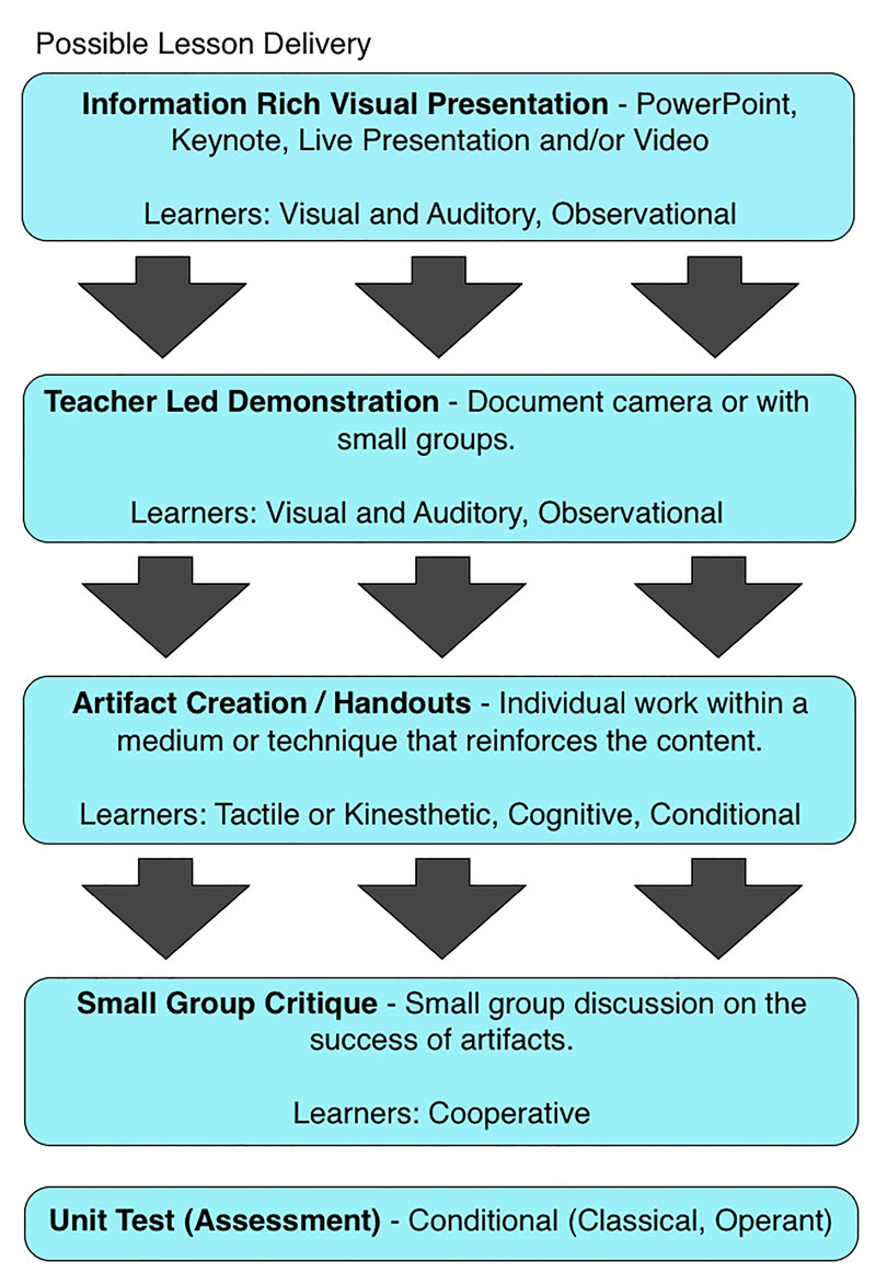
Teaching Art to Multiple Learning Styles
As a teacher, understanding the learning styles of your students is incredibly important. A classroom is filled with students that all have different learning styles. It is your job as a teacher to reach all of your students, so naturally every learning style should be addressed in your lesson.
This means that the structure of the lesson should include resources and activities that cater to multiple learning styles.
Here’s a look at how this may be accomplished in an art classroom…
 Here’s a link to a PDF of the above image… PDF Download
With a video, presentation, or live demonstration, the lesson could begin by addressing the needs of observational learners. This initial introduction should clearly communicate the process or technique visually.
The presentation is followed by the creation of an artifact that addresses the needs of the conditional learner allowing them to experiment with the medium or technique.
As the activity begins, a handout that features a step by step instructional guide on the process, medium, or technique is included. This addresses the needs of the cognitive learner.
At the conclusion of the assignment, the success of the artifacts can be discussed as a group, reinforcing the concepts of the lesson. For further reinforcement, a quiz or test can be administered allowing students with less “artistic skill” to be successful.
Summing it All Up
Fortunately, learning art is mostly a fun activity. Understanding your learning style allows you learn more efficiently making the process of becoming a skilled artist even more enjoyable.
How do you learn best?
If so, join over 36,000 others that receive our newsletter with new drawing and painting lessons. Plus, check out three of our course videos and ebooks for free.