This tutorial is dedicated specifically to alcohol-based markers. As their name suggests, the color (dye) of these markers is suspended in alcohol, making it a fast evaporating solvent.
An advantage of alcohol-based markers is their ability to make smooth gradients of color. You don’t need to add water to blend colors, as would be necessary in the case with water-based markers. In today’s post, you’ll learn an easy way to create beautiful gradients, which can be a challenge for water-based markers.
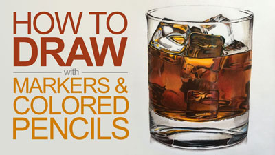
Another plus of this medium is that you can use markers in a combination with other supplies – for example, colored pencils. It opens up a completely new world of possibilities!
The first part of this tutorial is theoretical. We’ll talk about choosing your first set of markers and explore some basic techniques. Then we’ll apply all the knowledge to a quick and fun project. If you’re interested in the practical part, feel free to skip down the page. Let’s begin!
Alcohol-Based Markers
Like all of the other forms of art media, there are many brands of alcohol-based markers to choose from. Here are some of them:
- Copic
- Touch
- Winsor&Newton
- Spectrum Noir
- Prismacolor Premier
- Finecolour
I bet you’ve heard of at least one of those names. However, the list of all existing brands, including the local ones, would be excessively long.
Perhaps the most popular question that beginner artists have is “what brand of markers should I choose?” There are so many different opinions. I’m afraid that there isn’t a perfect answer. Choosing any artistic tool requires doing some research and experimentation.
We won’t be conducting a comparative review of art products that exist on the market today. Instead, we’ll cover the basics of how alcohol-based markers are used, since most of the brands listed above all behave in a similar way.
The common rule of thumb is that investing in a qualitative product pays off. It allows you getting better results and having a more pleasant experience in general.
On one hand, the safest option may be choosing a well-known brand with a strong reputation. Most likely, the prices on their products are closer to the higher end. You can be sure that the components of their markers are safe and non-toxic. Such brands usually have a well-thought collection of colors. Moreover, they give you an option to buy refills, which is a nice thing.
However, the quality difference between very expensive and budget markers have significantly decreased in recent years. You can still create stunning works of art with inexpensive markers.
Many products that are moderately priced also have a wide range of colors. In addition, you can refill their markers – no need to buy new ones.
In contrast to watercolors or other paints, you can’t simply make a new color by blending applications of two markers. In most cases, mixing is limited, even if you layer several marker applications. This is especially true for light and vibrant colors.
In other words, if you need orange, it will be much easier to get a marker of the proper hue and saturation than to mix orange using red and yellow. This nuance may be an obstacle for some people. Not everyone feels ready to invest in a big set of expensive markers right from the start.
It’s important to find a happy medium between quality, price, and quantity, and this is different from person to person.
Regardless of the markers that you have at your disposal, I recommend focusing on the techniques. Master them using any brand of markers you have. If you understand the logic of using this medium, you’ll be able to produce nice results with any decent markers.
Also, many brands sell markers “open stock”. It may be a great opportunity to try different brands without a huge investment.
There’s no strict rule that you should use only markers of the same brand together. In most cases, products of different brands do blend and work well with each other.
(For this tutorial, I used Finecolour Brush and Double Line markers.)
Creating Your Basic Collection of Markers
When beginning your collection of markers, pay attention to inscriptions stamped on the cap or body of each marker. For some brands, there is a letter (or two letters) and some numbers.
Letters indicate the color family. For example, B is for Blue, V is for Violet, and BV is Blue-Violet. You can easily continue the row by guessing other examples…
- R – Red
- Y – Yellow
- G – Green
- RV – Red-Violet
- YR – Yellow-Red
- YG – Yellow-Green
- BG – Blue-Green
Letter E may cause confusion, but the answer is quite simple. E is for the Earth tones.
Many brands provide a naming system that is logically sound. In this case, you can see the connection between the increasing or decreasing numbers and changes in the color’s saturation and brightness. In other cases, the given numbers seem rather random, so you have to rely on the swatches.
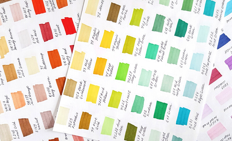
Always make color samples of your markers. The color that you see on the marker’s body or cap is usually not the same as the color of the mark that it makes.
Color charts make it easier to see what colors you have and will help you make the correct decision on what color to use in your drawings.
The choice of colors depends on the primary theme of your art. For example, botanical sketching requires an extended set of greens with the addition of reds, yellows, blues, and browns.
Take a moment to analyze your goals and favorite themes. You’ll get a basic understanding of what colors you use more often. This is a good place to start.
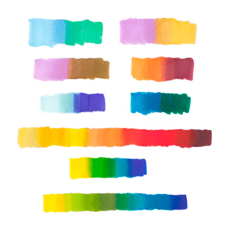
As mentioned above, the possibilities of mixing new colors with alcohol-based markers are limited. Therefore, it’s best to gather your set based on the following principle: get a lighter and a darker variant for every color that you plan to use.
These lighter and darker colors may be slightly warmer or cooler than the middle value.
The image below illustrates this principle.
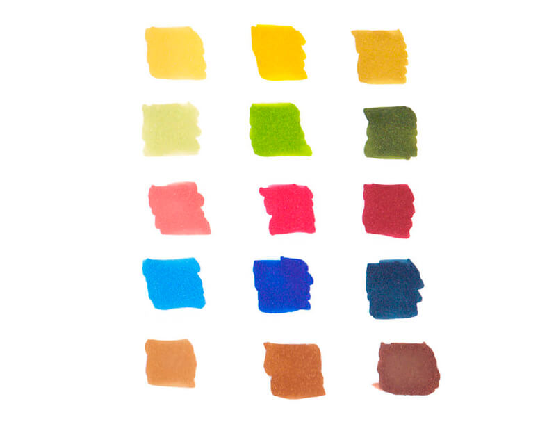
I didn’t add the indications of colors because those numbers mean something mainly within a specific brand’s naming system. You may be using any markers in the world, so only the actual colors matter.
Depending on your favorite themes, it may be that you don’t need three different reds or yellows (but need a couple of violets and a turquoise marker instead).
A set of grays is a must-have for any collection of alcohol-based markers. I recommend having at least three gray markers.
Each gray shade has its designated place in the color chart system. Take a closer look at the caps or body of your gray marker. You’ll find a letter – it indicates the hue. For example:
W – Warm Gray
C – Cool Gray
N – Neutral Gray
Cool Gray has a hint of blue; Warm Gray has some brown in it. Neutral Grey, which can be found in some brands, is neutral, as its name suggests.
See also: Warm vs. Cool Grays
Also, some manufacturers offer us another family of grays called “Toner Gray”. Usually, it is halfway between neutral and warm.
Compare the swatches in the image below to see the difference.
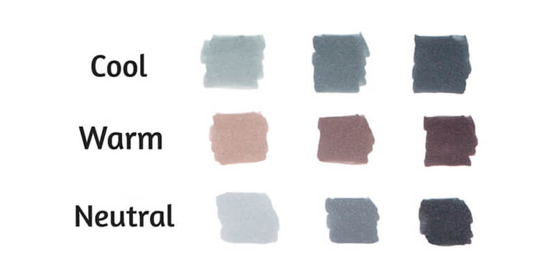
By the way, many manufacturers of markers use another spelling – “Grey”. I use the American English version throughout this post, but don’t be puzzled by this seeming difference.
After the letters comes a number. Usually, the higher the number, the darker the shade is. The image below illustrates this.
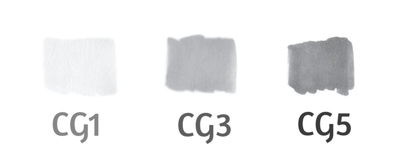
It is recommended to pick gray markers, skipping every other number in the row. For example, your set may include Cool Gray 1, Cool Gray 3, and Cool Gray 5.
The Tips of Alcohol-Based Markers
A marker usually has two tips, one at each side of the body. Here are some common types:
- Fine nib is pointed (it is the upper one in the image below.) It is best for drawing thin lines of approximately equal width and working with details.
- Brush nib is a soft and flexible tip that allows creating varied, organic lines.
- Chisel nib is relatively big and broad, so it can quickly cover large areas. However, it is still able to make thin marks with its edge.
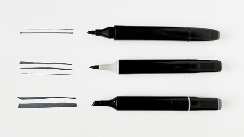
Again, it’s up to you to decide which combination will serve your goals best. In my experience, Brush tips perform blending substantially easier and quicker than Chisels. They allow for so many varieties of marks! So it’s worth giving Brush tips a try.
Basic Mark Making with Markers
In this part of the tutorial, we’ll explore several techniques that will enhance your skillset. They are simple yet effective.
First of all, the paper that you use matters.
I recommend working on a special paper that is designed for markers. It is smooth, allowing the tips of your markers to last longer. With that paper, you won’t run out of your markers too quickly. This paper doesn’t prevents the marker dye inks to soak into the paper fibers. Some papers have a coating that prevents inks from bleeding through.
It’s also easier to achieve smooth blending on special marker paper, which is very important.
See also: All About Drawing Papers and Surfaces
Quickly or Slowly – The Speed at Which You Make Your Mark
Look at the two samples below. They were made with the same Cool Gray 3 marker.

We can easily see that the sample “a” isn’t uniform. It consists of some horizontal strokes which are clearly visible. This sample was created by a series of relatively slow hand motions, so the inks had time to dry (at least, partially).
In contrast, sample “b” is uniform and smooth. We can see hints of separate strokes only near the outer edges of the sample. It was drawn quickly, so the paper was still wet during the process.
Remember – marker applications dry very fast! If you need a smooth covering, apply inks in a swift and confident manner. And vice versa: if you don’t need any blending between two colors, let the first layer dry completely.
Layering with Markers
To put it simply, adding a new layer of the same color darkens the color. This value shift is subtle.
To achieve a smooth transition from a lighter to a darker value, we should make marks quickly, while the marker applications are wet.
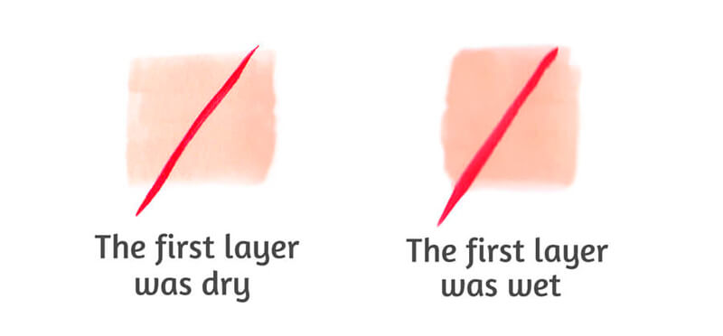
Compare the two samples below.
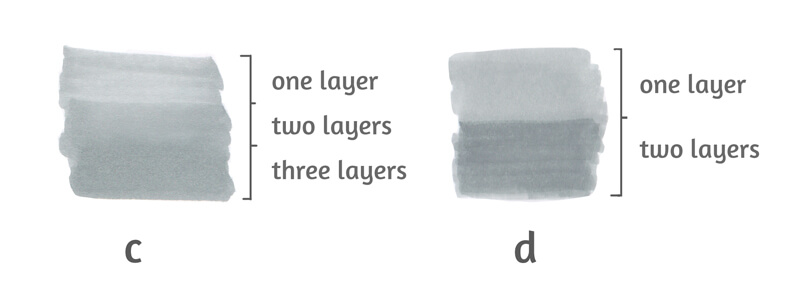
Sample “c” demonstrates a relatively smooth transition between layers. It’s fair to say that it was created using the “wet on wet” technique.
Sample “d” demonstrates a noticeable seam between lighter and darker shades. In this case, the second layer was applied after the first one had dried completely.
Both samples were created with one marker – Cool Gray 3. The difference in value was achieved only by layering.
Textural Marks
In some cases, we don’t need our marker applications to look smoothly blended. Sometimes, those visible strokes are our friends. They break the visual uniformity and create the illusion of texture.
In the image below, you’ll find some textural marks. They are spontaneous, even chaotic. Such marks can be created with swift hand motions.
While drawing, vary the angle and pressure on the marker. The wrist is active yet relaxed; the fingers may be involved if necessary.
Take a moment and consider all the possible ways to use these types of marks.
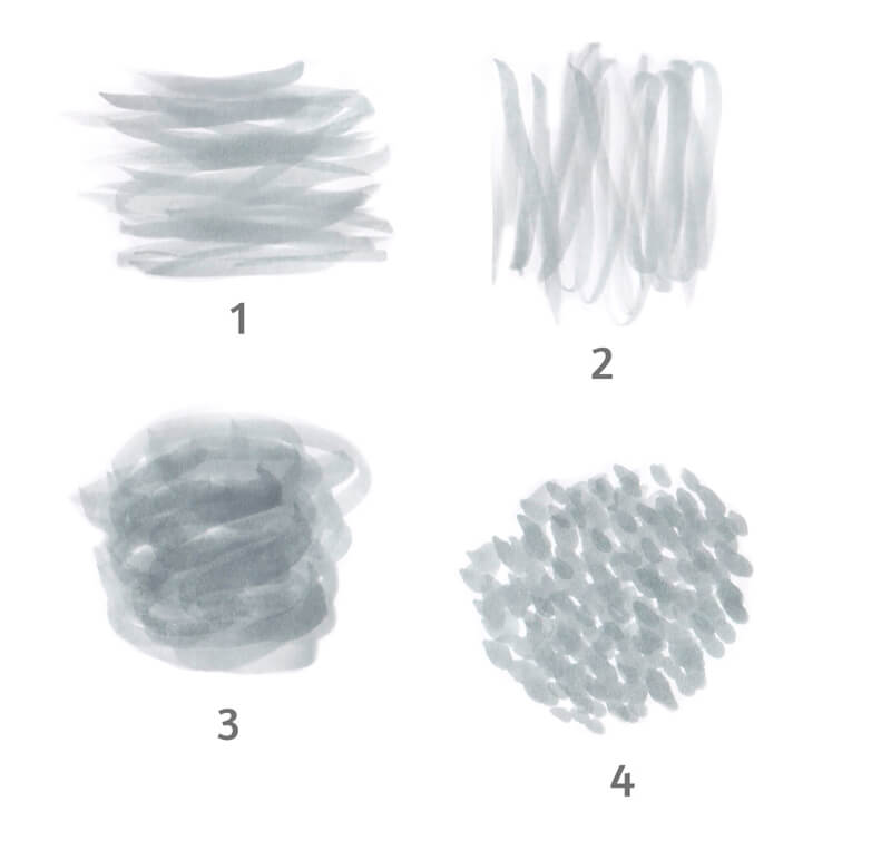
Samples “1” and “2” are perfect for wooden textures, while sample “3” is ideal for a variety of organic textures. Sample “4” looks like a tree’s crown from a distance.
How to Blend Markers
I hope that the amount of information that we’ve covered so far doesn’t overwhelm you. Blending markers is fairly straight-forward, we’ll be following just one sequence of actions.
- Start with the lighter color;
- Add the darker color (or any second color of your choice) with an overlapping layer;
- Add more strokes of the lighter color to the border between two colors, where the “seam” is visible.
Why is it recommended to keep this order? The lighter color is your guideline. With markers, you can’t go lighter once colors are in place. It’s very difficult to lighten the applications, so save the “airiness” in your works as long as possible.
Please note that the order of applications may change. There can be exceptions when it’s appropriate to apply the darker color first.
Creating Gradients with Markers
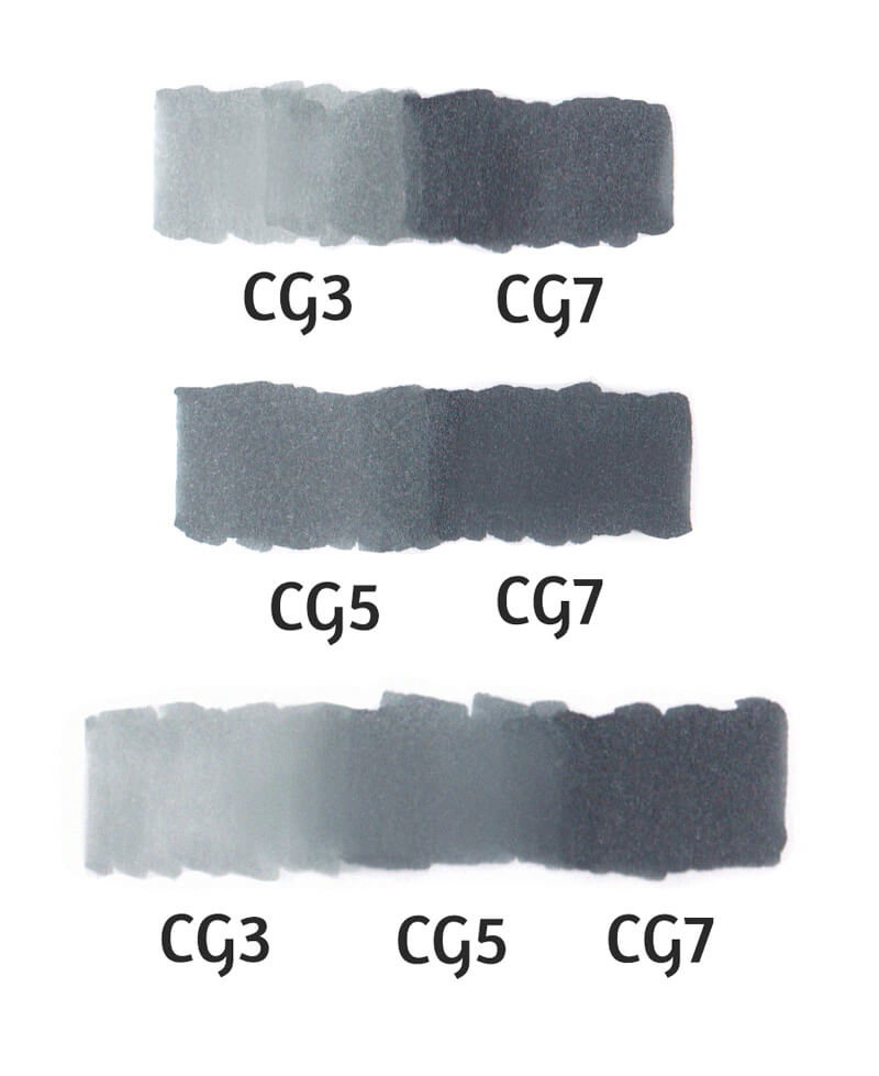
If your goal is a seamless blending of two colors, the best option will be picking two colors that are close in value.
Cool Gray 3 and Cool Gray 7 can’t form a smooth transition between shades, but Cool Gray 5 and Cool Gray 7 can.
I used CG5 as a middle link to make a smooth gradient between CG3 and CG7.
Blending Practice
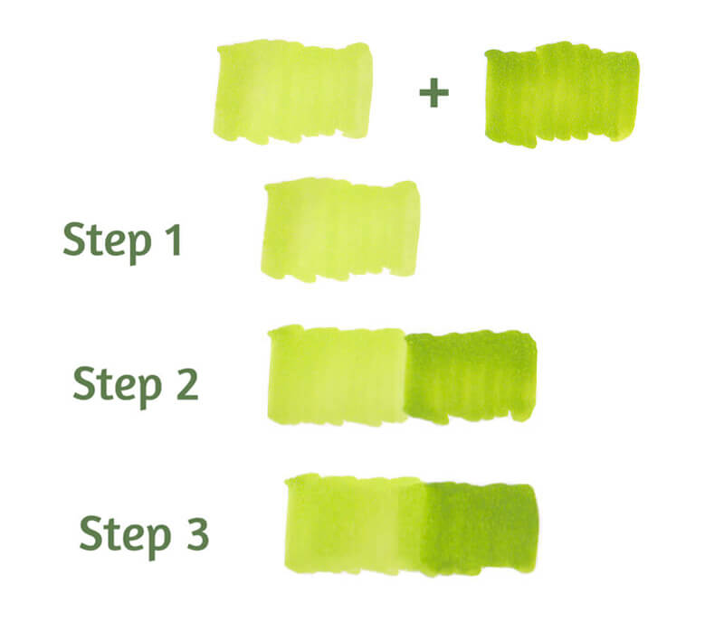
Let’s blend two green colors. To do this, I pick two colors that are relatively close in value, YG24 (left) and YG27 (right).
- I start with the lighter YG24;
- I add the darker YG27 with an overlapping layer;
- I add more strokes of the lighter YG24 to the visible “seam” area.
Does it mean that only colors of the same color family can be blended? Luckily, no. It’s possible to experiment with any of them! Some combinations blend in a nicer and smoother manner, but there are no limits.
Even contrasting colors can be blended to a certain extent.
Try different options – who knows, maybe you’ll find your next favorite color combination? In the process, pay attention to the value gap between the lighter and darker colors.
Making complex, challenging gradients may be a great exercise. Try to create a row of colors that consist of as many steps as possible.
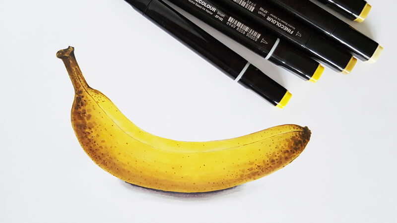
How to Draw a Banana with Markers
Let’s put to practice everything that we learned today. Our project will be quick and fun!
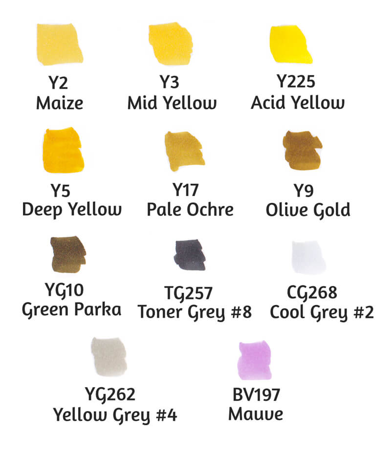
First, I prepare a set of markers that seem to be a good fit for the art. I refer to my pages of swatches. When in doubt, try the markers in a combination on a spare piece of paper.
I’m going to draw a banana that has some brown spots on its peel. Therefore, I’ve chosen several variants of yellow and some browns. Also, we’ll need gray markers to change the tone and intensity.
I’m going to include a little bit of light violet, which is the opposite of yellow on the color wheel. This tint will make the sketch more realistic and interesting.
All markers are by Finecolour Brush.
As we already know, marker applications dry fast and that dictates the tempo of drawing. If you don’t have enough experience with alcohol-based markers, selecting colors on the fly may lead to frustration. Preparing the tools beforehand allows you to save time and mental energy.
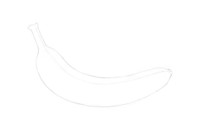
The Pencil Sketch
I’ve prepared a sheet of marker paper with the main contours of the banana. The object is sketched with an HB graphite pencil.
The lines should be light because excessive graphite may contaminate marker applications. Soften the contours with a kneaded eraser, if necessary.
Adding Color with Markers
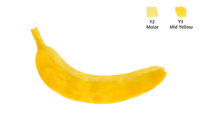
I start with lighter colors, Y2 Maize and Y3 Mid Yellow. The working tip for all of the steps that follow is a Brush.
I apply Y2 mostly to the upper part of the banana. It is assumed that this area gets more light from the environment. I cover the rest of the banana with Y3, which is more saturated.
Remember how to make seamless gradients? Apply the first color, then add the second one, and quickly blend the border between them with the first color. The same principle goes here – don’t let this new shape overwhelm you.
In this case, the lighter Y2 is our first color, and the darker Y3 is the second.
I’m holding both markers in my hands all the time. (When I’m drawing with Y2 in my right hand, Y3 stays ready in my left hand, and vice versa.) This allows for changing the tools as fast as possible, before the inks dry.
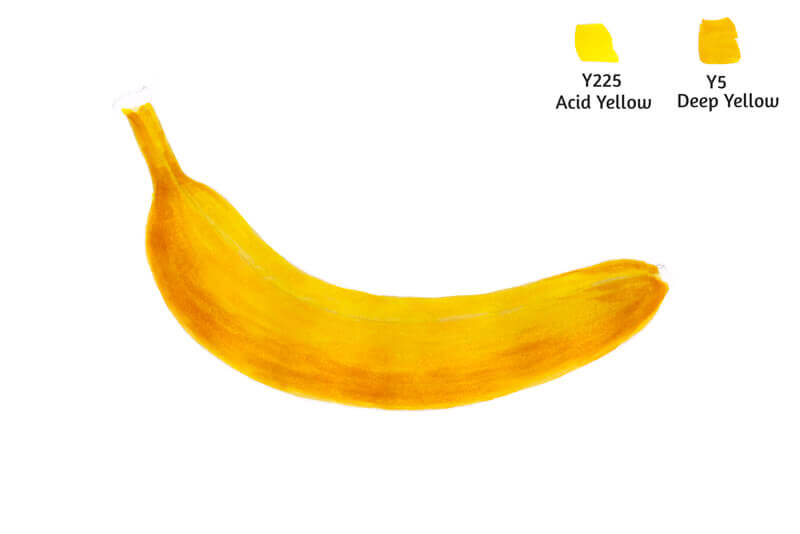
Now it’s time to add some yellows that are more vibrant. I add Y225 Acid Yellow mostly to the top of the banana. Y5 Deep Yellow is applied as its companion to the bottom part.
The border between both colors is blended with Y225.
If you still see separate strokes, it may be a sign that your art needs another layer of marker applications. Adding more inks of the lighter color is a way to create a smoother transition.
However, in this case, we can leave some visible strokes to accent the texture of the overripe peel.
With Y17 Pale Ochre, I work on the form of the banana, giving it more volume. I create some soft core shadows and mark the edges.
If we apply this color alone, it may create a harsh contrast with existing yellow layers. That’s why I blend Y17 with Y3 Mid Yellow. It will soften the brownish strokes.
Pay attention to the order of applications for this step! Sometimes we apply the darker color first, and then blend it with the lighter one. But this happens mostly after the base layers (formed with lighter colors) are already in place.

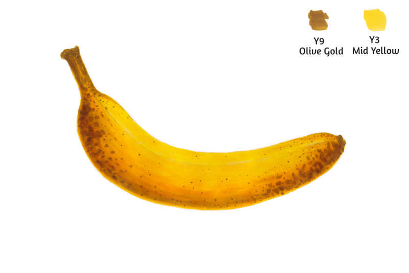
I add some spots on the banana peel, using Y9 Olive Gold. The Brush tip is great for creating such varied, spontaneous marks of various sizes.
I blend some of the spots with Y3 to make them softer and more blurry.
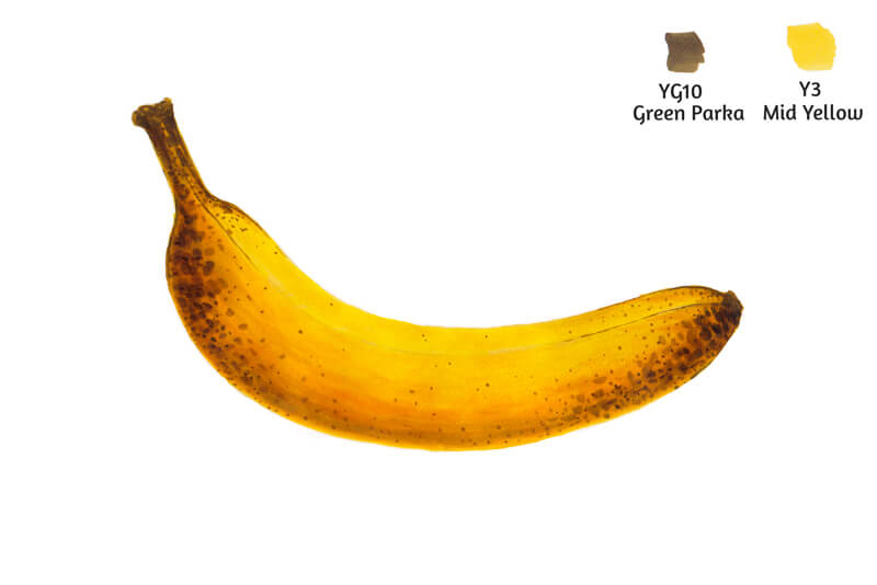
With YG10 Green Parka, I add darker spots. Y3 can be used again to blend them.
I use YG10 to outline the edge between the sides of the banana peel.
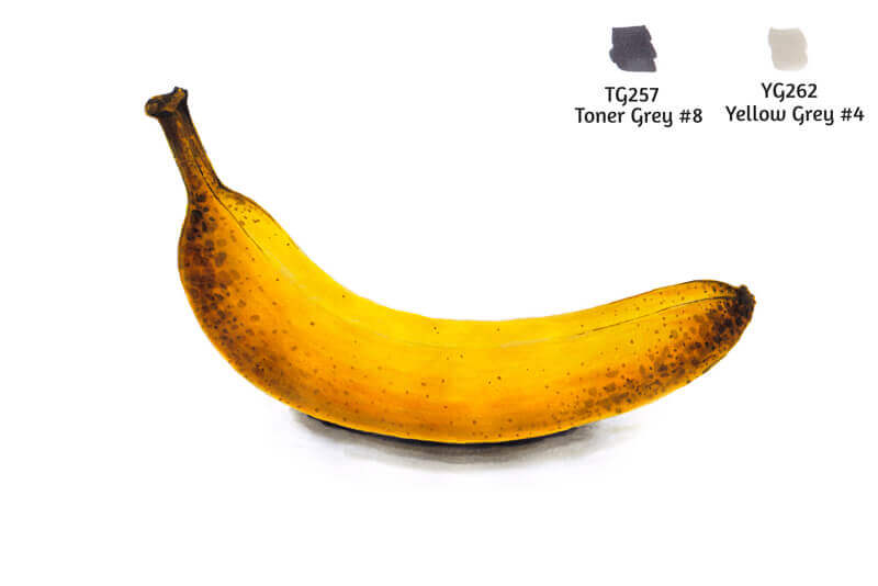
I use TG257 Toner Gray #8 to add a few more spots on the peel. (They are really dark!) I soften them with Y17 Pale Ochre. I also accent the stem.
If you don’t have any Toner Grays, it’s possible to use a marker from the Warm Gray or Neutral Gray family.
I used thin marker paper for this drawing (it’s 100 gsm), so this amount of inks makes it buckle a little. Luckily, we’ve completed the banana!

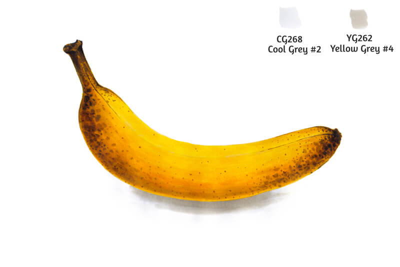
I add a cast shadow under the banana, using CG268 Cool Gray #2. This shade covers a relatively large area. Then I add some YG262 Yellow Gray #4 closer to the banana.
Then I blend the border between the two grays with the lighter marker.
With TG257 Toner Gray #8, I increase the contrast in the area where the banana touches its cast shadow.
I blend this shade with lots of YG262. There is a substantial gap in value between those grays. The surface of the paper should be wet with an alcohol solvent to make this gradient happen.
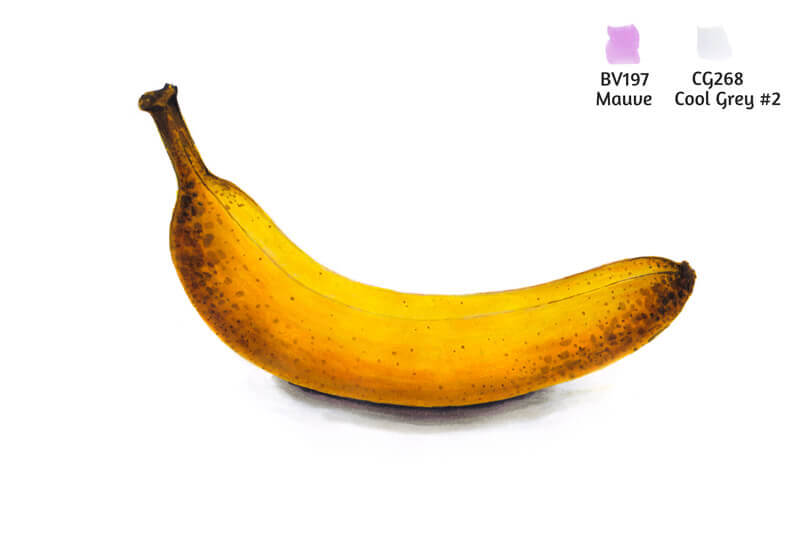
The sketch is almost complete. To make our banana more realistic, I add some BV197 Mauve to the lower part of the banana. I accent the core shadow and mute the area of reflected light. I also add this color to the cast shadow.
I use CG268 Cool Gray #2 to blend this color a bit more.
Light violet brings some depth and credibility to the sketch. Yellows look more vibrant due to this contrast.
Conclusion
Congratulations – we’ve come a long way from the very basics of using alcohol-based markers to a wonderful practical project! I hope that you enjoyed our journey.
Markers open up a big world of creative possibilities. I wish you much inspiration!
If so, join over 36,000 others that receive our newsletter with new drawing and painting lessons. Plus, check out three of our course videos and ebooks for free.