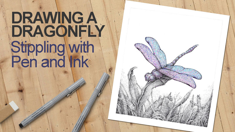
Beginning ink artists usually choose stippling as a starting point technique because it’s forgiving – a couple of odd dots probably won’t ruin the artwork. It’s also relatively easy to control the accuracy of dots (and the drawing in general) – probably easier than dealing with a variety of hatches.
On the other hand, creating a multi-layered net of dots requires quite a bit of time. There are many opinions on whether it is appropriate to combine stippling with hatching. Some artists prefer “pure” stippling while some choose to include lines and various types of hatching in the stippled artwork.
Let me show you my approach and the process of combining different techniques in an ink drawing. In this tutorial, we’ll create a drawing of a beautiful dragonfly, mixing black and bright, colorful dots. Stippling is not limited to just one color after all!
The Art Supplies for This Drawing
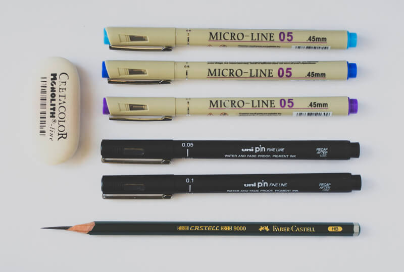
For this project, I’ll be using:
- Black ink liners, the width numbers are 0.05 and 0.1.
- Colorful pens – light blue, dark blue and purple.
- HB graphite pencil and eraser for creating the underdrawing.
The size of my artwork is relatively small, 17×23 cm (or roughly 6.5″ by 9″). The choice of paper is up to you, but I prefer the smooth white paper. Another option is smooth or vellum Bristol paper.
Please use ink liners or pens of any brand you like or have. Of course, a creative approach is welcome – choose any additional colors, if you wish!
Basic Stippling Technique
When to Use Stippling
Before we dive into the process of outlining the “final” artwork, let’s explore the possibilities of the stippling technique. It’s worth considering what’s possible in a drawing such as this, since stippling has many ways it can be used.
Some of them are:
- Creating illusions of sand, soil, dust and similar types of textures;
- Drawing clouds, sprays and mist;
- Various velvety, fluffy, fleecy textures;
- Depicting delicate and, especially, transparent objects, like the wings of insects;
- Light objects in a drawing;
- Emphasize the dramatic change from a darker to a lighter value;
- Accentuate the darker values and strengthen the shadows without overworking the drawing in general;
- Anything that has plenty of thin, refined details;
- Drawing objects that are far from the viewer and located somewhere in the background.
In addition to this list, stippling is a great way to draw anything that has subtle value changes, including a wide range of objects or unobtrusive blurry backgrounds. Even a couple of dots added in the right place may enhance your artwork and make it more interesting.
How to Develop Stippling in a Drawing
Simply said, stippling is a creation of a pattern that consists of dots.
The more dots are put on the paper and the closer those dots are to each other, the darker the value becomes. By layering more and more dots, we can create an illusion of shadow and develop a smooth transition between lighter and darker values.
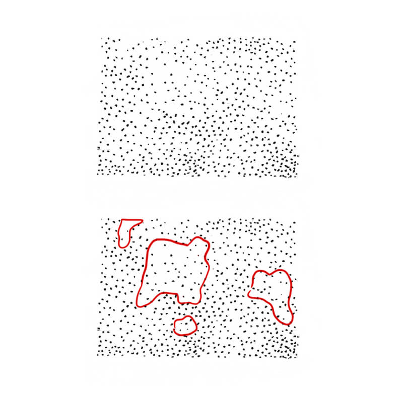
It’s important to train your eyes and hand to place new dots in the gaps between the existing ones, creating a harmonious pattern. This concept may seem obvious but also complex. It’s just a matter of balancing areas of the filled and blank surface within the picture plane.
The illustration below shows an example of how the gaps between the dots can be an expressive tool itself, forming shapes and silhouettes, creating an illusion of relief and texture. That’s why it’s important to use this space wisely.
Let’s take a look at some examples of shading with stippling.
In the image below, you’ll find an interesting effect that is achieved by adding more even layers of dots (from one layer to four):
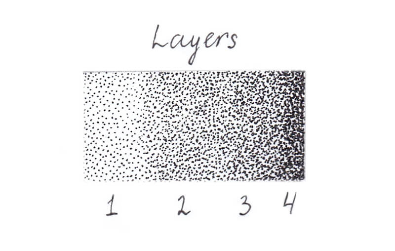
Remember, the higher the concentration of dots, the darker the value!
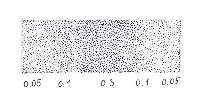
And here is an example of stippling a gradation of value.
I’ve created this gradation in value using the liners of different width numbers: 0.05, 0.1 and 0.3. Bigger dots create a more pronounced, rough pattern, and smaller dots create the impression of a delicate texture that is almost smooth.
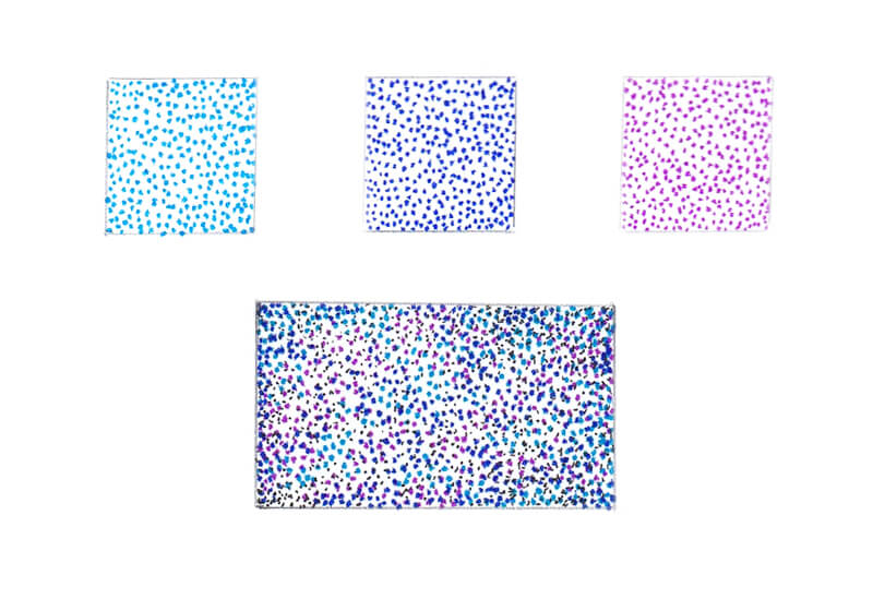
Adding dots of a different colors expands your possibilities greatly. In this project, we’ll have three subsidiary colors supporting and varying the pattern of black dots.
Together, these colors create a sample full of lovely nuances!
Become More Confident with Stippling
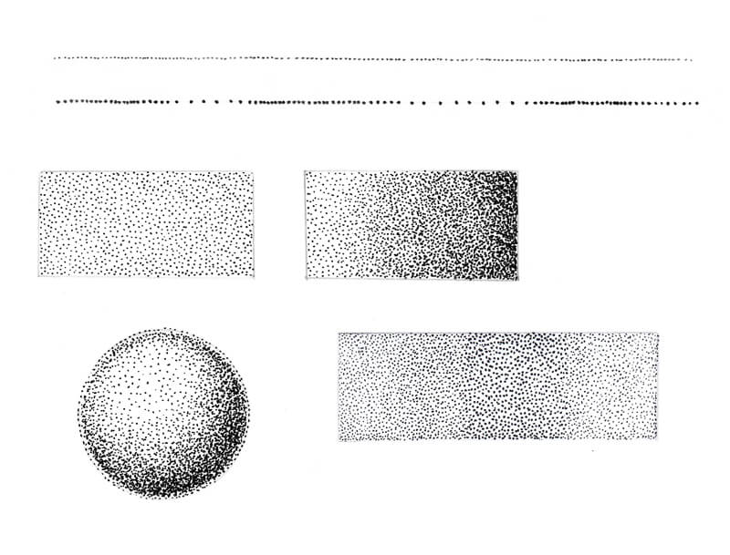
It’s useful to practice stippling before proceeding to your final drawing. You can draw a couple of small rectangles, using a pencil and a ruler, and fill them with dots. Here are some suggestions:
- Create an even layer of dots, using any liner you like. Pay attention to the gaps between the dots – the intervals are as important as the pattern of dots.
- Create a transition from lighter to darker value, using just a single liner.
- Play with liners of different widths, making larger and smaller dots.
- Draw a ‘line’ that consists of dots. Try varying the intervals between the dots.
I also recommend drawing a shape (for example, a circle/a sphere) and filling it with dots to create a basic, stylized illusion of volume.
If you’re going to use colorful dots in a combination with black ones, try creating an appropriate sample too. It’s important to know how all these dots would look together!
Stippling Tips and Advice
Nuances matter and the following list of variables should be considered…
- The way you hold your tool
- The amount of pressure you place on the pen
- The angle between the pen liner and the paper are important
- The placement of the paper. (If you have a habit to rotate your artwork while drawing, this will affect the result you get.)
In some cases (especially, if stippling is the only technique used in your artwork), consistency in the way you create your dotted pattern helps to achieve a desired result.
Sometimes having a support for your paper that has an angle instead of drawing just on a flat table makes a difference too. To put it simply, experiment and find out what works best for you.
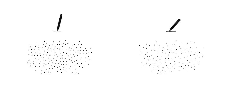
Many artists prefer to stipple, holding a liner or a nib pen at a 90° angle relative to the paper. Changing the angle will affect the character of dots – they may become distorted or faded. Below is an illustration of this concept.
While drawing, keep your hand as relaxed as possible and make sure your movements are quick when you lift the pen tip from the paper. The indecisive movements may create unpleasant tail-like marks that result in sloppy, irregular commas.
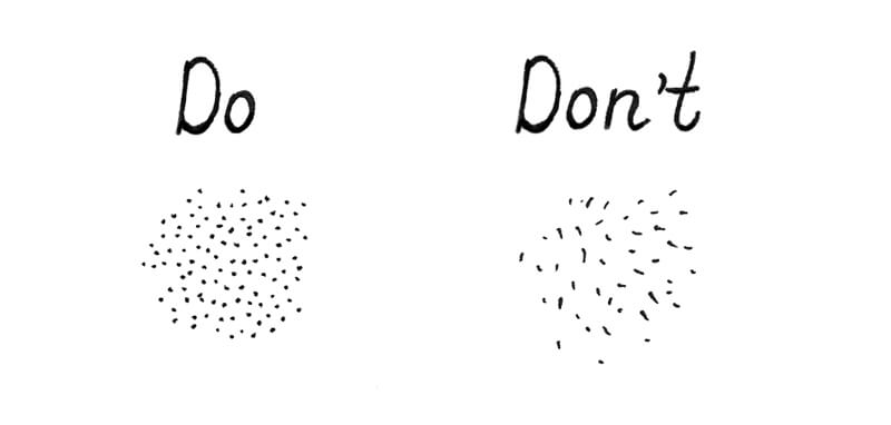
However, there are no strict rules in art. If you like drawing dots with spontaneous ‘tails’ and this gets you the desired result, please feel free to continue doing what makes you happy!
Make light touches with your liner. The process of stippling may make your hand a little tired. Taking a short break with a couple of exercises for the fingers and wrists is a good idea. Plus, an excessively hard pressure on your tool will damage its tip and reduce its life span.
If you have to create big, bold dots, it’s a better to use a liner with a wider tip that makes such dots naturally, rather than trying to create those big marks with a thinner-width liner.
While developing values, try to place your dots in a spontaneous, slightly chaotic way. The result will have a more natural feel. Sometimes the better option is to keep to a defined pattern and place dots in an even row, but these cases are rare and the result may look “stiff” and somewhat mechanical.
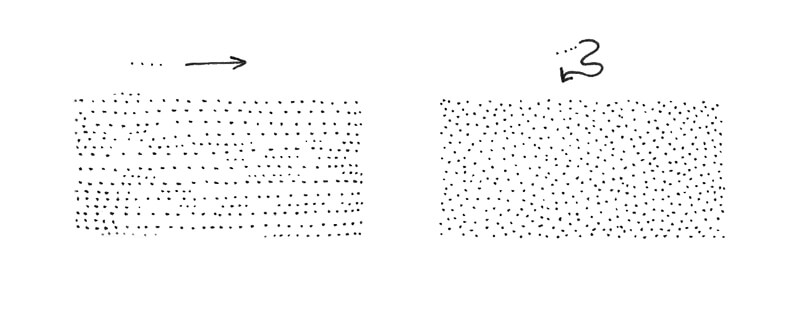
Stippling is a time-consuming technique and it requires patience and dedication. If you’re a beginner, I recommend starting with small exercises and smaller artworks, varying the rhythm and pressure to find what fits you. Take breaks as often as you feel necessary.
Stippling can be a kind of meditation or a way to reach your own “state of flow”.
See also: Pen and Ink Drawing Lessons
How to Combine Stippling, Lines, and Hatching
If you are interested in the “pure” stippling technique with no inclusion of lines or hatching, feel free to skip this part. Here we’re going to explore a couple of simple, yet effective, ways to create harmony between different inking techniques.
One of the advantages of combining techniques is speeding up your process. Adding some hatching allows you to save time, which is also a bonus for anyone lacking patience.
The first method applies to the contours in the drawing. You can use both dots and short hatches to create a broken, dashed line.

I personally like this trick because it helps to make the contours in your drawing quite clear and “readable”. Stippled artworks can often have a slight “blurry” feel and creating clear contours can be difficult.
The closer an object appears in a drawing, the thicker and more continual the contour line. Objects that are far in the distance require a thinner edge and more dots in the contours. This creates a feeling of atmosphere.
Even the parts of a contour line that are continuous should feel organic – a strict line, like one drawn with a ruler, may become a conflicting element.
Another great approach is to place hatching on top of a dotted layer. The opposite way works too. You can create a layer of hatches and then cover it with dots.
The type of hatching used is up to you. Sometimes, describing a contour with hatching is the best option and in other cases, just a layer of simple parallel hatching works.
You can see an example of this combination in the image below.
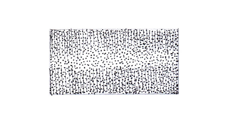
It’s important to choose your tools wisely. Hatched marks that are too thick will be distracting. That’s why I prefer using a thinner ink liner for hatching and wider liner for stippling. The sample above was made with 0.05 and 0.1 ink liners and the result is more harmonious.
Using this approach, you can add depth to your drawings, accentuate the relief of objects, and create an illusion of volume.
A combination of dots and hatching is a powerful tool for creating the illusion of texture. Below you’ll find an illustration of how a layer of stippling and groups of short hatched marks work together to develop texture and relief.
I used the 0.05 liner for hatching and the 0.1 liner for stippling.
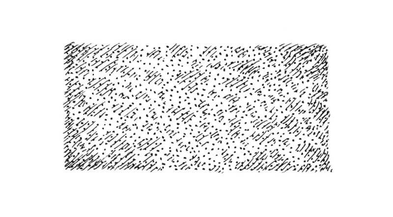
Mixing techniques with a success requires skill and experience. Let me share with you one of my experiences.
Many years ago, I experimented with an illustration depicting various characters in a medieval castle. I used hatching for the interior, clothes, and all the objects. But when it came to shading the faces, I decided that my nib’s tip is too wide – and went for stippling.
The result wasn’t as pleasing as I imagined. The dots created a weird, uneven texture that contrasted with everything else in the drawing.
There’s nothing wrong in making poor decisions that don’t work. We learn this way! So don’t be afraid to experiment.
Drawing the Dragonfly
Now we’re ready to move forward. Let’s start with a pencil sketch.
My goal is a stylized artwork, so I won’t be using any particular reference photo of a dragonfly. But if you feel it necessary to use a photo reference, please do.
I outline the main contours of the dragonfly, constructing it with loose shapes. I also add the general contours of the surrounding botanical elements. A thin border around the outer edges is left to balance and frame the artwork.
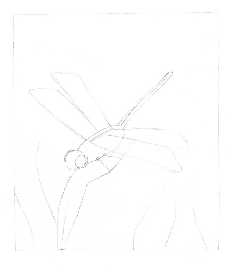
The dragonfly wings are the focal point of the drawing. They are located in the center of the artwork and feature a whimsical, refined pattern. Colorful dots are to be added to the wings and portions of the body. But before we proceed to the inking steps, we have to better understand the pattern of the wings.
Below you’ll find an image of a portion of the wing. This is just a stylized option since dragonfly wings are variable in size, proportion, and pattern.
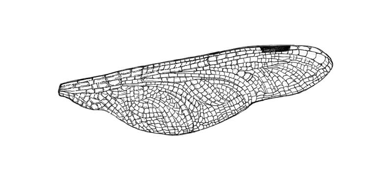
It may appear slightly overwhelming. To fill the shape of the wing with smaller elements, an artist has to see and understand the smaller segments. This set can look like this:
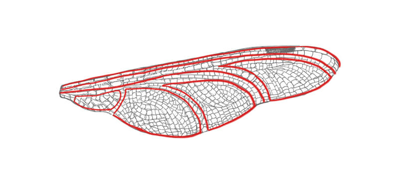
The close-up above is created with thin lines and dots.
In our finished artwork, where the dragonfly has context and is located at some distance, we won’t be able to use lines to convey all the tiny details. That’s why my suggestion is stippling. Let’s continue with the underdrawing.
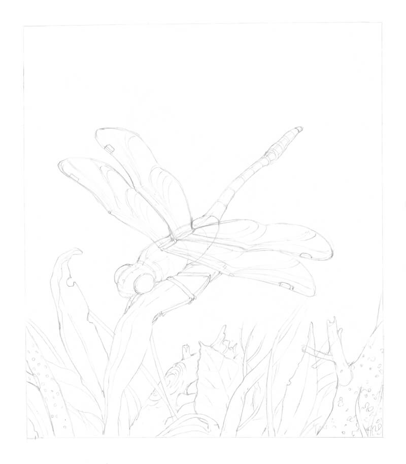
I refine the contours of the dragonfly and then add details to make the insect look believable. The segments of the abdomen, thorax, and wings are all addressed. Feel free to invent some individual elements to add interest to your dragonfly!
I also define the natural environment by drawing the contours of the long leaves, twigs and a fragment of a tree. The goal is to fill the bottom part of the artwork with interesting plant life.
Let’s start inking!
With the 0.1 ink liner (black) I apply dots to the dragonfly’s head, including its big eyes and body. The lighter areas, like the top of the head and central line of the “tail”, require fewer dots.
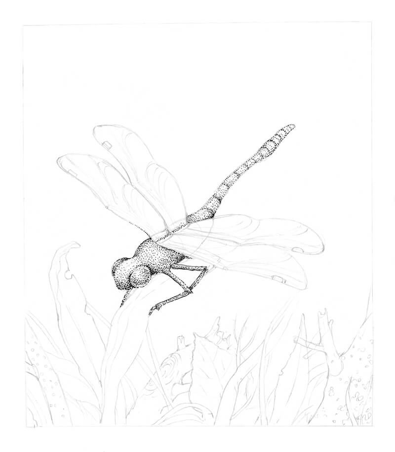
I outline the contours with dots and short lines, using the 0.1 liner.
I also accent the darker areas of the environmental elements, applying dots and keeping the intervals approximately equal. The only exception is some spots of the tree bark texture.
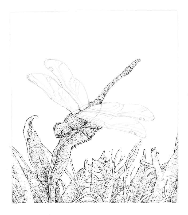
I add another layer of 0.1 stippling to the elements in the bottom part of the drawing. It’s time to increase the contrast, but we’ll work slowly to do so. When it comes to ink, even small dots aren’t easy to remove!
I also use short hatches to add the details of the tree texture and draw the small circles of the twig’s bark pattern on the left side of the drawing.
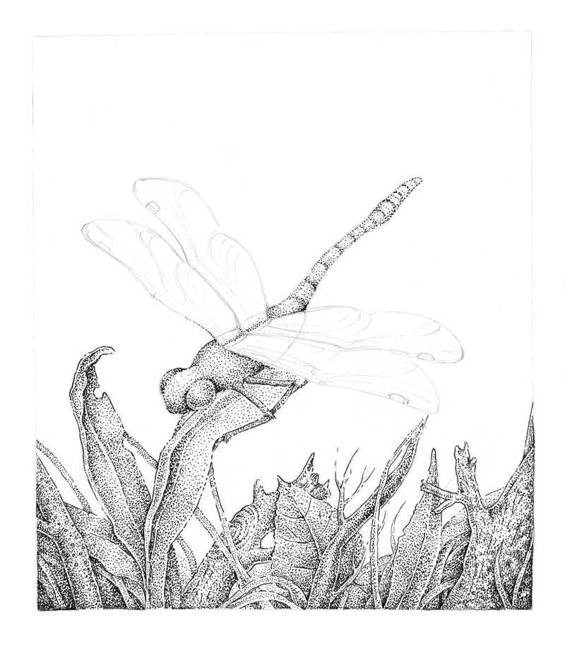
I add the groups of thin hatches made with 0.05 liner to the darker areas, adding depth to the drawing. I pay a special attention to the cast shadow under the dragonfly and everything that is near the bottom edge of the artwork.
The objects that belong in the foreground should be detailed since this area is closer to the viewer. I leave the dragonfly’s segmented abdomen (the ‘tail’) relatively light, allowing it to blend with the background slightly.
I also add groups of small dots to the background, creating a blurry effect.
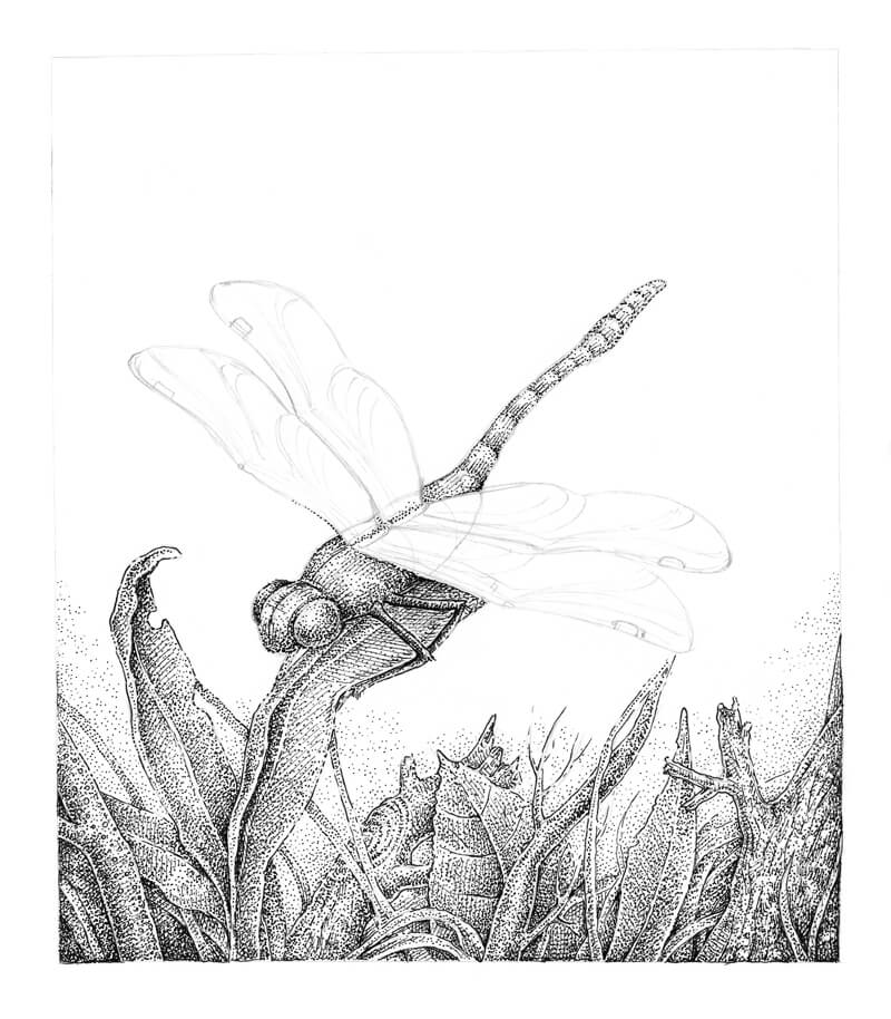
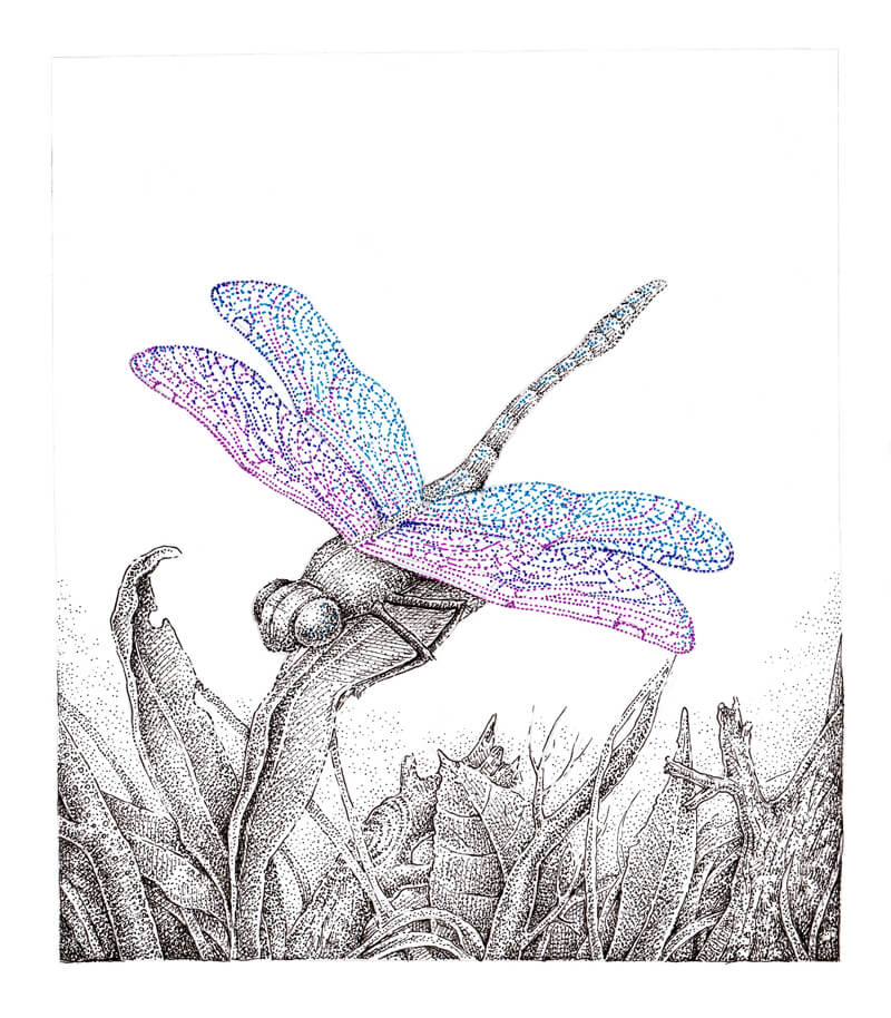
I develop the wings with colorful dots, mixing the light blue, dark blue and purple. I also some of the dots to the dragonfly’s eyes and body.
There is an order in creating colorful lines and patterns. The upper part of the wings is mainly light blue, then dark blue, and finally, purple – closer to the head. Of course, you can also include additional colors if you like.
The individual dots here are quite larger since I’m working with the .5 pens, which are 0.45 mm in width. Although the pens have a consistent width, you can vary the pressure. A lighter touch creates a smaller dot.
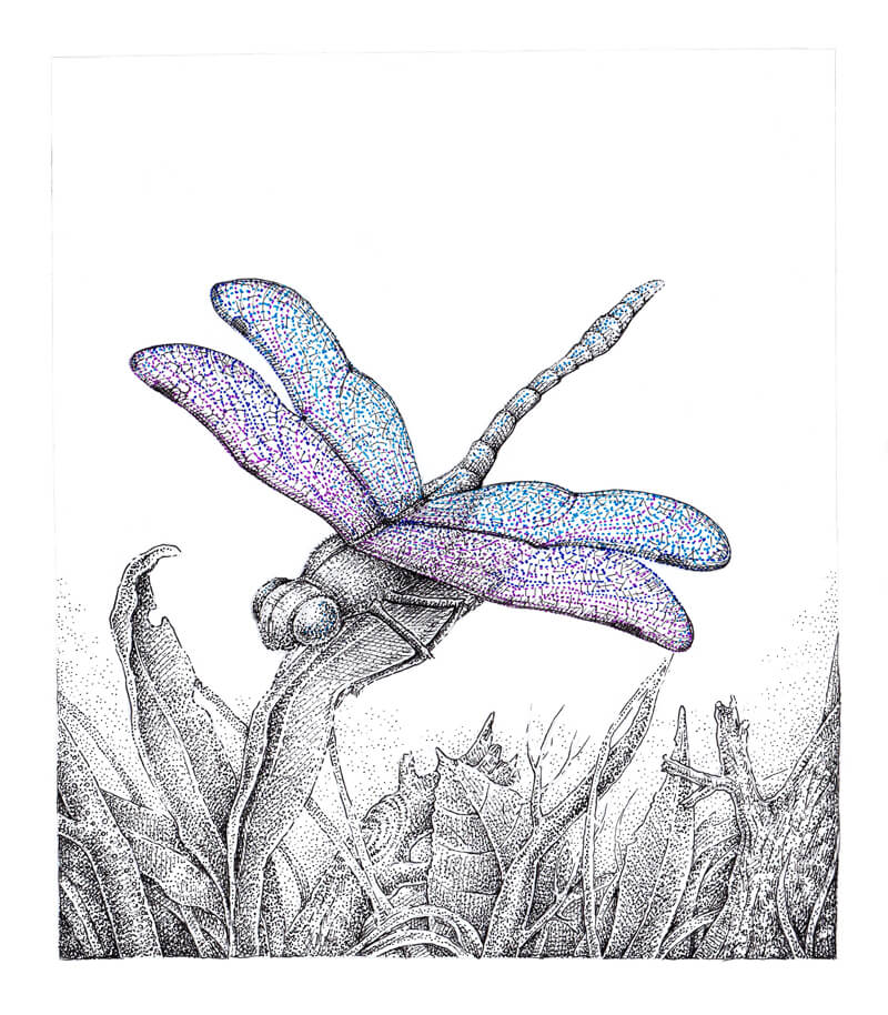
The colorful dots attract too much attention and stand out too much on their own. That’s why I dilute them with small black dots made with the 0.05 black liner. The goal is to create an application that mutes the pure brightness of blue and purple dots.
Subtle black stippling creates a pleasant smoothing effect and unites the wing in appearance. I apply more dots to bottom sides of the wing (the lines that are closer to the head).
The wings are transparent, so I add a hint of them on the body and leg that are visible.
I also make sure to darken the distinctive black spots near the tips of the wings.
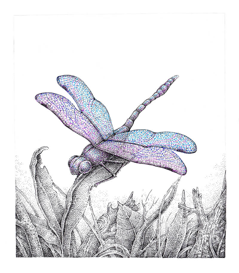
As a finishing touch, I add some light blue and purple dots to the head and body of the dragonfly.
To increase the contrast, I add more 0.05 black hatches to the cast shadow under the dragonfly.
The artwork is now complete! I considered filling the upper part of the artwork in the background with small dots, but eventually decided against it. My goal is to leave the drawing as light, fresh, and atmospheric as possible.
Conclusion
Congratulations – we’ve created a nature-inspired pen and ink drawing with stippling! Thanks for joining me on this wonderful journey as we explored ways to apply stippling and balance the colors. We’ve covered a lot, and I hope you discovered some useful tips for your creative process.
If this tutorial inspired you, but you feel like some of the steps are too complex, please take a look at the great in-depth course The Pen and Ink Experience here on The Virtual Instructor. It explains the fundamentals and provides the basic building blocks of drawing with pen and ink.
I wish you much creative joy and inspiration!
If so, join over 36,000 others that receive our newsletter with new drawing and painting lessons. Plus, check out three of our course videos and ebooks for free.
Lesson Discussion
Comments are closed.


thank you for being unselfish
Hi,
This is my second year with you. Love all the artistic work you put online. I am an artist thats likes to work in many different mediums. Have you thought of drawing a dragon, not catoonish but with elegant lines, etc. Done in graphite, soluble graphite or any of the other mediums? I have been wanting to do dragons and would like to see how you would do a dragon.
Keep painting
Belinda