But before jumping into the inking process, we should prepare our drawing. Everything starts with an idea – the message you want to convey in a visual form. Then you can think over the details; and, as a result, you get something like a roadmap for performing the technical part (which is drawing itself).
I invite you to an exciting artistic journey; let’s have fun and learn some useful tips to enhance our skills!
A Drawing with Multiple Objects: How to Gather Ideas
There are many approaches to finding ideas for a new drawing. Inspiration is everywhere: among images on the web, inside or outside your home (in real life), in reminiscences or even in a dream.
When I was looking for this drawing’s idea, my attention was focused on things I love most: animals and nature. Spring is an adorable time – it seems like every existing creature wakes up and rejoices in warm summer days. This is definitely worth capturing!
Another part of the task was to choose the objects with interesting and challenging textures.
From an artistic standpoint, it’s great to choose things you like (and feel comfortable with) to create drawings and paintings; but what actually makes your skills grow is a deliberate practice. This means, you consciously choose to practice something that is your weak point.

Now we should think about the secondary objects that support the primary idea and help to develop the concept into a detailed illustration.
I use a method of finding associations – ideas that have something in common with each other.
For example, a wooded location is a natural habitat for our hedgehog; there are various kinds of trees, florals, plants, leaves, etc. In a forest, we can also find mushrooms and stones of any kind. All these objects will be included in my drawing.
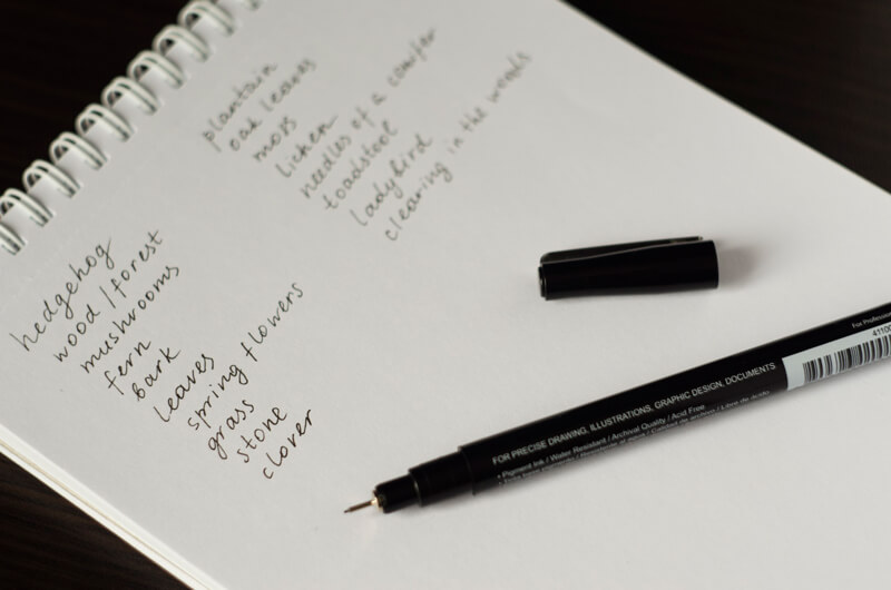
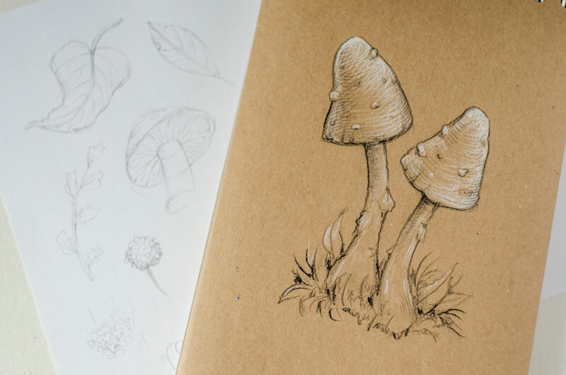
To get specific, I use my visual library – since I’ve drawn many types of leaves, plants, and mushrooms, there are many examples of them in my mind, already waiting to be drawn.
Another great way to get the visual material and reference images is a simple Google Images or Pinterest search. (Remember about the copyrights! Make sure that you use images that you have permission to draw.). I usually don’t copy images that are fitting my concept, just observe the main features and particular details that will help me to draw the object correctly.
I highly recommend observing the real objects before drawing anything that should look like them. It’s extremely useful to be able to touch, rotate, even smell something – believe it or not, all these tiny details and impressions are perceptible by the viewer.
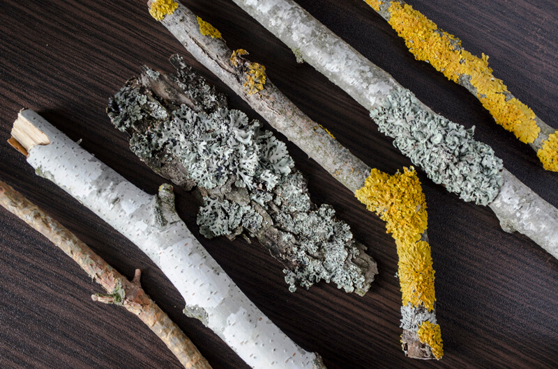
Here are some examples from my “tree texture” collection. These pieces of wood demonstrate not only a variety of bark textures, but also the intricate decorations of moss and lichen spots.
Sometimes you choose a familiar object for a drawing; you know exactly how it looks because you interacted with it before and drew it many times. In this case, creating preliminary sketches isn’t necessary.
However, some sketching can be useful, even if you feel quite confident – it refreshes your memory and warms up your drawing hand.
A Summary of the Process
There are four questions to ask yourself for including multiple objects in a drawing.
1. What do I want to draw? (Your primary idea.)
2. What other things are related to this object? (The associations.)
3. How do these things look in general and in detail? (The research.)
4. What elements of the same category can I use? (For example, various kinds of leaves.)
Analyzing a Texture and Learning to Draw It with Ink Liners
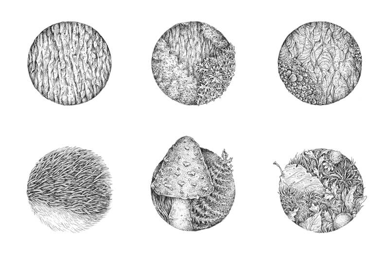
Now you have your list of objects – this allows us to gain some insight into the set of textures of your future drawing. It’s helpful to take some time and explore them. Create samples of the most substantial and complex patterns.
In my case, the most extensive and remarkable surfaces are the hedgehog’s spines and hair, the texture of the mossy tree bark, the mushroom caps, and a composite texture of various botanical objects – we’ll have plenty of them in the drawing.
Any texture can be divided into components or layers. Let me dwell on this for a moment…
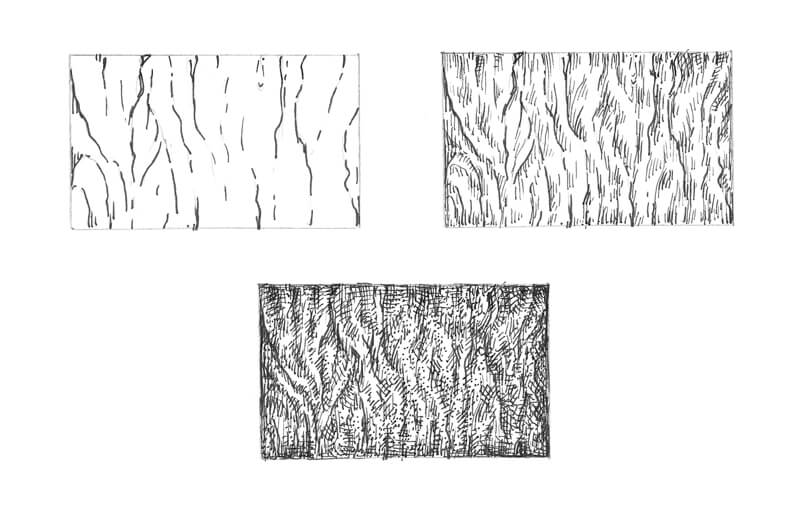
Please take a look at the image below. This is a stylized example of the tree bark texture. I’ve built it with three layers of lines, hatching, and a subtle inclusion of dots to make this sample look more organic.
Here is my checklist for drawing a texture:
1. Find the pattern – stylize the object’s surface and outline the boldest and most prominent lines of the texture, grasp the rhythm.
2. Add shadows and accentuate the relief (various types of hatching work great for this step).
3. Create the details and add the individual features.
Examples of Textures Drawn with Pen and Ink
In this tutorial, we’ll explore the process of drawing a variety of textures, following a similar process. Please remember: there are no strict rules how an artist should approach textures, so if you feel like your process is slightly different from someone else’s, that is completely fine.
You can practice creating a sample of texture in two forms. The first one is drawing just a flat shape with a textural pattern (like the bark example above). In this case, you deal only with the relief and values of the texture itself.
Or you can complicate the task and draw a miniature sample of the texture, imagining that it is located on a three-dimensional form. For example, this could be a part of the tree trunk covered with bark. In this case, the shape has its own range of value, which determines and affects the values of the texture.
Here is my worksheet with the texture study. There are three samples of the tree bark, the hedgehog’s spines and hair, the mushrooms, and a combination of botanical elements.
I started with finding the general pattern of each texture and marking the darkest areas with hatching.
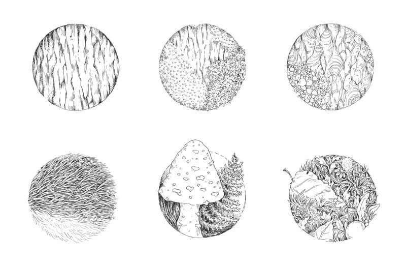
Then I applied ink hatches and dots to create an illusion of contrast and depth. The majority of samples are flat – to make them more attractive, I darkened the inner periphery of each circle.
The sample with a mushroom is slightly different because the cap is three-dimensional.
You can always create your own samples of any texture. Just draw any shape (for example, a rectangle or a circle) and fill it with a pattern that you wish to practice. It can also be a three-dimensional model like a cube or a sphere. Just be creative and have fun!
Why is texture practice important?
If we work with black ink, a texture becomes one of the most influential components of the drawing. It affects the viewer’s impression greatly and helps them to understand the subject. It makes the subject appear more realistic and elaborate.
And, after all, practicing textures is a pleasant, meditative process that helps to grow your observational skills tremendously.
Now we’ve done our homework and are ready to dive into the drawing process.
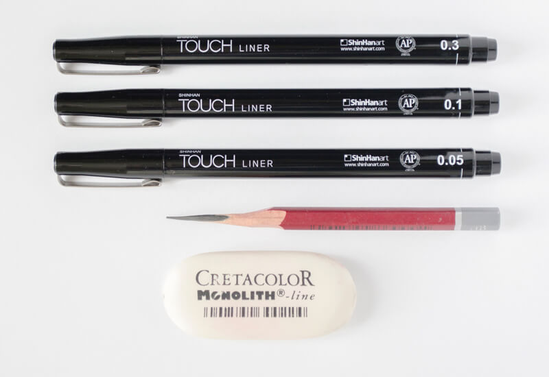
The Art Supplies
For this artwork, I’ll be using:
• A graphite pencil; the HB type is an optimal choice.
• An eraser, as may be necessary.
• Ink liners, the width numbers are 0.05, 0.1 and 03. Any brand of the liners will work just fine.
• Thick drawing paper with an even surface – please use any kind of paper you like. The paper format of this artwork is close to A4.
Creating a Pencil Underdrawing
There are two diametrically opposite opinions about the necessity of a pencil underdrawing for pen and ink artworks. Here are some thoughts on this point…
А decision to outline the clean copy art with the light pencil marks before inking is completely up to an artist. Art is a set of individual preferences and decisions, right? There is nothing wrong with an intention to be prepared and relaxed while using the ink liners.
Ink drawings that were created without a pencil sketch underneath may look more spontaneous. However, the main advantage of having your pencil underdrawing in place is a certainty – you have the clarity in your artistic vision for this particular artwork. It’s not just a knowledge of where the borders of the objects exist on the sheet of paper, but also an opportunity for your brain to think out the artwork beforehand.
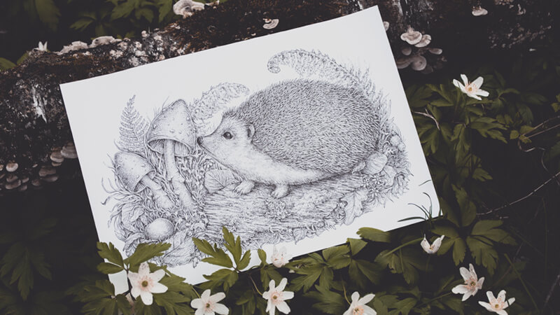
My goal is to create an interaction between the elements of the drawing. I think that the artwork will be more interesting, dynamic, and fun if the hedgehog is facing the mushrooms, as if it is smelling them.
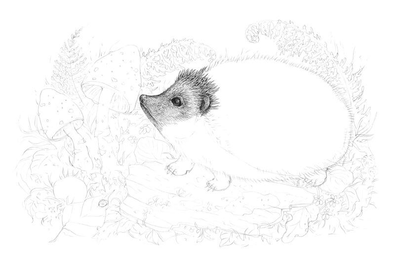
I start the drawing with light pencil marks, outlining the rough shapes of the hedgehog, the mushrooms, the piece of tree bark, and the core lines of the fern leaves in the background.
I also mark the borders of the artwork itself. I’m going to limit the drawing, so there will be relatively large spaces of the white untouched paper in the perimeter.
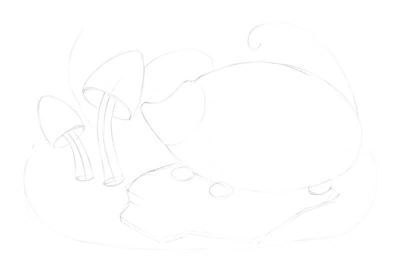
Then I refine the drawing, starting with the largest and the most important element – the hedgehog. One of the reasons why we started with a list of ideas and the overall preliminary research is to help us to get clarity on what we are going to draw and in what sequence.
I’m aiming for a balance between the accuracy of details and saving time, so depicting all the spines with a pencil probably isn’t a great idea.
I make sure I’ve captured the distinctive feature of the hedgehog’s body, especially a small hollow in the neck area, and the overall roundness of the silhouette.
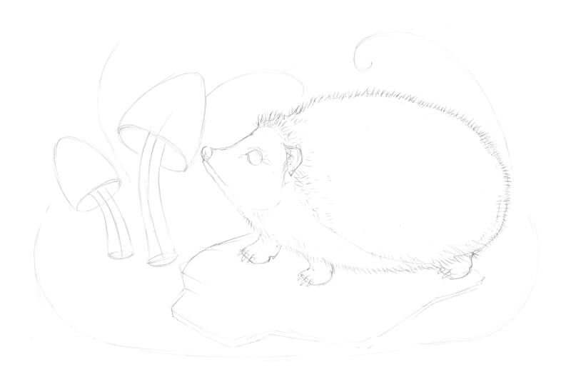
Now I refine the mushrooms, adding the small bumps to the caps, and mark the areas of moss and lichen on the tree bark.
I also fill the remaining space with the secondary elements, based on my list of associations and sketch ideas. Don’t be afraid to use the same element several times. For example, if you draw a leaf several times in slightly different positions, this will look natural and harmonious.
Deciding how many objects or details to include is always up to you.
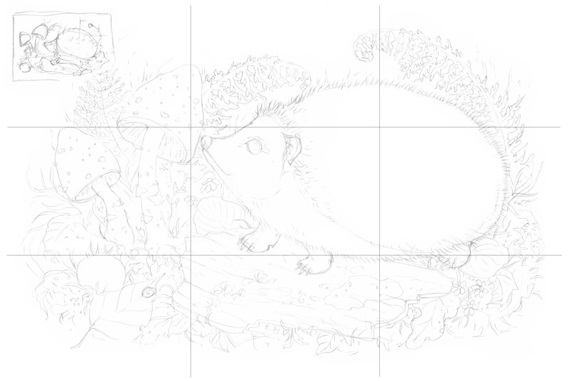
And what about the composition of this piece?
Let’s resort to the compositional rule of thirds. If I put a set of crossing lines on top of the sketch and check the points of intersection, I see that the drawing is aligned quite neatly with these points.
The shapes of the fern leaves in the background have a special function, too. Their core lines twist in a spiral; this creates harmony and unity. Plus, the spiral-like elements attract the viewer’s attention to the front elements of the drawing.
The best way to make sure that your composition is successful is to play with variants beforehand. Try creating some rough miniature sketches – chances are, you’ll get several new ideas for your concept.
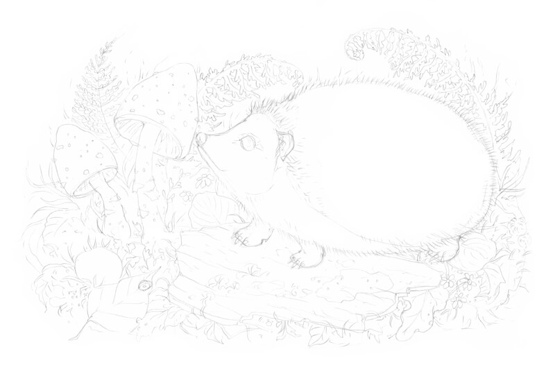
The pencil underdrawing is complete; now we can pick up the ink liners!
Drawing with Ink Liners
Below you’ll find my process of inking an artwork; I should note that there are various methods of drawing.
For example, I usually start with one particular piece of the work and develop it until it looks almost complete. Then I proceed to another piece nearby. This approach works fine in the case with ink or ink liners, but I can’t say the same regarding other mediums (for example, colored pencils or pastels).
Some artists like another approach – working on the whole picture at the same time, adding the ink marks here and there, and evaluating the drawing in total at each step.
As you will notice, I start drawing with the most complex object – the hedgehog. One of the reasons for that is a human psychology. Once we are done with the most difficult part, it’s much easier to complete everything that remains. It’s also relaxing and fun!
My method of combining the hatching, cross-hatching, and stippling layers may seem quite intricate, but it’s rather an illusion. If you understand the principles, everything else falls into place.
However, your drawing may have fewer layers and be created in a simpler manner. You are the master of your process!
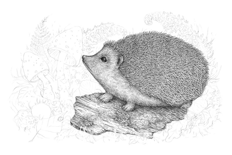
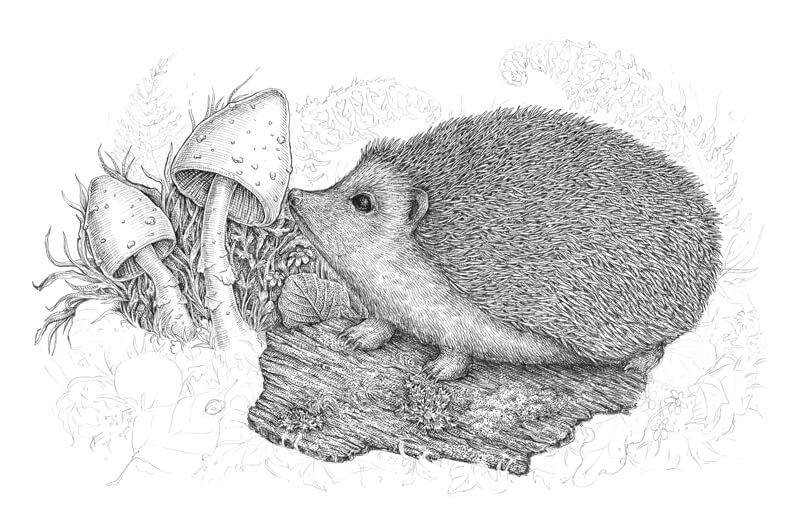
How to Draw a Hedgehog
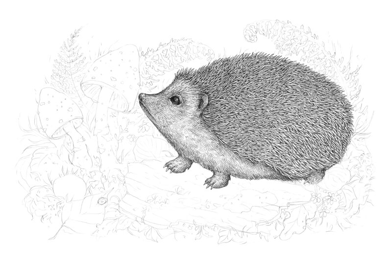
I start with the hedgehog’s snout. With the 0.1 liner, I draw the lines that imitate single hairs – they form an illusion of the hairy covering.
I also darken the eye, leaving just a small highlight and a line of the reflected light.
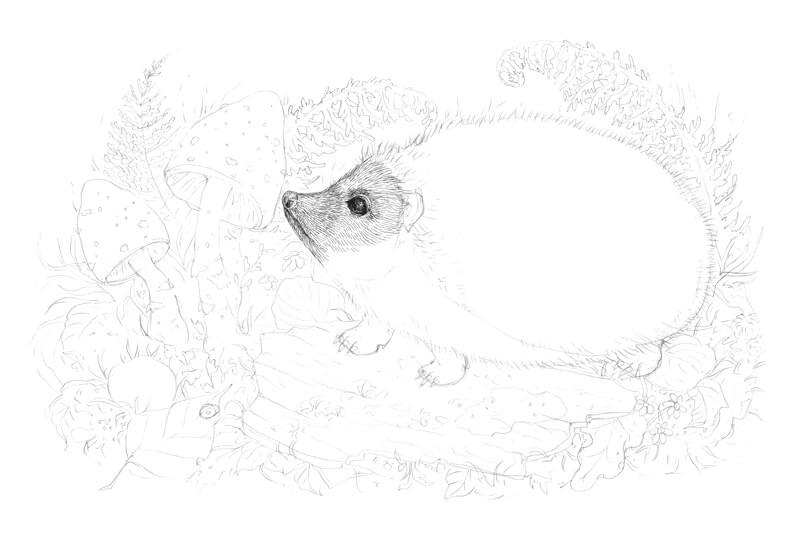
I add more thin hatches and dots to the same area, using the 0.05 ink liner. I increase the contrast of the texture near the eye and in the bottom part of the snout.
Then I draw the ear and the first rows of spines, using the 0.1 liner. The intervals between the spines should be dark and contrasting.
Let’s work on the spines. I add more and more of them, using the 0.1 liner. You don’t have to draw every single spine separately, it’s enough just to imitate a distinctive spiky pattern.
I also pay attention to the overall look of the spines; they should be slightly different in size and direction. Having some spontaneity here is key to a natural feel of the hedgehog’s back.
In the image below, you can see an enlarged sample of this texture near the actual drawing.
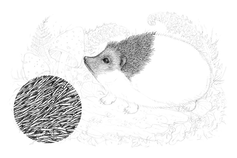
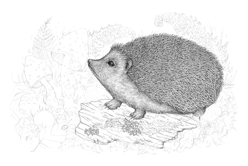
I add more spines and hairs, using the 0.05 and 0.1 liners. Please keep in mind that the elements that are closer to the viewer are more contrasting; you can use heavier lines for them.
With the 0.1 liner, I add small dots to the spines here and there to vary the texture.
I complete the pattern of the spines, using the 0.1 liner. The spines on this part of the hedgehog’s body may be thicker and longer. Plus, they often change direction here, as if they’re bristling a bit.
The hatches on the hedgehog’s feet should be thin and uniform, so I use the 0.05 liner to draw them. I also darken the bottom part of the body and add a cast shadow on the feet.
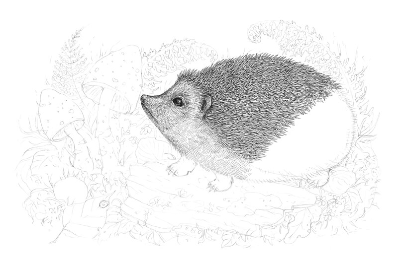
At this stage of our work, the figure of the animal looks like it is cut out. We’ll soften this later, after other elements of the drawing are covered with ink lines.
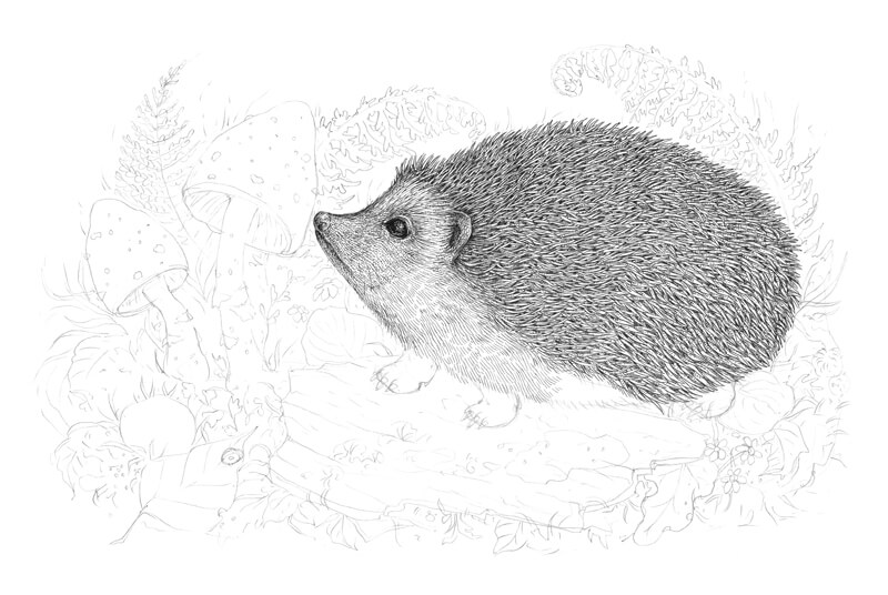
The hedgehog is almost complete. Later I’ll get back to it to make sure that it fits in with the other elements.
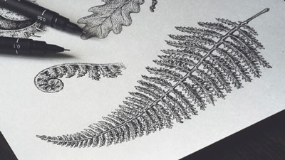
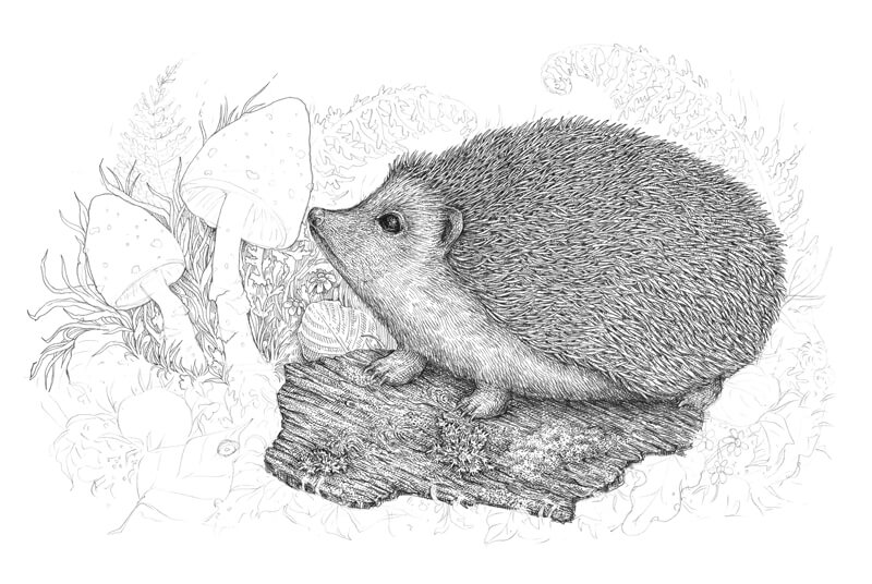
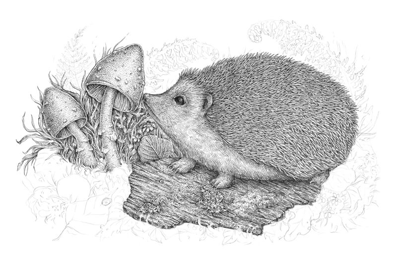
How to Draw the Tree Texture
With the 0.1 ink liner, I mark the general lines of the bark, creating the distinctive pattern. I also mark several zones of moss and lichen, accenting the most prominent details.
Don’t forget that a piece of bark has thickness; such small nuances add to the credibility of the drawing. The foreground objects, like the grass blades, overlap the piece of bark in some places, so I avoid creating a solid contour line.
With the 0.05 ink liner, I add the groups of long hatches that accent the relief of the bark.
The place right under the hedgehog is the darkest area of the object, so I put a couple more layers there.
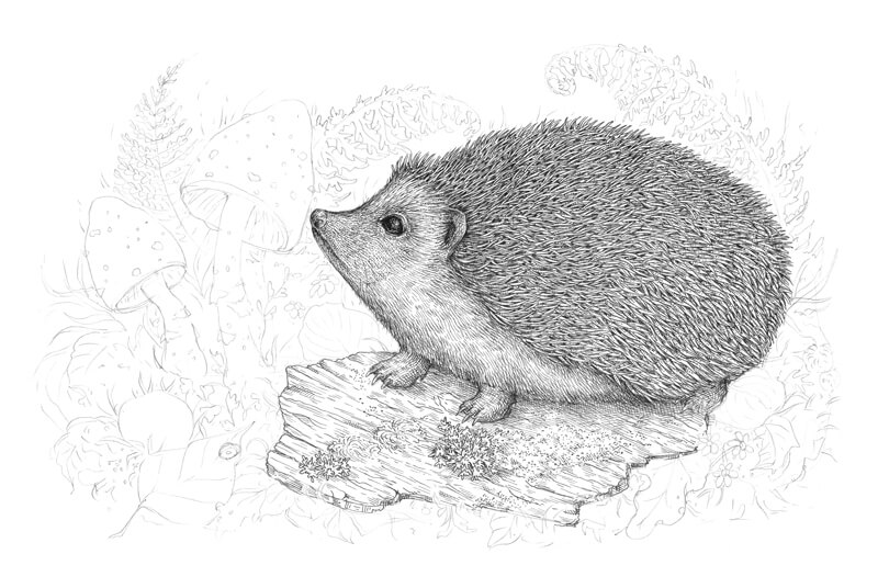
I increase the contrast even more, applying the hatching with the 0.1 liner. It’s great to use stippling, too – it creates a blurry effect in the drop shadow and adds a natural feel to the tree texture.
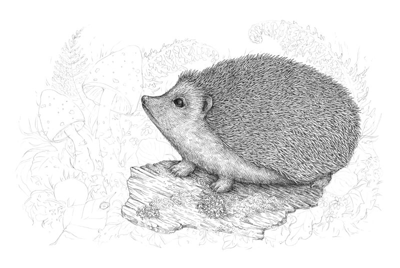
I continue working on the tree bark in the same manner. Horizontal hatches accentuate the direction and the position of the object.
Keep the relief in mind; the lighter and darker areas are very close to each other and alternate.
In the image below, you can see the enlarged sections of the texture near the actual drawing.
I complete the tree texture, using the 0.1 ink liner for hatching, then also add some bigger dots with the 0.3 liner. The front part of the bark should be slightly darker and more contrasting than the middle and back parts.
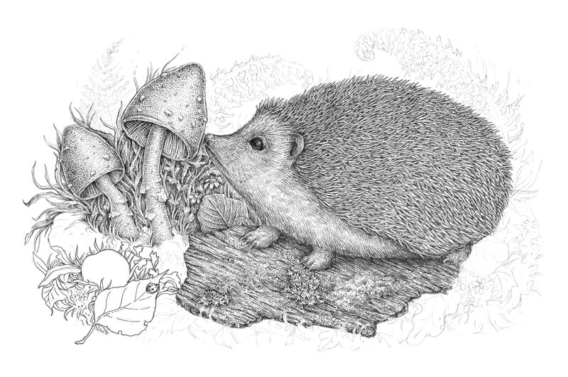
How to Draw Mushrooms, Leaves and Other Botanical Elements
With the 0.05, I outline the contours of the mushrooms and leaves on the left-hand side of the drawing.
I recommend playing with the lines – they should be as organic and varied as possible. Try to change the pressure and angle while drawing; an ink liner doesn’t allow as much of the line variety as a nib does, but you still have options.
I also add some basic parallel hatching to the darker areas. This type of hatching works perfectly in the background because it is uniform and provides a hint of stylization.
With the 0.1 liner, I add more hatches and dots to our botanical background. Avoid making the elements too dark; this may confuse and overwhelm the viewer. Our goal is to add a little bit of depth.
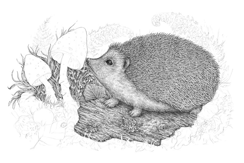
With the 0.1 liner, I mark the relief of the inner parts of the mushrooms’ cups. I add the contour hatching to emphasize a transition from darker to lighter values.
I also mark the prominent details of the cups.

The top parts of the cups and the stems are relatively light, but we need to make the mushrooms three-dimensional (or rather create an illusion of volume).
I apply the contour hatching to create an illusion of volume, using the 0.05 ink liner. The central parts of the cups and stems remain light.
I cover the mushrooms with dots, using the 0.1 liner. Stippling is a great way to create a pleasant, velvety texture.
It’s possible that I’ll add something here later, but let’s leave the mushrooms like this for now.
With the 0.3 liner, I outline the elements of the forefront. I use relatively thick lines, because the front objects have heavy contrast and detail.
I recommend making gaps in your lines; thick unbroken lines will create a stylized impression, as if our drawing is a page from a coloring book.
Including small unexpected elements is fun – that’s why I’ve put a ladybug on a leaf.
I work on the objects in the foreground, adding the groups of hatches with the 0.1 liner.
I add some contour hatching to the sides of the stone to create the illusion of volume. A stone is a smooth object with an even texture (in contrast to the tree bark or spines).
Having something with a different texture in your drawing is useful; it creates variety and allows you to rest a bit.
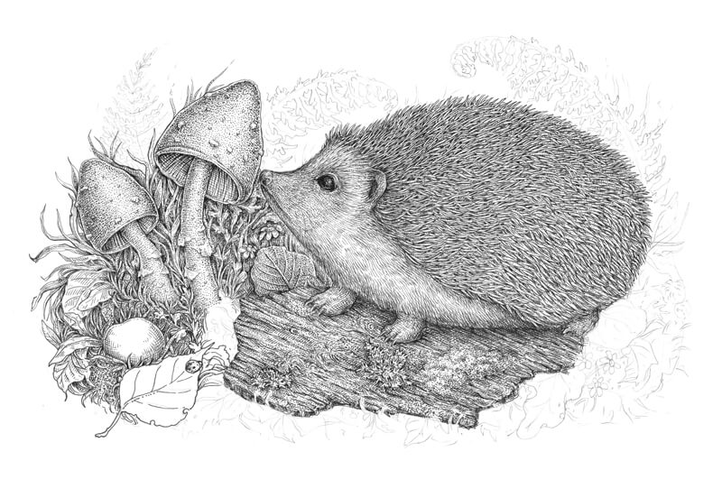
I add another layer of hatching to the stone and leaves, then increase the contrast by adding dots to the darker areas. Bigger dots created with the 0.3 liner work perfectly here.
I work on the foreground, including the objects on the right-hand side. With the 0.1 and 0.3 liners, I outline the contours of the botanical elements. The reason why I use both liners is quite simple – this creates the line variety.
I add layers of hatching and stippling, just as we did with the foreground objects on the left-hand side.
The distinctive “lacy” or “refined” feel of the ink layers is created by using the thin-line liners and taking the time to build up the layers. Ink drawings can be spontaneous and sketchy, or they can look very accurate and elaborate. As I mentioned earlier, the manner you approach your work is totally up to you.
With the 0.05 ink liner, I draw the fern leaves in the background. I use the thinnest liner because the objects in the distance have minimal contrast (or at least less contrasting than the objects of the foreground or middle ground).
I apply only a few lines to draw the fern; just outline the main contours and add some hatching to accentuate the directions of the leaves’ small segments. I make sure that the leaves look like a soft, blurred silhouette.
The artwork is almost complete. I evaluate it to find the things to improve…
I think that the hedgehog needs more volume, so I darken the bottom part of its back (where the spines are). With the 0.05 ink liner, I add hatches to the gaps between the spines, leaving their ends untouched. This method guarantees that you won’t lose the texture and the arrangement of values will remain accurate.
I also darken the stems of the mushrooms just a bit, using the 0.05 liner.
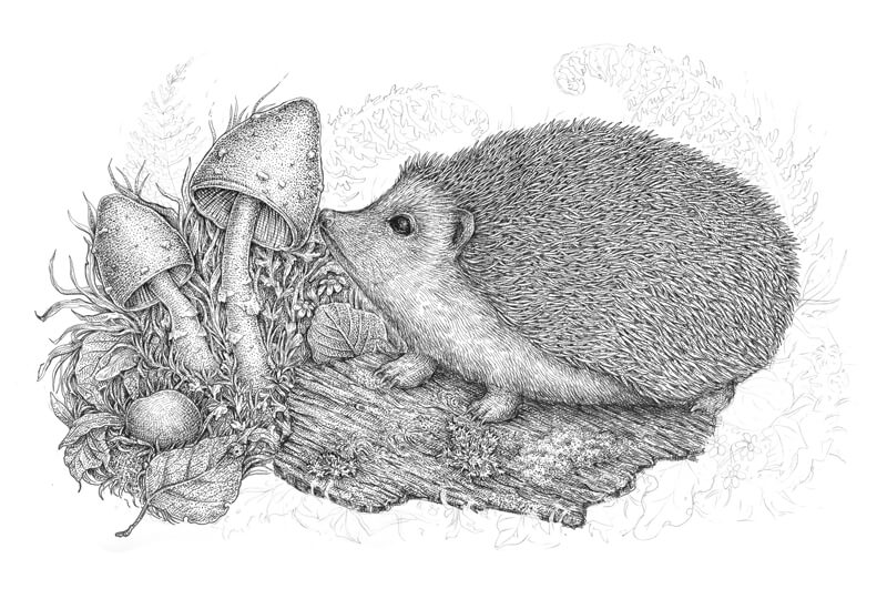
And, as a finishing touch, I make the nose of the hedgehog much darker. Now it looks more realistic!
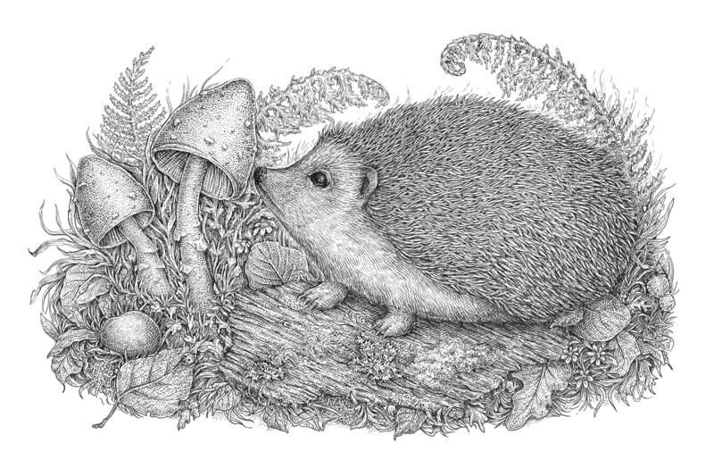
The Conclusion
Congratulations, well done! You’ve followed me through the whole process; maybe you were even drawing alongside and now you have a beautiful result.
I hope that this tutorial was interesting and helpful. My goal was to show you the power of basic tools and techniques for creating ink drawings. There are many approaches to creating art. Take the drawing tips that work for you, explore various options, and enjoy the journey.
If this tutorial inspired you, but you feel like some of the steps are too complex, please take a look at the amazing in-depth course The Pen and Ink Experience here on The Virtual Instructor. It explains the fundamental things that help you to understand the building blocks of drawing with pen and ink.
Thanks so much for your attention. I wish you much inspiration and fun!
If so, join over 36,000 others that receive our newsletter with new drawing and painting lessons. Plus, check out three of our course videos and ebooks for free.