That same person, however, may struggle to verbalize the differences between some of the principles of art. Two specific principles – unity and harmony, come to mind. The principles of art can create a feeling about an artwork and feelings are difficult to quantify.
This article explores three of the principles of art. These three principles are best understood as a group since they are related. The first two, previously mentioned, are harmony and unity. The third is called variety.
Harmony and Variety in Art
Harmony
Harmony is the principle of art that creates cohesiveness by stressing the similarities of separate but related parts.
One should note that harmony is not the same as unity. Harmony does, however, enhance unity in a work of art. Specifically, harmony uses the elements of art (color, line, shape, form, value, space, texture) as a vehicle to create a sense of togetherness amongst otherwise separate parts.
A set of colors that relate according to a specific scheme creates harmony.
Likewise, a uniform texture of brush strokes across the surface of a canvas creates harmony.
Another way to guarantee harmony is to choose compositional components that are similar in shape and contour. For example, a composition that utilizes only curvy shapes will have more harmony than a similar composition that includes both curvy and geometric shapes. The parts of the image below are in harmony because every contour is a curve.
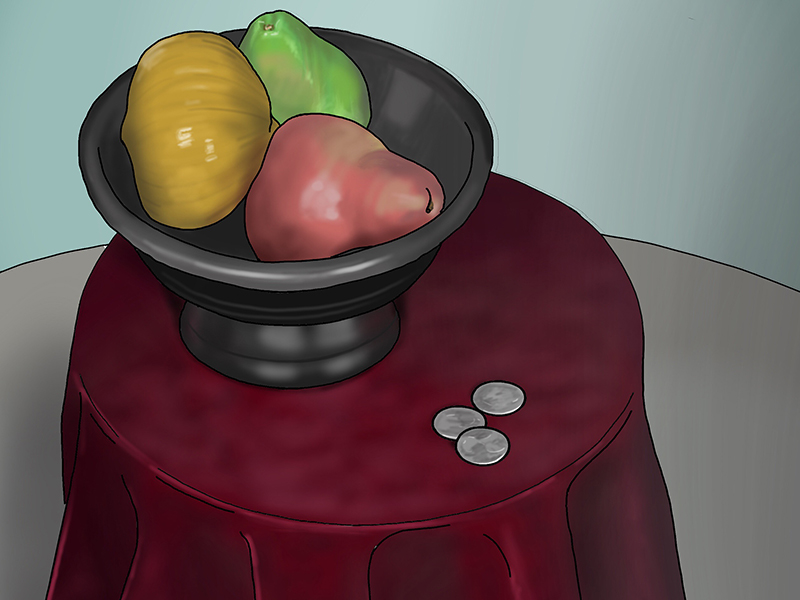
Even a narrowed range of value can contribute to harmony in a work of art.
Variety
For many people, performing the same task or following the same routine over and over again leads to boredom. That is why vacations are such a pleasure. A vacation is an interruption of life’s routines. Some people are active when on vacation while others do nothing at all. One thing is certain – vacations look different than the routines they interrupt. Vacations are a measured dose of variety in a person’s life. Art needs variety also.
All harmony and no variety is boring. A favorite professor of mine used to say, “Variety is the spice of life”. He was not life-coaching. He was talking about art.
Variety is the principle of art that adds interest to an artwork.
Variety works through juxtaposition and contrast. When an artist places different visual elements next to one another, he/she is using variety. Straight lines next to curvy lines add variety. Organic shapes among geometric shapes add variety. Bright colors next to dull colors add variety.
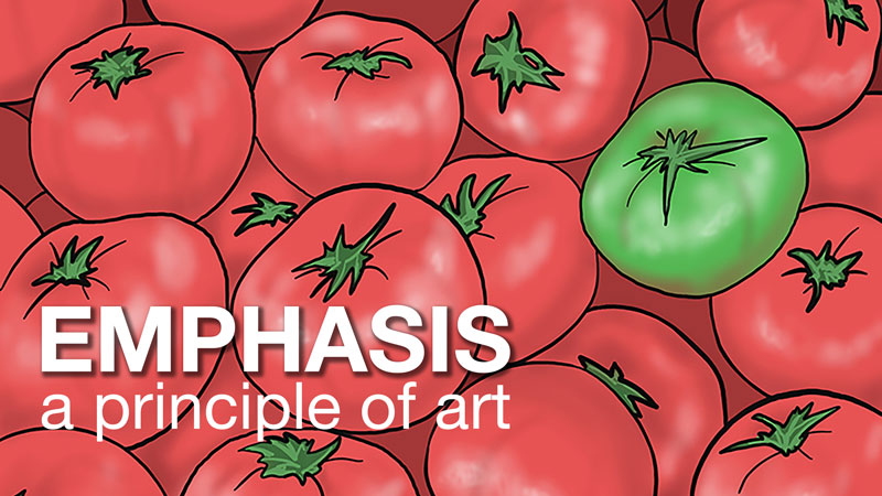
Note: If an artist uses variety to draw the viewers attention to a specific area in a composition then variety morphs into emphasis, also a principle of art. Principles of art bleed into one another. They overlap.
Harmony and variety are really opposite expressions of the same nebulous concept. To emphasize one is to de-emphasize the other. Harmony and variety play tug-of-war in a composition. Too much harmony is boring while too much variety is aimless and incomprehensible.
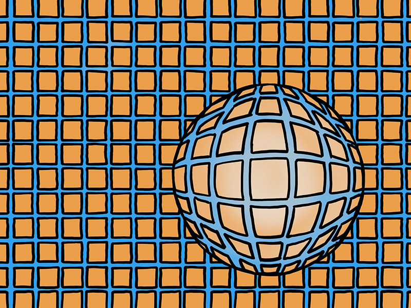
Look at the image below. Both harmony and variety are evident. The orange squares and the blue grid that surround them are in harmony based on both color and shape. The round form of distorted squares adds variety. The ball breaks the monotony of squares and adds interest.
Unity
Unity is the principle of art that gives an artwork a feeling of “oneness”. Unity and harmony are similar, but unity is more broad. There are numerous ways to create unity in art. Some of those ways are particular to individual artist’s style.
Unity is about separate parts working together. We can better understand unity by thinking about a car. A car’s purpose is to provide transportation. When the many parts of a car are working together, it moves. No part of the car, separated from the whole, is capable of providing transportation. When the car functions as it should, the parts are working together in unity.
Like harmony and variety, unity is not easy to understand at first. Different from the elements of art, unity is an impression – a feeling the artwork conveys to the viewer.
One can imagine a solitary shape and hold that shape in the mind. One cannot, however, simply imagine unity and hold that concept in the mind. We must evaluate unity by looking and analyzing. Therefore, developing unity in artworks requires the artist to pay attention to its development throughout the process of creating.
Here are some proven methods that ensure a unified composition…
- Simplicity
- Repetition
- Proximity
Let’s take a closer look at each of these techniques…
Simplicity – Simplicity refers to purposely reducing the amount of potential variety. For example, a graphite pencil drawing is likely to exhibit some measure of unity, given the lack of color. By eliminating color, the image is simpler than it potentially could have been if color was introduced.
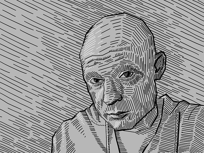
A personal favorite is to make a drawing by hatching with only straight lines. Straight lines are less complex than curvilinear lines and will unify a composition.
Look at the image below. The simplicity of the line-type and the lack of color are simplifications of the original reference. Much of the visual information has been intentionally left out. The result is a unified image.
Repetition – Repetition within a composition will guarantee a feeling of unity. Tessellations are an obvious example of how repetition unifies a composition. A tessellation is an arrangement of shapes that fit together in a repeated pattern without gaps.
Repetition can also unify an entire series of artworks, like a group of paintings. A certain shape, object or texture that is repeated among a group of paintings acts as a motif, helping each painting to feel as though it is part of a greater whole.
Proximity – Proximity refers to the closeness of different components in a work of art. By placing parts close together, the mind is able to see the parts as one thing, a mass.
Negative space is the space between elements in a work of art. It can refer to the “empty spaces” within a drawing or painting. The more limited the negative space, the more unified the areas of a composition may feel.
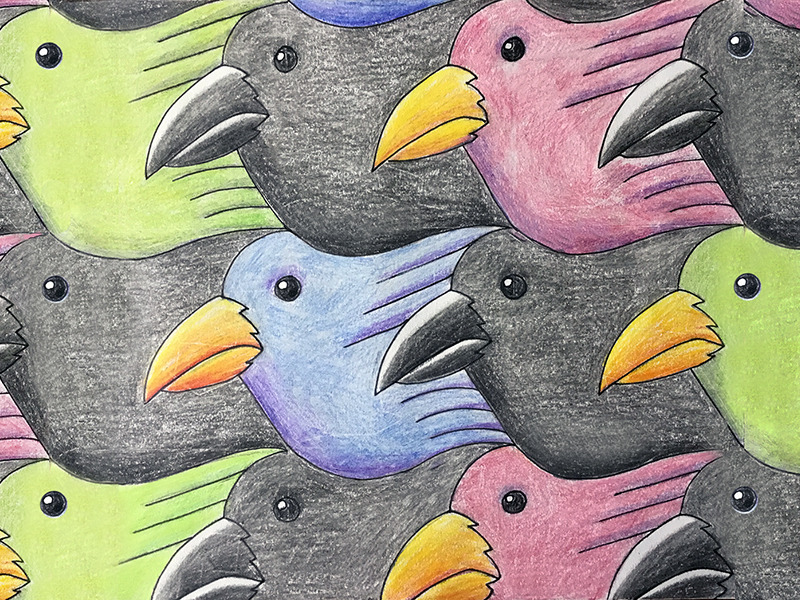
The tessellation below depends on both repetition and proximity, resulting in a highly unified image. Due to the complete lack of negative space, the repeated bird shapes feel like one pattern.
If so, join over 36,000 others that receive our newsletter with new drawing and painting lessons. Plus, check out three of our course videos and ebooks for free.
Lesson Discussion
Comments are closed.


Well done! This is a great explanation of things that are difficult to understand. I really appreciate your clarity and accuracy here.