
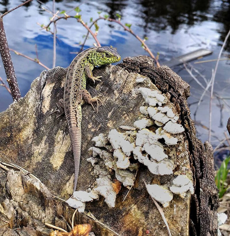
This wonderful lizard was sitting on a tree stump and apparently, tried to warm itself. I came closer, and trying to be as quiet as possible, I took a photo with my phone. Luckily, the lizard didn’t flee!
I couldn’t imagine a better option for drawing with pen and ink! This animal has such an adorable, detailed skin texture. So today, I invite you on an artistic journey. Let’s draw and explore the natural world together!
The main subject of this tutorial is drawing a lizard, but I’m also going to cover the following topics:
- How to use a photo of a lower quality as a reference and be creative with it;
- How to work with various textures, including the texture of scales and tree;
- How to balance details;
- How to create a drawing, using just a couple of pen and ink liners.
The Art Supplies for This Drawing
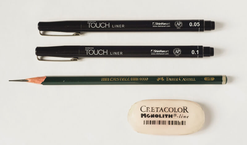
For this project, I’ll be using two ink liners (the width numbers are 0.05 and 0.1). The brand isn’t important; please work with the liners that you love or have at your disposal.
A graphite pencil and an eraser are useful tools for creating preliminary sketches and an underdrawing.
The size of my artwork is close to a standard A4 size or around 8.5″ by 11″; I slightly shortened the length of the paper to make it fit the composition.
Transforming a Photo into a Personal Artwork
Some artists like to create drawings that reproduce a photo like an exact copy with all of the details. Other artists, on the contrary, prefer to grasp just the general features of the subject using a photo reference. Then add the remaining parts from imagination or other sources.
It’s up to you which way you choose to work. In my case, I’ll use my photo as a guideline and change several things to make the resulting artwork more impressive and personal.
Also, I feel like there are some additional elements that work to improve the overall look (and the viewer’s experience) by conveying the mood more efficiently.
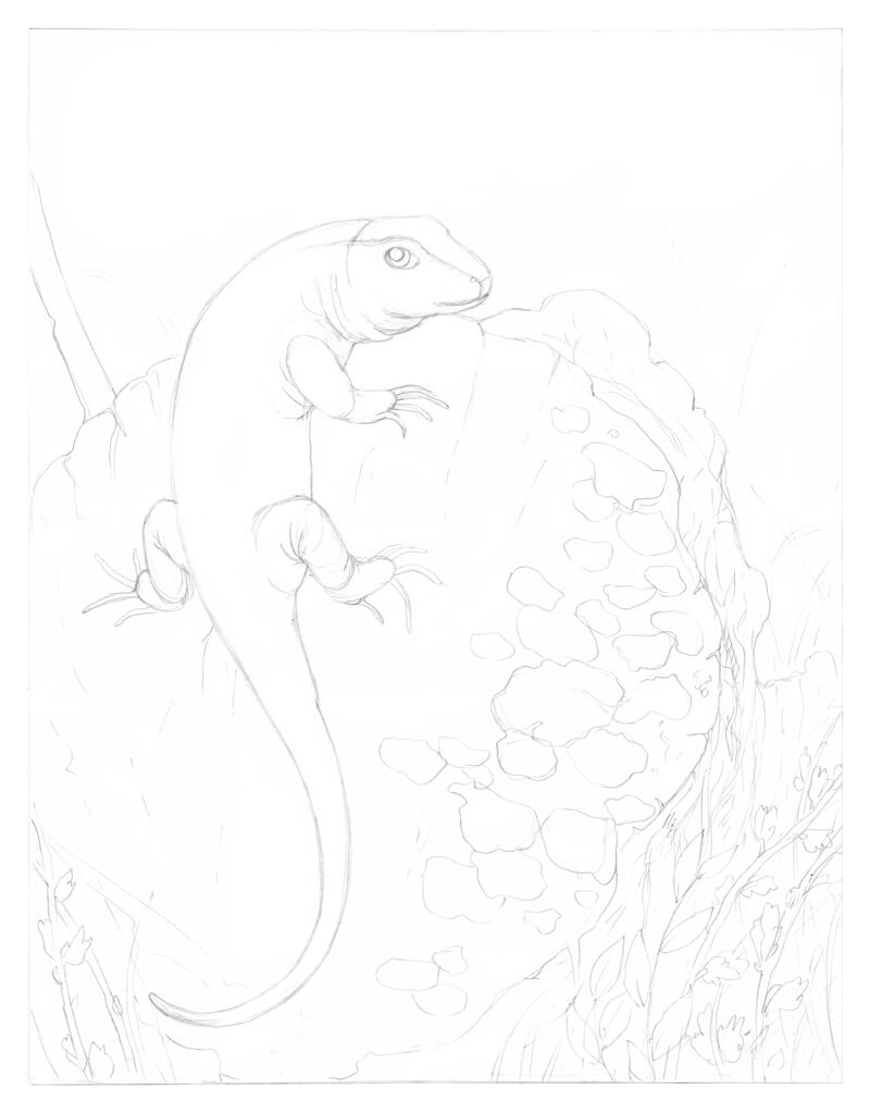
I start with miniature sketches, keeping in mind the compositional rule of thirds. My first attempt – the one on the left side in the following image – is based on observing the photo. I outline the main contours, making sure that I understand the essence of the objects: a smooth flow of imaginary lines and the characteristics of shapes.
I asked myself while drawing, “What is this lizard thinking about and how can I describe its personality?”
At this step, you can also play with the elements and make changes to see what’s working.
Let this process be as natural as possible. There is no need to rush through the steps and make everything perfect. Create two, four, ten or even a hundred preparatory sketches, if this is what it takes to explore the options!
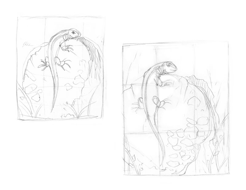
Another mini sketch that I drew (on the right side in the image above) is a more refined version of the result I wanted to achieve. This time, I was focused on the composition.
I moved the lizard’s figure, especially on the tail, so it became aligned with the thirds’ grid. When the tail is shifted to a side, the figure is more dynamic and conveys action – like this lizard is ready to run away at any moment.

I also added some plants to the foreground. They’ll help to differentiate the planes in the drawing.
If you have a reference, you may want to crop the photo in a photo editing program to explore various composition options. Sometimes, a small tweak works wonders!
My sketches usually are quite stylized and messy, but they serve one purpose – eliminating the fear of the blank page. Before I jump straight into the process of working with my final drawing, I need to “dump my brain” with all the ideas and options that I have for this artwork.
Please remember that there is no need to make a “perfect preparatory sketch” – if you feel the urge to change something later on, absolutely do it.
Thinking about the Details
The Individual Objects and Categories
At this step, we already know what elements will be included in the drawing: a lizard, a tree stump with mushrooms growing on it, some plants and twigs.
However, I don’t feel quite confident yet. On my photo, the mushrooms look like the unintelligible light-colored shapes. Plus, I’d like to draw the leafy plants in the foreground; that’s why I need to explore the possibilities for handling these elements.
If the reference photo is imperfect or just lacks the important details, one of the options is to search for additional photos showing similar objects. This is especially effective if you are drawing something complex that you can’t depict from memory or experience.
Another option is to use your imagination or the visual library in your mind – if you created many drawings in the past, you may have plenty of images in your mind. You can use those images in hundreds or thousands of different combinations!
When it comes to thinking over the details of this artwork, I decided to use a bit of my memory. I sketched a couple of twigs and examples of tree mushrooms, using the graphite pencil. The reason for this is speed; drawing with a pencil is, in my case, quicker – than drawing the same objects, using ink liners.
I also sketched a part of a stem that has many small dots on it; you can find this object in my reference photo. It would make a wonderful inclusion!
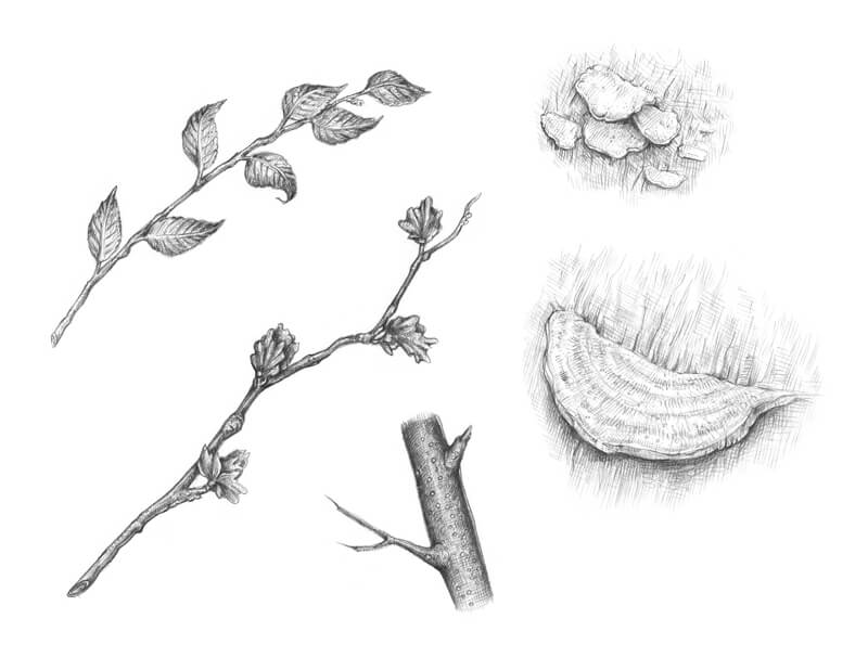
I don’t strive for total correctness. The purpose of these sketches is to help you understand the objects, literally sensing their features and particular details. Chances are, not all models that you’ve drawn will appear in the artwork, but you’ll get a a few ideas to choose from.
Perhaps you know the feeling when you can ‘see’ something in your mind, but when it comes to transferring this image to a drawing, it seems difficult? One of the ways to add confidence to an idea is to join it with something you know and include it in the drawing.
The Textures
Basic lines
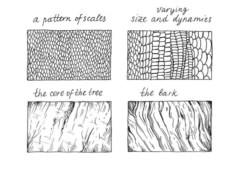
I already shared my process of analyzing textures and creating samples in the previous tutorial. In brief, making small samples of flat textures is a great exercise that helps to grasp the main features of a texture and create its illusion in a drawing.
For this step, I usually work with the core medium of my finished art (in other words, if the resulting drawing is created with ink, I draw the samples with ink as well).
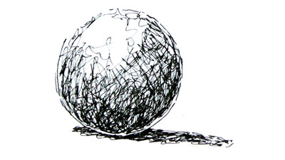
With the samples, we deal only with the relief of the texture itself – there are no signs that it’s a surface of a three-dimensional object. Think of a sample like a small patch with a simple pattern.
The skin of a lizard features overlapping scales made of keratin; this provides protection from the environment and reduces water loss through evaporation. The size of scales and the width of rows may vary.
I draw two examples of the scaly texture (the upper row in the image below). The first variant is a uniform pattern – the scales are all a relatively equal size. However, the best option is to allow some imperfections because they create a sense of dynamism.
Another sample is more varied; the scales here differ in size, shape, directions and even in the width of rows.
I also add the samples of the tree core and bark, basing it on the photo and adding some arbitrary features. Drawing natural textures with all the smooth, organic lines is fun, isn’t it?
As you can see, the first step is outlining the structural elements of a texture, as if we’re marking its relief with lines. I used the 0.1 ink liner for that.
Sometimes you can’t create a sample of a texture from memory. In such cases, the best option is to use a reference photo – or several photos.
Working only from memory may lead you into the trap of repeating the same elements or style over again, without seeing and observing any real-life models. This can be dangerous, since it doesn’t allow your art to get any “fresh air” and keeps your skills from growing.
Completing Texture Studies
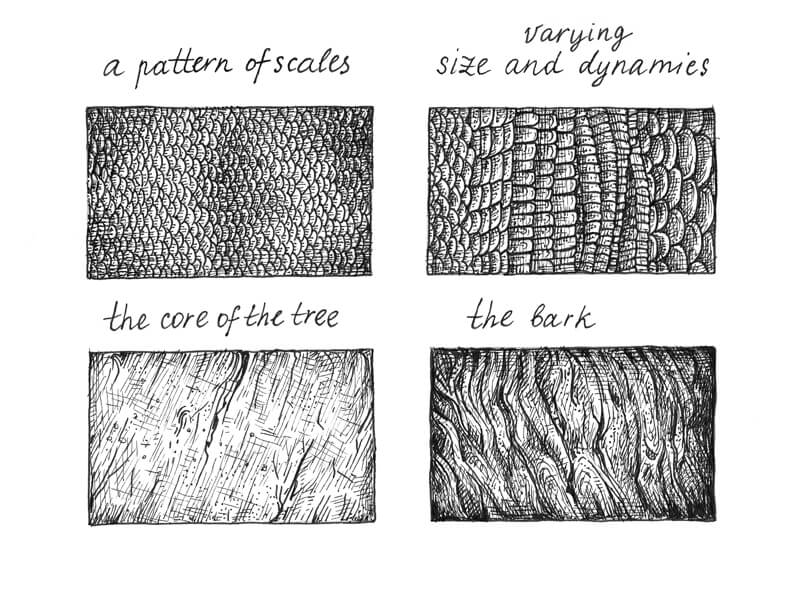
The second step is to apply layers of hatching to the samples. Scales are small, close-fitting elements, so I use the thin 0.05 liner to visually seperate the rows and the individual scales.
It’s possible to develop a pattern of lighter and darker scales – just add more hatches to the elements that you think should be accentuated. I recommend leaving the external edges of scales untouched or slightly lighter than their ‘bodies’; this simple trick will help to keep the relief of the texture.
A similar principle applies to the tree samples: I use thin-line hatching to accentuate the darker areas. In the case of natural textures, it’s helpful to allow some spontaneity in the relief; otherwise, the texture may look too monotonous.
I’ve noticed that the core of the tree in my image has an interesting pattern of cracks (the vertical, slightly inclined wider lines) and thinner, almost parallel lines (probably they were made during the cutting). The lines are crossing each other, sometimes in a whimsical order.
The structure of the tree’s core is rough, so I add dots to my sample to accentuate this feature.
You may ask, why even bother making all these samples? Obviously, our final artwork doesn’t need too many details; we don’t see the objects that we’re going to draw with all of the textural information.
Understanding of a texture makes you prepared. If you are familiar with the nuances, you know what to discard and what to accentuate. The texture sample exercise is also an important step in the process of transforming a blurry, abstract idea into a concrete and credible piece of art.
Creating a Pencil Underdrawing
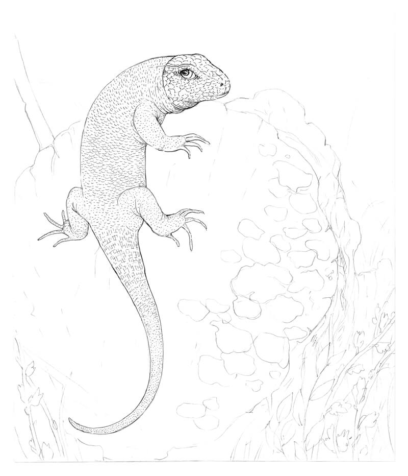
Let’s set the foundation for our future ink drawing. I use an HB graphite pencil to outline the main objects. The lizard can be constructed as a set of simple, stylized shapes.
While drawing, I imagine all the shapes as three-dimensional forms.
It’s also great to leave a thin frame of white paper in the perimeter. The borders will make your artwork pop and provides a bit of contrast.
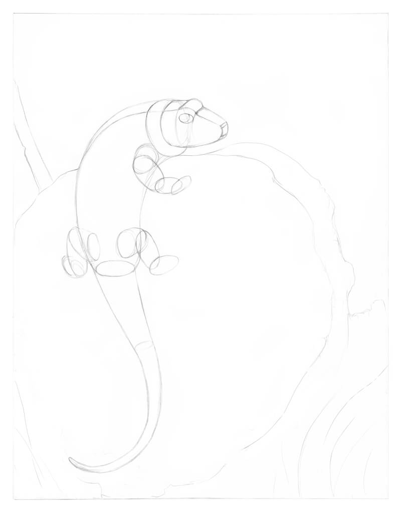
I refine the outline, observing my reference photo and adding new details.
At this stage, your preparatory work and all the sketches you’ve created are your friends. Pay attention to them, but don’t be afraid to change something in the finished drawing. For example, I decided to alter the position of the lizard’s feet just a bit.
I also add the details that, as I feel, should be present – otherwise I can miss them at the later stages. Such details are the skin folds in the areas of the reptile’s limbs and neck, the leaves on the twigs and the mushrooms, including the smallest of them. I vary the size of the mushrooms (the individual ones and the groups) to make the final version as interesting and balanced as possible.
This is just a rough outline, so feel free to add additional details later on. The drawing process is always a kind of improvisation!
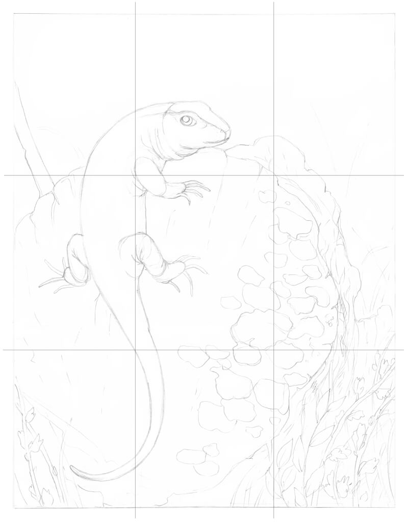
As a concluding step, let’s check the composition of this piece.
At this point, it’s close to the miniature sketch that I created in preparation; three points of the grid are in the right places (note the intersections near the upper limb, tail, and the border between the bark and tree core).
Let’s Add Ink!
Now begins the fun part! I’ve divided this tutorial into specific sections. But, the parts dedicated to the stump and plants are combined because these objects are similar from a technical standpoint.
If you like working on an artwork gradually, keeping it as a whole at each step of the progress, you are more than welcome to follow your process.
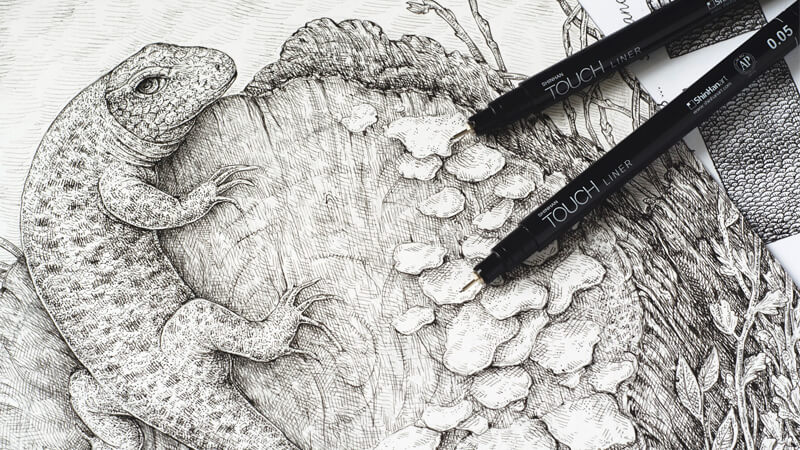
Drawing a Lizard with Ink Liners
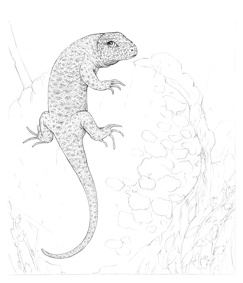
I start with the lizard because it is the most complex element of the drawing and it is the focal point.
I outline the contours of the head, including the eye and then add a pattern of relatively large scales using the 0.1 ink liner. Avoid creating rigid, consistent lines with no gaps as this will make your artwork look too stylized.
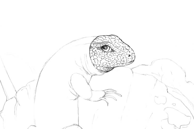
I continue developing the drawing with the same liner.
The scales on the body are smaller so I mark them with thin rounded lines. I pay attention to the character of the lines as a whole – allowing some variety among the ink hatches which makes the artwork more interesting.
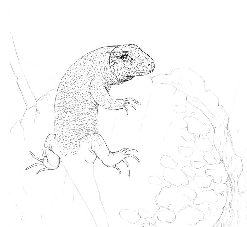
The upper part of the lizard’s tail has changes in the pattern – the scales here are longer, more rectangular in shape.
Careful observation of the reference photo helps me to see where this pattern ends. I fill the rest of the tail with short hatches and dots, creating the illusion of a subtle texture.
It’s time to develop the pattern of the lizard’s skin. With the 0.05 ink liner, I add the groups of short parallel hatches that imitate the spots. I’ve taken some placements of spots from the photo, but some are just a result of improvisation.
I’d like to give the lizard more volume. With the 0.05 liner, I apply contour and cross-contour hatching to the sides of the animal.
You can see a fragment of hatching right next to the actual drawing in the image below. The hatches are thin and refined – this creates an attractive set of layers.
Please don’t rush the process. You can add more hatching layers in future steps, but it’s almost impossible to ‘undo’ excess ink covering.
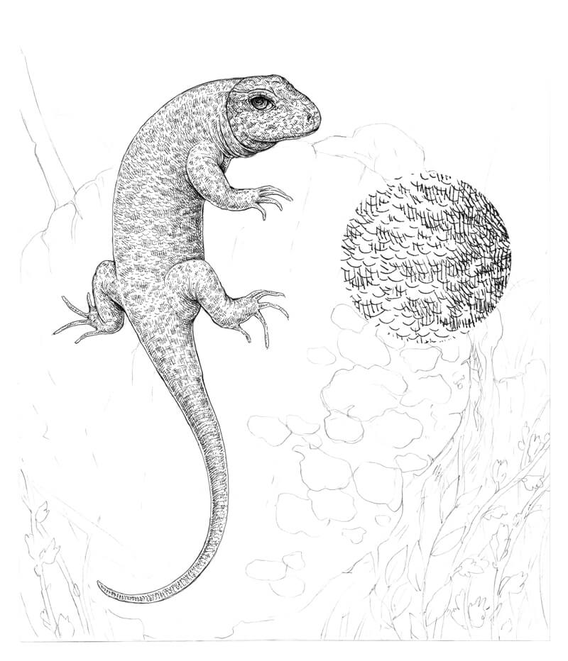
I add dots to the lizard’s skin texture, using the 0.1 liner. My goal is to make it appear grainier.
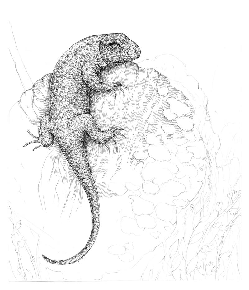
At this stage, the lizard looks lonely and isolated. We can’t say if it’s complete because the surrounding environment is bare; so let’s leave the lizard as it is for now and proceed to the tree stump.
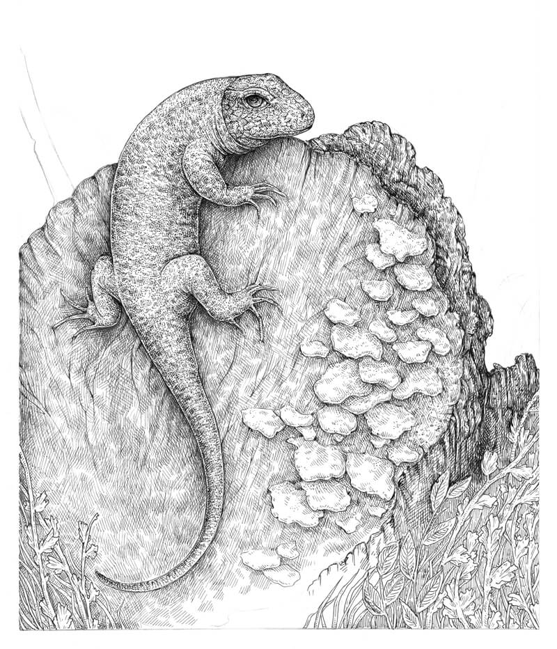
Drawing the Tree Stump with Ink Liners
I add groups of long, parallel hatches to the core of the tree, using the 0.05 liner. The relief starts to reveal itself. I also mark the cracks. The photo suggests the variants where the cracks may be, but don’t feel compelled to copy any reference exactly.
I create a dense shadow under the lizard. The belly of the animal is relatively dark, so I make sure to leave a thin line of reflected light and make the cast shadow a bit darker than the core shadow of the lizard.
I continue working on the tree core, using the 0.05 ink liner. The layers of hatching create interesting effects.
The shadow under the lizard becomes even more accentuated. I also outline the contours of the mushrooms, adding a couple of new pieces near the existing ones.
With more layers of 0.05 hatching, I complete the basic texture of the tree’s core. I darkened the side of the stump to keep the light consistent.
We have some elements in the foreground, so I leave the front part of the stump untouched, just to be sure that I won’t cover any significant object that we may later add.
As you might notice, I’ve changed the shape and position of the trunk’s top plane.
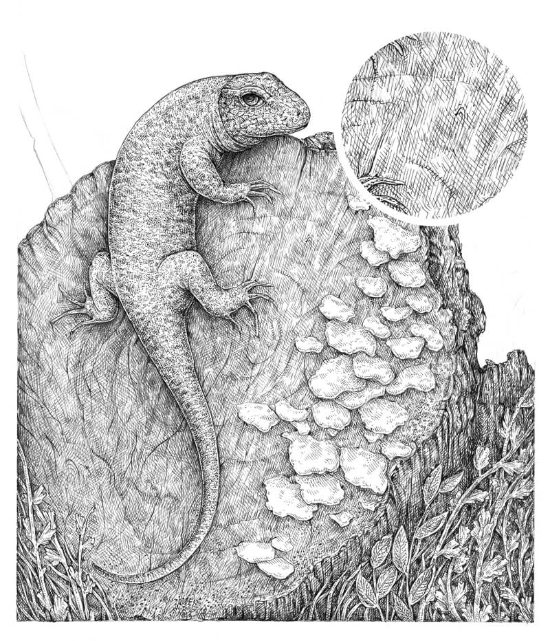
In the image below, you’ll see layered thin-line hatching that is used. If you look at a drawing created in this technique from a distance, it’s possible to assume that it was drawn with graphite pencils. It’s a fun trick, isn’t it?
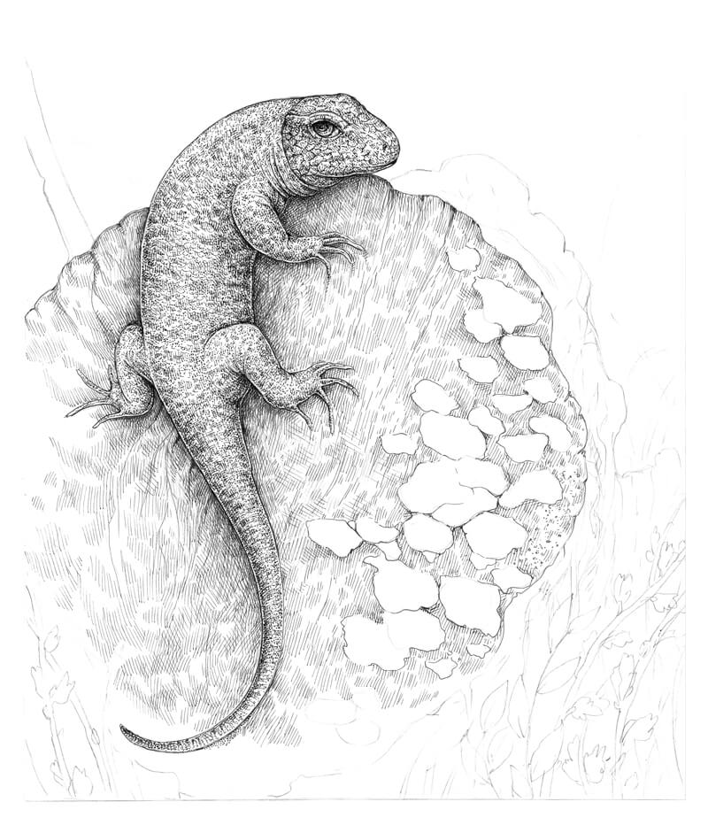
Let’s add life to the mushrooms. They are the lightest group of objects in our drawing, so I’ll do my best to limit the number of hatches and dots that I apply here.
With the 0.05 liner, I mark only the darker areas, accenting the relief of each element and the cast shadows.
With the 0.05 liner, I outline the main contours of the bark that is covering the tree trunk. I also create a hint of relief, applying the groups of hatches and alternating areas of lighter and darker values.
The bark is relatively far from the viewer, so I avoid adding high contrast here.
I’m going to give more depth to the bark area. The key is to emphasize the lines of texture that are visible on our tree, using the wider 0.1 liner, then support them with hatching applied with the 0.05 liner.
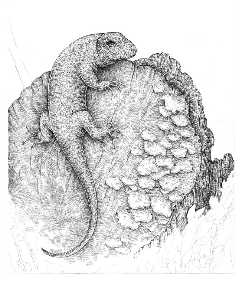
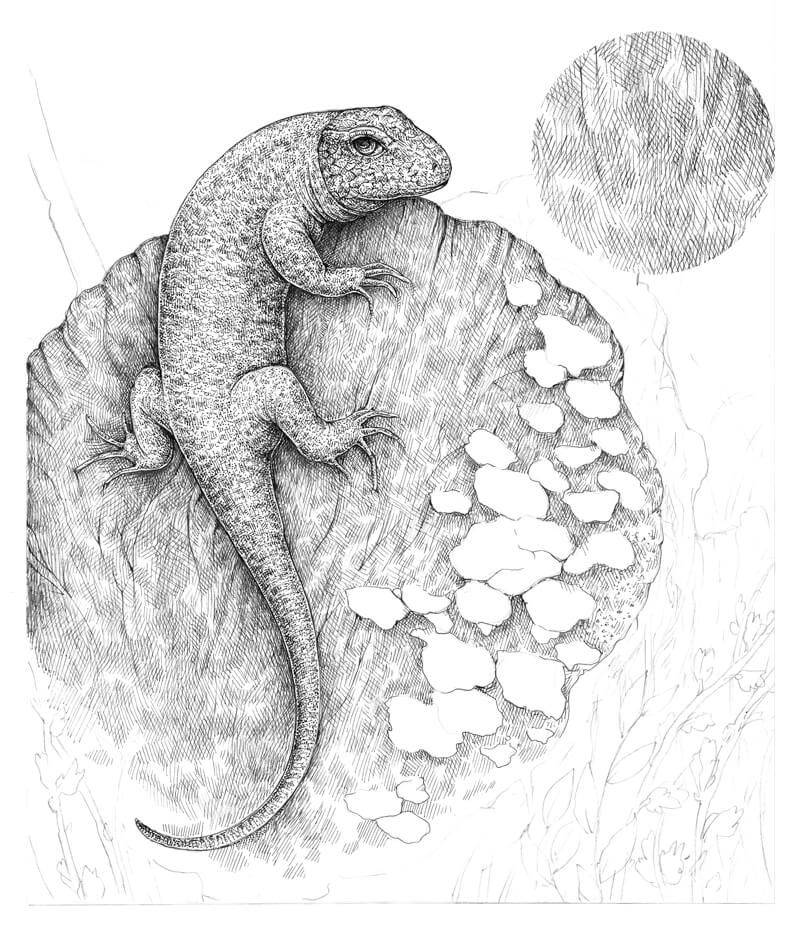
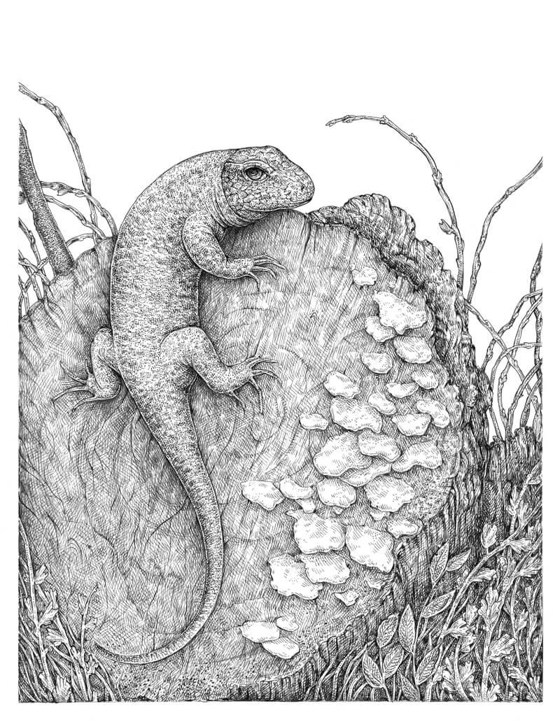
Now it’s time to time to draw the elements of the foreground – the plants and twigs.
With the 0.1 liner, I outline the contours of the twigs. Some lines cover the existing pencil lines, but I also draw new stems and leaves directly with the pen.
I add groups of vertical hatching to the gaps between the twigs to create the illusion of depth, using the 0.05 ink liner. I also touch the twigs and leaves here and there to give them a hint at some volume.
At this point, the foreground shouldn’t have strong contrast.
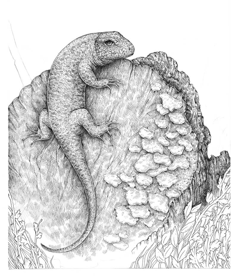
I add more dots and hatches to the gaps between the foreground objects, using the 0.1 liner. The reason why we use a wider-line liner is simple: a foreground is a plane that is closer to the viewer, so it has more contrast and details.
I apply hatches in a way that they create an illusion of depth. It seems that some details of the bark are visible in the middle ground. This effect is achieved by playing with darker and lighter areas without any rigid contours or distinct spots.
I also work on the twigs – in this case, dots and short hatches are a perfect choice.
I cover the bottom part of the tree with hatching, using the 0.05 liner. I also develop the form of the trunk’s outer side and develop the illusion of bark’s texture by darkening the hollows.
The stump’s plane doesn’t look harmonious at this point since some areas are too light. There are a plenty of them in the bottom part of the drawing so I add a couple of hatching layers there, using the 0.05 ink liner.
I also accentuate the cracks in the wood and include the adorable imperfections that make the drawing more realistic.
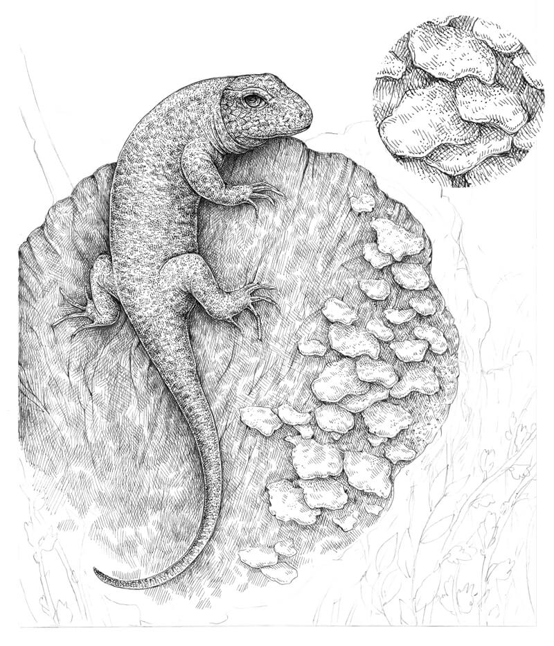
A pattern of growth circles isn’t evident in my reference photo, but I think it would make a wonderful finishing touch.
With the 0.05 liner, I draw the rounded lines that are extending from the core of the tree. The more organic these lines are, the better.
I vary the width of the lines by applying additional ink strokes right next to them. To transform these lines into circles, I support them with groups of hatches that extend and blur the initial lines.
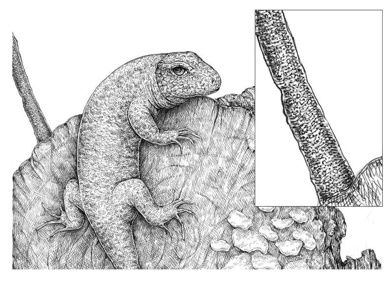
I draw the dotted stem in the background, using the 0.1 ink liner. Small rounded lines are added here to mark the circles.
I cover the shape of the stem with contour and cross-contour hatching, using both 0.05 and 0.1 liners while varying the pressure on the tools.
Thinner marks look lighter, somewhat grayish (especially if your liner has started getting drier).
The dots are barely visible as my intent is to create a spotty, blurred pattern with a low contrast. This object is in the background, so we don’t want it to attract too much attention.
With the 0.05 ink liner, I draw the thin twigs in the background.
Let’s consider the rule of atmospheric perspective. As the distance between an object and a viewer increases, the contrast between the object and its background decreases (and the contrast of the details within the object also decreases). Based on this rule, the twigs should be stylized and light, so I avoid creating any bold contours or dark spots there.
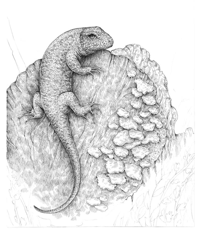
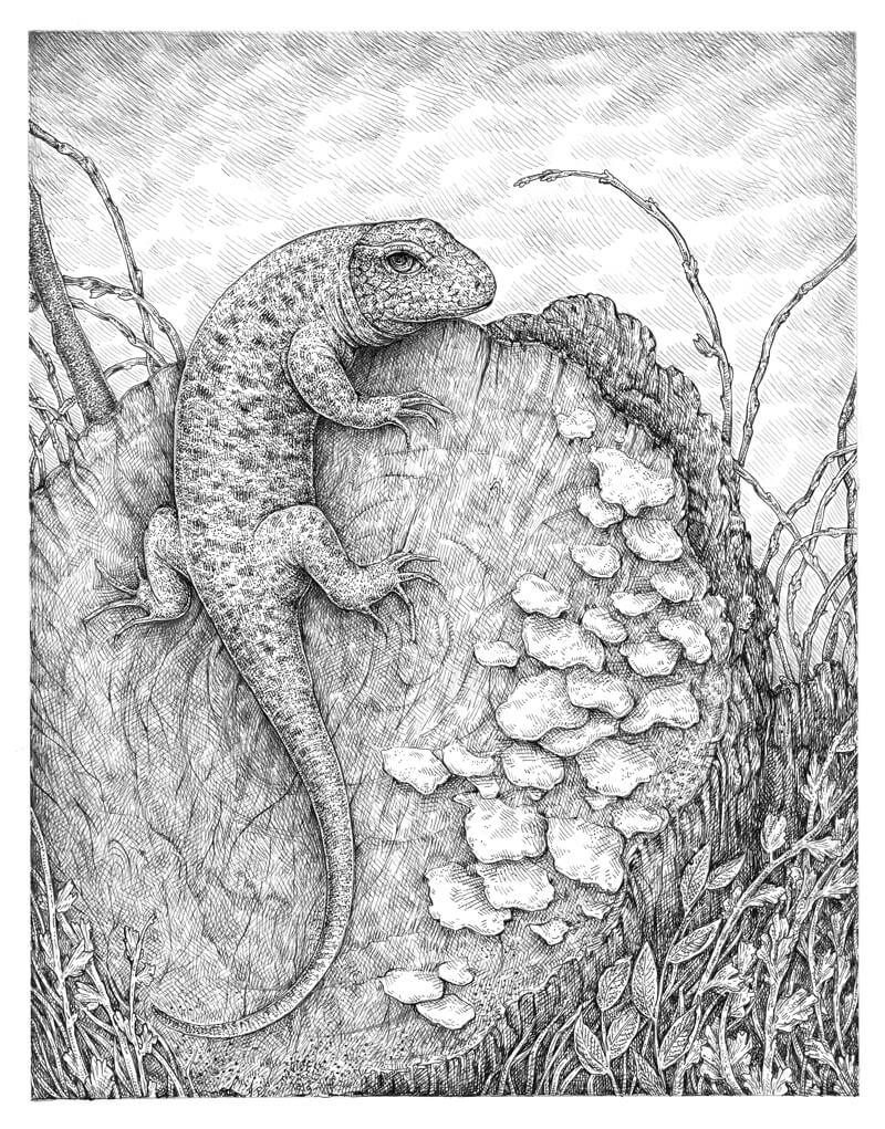
The artwork is almost complete. To be honest, I like it the way it is right now, but without a background in the upper part, it looks unfinished.
I add groups of diagonal, slightly curved hatches to the top of the drawing, using the 0.05 liner. My hand movements are fast, and I press on the liner very lightly. Although this tool doesn’t provide a significant amount of line width variation, you still can create some variety. Alternating the areas of lighter and darker value create an illusion of movement, but don’t distract from the artwork.
This background doesn’t replicate the mass of water with all those beautiful highlights that we see in the reference photo. However, that was an intentional decision – I don’t want to overwhelm the drawing with too much visual information.

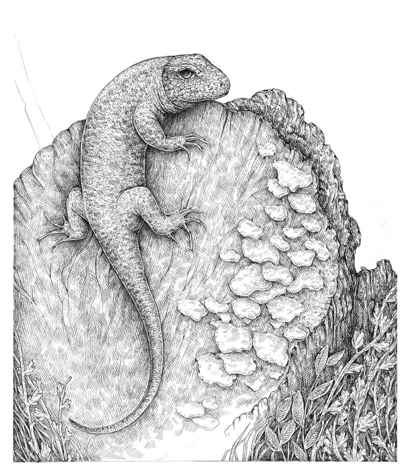
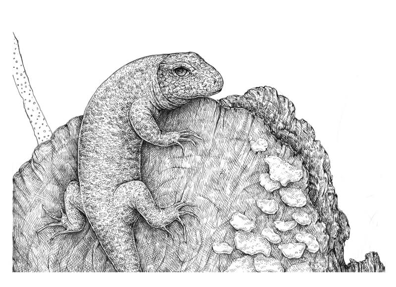
I evaluate my drawing. Remember, we want the lizard to be “the star of the show” and make sure that it fits within the environment.
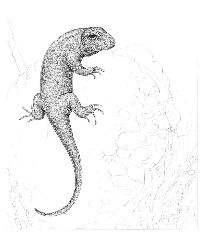
Now that we have everything in place, I think that the lizard’s skin pattern lacks darker tones. I add some hatching to the spots, using the 0.1 liner.
I’d say that the lines of the reflected light near contours of the lizard’s body are quite bright. But I find them fitting to my personal style, so I’ll leave them in place.
As a finishing touch, I darken the shadows between the mushrooms and on the bark (near the top plane of the stump). Looks nice!
Conclusion
Thanks for joining me on this wonderful journey! We’ve covered a lot, and I hope you discovered some useful tips for your creative process.
If this tutorial inspired you, but you feel like some of the steps are too complex, please take a look at the great in-depth course The Pen and Ink Experience here on The Virtual Instructor. It explains the fundamental things that help you to understand the building blocks of drawing with pen and ink.
May your walks and outdoor adventures bring you much creative fun and inspiration!
If so, join over 36,000 others that receive our newsletter with new drawing and painting lessons. Plus, check out three of our course videos and ebooks for free.

Lesson Discussion
Comments are closed.
Do you know of any exersizes i can do to learn how to draw straight lines? My problem is I have lost all feeling in my hands and the Dr.s don’t know whats wrong. I use to do oil paintings before the loss of feeling. I stopped Drawing and painting for years until my wife insisted I give it a try. I am slowly making progress, but it seems a straight line and circle are a real problem. I would appreciate any and all help you could give me. Thank You. Curt
Hi Curt,
I know that this is frustrating. Why learn to draw straight lines though? You can use a ruler for that. Allow your lines to be expressive. Straight lines are sometimes boring – in my opinion.