Gettin Sketchy – Drawing a Zebra with White Charcoal on Black Paper – Season 2 Episode 11
This episode aired live on YouTube on November 4, 2020.
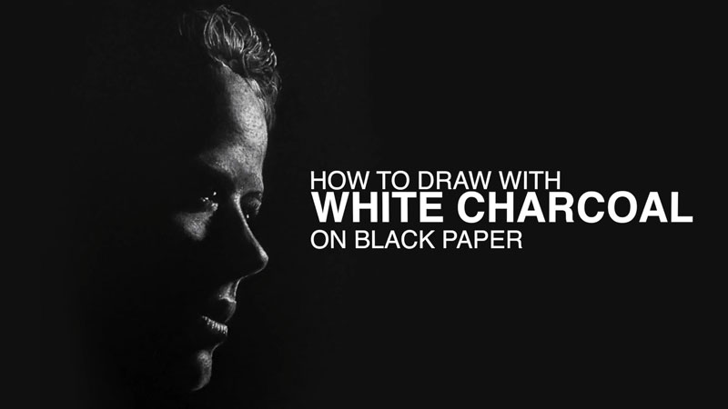
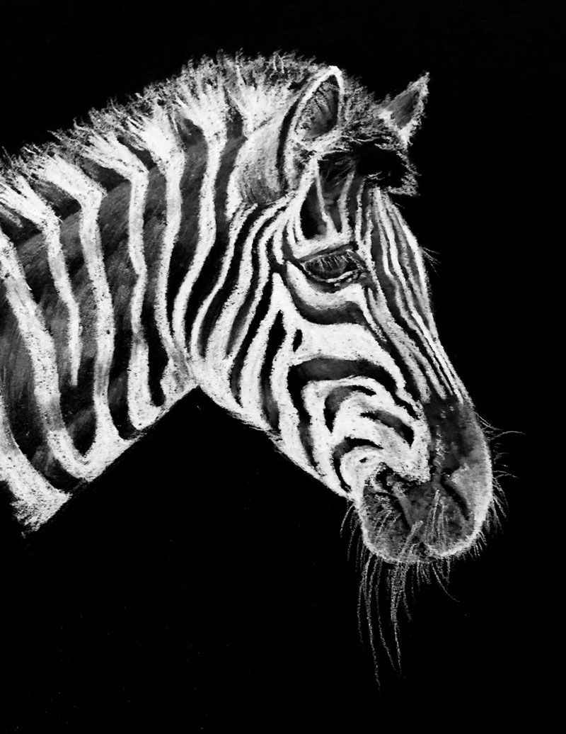
In this timed drawing exercise, we take a look at drawing a zebra with white charcoal on black paper. This drawing presents a different type of challenge. White charcoal applied to black paper is a quick process, but the challenge lies in adding lighter values instead of darker ones.
White Drawing Media on Black Paper
In nearly every case, we first learn to draw by making dark marks on lighter surfaces. For example, graphite is a dark gray material and in most cases, we apply it to white or nearly white drawing paper. This means, in terms of value, we add all of the darker tones to complete the drawing.
Most of the drawing process is adding darker tones, relying on the white of the paper to affect the middle and lighter tones. We may use the eraser to lighten up areas, but for the most part, we are adding the darker values and adjusting the pressure placed on the pencil to create mid-tones. This process is completely reversed when we use white charcoal on black paper.
Instead of adding the darker tones, we should be adding the lighter values. And instead of relying on the paper for our lighter values, we rely on the paper for our darker tones. While this may seem simple, it’s a bit more of a challenge since our brains are already conditioned to apply darker tones when we draw.
To understand this, think of a chalkboard. (Some still exist out there.) Chalkboards are usually either green or black. In this case, imagine a black chalkboard in your mind. Now consider drawing a representational drawing on the chalkboard with white chalk.
Where would you start?
In a typical drawing, we would likely start by defining the shapes and then the contours. This is fine we when draw on a light surface with a dark medium. Outlines (or contours) are fine when they are dark against a white background. But with a black surface and a white medium, we have to think a bit differently. White contours (or outlines) don’t really make a lot of sense.
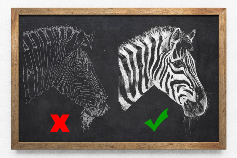
So when we begin a drawing with white drawing media on black paper, we should be aware that the contour lines should be drawn very lightly. The edges of the subject will be defined by the contrast in value, not by a line. (This should be the case in any drawing. But when we are new to drawing, we tend to define subjects with defined outlines.)
As you can see, a zebra naturally has strong contrast in value due to its wonderfully patterned skin.
Here’s a look at the completed drawing of a zebra…
White Charcoal
While the medium used in this drawing is called “white charcoal”, its name is a little misleading. Charcoal is burnt organic material and doesn’t naturally occur as the bright white we see in white charcoal products. Pigment has been added to the medium making white charcoal more similar to white pastel or conté.
Of course, it can be used interchangeably with traditional black charcoal varieties like vine charcoal and compressed charcoal. It blends very well with these materials and is as powdery as compressed charcoal.
Just like traditional charcoal (black), white charcoal is easily blended or smudged with a finger or blending stump, allowing for smooth transitions of tone. It can be erased, but not without some effort. Heavier applications are harder to erase, while softer applications are removed with ease, although some residue may remain.
Photo Reference
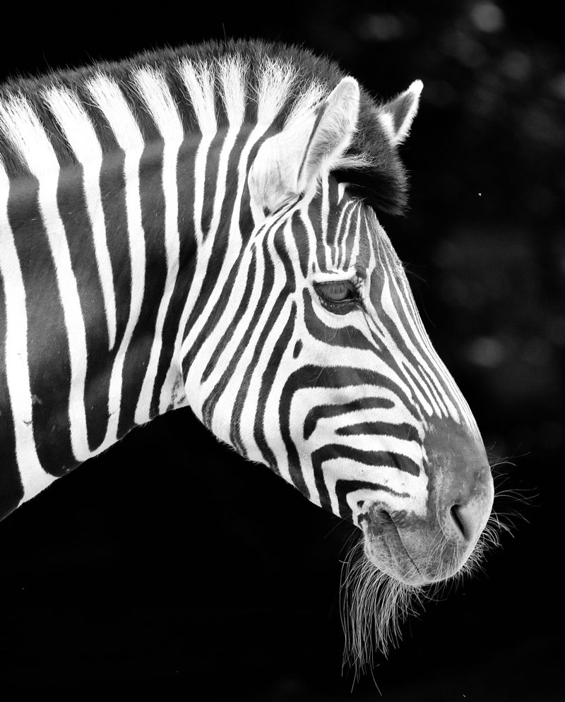
The reference photo for this exercise comes from Pixabay.com. The reference provided below has been altered to strengthen the values. The image has been cropped and all color information is removed. All of these edits were completed in Photoshop.
Here’s a look at the photo reference…
Recommended Supplies for This Zebra Drawing
Aside from white charcoal, I also used a few blending stumps and a kneaded eraser. The drawing was completed on black Artagain paper by Strathmore. Like with any drawing or painting, the surface is very important. This particular surface is rather smooth but has enough tooth to accept the material. The paper is very black compared to other brands and produces nice contrast.
Here are a few links to purchase white charcoal and Artagain Black Paper …(Some of the following links are affiliate links which means we make a small commission if you purchase at no additional cost to you.)
I highly recommend drawing with lighter media on black paper. This exercise reinforces the concept that we add values to a drawing. It’s not about “shading” – it’s about developing a full range of value. We often overlook the importance of highlights and light values, but this exercise forces us to focus our attention on them.
If so, join over 36,000 others that receive our newsletter with new drawing and painting lessons. Plus, check out three of our course videos and ebooks for free.


