
The Blog

Gettin’ Sketchy – Season 5
Drawing
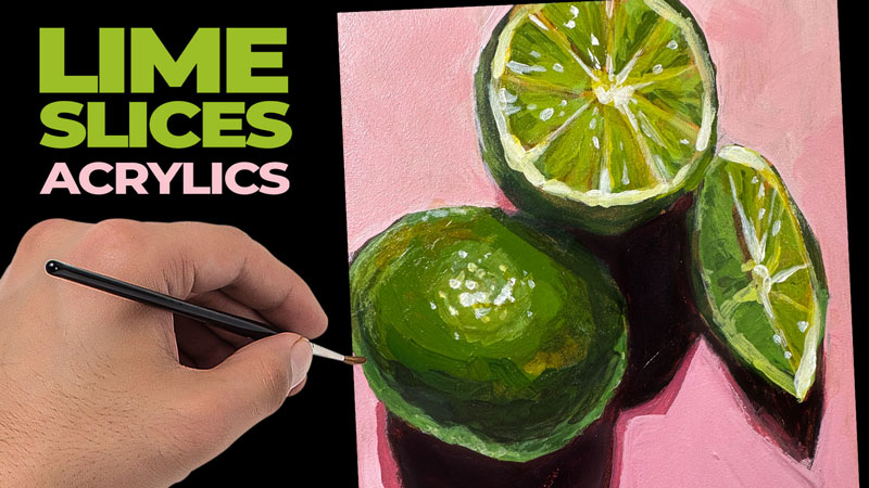
Acrylic Painting Lesson – Limes
Painting
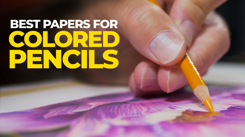
Best Papers for Colored Pencils
Drawing
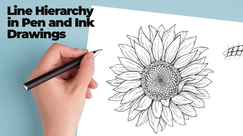
Line Hierarchy in Ink Drawing
Drawing
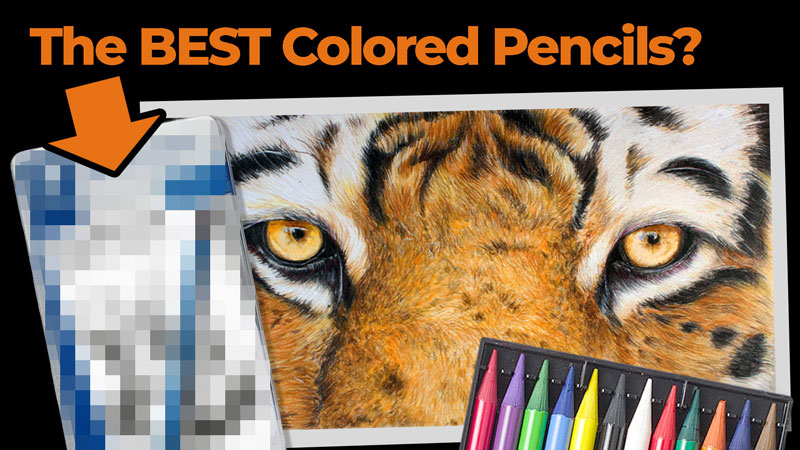
The Best Colored Pencils
Drawing
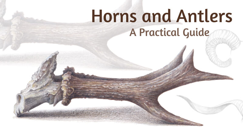
How to Draw Horns and Antlers
Drawing