
What is Optical Color Mixing?
Optical color mixing is a phenomenon that happens when a viewer perceives color in an image as a result of two or more colors that are positioned next to, or near each other. The perceived color is not actually on the surface. Instead, the color that the viewer perceives is what color(s) would result from the mixing of the colors that are actually on the surface. In other words, if yellow and blue are placed on a surface in close enough proximity to one another, the viewer may perceive that the color green is present – even though it is not on the surface at all.
Since pure colors are laid next to each to create this effect, the intensity of the perceived color is arguably stronger than what would result from mixing those colors with paint or another colored medium. Of course, some artistic control of the resulting perceived color is sacrificed for the stronger intensity.
Here’s How Optical Color Mixing Works…
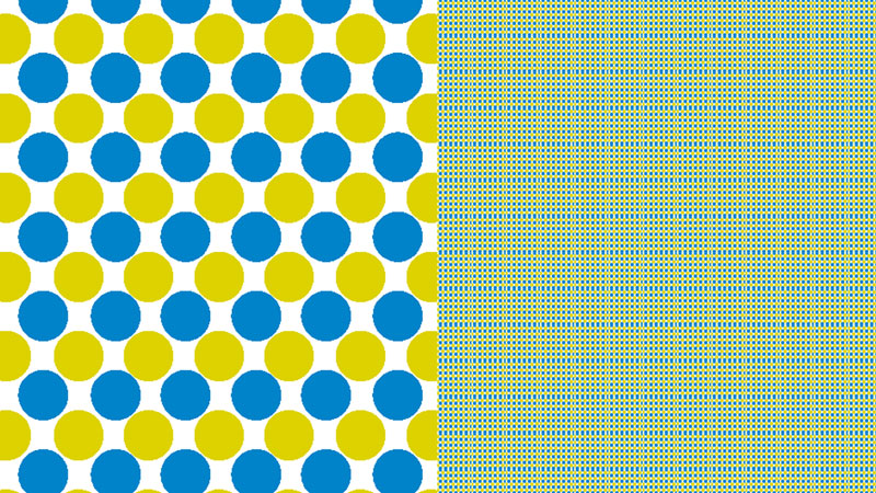
A combination of yellow and blue dots can be found in the image below. When these dots are enlarged, we clearly see each dot as yellow or blue.
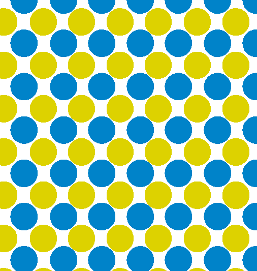
But, if we take this pattern, make it smaller, and repeat it – then we see this arrangement as green. Green, of course is what color we would get if we were to mix yellow and blue pigments together. However, in the image below, the colors are not mixed. They are simply laid next each other in close proximity to one another.
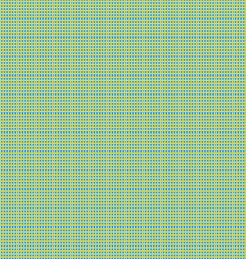
The white spaces between the colors also play a role in the perceived value of the color. So, it is clear that optical mixing can also affect not only the color, but also the value that is perceived by the viewer.
Optical Mixing Affects Value
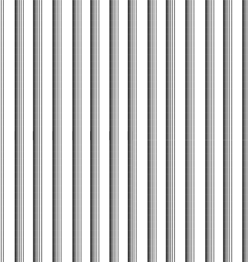
Black and white lines, when applied with controlled spacing, can be perceived as gray. This type of optical color mixing is exploited frequently by pen and ink artists. Controlling the amount of negative space between black lines allow the pen and ink artist to create gradations or gradual changes in value in drawings.
Here’s how it works…
In the image below, a series of black lines are drawn on a surface. Each black line is the same width, but the amount of negative or white space between the lines increases from left to right. When enlarged, there is little to no gradation of value perceived from left to right.

However, when this same grouping of lines is reduced and repeated, a gradation of value is easily perceived by the viewer.
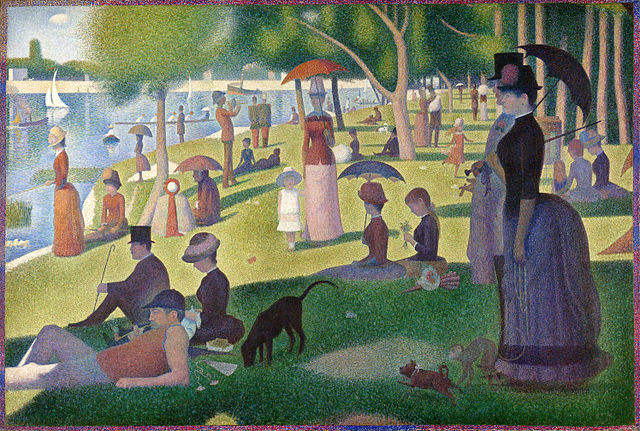
Pointillism
Pointillism refers to a painting methodology in which small dots of color are added to the support with the intent of relying on optical color mixing for color translation. In other words, pure color is added on the painting surface in a manner so that adjacent colors will affect how that color is perceived by the viewer.
Perhaps the most well-known artist that used this technique was the French Post-Impressionist painter, Georges-Pierre Seurat. His most famous painting that utilizes this technique is entitled, “A Sunday Afternoon on the Island of La Grande Jatte”. The painting is quite large measuring 81.7″ by 121.25″. It took him two years to complete it (1884-86).

Other Mediums
Optical color mixing can be used and exploited with other media including pastel and colored pencils. Both pastels and colored pencils rely on layering. As colors as layered, some of the underlayment can be allowed to show through. Applying colors in this way affects how the top layer of colors are perceived. This is most often observed when colors are scumbled over layers without any subsequent blending.
Put It To Work
If you’re looking to try your hand at optical color mixing, I think the best colored medium to start with are oil pastels. Oil pastels are easy and quick to make marks, so results can be measured quickly. Experiment with color combinations and judge how they will be perceived by a viewer. Try a variety of sizes of mark and evaluate your success. After a bit of time with oil pastels, you’ll be ready to tackle more challenging mediums like oil paint.
If so, join over 36,000 others that receive our newsletter with new drawing and painting lessons. Plus, check out three of our course videos and ebooks for free.


Lesson Discussion
Comments are closed.
I think that this could be a very helpful thing to know and a helpful art skill to work with.