Materials
- Pastelmat Paper (affiliate link)
- Rembrandt Pastels (affiliate link)
First Impressions
This paper makes a good first impression, even before any marks are made on the surface. The paper is thick and heavy with a smoother surface. (I was surprised that the tooth is so smooth since it is designed for pastel applications.) It’s relatively heavy with a weight of 170 lb.
A cover sheet is included with each sheet of paper within the pad which is a wonderful surprise. It would be nice if other paper manufacturers did the same.
The pad that I purchased included four colors – Buttercup, Maize, Dark Grey, and Light Grey. The colors provided in this pad are quite nice. I especially like the Dark Grey, which is the surface I used for the drawing demonstration.
The paper only has one side that is suitable for drawing. The backside of the paper looks and feels much like poster board. This is likely not an issue for most folks, but it is a unique characteristic.
The paper is acid-free which is an important characteristic to look for with any surfaces that you use.
A Few Tests
Before creating a drawing, I decided to conduct a few tests to evaluate how Pastelmat may behave when pastels are applied. With pastel drawing, layering and blending are particularly important factors to evaluate. Since the paper is so heavy, I suspected that adding water to pastels on this surface may be a strength, so I decided to give that a go as well.
Here’s what I tested…
- Layering – The paper’s ability to layer, cover, and the intensity of color with each layer.
- Blending – How easy it is to blend colors and the control the artist has over blended colors.
- Rigidity – How the paper behaves when water is added to pastel applications.
Layering with Pastelmat
The smoother tooth of the paper had me a bit concerned about how pastels may layer on this surface. In most circumstances, a heavier tooth is better suited for accepting multiple layers of pastels. Layering is especially important with pastel drawing and a quality pastel surface should allow for many layers.
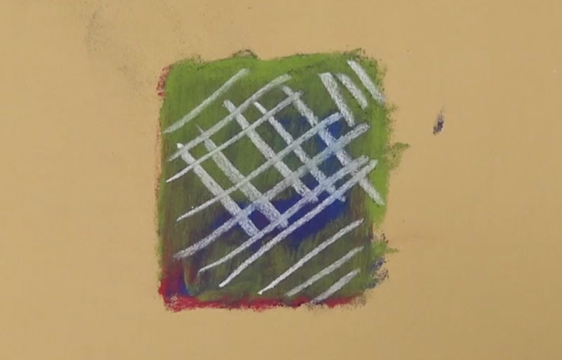
I was pleasantly surprised at how easily colors layered. With each layer, I had control over how much of the colors underneath were allowed to show through. If I desired, I could easily create an opaque layer over the colors underneath. The true test was layering white over the several colors I had in place. With very little effort, I was able to layer strong applications of white right over the colors. So even though the tooth of the paper is smoother, layering colors is very easy.
Where’s the Dust?
During my layering experiment, I quickly discovered that there was less dust produced by the pastels. Rembrandt pastels naturally produce less dust, but this was even less than usual. It seems the paper “locks” the pastel in place. This seems to make the color a little more intense and reduces the amount of dust produced, which is just fantastic.
Blending on Pastelmat
Blending on Pastelmat took a little effort – more than usual. I really had to use some “elbow grease” to get the color to move. This may seem like a disadvantage, but it may be a benefit. With the resistance, I found that I had more control over what was blended and what wasn’t. Even using just my (fat) finger, I had quite a bit of control.
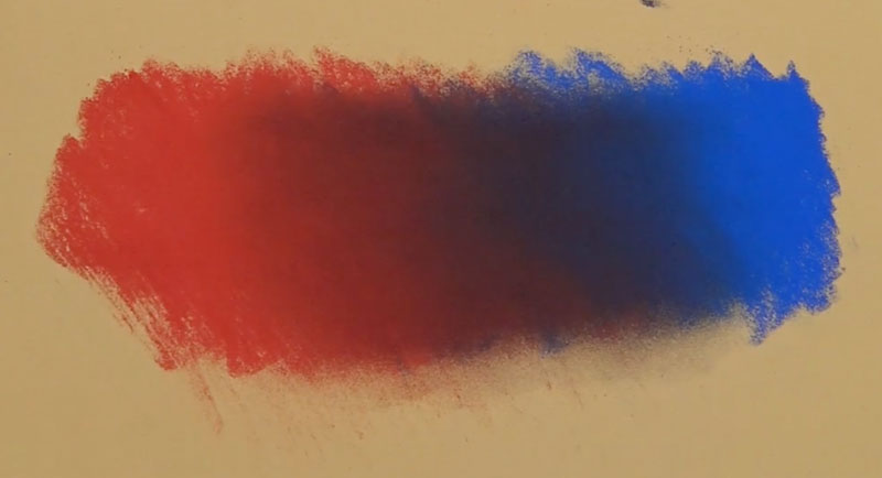
As I blended, the colors mixed as I expected. The blue and red produced a warm, dark purple.
Adding Water to Pastelmat
Pastels can be moved around and manipulated by adding a bit of water to them with a brush. This creates a nice painterly look, especially when used for backgrounds. The problem with most pastel papers is that they aren’t rigid enough to support much water without rippling or buckling.
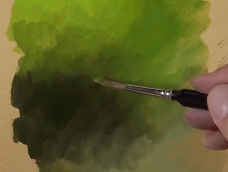
This isn’t the case with Pastelmat. At 170 lb., the paper is heavier than some watercolor papers. And with the sturdy backing, the paper is quite rigid and strong. It was easy adding a bit of water, applied with a sable brush, to pastel applications. The paper only bent slightly as the water dried, leaving a “painted” look to the pastels over which it was applied.
Creating a Drawing
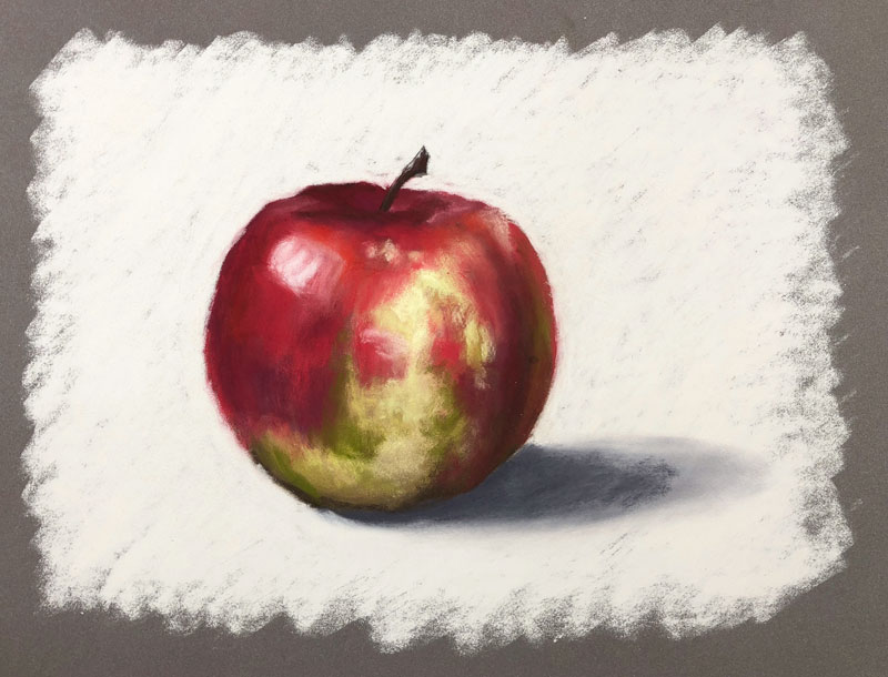
After my tests, I was eager to create a drawing on this paper. I usually choose a simple subject to draw when testing out a product that’s new to me. In many cases, it’s an apple.
I chose the Dark Grey surface to work on for my first drawing since I new the contrast would be strong.
During my tests, I didn’t really pay much attention to how the marks felt when I applied them, but when I began a proper drawing – it was the first thing I noticed. Right away, I noticed how easily the marks spread over the paper. It felt very “buttery” and the pastel glided over the paper with ease. The marks were strong, but controlled.
On most surfaces, the act of drawing with pastels feels like drawing. We would expect the resistance of the paper against a dry, powdery medium like pastels to produce this sensation. With Pastelmat, however, the feeling was very different. It felt very soft, almost like I was making marks with a paint brush. It made the act of painting with pastels feel like – painting with pastels.
I began blocking in broad sections of color. Once these larger shapes of color were in place, I began working the values darker and lighter while adding in bits of related colors.
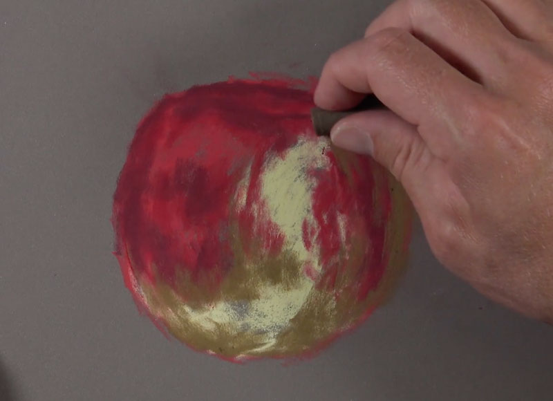
After a few layers of colors, it was time to do a bit of blending. As I expected, I had quite a bit of control over the blending. Sometimes, blending pastels can create a mess. This wasn’t the case here as I was able to mix and soften the colors I wanted without overdoing it.
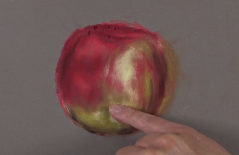
The blended applications worked as an underpainting as I next began layering additional colors over the top. I used a warmer red in a few areas and allowed the marks to sit on the surface without any blending. I was pleased to see how much depth this created in the drawing.
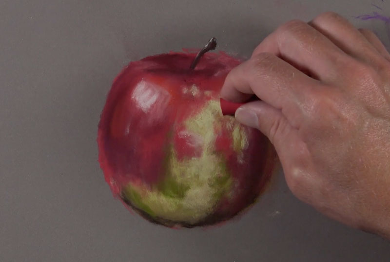
Once I was happy with the colors and value relationships on the apple, I was ready to frame out the subject and address the background. For this, I used a very light, creamy yellow, although it appears nearly white. During this process, I was able to clean up and address the edges of the apple. Against the light background and the contrast it provided, the values and colors of the apple became stronger.
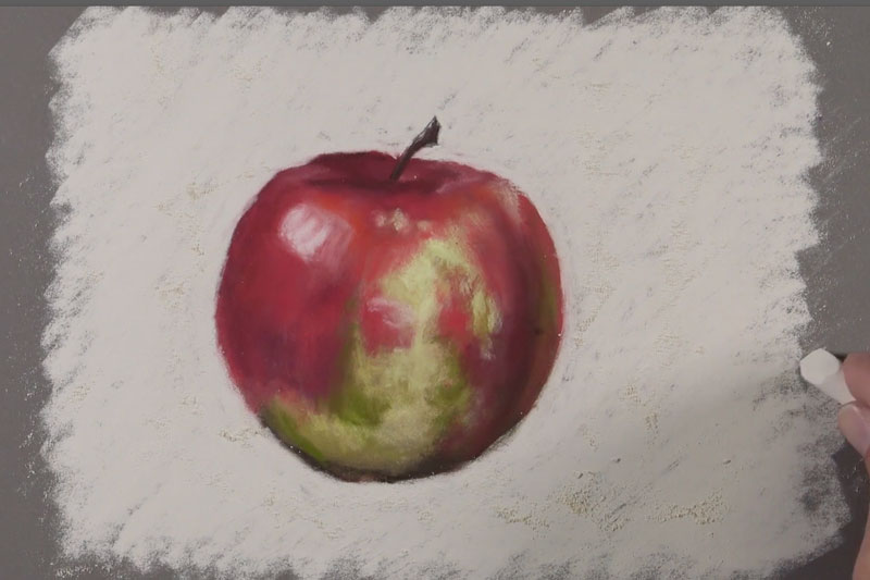
With the background in place, all that was left to do was to add a cast shadow underneath the apple. To contrast the warmer hues on the apple, a cooler dark gray was chosen. The outer edges of the shadow were softened with a finger, while the areas just underneath the apple received a heavier application, darkening the tone.

The Pros and Cons
After my tests and drawing, I was ready to look back and consider the pros and cons. Here’s what I think…
Pros
- Layers easily
- Blends with a lot of control and won’t make a mess of your paper
- Less dust – seems to “lock” the pastel in place
- Works extremely well with water and won’t buckle or wrinkle
Cons
- Expensive, but perhaps worth the investment
- Only one side of the paper is suitable for drawing/painting
- Limited colors compared to other papers made for pastel drawing
Have you used Pastelmat paper? What are your thoughts? I’d love for you to share in the comment section below…
If so, join over 36,000 others that receive our newsletter with new drawing and painting lessons. Plus, check out three of our course videos and ebooks for free.
Lesson Discussion
Comments are closed.



Matt, tu for this info .
On one of your members minutes lesson..you mention a board- canvas
Type with a sanded surface. You had bought several and was anxious to try pastels on it.
What was the name of the board and link to purchase it.
Thank you so much,
Raquel