
While value and intensity are different, they do have somewhat overlapping applications. This is one of the reasons that they are so often confused. Even though their applications are sometimes used interchangeably, knowing the difference between the two can help us make better aesthetic decisions in our drawings and paintings.
What is Value?
Let’s start by discussing value. Value, in terms of art, is the darkness or lightness of a color. Value is one of the seven elements of art and in many circles, it is considered to be the most important. Its importance in creating the illusion of light, form, and texture in a drawing or painting cannot be denied.
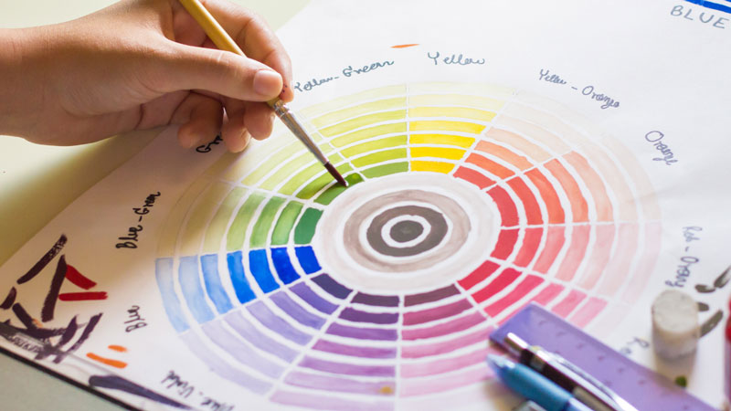
All values can be measured using a value scale, which theoretically has an infinite number of values. Most value scales are sufficient enough when showing 7-9 values.

All colors have an inherent value associated with them. For example, purely pigmented yellows are generally lighter in value when compared to purely pigmented blues, which are darker.
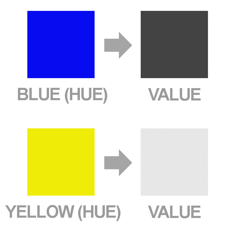
The pure color is generally referred to as “hue”. The value of a hue is adjusted by the addition of either pure black or pure white. Value is the measurement of the amount of black or white a pure hue has mixed.
By adding black to the color, the value is made darker, resulting in what is referred to as a “shade”. When white is added to a color, the result is a lighter value. Lighter values are referred to as “tints”.
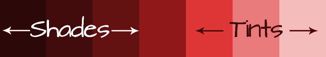
An example can be seen with the color red. The hue is red. A tint of red is what is commonly referred to as the color “pink” (red + white). A darker value, or shade of red, may be a color that we commonly refer to as “Burgundy” (red + black).
Other colors can be added to a hue resulting in an adjustment of value. But because the addition of these colors also changes the hue, white and black are commonly used as the measurement. Since these colors are neutral colors, they only affect the value and do not change the hue.
What is Intensity?
Intensity, on the other hand deals with the amount of purity in the hue itself. It can also be referred to as “saturation”. Primary colors are considered to be the most “pure” in intensity.
Intensity can also be considered as the brightness or dullness of a color.
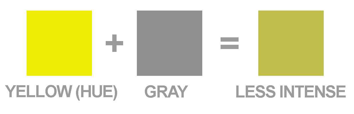
Intensity is adjusted by adding additional colors to the pure hue. A color can be made less intense by adding gray to the color. In some ways, intensity can be measured by the amount of gray in the hue.
Hues can only degrade in intensity. In other words, additional colors cannot be added to a hue to make them “more intense”. Each color that is added to a pure hue decreases its intensity.
Now This Is Where The Confusion Comes In…
When the intensity of a color is adjusted, the value also changes. In the same way, when the value is adjusted, the intensity changes but to a lesser degree.
In other words, a lighter value of yellow is also a less intense version of the hue. And a less intense yellow could be a lighter or darker version of the hue. I know – completely confusing.
So ultimately, although value and intensity are different, they are used interchangeably.
Practical Applications
Value and intensity can be exploited together to create desired illusions in drawings and paintings.
Areas or objects that are receiving light will be lighter in value. Conversely, areas that are not in light, or in shadow, will be darker in value.

Areas or objects that are receiving light are typically more intense in hue, while areas or objects in shadow are sometimes less intense chromatically.
The illusion of distance or space in a color drawing or painting can also easily be created using value and intensity. Space that is closest to the viewer (foreground) will have a greater likelihood of darker values. Colors will also be more intense in these areas. There is often more contrast between the darks and lights in these areas as well.
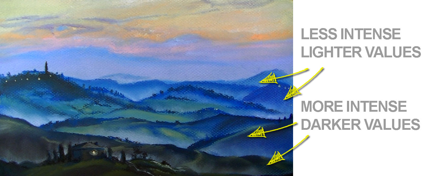
Areas of the landscape that are farther away (middle ground and background), can be depicted using lighter values and lower intensities. Mixing white will result in lighter values, while mixing grays will create duller hues. Less contrast between values is present in locations that are further from the viewer.
When used in conjunction, value and intensity can enhance the variety and depth of color used in an artwork and lead to more developed and interesting works.
If so, join over 36,000 others that receive our newsletter with new drawing and painting lessons. Plus, check out three of our course videos and ebooks for free.
Lesson Discussion
Comments are closed.
hi
Greg info thanks