
The Blog

Gettin’ Sketchy – Season 11
Drawing

Realistic Drawing Hack
Drawing

Gettin’ Sketchy – Season 10
Drawing
Gettin’ Sketchy – Season 9
Drawing
Gettin’ Sketchy – Season 8
Drawing
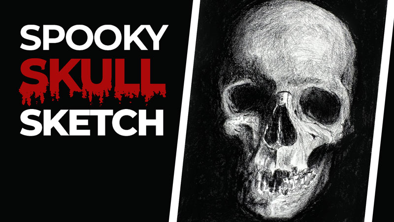
Spooky Skull Sketch
Drawing

Gettin’ Sketchy – Season 7
Drawing
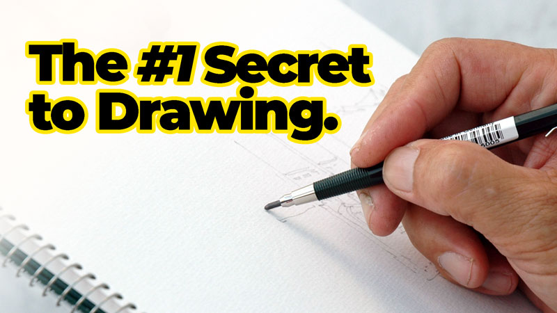
#1 Secret to Drawing
Drawing

Gettin’ Sketchy – Season 6
Drawing