
Acrylic paint is a relatively new medium in the world of art. It has been around for just over a half a century. Despite it's "newness", acrylic paint has quickly become a popular art making medium.
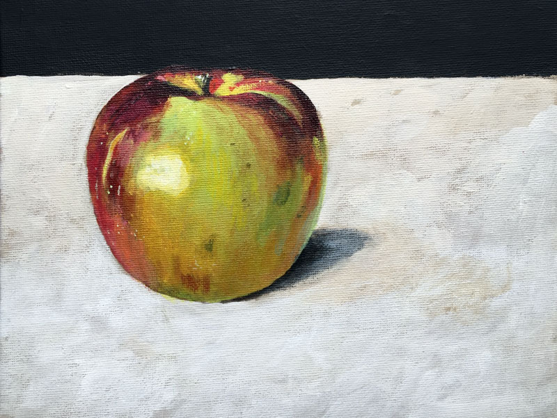
Acrylic paint is less dangerous than oil paint because it uses water instead of toxic solvents. When dry, acrylic paint can have some of the same visual characteristics as oil paints.

Application methods vary for acrylics just as they do for other painting mediums. Every artist will find an approach that best suits the effects that they are after in their own painting. It is a good idea to experiment to find the process that best suits you.
In this lesson, we'll look at creating a small still life painting of an apple by layering colors on the surface. We'll begin with an underpainting to develop the values before moving on to layering the local colors of the apple.
(Some of the following links are affiliate links which means we earn a small commission if you purchase at no additional cost to you.)
When painting with acrylics, I prefer to use a disposable palette, in this case - palette paper. Acrylics dry incredibly fast and have the potential of creating quite a mess on a plastic palette. A disposable palette can be thrown away after the painting process and makes for easy clean up.
Colors chosen are determined before painting begins by analyzing the subject or the photo reference. In most circumstances, additional pigments will be added to the palette during the painting process.
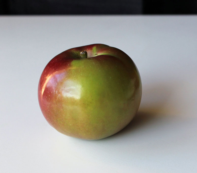
For this demonstration, I am using several pigments. I like to arrange the paints on the palette with enough space for mixing in between them.
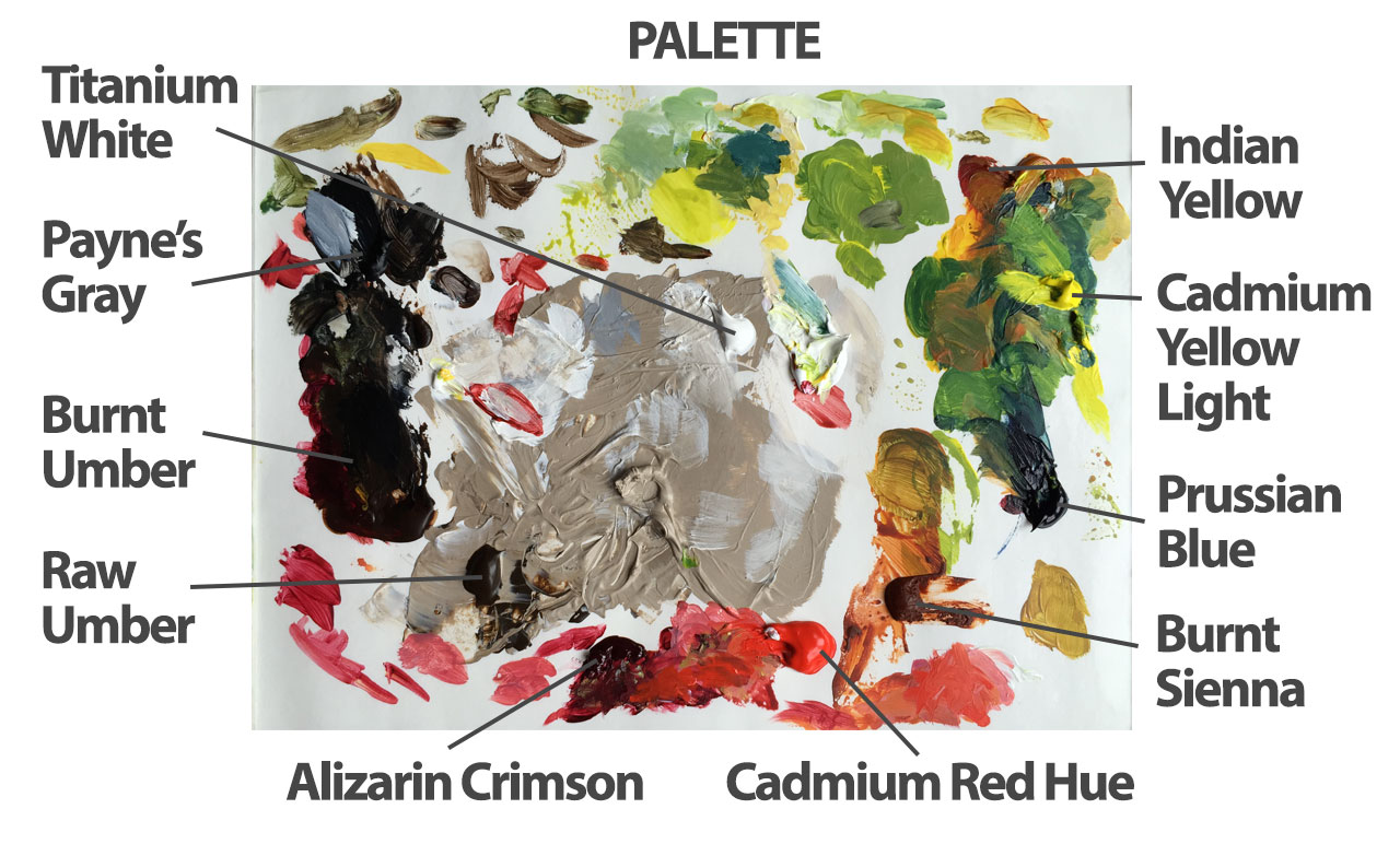
While the subject that you paint will dictate the actual pigments that are used, it's a good idea to try and limit them as much as possible. Limiting your palette will encourage harmony and unity in the work.
A blank white canvas might seem like a great place to start, but in many cases it's a good idea to start with a bit of color. Adding a bit of color to the surface creates a nice starting point for judging values due to contrast. This practice is often referred to "as creating a ground".
The "ground" can be any color that you like, but it is advisable to choose a color that may accentuate the finished painting. In many cases, the ground will still be visible through the subsequent brush strokes that are applied.
In this example, a neutral ground is created and evenly applied to the canvas. A mixture of Raw Umber and Titanium White is used to mix the neutral ground.
After the ground has dried, a pencil sketch is applied. A softer graphite pencil is used to draw the contour lines of the shape of the apple and to "map out" the areas of value and color changes.
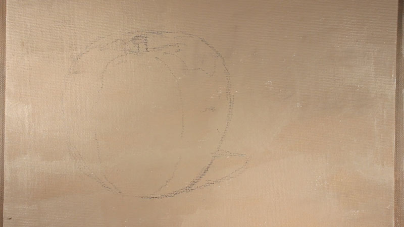
Some artists prefer to start painting the local colors (observed colors) at this point. This approach is perfectly acceptable as long as the values of the colors are addressed at a later stage. However in this example, we'll start by addressing the values by painting an underpainting. The underpainting allows us to begin to establish the values of the painting early in the process.
A mixture of Payne's Gray and Burnt Umber are used to apply the darker values. The color is thinned a bit with water to address mid tones. White is mixed with the ground mixture to address the lighter values. In this case, the underpainting is "loose" and does not address all of the observed values.
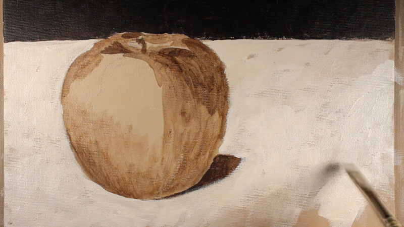
At this point, we're ready to start addressing the local colors that are observed. You may start with any section of the painting that seems natural to you because acrylics layer easily and dry very quickly. In this example, the areas of yellow-green are addressed first. A mixture of Cadmium Yellow Light, Prussian Blue, Indian Yellow Hue, and White is used.
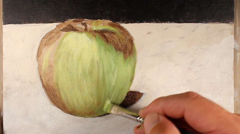
As colors are added with the brush, the form of the object is considered. Strokes are pulled along the cross contours of the apple. These subtle, directional lines help to inform the viewer of the form.
The layering of color continues with the sections of red on the apple. A mixture of Alizarin Crimson and Cadmium Red Light is used. For areas of darker value, Burnt Umber and Payne's Gray are added. For lighter values, Titanium White is mixed.
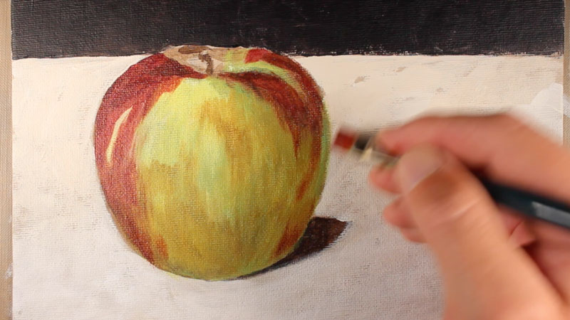
With each layer that is added, the colors become more complex. Adjustments to the value and concentration of the mixtures are made with each application. As larger areas of color are added, details can be developed.
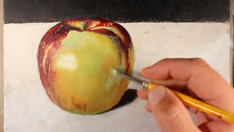
The area of cast shadow behind the apple is strengthened with a mixture of Payne's Gray and Burnt Umber before being layered over with a mixture of White and Raw Umber.
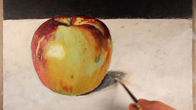
With a few final touches, the painting is completed.
Like all paints, acrylic paint is made up of three general ingredients (more exist but generally fall into one of these categories) -pigment, solvent, and binder. The pigment is the color and is generally universal in all different types of paints.
Solvent is what thins the paint. Water is typically used as the solvent for acrylic painting.
Binder is the material that holds the pigment together and allows the paint to be spread over a surface. Acrylic paint has a binder of acrylic polymer emulsion and dries quickly to create a waterproof surface. It can also can be used as a glue or as an image transfer medium. Acrylics can be matte finish or gloss. Matte acrylics dry to a dull sheen while gloss acrylics are shiny.
Acrylics can be applied with brushes, palette knives, or really anything at all. In my experience, nylon brushes work best with acrylic paint-although any type of brush will work. It is especially important to keep your brushes clean, as acrylic paints will dry quickly and ruin a brush.
Acrylics can be applied to almost any surface. Artists mostly use canvas, watercolor paper, illustration board, gessoed masonite, or other papers to paint on-although any surface is fair game.
Acrylic paints are resistant to UV light making them a suitable choice for outdoor applications. Acrylic paint also dries to create a waterproof surface that is impervious to many types of liquids.
Acrylic paints can be used with a variety of different acrylic mediums that can change the characteristics of the paint. Some mediums make the paint thicker for impasto effects, while some make the paint more transparent for glazing techniques. Others change the texture of the paint. Experiment with different mediums to find out which ones suit you best.