It's no wonder that as artists we are drawn to the natural beauty around us. Landscapes are filled with interesting lines, shapes, and complex colors. Every so often, these elements arrange themselves into aesthetic compositions and all that's left is for the artist is to record them.
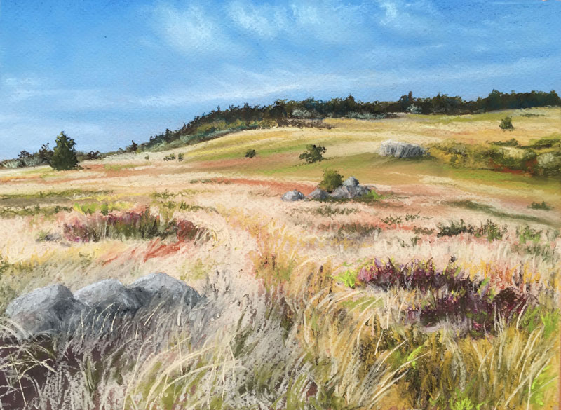
The inherent "looseness" of pastels make them a medium perfect for recording scenes such as these. Implied details manifest through the eyes of our viewers, as values, colors, and textures are recorded with broad applications and streaks of deliberate marks.
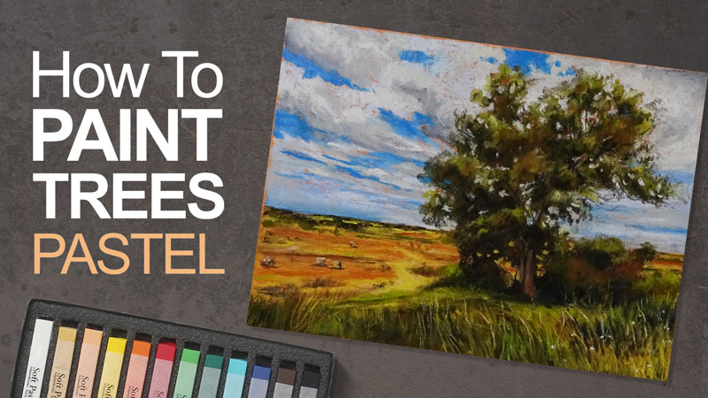
In this lesson, we take a look at recording a naturally aesthetic landscape with pastels. This one is a scene off of the Appalachian Trail in the state of Virginia.
Pastels, like other forms of art media, are available in various "levels" of quality. Introductory sets are quite affordable and can be used with success by beginner and intermediate artists alike.
While introductory sets are inexpensive, intermediate and advanced artists should find the professional quality pastels to be quite a "step up". The pigments are stronger and the pastels are less "dusty" than student-grade pastels. The variety of color is also greater with artist-grade pastels and the pigments are more fade-resistant.
(Some of the following links are affiliate links which means we earn a small commission if you purchase at no additional cost to you.)
Recommended Introductory Sets for New Pastelists:
Professional Sets for High Quality Results:
Hard Pastels (More Binder, Less Pigment)
We'll take a patient approach to layering colors to develop the painting. We'll start with the background, developing it completely before moving on the middle ground. The middle ground is developed next and then finally, the foreground. Essentially, this means that we'll start at the top of the picture plane and work our way down.
For this demonstration, we'll work on toned pastel paper (Canson Mi-Teintes). This paper features a heavily textured side and a smoother side. For paintings that require heavy layering, it is suggested to work on the side of the paper that has the heavier tooth (texture). The heavy texture allows for multiple applications of color without disturbing the tooth, which is important for consistent acceptance of the material.
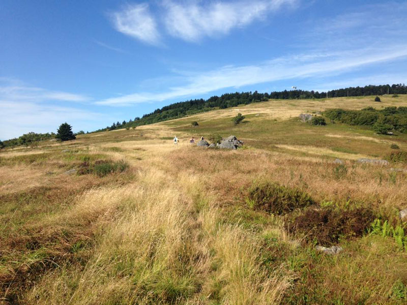
Photo Reference (Photo by Anna Roberston)
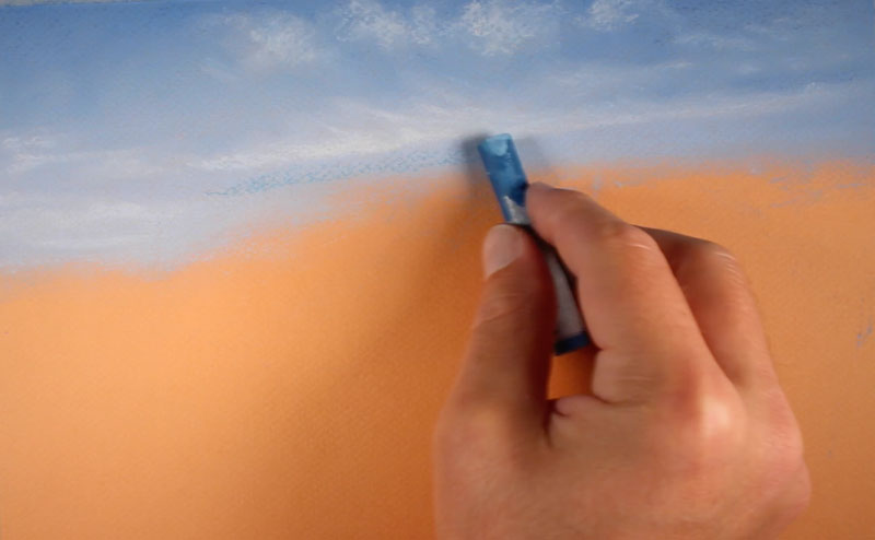
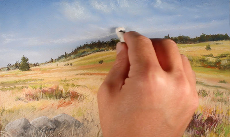
We'll develop the background first, working a darker blue over an application of lighter blue. A very light blue is used to create the shapes for the clouds and to develop the transition of value from light to dark. A finger is used to lightly blend the colors applied for the clouds.
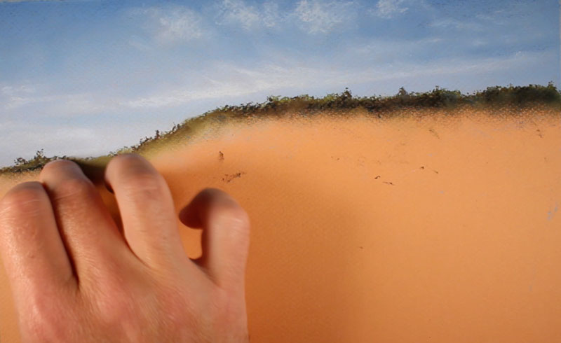
A distant tree line is created, overlapping the background. A dark yellow-green is applied initially, followed by Burnt Umber and a light application of black. These colors are lightly blended with a finger, leaving a harder edge at the top.
Shapes of color are added in the distant middle ground. A light cream, various yellow-greens, Yellow-Ochre, and a few streaks of Burnt Sienna are all used to create horizontally-aligned shapes.
A few distant trees are added and details are omitted. Instead, the colors and values and the shapes that they create are the focus.

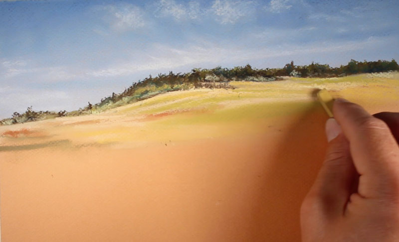
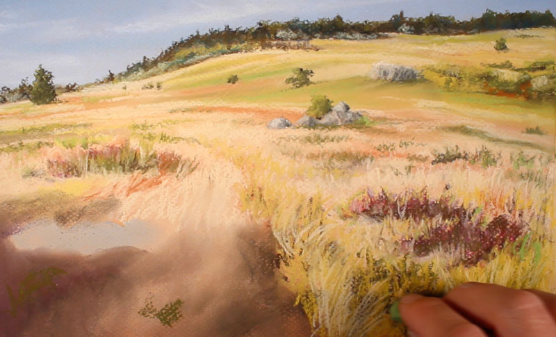
A good amount of the light cream color is brought down into the foreground, leaving bits of the orange paper to show through. A few streaks of Burnt Sienna are added as well.
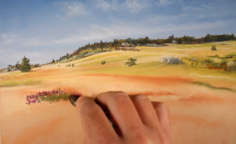
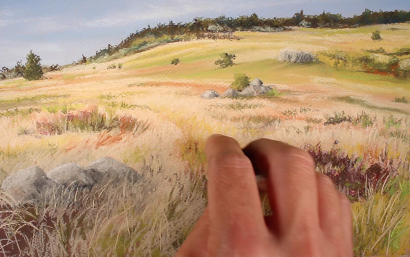
Patches of observed color are next layered in the foreground. For the subtle red-purples, red is layered over purple applications, before darkening with Burnt Umber. A dark yellow-green is used for the bits of grass and highlighted with a light yellow-green.
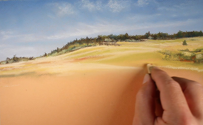
We'll continue to add the details within the scene, including the rock formation and small tree behind it.
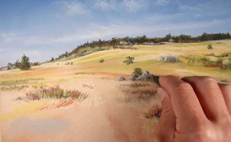
In the foreground, the lines made for the grass become longer and more deliberate. A greater variety of color, and greater contrast in value, can be found here.
Another formation of rocks are added in the foreground to help guide the viewer into the work. The small rock formation is developed completely before adding the tall blades of grass around it.
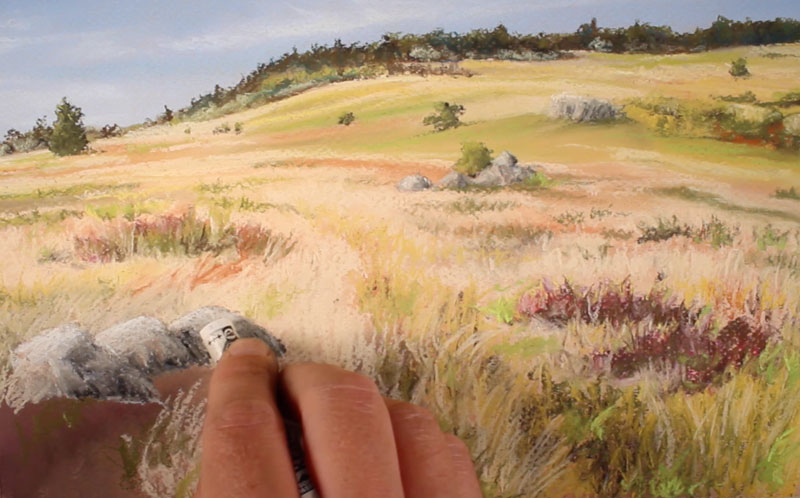
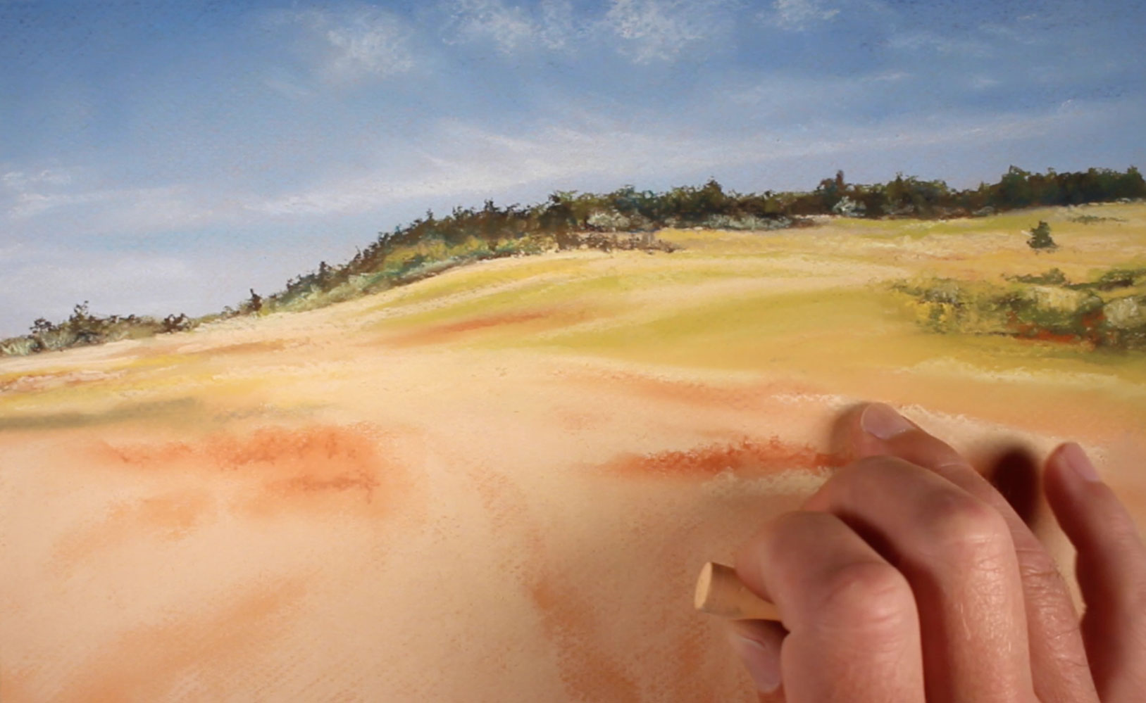
Additional strokes are made with the light cream to indicate the field grass. A few breaks are left to allow the darker colors underneath to show through.
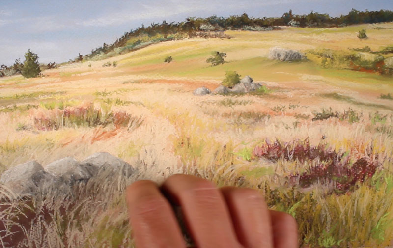
Deliberate strokes are made with a slightly lighter cream color to create highlights on the tips of the grass blades.
The sky is revisited. This time, a white is used to strengthen the highlights on the clouds. Again, this application is lightly blended with a finger.
The landscape painting is now complete and can be finished and protected with a fixative, is so desired.