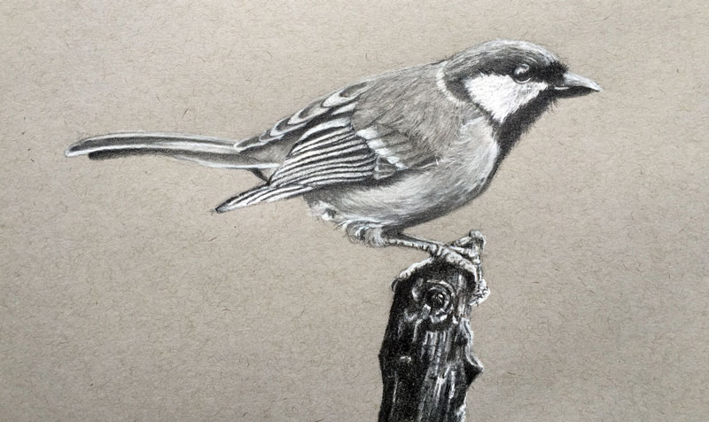
In this lesson, we'll look at the process of drawing a bird by combining graphite pencil with white charcoal pencil. Several drawing concepts are explored as we break the subject down into basic geometric and organic shapes, develop the contour lines, and build up the value range - developing textures and the illusion of form.


This drawing is created on gray drawing paper which allows us to push the value range from the center of the value scale. By starting with a surface that is essentially a mid-tone, we can better evaluate the contrast in value as it is developed with the darker graphite pencil and lighter white charcoal pencil.
Graphite pencils are comprised of powdered graphite and clay constituents encased within a wooden pencil. Available in wide degrees of softness, graphite pencils are capable of producing darker marks as well as very light ones. Most of us begin our drawing journey with a graphite pencil in hand, making marks on white or very light surfaces. As a result, we become accustomed to developing mostly darker values within a drawing, leaving the "whiteness" of the paper to produce the lighter values.
Charcoal, on the other hand, is a burnt organic material. When it is combined with a binder, it is referred to as "compressed charcoal" which is the material that we find in charcoal pencils. Traditionally, charcoal is very dark but pigment and other materials can be added to produce a product referred to as "white charcoal".
Technically speaking, "white charcoal" isn't exactly charcoal in the traditional sense. Pigments and possibly clay constituents are added to the material, making it a completely unique medium, similar to pastel pencils.
The advantage of using graphite and white charcoal in tandem allows us to focus on both the darker and lighter values, leading to a greater chance of developing a full range. This is especially true when we work on a toned surface. We can actively add the highlights, instead of leaving them as we would on a white drawing surface.
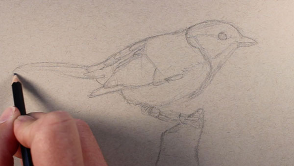
Working on a gray surface, we'll begin the drawing by focusing on the basic shapes that can be determined by our subject, a bird named "The Great Tit". An oval is drawn for the mid section and basic shapes are added extending off of the main section. Lines are drawn loosely with several light marks with an "HB" pencil.
With the basic shapes in place, the contour lines (or outlines) are added with confidence. Locations of strong contrast in value are also noted in this step.
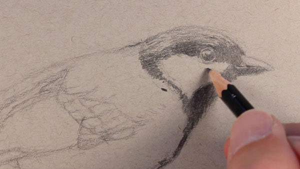
Sticking with the "HB" pencil darker values on the head and eye are addressed, leaving spaces for lighter highlights to be added. It should be noted that while graphite and white charcoal do work well together for creating a full range of value, it is difficult to layer over graphite applications with the white charcoal pencil. This is why it is important to leave areas "open" for subsequent charcoal applications.
As the darker values are developed, directional strokes are pulled in the direction that the small feathers grow from the head. Not only does this action better communicate the texture in this location, but it also furthers the illusion of form.
With initial darker values in place, the lighter values are next addressed with the white charcoal pencil. A strong highlight is added within the eye and lighter values are developed on the upper portion of the beak. The distinctive shape on the side of the head and highlights on the top of the head are also added. Here again, strokes are pulled in the direction that the feathers dictate.
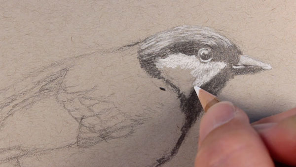
With a softer "4B" graphite pencil, darker values are strengthened. A few stray marks are pulled out around the edges of the head in spots, adding to the realism.
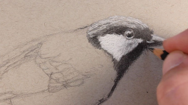
The drawing process continues to the next portion of the body of the bird. A bit of graphite is added and blended gently using a blending stump. Lighter and darker directional strokes are applied over the top creating the illusion of the texture.
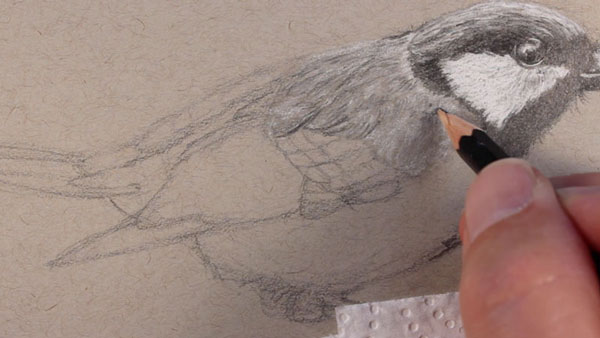
Again, this process is repeated for the lower portion of the body. The texture is slightly different in this area, defined by stronger directional strokes and darker values on the bottom of the bird.
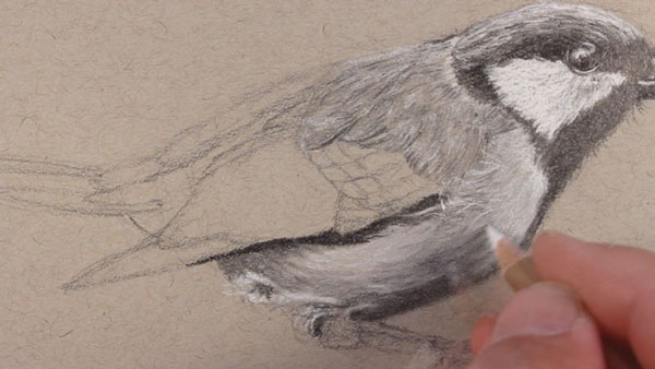
The back portion of the bird, including the wings and tail feathers, features strong contrast in value. These areas are addressed with heavier applications of white charcoal and softer graphite before being "toned down" with a blending stump and light applications of the "HB" pencil.
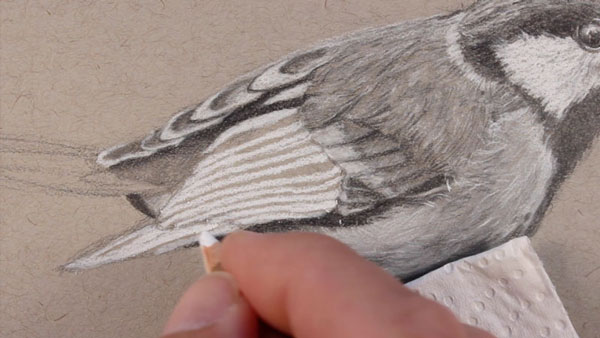
The key to creating the illusion of texture in a drawing lies mainly in the relationship of values. Most of the body, with the exception of the wings, is addressed with gradations (or slow changes) in value. The texture of the legs and talons is quite different and is developed with harder transitions. Darker values are placed right next to lighter ones.
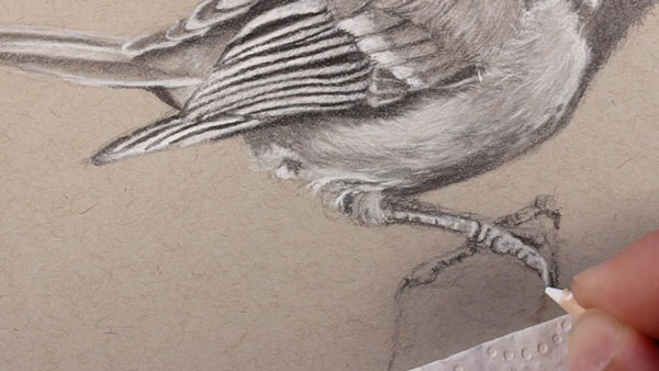
In this scene, our bird is perched on a broken branch. Values are developed again considering the directional strokes. Lighter values are developed first with the white charcoal pencil, before adding the darker shading with graphite. Most of the strokes are made in the same direction as the branch leans with the exception of a few subtle horizontal lines.
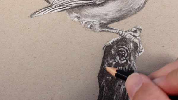
By utilizing the combination of graphite and white charcoal, our completed drawing communicates the subject, the texture, and the light within the scene through a full range of value.
