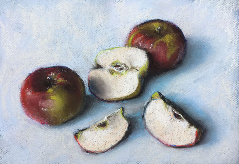
In this lesson, we'll create a loose still life of apples with pastels. We'll focus on loosening up with our marks to keep the drawing fresh. Instead of defining all of the details, we'll let them be implied through the placement of our colors and values. And speaking of colors, we'll play up the complementary color relationship of the reds and greens and add a splash of blue to liven up the work.

Recommended Materials for This Tutorial
(Some of the following links are affiliate links which means we earn a small commission if you purchase at no additional cost to you.)
One of the reasons pastels are so wonderful as a medium is their ability to be blended. Transitions of tone and color are easy achieved by smudging with a finger. However, it's easy to get carried away and over-blend the applications. When over-blending occurs, the work can appear overworked and lose its "freshness". There are few ways that we can combat this.
One way is to simply use a heavier toothed paper. This forces us to rely less on blending and more on deliberate mark making.
A second way to keep a drawing fresh is to limit the number of marks that are made. This forces us to consider every stroke as they are made so our marks have more meaning. Some artists even resort to counting strokes or placing a limit on the number of strokes made. I've personally never taken it that far, but I do like the thinking behind this practice.
Perhaps the easiest way to keep a drawing fresh is to simply loosen up a bit. Pastels lend themselves to looser marks, especially in the beginning stages. Don't be afraid of allowing your marks to imply details. You don't have to spell everything out to your viewer in your drawing.
Related: Simple Still Life with Pastels
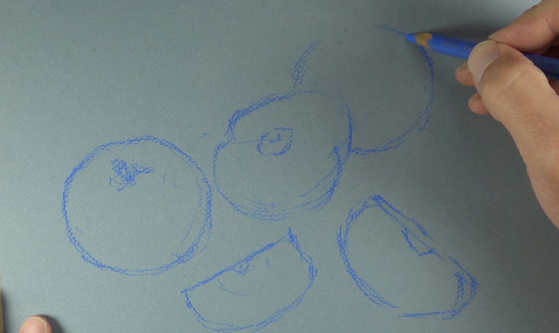
We'll begin by sketching out the contours of each of the apples with a medium blue pastel pencil. A blue pencil is used since this is a color that we'll emphasize in the image. The marks are quick as the composition is defined.
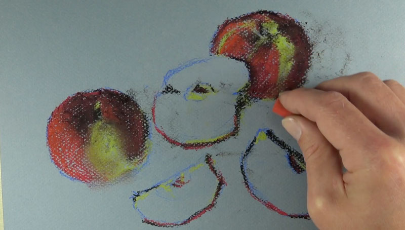
With the contours in place, we can begin adding a bit of color and shadow. A medium yellow-green is added before adding a bit of black in the locations of shadow. A deeper red is also applied and layered over the black applications. Each color that is included is added to all of the apples to ensure harmony in the work.
We'll continue adding various yellow-greens and slightly brighter reds to each of the apples. The flesh of the exposed apples is also addressed with a very light orange and a cream. A few highlights are added with the light orange and bit of cast shadow is added to the center apple with a touch of black. This shadow is gently blended with a finger. A few touches of light yellow-green are also included in portions of the flesh.
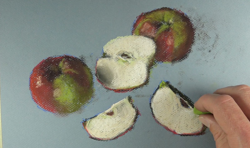
We'll continue to push the colors and the contrast as the image is developed. In this case, the cast shadow behind the center apple is strengthened with a bit of black. To de-intensify the black, this application is gently blended with a finger.
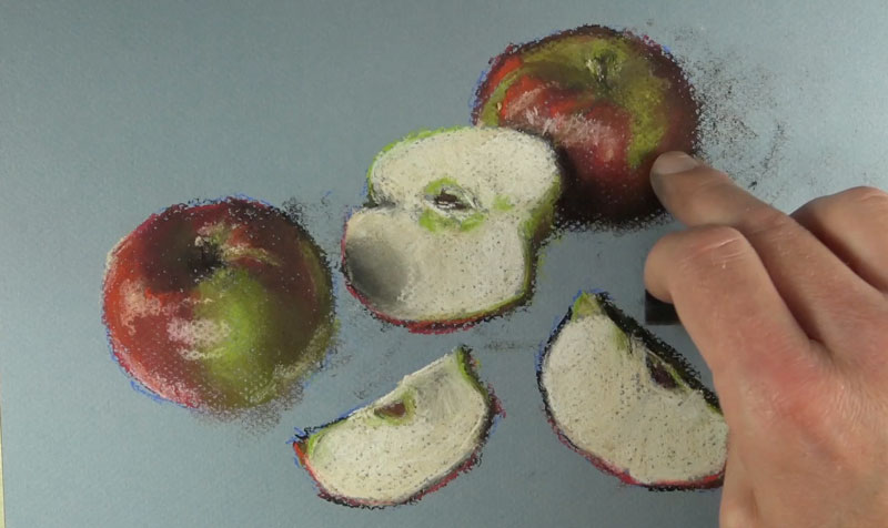
Shapes of cast shadows are added behind each of the apples with a light blue and a bit of purple before addressing the dominant background color. Although it may appear white, the background is actually a very light blue as well. These cooler colors contrast the warmer colors on the apples.
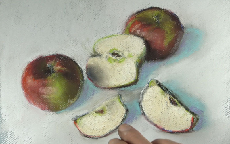
To strengthen the cast shadows and increase the contrast, a touch of black is added and gently blended with a finger. A bit more of the light blue is added before easing the transition from the shadow to the surface color by blending.
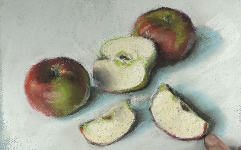
A few stronger white highlights and applications of a very bright yellow-green are added. These highlights are added sparingly, but really help to increase the contrast.
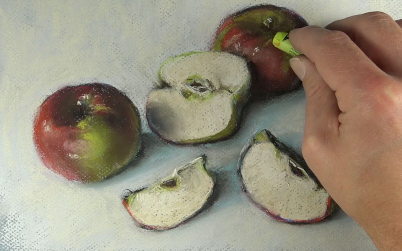
With our final highlights in place the work is complete. We could continue to apply additional pastel applications, but we may be in danger of overworking the drawing. Instead, we'll allow some of the bolder marks of color stay in place and allow the drawing to stay fresh.
