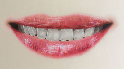
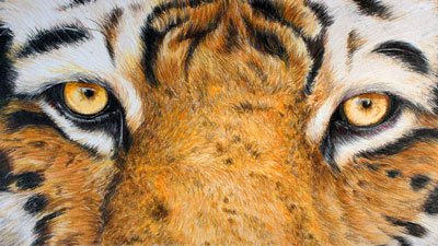
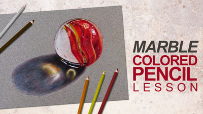
If you are drawing or painting in color then color theory should be a concept that you understand and use frequently. Knowing color theory will help you make decisions that otherwise may be difficult to make. It is one thing to understand color theory, it is quite another to implement color theory in your artwork in an intelligent way. Color theory is a very complex part of the fundamentals of art. This page will cover one way to use color theory to make your painted or drawn objects more visually stimulating and even more realistic. Before we get to that, let's explore some basics about light and shadow.
We see objects because of light. Without light, we cannot see. I know, really profound, right? The reason that I point this out though, is that if we are to draw or paint objects as they appear to us, we must fully understand light and how it behaves on objects. We see the form of objects because of how light interacts with them. We are informed about the light that hits them (light source) through highlights and shadows. The highlights are the areas on an object where light is hitting the object. Highlights are generally created by using the tint of the color. The opposite of highlights are shadows. Shadows are the areas on the object where light is not hitting. Shadows are typically created by using the shades of a color. The placement of highlights and shadows tell us where the light is coming from and how it is interacting with object.
Shadows are inherently blue in hue. Meaning that blue is the general color for most shadows. Most of us think of shadows as being black, however black is a neutral color. The hue of shadow is in fact blue. Therefore, when we create shadow, theoretically it should have blue in it. Keep that in mind.
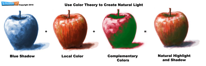
We don't see blue objects everywhere around us though, instead we see what's called "local color" . Local color refers to the actual color of the object. A red apple's local color is red. There may some other colors on the apple like yellow, white, or green. Local color includes those colors as well. It's generally what your eye sees on an object. Tints of local color are mostly created by adding white to the color, while shades of the local color are created by adding black to the color.
If we think of the shadows and the highlights as opposites, we can use our knowledge of color theory to boost that contrast resulting in more dynamic and more natural looking shadows. We know that complementary colors are opposites on the color wheel. For example, red and green are found on opposite sides of the color wheel. This makes them complementary. ( For more clarification on complementary colors, visit the color theory page.) So, if we use the cool complementary color for the shadows and the warm complement for the highlights, we increase the contrast making the image more visually stimulating.
Now put all of that together. Start your drawing or painting with a plan as to how you will handle the highlights and shadows. Perhaps, you may start with a monochromatic underpainting in blue, layer the local color on top of that and then accent with the complements.