Skip to content
Courses
Lessons
Drawing
Painting
Live Lessons
Lesson Plans
Community
Forum
Critique
Blog
Log In
Dashboard
Join
color
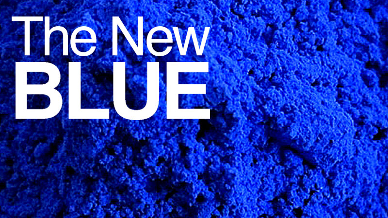
The New Blue – YInMn – A Brilliant Primary is Born
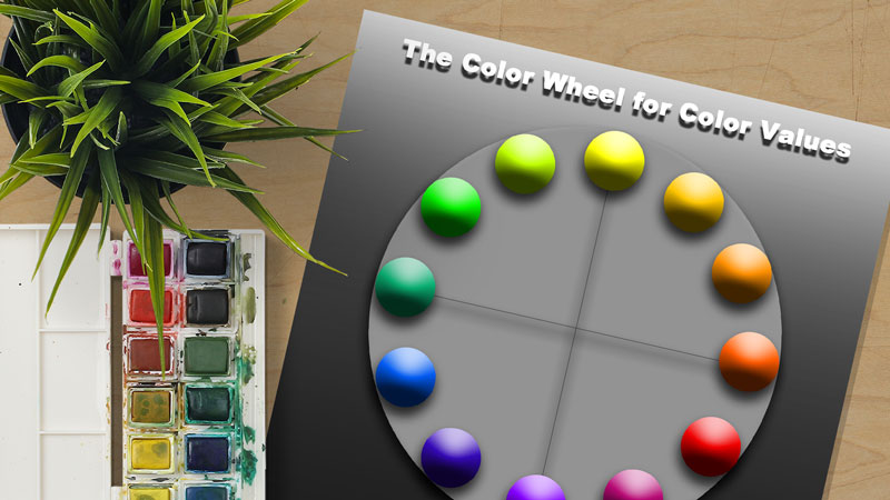
Color Wheel Chart for Values
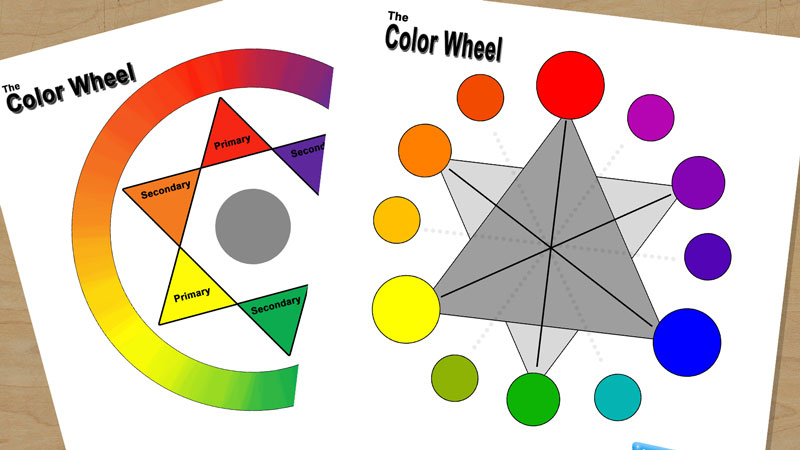
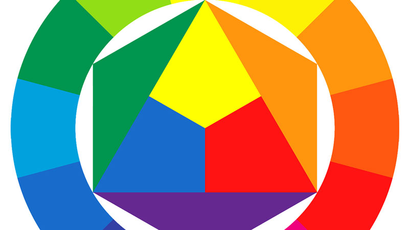
Color Wheel Chart for Teachers and Students
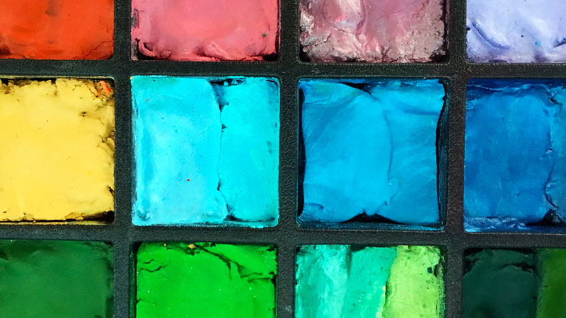
Some Interesting Facts about Color
Teach Color Theory with the Interactive Color Wheel