

Mixing Skin Tones
Why is it that mixing skin tones is so darn difficult? Mixing beautiful greens for grass is easy enough. Mixing realistic blues for skies and water is easy enough, but skin tones – that’s a different story. So, why are they are hard to mix and how can we make it easier on us all?
The truth of the matter is that skin tones are complex colors. Simply mixing two colors with equal parts is not going to get the job done. It will take several colors to get the color “right”. The complexity deepens when you consider that a range of values and color temperatures can exist on one face. And let’s not forget that no two skin tones are exactly the same. It’s easy to want to reach for that pre-made “flesh tone” at this point, but resist the temptation!
Let’s step back for a moment and simplify things a bit. But before we do, let me make this disclaimer – Portrait artists approach painting in different ways, so the way of mixing I present here may not be best for you, it’s simply how I approach mixing skin tones.
Establishing Your Base Tone
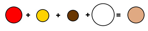
The first color that should be mixed will establish a base tone for the face. This color should be the general tone of the subject and will be the foundation on which we build the values and temperatures in the portrait. While all skin tones are different, a blend of the colors red, yellow, brown, and white will result in a suitable foundation color. Some skin tones will require more red, while others will require more white and so on. But for most subjects, a mixture of these four colors works nicely.
A little saying that I use to help my students remember the colors used for base skin tone mixing is… “Red, yellow, brown, and white – that’s how to mix your skin tones right.”
Getting the Values Right
Just like with painting or drawing any other subject, light will react on the surface of the face. The light will affect the values and color temperatures that should be found in your painting or drawing. We can create these values and temperatures by adjusting the base tone that we created.
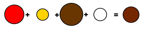
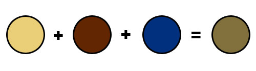
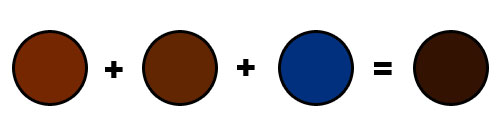
Let’s start with the values. The first suggestion is to throw out your tube of black. You don’t need it. Mixing black with your skin tone will just muddy the color, making it look gray. Instead, the colors that should be used to make values darker are brown (burnt umber, raw umber) and blue (phthalo). A mixture of blue and brown will create a “natural black” that will produce natural looking tones. An added benefit is control over the temperature. If you need shadows that are cooler in temperature, mix your darker values with more blue. If a warmer shadow is what you are after, add more brown.
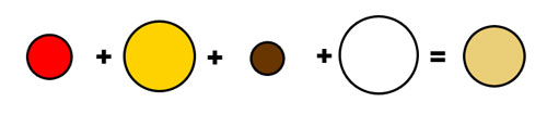
Lighter values should be mixed by adding white with the base tones. However, be cautious. White can mute colors when over-used and “wash out” natural tones. Seldom is an area on a face “white”.
Color Temperature
Color temperature is the warmth or coolness of the color. It doesn’t have to be complicated. The more that you add a warm color to your base tone, the warmer it gets. The more that you add a cooler color to your base tone, the cooler it gets. The trick is recognizing whether a color is cool or warm, and it all starts with your light.

Not all light is warm. And not all highlights are warm. You may find areas on your subject where the light is very light, but slightly cool in temperature. For most highlights, the color temperature will be warm. For shadows, the color temperature varies from warm to cool.
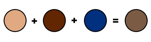
Areas of the face will change in color temperature. For example, areas around the nose and checks tend to be more red, making the temperature warmer. Pay close attention to subtle changes in color, value, and temperature and include them in your work. Don’t be afraid to be bold with contrasting these areas. It’s the contrast in value, color, and temperature that leads to the illusion of form.
If so, join over 36,000 others that receive our newsletter with new drawing and painting lessons. Plus, check out three of our course videos and ebooks for free.
Lesson Discussion
Comments are closed.
i love this!!!