
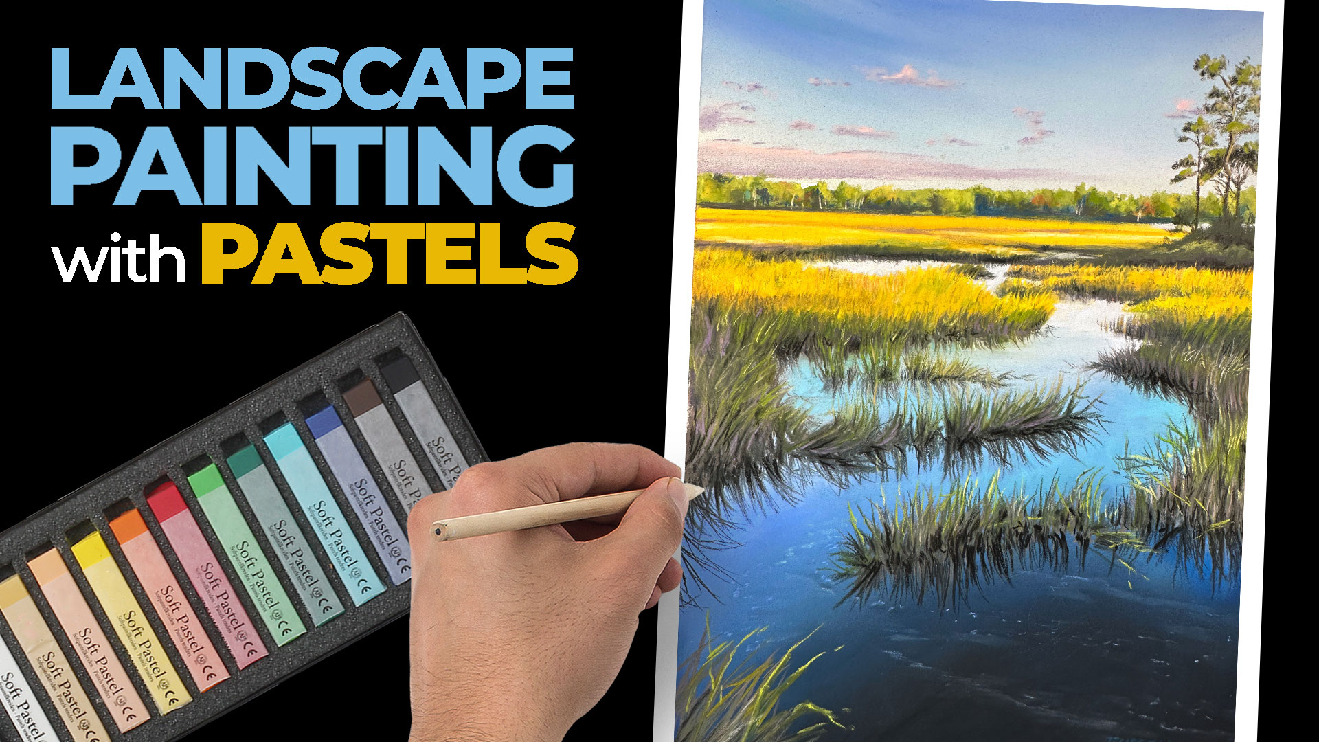
Marsh Landscape with Pastels

Lessons
About This Lesson Series...
The Marsh Landscape with Pastels class is a complete demonstration focused on capturing atmosphere, depth, and natural beauty using soft pastels. In this lesson, you’ll learn how to approach a landscape subject with confidence while taking advantage of the rich color and expressive mark-making that pastels provide. The class emphasizes observation, thoughtful layering, and controlled application to create a believable and engaging marsh scene.
Planning the Landscape
The lesson begins with planning the composition and establishing the major shapes of the landscape. You’ll learn how to simplify the scene into manageable areas while maintaining accurate proportions and perspective. This early stage helps ensure that the final artwork feels balanced and visually cohesive, setting a strong foundation for the pastel application that follows.
Blocking in Color and Value
Once the composition is established, you’ll begin blocking in the main colors and values. The class demonstrates how to work from general to specific, laying down broad areas of color before refining details. You’ll explore how value relationships create depth and how color temperature can suggest distance and atmosphere within the marsh environment.
Creating Depth and Atmosphere
A major focus of the class is developing depth through layered pastel application. You’ll learn how softer edges and lighter values can push elements into the distance, while stronger contrasts bring areas forward. The lesson also shows how subtle shifts in color and value help convey the humid, open atmosphere typical of marsh landscapes.
Developing Texture with Pastels
Pastels are ideal for suggesting natural textures, and this class highlights techniques for creating grasses, water, and sky using varied strokes and pressure. You’ll see how different marks can imply texture without overworking the surface. The instructor explains how to selectively add detail, ensuring that textures enhance the scene rather than distract from it.
Refining and Unifying the Painting
As the artwork nears completion, you’ll focus on refining shapes, strengthening contrasts, and unifying colors. The lesson demonstrates how to make final adjustments that enhance harmony and visual flow. By the end of the class, you’ll have a finished pastel landscape and a deeper understanding of how to use pastels effectively to capture mood and place.
Specific Lessons
Lesson 1 (1:07:54)
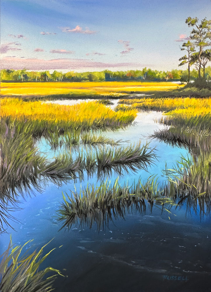
In lesson one, we develop the sky and establish the distant trees on the horizon.
Lesson 2 (1:08:43)
In lesson two, we work down below the horizon and begin developing the marsh.
Lesson 3 (1:02:45)
In lesson three, we continue work on the upper middle ground and add the tall trees on the right side of the picture plane.
Lesson 4 (1:03:04)
In lesson four, we develop details in the middle ground using pastel pencils.
Lesson 5 (1:04:47)
In lesson five, we reach the bottom 1/3 of the picture plane, continuing to develop the details of the grasses.
Lesson 6 (1:11:08)
In lesson six, we complete the drawing.
Resources for this Lesson...
Distributing any content downloaded from this site is strictly prohibited and against the terms and conditions of use.
References
Here's what you'll need...
(Disclosure: Links to art materials are affiliate links which means we make a small commission if you purchase at no additional cost to you.)

Founder of The Virtual Instructor, artist and teacher. Matt makes learning art easy to understand and enjoyable.
Found you!
Numbers just refer to the colors.
So sorry about covid.
Hi Matt, I had some trouble with Kidney stones myself. after a few months of tests and ultrasounds it turned out to be my parathyroids. After having two of the four removed all is well.
Foam Pipe insulation works great for blending!
Dear Matt,
I just finished this wonderful landscape. Had a great time and the with your explanations, my version turned out great. My husbands wants me to get it framed.
Thank you so much for amazing hours,
Buddy
Lol, husband … got only one.
So what is the controversial video?
You can use fine paint brushes for blending as well.
Black k tends to deaden the liveliness. Using a very dark green or purple would work better.
No boat!
Purple would be a perfect transition . It would create an opposite and help with tricking your eyes to see reflection.
Everyone says you’re not supposed to blow pastels into the air.
Yes, not the best practice. But I am working on a flat surface for recording purposes.
I find the chit-chat distracting, especially the conversation not related to the lesson(s). I think one instructor is sufficient. This is the problem I have with live YouTube tutorials: too many “chiefs” wanting to provide their own input; interruptions to take questions from the audience, which is distracting; and a truncated tutorial due to the constant stops and starts. I was hoping this site would provide a different experience. I’m disappointed.
This is a demonstration, rather than a tutorial.
Hi Janice,
I’m sorry to hear that you find the chit chat distracting. These lessons are broadcast live and are meant to be informative and entertaining. The “audience” is our students and we encourage them to ask questions while we are live. This allows us to answer questions directly and help people in real-time. This is meant to be similar to a live class while an instructor is giving a demo. If you are looking for strictly instruction, perhaps you should stick with the courses (not the classes) and the critiques.
I find your teaching very useful. I have learnt far more than I did during 3 years in a London art school . But I too find the chitchat distracting. I just want to focus on what you are doing/saying re the work. I want to concentrate!
Hello Matt,
What happened to the resource of the E-book material you usually provide?
If this is not obtainable do you have another resource e-book on your instruction of pastels?
Thanks,
Hi Linda,
This series is considered a class. Classes feature real-time instruction and do not include ebooks. The ebooks are included with the courses.
Do you list the supplies we need for the lessons?
Hi Leslie,
There is a “Materials” tab under the video. Clicking on this will reveal the materials with links to purchase if you wish.
I painted along with you. I painted this in one day by skipping through the dialogue. (I like that it goes slowly.)
Happy with your way of laying down color. This makes more sense to me. I look forward to advancing with other pastel videos.
Thanks for making this easy to do. Great Teaching!