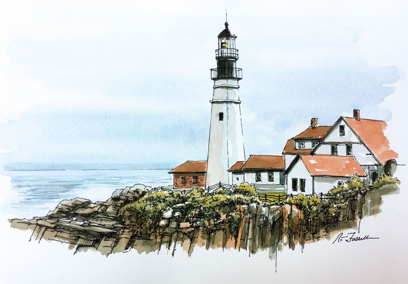
In this lesson, we'll combine pen and ink with watercolor washes to create a line and wash work of a landscape. By combining pen and ink with watercolor, we can exploit the best characteristics of each medium to create a balanced work. The pen and ink allows us to define edges and develop texture and value while the watercolor washes add richness and color.
One of the best aspects of combining these two mediums is the portability of pen and ink and watercolor. You can take these mediums anywhere as they are easily packed and cleaned up. Another advantage is that these mediums are inexpensive as a set of pens along with a set of quality watercolors are relatively affordable.
Recommended Materials for This Tutorial
(Some of the following links are affiliate links which means we earn a small commission if you purchase at no additional cost to you.)
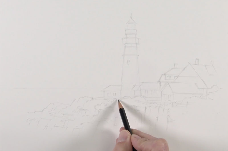
We'll begin with a basic sketch of the contour lines using an H graphite pencil. No shading or value is added at this stage since we'll rely on the pen and ink applications and the watercolor washes for this information. Since the horizon line must be perfectly straight, a ruler is used. The rest of the initial sketch is completed quickly using basic shapes.
Using the graphite sketch as a guide, we can add our pen and ink applications over the top. As we go, we'll consider the light source which originates from the upper right. We can make the lines on the opposite side of the light source slightly thicker and allow for some broken lines on the side of the subjects closer to the light source. This will aid in creating the illusion of light using only line.
We can also develop a bit of value and texture through our line work. Hatching is used to broaden the value range and to add a bit of shading. Textural marks that flow along the form of the rocks are added as well. To add a bit of interest, these textural marks alternate vertically and horizontally. Looser, random strokes are used for the bushes.
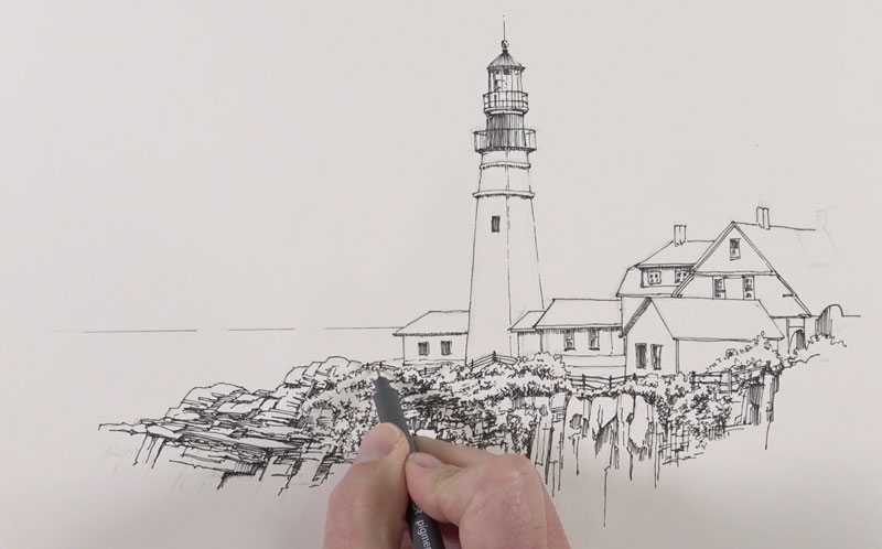
With our ink drawing in place, we can gently erase the remaining graphite lines in preparation for the watercolor washes with a kneaded eraser.
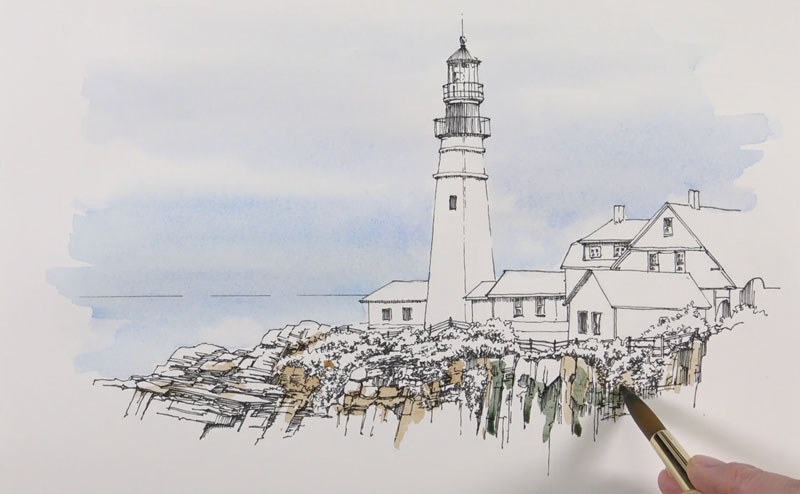
We'll start with applications to the sky and the water first. A light wash of pure water is added and while still wet, a translucent mixture of Ultramarine and Prussian Blue is added to the saturated surface. This encourages the color to bleed into the areas in which we added water.
On the rocks, a bit of Burnt Sienna is lightly washed, followed by a darker mixture of Burnt Umber, Burnt Sienna, and a touch of Prussian Blue.
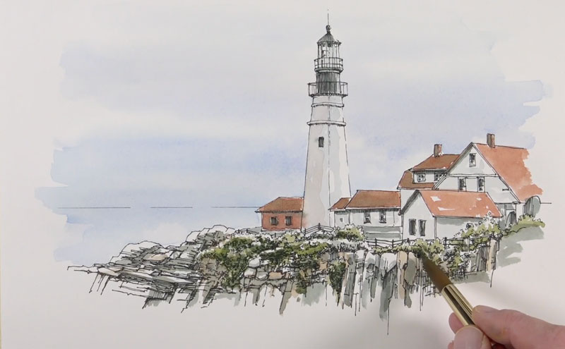
We'll continue to gradually build up the intensity of the color with additional washes. Burnt Sienna with a bit of Cadmium Red is applied to the roof tops and our lone brick building. Values are darkened with a layer of Burnt Umber applied over the top. A light gray mixture of Burnt Umber and Prussian Blue is added to the buildings instead of leaving them plain white.
The bushes on the rocks are developed with a mixture of Cadmium Yellow and Ultramarine. To darken the shadows in the bushes, a bit of Burnt Umber and Prussian Blue are added to the green mixture.
The shadows on the rocks are gradually darkened using a darker gray, mixed by adding Burnt Umber with Prussian Blue. This darker gray mixture is also applied to the darkest locations on the lighthouse.
We'll continue to push the values darker and increase the contrast of colors. A stronger application of our dark gray mixture is added to the darkest shadows on the rocks and the dark locations on the lighthouse. A stronger application of Burnt Sienna is also added to portions of the rocks.
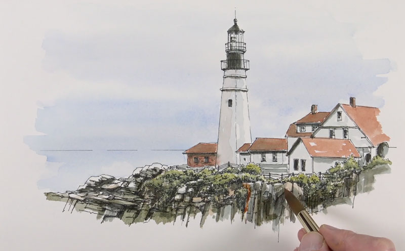
We'll add the light in the lighthouse with a strong application of Cadmium Yellow and then blot it with a bit of water to create the illusion of the light fading.
We'll also add a few ripples in the water with a darker mixture of Ultramarine and Prussian Blue. The horizontal strokes used for the ripples should fade as the ripples recede from the viewer. To soften the contrast, a bit of water can be washed over the application as it dries.
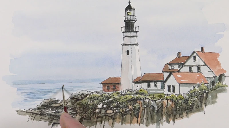
Now our image is complete. The pen and ink applications compliment the looser watercolor washes by defining edges and communicating texture.