
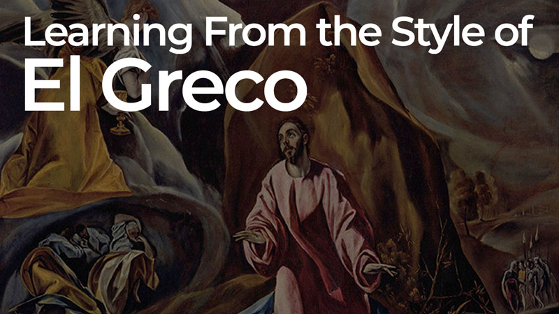
Today, we’ll take a look at the artist, El Greco, and examine his unique style. Perhaps, you’ll take away a few things in regards to your own style and see that sometimes we can throw out conventional wisdom in order to create something truly unique.
On occasion an artist will stretch the conventions of his/her own time and produce work that is undeniably unique. El Greco was such an artist. His work bridged the gap between artistic periods, and even between worlds. El Greco’s mystical paintings inspired devotion to God in his own time. Later, in the Twentieth century, Cubists and Expressionists found his painting inspiring in a different way. The abstract artists of the Twentieth century drew their own inspiration from the way El Greco freely manipulated color and proportion. Though El Greco’s artwork speaks for itself, some context may help one to appreciate how he came to develop the distinct style for which he is known.
Who was El Greco?
El Greco was born Doménikos Theotokópoulos. Hailing from the Island of Crete, he moved, as a young man, to Venice and eventually Rome. Nothing is known about his early education on Crete. It is assumed, however, that he was receiving an education since he continued studying art after moving to Italy. El Greco was known to read both philosophy and religious commentary in his mother-tongue, Greek.
If El Greco was educated as a boy on Crete he would have learned in a monastery. Monasteries were the educational centers on Crete at that time. There he would have seen and studied the Byzantine style of painting that persisted in Greece, being somewhat insulated from the ground breaking artistic innovations happening just next door, in Italy, during their Renaissance.
Of course, upon moving to Venice, El Greco was thrust into that explosive world of artistic skill and expression. It was at this time, in El Greco’s early adulthood, that he first came to occupy a place between two things.
El Greco came under the influence of Titian while studying in Venice. Titian was perhaps the greatest representational artist in the world at that time (Michelangelo had just died). He left his stamp on El Greco. Taking the opportunity to travel, however, El Greco headed north toward Florence. In doing so, he saw and incorporated ideas common to the Mannerist artists that ushered out the Renaissance.
Eventually, some would call El Greco the greatest Mannerist of all. His art, however, utilizes Byzantine, Renaissance, and Mannerist concepts, all the while pointing to the Baroque period that would blossom after his death.

What is Mannerism?
Mannerism is the name given to art that seemed more of a rebellion against the complex naturalism of the Renaissance, instead of a distinct, cohesive style of its own. The unrelenting preoccupation with human proportions and mathematically accurate perspective common to Renaissance art gave way to exaggerated proportions, stylized facial features and utterly impossible, flat spaces. Some Mannerists used unnatural colors for expression, fighting the inclination to simply copy the observable colors of a subject. In short, Mannerism was interested in style over accuracy. It challenged accepted Renaissance solutions to artistic problems.
El Greco in Toledo
El Greco eventually moved on to Spain where he would remain for the rest of his life. It was here, of course, that he received the “nickname”, El Greco, which simply means the “the Greek” in Spanish. It was in Spain where Byzantine symbolism and Mannerist ideas would synthesize into the style that set El Greco apart.
El Greco’s Proportions
El Greco was a pious individual living in Toledo, the spiritual center of Spain. His artwork meant to show both the earthly and the heavenly, at once. These are the two worlds El Greco sought to reconcile in his art. Exaggerated proportion was a convention used in Byzantine art to solve such a problem as it related to, Jesus, being both God and Man at once.
Look at the examples below. See how Jesus’ proportions are not that of a baby but a man. The head is too small for a baby and the limbs seem long in relation to the torso. This stylization meant to convey the otherworldly or heavenly nature of Jesus. El Greco may have remembered how Jesus was represented in Byzantine art as he was trying to find a way to communicate his own subjects’ closeness to God.
See how El Greco elongated the body of John the Baptist. Did El Greco extend this Byzantine stylization to include saints and even earthy subjects, as an expression of their piety?
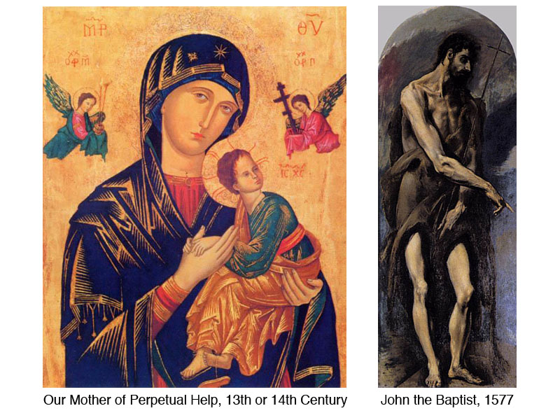
Whether El Greco found inspiration in the Byzantine version of Baby Jesus or not, his figures do appear out-of-this-world. Their stretched proportions and fluid poses make them human like, but not merely human. Beyond human. Spiritual.
El Greco’s Space
Look at The Agony in the Garden at Gethsemane (below). This painting illustrates Jesus praying in the Garden just before he is arrested. On the right, the land and sky in the background seem to merge in to one solid shape, light in value. The abrupt change from light to dark in the sky seems to serve a compositional purpose more than a representational one – an example of style over accuracy.
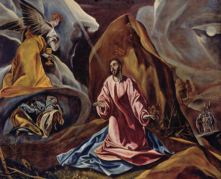
On the left side of the canvas the space is even more uncertain. The angel in yellow seems to be both in the foreground and background at once. The size or scale of the angel matches Jesus, leading one to believe that he, the angel, is next to Jesus. The placement of the angel, however, says otherwise. The yellow garment matches the contour of the grotto in which the disciples sleep, leads one the believe that he, the angel, is resting over the disciples and is just larger than the other figures.
The imagery on the left beyond the angel is open to interpretation as well. Do the lighter values describe land or are there clouds as well? Again, the values in the negative space seem to have more of a compositional purpose that a representational one. The uncertain space in the background gives the painting a flat quality. In this way, El Greco leans hard toward Mannerism.
El Greco’s Color
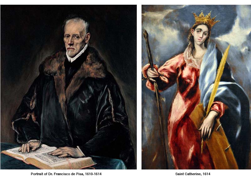
El Greco thought of color as a means to differentiate between the earthy and the heavenly. He used high intensity colors when depicting saints and angels, but low-intensity colors for his subjects still bound to this earth. Compare the portrait of Dr. de Pisa with the representation of St. Catherine. The primary color scheme El Greco used in the painting on the right, along with the dynamic, high contrast background are from of a different realm altogether when juxtaposed against the portrait of Dr. de Pisa.
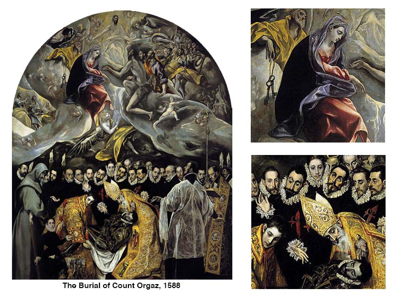
El Greco used intensity of color to distinguish between the two worlds, even in the same artwork, on occasion. The Burial of Count Orgaz (below), perhaps his greatest work of art, is a fine example. The difference between how color is used in the lower and upper halves is stark. Here again, El Greco used a primary color scheme to describe the heavenly.
Perhaps he loved applying this scheme to heavenly imagery because one cannot make primary colors by mixing any other pair of colors together. El Greco might have described the primary pigments as those that only God could make, qualifying them to represent the holy.
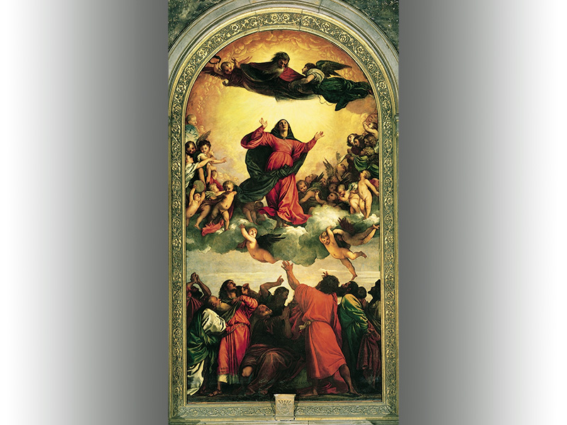
Of course, El Greco was, while in Venice, a student of Titian, the High Renaissance Master. He would have known the painting, Assunção de Nossa Senhora (below), By Titian. Titian’s use of color and tonal contrast is more subtle that El Greco. Still yet, the generally dark mass of figures at the bottom, and also the red and blue clad figures set against the intense yellow background in the heavens, must have played a part in the stylistic decisions made in The Burial of Count Orgaz.
Conclusion
El Greco, like Byzantine painters, used unnatural proportions for effect. He employed intense color relationships and flat spaces common to Mannerists. He used the natural, authentic color mixtures and color schemes mastered by Renaissance artists. Then, when one considers the general darkness of his compositions and painterly brushwork, one can see a foreshadowing of the coming Baroque period. Here again, El Greco’s style rides the fine line between definable periods – a man between worlds.
We can learn quite a lot when we look to artists from the past that have made a significant impact. Many times, we can see that our own personal styles can emerge when we reject conventional opinions on what art should look like or be. El Greco is fine example of this.
Sources:
Hamlyn, Paul. El Greco. London: Paul Hamlyn Limited, 1967.
Tansey, Richard G. and Kleiner, Fred S. Gardner’s Art Through the Ages, tenth edition. Orlando: Ted Buchholz, 1996
If so, join over 36,000 others that receive our newsletter with new drawing and painting lessons. Plus, check out three of our course videos and ebooks for free.

Lesson Discussion
Comments are closed.
I love the art history lessons! I especially like how you connected it personally with us, the reader/artist. I would like to see more art history articles.
Hi, sounds good! Is the medium oil, or can it be done with acrylics as well? Also, I’m a beginner..is this too advanced for me?
I also love the history. Thank you!
Very interesting. I did not know much about El Greco, until now. It makes me want to learn more. Thank you.
I also love the art history lessons and how they relate to us, the students. It is not “just” their artwork we learn about, but also the concepts that were used that students can apply now, to our own artwork!